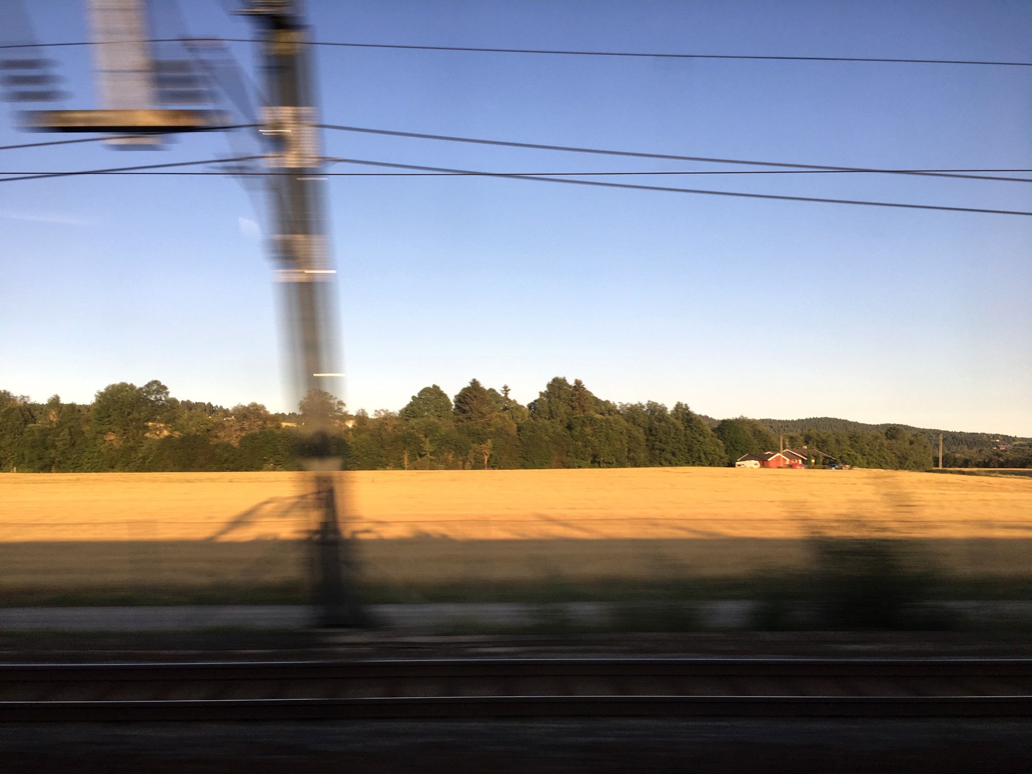
It’s funny when you are on vacation and see people taking photos from a moving vehicle using an iPhone. The standard iPhone App has no ability to really increase its shutter speed to 1/800 of a second, so you have to install an app like Halide. The photograph below is taken from a train, and has a somewhat artistic flair to it. The closer to the horizon, the less blur there is, because the train is moving slower with respect to distance closer to the horizon (i.e. motion parallax).
A photo taken from a moving train.
But if you are using the Apple camera app, you can’t control shutter speed. Of course it is easier to adjust these sort of settings on a DSLR, using shutter-priority. If you want to control aspects like the shutter speed, you have to turn to an app like Halide. The only problem with this is I find changing settings on an app to be fiddly… one of the reasons to travel with a real camera, and not rely solely on mobile devices. Regardless, it is almost impossible to remove these types of motion blur from an image, where the blur only exists in one plane of the depth of field.
Here’s a great intro to shutter speed on the iPhone, an intro into advanced photo shooting on the iPhone, and some info on the manual controls in Halide.
Hang a large, scenic panorama from a wall, and the picture of the scene looks like the scene itself. Photographs are mere imitations of life, albeit flat renditions. Yet although they represent different realities, there are cues on the flat surface of a photograph which help us perceive the scene in depth. We perceive depth is photographs (or even paintings) because the same type of information reaches our visual system from photographs of scenes as from the scenes themselves.
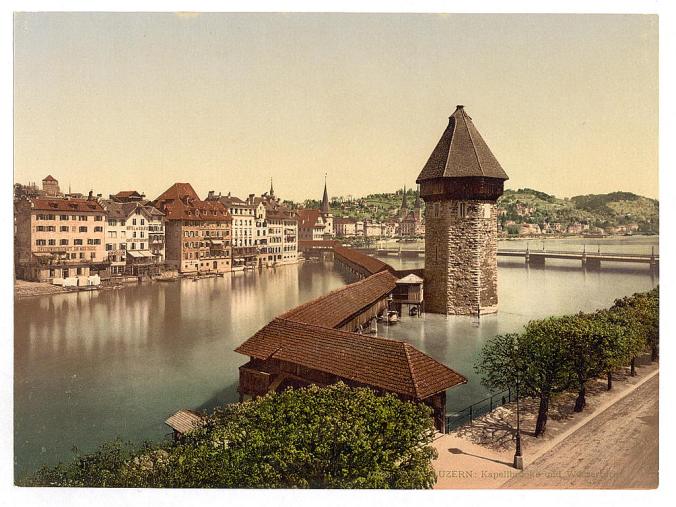
Consider the following Photochrom print (from the Library of Congress) of the Kapellbrücke in the Swiss city of Lucerne, circa 1890-1900. There is no difficulty perceiving the scene as it relates to depth. It is possible to identify buildings and objects in the scene, and obtain an understanding of the relative distances of objects in the scene from one another. These things help define its “3D” ness. The picture can be seen from another perspective as well. The buildings on the far side of the river get progressively smaller as they progress along the river from the left to right, and the roof of the bridge is much larger in the foreground than it is in the distance. There is no motion parallax, which is the relative movement of near and far objects were we physically moving around the scene. These things work together to define our perception of the prints flatness.
Fig. 1: Flatness – The Kapellbrücke in Lucerne
Our perception of the 3D nature of a flat photograph comes from the similarity of information reaching the human visual system from an actual 3D scene, and one described in a photograph of the same scene.
What depth cues exist in an image?
Occlusion – i.e. overlapping or superimposition. If object A overlaps object B, then it is presumed object A is closer than object B. The water tower in Fig.1 hides the buildings on the hill behind it, hence it is closer.
Converging lines – As parallel lines go into the distant, they become closer together. The bridge’s roofline in Fig.1 gets smaller as it moves higher in the picture.
Relative size – Objects that are larger in an image are perceived to be closer than those which are further away. For example, the houses along the far riverbank in Fig. 1 are roughly the same height, but become smaller as they progress from the left of the picture towards the centre.
Lighting and shading – Lighting is what brings out the form of a subject/object. The picture in Fig. 1 is light on the right, and darker on the right, this is effectively shown in the water tower which has a light side, and a side with shadows. This provides information about the shape of the tower.
Contrast – For scenes where there is a large distance between objects, those further away will have a lower contrast, and may appear blurrier.
Texture gradient – The amount of detail on an object helps understand depth. Objects that are closer appear to have more detail, and as it begins to loose detail those areas are perceived to be further away.
Height in the plane – An object closer to the horizon is perceived as being more distant than objects above or below it.
Examples of some of these depth cues are explained visually below.
Motion parallax is one of those perceptual things that you notice the most when looking out the window of a fast moving vehicle, like a train. It refers to the fact that objects moving at a constant speed across the frame will appear to move a greater amount if they are nearer to an observer (or camera) than they would if they were at a great distance (parallax = change in position). This phenomenon is true whether (i) the observer/camera is moving relative to the object, or (ii) object itself that is moving relative to the observer/camera. The rationale for this effect has to do with the distance the object moves with respect to the percentage of the camera’s field of view that it moves across. This helps provide perceptual cues about difference in distance and motion, and is associated with depth perception.
Consider the example below simulating taking a photograph out of a moving vehicle. The tree that is 300m away will move 20m in a particular direction (opposite the direction of the vehicle), but only traverse 25% of the field-of-view. The closer tree, which is only 100m away will move out of the frame completely with the same 20m displacement.
Motion parallax is an attribute of perception, so it exists in real scenes, but not when one views a photograph. Can a photograph contain artifacts of motion parallax? Yes, and it is easy – just take a photograph from a moving vehicle (trains are best), using a relatively slow shutter speed. The picture below was taken on the VIA train to Montreal, using my iPhone pressed up against the glass, with the focus plane approximately in the middle of the window.
Smartphone cameras have lead to the age of the disposable image.
It is not the first time this has happened of course, there have been other instances since the birth of photography. During the Victorian period, technologies such a albumen prints brought photographs to the masses. But then photography was a new phenomena, and seeing visual depictions of the world far away through photographs such as stereoviews, likely left people in awe. New technology displaces old, and old photographs were soon forgotten in a drawer somewhere. For a good many years snapshots of time were captured using black-and-white paper photographs, which were then displaced by colour in various mediums – print, slide, instant photograph.
The concept of film slowly gave way to digital, which swept away the constraints of the physical medium. All of a sudden you could take hundreds of photographs, view them instantly, and not have to worry about having them developed. In 2018 alone, over 1 trillion photos were taken. How many photographs are there of the Eiffel Tower? The vast difference of course it that film technology left us with physical prints that sat in cupboards, or were framed. Digital photographs offer another form of disposable image, one which has an uber short lifespan. We don’t dispose of them, but rather just forget them.
When you’re an infant those memories made aren’t really that accessible when you get older. That’s because humans generally suffer from something scientists term infant amnesia. Something to do with rapid neuron growth disrupting the brain circuitry that stores old memories, making them inaccessible (they are not lost, but tucked away). Of course you don’t want to remember everything that happens in life… that would clog our brains with a bunch of nothingness. But we all have selective memories from infancy which we can visualize when they are triggered. For me there are but a couple, and they are usually triggered by an associative sense.
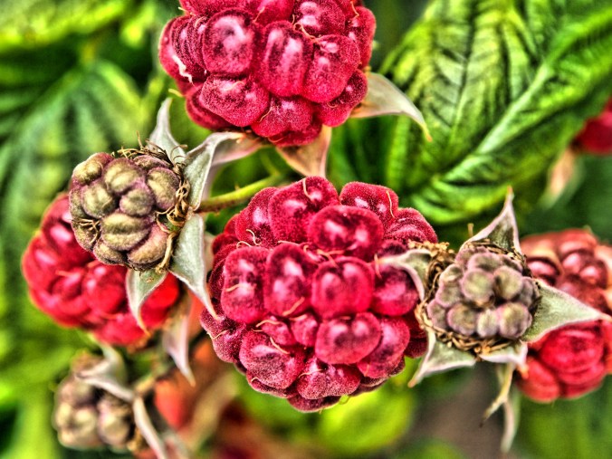
The first is the earthy smell of a cellar, which triggers fleeting memories of childhood times at my grandmothers house in Switzerland. The second is also of the same time and place – the deep smell of wild raspberries. These memories are triggered by olfactory senses, making the visual, however latent, emerge even if for a brief moment. It is no different to the other associations we make between vision, smell, and taste. Dragonfruit is a beautiful looking tropical fruit, but it can have a bitter/tart taste. Some of these associations have helped us survive over the millennia.
Mmmm… raspberries… but you can’t smell them, or taste the ethyl formate (the chemical partially responsible for their flavour)
It makes you wonder then if these sense-experiences don’t allow us to better retain memories. If you travel to somewhere like Iceland, and take a picture of a geyser, you may also smell faint wisps of sulphur. There is now an association between a photograph of geyser, and physically experiencing it. The same could be said of the salty Atlantic air of Iles de la Madeleine, or the resinous smell of walking through a pine forest. Memory associations. Or maybe an Instagram of a delicious ice cream from Bang Bang ice-cream. Again an association. But how many of the photos we view lack context because we don’t have an association between the visual, and information gathered from our other senses. You can view a picture of the ice cream on Instagram, but you won’t know what it tastes or smells like, and therefore the picture only provides half the experience.
There was a time when photographs had meaning, and held our attention, embedded something inside our minds. Photographs like The Terror of War taken by Nick Ut in 1972 during the Vietnam War. But the digital age has changed the way we consume photographs. Every day we are bombarded with visual content, and due to the sheer volume, most of it makes little if any lasting impact.
Eventually, the visual data around us becomes an amalgam of blurriness and noise, limiting the amount of information we gain from it.
The human visual system is extremely adept at processing visual information. It can process something like 70 images per second [1,2], and identify images in as little as 13 milliseconds. But it was never really designed to see the variety of visual data now thrust at it. When we evolved, vision was purely to used to interpret the world directly surrounding us, primarily from a perspective of survival, and the visual data it provided was really quite simple. It was never really designed to look at screens, or read books. There was no real need for Palaeolithic humans to view something as small as text in a book. Over time visual processing systems evolved as human life evolved.
The greatest change in visual perception likely occurred when the first civilizations appeared. Living in communities meant that the scope and type of visual information changed. The world became a busier place, more cluttered from a sensory perspective. People no long had to use their vision as much for hunting and gathering, but adapted to live in a community setting, and an agricultural way of life. There likely was very little change in thousands of years, maybe even until the advent of the Industrial Revolution. Society became much more fast paced, and again our vision had to adapt. Now in addition to the world around us, people were viewing static images called photographs, often of far-flung exotic places. In the ensuing century, visual information would play an increasing role in people’s lives. Then came the 21st century, and the digital age.
The transient nature of digital information has likely changed the way we perceive the visual world around us. There was a time when viewing a photograph may have been more of an ethereal experience. It can still be a magical experience, but few people likely realize this. We are so bombarded with images that they fill every niche of our lives, and many people likely take them for granted. Our visual world has become super-saturated. How many Instagram photographs do we view every day? How many of these really make an impact on our lives? It may be that too much visual information has effectively morphed what we perceive on a daily basis into a dull noise. It’s like living next to a busy rail-line – what seems noisy at first over time gets filtered out. But what are we loosing in the process?
[1] Potter, M., “Meaning in visual search”, Science, 187(4180), pp.965–966 (1975) [2] Thorpe, S., Fize, D., & Marlot, C., “Speed of processing in the human visual system”, Nature, 381(6582), pp.520–522 (1996)
Sometimes we tend to forget how exciting first achievements are. You get a good sense of these if you peruse vintage science journals from the late 1800s, many of which are available online as PDFs. When I was looking for an article from La Nature Revue Des Sciences recently from 1884, I came across another interesting article on the photography of lightning strikes by Gaston Tissandier (Vol.12, No.548., pp.118-119), entitled “Les Éclairs, Reproduits par la Photographie Instantanée“, or “The Flashes reproduced by instant photography”. The images show photographic prints of lightning taken by Mr. Robert Haensel of Reichenberg, Bohemia.
Photographs of lightning, taken on July 6th, 1883 at 10pm, when the sky was very dark
These photographs seem very simple, but are like pieces of artwork. They were acquired using silver-bromide gelatin plates, and activated by the lightning flashes themselves. Now the average duration of a flash of lightning is 0.1-0.2 seconds, so it says a lot about the sensitivity of film at the time. Haensel exposed 10 plates, of which four good negatives were produced. The photographs were reproduced for publication using the photogravure process.
This article was also published in The Popular Science Monthly, as, “Photographing a Streak of Lightning”, Vol. 24 pp.752-754 (April 1884). An earlier article appeared in The Photographic News, on January 4th, 1884 (London).
Previous discussions have focused on the quasi untruths the camera produces. What is the greatest of them? The freezing or blur of movement? The distortion of perspective? Or maybe the manipulation of colour? When it comes to colour, where does the truth lie? Colour is interpreted differently by each person, and even the camera itself. No one may truly understand the complexities of how colour is actually perceived. Most people see a blue sky, but what shade of blue? Consider the following photograph taken at Point Pleasant Park, in Halifax (Nova Scotia). The sky seems over-saturated, but there was no processing done. Is it natural, or an affect of being in the right place at the right time?
Prince of Wales Tower, Point Pleasant Park, Halifax
Colours in a digital photograph are a result of many differing processes – light passes through the various glass optics of the lens, and is absorbed by the sensor which converts the photons into a digital signal. This does not mean that the colours which exist in a scene will be properly interpreted. The pure “light” of white can be used to manipulate the colours of a photograph, something called white balancing. Scroll through the available choices, and the colour temperature of the photograph will change. Sometimes we manipulate colours through white balancing, other times through manipulation of the colour histogram, all to make the contents of the photograph seem more akin to our perception of realism. Sometimes we add colour to add a sense of non-realism. Sometimes we saturate the colours to make them seem bright, and other times we mute them.
Take a photograph of something. Look at the colours in the scene, and try to remember what they looked like. Maybe take the same photo with different cameras. It is hard to reproduce the exact colour… so in many ways the photograph the camera produces is something of a generic interpretation to be manipulated in a human way to some visual aesthetic. Which takes us to the question of what is the truth? Is there any real truth to a photograph?
Nothing has a true colour- it is all varying perceptions of the interaction of light and colour pigments, and the human eye. We apply filters in Instagram to make things seem more vivid and hyper real, or desaturated and contemplative. There is no right or wrong way of understanding colour, although our experiences are influenced by the other senses such as smell. I mean, as far as wavelengths go, the Earth’s sky is really more of a bluish violet colour, but because of the human visual system we perceive it as pale blue. So maybe our own eyes are manipulating the truth?
Many image post-processing applications use unsharp masking (UM) as their choice of sharpening algorithm. It is one of the most ubiquitous methods of image sharpening. Unsharp masking was introduced by Schreiber [1] in 1970 for the purpose of improving the quality of wirephoto pictures for newspapers. It is based on the principle of photographic masking whereby a low-contrast positive transparency is made of the original negative. The mask is then “sandwiched” with the negative, and the amalgam used to produce the final print. The effect is an increase in sharpness.
The process of unsharp masking accentuates the high-frequency components of an image, i.e. the edge regions where there is a sharp transition in image intensity. It does this by extracting the high-frequency details from an image, and adding them to the original image. This process can be better understood by first considering a 1D signal shown in the figure below.
An example of unsharp masking using a 1D signal
This is the process of what happens to the signal
The original signal.
The signal is “blurred”, by a filter which enhances the “low-frequency” components of the signal.
The blurred signal, ➁, is subtracted from ➀, to extract the “high-frequency” components of the signal, i.e. the “edge” signal.
The “edge” signal is added to the original signal ➀ to produce the sharpened signal.
In the context of digital images unsharp masking works by subtracting a blurred form of an image from the original image itself to create an “edge” image which is then used to improve the acuity of the original image. There are many different approaches to unsharp masking which use differing forms of filters. Some use a more traditional approach using the process outlines above, with the blurring actuated using a Gaussian blur, while others use specific filters which create “edge” images directly, which can be either added to, or subtracted from the original image.
[1] Schreiber, W., “Wirephoto quality improvement by unsharp masking,” Pattern Recognition, Vol.2, pp.117-121 (1970).
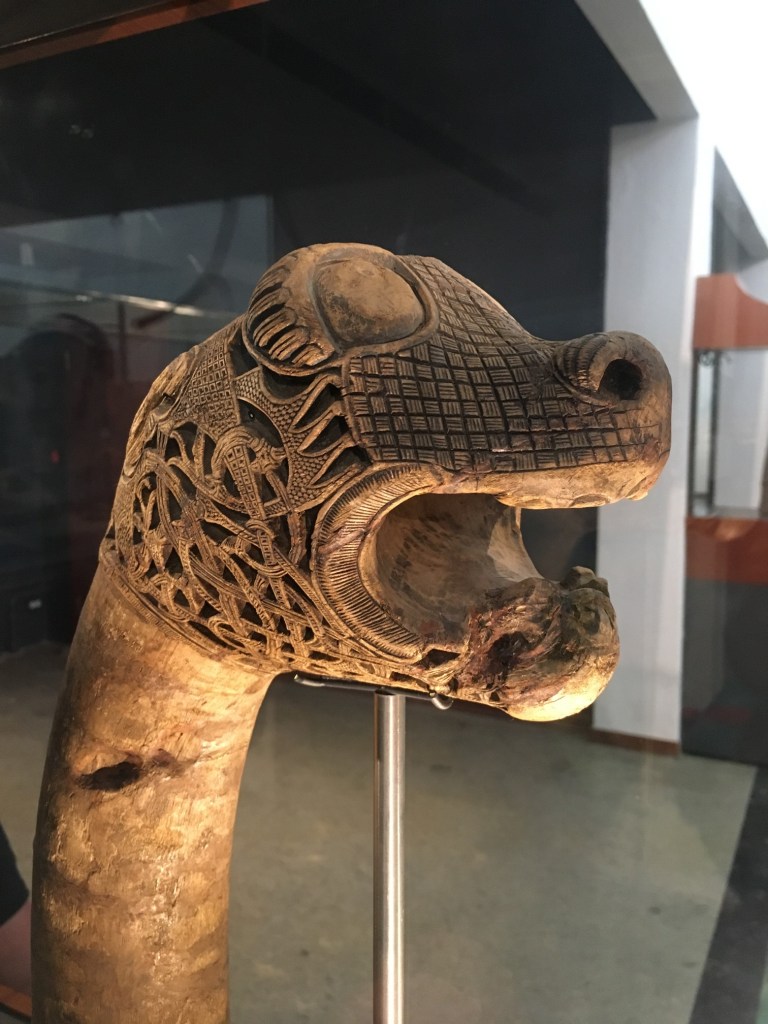
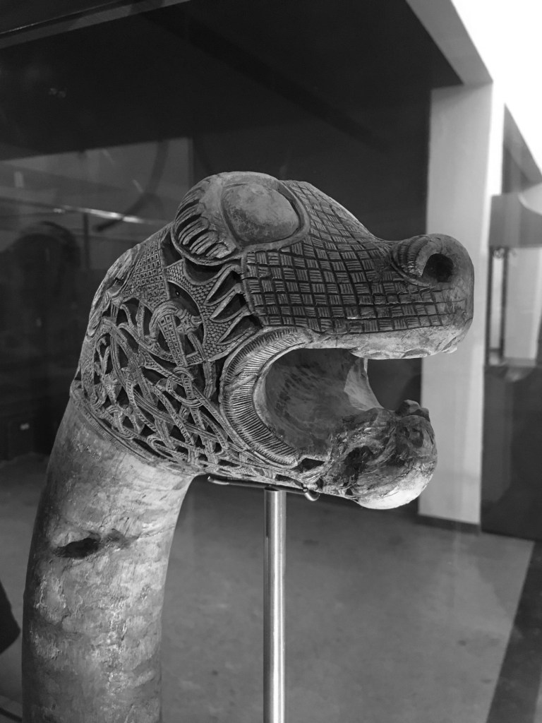
There are some images which contain shafts of light. Sometimes this light helps highlight certain objects in the photograph, be it as hard light or soft light. Consider the following photo of a viking carving from the Viking Ship Museum in Oslo. There are some nice shadows caused by the light streaming in from the right side of the scene. One way to reduce the effects of light is to convert the photograph to black-and-white.
Before
After
By suppressing the role colour plays in the image, the eyes become more fixated on the fine details, and less on the light and shadows.
4︎⃣ Improving on sharpness
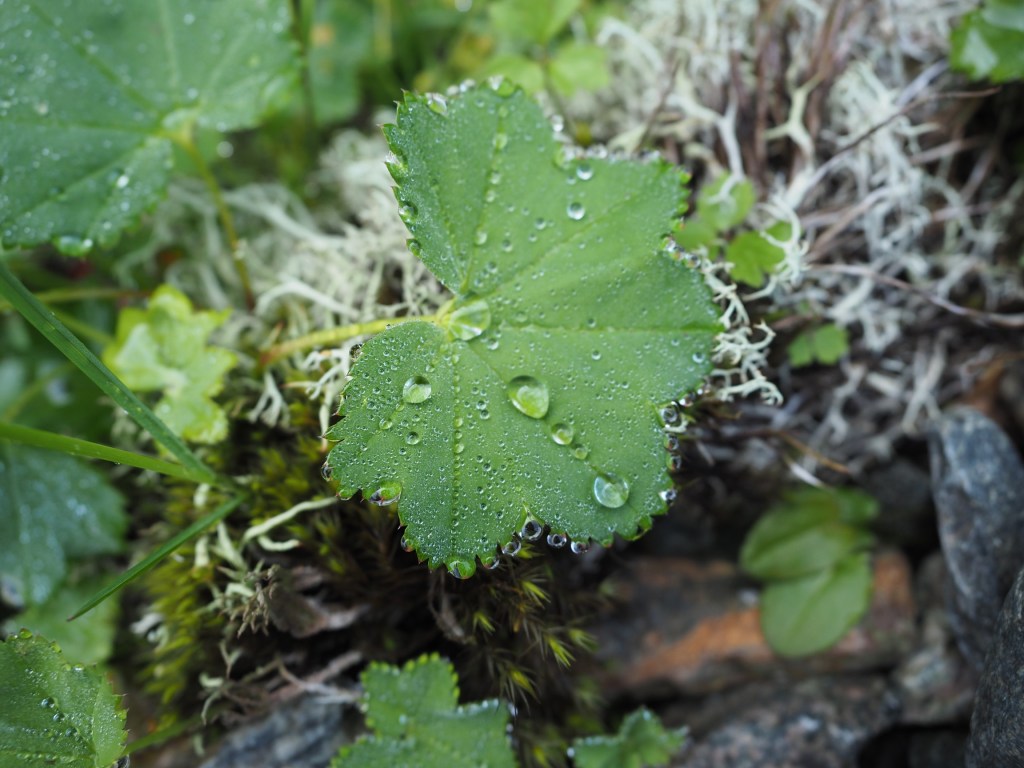
Sometimes it is impossible to take a photograph with enough sharpness. Tweaking the sharpness just slightly can help bring an extra crispness to an image. This is especially true in macro photographs, or photographs with fine detail. If the image is blurry, there is every likelihood that it can not be salvaged. There is only so much magic that can be performed by image processing. Here is a close-up of some water droplets on a leaf.
If we filter the image using some unsharp masking to sharpen the image, we get:
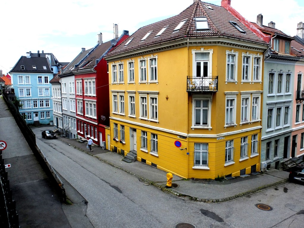
5︎⃣ Saturating colour
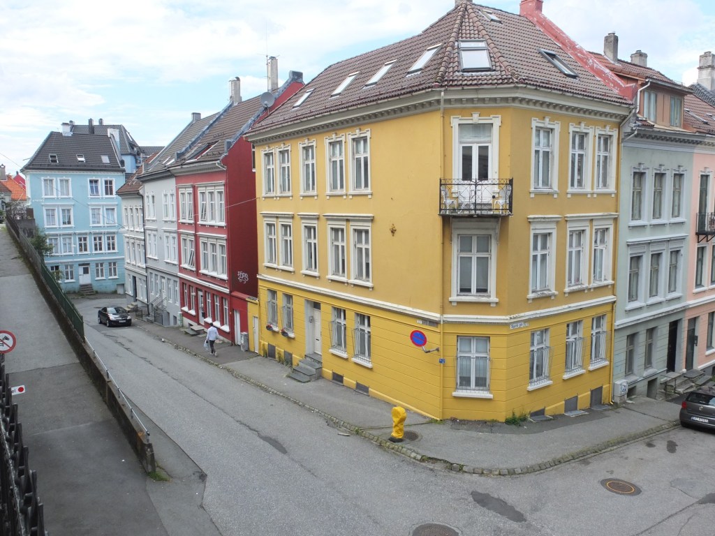
Photographs of scenes containing vivid colour may sometimes appear quite dull, or maybe you want to boost the colour in the scene. By adjusting the colour balance, or manipulating the colour histogram, it is possible to boost the colours in a photograph, although they may end up “unrealistic” colours in the processed image. Here is a street scene of some colourful houses in Bergen, Norway.
Here the image has been processed with a simple contrast adjustment, although the blue parts of the sky have all but disappeared.