In a previous post we looked at whether image blur could be fixed, and concluded that some of it could be slightly reduced, but heavy blur likely could not. Here is the image we used, showing blur at two ends of the spectrum.
Blur at two ends of the spectrum: heavy (left) and light (right).
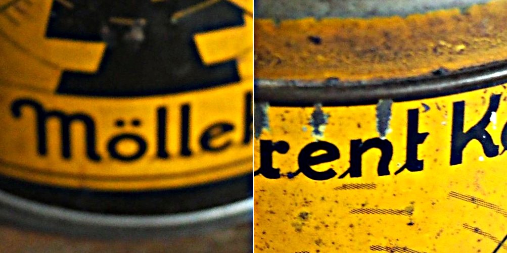
Now the “Unsharp Masking” filter in ImageJ, is not terribly different from that found in other applications. It allows the user to specify a “radius” for the Gaussian blur filter, and a mask weight (0.1-0.9). How does modifying the parameters affect the filtered image? Here are some examples using a radius of 10 pixels, and a variable mask weight.
Radius = 10; Mask weight = 0.25
Radius = 10; Mask weight = 0.5
Radius = 10; Mask weight = 0.75
We can see that as the mask weight increases, the contrast change begins to affect the colour in the image. Our eyes may perceive the “rent K” text to be sharper in the third image with MW=0.75, but the colour has been impacted in such as way that the image aesthetics have been compromised. There is little change to the acuity of the “Mölle” text (apart from the colour contrast). A change in contrast can certainly improve the visibility of detail in the image (i.e. they are easier to discern), however maybe not their actual acuity. It is sometimes a trick of the eye.
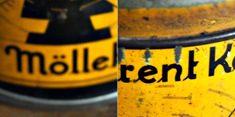
What about if we changed the radius? Does a larger radius make a difference? Here is what happens when we use a radius of 40 pixels, and a MW=0.25.
Radius = 40; Mask weight = 0.25
Again, the contrast is slightly increased, and perceptual acuity may be marginally improved, but again this is likely due to the contrast element of the filter.
Note that using a small filter size, e.g. 3-5 pixels in a large image (12-16MP) will have little effect, unless there are features in the image that size. For example, in an image containing features 1-2 pixels in width (e.g. a macro image), this might be appropriate, however will likely do very little in a landscape image.
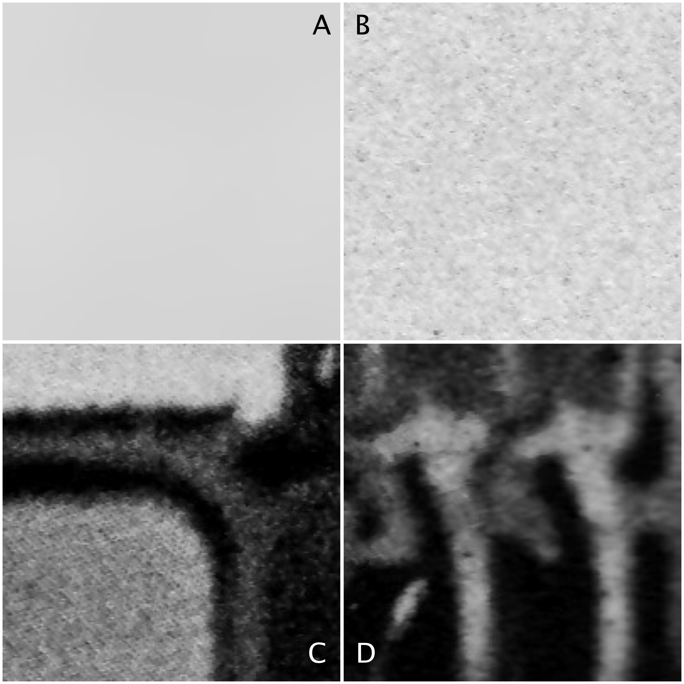
Sometimes algorithms talk about the mean or variance of a region of an image (sometimes called a neighbourhood, or window). But what does this refer to? The mean is the average of a series of numbers, and the variance measures the average degree to which each number is different from the mean. So the mean of a 3×3 pixel neighbourhood is average of the 9 pixels within it, and the variance is the degree to which every pixel in the neighbourhood varies from the mean. To obtain a better perspective, it’s best to actually explore some images. Consider the grayscale image in Fig.1.
Fig 1: The original image
Four 200×200 regions have been extracted from the image, they are shown in Fig.2.
Fig.2: Different image regions
Statistics are given at the end of the post. Region B represents a part of the background sky. Region A is the same region processed using a median filter to smooth out discontinuities. In comparing region A and B, they both have similar means: 214.3 and 212.37 respectively. Yet their appearance is different – one is uniform, and the other seems to contain some variance, something we might attribute to noise in some circumstances. The variance of A is 2.65, versus 70.57 for B. Variance is a poor descriptive statistic, because it is hard to visualize, so many times it is converted to standard deviation (SD), which is just the square root of variance. For A and B, this is 1.63 and 8.4 respectively.
As shown in region C and D, more complex scenes introduce an increased variance, and SD. The variances can be associated with the distribution of the histograms shown below.
Fig 3: Comparison of histograms
When comparing two regions, a lower variance (or in reality a lower SD) usually implies a more uniform region of pixels. Generally, mean and variance are not good estimators for image content because two totally different images can have same mean, and variance.
The term snapshot is an interesting one. In reality all snapshots are photographs, but not all photographs are snapshots. A snapshot is almost an unexpected photograph, one taken quickly without thinking about it too much, and often in a surreptitious manner – an abrupt artifact. Snapshots are ubiquitous with small, pocket-cameras, like the Ricoh GR series, or even mobile phone cameras (although it just isn’t the same). Once a camera is set up using a tripod, or the camera itself is a behemoth dSLR, the whole atmosphere of taking a photograph changes. Often the thing that is to be photographed has already happened, the moment passed. Snapshots involving people also change as they become more self-aware. It’s hard to get a candid shot. Paul Strand [1] suggested that a snapshot is “when it becomes necessary to stop movement“.
A snapshot of the Hotel Spiezerhof in Spiez (Switzerland) taken from a ship moving on the lake, circa 1935.
For the first decades of the photograph, the snapshot did not really exist, for a number of reasons, both technological and sociological. From the 1840s to the turn of the century, the more formal portrait photograph was the mainstay. Cameras were slow, and although the “nuclear” family was considered a well developed entity, casual family life was not really considered a good basis for photographic subject matter. As Steven Halpern [2] suggests the portrait was a means for the masses to achieve a cultural identity. In 1878 Charles Haper Bennett discovered how to sensitize dry gelatin plates, a process which allowed exposures of 1/20th of a second or less. It was now possible to stop movements. The last two decades of the 19th century followed a series of innovations such as handheld cameras, roll film and the astigmat lens, culminating in the Kodak Brownie, which made photography available to everyone. Family life had also changed, and while the portrait had focused on the individual, the snapshot characterized the interaction of the whole family, in a much more laid-back manner.
A snapshot taken from the window of a moving VIARail train in Montreal using an iPhone.
Snapshots are interesting in scenes where there is movement, or change, a visual record of something that won’t happen the same way again. Taking pictures in a downtown core is a great example. Stand at a cross-walk and watch the movement of people. A snapshot will freeze the movement of people, but it is by no means an exact art. People can be partially in focus, partially blurred, or obscured. In that respect a snapshot means short exposures, using a fast shutter speed, and in the case of film, a high ISO film. Long exposures are by no means snapshots. Any photograph that stops movement could therefore be considered a snapshot.
[1] Paul Strand, The Snapshot, Aperture, 19(1), p.49 (1974) [2] Steven Halpern, The Snapshot, Aperture, 19(1), p.65 (1974)
Everyone has some image that they wish had better resolution, i.e. the image would have finer detail. The problem with this concept is that it is almost impossible to create pixels from information that did not exist in the original image. For example if you want to increase the size of an image 4 times, that basically means that a 100×100 pixel image would be transformed into an image 400×400 pixels in size. There is a glitch here though, increasing the dimensions of the image by four times, actually increases the data within the image by 16 times. The original image had 10,000 pixels, yet the new image will have 160,000 pixels. That means 150,000 pixels of information will have to be interpreted from the original 10,000 pixels. That’s a lot of “padding” information that doesn’t exist.
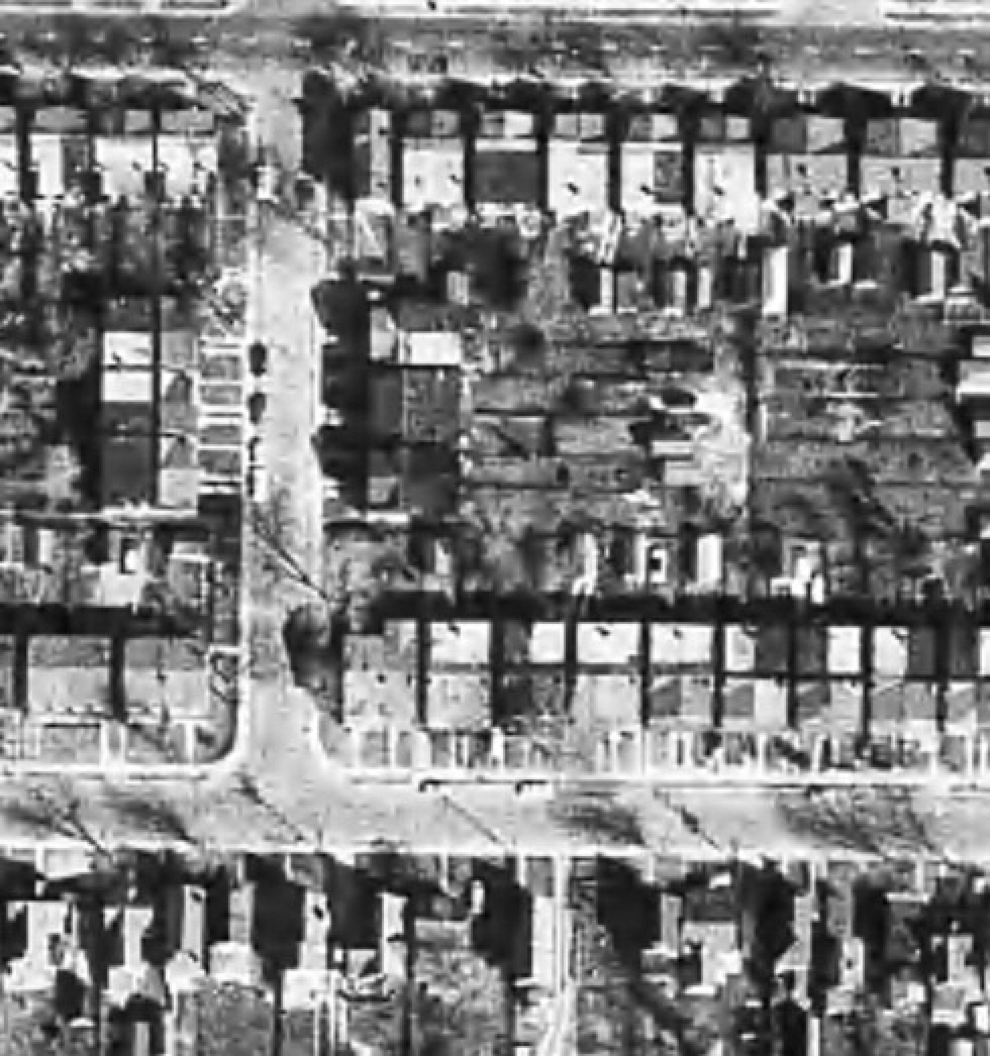
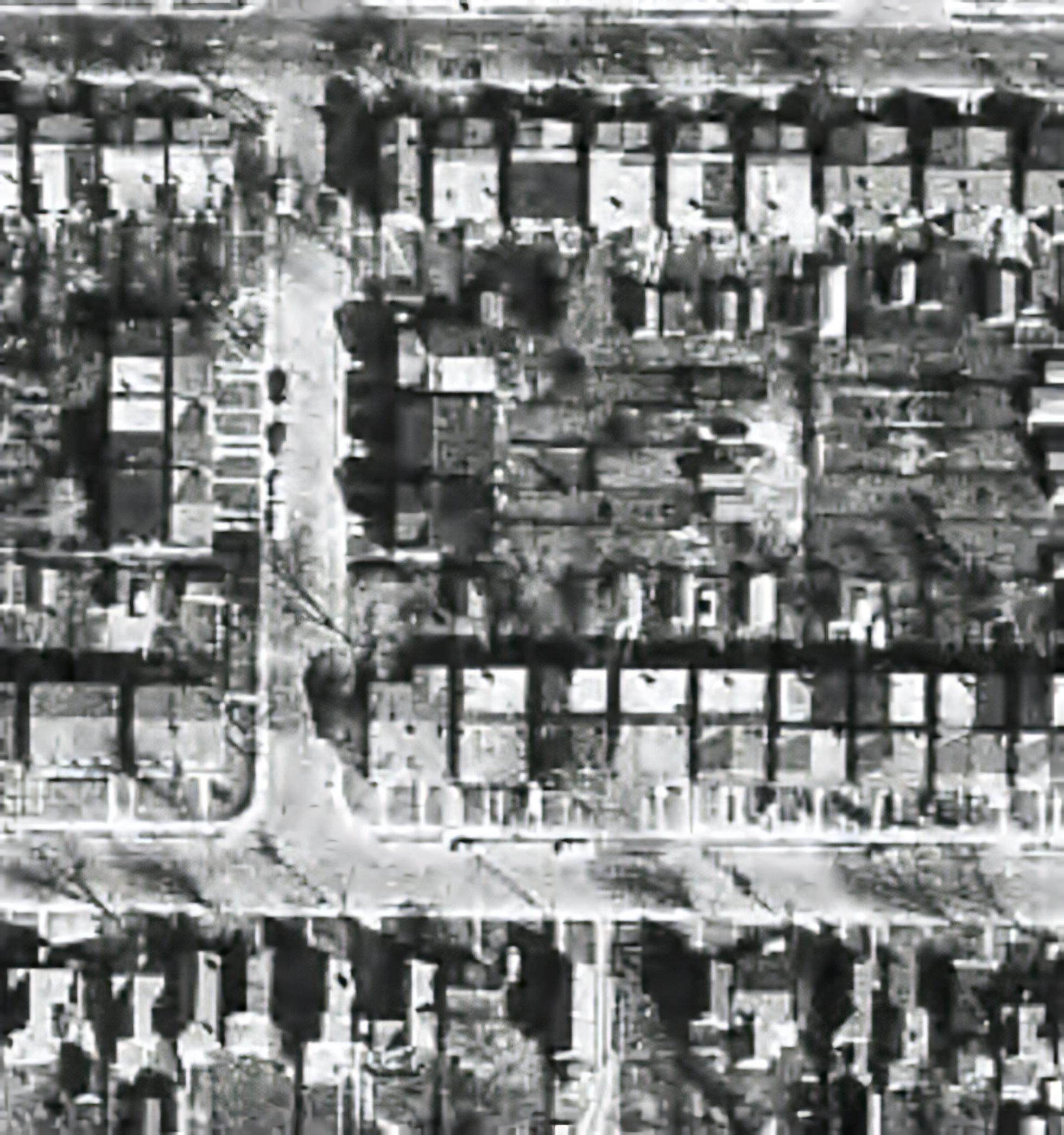
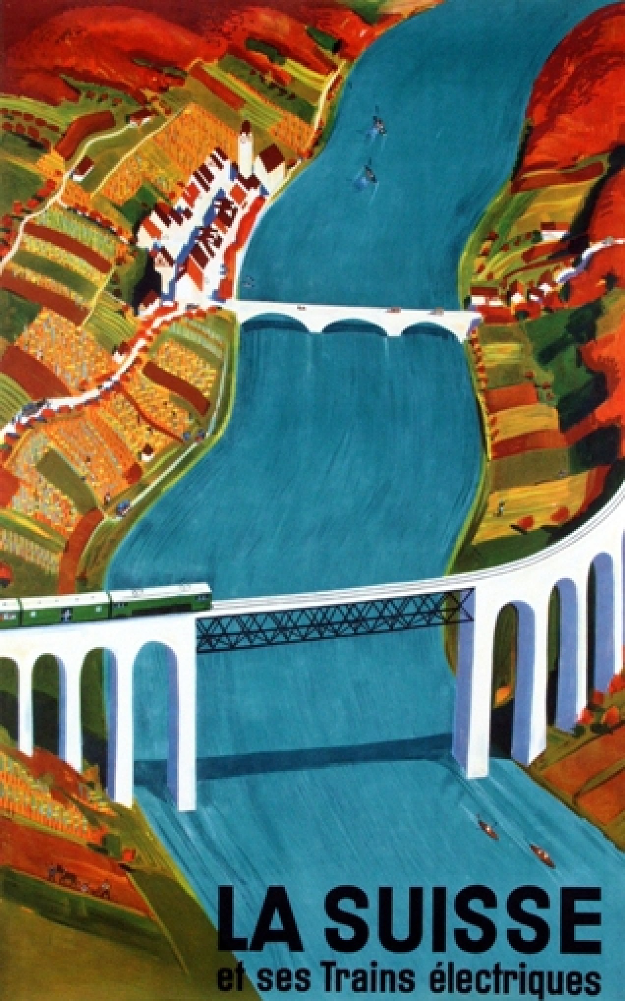
There are a lot of algorithms out there that suggest that they can increase the resolution of an image anywhere from 2-16 times. It is easy to be skeptical about these claims, so do they work? I tested two of these platforms on two vastly different images. Images where I was interested in seeing a higher resolution. The first image is a segment of an B&W aerial photograph of my neighbourhood from 1959. I have always been interested in seeing the finer details, so will super-resolution fix this problem? The second image is a small image of a vintage art poster which I would print were it to have better resolution.
My experiments were performed on two online systems: (i) AI Image Enlarger, and (ii) Deep Image. Now both seem to use AI in some manner to perform the super-resolution. I upscaled both images 4 times (the max of the free settings). Now these experiments are quick-and-dirty, offering inputs from the broadest ends of the spectrum. They are compared to the original image “upscaled” four times using a simple scaling algorithm, i.e. each pixel in the input image becomes 4 pixels in the output image.
The first experiment with the B&W aerial photograph (490×503) increased the size of the image to 1960×2092 pixels. Neither super-resolution algorithm produced any results which are perceptually different from the original, i.e. there is no perceived enhanced resolution. This works to the theory of “garbage-in, garbage-out”, i.e. you cannot make information from nothing. Photographs are inherently harder to upsize than other forms of image.
The original aerial image (left) compared with the super-resolution image produced by AI Image Enlarger (right).
The original aerial image (left) compared with the super-resolution image produced by Deep Image (right).
The next experiment with the coloured poster (318×509) increased the size of the image to 1272×2036 pixels. Here the results from both algorithms are quite good. Both algorithms enhance detail within the images, making things more crisp, aesthetically pleasing, and actually increasing the detail resolution. Why did the poster turn out better? This is mainly because artwork contains a lot more distinct edges between objects, and the colour also likely contributes to the algorithms success.
The original poster image (left) compared with the super-resolution image produced by AI Image Enlarger (right).
The original poster image (left) compared with the super-resolution image produced by Deep Image (right).
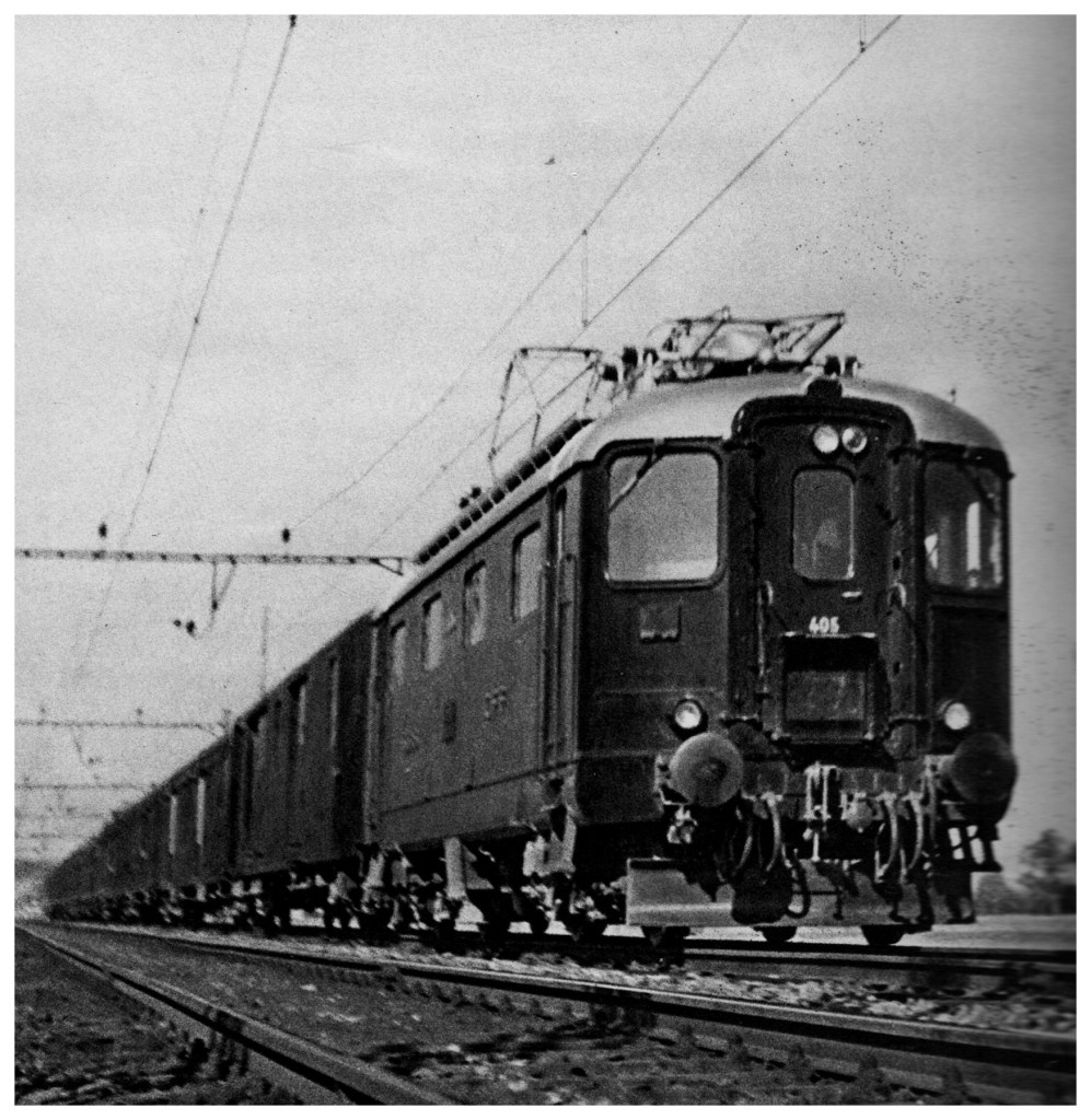
To compare the algorithms, I have extracted two segments from the poster image, to show how the differing algorithms deal with the super-resolution. The AI Image Enlarger seems to retain more details, while producing a softer look, whereas Deep Image enhances some details (river flow) at the expense of others, some of which it almost erodes (bridge structure, locomotive windows).
It’s all in the details: AI Image Enlarger (left) vs. Deep Image (right)
The other big difference is that AI Image Enlarger was relatively fast, whereas Deep Image was as slow as molasses. The overall conclusion? I think super-resolution algorithms work fine for tasks that have a good amount of contrast in them, and possibly images with distinct transitions, such as artwork. However trying to get details out of images with indistinct objects in them is not going to work too well.
Most modern cameras automatically focus a scene before a photograph is acquired. This is way easier than the manual focus that occurred in the ancient world of analog cameras. When part of a scene is blurry, then we consider this to be out-of-focus. This can be achieved in a couple of ways. One way is by means of using the Aperture Priority setting on a camera. Blur occurs when there is a shallow depth of field. Opening up the aperture to f/2.8 allows in more light, and the camera will compensate with the appropriate shutter speed. It also means that objects not in the focus plane will be blurred. Another way is through manually focusing a lens.
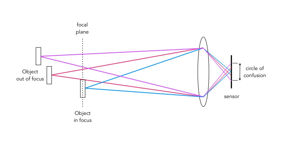
Either way, the result is optical blur. But optical blur is by no means shapeless, and has a lot to do with a concept known as the circle of confusion (CoC). The CoC occurs when the light rays passing through the lens are not perfectly focused. It is sometimes known as the disk of confusion, circle of indistinctness, blur circle, or blur spot. CoC is also associated with the concept of Bokeh, which I will discuss in a later post. Although honestly – circle of confusion may not be the best term. In German the term used is “Unschärfekreis”, which translates to “circle of non-sharpness“, which inherently makes more sense.
A photograph is basically an accumulation of many points – which represent the exact points in the real scene. Light striking an object reflects off many points on the object, which are then redirected onto the sensor by the lens. Each of these points is reproduced by the lens as a circle. When in focus, the circle appears as a sharp point, otherwise the out-of-focus region appears as circle to the eye. Naturally the “circle” normally takes the shape of the aperture, because the light passes through it. The following diagram illustrates the “circle of confusion“. A photograph is exactly sharp only on the focal plane, with more or less blur around it. The amount of blur depends on an objects distance from the focal plane. The further away, the more distinct the blur. The blue lines signify an object in focus. Both the red and purple lines show objects not in the focal plane, creating large circles of confusion (i.e. non-sharpness = blur).
The basics of the “circle of confusion”
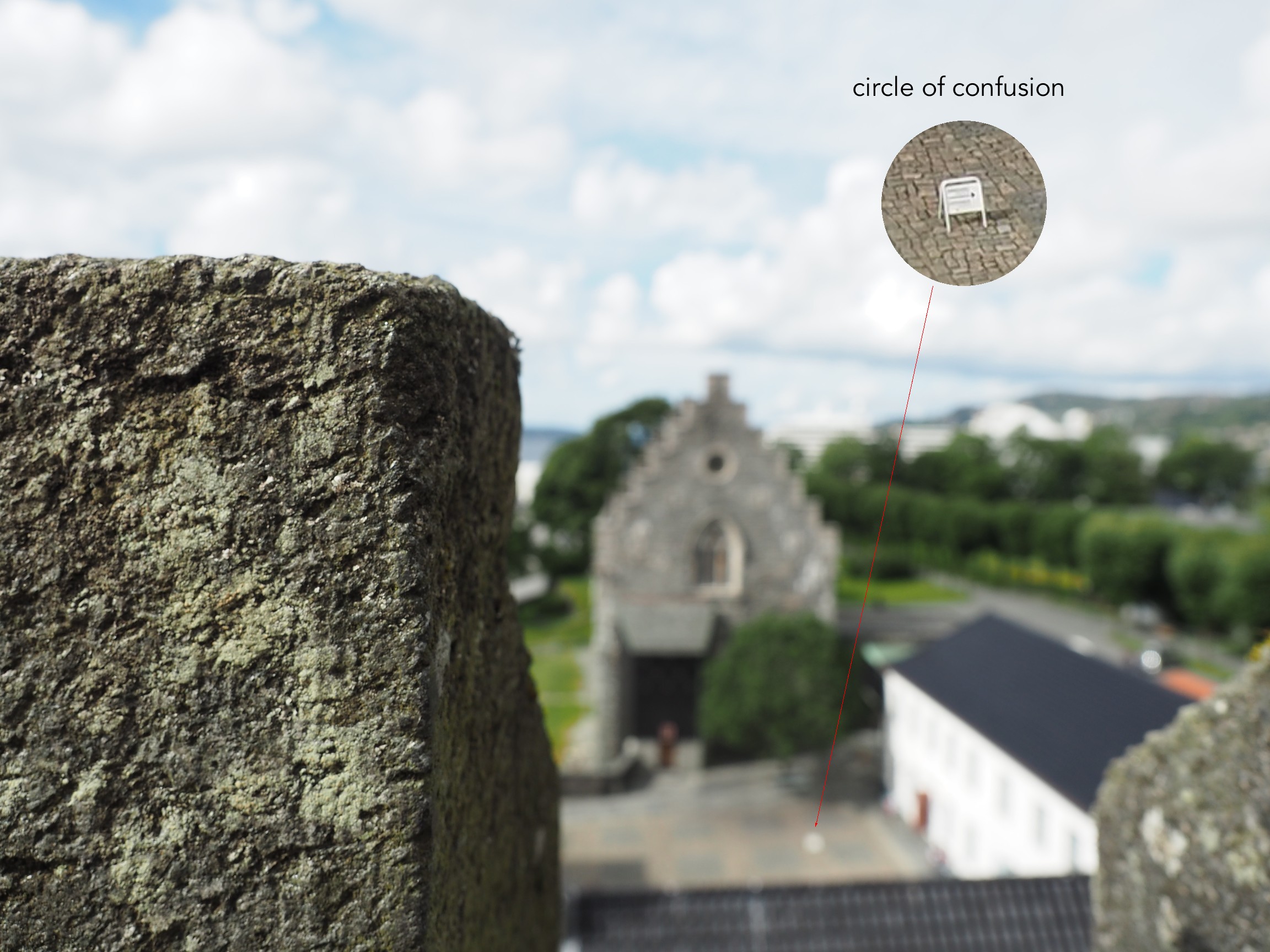
Here is a small example. The photograph below is taken in Bergen, Norway. The merlon on the battlement is in focus with the remainder of the photograph beyond that blurry. Circles of confusion are easiest to spot as small bright objects on darker backgrounds. Here a small white sign becomes a blurred circle-of-confusion.
An example of the circle of confusion as a bright object.
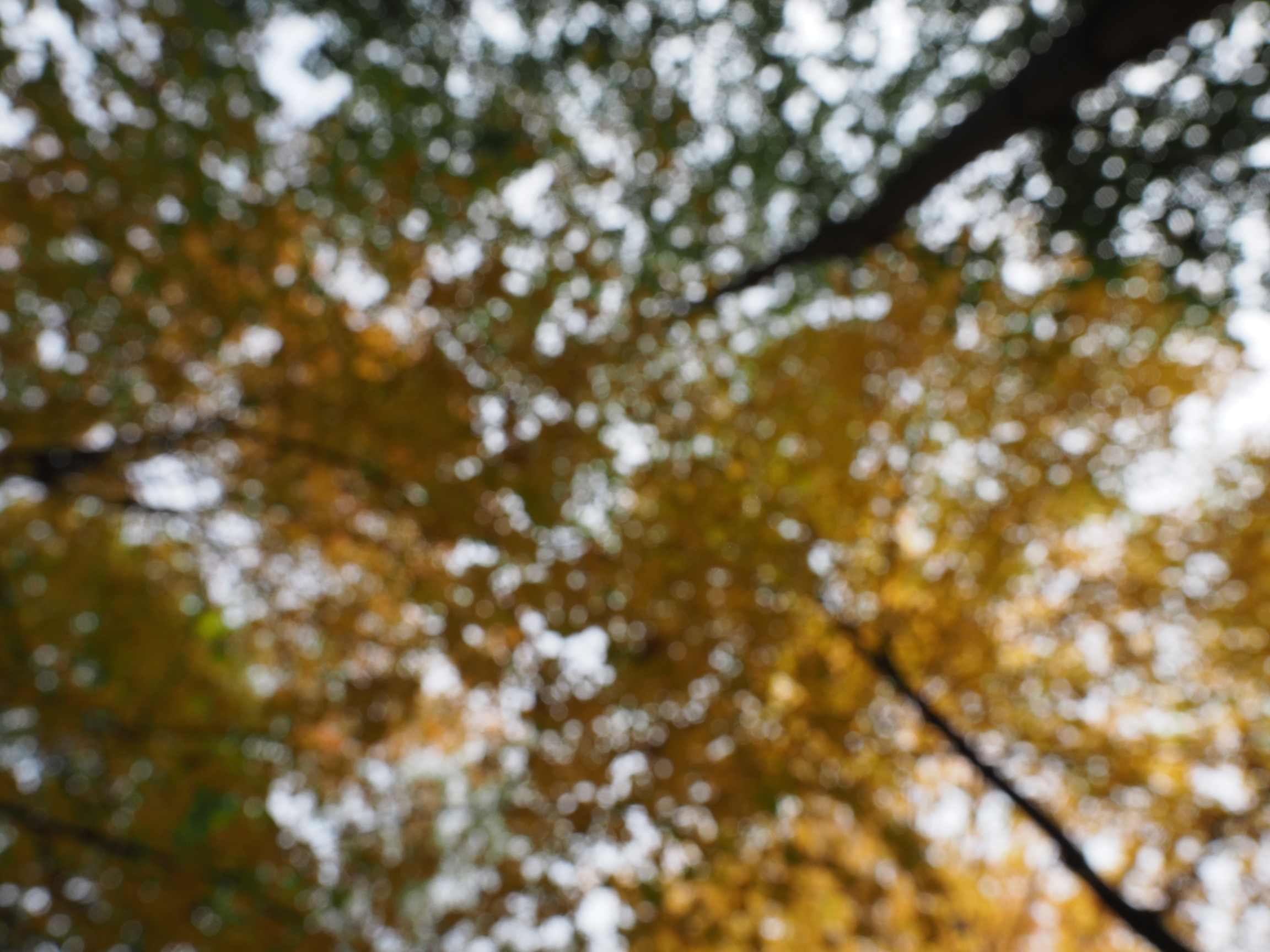
Here is a second example, of a forest canopy, taken through focusing manually. The CoC are very prevalent.
An example where the whole image is composed of blur.
As we de-focus the image further, the CoC’s become larger, as shown in the example below.
As the defocus increases (from left to right), so too does the blur, and the size of the CoC.
Note that due to the disparity in blurriness in a photograph, it may be challenging to apply a “sharpening” filter to such an image.
About a year ago I decided to take a relook at film photography. After so many years taking digital photographs it seemed like an odd sort of move. My trip back to film began when I bought a Voigtländer 25mm lens for my Olympus MFT camera. It is completely manual, and at the moment I started focusing, I knew that I had been missing something with digital. Harking back to film seems a move that many amateur photographers have decided to make. Maybe it is a function of becoming a camera aficionado… the form and aesthetic appeal of vintage cameras brings something that modern digital cameras don’t – a sense of character. There is a reason some modern cameras are modelled on the appearance of vintage cameras. Here are some thoughts.
Digital has changed the way we photograph, and although we know we will never bungle a holiday snap, it does verge on clinical at times. I can take 1000 photographs on a 2-week trip, and I do enjoy having instant access to the photograph. Digital is convenient, no doubt about that, but there is some aesthetic appeal missing that algorithms just can not reproduce. Taking a digital image means that each pixel is basically created using an algorithm. Light in, pixel out. Giving an image a “film-look” means applying some form of algorithmic filter after the image is taken. Film on the other hand is more of an organic process, because of how the film is created. Film grains, i.e. silver crystals are not all created equal. Different films have different sized grains, and different colour profiles.
“Tea, Earl Grey, Hot”
There are many elements of photography that are missing with digital. Yes, a digital camera can be used in manual mode, but it’s just not the same. For the average person, one thing missing with digital is an appreciation for the theory behind taking photographs – film speed (meaningless in digital), shutter speed, apertures. Some digital lenses allow a switch over to manual focusing, which opens the door to control over how much of a photograph is in focus – much more fun that auto-focus. Moving to pure analog means that you have to have an understanding of camera fundamentals, and film types.
What type of camera to experiment with? While digital cameras tend to have the same underpinning technology, film cameras can be quite different. A myriad of differing manufacturers, and film sizes. Do you want to use a box camera (aka Brownie), or a foldable one with bellows? A vintage German camera (East or West?), Japanese, or Russian? Full frame or half-frame? SLR or rangefinder? Zone focusing? Fully manual, or with light meter (assuming they work). So many choices.
Another part of the organic nature of film photography is the lenses. Unlike modern lenses which can be extremely complex, and exact, vintage lenses often contain a level of imperfections which means they provide a good amount of character. If you want good Bokeh, or differing colour renditions, then a vintage lens will provide that. They are manual, but that’s the point isn’t it? Lastly there is the film. Each film has it’s own character. Monochrome film to render cinematic ambiance, or colour film that desaturates colours. There are also films which have no (inexpensive) digital equivalent – like infrared film (from Rollei, and not really the same as using a filter).
Apart from pure analog, there is also the cross-over of analog to digital, the hybrid form of photography. This is achieved by using vintage analog lenses on digital cameras, providing the best of both worlds. It does mean that functions such as aperture control, and focusing have to be done manually (which isn’t a bad thing), but also allows for much more creative control. There are also effects such as Bokeh, which can not be reproduced algorithmically in any sort of organic manner.
There is some irony in film though. Many people of course end up digitizing the film. But the essence of the photograph is captured in the film and digitizing it does not take all of that away (it does loose something as the transferral from film to paper adds another layer of appeal). To display your work, digital is still the best way (hard to write a blog post with a paper photograph). My foray into film is partly a longing to relive the experiential side of photography, to play with apertures, to focus a lens – it doesn’t have to be exact, and that’s the point.
The downside is of course you will never get to see the photograph until after it is developed. However it’s best to look at this more from a more expressive point-of-view. The art may lie partially in the unveiling. Maybe film photography lends itself more to an art form.
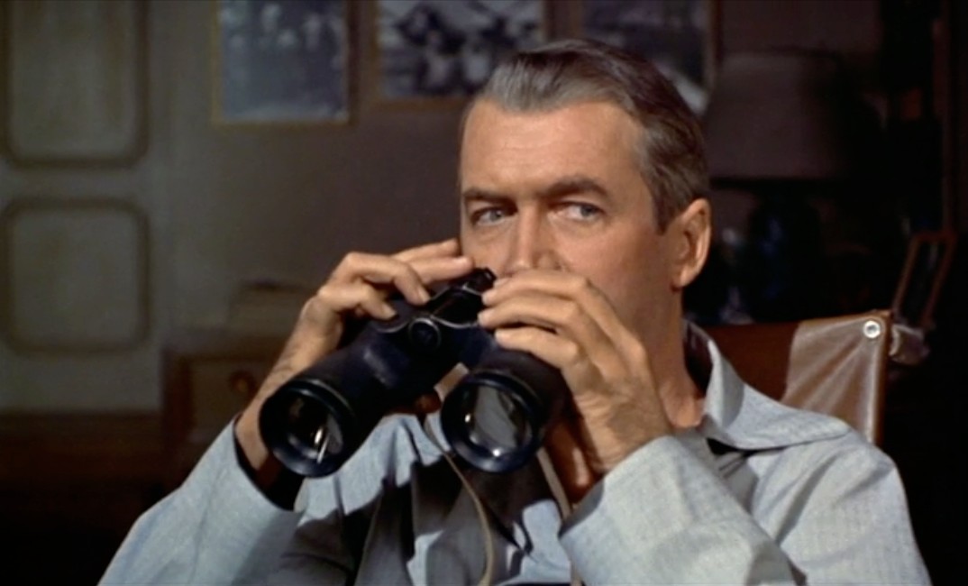
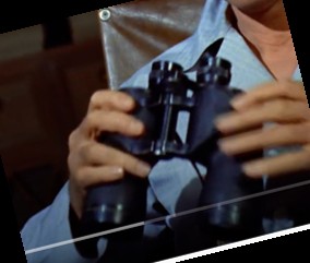
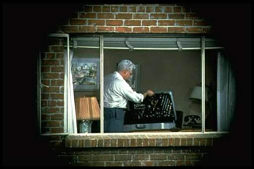
The other interesting thing about Hitchcock’s “Rear Window” is the fact that the binocular shots, and the camera shots appear the same. Again we could mark this down to artistic license, but there are inherently some issues which persist from an optical point-of-view. Firstly, what kind of binoculars are they? Little is written in the literature about the brand, so that requires a little investigative work.
Jeff with his binoculars in Rear Window
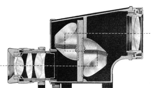
The most telling feature of these binoculars is that these are porro prism binoculars. In Porro prism Binoculars the objective or front lens is offset from the eyepiece. This offset is often characterized by a cap, which terminates the transition from ocular to objective lens.
The cross-section of half of a binocular. showing the transition from ocular (left) to objective (right) lens.
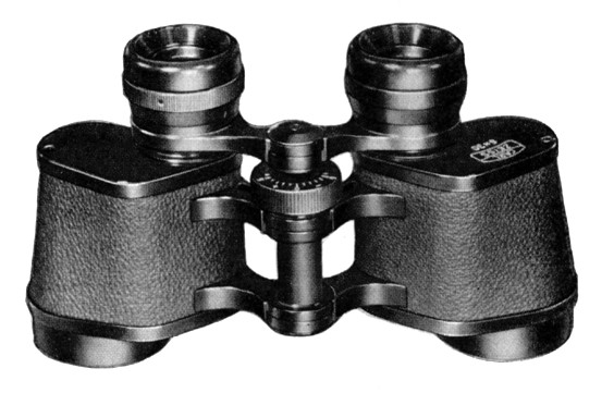
With some manufacturers, the transition seems to be smooth, with streamlined curves. There are a couple of brands that stand out in this respect: Bausch and Lomb (USA), Bushnell (USA), Cadillac (USA, made in Japan). Brands like Zeiss on the other hand, had a capped, “hard” transition.
A pair of Zeiss binoculars, showing the hard black “caps” covering the lenses.
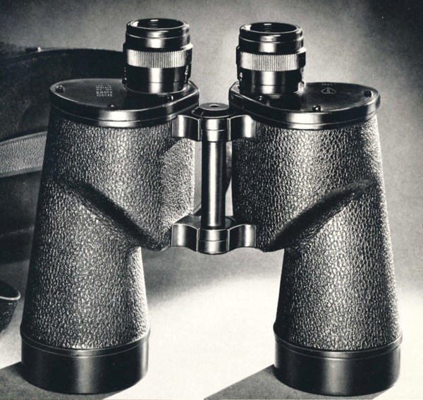
Beyond this, it is hard to tell what brand they were, because those markings would be on the front of the binoculars. More important are likely the power of magnification (how many times closer you are to the thing you are viewing), and the objective diameter of the lens. After doing some comparative measurements of the binoculars in the movie, with those in a early 1950s Bausch and Lomb catalog, I would guesstimate that these are the 7×50 binoculars, i.e. objective diameter was 50mm, and the power of magnification 7 times. A 400mm lens has a magnification factor of ×8, so binoculars with a power of ×7-8 would make sense (if we ignore the optical differences between binoculars and 35mm film lenses, e.g. cameras have a film plane, binoculars don’t).
A comparison of the binoculars in the movie, and the Bausch and Lomb 7×50 binoculars, circa early 1950s – notice the ergonomic flow of the lens parts.
The other factor which makes the B&L 7×50 the most likely candidate is that Bausch and Lomb supplied the US armed forces during WW2 (and Jeff was in the US Army Air Force), and this particular model was the Navy model, which had the “highest relative brightness of any binocular”, a so-called true “night glass”. So what are the issues between the 400mm camera lens and the binocular optics, assuming 7×50?
Field-of-View – The FoV of a 400mm lens is just over 5° (horizontal), which at 100′ distance (the width of the courtyard), translates to around 9 feet. The B&L 7×50 binoculars had a linear field of 381′ at 1000 yards, which would be about 12.7′ at 100′.
Full image circle – The camera would truncate the image circle of the lens to a rectangle, and therefore the maximum FoV is only possible along the diagonal of the frame. Binoculars allow you to see the full circle of the FoV and thus the maximum FoV in all directions. A 35mm camera with a 3:2 ratio only displays about 59% of an image circle with the same diameter as the diagonal of the rectangular image sensor.
Stereo Vision – Binoculars allow both eyes to see slightly different angles of the same objects that allow use of depth perception. Other than specialized 3D cameras, most cameras are monocular.
Rear Window: The view through the binoculars.
So Hitchcock’s use of both binoculars and a 35mm camera with a 400mm lens does take a lot of artistic license, because they are not the same, but portray the same thing on screen.
Last week I watched Rear Window, an Alfred Hitchcock directed thriller from 1954 starring James Stewart and Grace Kelly. The story follows photojournalist, L.B. “Jeff” Jefferies, who breaks his leg while shooting an action shot at a car race (supposedly working for LIFE Magazine). Confined to a wheelchair in his New York apartment, he spends time watching the occupants of neighbouring apartments through his apartments rear window, as they go about their daily lives. He begins to suspect that a man across the courtyard may have murdered his wife. Jeff enlists the help of his high society fashion-consultant girlfriend Lisa Freemont and his visiting nurse Stella to investigate. It’s a great movie from a period when life was likely a little simpler than it is now.
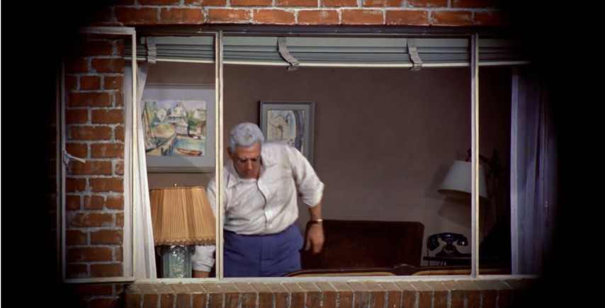
For the early part of the movie, Jeff is just looking out the window, bored with being confined to his apartment while his cast covered leg recovers. When he deduces something is amiss across the courtyard, he pulls out his camera, with its telephoto lens to view the scene a little closer. The courtyard was supposedly 98′ wide and 185′ in length.
Part of the courtyard.
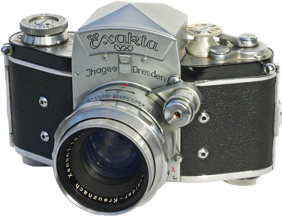
The 35mm film camera used by Jeff is an Exakta VX Ihagee Dresden, with the Exakta logo covered by a piece of black material in the movie. Why choose the Exakta? In the time the film was shot, there were really only three 35mm camera systems with global recognition: Leica, Contax, and Exakta. Hitchcock could have used a Leica with a reflex housing for the telephoto lens (e.g. Visoflex II), but a solution with a one-eyed reflex with a prism viewfinder was more elegant. Why was the brand covered with black tape? To cover up its East German / Communist origins? This may have played a role, but more likely just an avoidance of advertising in film.
The Exakta is an interesting choice of camera for the period, made by Ihagee Kamerawerk Steenbergen & Co, Dresden, in former East Germany and was produced between 1951-56. The Exakta is notable as being the first ever Single Lens Reflex (SLR) camera for both 127 roll film (1933), and 135 format 35mm film (1936). It’s not surprising that Jeff was using a Exakta, as before Japanese started to dominate the camera market the Exakta dominated the market, capturing perhaps 95% of SLR sales (they did kind of invent the SLR in 1936). The lens being used on the camera is a Kilfitt Fern-Kilar f/5.6 400mm telephoto lens.
The Exakta VX
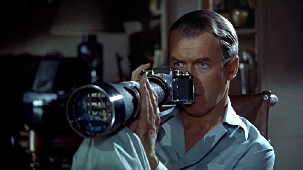
There are a number of things that are of interest with the use of the camera. I know this is a movie, and the camera was used as a prop, but here goes. Firstly, as a press photographer, it is unlikely he would have used a 400mm lens. Jeff’s character was supposedly based on war photographer Robert Capa, used a Contax II with a 50mm lens. (Ironically Capa was killed covering the First Indochina War in 1954, which is where Jeff’s editor wanted to send him). A 400mm lens would be more useful for a sports photographer shooting field based sports like football (soccer) or a bird watcher. The lens Jefferies uses to take the photograph on the racetrack is clearly a wide-angle (and frankly taken from a very dangerous viewpoint).
Is Jeff pushing the shutter button?
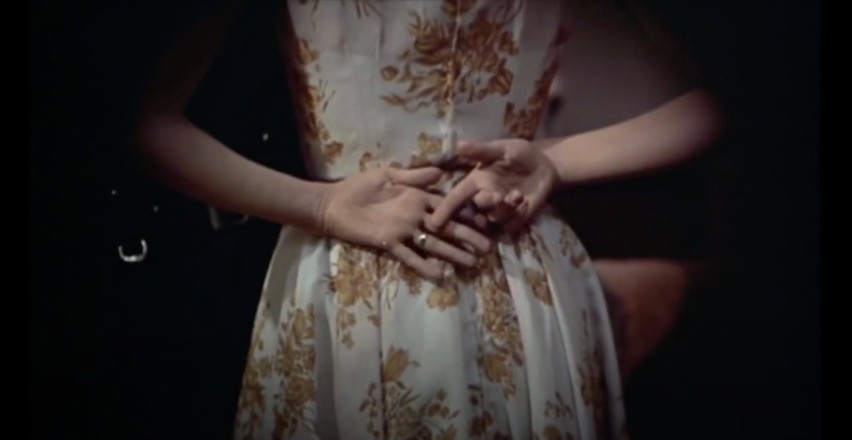
Next there is the issue of the view through the lens itself, which it seems is solely for cinematic effect. I know from a cinematography point-of-view, Hitchcock was trying to imply that the view was through a camera, showing a circular view, but camera views are rectangular. Next there is the issue of the “focal length” of the lens, which seems to be quite flexible. There are two scenes (shown below) taken seconds apart in Thorwald’s apartment, and viewed through the Kilfitt Fern-Kilar 400mm lens. One shows a close-up of Lisa’s hand behind her back (showing where she has slipped on the victim’s wedding ring). This would mean that the 400mm lens had the ability to zoom, which was not possible (and likely act like a 800-1200mm lens). There is also the issue of light intensity, which doesn’t seem to change, even though it is nighttime. The wonders of artistic license.
Two shots, seconds apart, taken with the 400mm lens.
The field-of-view for the 400mm lens is about right for most shots, at 8-9 feet horizontally, and 5-6 feet vertically. At times it looks as though Jeff is taking photos, however the shutter release button is on the photographers left side of the camera, so from this we know he did not take any photographs. In addition, Jeff never actually cocks the shutter, which is a requirement for looking through the viewfinder – the mirror stays up after exposure, so viewfinder is dark, cocking the shutter returns the mirror to normal position (and transports the film to the next exposure).
Lars Thorwald, shown through the framed camera shot, and approximates the FOV of the lens quite well.
Which leads us to the issue of photographs. why would a photojournalist, who takes photographs for a living, not take any photographs of things happening across the courtyard? If he would have taken some photographs, then he would of at least had pictures of suspicious behaviour to show his friend Det. Lt. Doyle. But not once did we hear Jeffries depress the shutter button (and you would hear it because it is noisy). He may have taken photographs at other times, but not during the setting in the movie.
P.S. The lens was manufactured by Heinz Kilfitt Optische Fabrik (1946-64) from Munich (West Germany). Kilfitt was an innovative lens maker, producing the world’s first 35mm macro lens, the Kilfitt 4 cm f/3.5 Makro-Kilar in 1955.
Some types of photography lend themselves to inherent distortions in the photograph, most notably those related to architectural photography. The most prominent of these is the keystone effect, a form of perspective distortion which is caused by shooting a subject at an extreme angle, which results in converging vertical (and also horizontal) lines. The name is derived from the archetypal shape of the distortion, which is similar to a keystone, the wedge-shaped stone at the apex of a masonry arch.
Fig.1: The keystone effect
The most common form of keystone effect is a vertical distortion. It is most obvious when photographing man-made objects with straight edges, like buildings. If the object is taller than the photographer, then an attempt will be made to fit the entire object into the frame, typically by tilting the camera. This causes vertical lines that seem parallel to the human visual system to converge at the top of the photograph (vertical convergence). In photographs containing tall linear structures, it appears as though they are “falling” or “leaning” within the picture. The keystone effect becomes very pronounced with wide-angle lenses.
Fig.2: Why the keystone effect occurs
Why does it occur? Lenses are designed to show straight lines, but only if the camera is pointed directly at the object being photographed, such that the object and image plane are parallel. As soon as a camera is tilted, the distance between the image plane and the object is no longer uniform at all points. In Fig.2, two examples are shown. The left example shows a typical scenario where a camera is pointed at an angle towards a building so that the entire building is in the frame. The angle of both the image plane and the lens plane are different to the vertical plane of the building, and so the base of the building appears closer to the image plane than the top, resulting in a skewed building in the resulting image. Conversely the right example shows an image being taken with the image plane parallel to the vertical plane of the building, at the mid-point. This is illustrated further in Fig.3.
Fig.3: Various perspectives of a building
There are a number of ways of alleviating the keystone effect. The first method involves the use of specialized perspective control and tilt-shift lenses. The best way to avoid the keystone effect is to move further back from the subject, with the reduced angle resulting in straighter lines. The effects of this perspective distortion can be removed through a process known as keystone correction, or keystoning. This can be achieved in-camera using the cameras proprietary software, before the shot is taken, or in post processing on mobile devices using apps such as SKRWT. It is also possible to perform the correction with post-processing using software such as Photoshop.
Pictures are flat objects that contain pigment (either colour, or monochrome), and are very different from the objects and scenes they represent. Of course pictures must be something like the objects they depict, otherwise they could not adequately represent them. Let’s consider depth in a picture. In a picture, it is often easy to find cues relating to the depth of a scene. The depth-of-field often manifests itself as a region of increasing out-of-focus away from the object which is in focus. Other possibilities are parallel lines than converge in the distance, e.g. railway tracks, or objects that are blocked by closer objects. Real scenes do not always offer such depth cues, as we perceive “everything” in focus, and railway tracks do not converge to a point! In this sense, pictures are very dissimilar to the real world.
If you move while taking a picture, the scene will change. Objects that are near move more in the field-of-view than those that are far away. As the photographer moves, so too does the scene, as a whole. Take a picture from a moving vehicle, and the near scene will be blurred, the far not as much, regardless of the speed (motion parallax). This then is an example of a picture for which there is no real world scene.
A photograph is all about how it is interpreted
Photography then, is not about capturing “reality”, but rather capturing our perception, our interpretation of the world around us. It is still a visual representation of a “moment in time”, but not one that necessarily represents the world around us accurately. All perceptions of the world are unique, as humans are individual beings, with their own quirks and interpretations of the world. There are also things that we can’t perceive. Humans experience sight through the visible spectrum, but UV light exists, and some animals, such as reindeer are believed to be able to see in UV.
So what do we perceive in a photograph?
Every photograph, no matter how painstaking the observation of the photographer or how long the actual exposure, is essentially a snapshot; it is an attempt to penetrate and capture the unique esthetic moment that singles itself out of the thousands of chance compositions, uncrystallized and insignificant, that occur in the course of a day.