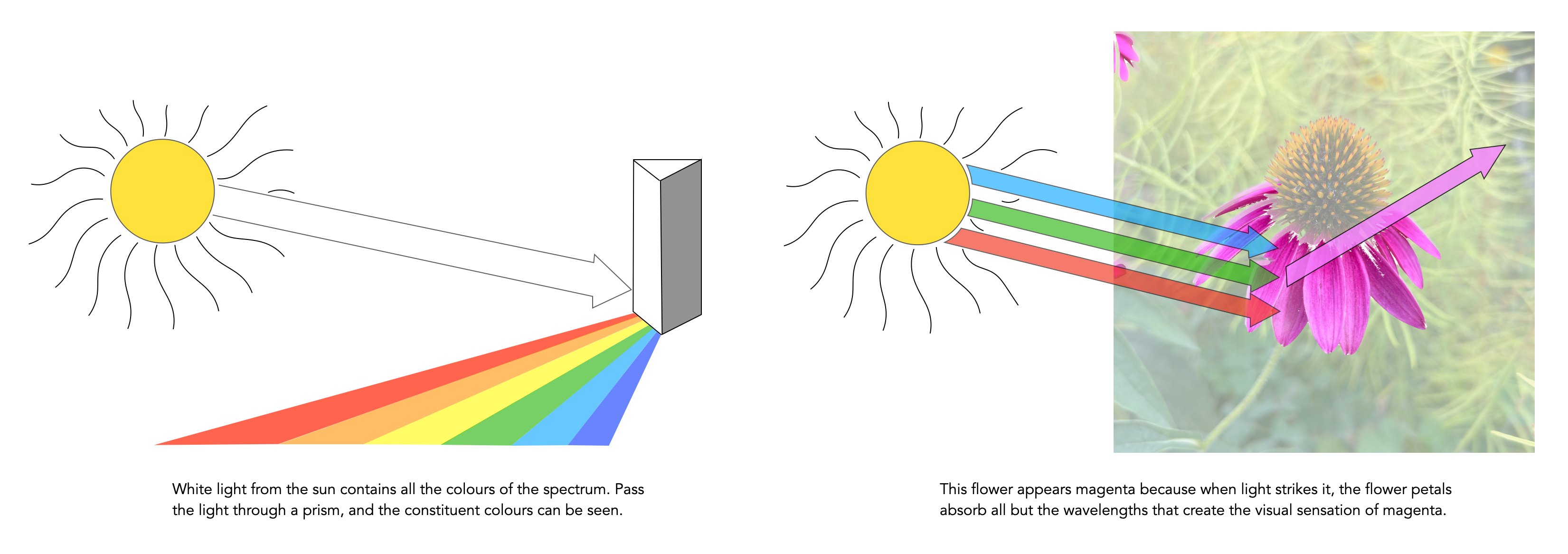
Light from the sun has appears to have no hue or colour of its own; it is “white” light. But it actually does contain all colours, and if it is projected through a prism it will be separated into a band of colours like a rainbow. A coloured object, for example a flower, has colour because when light strikes it, the flower petals reflect their hue components or wavelengths of the light while absorbing other colours. In the example below the flower reflects the ‘magenta’ components, and the human eye being sensitive to these reflected wavelengths, sees them as magenta. Dyes, such as those found in paint, and colour prints acts just like the flower does in selectively absorbing and reflecting certain wavelengths of light and therefore producing colour.
How humans perceive colour is interesting, because the technology of how digital cameras capture light is adapted from the human visual system. When light enters our eye it is focused by the cornea and lens into the “sensor” portion of the eye – the retina. The retina is composed of a number of different layers. One of these layers contains two types of photosensitive cells (photoreceptors), rods and cones, which interpret the light, and convert it into a neural signal. The neural signals are collected and further processed by other layers in the retina before being sent to the brain via the optic nerve. It is in the brain that some form of colour association is made. For example, an lemon is perceived as yellow, and any deviation from this makes us question what we are looking at (like maybe a pink lemon?).
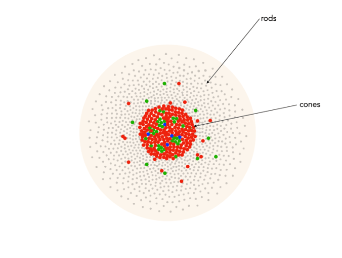
Fig.1: An example of the structure and arrangement of rods and cones
The rods, which are long and thin, interpret light (white) and darkness (black). Rods work only at night, as only a few photons of light are needed to activate a rod. Rods don’t help with colour perception, which is why at night we see everything in shades of gray. The human eye is suppose to have over 100 million rods.
Cones have tapered shape, and are used to process the the three wavelengths which our brains interpret as colour. There are three types of cones – short-wavelength (S), medium-wavelength (M), and long-wavelength (L). Each cone absorbs light over a broad range of wavelengths: L ∼ 570nm, M ∼ 545nm, and S ∼ 440nm. The cones are usually called R, G, and B for L, M, and S respectively. Of course these cones have nothing to do with their colours, just wavelengths that our brain interprets as colours. There are roughly 6-7 million cones in the human eye, divided up into 64% “red” cones, 32% “green” cones, and 2% “blue” cones. Most of these are packed into the fovea. Figure 2 shows how rods and cones are arranged in the retina. Rods are located mainly in the peripheral regions of the retina, and are absent from the middle of the fovea. Cones are located throughout the retina, but concentrated on the very centre.
Fig.2: Rods and cones in the retina.
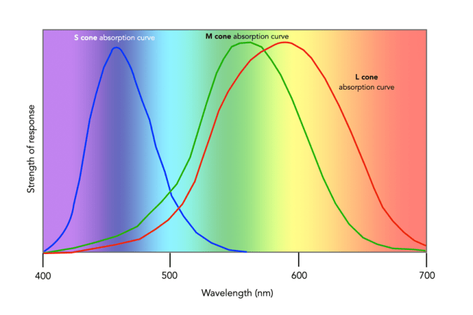
Since there are three types of cones, how are other colours formed? The ability to see millions of colours is a combination of the overlap of the cones, and how the brain interprets the information. Figure 3 shows roughly how the red, green, and blue sensitive cones interpret different wavelengths as colour. As different wavelengths stimulate the colour sensitive cones in differing proportions, the brain interprets the signals as differing colours. For example, the colour yellow results from the red and green cones being stimulated while the blues cones are not.
Fig.3: Response of the human visual system to light
Below is a list of approximately how the cones make the primary and secondary colours. All other colours are composed of varying strengths of light activating the red, green and blues cones. when the light is turned off, black is perceived.
The colour violet activates the blue cone, and partially activates the red cone.
The colour blue activates the blue cone.
The colour cyan activates the blue cone, and the green cone.
The colour green activates the green cone, and partially activates the red and blue cones.
The colour yellow activates the green cone and the red cone.
The colour orange activates the red cone, and partially activates the green cone.
The colour red activates the red cones.
The colour magenta activates the red cone and the blue cone.
The colour white activates the red, green and blue cones.
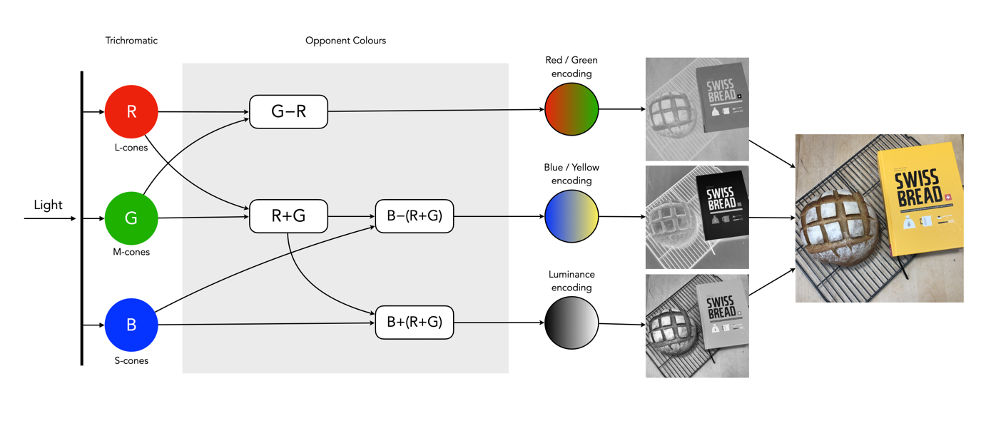
So what about post-processing once the cones have done their thing? The sensor array receives the colours, and stores the information by encoding it in the bipolar and ganglion cells in the retina before it is passed to the brain. There are three types of encoding.
The luminance (brightness) is encoded as the sum of the signals coming from the red, green and blue cones and the rods. These help provide the fine detail of the image in black and white. This is similar to a grayscale version of a colour image.
The second encoding separates blue from yellow.
The third encoding separates red and green.
Fig.4: The encoding of colour information after the cones do their thing.
In the fovea there are no rods, only cones, so the luminance ganglion cell only receives a signal from one cone cell of each colour. A rough approximation of the process is shown in Figure 4.
Now, you don’t really need to know that much about the inner workings of the eye, except that colour theory is based a great deal on how the human eye perceives colour, hence the use of RGB in digital cameras.
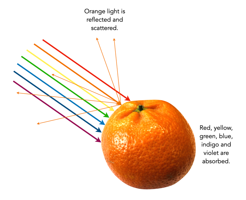
Colour is the basis of human vision. Everything appears coloured. Humans see in colour, or rather the cones in our eyes interpret wavelengths of red, green and blue when they enter the eye in varying proportions, enabling us to see a full gamut of colours. The miracle of the human eyes aside, how does colour exist? Are trees really green? Bananas yellow? Colour is not really inherent in objects, but the surface of an object reflects some colours and absorb others. So the human eye only perceives reflected colours. The clementine in the figure below reflects certain wavelengths, which we perceive as orange. Without light there is no colour.
Reflected wavelengths = perceived colours
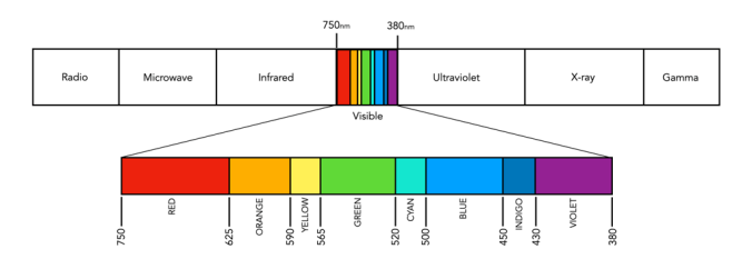
Yet even for the simplest of colour theory related things, like the visible spectrum, it is hard to find an exact definition. Light is a form of electromagnetic radiation. Its physical property is described in terms of wavelength (λ) in units of nanometers (nm, which is 10-9 metres). Human eyes can perceive the colours associated with the visible light portion of the electromagnetic radiation spectrum. It was Isaac Newton who in 1666 described the spectrum of white light as being divided into seven distinct colours – red, orange, yellow, green, blue, indigo and violet. Yet in many renditions, indigo has been replaced by blue, and blue by cyan. In some renditions there are only six colours (like in Pink Floyd’s album cover for Dark Side of the Moon), others have eight. It turns out indigo likely doesn’t need to be there (because its hard to tell indigo apart from blue and violet). Another issue is the varied ranges of the visible spectrum in nanometers. Some sources define it as broadly as 380-800nm, while others narrow it to 420-680nm. Confusing right? Well CIE suggests that there are no precise limits for the spectral range of visible radiation – the lower limit is 360-400nm and the upper limit 760-830nm.
The visible spectrum of light(segmented into eight colours)
Thankfully for the purposes of photography we don’t have to delve that deeply into the specific wavelengths of light. In fact we don’t even have to think too much about the exact wavelength of colours like red, because frankly the colour “red” is just a cultural association with a particular wavelength. Basically colours are named for the sake of communications and so we can differentiate thousands of different paints chips. The reality is that while the human visual system can see millions of distinct colours, we only really have names for a small set of them. Most of the worlds languages only have five basic terms for colour. For example, the Berinmo tribe of Papua New Guinea have a term for light, dark, red, yellow, and one that denotes both blue and green [1]. Maybe we have overcomplicated things somewhat when it comes to colour.
But this does highlight some of the issues with colour theory – the overabundance of information. There are various terms which seem to lack a clear definition, or overlap with other terms. Who said colour wasn’t messy? It is. What is the difference between a colour model and a colour space? Why do we use RGB? Why do we care about HSV colour space? This series will look at some colour things as it relates to photography, explained as simply as possible.
Davidoff, J., Davies, I., Roberson, D., “Colour categories in a stone-age tribe”, Nature, 398, pp.203-204 (1999)
Colour is a complex sensation, but we should remember that an object has no single characteristic colour because its appearance is affected by a number of factors. If we ask what the colour of the girls kimonos are from the image below (from a series of ca.1880s-90s full-plate images printed by sunlight on simple “salted paper”, and hand-tinted with transparent water colours), our first reaction may be to say that they are purple. By this means we identify the hue of the object. However, this description is clearly inadequate. To be more specific, we could say that one kimono is light purple and the other is dark purple. This describes the brightness of the colour. Colour could also be described as bright, dull or vivid, a characteristic known as saturation. Therefore the perception of colour is comprised of three characteristics, any one of which can be varied independently. But we are really describing sensations, not the object, nor the physical stimuli reaching the eye.
The first permanent photograph was produced in 1825 by the French inventor Joseph Nicéphore Niépce. Since then photographs have become the epitome of our visual history. Until becoming widespread in the 1950s, colour images were more of an aberration, with monochrome, i.e. black-and-white, being the norm, partially due to the more simplistic processing requirements. As a result, history of good portion of the 19th/20th centuries is perceived in terms of monochromic images. This determines how we perceive history, for humans perceive monochromatic images in a vastly differing manner to colour ones.
The use of black-and-white in historical photographs implies certain ideas about history. There is the perception that such photos are authentic historical images. By the mid half of the 19th century, photography had become an important means of creating a visual record of life. However the process was inherently monochromatic, and the resulting photographs provided a representation of the structure of a subject, but lacked the colour which would have provided a more realistic context. There were some photographic processes which yielded an overall colour, such as cyanotypes, however such colour was unrealistic. The first colourization of photographic occurred in the early 1840s, when Swiss painter Johann Baptist Isenring used a mixture of gum arabic and pigments to make the first coloured daguerreotype. Such hand colouring continued in successive mediums including albumen and gelatin silver prints. The purpose of this hand-colouring may have been to increase the realism of the photographic prints (in lieu of a colour photographic process) .
The major failing of monochromatic images may be the fact that they suffer from a lack of context. Removing the colour from an image provides us with a different perception of the scene. Take for example the picture of the Russian peasant girls shown in Fig. 1. The image is from the US Library of Congress Prokudin Gorskii Collection, and depicts three young women offering berries to visitors to their izba, a traditional wooden house, in a rural area along the Sheksna River, near the town of Kirillov. Shown in colour, we perceive a richness in the girls garments, even though they are peasant girls in some small Russian town. When we think of peasant Russia in the early 20th century, we are unlikely to associate such vibrant colours with their place in society. Had we viewed only the panchromatic image, our perception would be vastly different.
Russian peasant girls in colour and grayscale (Prokudin Gorskii)
Humans are capable of perceiving approximately 32 shades of gray and millions of colours. When we interpret an image to extract descriptors, some of those descriptors will be influenced by the perceived colour of objects within the image. A monochrome image relies on a spectrum of intensities that range from black to white, so when we view a monochromatic image, we perceive the image based on tone, texture and contrast, rather than colour. In the photograph of the peasant girls we are awed by the dazzling red and purple dresses, when viewing the monochrome image we are drawn to the shape of the dresses, the girls pose, and the content of the image.
Here is a second example of a sulfur stack shown in both colour and grayscale. The loss of meaning in the monochrome image is clear. The representative stack of sulphur is readily identifiable in the colour image, however in the monochrome image, the identifying attribute has been removed, leaving only the structure of the image with a loss of context.
Extracted sulfur stacked in a “vat” 60 feet tall at Freeport Sulphur Co. in Hoskins Mound, Texas. Kodachrome transparency by John Vachon