After Ranger 7, NASA moved on to Mars, deploying Mariner 4 in November 1964. It was the first probe to send signals back to Earth in digital form, which was necessitated by the fact that the signals had to travel 216 million km back to earth. The receiver on board could send and receive data via the low- and high-gain antennas at 8⅓ or 33⅓ bits-per-second. So at the low end, one pixel (8-bit) per second. All images were transmitted twice to insure no data were missing or corrupt. In 1965, JPL established the Image Processing Laboratory (IPL).
The next series of lunar probes, Surveyor, were also analog (due to construction being too advanced to make changes), providing some 87,000 images for processing by IPL. The Mariner images also contained noise artifacts that made them look as if they were printed on “herringbone tweed”. It was Thomas Rindfleisch of IPL who applied nonlinear algebra, creating a program called Despike – it performed a 2D Fourier transform to create a frequency spectrum with spikes representing the noise elements, which could then be isolated, removed and the data transformed back into an image.
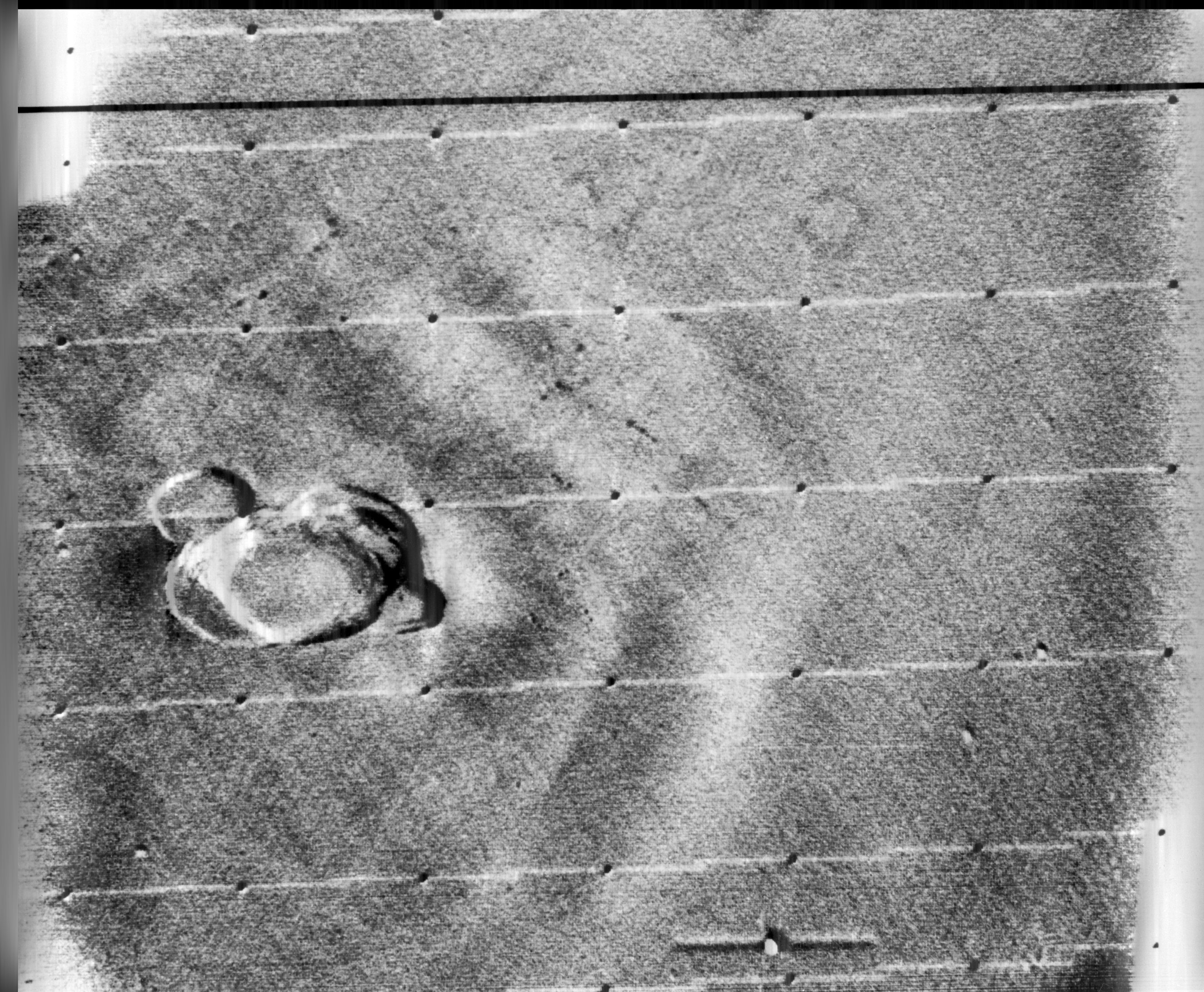
Below is an example of this process applied to an image from Mariner 9 taken in 1971 (PIA02999), containing a herringbone type artifact (Figure 1). The image is processed using a Fast Fourier Transform (FFT – see examples FFT1, FFT2, FFT3) in ImageJ.
Fig.1: Image before (left) and after (right) FFT processing
Applying a FFT to the original image, we obtain a power spectrum (PS), which shows differing components of the image. By enhancing the power spectrum (Figure 2) we are able to look for peaks pertaining to the feature of interest. In this case the vertical herringbone artifacts will appear as peaks in the horizontal dimension of the PS. Now in ImageJ these peaks can be removed from the power spectrum, (setting them to black), effectively filtering out those frequencies (Figure 3). By applying the Inverse FFT to the modified power spectrum, we obtain an image with the herringbone artifacts removed (Figure 1, right).
Fig.2: Power spectrum (enhanced to show peaks)
Fig.3: Power spectrum with frequencies to be filtered out marked in black.
Research then moved to applying the image enhancement techniques developed at IPL to biomedical problems. Robert Selzer processed chest and skull x-rays resulting in improved visibility of blood vessels. It was the National Institutes of Health (NIH) that ended up funding ongoing work in biomedical image processing. Many fields were not using image processing because of the vast amounts of data involved. Limitations were not posed by algorithms, but rather hardware bottlenecks.
Some people probably think image processing was designed for digital cameras (or to add filters to selfies), but in reality many of the basic algorithms we take for-granted today (e.g. improving the sharpness of images) evolved in the 1960s with the NASA space program. The space age began in earnest in 1957 with the USSR’s launch of Sputnik I, the first man-made satellite to successfully orbit Earth. A string of Soviet successes lead to Luna III, which in 1959 transmitted back to Earth the first images ever seen of the far side of the moon. The probe was equipped with an imaging system comprised of a 35mm dual-lens camera, an automatic film processing unit, and a scanner. The camera sported a 200mm f/5.6, and a 500mm f/9.5 lens, and carried temperature and radiation resistant 35mm isochrome film. Luna III took 29 photographs over a 40-minute period, covering 70% of the far side, however only 17 of the images were transmitted back to earth. The images were low-resolution, and noisy.
The first image obtained from the Soviet Luna III probe on October 7, 1959 (29 photos were taken of the dark side of the moon).
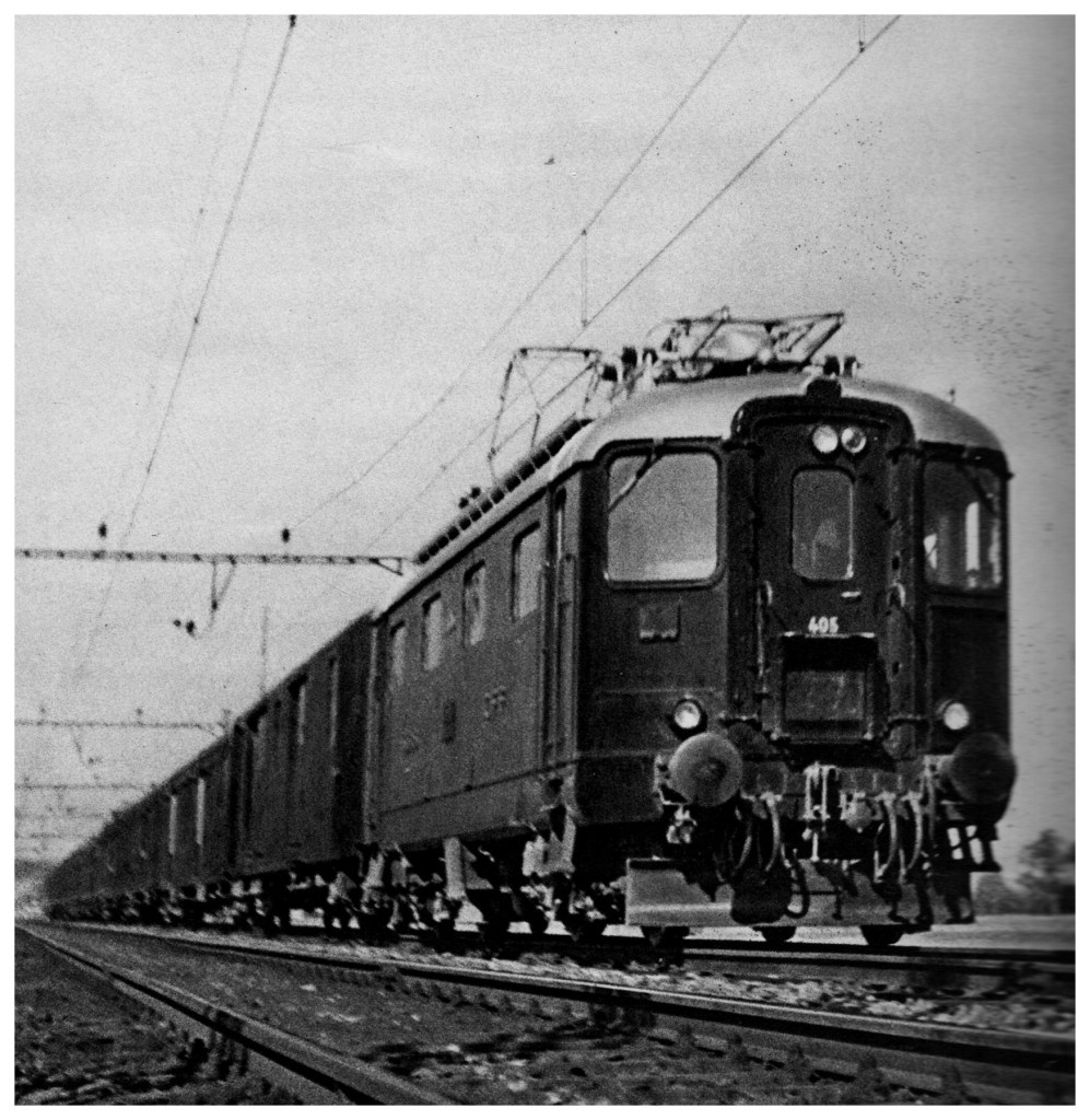
In response to the Soviet advances, NASA’s Jet Propulsion Lab (JPL) developed the Ranger series of probes, designed to return photographs and data from the moon. Many of the early probes were a disaster. Two failed to leave Earth orbit, one crashed onto the moon, and two left Earth orbit but missed the moon. Ranger 6 got to the moon, but its television cameras failed to turn on, so not a single image could be transmitted back to earth. Ranger 7 was the last hope for the program. On July 31, 1964 Ranger 7 neared its lunar destination, and in the 17 minutes before it impacted the lunar surface it relayed the first detailed images of the moon, 4,316 of them, back to JPL.
Image processing was not really considered in the planning for the early space missions, and had to gain acceptance. The development of the early stages of image processing was led by Robert Nathan. Nathan received a PhD in crystallography in 1952, and by 1955 found himself running CalTech’s computer centre. In 1959 he moved to JPL to help develop equipment to map the moon. When he viewed pictures from the Luna III probe he remarked “I was certain we could do much better“, and “It was quite clear that extraneous noise had distorted their pictures and severely handicapped analysis” [1].
The cameras† used on the Ranger were Vidicon television cameras produced by RCA. The pictures were transmitted from space in analog form, but enhancing them would be difficult if they remained in analog. It was Nathan who suggested digitizing the analog video signals, and adapting 1D signal processing techniques to process the 2D images. Frederick Billingsley and Roger Brandt of JPL devised a Video Film Converter (VFC) that was used to transform the analog video signals into digital data (which was 6-bit, 64 gray levels).
The images had a number of issues. First there was the geometricdistortion. The beam that swept electrons across the face of the tube in the spacecraft’s camera moved at nonuniform rates that varied from the beam on the playback tube reproducing the image on Earth. This resulted in images that were stretched or distorted. A second problem was that of photometric nonlinearity. The cameras had a tendency to display brightness in the centre, and a darkness around the edge which was caused by a nonuniform response of the phosphor on the tube’s surface. Thirdly, there was an oscillation in the electronics of the camera which was “bleeding” into the video signal, causing a visible period noise pattern. Lastly there was scan-line noise, which was the nonuniform response of the camera with respect to successive scan lines (the noise is generated at right-angles to the scan). Nathan and the JPL team designed a series of algorithms to correct for the limitations of the camera. The image processing algorithms [2] were programmed on JPL’s IBM 7094, likely in the programming language Fortran.
The geometricdistortion was corrected using a “rubber sheeting” algorithm that stretched the images to match a pre-flight calibration.
The photometricnonlinearity was calculated before flight, and filtered from the images.
The oscillation noise was removed by isolating the noise on a featureless portion of the image, created a filter, and subtracted the pattern from the rest of the image.
The scan-line noise was removed using a form of mean filtering.
Ranger VII was followed by the successful missions of Ranger VIII and Ranger IX. The image processing algorithms were used to successfully process 17,259 images of the moon from Rangers 7, 8, and 9 (the link includes the images and documentation from the Ranger missions). Nathan and his team also developed other algorithms which dealt with random-noise removal, Sine-wave correction.
Refs: [1] NASA Release 1966-0402 [2] Nathan, R., “Digital Video-Data Handling”, NASA Technical Report No.32-877 (1966) [3] Computers in Spaceflight: The NASA Experience, Making New Reality: Computers in Simulations and Image Processing.
† The Ranger missions used six cameras, two wide-angle and four narrow angle.
Camera A was a 25mm f/1 with a FOV of 25×25° and a Vidicon target area of 11×11mm.
Camera B was a 76mm f/2 with a FOV of 8.4×8.4° and a Vidicon target area of 11×11mm.
Camera P used two type A and two type B cameras with a Vidicon target area of 2.8×2.8mm.
I have done image processing in one form or another for over 30 years. What I have learnt may only come with experience, but maybe it is an artifact of growing up in the pre-digial age, or having interests outside computer science that are more of an aesthetic nature. Image processing started out being about enhancing pictures, and extracting information in an automated manner from them. It evolved primarily in the fields of aerial and aerospace photography, and medical imaging, before there was any real notion that digital cameras would become ubiquitous items.
The problem is as the field evolved, people started to forget about the context of what they were doing, and focused solely on the pixels. Image processing became about mathematical algorithms. It is like a view of painting that focuses just on the paint, or the brushstrokes, with little care about what they form (and having said that, those paintings do exist, but I would be hesitant to call them art). Over the past 20 years, algorithms have become increasingly complex, often to perform the same task that simple algorithms would perform. Now we see the emergence of AI-focused image enhancement algorithms, just because it is the latest trend. They supposedly fix things like underexposure, overexposure, low contrast, incorrect color balance and subjects that are out of focus. I would almost say we should just let the AI take the photo, still cameras are so automated it seems silly to think you would need any of these “fixes”.
There are now so many publications on subjects like image sharpening, that it is truly hard to see the relevance of many of them. If you spend long enough in the field, you realize that the simplest methods like unsharp masking still work quite well on most photographs. All the fancy techniques do little to produce a more aesthetically pleasing image. Why? Because the aesthetics of something like “how sharp an image is”, is extremely subjective. Also, as imaging systems gain more resolution, and lenses become more “perfect”, more detail is present, actually reducing the need for sharpening. There is also the specificity of some of these algorithms, i.e. there are few inherently generic image processing algorithms. Try to find an algorithm that will accurately segment ten different images?
Part of the struggle is that few have stopped to think about what they are processing. They don’t consider the relevance of the content of a picture. Some pictures contain blur that is intrinsic to the context of the picture. Others create algorithms to reproduce effects which are really only relevant to creation through physical optical systems, e.g. bokeh. Fewer still do testing of any great relevance. There are people who publish work which is still tested in some capacity using Lena, an image digitized in 1973. It is hard to take such work seriously.
Many people doing image processing don’t understand the relevance of optics, or film. Or for that matter even understand the mechanics of how pictures are taken, in an analog or digital realm. They just see pixels and algorithms. To truly understand concepts like blur and sharpness, one has to understand where they come from and where they fit in the world of photography.
Sometimes you want to take a photograph of something, like close-up, but the whole scene won’t fit into one photo, and you don’t have a fisheye lens on you. So what to do? Enter the panorama. Now many cameras provide some level of built-in panorama generation. Some will guide you through the process of taking a sequence of photographs that can be stitched into a panorama, off-camera, and others provide panoramic stitching in-situ (I would avoid doing this as it eats battery life). Or you can can take a bunch of photographs of a scene and use a image stitching application such as AutoStitch, or Hugin. For simplicities sake, let’s generate a simple panorama using AutoStitch.
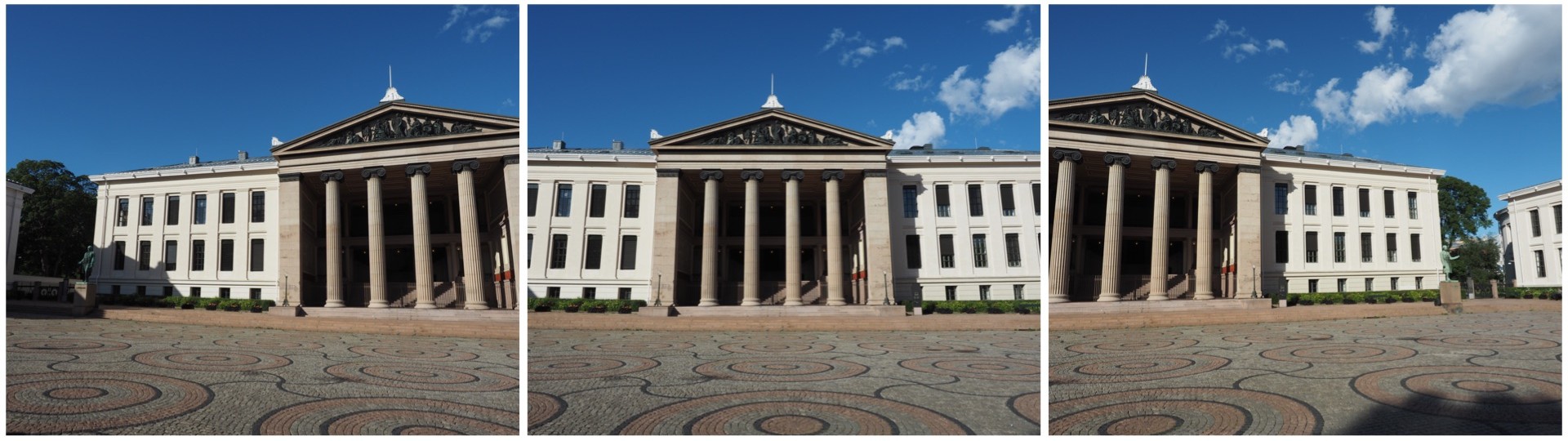
In Oslo, I took a three pictures of a building because obtaining a single photo was not possible.
The three individual images
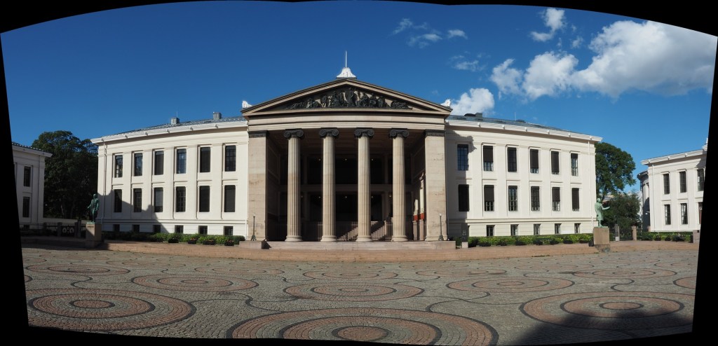
This is a very simple panorama, with feature points easy to find because of all the features on the buildings. Here is the result:
The panorama built using AutoStitch
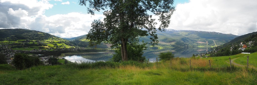
It’s not perfect, from the perspective of having some barrel distortion, but this could be removed. In fact the AutoStitch does an exceptional job, without having to set 1001 parameters. There are no visible seams, and the photograph seems like it was taken with a fisheye lens. Here is a second example, composed of three photographs taken on the hillside next to Voss, Norway. This panorama has been cropped.
A stitched scene with moving objects.
This scene is more problematic, largely because of the fluid nature of some of the objects. There are some things that just aren’t possible to fix in software. The most problematic object is the tree in the centre of the picture. Because tree branches move with the slightest breeze, it is hard to register the leaves between two consecutive shots. In the enlarged segment below, you can see the ghosting effect of the leaves, which almost gives that region in the resulting panorama a blurry effect. So panorama’s containing natural objects that move are more challenging.
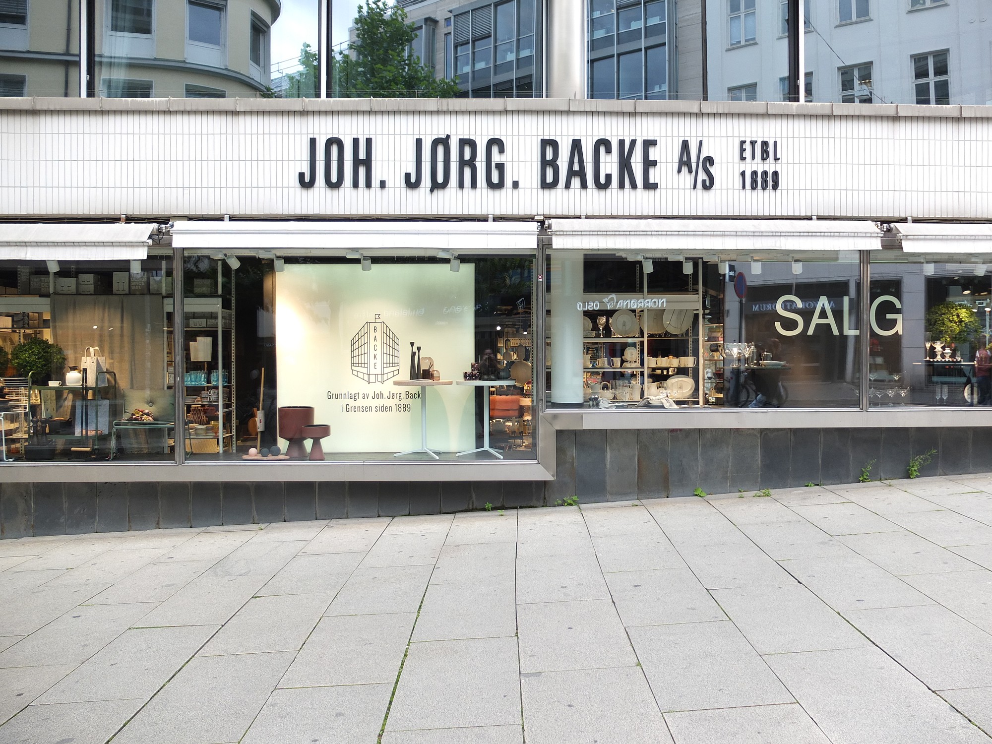
Using a sharpening filter is really contingent upon the content of an image. Increasing the size of a filter may have some impact, but it may also have no perceptible impact – what-so-ever. Consider the following photograph of the front of a homewares store taken in Oslo.
A storefront in Oslo with a cool font
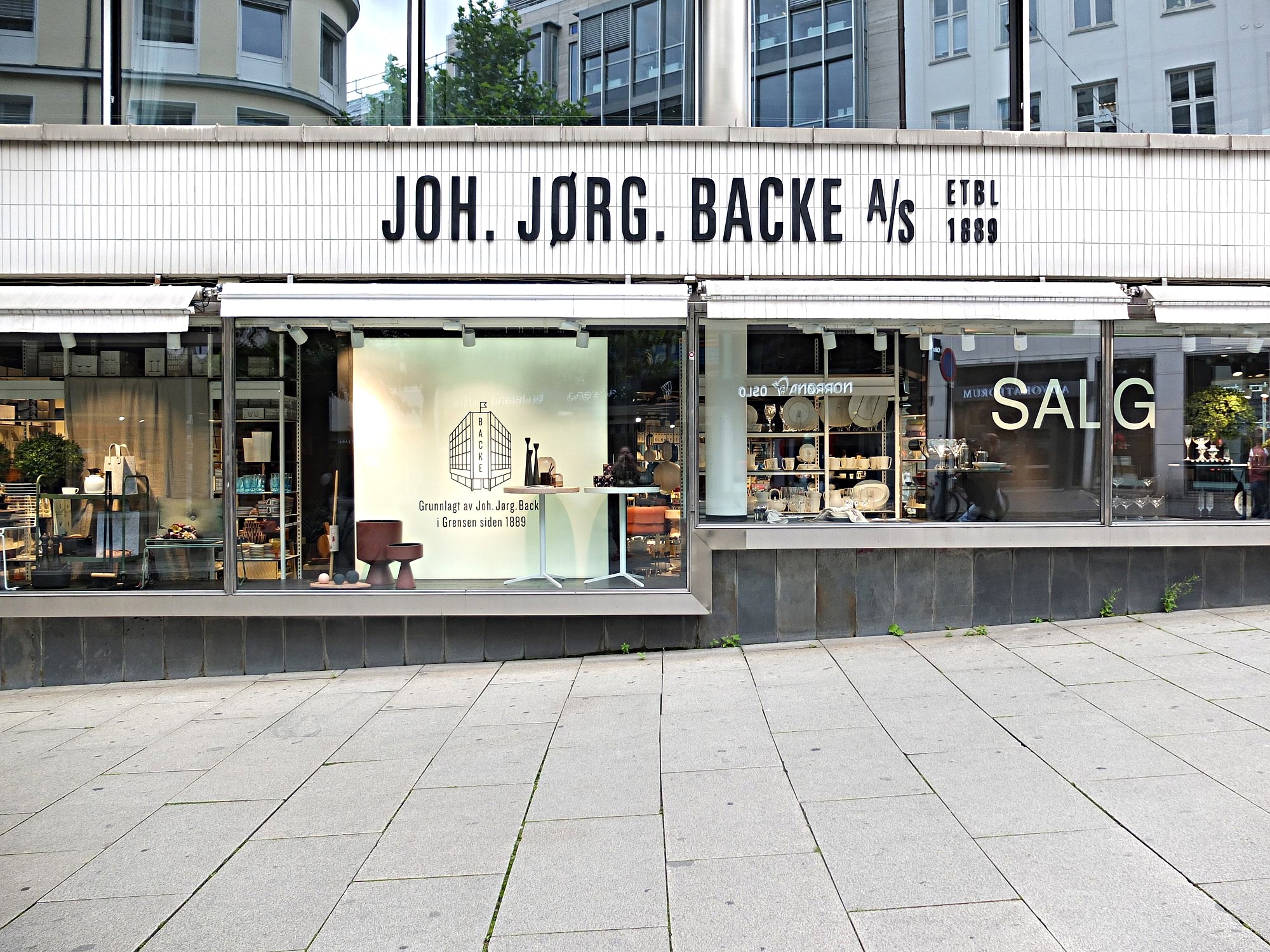
The image (which is 1500×2000 pixels – down sampled from a 12MP image) contains a lot of fine details, from the stores signage, to small objects in the window, text throughout the image, and even the lines on the pavement. So sharpening would have an impact on the visual acuity of this image. Here is the image sharpened using the “Unsharp Mask” filter in ImageJ (radius=10, mask-weight=0.3). You can see the image has been sharpened, as much by the increase in contrast than anything else.
Image sharpened with Unsharp masking radius=10, mask-weight=0.3
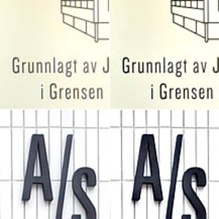
Here is a close-up of two regions, showing how increasing the sharpness has effectively increased the contrast.
Pre-filtering (left) vs. post-sharpening (right)
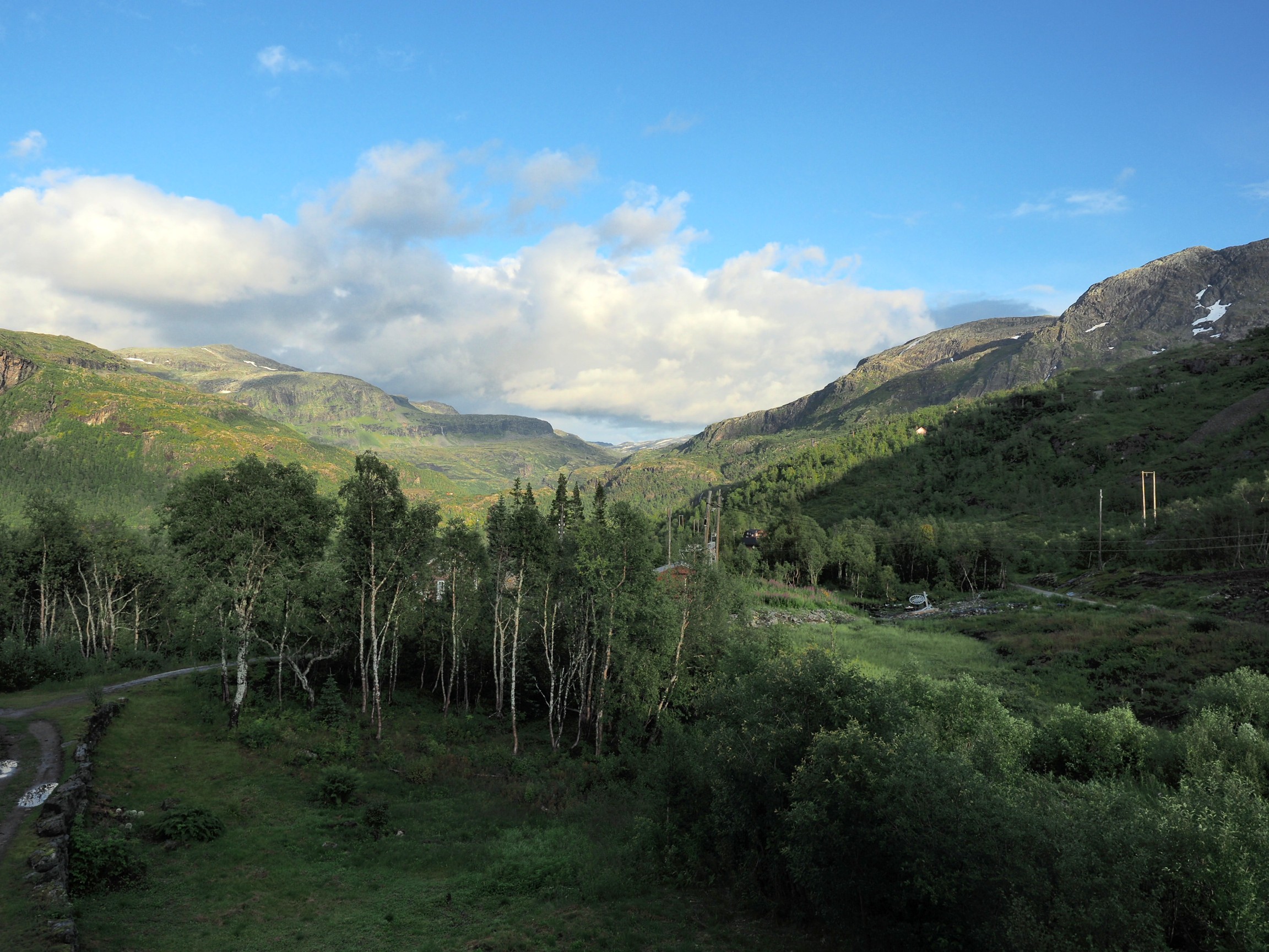
Now consider an image of a landscape (also from a trip to Norway). Landscape photographs tend to lack the same type of detail found in urban photographs, so sharpening will have a different effect on these types of image. The impact of sharpening will be reduced in most of the image, and will really only manifest itself in the very thin linear structures, such as the trees.
Sharpening tends to work best on features of interest with existing contrast between the feature and its surrounding area. Features that are too thin can sometimes become distorted. Indeed sometimes large photographs do not need any sharpening, because the human eye has the ability to interpret the details in the photograph, and increasing sharpness may just distort that. Again this is one of the reasons image processing relies heavily on aesthetic appeal. Here is the image sharpened using the same parameters as the previous example:
Image sharpened with Unsharp masking radius=10, mask-weight=0.3
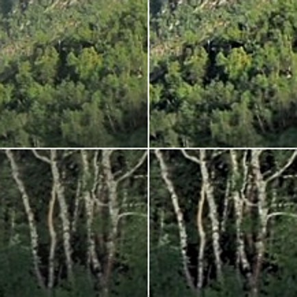
There is a small change in contrast, most noticeable in the linear structures, such as the birch trees. Again the filter uses contrast to improve acuity (Note that if the filter were small, say with a radius of 3 pixels, the result would be minimal). Here is a close-up of two regions.
Pre-filtering (left) vs. post-sharpening (right)
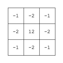
Note that the type of filter also impacts the quality of the sharpening. Compare the above results with those of the ImageJ “Sharpen” filter, which uses a kernel of the form:
ImageJ “Sharpen” filter
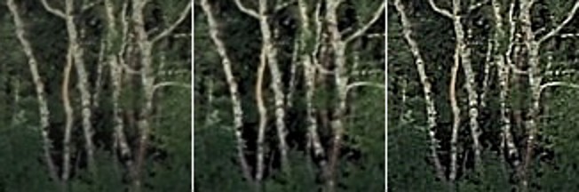
Notice that the “Sharpen” filter produces more detail, but at the expense of possibly overshooting some regions in the image, and making the image appear grainy. There is such as thing as too much sharpening.
Original vs. ImageJ “Unsharp Masking” filter vs. ImageJ “Sharpen” filter
So in conclusion, the aesthetic appeal of an image which has been sharpened is a combination of the type of filter used, the strength/size of the filter, and the content of the image.
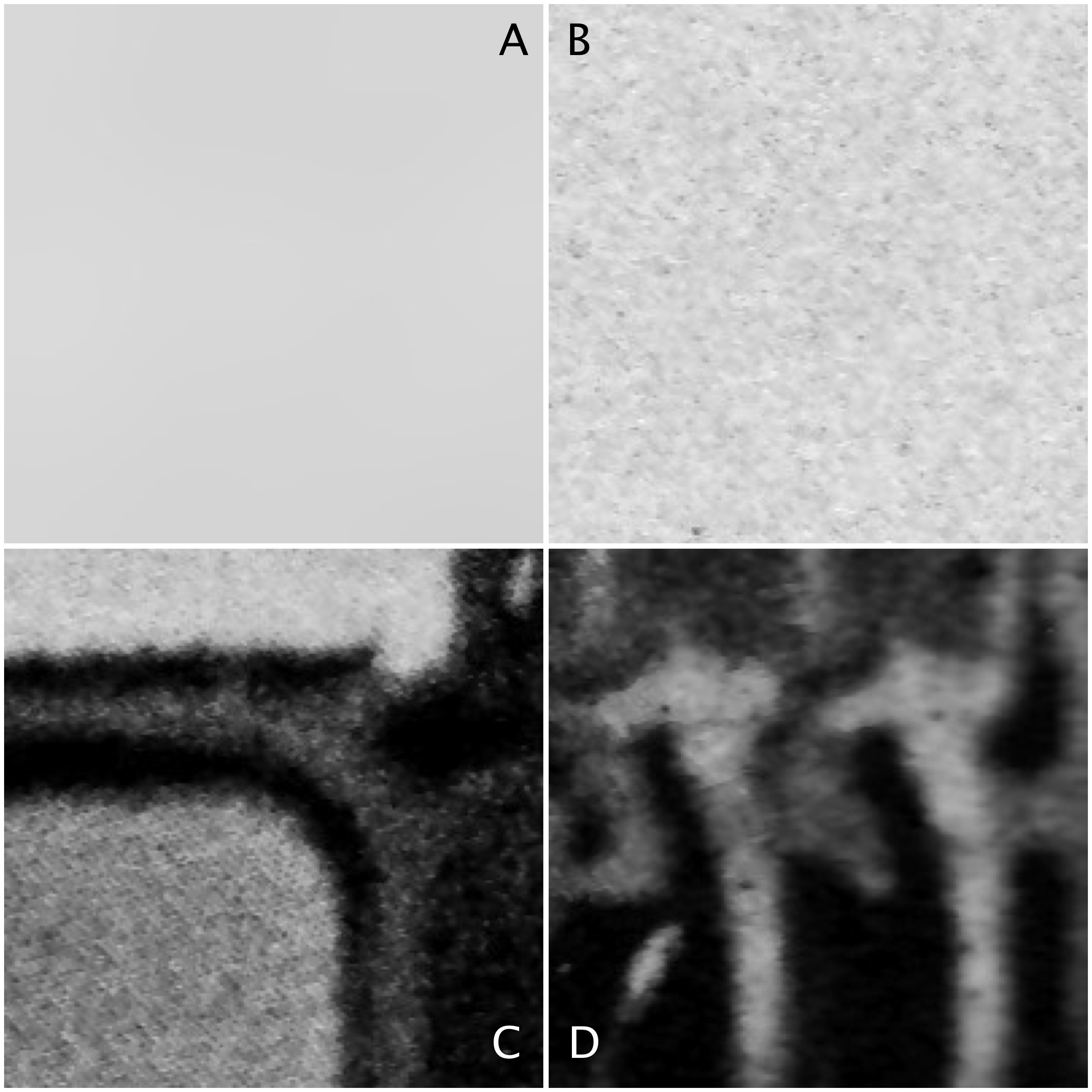
Sometimes algorithms talk about the mean or variance of a region of an image (sometimes called a neighbourhood, or window). But what does this refer to? The mean is the average of a series of numbers, and the variance measures the average degree to which each number is different from the mean. So the mean of a 3×3 pixel neighbourhood is average of the 9 pixels within it, and the variance is the degree to which every pixel in the neighbourhood varies from the mean. To obtain a better perspective, it’s best to actually explore some images. Consider the grayscale image in Fig.1.
Fig 1: The original image
Four 200×200 regions have been extracted from the image, they are shown in Fig.2.
Fig.2: Different image regions
Statistics are given at the end of the post. Region B represents a part of the background sky. Region A is the same region processed using a median filter to smooth out discontinuities. In comparing region A and B, they both have similar means: 214.3 and 212.37 respectively. Yet their appearance is different – one is uniform, and the other seems to contain some variance, something we might attribute to noise in some circumstances. The variance of A is 2.65, versus 70.57 for B. Variance is a poor descriptive statistic, because it is hard to visualize, so many times it is converted to standard deviation (SD), which is just the square root of variance. For A and B, this is 1.63 and 8.4 respectively.
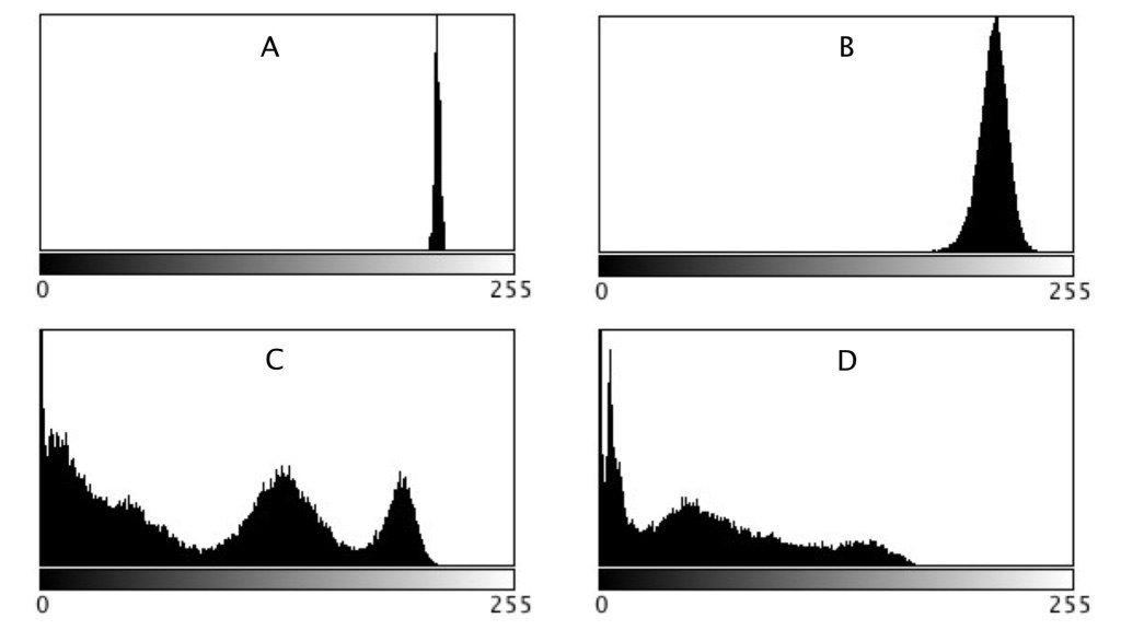
As shown in region C and D, more complex scenes introduce an increased variance, and SD. The variances can be associated with the distribution of the histograms shown below.
Fig 3: Comparison of histograms
When comparing two regions, a lower variance (or in reality a lower SD) usually implies a more uniform region of pixels. Generally, mean and variance are not good estimators for image content because two totally different images can have same mean, and variance.
There are lots of blogs that extol some piece of code that does some type of “image processing”. Classically this is some type of image enhancement – an attempt to improve the aesthetics of an image. But the problem with image processing is that there are aspects of if that are not really a science. Image processing is an art fundamentally because the quality of the outcome is often intrinsically linked to an individuals visual preferences. Some will say the operations used in image processing are inherently scientific because they are derived using mathematical formula. But so are paint colours. Paint is made from chemical substances, and deriving a particular colour is nothing more than a mathematical formula for combining different paint colours. We’re really talking about processing here, and not analysis (operations like segmentation). So what forms of processing are artistic?
Anything that is termed a “filter”. The Instagram-type filters that make an ordinary photo look like a Polaroid.
Anything with the word enhancement in it. This is an extremely loose term – for it literally means “an increase in quality” – what does this mean to different people? This could involve improving the contrast in an image, removing blur through sharpening, or maybe suppressing noise artifacts.
These processes are partially artistic because there is no tried-and-true method of determining whether the processing has resulted in an improvement in the quality of the image. Take an image, improve its contrast. Does it have a greater aesthetic appeal? Are the colours more vibrant? Do vibrant colours contribute to aesthetic appeal? Are the blues really blue?
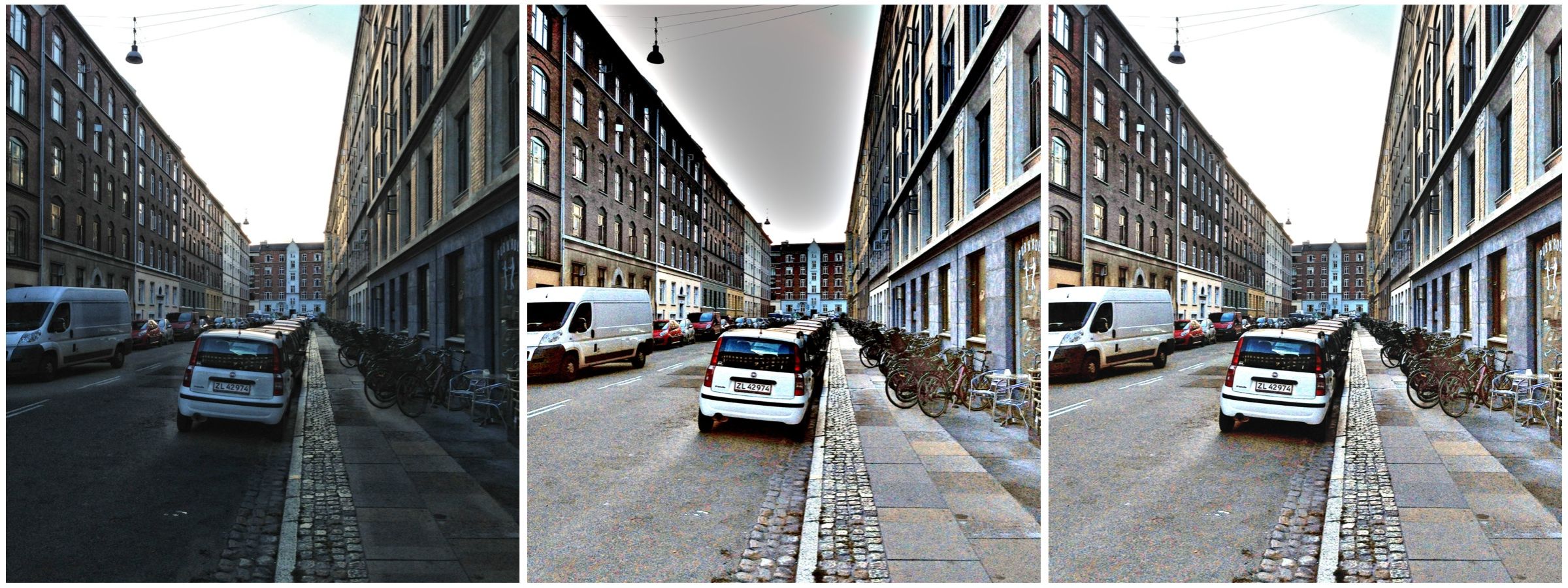
Contrast enhancement: (a) original, (b) Retinex-processed, (c) MAXimum of (a) and (b)
Consider the photograph above. To some, the image on the left suffers from being somewhat underexposed, i.e. dark. The image in the middle is the same image processed using a filter called Retinex. Retinex helps remove unfavourable illumination conditions – the result is not perfect, however the filter can help recover detail from an image in which it is enveloped in darkness. Whilst a good portion of the image has been “lightened”, the overcast sky has darkened through the process. There is no exact science for “automagically” making an image have greater aesthetic appeal. The art of image processing often requires tweaking settings, and adjusting the image until it appears to have improved visually. In the final image of the sequence below, the original and Retinex processed images are used to create a composite by retaining only the maximum value at each pixel location. The result is a brighter, contrasty, more visually appealing image.
A pixel is an abstract, size-less thing. A pixels size is relative to the resolution of the physical device on which it is being viewed. The photosites on a camera sensor do have a set dimension, but once an image is acquired, and the signal are digitized, image pixels are size-less.
For example, let’s consider TVs, and in particular 4K Ultra HD TVs. A 43″ version of this TV might have a resolution of 3840×2160 pixels (w×h). The 75″ version of this TV has *exactly* the same number of pixels – about 8 million of them. What changes is the pixel size, but then so does the distance you should view the TV from. The iPhone 11 in comparison has a screen size of 1792×828. For example, the 43″ 4K TV has dimensions of roughly 37″×20.8″, which means that the size of a pixel is 0.24mm. A 75″ 4K TV would have a pixel size of 0.41mm. An Apple Macbook Air with a 13.3″ screen (2560×1600 pixels) has a pixel size of 0.11mm.
As an example consider the image below. Two sizes of pixels are shown, to represent different resolutions on two different physical devices. The content of the pixel doesn’t change, it just adapts to fill the physical pixels on the device.
Pixel sizes on different screens
Likely more important than the size of pixels is how many of them there are, so a better measure is PPI, or pixels-per-inch. The iPhone 11 has 326ppi, a typical 43″ TV has 102ppi, and the 75″ TV has 59ppi.
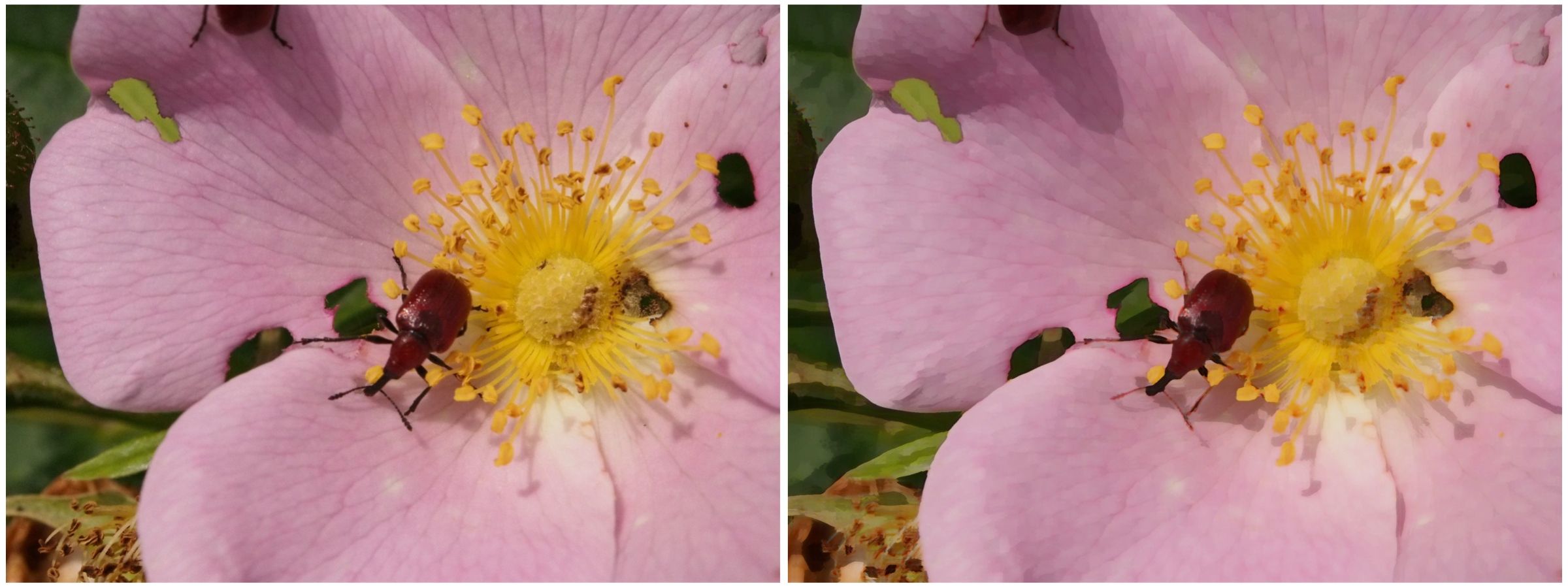
Art-like effects are easy to create in photographs. The idea is to remove textures, and sharpen edges in a photograph to make it appear more like abstract art. Consider the image below. An art-like effect has been created on this image using a filter known as Kuwahara. It has the effect of homogenizing regions of colour, hence you will notice a loss of detail within the image, and colours within a region. It was originally designed to process angiocardiographic images. The usefulness of filters such as Kuwahara is that they remove detail and increase abstraction. Another example of such a filter is the bilateral filter.
Image (before) and (after)
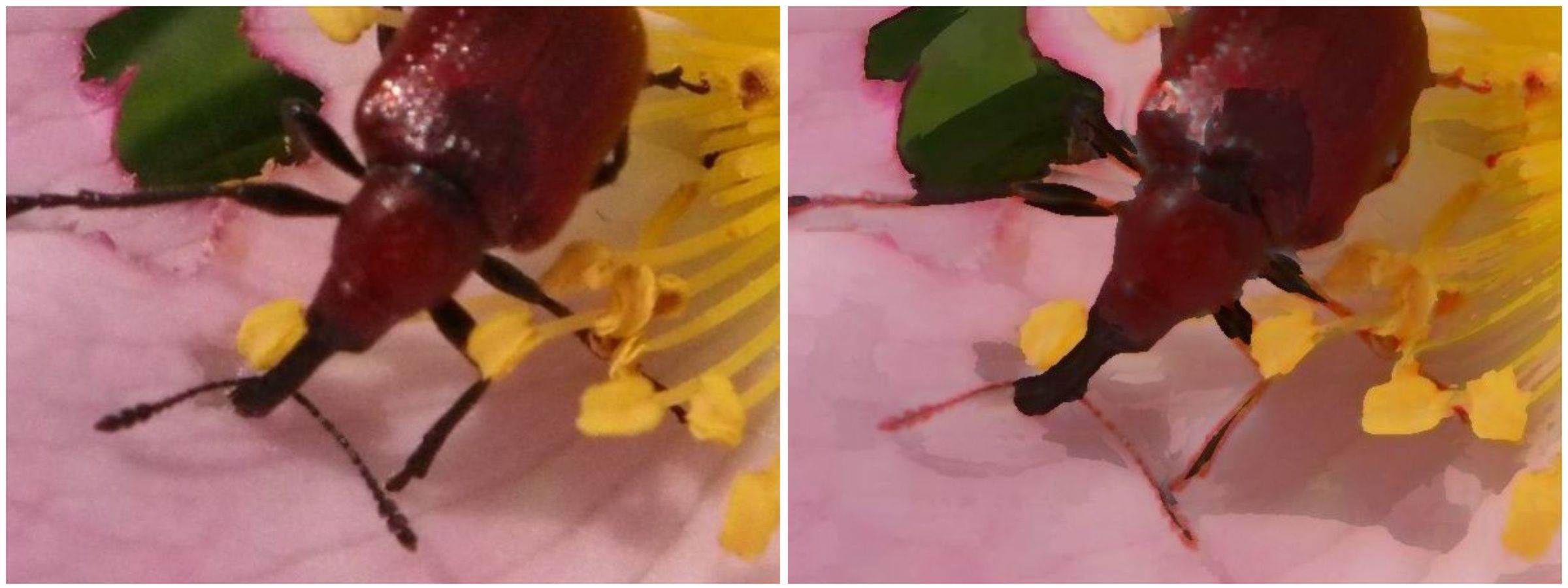
The Kuwahara is based on local area “flattening”, removing detail in high-contrast regions while protecting shape boundaries in low-contrast areas. The only issue with Kuwahara is that is can produce somewhat “blocky” results. Choosing a different shaped “neighbourhood” will have a different affect on the image. A close-up view of the beetle in the image above shows the distinct edges of the processed image. Note also how some of the features have changed colour slightly (the beetles legs have transformed from dark brown to a pale brown colour), due to the influence of the surrounding pink petal colour.
Close-up detail (before) and (after)
Filters like Kuwahara are also used to remove noise from images.
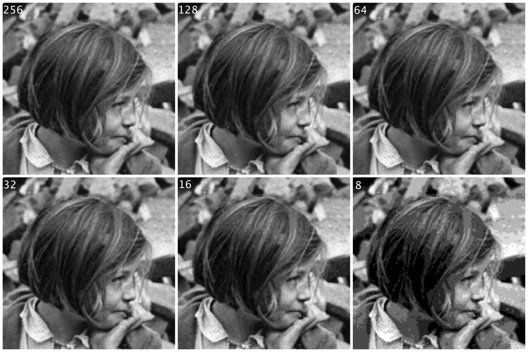
If you are starting to learn about image processing then you will likely be dealing with grayscale or 8-bit images. This effectively means that they contain 2^8 or 256 different shades of gray, from 0 (black), to 255 (white). They are the simplest form of image to create image processing algorithms for. There are some image types that are more than 8-bit, e.g. 10-bit (1024 shades of grey), but in reality these are only used in specialist applications. Why? Doesn’t more shades of grey mean a better image? Not necessarily.
The main reason? Blame the human visual system. It is designed for colour, having three cone photoreceptors for conveying colour information that allows humans to perceive approximately 10 million unique colours. It has been suggested that from the perspective of grays, human eyes cannot perceptually see the difference between 32 and 256 graylevel intensities (there is only one photoreceptor with deals with black and white). So 256 levels of gray are really for the benefit of the machine, and although the machine would be just as happy processing 1024, it is likely not needed.
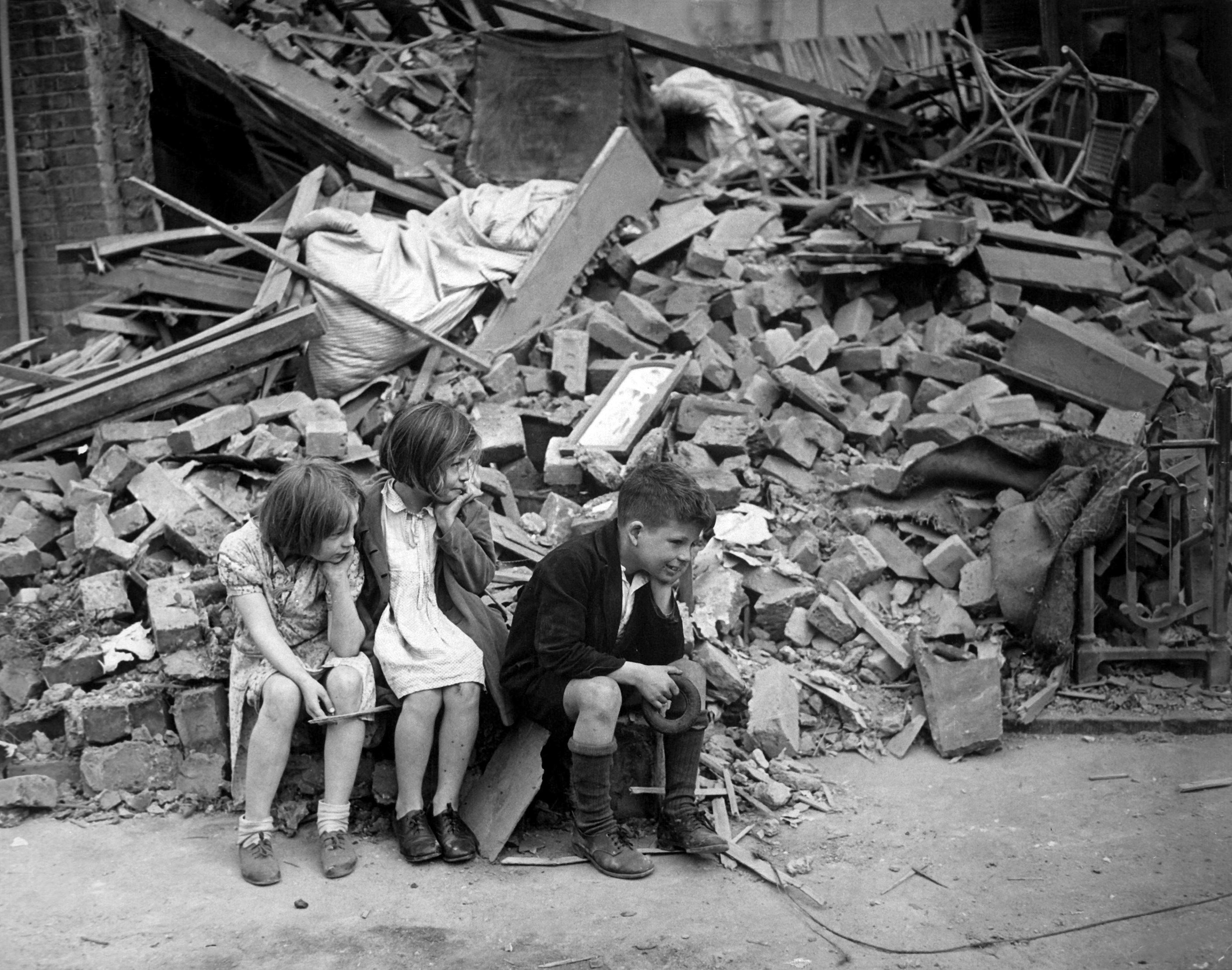
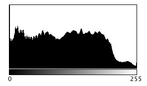
Here is an example. Consider the following photo of the London Blitz, WW2 (New Times Paris Bureau Collection).
This is a nice grayscale image, because it has a good distribution of intensity values from 0 to 255 (which is not always easy to find). Here is the histogram:
Now consider the image, reduced to 8, 16, 32, 64, and 128 intensity levels. Here is a montage of the results, shown in the form of a region extracted form he original image.
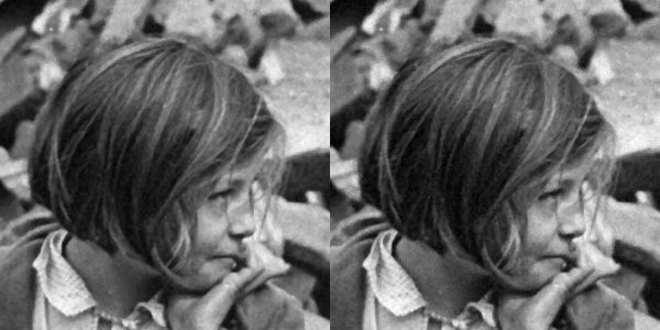
Not that there is very little perceivable difference, except at 8 intensity levels, where the image starts to become somewhat grainy. Now consider a companion of this enlarged region showing only 256 (left) versus 32 (right) intensity levels.
Can you see the difference? There is very little difference, especially when viewed in the over context of the complete image.
Many historic images look like they are grayscale, but in fact they are anything but. They may be slightly yellowish or brown in colour, either due to the photographic process, or due to aging of the photographic medium. There is no benefit to processing these type of photographs as colour images however, they should be converted to 8-bit.