“In black-and-white the photographer has to translate in his mind’s eye the colours of his subject into a range of tones before he presses the trigger, and that effort alone makes black-and-white in a way more creative than colour. It paraphrases and formalizes more. Structure, texture, and rich tonal quality are all weakened by colour, for colour tends to distract the eye from strong forms and their pure architecture. A decorative prettiness may be gained by colour, and sometimes emotional force too, but drama is often lost, not least the drama of a significant instant of action which will never recur. Light in its various moods has deep emotional meanings for everyone, and black-and-white can often convey those meanings more powerfully than colour.”
Eric de Maré, Color Photography (1973)
black and white
The simplicity of achromatic photographs
We live in a world where colour surrounds us, so why would anyone want to take an achromatic, black-and-white photograph? What draws us to a B&W photograph? Many modern colour images are brightened to add a sense of the exotic in the same way that B&W invokes an air of nostalgia. B&W does not exaggerate the truth in the same way that colour does. It does sometimes veil the truth, but in many ways it is an equalizer. Colours and the emotions they represent are stripped away, leaving nothing but raw structure. We are then less likely to draw emotions into the interpretation of achromatic photographs. There is a certain rawness to B&W photographs, which cannot be captured by colour.
Every colour image is of course built upon an achromatic image. The tonal attributes provides the structure, the chrominance the aesthetic elements that help us interpret what we see. Black and white photographs offer simplicity. When colour is removed from a photograph, it forces a different perspective of the world. To create a pure achromatic photograph means the photographer has to look beyond the story posed by the chromatic elements of the scene. It forces one to focus on the image. There is no hue, no saturation to distract. The composition of the scene suddenly becomes more important. Both light and the darkness of shadows become more pronounced. The photographic framework of a world without colour forces one to see things differently. Instead of highlighting colour, it helps highlight shape, texture, form and pattern.
Sometimes even converting a colour image to B&W using a filter can make the image content seem more meaningful. Colour casts or odd-ball lighting can often be vanquished if the image is converted. Noise that would appear distracting in a colour image, adds to an image as “grain” in B&W. B&W images will always capture the truth of a subjects structure, but colours are always open to interpretation due to the way individuals perceive colour.
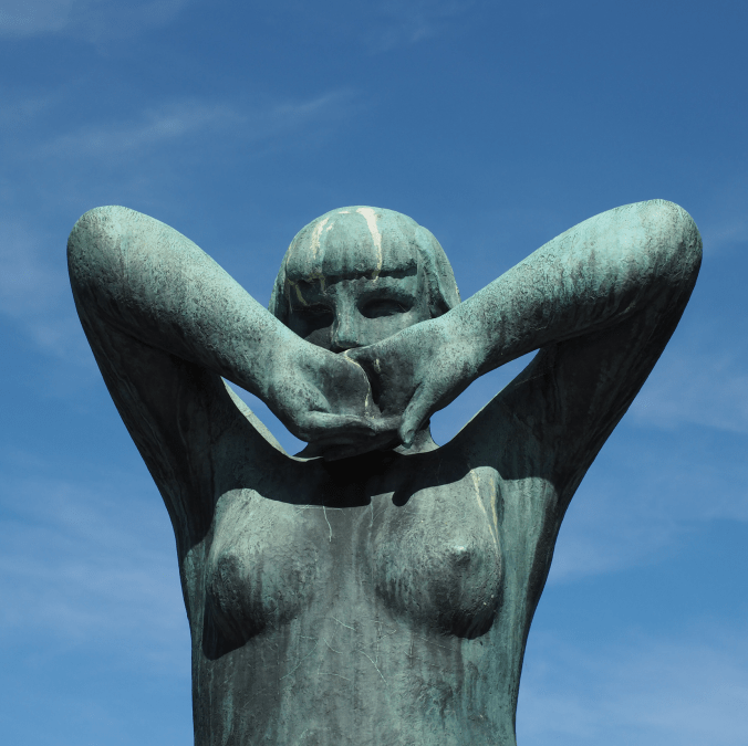

Above is a colour photograph of a bronze sculpture taken at The Vigeland Park in Oslo, a sculpture park displaying the works of Gustav Vigeland. The colour image is interesting, but the viewer is somewhat distracted by the blue sky, and even the patina on the statue. A more interesting take is the achromatic image, obtained via the Instagram Inkwell filter. The loss of colour has helped improve the contrast between the sculpture and its background.
Are black-and-white photographs really black and white?
Black-and-white photography is somewhat of a strange term, because it alludes to the fact that the photograph is black-AND-white. However black-and-white photographs if interpreted correctly would mean an image which contains only black and white (in digital imaging terms a binary image). Alternatively they are sometimes called monochromatic photographs, but that too is a broad term, literally meaning “all colours of a single hue“. This means that cyanotype and sepia-tone prints, are also to be termed monochromatic. A colour image that contains predominantly bright and dark variants of the same hue could also be considered monochromatic.
Using the term black-and-white is therefore somewhat of a misnomer. The correct term might be grayscale, or gray-tone photographs. Prior to the introduction of colour films, B&W film had no designation, it was just called film. With the introduction of colour film, a new term had to be created to differentiate the types of film. Many companies opted for the use terms like panchromatic, which is an oddity because the term means “sensitive to all visible colors of the spectrum“. However in the context of black-and-white films, it implies a B&W photographic emulsion that is sensitive to all wavelengths of visible light. Afga produced IsoPan and AgfaPan, and Kodak Panatomic. Differentially, colour films usually had the term “chrome” in their names.
All these terms have one thing in common, they represent the shades of gray across the full spectrum from light to dark. In the digital realm, an 8-bit grayscale image has 256 “shades” of gray, from 0 (black) to 255 (white). A 10-bit grayscale image has 1024 shades, from 0→1023. The black-and-white image shown in Fig.1 illustrates quite aptly an 8-bit grayscale image. But grays are colours as well, albeit without chroma, so they would be better termed achromatic colours. It’s tricky because a colour is “a visible light with a specific wavelength”, and neither black nor white are colours because they do not have specific wavelengths. White contains all wavelengths of visible light and black is the absence of visible light. Ironically, true blacks and true whites are rare in photographs. For example the image shown in Fig.1 only contains grayscale values ranging from 24..222, with few if any blacks or whites. We perceive it as a black-and-white photograph only because of our association with that term.
Does a lack of colour make it harder to extract the true context of pictures?
For many decades, achromatic black-and-white (B&W) photographs were accepted as the standard photographic representation of reality. That is until the realization of colour photography for the masses. Kodak introduced Kodachrome in 1936 and Ektachrome in the 1940s which lead to the gradual, popular adoption of colour photography. It only became practical for everyday photographers during the mid-1950s after film manufacturers had invented processes that made colour pictures sufficiently easy to develop. That didn’t mean that B&W disappeared from society, as in certain fields like journalistic photography they remained the norm. There were a number of reasons for this – news photos were generally printed in B&W, and B&W film was faster, meaning less light was needed to take an image, allowing photojournalists to shoot in a variety of conditions. So from a journalistic viewpoint, people interpreted the news of the world in B&W for nearly a century.
The difference between B&W and colour is that humans don’t see the world in monochromatic terms. Humans have the potential to discern millions of colours, and yet are limited to approximately 32 shades of gray. We have evolved in this manner because the world around us is not monochromatic, and our very survival once depended on our ability to separate good food from the not so good. Many things can be inferred from colour. Many things are lost in B&W. Colour catches the eye, and highlights regions of interest. For instance, setting and time of day/year can be inferred from a photograph’s colours. Mood can also be communicated based on colour.
Black-and-white photographs offer a translation of our view of the world into a unique achromatic medium. Shooting B&W photographs is clearly more challenging because unlike the 16 million odd colours available to describe a scene, B&W typically offers only 256, from pure black (0), to pure white (255). Take for example a photograph taken during the First World War. These photographs were typically B&W, and grainy, painting a rather grim picture of all aspects of society during this period. We typically associated B&W with nostalgia. There was some colour photography during the early 20th century, provided by the Autochrome Lumière technology, and resulting in some 72,000 photographs of the time period from places all over the world. But seeing things in B&W means having to interpret a scene without the advantage of colour. Consider the following photograph from Paris during the early 1900s. It offers a very vibrant rendition of the street scene, with the eye drawn to the varied colour posters on the wall of the building.

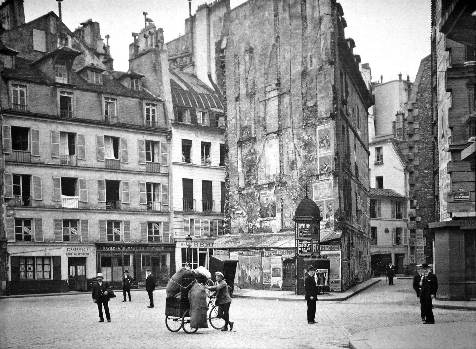
Without the colour, we are left with a somewhat drab and gloomy scene, befitting the somber mood associated with the early years of the early 20th century. In the B&W we cannot see the colour of the posters festooning the buildings. What is interesting is that we are likely not use to seeing colour photographs from before the 1950s. It’s almost like we expect images from the before 1950 to be monochromatic, maybe because we perceive these years filled with hardship and suffering. But there is something unique about the monochrome domain.
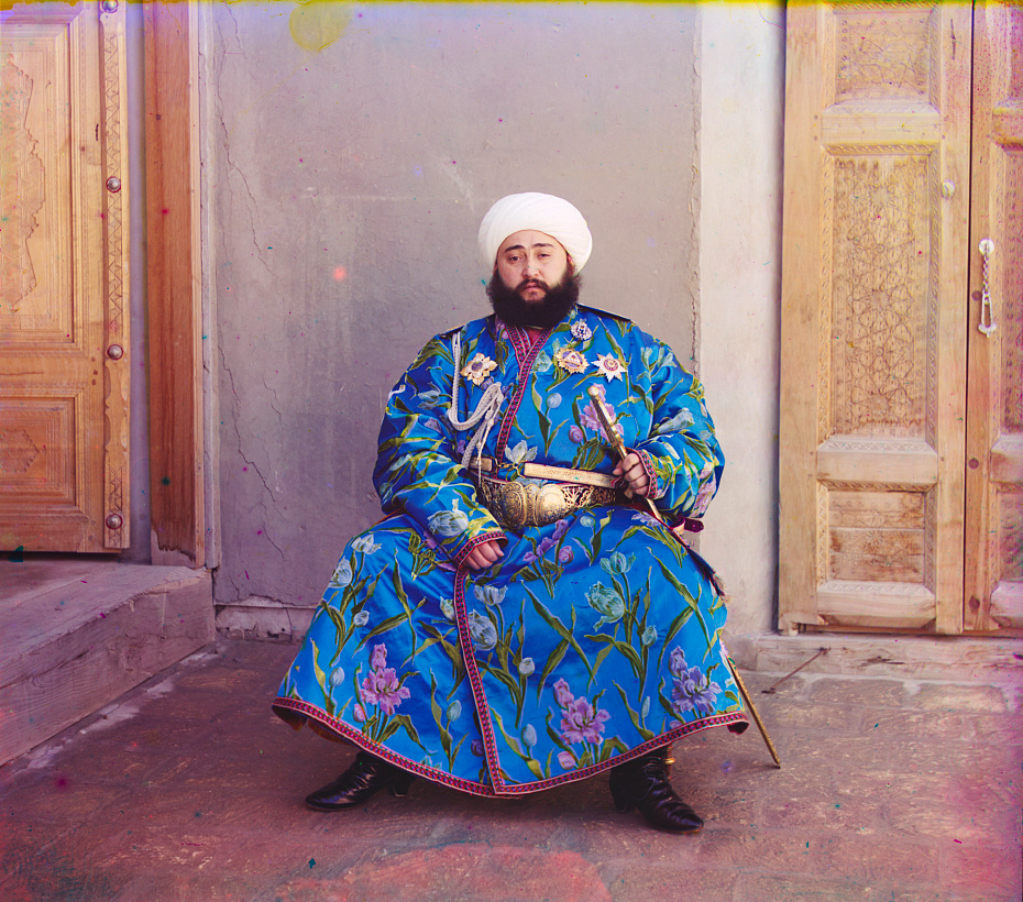
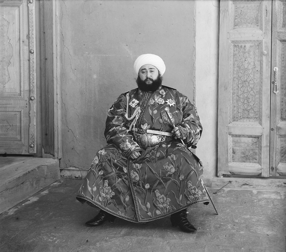
The aesthetic of black-and-white photographs is based on many factors, including lighting, any colour filters that were used during acquisition of the photograph, and the colour sensitivity of the B&W film. Sergei Mikhailovich Prokudin-Gorskii (1863-1944) was a man well ahead of his time. He developed an early technique for taking colour photographs involving a series of monochrome photographs and colour (R-G-B) filters. The images below show an example of Alim Khan, Emir of Bukhara. It is shown in comparison with two grayscale renditions of the photograph. The first is the lightness component from the Lab colour space, and the second is a grayscale image extracted from RGB using G=0.299R+0.587G+0.114B. Both offer a different perspective of how the colour in the image could be rendered by the camera. None present the vibrance of the image in the same way as the colour image.