Photography in the 21st century is interesting because of all the fuss made about megapixels and sharp glass. But none of the tools of photography matter unless you have an innate understanding of light. For it is light that makes a picture. Without light, the camera is blind, capable of producing only dark unrecognizable images. Sure, artificial light could be used, but photography is mostly about natural light. It is light that provides colour, helps interpret contrast, determines brightness and darkness, and also tone, mood, and atmosphere. However in our everyday lives, light is often taken somewhat fore granted.
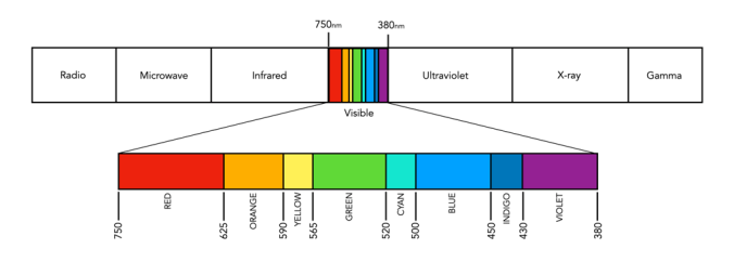
One of the most important facets of light is colour. Colour begins and ends with light; without light, i.e. in darkness, there is no colour. Light is an attribute of a big family of “waves” that starts with wavelengths of several thousand kilometres, including the likes of radio waves, heat radiation, infrared and ultraviolet waves, and X rays, and ends with gamma radiation of radium and cosmic rays with wavelengths so short that they have to be measured in fractions of a millionth part of a millimeter. Visible light is of course that part of the spectrum which the human eyes are sensitive to, ca. 400-700nm. For example the wavelength representing the colour green has values in the range 500-570nm.
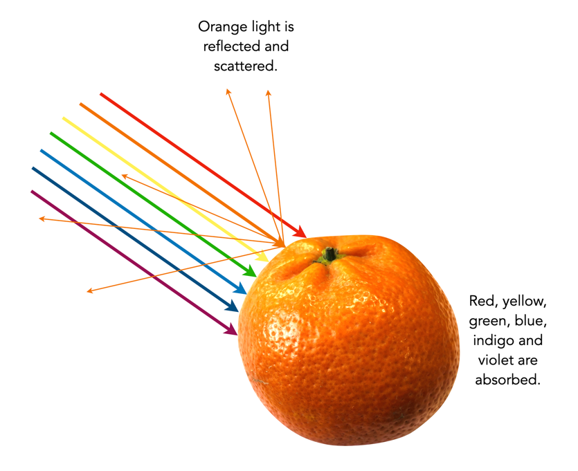
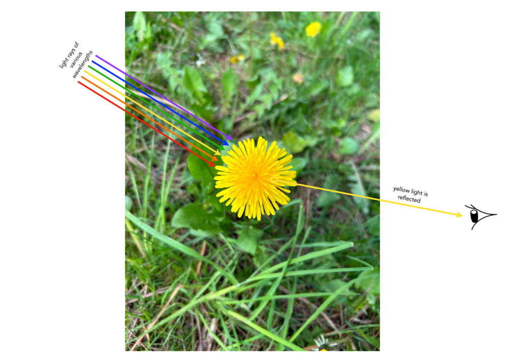
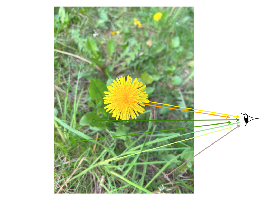
It is this visible light that builds the colour picture in our minds, or indeed that which we take with a camera. An object will be perceived as a certain colour because it absorbs some colours (or wavelengths) and reflects others. The colours that are reflected are the ones we see. For example the dandelion in the image below looks yellow because the yellow petals in the flower have absorbed all wavelengths of colour except yellow, which is the only colour reflected. If only pure red light were shone onto the dandelion, it would appear black, because the red would be absorbed and there would be no yellow light to be reflected. Remember, light is simply a wave with a specific wavelength or a mixture of wavelengths; it has no colour in and of itself. So technically, there is really no such thing as yellow light, rather, there is light with a wavelength of about 590nm that appears yellow. Similarly, the grass in the image reflects green light.
The colour we interpret will also be different based on the time of day, lighting, and many other factors. Another thing to consider with light is its colour temperature. Colour temperature uses numerical values in degrees Kelvin to measure the colour characteristics of a light source on a spectrum ranging from warm (orange) colours to cool (blue) colours. For example natural daylight has a temperature of about 5000 Kelvin, whereas sunrise/sunset can be around 3200K. Light bulbs on the other hand can range anywhere from 2700K to 6500K. A light source that is 2700K is considered “warm” and generally emits more wavelengths of red, whereas a 6500K light is said to be “cool white” since it emits more blue wavelengths of light.
Q: How many colours exist in the visible spectrum?
A: Technically, none. This is because the visible spectrum is light, with a wavelength (or frequency), not colour per se. Colour is a subjective, conscious experience which exists in our minds. Of course there might be an infinite number of wavelengths of light, but humans are limited in the number they can interpret.
Q: Why is the visible spectrum described in terms of 7 colours?
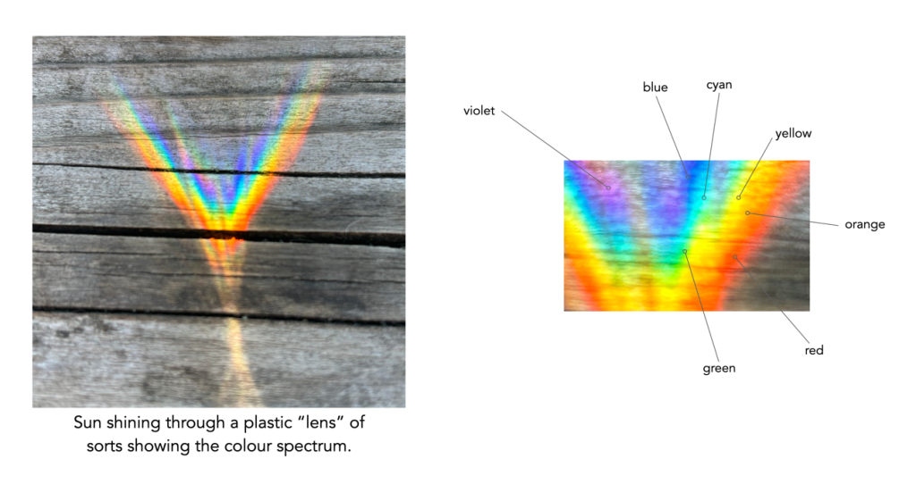
A: We tend to break the visible spectrum down into seven colours: red, orange, yellow, green, blue, indigo, and violet. Passing a ray of white light through a glass prism, splits it into seven constituent colours, but these are somewhat arbitrary as light comes as a continuum, with smooth transitions between colours (it was Isaac Newton that first divided the spectrum into 6, then 7 named colours). There are now several different interpretations of how spectral colours have been categorized. Some modern ones have dropped indigo, or have replaced it with cyan.
Q: How is reflected light interpreted as colour?
A: Reflected light is interpreted by both camera sensors, film, and the human eye by filtering the light, to interpret the light in terms of the three primary colours: red, green, and blue (see: The basics of colour perception).