What is a pixel?

So camera sensors don’t have pixels, but what is a pixel?

A pixel is short for picture element, and represents the essential building block of images. The term was first coined in 1965, in two different academic articles in SPIE Proceedings in 1965, written by Fred C. Billingsley of Caltech’s Jet Propulsion Laboratory. An alternative, pel, was introduced by William F. Schreiber of MIT in the Proceedings of the IEEE in 1967 (but it never really caught on).

Pixels are square in shape. In the context of digital cameras, a pixel is derived from the digitization of a signal from a sensor photosite. Pixels come together in a rectangular grid to form an image. An image is somewhat like a mosaic in structure. Each pixel provides data for representing the entire picture being digitized. 

Picture showing relationship between an image and a pixel.

What are the characteristics of a pixel? Firstly a pixel is dimensionless. Pixels are not visible unless an image is overly enlarged, and their perceived “size” is directly related to the size of pixels on a physical device. An image shown on a mobile device will be deemed to have smaller pixels than an image shown on a 4K television.

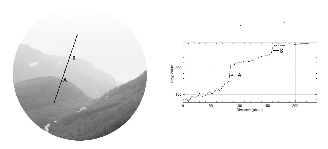
Pixels have a value associated with them which represents their “colour”. This value relates to luminance in the case of a grayscale image, with a pixel taking a value between black (0) and white (255). In the case of a colour image this is both luminance and chrominance. A pixel in a colour image typically has three components, one for Red, one for Green, and one for Blue, or RGB – when the values are combined they derive a single colour.

The precision to which a pixel can specify colour is called its bit depth or colour depth. For example a typical grayscale image is 8-bit, or contains 2^8=256 shades of gray. A typical colour image is 24-bit, or 8 bits for each of Red, Green and Blue, providing 2^24 or 16,777,216 different colours.

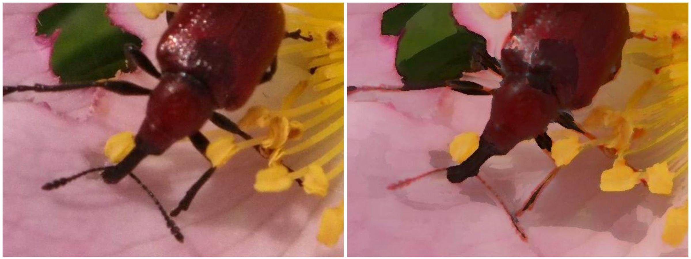
A single pixel considered in isolation conveys information on the luminance and/or chrominance of a single location in an image. A group of pixels with similar characteristics, e.g. chrominance or luminance, can coallesc together to form an object. A pixel is surrounded by eight neighbouring pixels, four of which are direct, or adjacent, neighbours, and four of which are indirect or diagonal neighbours.

pixel neighbours
Pixel neighbours: The red pixels are the direct neighbours, while the blue pixels are the indirect neighbours.

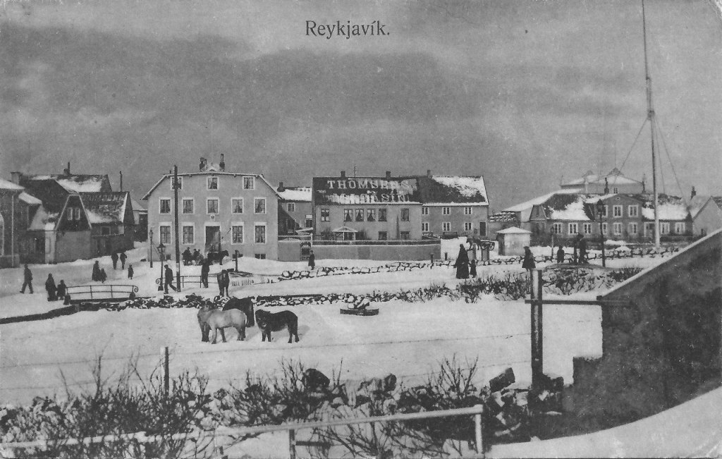
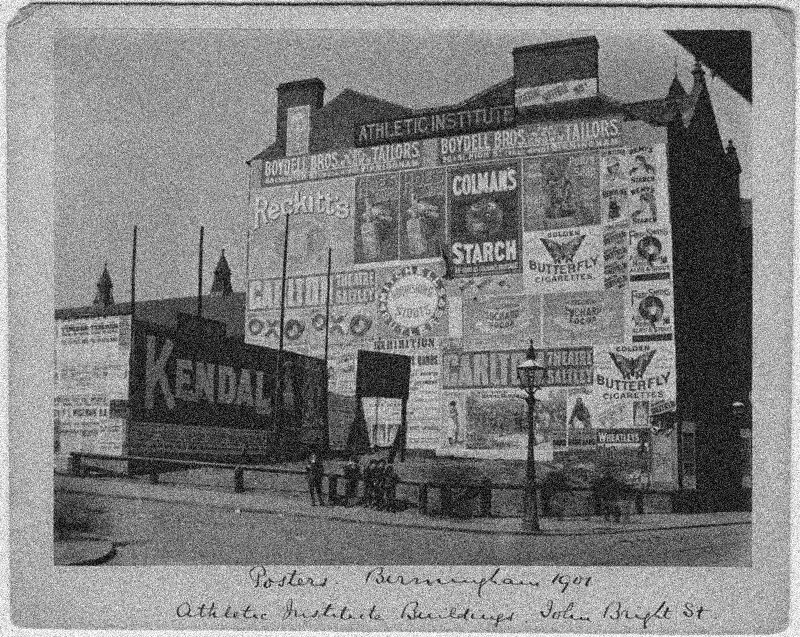
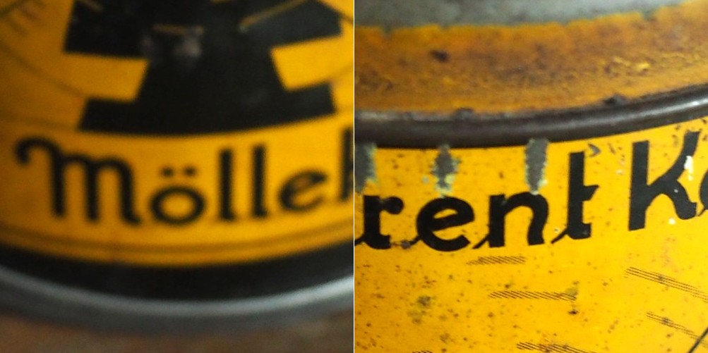
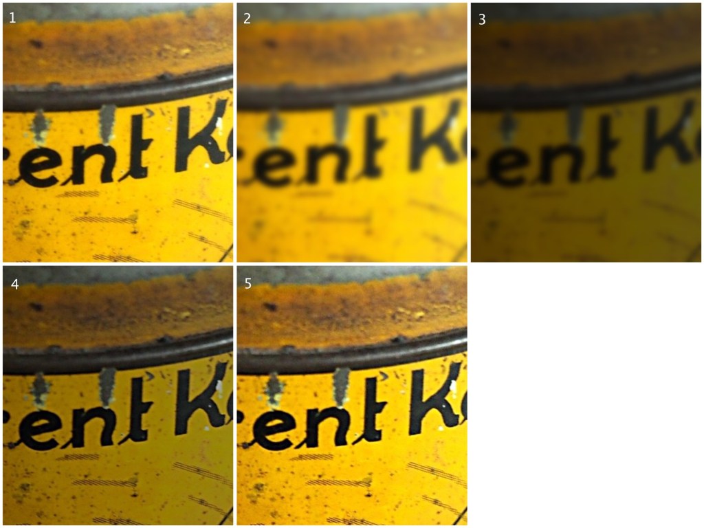
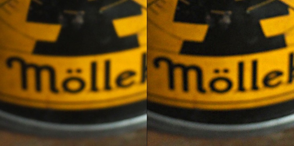
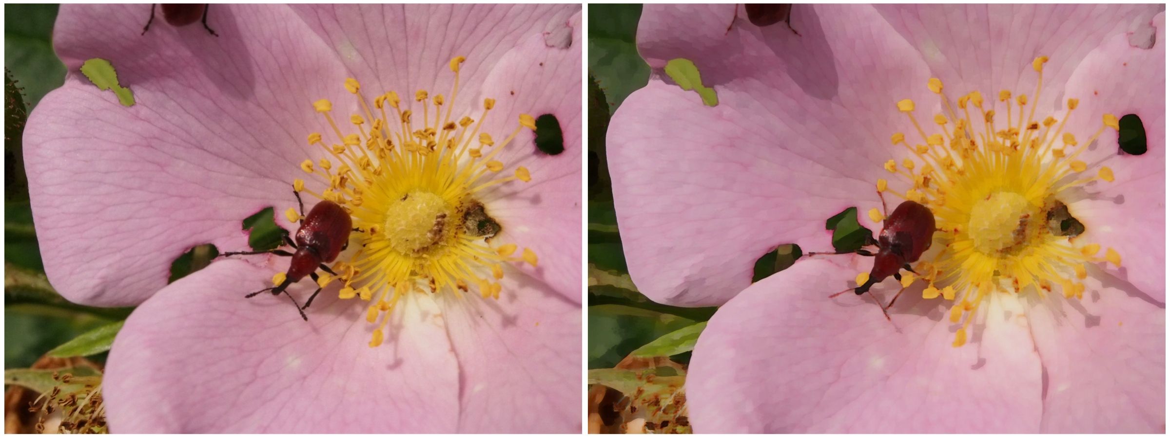
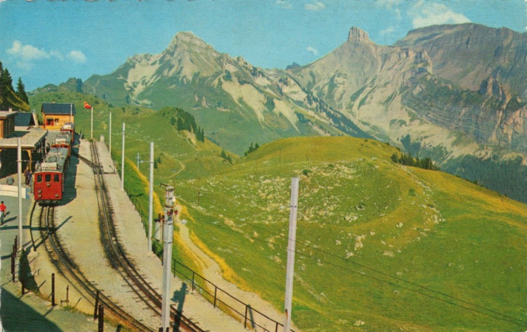
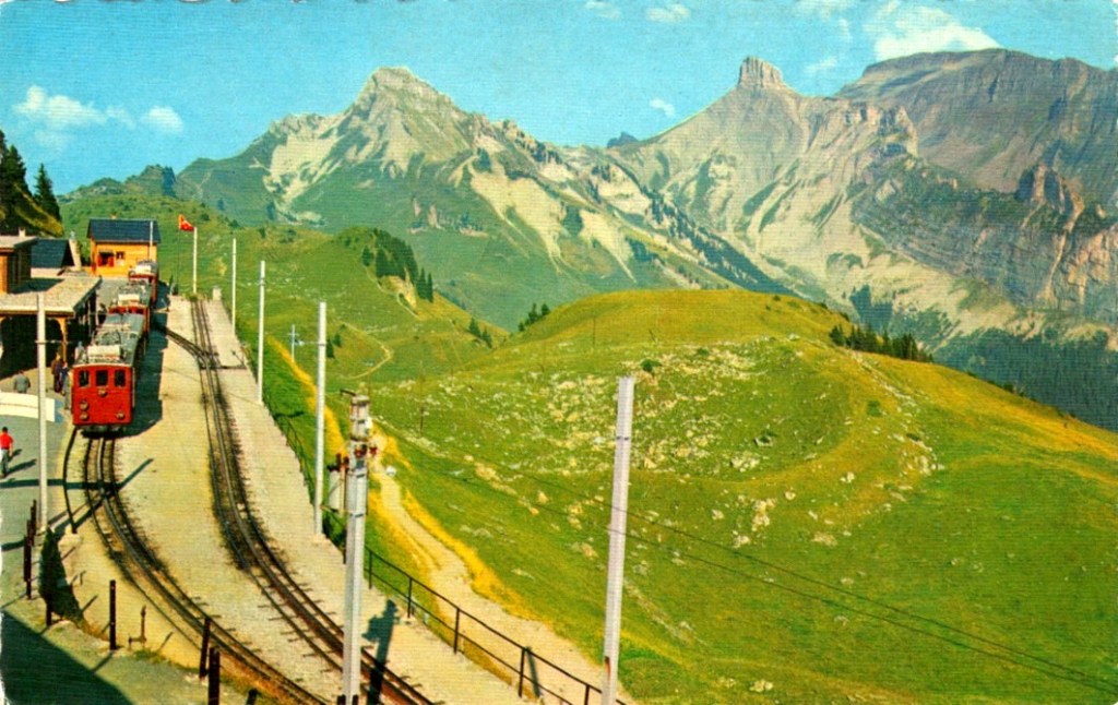
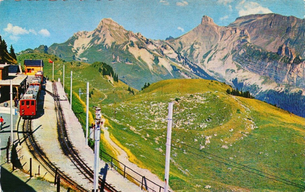
The more pixels an image contains, the more detail it has the ability to describe. This is known as image resolution. Consider the two pictures of the word “Leica” below. The high resolution version has 687×339 pixels, whereas the low resolution image is 25% of its size, at 171×84 pixels. The high resolution image has more pixels, and hence more detail.


Image enhancement (4) : Contrast enhancement

Contrast enhancement is applied to images where there is a lack of “contrast”. Lack of contrast manifests itself as a dull or lacklustre appearance, and can often be identified in image histograms.  Improving contrast, and making an image more visually (or aesthetically) appealing is incredibly challenging. This is in part because the result of contrast enhancement truly is a very subjective thing. This is even more relevant with colour images, as modifications to a colour, can impact different people differently. What ideal colour green should trees be? Here is a brief example grayscale image and its intensity histogram.

A picture of Reykjavik from a vintage postcard

It is clear from the histogram that the intensity values do not span the entire range of values, effectively reducing the contrast in the image. Some parts of the image that could be brighter, are dull, and other parts of the image that could be darker, are lightened. Stretching both ends of the histogram out, effectively improves the contrast in the image.

The picture enhanced by stretching the histogram, and improving the contrast

This is the simplest way of enhancing the contrast of an image, although the level of contrast enhancement applied is always guided by the visual perception of the person performing the enhancement.

Image enhancement (3) : Noise suppression

Noise suppression may be one of the most relevant realms of image enhancement. There are all kinds of noise, and even digital photographs are not immune to it. Usually the algorithms that deal with noise are grouped into two categories: those that deal with spurious noise (often called shot or impulse noise), and those that deal with noise that can envelop a whole image (in the guise of Gaussian-type noise). A good example of the latter is the “film grain” often found in old photographs. Some might think this is not “true” noise, but it does detract from the visual quality of the image, so should be considered as such. In reality noise suppression is not as important in enhancing images from digital cameras because a lot of effort has been placed on in-camera noise suppression.

Below is an example of an image with Gaussian noise. This type of noise can be challenging to suppress because it is “ingrained” in the structure of the image.

Image with Gaussian noise

Here are some different attempts at trying  to suppress the noise in the image using different algorithms (many of these algorithms can be found as plug-ins to the software ImageJ):

  • A Gaussian blurring filter (σ=3)
  • A median filter (radius=3)
  • The Perona-Malik Anisotropic Diffusion filter
  • Selective mean filter
Examples of noise suppressed using various algorithms.

To show the results, we will look at the extracted regions from some of the algorithmic results compared to the original noisy image:

Images: (A) Noisy images, (B) Perona-Malik, (C) Gaussian blur, (D) Median filter

It is clear the best results are from the Perona-Malik Anisotropic Diffusion filter [1], which has suppressed the noise whilst preserving the outlines of the major objects in the image. The median filter has performed second best, although there is some blurring which has occurred in the processed image, which letters in the poster starting to merge together. Lastly, the Gaussian blurring has obviously suppressed the noise, whilst incorporating significant blur into the image.

Suppressing noise in an image is not a trivial task. Sometimes it is a tradeoff between the severity of the noise, and the potential to blur out fine details.

[1] Perona, P.,  Malik, J., “Scale-space and edge detection using anisotropic diffusion”, In: Proceedings of IEEE Computer Society Workshop on Computer Vision,. pp.16–22. (1987)

Image enhancement (2) : the fine details (i.e. sharpening)

More important than most things in photography is acuity – which is really just a fancy word for sharpness, or even image crispness. Photographs can be blurry for a number of reasons, but usually they are all trumped by lack of proper focusing, which adds a softness to an image. Now in a 3000×4000 pixel image, this blurriness may not be that apparent – and will only manifest itself when an enlargement is made of a section of the image. In terms of photographing landscapes, the overall details in the image may be crisp, however small objects may “seem” blurry, because they are small, and lack detail in any case. Sharpening will also fail to fix large blur artifacts – i.e. it’s not going to remove defocus from a photograph which was not properly focused. It is ideal for making fine details crisper.

Photo apps and “image editing” software often contains some means of improving the sharpness of images. Usually by means of the “cheapest” algorithm in existence – “unsharp masking”. It works by subtracting  a “softened” copy of an image from the original. And by softened, I mean blurred. It basically reduces the lower frequency components of the image. But it is no magical panacea. If there is noise in an image, it too will be attenuated. The benefit of sharpening can often be seen best on images containing fine details. Here are examples of three different types of sharpening algorithms on an image with a lot of fine detail.

Sharpening: original (top-L); USM (top-R); CUSM (bot-L); MS (bot-R)

Three filters are shown here are (i) Unsharp masking (USM), (ii) Cubic Unsharp masking (CUSM) and (iii) Morphological sharpening (MS). Each of these techniques has its benefits and drawbacks, and the final image with improved acuity can only really be judged through visual assessment. Some algorithms may be more attune to sharpening large nonuniform regions (MS), whilst others (USM, CUSM) may be more aligned with sharpening fine details.

Image enhancement (1) : The basics

Image enhancement involves improving the perceived quality of an image, either for the purpose of aesthetic appeal, or for further processing. Therefore you are either enhancing features within an image, or suppressing artifacts. The basic forms of enhancement include:

  • contrast enhancement: enhancing the overall contrast of an image, to improve dynamic range of intensities.
  • noise suppression: reducing the effect of noise contained within an image
  • sharpening: improving the acuity of features within an image.

These relate to both monochromatic grayscale and colour images (there are additional mechanisms for colour images to deal with enhancing colour). The trick with these enhancement mechanisms is determining when they have achieved the required effect. In image processing this is often a case of the rest being “in the eye of the beholder”. A photograph who’s colour has been enriched may seem pleasing to one person, and over saturated to another. To illustrate, consider the following example. This image is an 8-bit image that is 539×699 pixels in size.

Original Image

Here is the histogram of its pixel intensities:

From both the image and histogram, it is possible to discern that the image lacks contrast, with the majority of gray intensities situated between values 25 and 195. So one of the enhancements could be to improve its contrast. Here is the result of a simple histogram stretching:

Contrast enhancement by stretching the histogram

It may then be interesting to smooth noise in the image or, sharpen the image to enhance the letters in the advertising. The sub-image extracted from the above shows three different techniques.

Forms of image enhancement (sub-image extracted from contrast enhanced image): original (top-left), noise suppression using a 3×3 mean filter (top-right), image sharpening using unsharp masking (bottom-left), and unsharp masking applied after mean filtering (bottom-right).

Can blurry images be fixed?

Some photographs contain blur which is very challenging to remove. Large scale blur, which is the result of motion, or defocus can’t really be suppressed in any meaningful manner. What can usually be achieved by means of image sharpening algorithms is that finer structures in an image can be made to look more crisp. Take for example the coffee can image shown below, in which the upper lettering on the label in almost in focus, while the lower lettering has the softer appearance associated with de-focus.

The problem with this image is partially the fact that the blur is not uniform. Below are two regions enlarged:containing text from opposite ends of the blur spectrum.

Reducing blur, involves a concept known as image sharpening(which is different from removing motion blur, a much more challenging task). The easiest technique for image sharpening, and the one most often found in software such as Photoshop is known as unsharp masking. It is derived from analog photography, and basically works by subtracting a blurry version of the original image from the original image. It is by no means perfect, and is problematic in images where there is noise, as it tends to accentuate the noise, but it is simple.

Here I am using the “Unsharp Mask” filter from ImageJ. It subtracts a blurred copy of the image and rescales the image to obtain the same contrast of low frequency structures as in the input image. It works in the following manner:

  1. Obtain a Gaussian blurred image, by specifying a blur radius (in the example below the radius = 5).
  2. Filter the blurred image using a “Mask Weight, which determines the strength of filtering. A value from 0.1-0.9. (In the example below, the mask weight =0.4)
  3. Subtract the filtering image from the original image.
  4. Divide the resulting image by (1.0-mask weight) – 0.6 in the case of the example.
1. Original image; 2. Gaussian blurred image (radius=5); 3. Filtered image (multiplied by 0.4); 4. Subtracted image (original-filtered); 5. Final image (subtracted image / 0.6)

If we compare the resulting images, using an enlarged region, we find the unsharp masking filter has slightly improved the sharpness of the text in the image, but this may also be attributed to the slight enhancement in contrast. This part of the original image has less blur though, so let’s apply the filter to the second image.

The original image (left) vs. the filtered image (right)

Below is the result on the second portion of the image. There is next to no improvement in the sharpness of the image. So while it may be possible to slightly improve sharpness, where the picture is not badly blurred, excessive blur is impossible to “remove”. Improvements in acuity may be more to the slight contrast adjustments and how they are perceived by the eye.

More on Mach bands

Consider the following photograph, taken on a drizzly day in Norway with a cloudy sky, and the mountains somewhat obscured by mist and clouds.

Now let’s look at the intensity image (the colour image has been converted to 8-bit monochrome):

If we look at a region near the top of the mountain, and extract a circular region, there are three distinct regions along a line. To the human eye, these appear as quite uniform regions, which transition along a crisp border. In the profile of a line through these regions though, there are two “cliffs” (Aand B) that marks the shift from one region to the next. Human eyes don’t perceive these “cliffs”.

The Mach bands is an illusion that suggests edges in an image where in fact the intensity is changing in a smooth manner.

The downside to Mach bands is that they are an artificial phenomena produced by the human visual system. As such, it might actually interfere with visual inspection to determine the sharpness contained in an image.

Mach bands and the perception of images

Photographs, and the results obtained through image processing are at the mercy of the human visual system. A machine cannot interpret how visually appealing an image is, because aesthetic perception is different for everyone. Image sharpening takes advantage of one of the tricks of our visual system. Human eyes see what are termed “Mach bands” at the edges of sharp transitions, which affect how we perceive images. This optical illusion was first explained by Austrian physicist and philosopher Ernst Mach (1838–1916) in 1865. Mach discovered how our eyes leverage the use of contrast to compensate for its inability to resolve fine detail. Consider the image below containing ten squares of differing levels of gray.

Notice how the gray squares appear to scallop, with a lighter band on the left, and a darker band on the right of the squares? This is an optical illusion, in fact the gray squares are all uniform in intensity. To resolve the brain/eyes deficiency in being able to resolve detail, incoming light gets processed in such a manner than the contrast between two different tones is exaggerated. This gives the perception of more detail. The dark and light bands seen on either side of the gradation are the Mach bands. Here is an example of what human eyes see:

What does this have to do with manipulation techniques such as image sharpening? The human brain perceives exaggerated intensity changes near edges – so image sharpening uses this notion to introduce faux Mach bands by amplifying intensity edges. Consider as an example the following  image, which basically shows two mountain sides, one behind the other. Without looking too closely you can see the Mach bands.

Taking a profile perpendicular to the mountain sides provides an indication of the intensity values along the profile, and shows the edges.

The profile shows three plateaus, and two cliffs (the cliffs are ignored by the human eyes). The first plateau is the foreground mountainside, the middle plateau is the mountainside behind that, and the uppermost plateau is some cloud cover. Now we apply an unsharp masking filter to the image, to sharpen the image (radius=10, mask weight=0.4)

Notice how the UM filter has the effect of adding a Mach band to each of the cliff regions.

Creating art-like effects in photographs

Art-like effects are easy to create in photographs. The idea is to remove textures, and sharpen edges in a photograph to make it appear more like abstract art. Consider the image below. An art-like effect has been created on this image using a filter known as Kuwahara. It has the effect of homogenizing regions of colour, hence you will notice a loss of detail within the image, and colours within a region. It was originally designed to process angiocardiographic images. The usefulness of filters such as Kuwahara is that they remove detail and  increase abstraction. Another example of such a filter is the bilateral filter.

Image (before) and (after)

The Kuwahara is based on local area “flattening”, removing detail in high-contrast regions while protecting shape boundaries in low-contrast areas. The only issue with Kuwahara is that is can produce somewhat “blocky” results. Choosing a different shaped “neighbourhood” will have a different affect on the image. A close-up view of the beetle in the image above shows the distinct edges of the processed image. Note also how some of the features have changed colour slightly (the beetles legs have transformed from dark brown to a pale brown colour), due to the influence of the surrounding pink petal colour.

Close-up detail (before) and (after)

Filters like Kuwahara are also used to remove noise from images.

The perception of enhanced colour images

Image processing becomes more difficult when you involve colour images. That’s primarily because there is more data involved. With monochrome images, there is really only intensity. With colour images comes chromaticity – and the possibility of modifying the intrinsic colours within an image whilst performing some form of image enhancement. Often, image enhancement in colour images is challenging because the impact of the enhancement is very subjective.

Consider this image of Schynige Platte in Switzerland. It is very colourful, and seems quite vibrant.

The sky however seems too aquamarine. The whole picture seems like some sort of “antique photo filter” has been applied to it. How do we enhance it, and what do we want to enhance? Do we want to make the colours more vibrant? Do we want to improve the contrast?

In the first instance, we merely stretch the histogram to reduce the gray tonality of the image. Everything becomes much brighter, and there is a slight improvement in contrast. There are parts of the image that do seem too yellow, but it is hard to know whether this is an artifact of the original scene, or the photograph (likely an artifact of dispersing yellow flower petals).

Alternatively, we can improve the images contrast. In this case, this is achieved by applying a Retinex filter to the image, and then taking the average of the filter result and the original image. The resulting image is not as “bright”, but shows more contrast, especially in the meadows.

Are either of these enhanced images better? The answer of course is in the eye of the beholder. All three images have certain qualities which are appealing. At the end of the day, improving the aesthetic appeal of a colour image is not an easy task, and there is no “best” algorithm.