Why are there no 3D colour histograms?

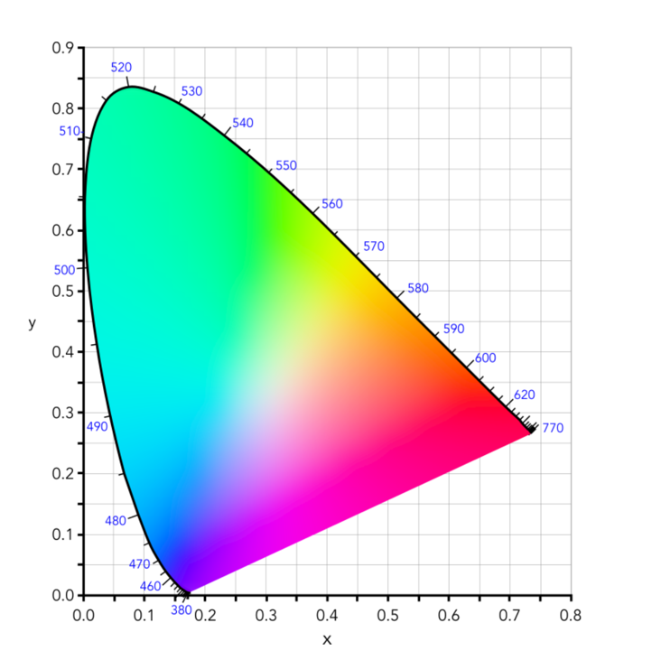
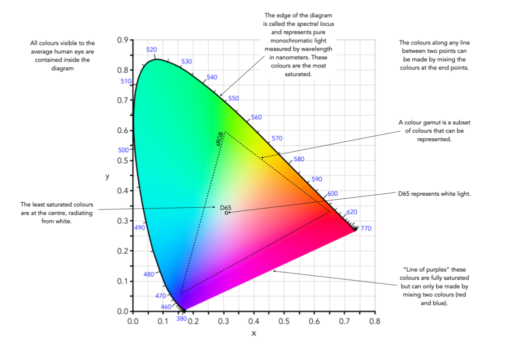
Some people probably wonder why there aren’t any 3D colour histograms. I mean if a colour image is comprised of red, green, and blue components, why not provide those in a combined manner rather than separate 2D histograms or a single 2D histogram with the R,G,B overlaid? Well, it’s not that simple.

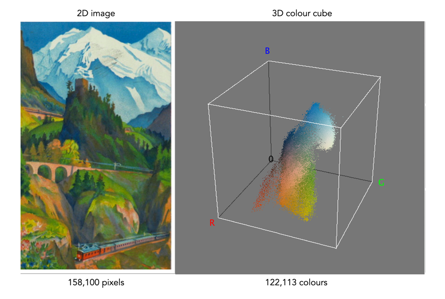
A 2D histogram has 256 pieces of information (grayscale). A 24-bit colour image contains 2563 colours in it – that’s 16,777,216 pieces of information. So a three-dimensional “histogram” would contain the same number of elements. Well, it’s not really a histogram, more of a 3D representation of the diversity of colours in the image. Consider the example shown in Figure 1. The sample image contains 428,763 unique colours, representing just 2.5% of all available colours. Two different views of the colour cube (rotated) show the dispersion of colours. Both show the vastness of the 3D space, and conversely the sparsity of the image colour information.

Figure 1: A colour image and 3D colour distribution cubes shown at different angles

It is extremely hard to create a true 3D histogram. A true 3D histogram would have a count of the number of pixels with a particular RGB triplet at every point. For example, how many times does the colour (23,157,87) occur? It’s hard to visualize this in a 3D sense, because unlike the 2D histogram which displays frequency as the number of occurrences of each grayscale intensity, the same is not possible in 3D. Well it is, kind-of.

In a 3D histogram which already uses the three dimensions to represent R, G, and B, there would have to be a fourth dimension to hold the number of times a colour occurs. To obtain a true 3D histogram, we would have to group the colours into “cells” which are essentially clusters representing similar colours. An example of the frequency-weighted histogram with for the image in Figure 2, using 500 cells, is shown in Figure 2. You can see that while in the colour distribution cube in Figure 1 shows a large band of reds, because these colours exist in the image, the frequency weighted histogram shows that objects with red colours actually comprise a small number of pixels in the image.

Figure 2: The frequency-distributed histogram of the image in Fig.1

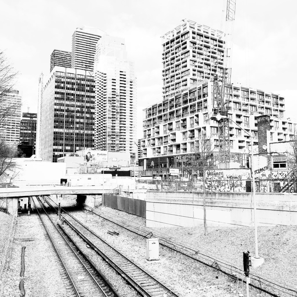
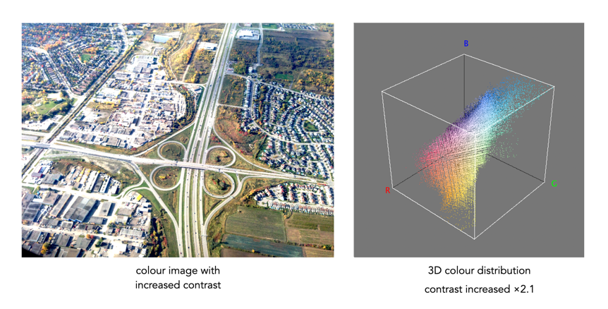
The bigger problem is that it is quite hard to visualize a 3D anything and actively manipulate it. There are very few tools for this. Theoretically it makes sense to deal with 3D data in 3D. The application ImageJ (Fiji) does offer an add-on called Color Inspector 3D, which facilitates viewing and manipulating an image in 3D, in a number of differing colour spaces. Consider another example, shown in Figure 3. The aerial image, taken above Montreal lacks contrast. From the example shown, you can see that the colour image takes up quite a thin band of colours, almost on the black-white diagonal (it has 186,322 uniques colours).

Figure 3: Another sample colour image and its 3D colour distribution cube

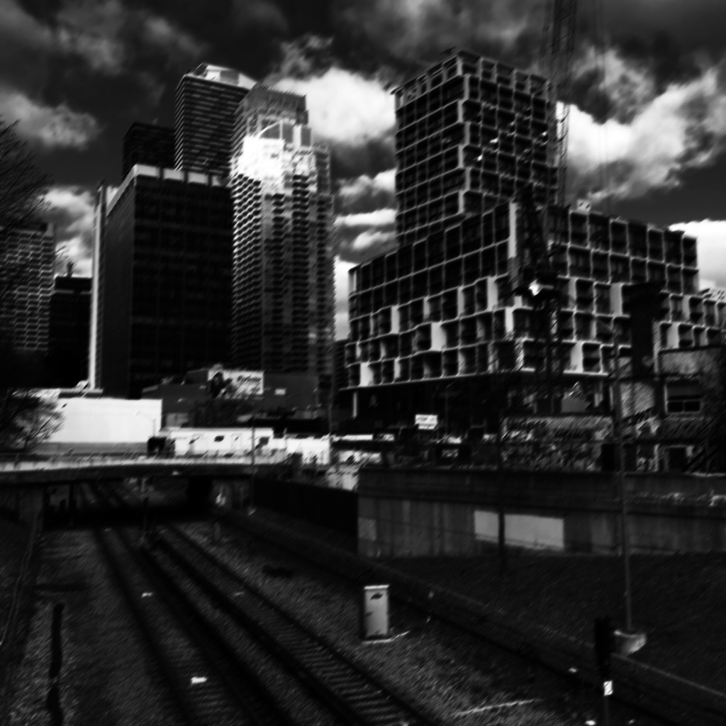
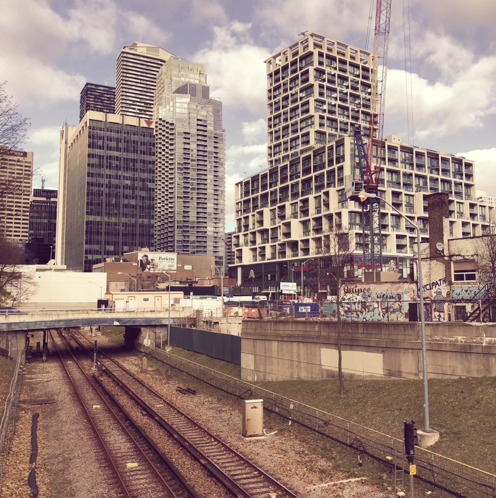
Using the contrast tool provided in ImageJ, it is possible to manipulate the contrast in 3D. Here we have increased the contrast by 2.1 times. You can easily see the result in Figure 4. difference working in 3D makes. This is something that is much harder to do in two dimensions, manipulating each colour independently.

Figure 4: Increasing contrast via the 3D cube

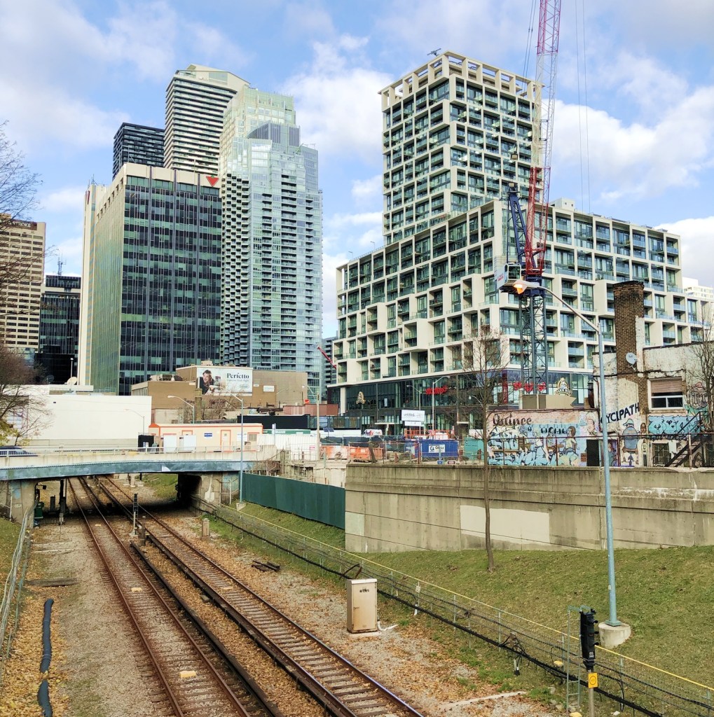
Another example of increasing colour saturation 2 times, and the associated 3D colour distribution is shown in Figure 5. The Color Inspector 3D also allows viewing and manipulating the image in other colour spaces such as HSB and CieLab. For example in HSB the true effect of manipulating saturation can be gauged. The downside is that it does not actually process the full-resolution image, but rather one reduced in size, largely because I imagine it can’t handle the size of the image, and allow manipulation in real-time.

Figure 5: Increasing saturation via the 3D cube

the image histogram (ii) – grayscale vs colour

In terms of image processing there are two basic types of histogram: (i) colour, and (ii) intensity (or luminance/grayscale) histograms. Figure 1 shows a colour image (an aerial shot of Montreal), and its associated RGB and intensity histograms. Colour histograms are essentially RGB histograms, typically represented by three separate histograms, one for each of the components – Red, Green, and Blue. The three R,G,B histograms are sometimes shown in one mixed histogram with all three R,G,B, components overlaid with one another (sometimes including an intensity histogram).

Fig.1: Colour and grayscale histograms

Both RGB and intensity histograms contain the same basic information – the distribution of values. The difference lies in what the values represent. In an intensity histogram, the values represent the intensity values in a grayscale image (typically 0 to 255). In an RGB histogram, divided into individual R, G, B histograms, each colour channel is just a graph of the frequencies of each of the RGB component values of each pixel.

An example is shown in Figure 2. Here a single pixel is extracted from an image. The RGB triplet for the pixel is (230,154,182) i.e. it has a red value of 230, a green value of 154, and a blue value of 182. Each value is counted in its respective bin in the associated component histogram. So red value 230 is counted in the bin marked as “230” in the red histogram. The three R,G, B histograms are visually no different than an intensity histogram. The individual R, G, and B histograms do not represent distributions of colours, but merely distributions of components – for that you need a 3D histogram (see bottom).

Fig.2: How an RGB histogram works: From single RGB pixel to RGB component histograms

Applications portray colour histograms in many different forms. Figure 3 shows the RGB histograms from three differing applications: Apple Photos, ImageJ, and ImageMagick. Apple Photos provides the user with the option of showing the luminance histogram, the mixed RGB, or the individual R, G, B histograms. The combined histogram shows all the overlaid R, G, B histograms, and a gray region showing where all three overlap. ImageJ shows the three components in separate histograms, and ImageMagick provides an option for their combined or separate. Note that some histograms (ImageMagick) seem a little “compressed”, because of the chosen x-scale.

Fig.3: How RGB histograms are depicted in applications

One thing you may notice when comparing intensity and RGB histograms is that the intensity histogram is very similar to the green channel or the RGB image (see Figure 4). The human eye is more sensitive to green light than red or blue light. Typically the green intensity levels within an image are most representative of the brightness distribution of the colour image.

Fig.4: The RGB-green histogram verus intensity histogram

An intensity image is normally created from an RGB image by converting each pixel so that it represents a value based on a weighted average of the three colours at that pixel. This weighting assumes that green represents 59% of the perceived intensity, while the red and blue channels account for just 30% and 11%, respectively. Here is the actual formula used:

gray = 0.299R + 0.587G + 0.114B

Once you have a grayscale image, it can be used to derive an intensity histogram. Figure 5 illustrates how a grayscale image is created from an RGB image using this formula.

Fig.5: Deriving a grayscale image from an RGB image

Honestly there isn’t really that much useful data in RGB histograms, although they seem to be very common in image manipulation applications, and digital cameras. The problem lies with the notion of the RGB colour space. It is a space in which chrominance and luminance are coupled together, and as such it is difficult to manipulate any one of the channels without causing shifts in colour. Typically, applications that allow manipulation of the histogram do so by first converting the image to a decoupled colour space such as HSB (Hue-Saturation-Brightness), where the brightness can be manipulated independently of the colour information.

A Note on 3D RGB: Although it would be somewhat useful, there are very few applications that provide a 3D histogram, constructed from the R, G, and B information. One reason is that these 3D matrices could be very sparse. Instead of three 2D histograms, each with 256 pieces of information, there is now a 3D histogram with 2563 or 16,777,216 pieces of information. The other reason is that 3D histograms are hard to visualize.

What is an RGB colour image?

Most colour images are stored using a colour model, and RGB is the most commonly used one. Digital cameras typically offer a specific RGB colour space such as sRGB. It is commonly used because it is based on how humans perceive colours, and has a good amount of theory underpinning it. For instance, a camera sensor detects the wavelength of light reflected from an object and differentiates it into the primary colours red, green, and blue.

An RGB image is represented by M×N colour pixels (M = width, N = height). When viewed on a screen, each pixel is displayed as a specific colour. However, deconstructed, an RGB image is actually composed of three layers. These layers, or component images are all M×N pixels in size, and represent the values associated with Red, Green and Blue. An example of an RGB image decoupled into its R-G-B component images is shown in Figure 1. None of the component images contain any colour, and are actually grayscale. An RGB image may then be viewed as a stack of three grayscale images. Corresponding pixels in all three R, G, B images help form the colour that is seen when the image is visualized.

A Decoupled RGB image
Fig.1: A “deconstructed” RGB image

The component images typically have pixels with values in the range 0 to 2B-1, where B is the number of bits of the image. If B=8, the values in each component image would range from 0..255. The number of bits used to represent the pixel values of the component images determines the bit depth of the RGB image. For example if a component image is 8-bit, then the corresponding RGB image would be a 24-bit RGB image (generally the standard). The number of possible colours in an RGB image is then (2B)3, so for B=8, there would be 16,777,216 possible colours.

Coupled together, each RGB pixel is described using a triplet of values, each of which is in the range 0 to 255. It is this triplet value that is interpreted by the output system to produce a colour which is perceived by the human visual system. An example of an RGB pixel’s triplet value, and the associated R-G-B component values is shown in Figure 2. The RGB value visualized as a lime-green colour is composed of the RGB triplet (193, 201, 64), i.e. Red=193, Green=201 and Blue=64.

Fig.2: Component values of an RGB pixel

One way of visualizing the R,G,B, components of an image is by means of a 3D colour cube. An example is shown in Figure 3. The RGB image shown has 310×510, or 158,100 pixels. Next to it is a colour cube with the three axes, R, G, and B, each with a range of values 0-255, producing a cube with 16,777,216 elements. Each of the images 122,113 unique colours is represented as a point in the cube (representing only 0.7% of available colours).

Fig 2 Example of colours in an RGB 3D cube

The caveat of the RGB colour model is that it is not a perceptual one, i.e. chrominance and luminance are not separated from one another, they are coupled together. Note that there are some colour models/space that are decoupled, i.e. they separate luminance information from chrominance information. A good example is HSV (Hue, Saturation, Value).

the image histogram (i) – what is it?

An image is really just a collection of pixels of differing intensities, regardless of whether it is a grayscale (achromatic) or colour image. Exploring the pixels collectively helps provide an insight into the statistical attributes of an image. One way of doing this is by means of a histogram, which represents statistical information in a visual format. Using a histogram it is easy to determine whether there are issues with an image, such as over-exposure. In fact histograms are so useful that most digital cameras offer some form of real-time histogram in order to prevent poorly exposed photographs. Histograms can also be used in post-processing situations to improve the aesthetic appeal of an image.

Fig.1: A colour image with its intensity histogram overlaid.

A histogram is simply a frequency distribution, represented in the form of a graph. An image histogram, sometimes called an intensity histogram, describes the frequency of intensity (brightness) values that occur in an image. Sometimes as in Figure 1, the histogram is represented as a bar graph, while other times it appears as a line graph. The graph typically has “brightness” on the horizontal axis, and “number of pixels” on the vertical axis. The “brightness” scale describes a series of values in a linear scale from 0, which represents black, to some value N, which represents white.

Fig.2: A grayscale image and its histogram.

A image histogram, H, contains N bins, with each bin containing a value representing the number of times an intensity value occurs in an image. So a histogram for a typical 8-bit grayscale image with 256 gray levels would have N=256 bins. Each bin in the histogram, H[i] represents the number of pixels in the image with intensity i. Therefore H[0] is the number of pixels with intensity 0 (black), H[1] the number of pixels with intensity 1, and so forth until H[255] which is the number of pixels with the maximum intensity value, 255 (i.e. white).

A histogram can be used to explore the overall information in an image. It provides a visual characterization of the intensities, but does not confer any spatial information, i.e. how the pixels physically relate to one another in the image. This is normal because the main function of a histogram is to represent statistical information in a compact form. The frequency data can be used to calculate the minimum and maximum intensity values, the mean, and even the median.

This series will look at the various types of histograms, how they can be used to produce better pictures, and how they can be manipulated to improve the aesthetics of an image.

Things to consider when choosing a digital camera

There is always a lot to think about when on the path to purchasing a new camera. In fact it may be one of the most challenging parts of getting started in photography, apart from choosing which lenses will be in your kit. It was frankly easier when there was less in the way of choices. You could make a list of 100 different things with which to compare cameras, but better to start with a simple series of things to consider.

Some people are likely swayed by fancy advertising, or cool features. Others think only of megapixels. There are of course many things to consider. This post aims to provide a simple insight into the sort of things you should consider when buying a digital camera. It is aimed at the pictorialist, or hobby/travel photographer. The first thing people think about when considering a camera is megapixels. These are important from a marketing perspective, mainly because they are a quantifiable number that can be sold to potential buyers. It is much harder to sell ISO or dynamic range. But megapixels aren’t everything, as I mentioned in a previous post, anywhere from 16-24 megapixels is fine. So if we move beyond the need for megapixels, what should we look for in a camera?

Perhaps the core requirement for a non-professional photographer is an understanding of what the camera is to be used for – landscapes, street photography, macro shooting, travel, blogging, video? This plays a large role in determining the type of camera from the perspective of the sensor. Full frame (FF) cameras are only required by the most dedicated of amateur photographers. For everyday shooting they can be far too bulky and heavy. At the other end of the spectrum is Micro-Four-Thirds (MFT), which is great for travelling because of it is compact size. In the middle are the cameras with APS-C sensors, sometimes often found in mirrorless cameras, and even compact fixed-lens format cameras. If you predominantly make videos, then a camera geared towards maybe less MP and more video features is essential. For street photography, perhaps something compact and unobtrusive. Many people also travel with a back-up camera, so there is that to consider as well.

Next is price, because obviously if I could afford it I would love a Leica… but in the real world it’s hard to justify. As the sensor gets larger, the price goes up accordingly. Large sensors cost more to make, and mechanisms such as image stabilization have to be scaled accordingly. Lenses for FF are also more expensive because they contain larger pieces of glass. It’s all relative – spend what you feel comfortable spending. It’s also about lifespan – how long will you use this camera? It was once about upgrading for more megapixels or fancy new features – it’s less about that now. Good cameras aren’t cheap – nothing in life is, neither are good lenses… but spend more for better quality and buy fewer lenses.

Then there are lenses. You don’t need dozens of them. Look at what lenses there are for what you want to do. You don’t need a macro lens if you are never going to take closeup shots, and fisheye lenses are in reality not very practical. Zoom lenses are the standard lenses supplied with many cameras, but the reality is a 24-80 is practical (although you honestly won’t use the telephoto function that much), anything beyond 80mm is likely not needed. Choose a good quality all round prime lens. There are also a variety of price points with lenses. Cheaper lenses will work fine but may not be as optically nice, have weather proofing or contain plastic instead of metal bodies. You can also go the vintage lens route – lots of inexpensive lenses to play with.

Now we get to the real Pandora’s Box – features. What extra features do you want? Are they features that you will use a lot? Focus stacking perhaps, for well focused macro shots. Manual focus helpers like focus peaking for use with manual lenses. High resolution mode? Image stabilization (IS)? I would definitely recommend IS but lean perhaps towards the in-body rather than the in-lens. In body means any lens will work with IS, even vintage ones. In lens is just too specialized and I favour less tech inside lenses. Features usually come at a price- battery drain, so think carefully about what makes sense for your particular situation.

So what to choose? Ultimately you can read dozens of reviews, watch reviews on YouTube, but you have to make the decision. If you’re unsure, try renting one for a weekend and try it out. There is no definitive guide to buying a digital camera, because there is so much to choose from, and everyone’s needs are so different.

Demystifying Colour (ix) : CIE chromaticity diagram

Colour can be divided up into luminosity and chromaticity. The CIE XYZ colour space was designed such that Y is a measure of the luminance of a colour. Consider a 3D plane is described by X=Y=Z=1, as shown in Figure 1. A colour point A=(Xa,Ya,Za) is then found by intersecting the line SA (S=starting point, X=Y=Z=0) with the plane formed within the CIE XYZ colour volume. As it is difficult to perceive 3D spaces, most chromaticity diagrams discard luminance and show the maximum extent of the chromaticity of a particular 2D colour space. This is achieved by dropping the Z component, and projecting back onto the XY plane.

Fig.1: CIE XYZ chromaticity diagram derived from CIE XYZ open cone.
Fig.2: RGB colour space mapped onto the chromaticity diagram

This diagram shows all the hues perceivable by the standard observer for various (x, y) pairs, and indicates the spectral wavelengths of the dominant single frequency colours. When Y is plotted against X for spectrum colours, it forms a horseshoe, or shark-fin, shaped diagram commonly referred to as the CIE chromaticity diagram where any (x,y) point defines the hue and saturation of a particular colour.

Fig.3: The CIE Chromaticity Diagram for CIE XYZ

The xy values along the curved boundary of the horseshoe correspond to the “spectrally pure”, fully saturated colours with wavelengths ranging from 360nm (purple) to 780nm (red). The area within this region contains all the colours that can be generated with respect to the primary colours on the boundary. The closer a colour is to the boundary, the more saturated it is, with saturation reducing towards the “neutral point” in the centre of the diagram. The two extremes, violet (360nm) and red (780nm) are connected with an imaginary line. This represents the purple hues (combinations of red and blue) that do not correspond to primary colours. The “neutral point” at the centre of the horseshoe (x=y=0.33) has zero saturation, and is typically marked as D65, and corresponds to a colour temperature of 6500K.

Fig.4: Some characteristics of the CIE Chromaticity Diagram

The Retinex algorithm for beautifying pictures

There are likely thousands of different algorithms out in the ether to “enhance” images. Many are just “improvements” of existing algorithms, and offer a “better” algorithm – better in the eyes of the beholder of course. Few are tested in any extensive manner, for that would require subjective, qualitative experiments. Retinex is a strange little algorithm, and like so many “enhancement” algorithms is often plagued by being described in a too “mathy” manner. The term Retinex was coined by Edwin Land [2] to describe the theoretical need for three independent colour channels to describe colour constancy. The word was a contraction or “retina”, and “cortex”. There is an exceptional article [3] on the colour theory written by McCann which can be found here.

The Retinex theory was introduced by Land and McCann [1] in 1971 and is based on the assumption of a Mondrian world, referring to the paintings by the dutch painter Piet Mondrian. Land and McCann argue that human color sensation appears to be independent of the amount of light, that is the measured intensity, coming from observed surfaces [1]. Therefore, Land and McCann suspect an underlying characteristic guiding human color sensation [1].

There are many differing algorithms for implementing Retinex. The algorithm illustrated here can be found in the image processing software ImageJ. This algorithm for Retinex is based on the multiscale retinex with colour restoration algorithm (MSRCR) – it combines colour constancy with local contrast enhancement. In reality it’s quite a complex little algorithm with four parameters, as shown in Figure 1.

Fig.1: ImageJ Retinex parameters
  • The Level specifies the distribution of the [Gaussian] blurring used in the algorithm.
    • Uniform treats all image intensities similarly.
    • Low enhances dark regions in the image.
    • High enhances bright regions in the image.
  • The Scale specifies the depth of the Retinex effect
    • The minimum value is 16, a value providing gross, unrefined filtering. The maximum value is 250. Optimal and default value is 240.
  • The Scale division specifies the number of iterations of the multiscale filter.
    • The minimum required is 3. Choosing 1 or 2 removes the multiscale characteristic and the algorithm defaults to a single scale Retinex filtering. A value that is too high tends to introduce noise in the image.
  • The Dynamic adjusts the colour of the result, with large valued producing less saturated images.
    • Extremely image dependent, and may require tweaking.

The thing with Retinex, like so many of its enhancement brethren is that the quality of the resulting image is largely dependent on the person viewing it. Consider the following, fairly innocuous picture of some clover blooms in a grassy cliff, with rock outcroppings below (Figure 2). There is a level of one-ness about the picture, i.e. perceptual attention is drawn to the purple flowers, the grass is secondary, and the rock, tertiary. There is very little in the way of contrast in this image.

clover in grass
Fig.2: A picture showing some clover blooms in a grassy meadow.

The algorithm is suppose to be able to do miraculous things, but that does involve a *lot* of tweaking the parameters. The best approach is actually to use the default parameters. Figure 3 shows Figure 2 processed with the default values shown in Figure 1. The image appears to have a lot more contrast in it, and in some cases features in the image have increased their acuity.

Fig.3: Retinex applied with default values.

I don’t find these processed images are all that useful when used by themselves, however averaging the image with the original produces an image with a more subdued contrast (see Figure 4), having features with increased sharpness.

Fig.4: Comparing the original with the averaged (Original and Fig.3)

What about the Low and High versions? Examples are shown below in Figures 5 and 6, for the Low and High settings respectively (with the other parameters used as default). The Low setting produces an image full of contrast in the low intensity regions.

Fig.5: Low
Fig.6: High

Retinex is quite a good algorithm for dealing with suppressing shadows in images, although even here there needs to be some serious post-processing in order to create an aesthetically pleasing. The picture in Figure 7 shows a severe shadow in a inner-city photograph of Bern (Switzerland). Using the Low setting, the shadow is suppressed (Figure 8), but the algorithm processes the whole image, so other details such as the sky are affected. That aside, it has restored the objects hidden in the shadow quite nicely.

Fig.7: Photograph with intense shadow
Fig.8: Shadow suppressed using “Low” setting in Retinex

In reality, Retinex acts like any other filter, and the results are only useful if they invoke some sense of aesthetic appeal. Getting the write aesthetic often involves quite a bit of parameter manipulation.

Further reading:

  1. Land, E.H., McCann, J.J., ” Lightness and retinex theory”, Journal of the Optical Society of America, 61(1), pp. 1-11 (1971).
  2. Land, E., “The Retinex,” American Scientist, 52, pp.247-264 (1964).
  3. McCann, J.J., “Retinex at 50: color theory and spatial algorithms, a review“, Journal of Electronic Imaging, 26(3), 031204 (2017)

The basics of the X-Trans sensor filter

Many digital cameras use the Bayer filter as a means of capturing colour information at the photosite level. Bayer filters have colour filters which repeat in 2×2 pattern. Some companies, like Fuji use a different type of filter, in Fuji’s case the X-Trans filter. The X-Trans filter appeared in 2012 with the debut of the Fuji X-Pro1.

The problem with regularly repeating patterns of coloured pixels is that they can result in moiré patterns when the photograph contains fine details. This is normally avoided by adding an optical low-pass filter in front of the sensor. This has the affect of applying a controlled blur on the image, so sharp edges and abrupt colour changes and tonal transitions won’t cause problems. This process makes the moiré patterns disappear, but at the expense of some image sharpness. In many modern cameras the sensor resolution often outstrips the resolving power of lenses, so the lens itself acts as a low-pass filter, and so the LP filter has been dispensed with.

Bayer (left) versus X-Trans colour filter arrays

C-Trans uses a more complex array of colour filters. Rather than the 2×2 RGBG Bayer pattern, the X-Trans colour filter uses a larger 6×6 array, comprised of differing 3×3 patterns. Each pattern has 55% green, 22.5% blue and 22.5% red light sensitive photosite elements. The main reason for this pattern was to eliminate the need for a low-pass filter, because this patterning reduces moiré. This theoretically strikes a balance between the presence of moiré patterns, and image sharpness.

The X-Trans filter provides a for better colour production, boosts sharpness, and reduces colour noise at high ISO. On the other hand, more processing power is needed to process the images. Some people say it even has a more pleasing “film-like” grain.

CharacteristicX-TransBayer
Pattern6×6 allows for more organic colour reproduction.2×2 results in more false-colour artifacts.
MoiréPattern makes images less susceptible to moiré.Bayer filters contribute to moiré.
Optical filterNo low-pass filer = higher resolution.Low-pass filter compromises image sharpness.
ProcessingMore complex to process.Less complex to process.
Pros and Cons between X-Trans and Bayer filters.

Further reading:

Spectre – Does it work?

Over a year ago I installed Spectre (for IOS). The thought of having a piece of software that could remove moving objects from photographs seemed like a real cool idea. It is essentially a long-exposure app which uses multiple images to create two forms of effects: (i) an image sans moving objects, and (ii) images with light (or movement) trails. It is touted as using AI and computational photography to produce these long exposures. The machine learning algorithms provide the scene recognition, exposure compensation, and “AI stabilization”, supposedly allowing for up to a 9-second handheld exposure without the need for a tripod.

It seems as though the effects are provided by means of a computational photography technique known as “image stacking“. Image stacking just involves taking multiple images, and post-processing the series to produce a single image. For removing objects, the images are averaged. The static features will be retained in the image, the moving features will be removed through the image averaging process – which is why a stable image is important. For the light trails it works similar to a long exposure on a digital camera, where moving objects in the image become blurred, which is usually achieved by superimposing the moving features from each frame on the starting frame.

Fig.1: The Spectre main screen.

The app is very easy to use. Below the viewing window are a series of basic controls: camera flip; camera stabilization, and settings. The stabilization control, when activated, provides a small visual feature that determines when the iPhone is STABLE. As Spectre can perform a maximum of 9 seconds worth of processing, stabilization is an important attribute. The length of exposure is controlled by a dial in the lower-right corner of the app – you can choose between 3, 5, and 9 seconds. The Settings really only allows the “images” to be saved as Live Photos. The button at the top-middle turns light trails to ON, OFF, or AUTO. The button in the top-right allows for exposure compensation, which can be adjusted using a slider. The viewing window can also be tapped to set the focus point for the shot.

Fig.2: The use of Spectre to create a motion trail (9 sec). The length of the train, and the slow speed it was moving at created slow-motion perception.

Using this app allows one of two types of processing. As mentioned, one of these modes is the creation of trails – during the day these are motion trails, and at night these are light trails. Motion trails are added by turning “light trails” to the “ON” position (Fig.4). The second mode, with “light trails” to the “OFF” position, basically removes moving objects from the scene (Fig.3)

Fig.3: Light trails off with moving objects removed.
Fig.4: Light trails on with motion trails shown during daylight.

It is a very simple app, for which I do congratulate the app designers. Too many photo-type app designers try and cram 1001 features into an app, often overwhelming the user.

Here are some caveats/suggestions:

  • Sometimes motion trails occur because the moving object is too long to fundamentally change the content of the image stack. A good example is a slow moving train – the train never leaves the scene, during a 9-second exposure, and hence gets averaged into a motion trail. This is an example of a long-exposure image, as aptly shown in Figure 2. It’s still cool from as aesthetics point-of-view.
  • Objects must move in and out of frame during the exposure time. So it’s not great for trying to remove people from tourist spots, because there may be too many of them, and they may not move quick enough.
  • Long exposures tend to suffer from camera shake. Although Spectre offers an indication of stability, it is best to rest the camera on at least one stable surface, otherwise there is a risk of subtle motion artifacts being introduced.
  • Objects moving too slowly might be blurred, and still leave some residual movement in a scene where moving objects are to be removed.

Does this app work? The answer is both yes and no. During the day the ideal situation for his app is a crowded scene, but the objects/people have to be moving at a good rate. Getting rid of parked cars, and slow people is not going to happen. Views from above are obviously ideal, or scenes where the objects to be removed are moving. For example, doing light trails of moving cars at night produces cool images, but only if they are taken from a vantage point – photos taken at the same level of the cars only results in producing a band of bright light.

It would actually be cool if they could extend this app to allow for times above nine seconds, specifically for removing people from crowded scenes. Or perhaps allowing the user to specify a frame count and delay. For example, 30 frames with a 3 second delay between each frame. It’s a fun app to play around with, and well worth the $2.99 (although how long it will be maintained is another question, the last update was 11 months ago).

Are-Bure-Boke aesthetic using the Provoke app

It is possible to experience the Are-Bure-Boke aesthetic in a very simple manner using the Provoke app. Developed by Toshihiko Tambo in collaboration with iPhoneography founder Glyn Evans, it was inspired by Japanese photographers of the late 1960’s like Daidō Moriyama, Takuma Nakahira and Yutaka Takanashi. This means it produces black and white images with the same gritty, grainy, blurry look reminiscent of the “Provoke” era of photography.

There isn’t much in the way of explanation on the app website, but it is fairly easy to use. There aren’t a lot of controls (the discussion below assumes the iPhone is held in landscape mode). The most obvious one is the huge red shutter release button. The button is obviously well proportioned in order to easily touch it, even though it does somewhat impede the use of the other option buttons. Two formats are provided: a square format 126 [1:1] and 35mm format 135 [3:2]. There is an exposure compensation setting which allows changes to be made up and down. The slider can be adjusted up to three stops in either direction: −3 to +3 in 1/3 steps. On the top-right is a button for the flash settings (Auto/On/Off). On the top-left there is a standard camera flip switch, and a preferences button which allows settings of Grid, TIFF, or GeoTag (all On/Off).

One of the things I dislike most about the app is related to its usability. Both the preferences and camera-flip buttons are very pale, making them hard to see in all but dark scenes when using 35mm format. The other thing I don’t particularly like is the inability to pull in a photograph from the camera roll. It is possible to access the camera roll to apply the B&W filters to photos on the camera roll, but the other functionality is restricted to live use. I do however like the fact that the app supports TIFF.

The original used to illustrate how the Provoke filters work (the “no filter” option).

The app provides nine B&W filters, or rather “films” as the app puts it. They are in reality just filters, as they don’t seem to coincide with any panchromatic films that I could find. The first three options offer differing levels of contrast.

  • HPAN High Contrast – a high contrast film with fine grain.
  • NPAN Normal – normal contrast
  • LPAN Low Contrast – low contrast

The next three are contrast + noise:

  • X800 – more High Contrast with more noise
  • I800 – IR like filter
  • Z800 – +2EV with more noise

The film types with “100” designators introduce blur and grain.

  • D100 – Darken with Blur (4Pixel)
  • H100 – High Contrast with Blur(4Pixel)
  • E100 : +1.5EV with Blur(4Pixel)

Examples of each of the filters are shown below. I have not adjusted any of the images for exposure compensation.

HPAN
X800
D100
NPAN
I800
H100
LPAN
Z800
E100

The Are-Bure-Boke aesthetic produces images which have characteristics of being grainy (Are), blurry (Bure) and out-of-focus (Boke). With the use of film cameras, these characteristics were intrinsic to the camera or film. The use of half-frame cameras allowed image grain to be magnified, low shutter speeds provide blur, and a fixed-focal length (providing a shallow DOF) provides out-of-focus. It is truly hard to replicate all these things in software. Contrast was likely added during the photo-printing stage.

What the app really lacks is the ability to specify a shutter-speed, meaning that Bure can not really be replicated. Blur is added by means of an algorithm, however is added across the whole image, simulating the entire camera panning across the scene using a low shutter speed, rather than capturing movement using a low-shutter speed (where some objects will not be blurred because they are stationary). It doesn’t seem like there is anything in the way of Boke, out-of-focus. Grain is again added by means of filter which adds noise. Whatever algorithm is used to replicate film grain also doesn’t work well, with uniform, high intensity regions showing little in the way of grain.

In addition Provoke also provides three colour modes, and a fourth no-filter option.

  • Nofilter
  • 100 Old Color
  • 100U Vivid and Sharp
  • 160N Soft
100
100U
160N

Honestly, I don’t know why these are here. Colour filters are a dime a dozen in just about every photo app… no need to crowd this app with them, although they are aesthetically pleasing. I rarely use anything except HPAN, and X800. Most of the other filters really don’t provide anything in the way of the contrast I am looking for, of course it depends on the particular scene. I like the app, I just don’t think it truly captures the point-and-shoot feel of the Provoke era.

The inherent difference between traditional Are-Bure-Boke vs the Provoke app is one is based on physical characteristics versus algorithms. The aesthetics of the photographs found in Provoke-era photographs is one of in-the-moment photography, capturing slices of time without much in the way of setting changes. That’s what sets cameras apart from apps. Rather than providing filters, it might have been better to provide a control for basic “grain”, the ability to set a shutter speed, and a third control for “out-of-focus”. Adding contrast could be achieved in post-processing with a single control.