Using vintage fisheye lenses on a crop-sensor

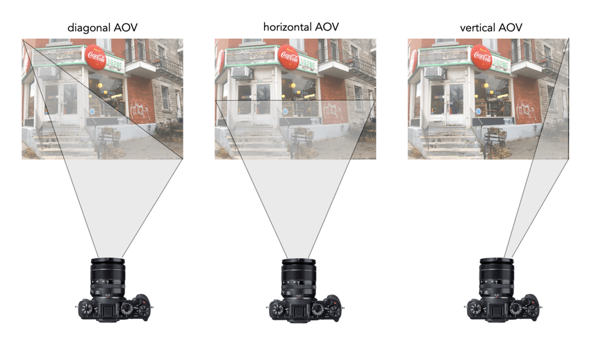
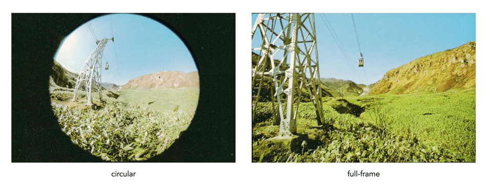
I love vintage lenses, and in the future, I will be posting much more on them. The question I want to look at here is the usefulness of vintage fish-eye lenses on crop sensors. Typically 35mm fisheye lenses are categorized into circular, and full-frame (or diagonal). A circular fisheye is typically in the range 8-10mm, with full-frame fisheye’s typically 15-17mm. The difference is shown in Figure 1.

Fig. 1: Circular 7.5mm versus full-frame 17mm

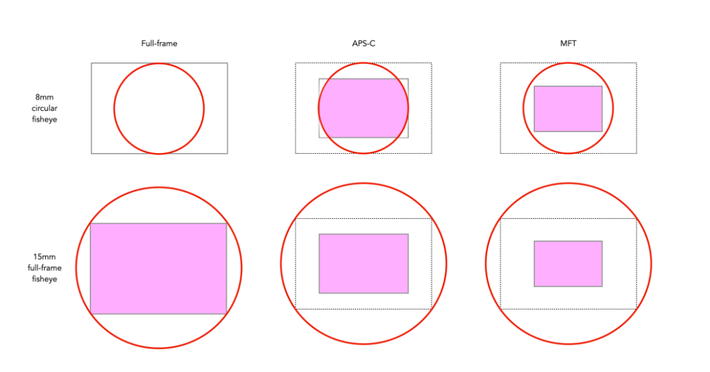
The problem arises with the fact that fish-eye lenses are different. So different that the projection itself can be one of a number of differing types, for example equidistant, and equisolid. That aside, using a fisheye lens on a crop-sensor format produces much different results. This of course has to do with the crop factor. An 8mm circular fisheye on a camera with an APS-C sensor will have an AOV (Angle-of-View) equivalent to a 12mm lens. A 15mm full-frame fisheye will similarly have an AOV equivalent of a 22.5mm lens. A camera with a MFT sensor will produce an even smaller image. The effect of crop-sensors on both circular and full-frame fisheye lenses is shown in Figure 2.

Fig.2: Picture areas in circular and full-frame fisheye lenses on full-frame, and crop-sensors

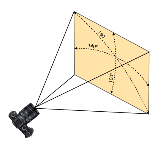
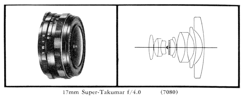
In particular, let’s look at the Asahi Super Takumar 17mm f/4 fish-eye lens. Produced from 1967-1971, in a couple of renditions, this lens has a 160° angle of view, in the diagonal, 130° in the horizontal. This is a popular vintage full-frame fisheye lens.

Fig.3: The Super-Takumar 17mm

The effect of using this lens on a crop-sensor camera is shown in Figure 4. It effectively looses a lot of its fisheye-ness. In the case of an APS-C sensor, the 160° in the diagonal reduces to 100°, which is on the cusp of being an ultra-wide. When associated with a MFT sensor, the AOV reduces again to 75°, now a wide angle lens. Figure 4 also shows the horizontal AOV, which is easier to comprehend.

Fig.4: The Angle-of-View of the Super-Takumar 17mm of various sensors

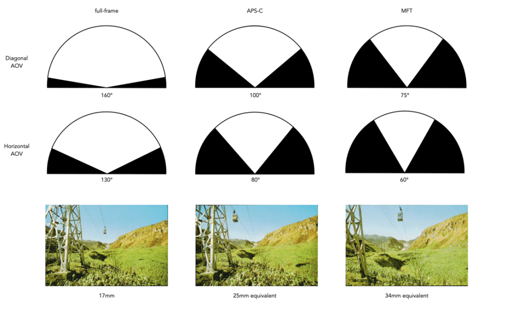
The bottom line is, that a full-frame camera is the best place to use a vintage fish-eye lens. Using one on a crop-sensor will limit its “fisheye-ness”. Is it then worthwhile to purchase a 17mm Takumar? Sure if you want to play with the lens, experiment with it’s cool built-in filters (good for B&W), or are looking for a wide-angle lens equivalent, any sort of fisheye effect will never be achieved. In many circumstances, if you want a more pronounced fisheye effect on a crop-sensor, it may be better to use a modern fisheye instead.

NB: Some Asahi Pentax catalogs suggest the 17mm has an AOV of 160°, while others suggest 180°.

Pixel peeping and why you should avoid it

In recent years there has been a lot of of hoopla about this idea of pixel peeping. But what is it? Pixel peeping is essentially magnifying an image until individual pixels are perceivable by the viewer. The concept has been around for many years, but was really restricted to those that post-process their images. In the pre-digital era, the closest photographers would come to pixel peeping was the use of a loupe to view negatives, and slides in greater detail. It is the evolution of digital cameras that spurned the widespread use of pixel peeping.

Fig.1: Peeping at the pixels

For some people, pixel-peeping just offers a vehicle for finding flaws, particularly in lenses. But here’s the thing, there is no such thing as a perfect lens. There will always be flaws. A zoomed in picture will contain noise, and grain, unsharp, and unfocused regions. But sometimes these are only a problem because they are being viewed at 800%. Yes, image quality is important, but if you spend all your time worrying about every single pixel, you will miss the broader context – photography is suppose to be fun.

Pixel-peeping is also limited by the resolution of the sensor, or put another way, some objects won’t look good when viewed at 1:1 at 16MP. They might look better at 24MP, and very good at 96MP, but a picture is the sum of all its pixels. My Ricoh GR III allows 16× zooming when viewing an image. Sometimes I use it just to find out it the detail has enough sharpness in close-up or macro shots. Beyond that I find little use for it. The reality is that in the field, there usually isn’t the time to deep dive into the pixel content of a 24MP image.

Of course apps allow diving down to the level of the individual pixels. There are some circumstances where it is appropriate to look this deep. For example viewing the subtle effects of changing settings such as noise reduction, or sharpening. Or perhaps viewing the effect of using a vintage lens on a digital camera, to check the validity of manual focusing. There are legitimate reasons. Pixel peeping on the whole is really only helpful for people who are developing or finetuning image processing algorithms.

Fig.2: Pixel peeping = meaningless detail

One of the problems with looking at pixels 1:1 is that a 24MP image was never meant to be viewed using the granularity of a pixel. Given the size of the image, and the distance it should be viewed at, micro-issues are all but trivial. The 16MP picture in Figure 2 shows pixel-peeping of one of the ducks under the steam engine. The entire picture has a lot of detail in it, but dig closer, and the detail goes away. That makes complete sense because there are not enough pixels to represent everything in complete detail. Pixel-peeping shows the ducks eye – but it’s not exactly that easy to decipher what it is?

People that pixel-peep are too obsessed with looking at small details, when they should be more concerned with the picture as a whole.

The different Angle-of-View measurements

Look at any lens spec, and they will normally talk about the angle-of-view (AOV), sometimes used interchangeably (and incorectly) with field-of-view (FOV). But there are three forms of AOV, and they can be somewhat confusing. The first form is the diagonal AOV. It is one of the most common ones found in lens literature, but it isn’t very easy to comprehend without viewing the picture across the diagonal. Next is the vertical AOV, which makes the least sense, because we generally don’t take pictures, or even visualize the vertical. Lastly is the horizontal AOV, which makes the most sense, because of how humans perceive the world in front of them.

Showing the diagonal AOV of a lens is hard to conceptualize. It’s a bit like the way TV’s are described as being, say 50″, which is the diagonal measurement. In reality through, the TV is only 43.6″ wide. Horizontal is how people generally conceptualize things. As an example of a lens, consider a 24mm full-frame lens – it has a diagonal AOV of 84°, and a horizontal AOV of 74°. This isn’t really a lot, but enough to get a little confusing. A 16mm lens that has a AOV of 180° in the vertical, may only have a horizontal AOV of 140° An example of this is shown below.

Why are there no 3D colour histograms?

Some people probably wonder why there aren’t any 3D colour histograms. I mean if a colour image is comprised of red, green, and blue components, why not provide those in a combined manner rather than separate 2D histograms or a single 2D histogram with the R,G,B overlaid? Well, it’s not that simple.

A 2D histogram has 256 pieces of information (grayscale). A 24-bit colour image contains 2563 colours in it – that’s 16,777,216 pieces of information. So a three-dimensional “histogram” would contain the same number of elements. Well, it’s not really a histogram, more of a 3D representation of the diversity of colours in the image. Consider the example shown in Figure 1. The sample image contains 428,763 unique colours, representing just 2.5% of all available colours. Two different views of the colour cube (rotated) show the dispersion of colours. Both show the vastness of the 3D space, and conversely the sparsity of the image colour information.

Figure 1: A colour image and 3D colour distribution cubes shown at different angles

It is extremely hard to create a true 3D histogram. A true 3D histogram would have a count of the number of pixels with a particular RGB triplet at every point. For example, how many times does the colour (23,157,87) occur? It’s hard to visualize this in a 3D sense, because unlike the 2D histogram which displays frequency as the number of occurrences of each grayscale intensity, the same is not possible in 3D. Well it is, kind-of.

In a 3D histogram which already uses the three dimensions to represent R, G, and B, there would have to be a fourth dimension to hold the number of times a colour occurs. To obtain a true 3D histogram, we would have to group the colours into “cells” which are essentially clusters representing similar colours. An example of the frequency-weighted histogram with for the image in Figure 2, using 500 cells, is shown in Figure 2. You can see that while in the colour distribution cube in Figure 1 shows a large band of reds, because these colours exist in the image, the frequency weighted histogram shows that objects with red colours actually comprise a small number of pixels in the image.

Figure 2: The frequency-distributed histogram of the image in Fig.1

The bigger problem is that it is quite hard to visualize a 3D anything and actively manipulate it. There are very few tools for this. Theoretically it makes sense to deal with 3D data in 3D. The application ImageJ (Fiji) does offer an add-on called Color Inspector 3D, which facilitates viewing and manipulating an image in 3D, in a number of differing colour spaces. Consider another example, shown in Figure 3. The aerial image, taken above Montreal lacks contrast. From the example shown, you can see that the colour image takes up quite a thin band of colours, almost on the black-white diagonal (it has 186,322 uniques colours).

Figure 3: Another sample colour image and its 3D colour distribution cube

Using the contrast tool provided in ImageJ, it is possible to manipulate the contrast in 3D. Here we have increased the contrast by 2.1 times. You can easily see the result in Figure 4. difference working in 3D makes. This is something that is much harder to do in two dimensions, manipulating each colour independently.

Figure 4: Increasing contrast via the 3D cube

Another example of increasing colour saturation 2 times, and the associated 3D colour distribution is shown in Figure 5. The Color Inspector 3D also allows viewing and manipulating the image in other colour spaces such as HSB and CieLab. For example in HSB the true effect of manipulating saturation can be gauged. The downside is that it does not actually process the full-resolution image, but rather one reduced in size, largely because I imagine it can’t handle the size of the image, and allow manipulation in real-time.

Figure 5: Increasing saturation via the 3D cube

the image histogram (ii) – grayscale vs colour

In terms of image processing there are two basic types of histogram: (i) colour, and (ii) intensity (or luminance/grayscale) histograms. Figure 1 shows a colour image (an aerial shot of Montreal), and its associated RGB and intensity histograms. Colour histograms are essentially RGB histograms, typically represented by three separate histograms, one for each of the components – Red, Green, and Blue. The three R,G,B histograms are sometimes shown in one mixed histogram with all three R,G,B, components overlaid with one another (sometimes including an intensity histogram).

Fig.1: Colour and grayscale histograms

Both RGB and intensity histograms contain the same basic information – the distribution of values. The difference lies in what the values represent. In an intensity histogram, the values represent the intensity values in a grayscale image (typically 0 to 255). In an RGB histogram, divided into individual R, G, B histograms, each colour channel is just a graph of the frequencies of each of the RGB component values of each pixel.

An example is shown in Figure 2. Here a single pixel is extracted from an image. The RGB triplet for the pixel is (230,154,182) i.e. it has a red value of 230, a green value of 154, and a blue value of 182. Each value is counted in its respective bin in the associated component histogram. So red value 230 is counted in the bin marked as “230” in the red histogram. The three R,G, B histograms are visually no different than an intensity histogram. The individual R, G, and B histograms do not represent distributions of colours, but merely distributions of components – for that you need a 3D histogram (see bottom).

Fig.2: How an RGB histogram works: From single RGB pixel to RGB component histograms

Applications portray colour histograms in many different forms. Figure 3 shows the RGB histograms from three differing applications: Apple Photos, ImageJ, and ImageMagick. Apple Photos provides the user with the option of showing the luminance histogram, the mixed RGB, or the individual R, G, B histograms. The combined histogram shows all the overlaid R, G, B histograms, and a gray region showing where all three overlap. ImageJ shows the three components in separate histograms, and ImageMagick provides an option for their combined or separate. Note that some histograms (ImageMagick) seem a little “compressed”, because of the chosen x-scale.

Fig.3: How RGB histograms are depicted in applications

One thing you may notice when comparing intensity and RGB histograms is that the intensity histogram is very similar to the green channel or the RGB image (see Figure 4). The human eye is more sensitive to green light than red or blue light. Typically the green intensity levels within an image are most representative of the brightness distribution of the colour image.

Fig.4: The RGB-green histogram verus intensity histogram

An intensity image is normally created from an RGB image by converting each pixel so that it represents a value based on a weighted average of the three colours at that pixel. This weighting assumes that green represents 59% of the perceived intensity, while the red and blue channels account for just 30% and 11%, respectively. Here is the actual formula used:

gray = 0.299R + 0.587G + 0.114B

Once you have a grayscale image, it can be used to derive an intensity histogram. Figure 5 illustrates how a grayscale image is created from an RGB image using this formula.

Fig.5: Deriving a grayscale image from an RGB image

Honestly there isn’t really that much useful data in RGB histograms, although they seem to be very common in image manipulation applications, and digital cameras. The problem lies with the notion of the RGB colour space. It is a space in which chrominance and luminance are coupled together, and as such it is difficult to manipulate any one of the channels without causing shifts in colour. Typically, applications that allow manipulation of the histogram do so by first converting the image to a decoupled colour space such as HSB (Hue-Saturation-Brightness), where the brightness can be manipulated independently of the colour information.

A Note on 3D RGB: Although it would be somewhat useful, there are very few applications that provide a 3D histogram, constructed from the R, G, and B information. One reason is that these 3D matrices could be very sparse. Instead of three 2D histograms, each with 256 pieces of information, there is now a 3D histogram with 2563 or 16,777,216 pieces of information. The other reason is that 3D histograms are hard to visualize.

What is an RGB colour image?

Most colour images are stored using a colour model, and RGB is the most commonly used one. Digital cameras typically offer a specific RGB colour space such as sRGB. It is commonly used because it is based on how humans perceive colours, and has a good amount of theory underpinning it. For instance, a camera sensor detects the wavelength of light reflected from an object and differentiates it into the primary colours red, green, and blue.

An RGB image is represented by M×N colour pixels (M = width, N = height). When viewed on a screen, each pixel is displayed as a specific colour. However, deconstructed, an RGB image is actually composed of three layers. These layers, or component images are all M×N pixels in size, and represent the values associated with Red, Green and Blue. An example of an RGB image decoupled into its R-G-B component images is shown in Figure 1. None of the component images contain any colour, and are actually grayscale. An RGB image may then be viewed as a stack of three grayscale images. Corresponding pixels in all three R, G, B images help form the colour that is seen when the image is visualized.

A Decoupled RGB image
Fig.1: A “deconstructed” RGB image

The component images typically have pixels with values in the range 0 to 2B-1, where B is the number of bits of the image. If B=8, the values in each component image would range from 0..255. The number of bits used to represent the pixel values of the component images determines the bit depth of the RGB image. For example if a component image is 8-bit, then the corresponding RGB image would be a 24-bit RGB image (generally the standard). The number of possible colours in an RGB image is then (2B)3, so for B=8, there would be 16,777,216 possible colours.

Coupled together, each RGB pixel is described using a triplet of values, each of which is in the range 0 to 255. It is this triplet value that is interpreted by the output system to produce a colour which is perceived by the human visual system. An example of an RGB pixel’s triplet value, and the associated R-G-B component values is shown in Figure 2. The RGB value visualized as a lime-green colour is composed of the RGB triplet (193, 201, 64), i.e. Red=193, Green=201 and Blue=64.

Fig.2: Component values of an RGB pixel

One way of visualizing the R,G,B, components of an image is by means of a 3D colour cube. An example is shown in Figure 3. The RGB image shown has 310×510, or 158,100 pixels. Next to it is a colour cube with the three axes, R, G, and B, each with a range of values 0-255, producing a cube with 16,777,216 elements. Each of the images 122,113 unique colours is represented as a point in the cube (representing only 0.7% of available colours).

Fig 2 Example of colours in an RGB 3D cube

The caveat of the RGB colour model is that it is not a perceptual one, i.e. chrominance and luminance are not separated from one another, they are coupled together. Note that there are some colour models/space that are decoupled, i.e. they separate luminance information from chrominance information. A good example is HSV (Hue, Saturation, Value).

the image histogram (i) – what is it?

An image is really just a collection of pixels of differing intensities, regardless of whether it is a grayscale (achromatic) or colour image. Exploring the pixels collectively helps provide an insight into the statistical attributes of an image. One way of doing this is by means of a histogram, which represents statistical information in a visual format. Using a histogram it is easy to determine whether there are issues with an image, such as over-exposure. In fact histograms are so useful that most digital cameras offer some form of real-time histogram in order to prevent poorly exposed photographs. Histograms can also be used in post-processing situations to improve the aesthetic appeal of an image.

Fig.1: A colour image with its intensity histogram overlaid.

A histogram is simply a frequency distribution, represented in the form of a graph. An image histogram, sometimes called an intensity histogram, describes the frequency of intensity (brightness) values that occur in an image. Sometimes as in Figure 1, the histogram is represented as a bar graph, while other times it appears as a line graph. The graph typically has “brightness” on the horizontal axis, and “number of pixels” on the vertical axis. The “brightness” scale describes a series of values in a linear scale from 0, which represents black, to some value N, which represents white.

Fig.2: A grayscale image and its histogram.

A image histogram, H, contains N bins, with each bin containing a value representing the number of times an intensity value occurs in an image. So a histogram for a typical 8-bit grayscale image with 256 gray levels would have N=256 bins. Each bin in the histogram, H[i] represents the number of pixels in the image with intensity i. Therefore H[0] is the number of pixels with intensity 0 (black), H[1] the number of pixels with intensity 1, and so forth until H[255] which is the number of pixels with the maximum intensity value, 255 (i.e. white).

A histogram can be used to explore the overall information in an image. It provides a visual characterization of the intensities, but does not confer any spatial information, i.e. how the pixels physically relate to one another in the image. This is normal because the main function of a histogram is to represent statistical information in a compact form. The frequency data can be used to calculate the minimum and maximum intensity values, the mean, and even the median.

This series will look at the various types of histograms, how they can be used to produce better pictures, and how they can be manipulated to improve the aesthetics of an image.

Things to consider when choosing a digital camera

There is always a lot to think about when on the path to purchasing a new camera. In fact it may be one of the most challenging parts of getting started in photography, apart from choosing which lenses will be in your kit. It was frankly easier when there was less in the way of choices. You could make a list of 100 different things with which to compare cameras, but better to start with a simple series of things to consider.

Some people are likely swayed by fancy advertising, or cool features. Others think only of megapixels. There are of course many things to consider. This post aims to provide a simple insight into the sort of things you should consider when buying a digital camera. It is aimed at the pictorialist, or hobby/travel photographer. The first thing people think about when considering a camera is megapixels. These are important from a marketing perspective, mainly because they are a quantifiable number that can be sold to potential buyers. It is much harder to sell ISO or dynamic range. But megapixels aren’t everything, as I mentioned in a previous post, anywhere from 16-24 megapixels is fine. So if we move beyond the need for megapixels, what should we look for in a camera?

Perhaps the core requirement for a non-professional photographer is an understanding of what the camera is to be used for – landscapes, street photography, macro shooting, travel, blogging, video? This plays a large role in determining the type of camera from the perspective of the sensor. Full frame (FF) cameras are only required by the most dedicated of amateur photographers. For everyday shooting they can be far too bulky and heavy. At the other end of the spectrum is Micro-Four-Thirds (MFT), which is great for travelling because of it is compact size. In the middle are the cameras with APS-C sensors, sometimes often found in mirrorless cameras, and even compact fixed-lens format cameras. If you predominantly make videos, then a camera geared towards maybe less MP and more video features is essential. For street photography, perhaps something compact and unobtrusive. Many people also travel with a back-up camera, so there is that to consider as well.

Next is price, because obviously if I could afford it I would love a Leica… but in the real world it’s hard to justify. As the sensor gets larger, the price goes up accordingly. Large sensors cost more to make, and mechanisms such as image stabilization have to be scaled accordingly. Lenses for FF are also more expensive because they contain larger pieces of glass. It’s all relative – spend what you feel comfortable spending. It’s also about lifespan – how long will you use this camera? It was once about upgrading for more megapixels or fancy new features – it’s less about that now. Good cameras aren’t cheap – nothing in life is, neither are good lenses… but spend more for better quality and buy fewer lenses.

Then there are lenses. You don’t need dozens of them. Look at what lenses there are for what you want to do. You don’t need a macro lens if you are never going to take closeup shots, and fisheye lenses are in reality not very practical. Zoom lenses are the standard lenses supplied with many cameras, but the reality is a 24-80 is practical (although you honestly won’t use the telephoto function that much), anything beyond 80mm is likely not needed. Choose a good quality all round prime lens. There are also a variety of price points with lenses. Cheaper lenses will work fine but may not be as optically nice, have weather proofing or contain plastic instead of metal bodies. You can also go the vintage lens route – lots of inexpensive lenses to play with.

Now we get to the real Pandora’s Box – features. What extra features do you want? Are they features that you will use a lot? Focus stacking perhaps, for well focused macro shots. Manual focus helpers like focus peaking for use with manual lenses. High resolution mode? Image stabilization (IS)? I would definitely recommend IS but lean perhaps towards the in-body rather than the in-lens. In body means any lens will work with IS, even vintage ones. In lens is just too specialized and I favour less tech inside lenses. Features usually come at a price- battery drain, so think carefully about what makes sense for your particular situation.

So what to choose? Ultimately you can read dozens of reviews, watch reviews on YouTube, but you have to make the decision. If you’re unsure, try renting one for a weekend and try it out. There is no definitive guide to buying a digital camera, because there is so much to choose from, and everyone’s needs are so different.

Demystifying Colour (ix) : CIE chromaticity diagram

Colour can be divided up into luminosity and chromaticity. The CIE XYZ colour space was designed such that Y is a measure of the luminance of a colour. Consider a 3D plane is described by X=Y=Z=1, as shown in Figure 1. A colour point A=(Xa,Ya,Za) is then found by intersecting the line SA (S=starting point, X=Y=Z=0) with the plane formed within the CIE XYZ colour volume. As it is difficult to perceive 3D spaces, most chromaticity diagrams discard luminance and show the maximum extent of the chromaticity of a particular 2D colour space. This is achieved by dropping the Z component, and projecting back onto the XY plane.

Fig.1: CIE XYZ chromaticity diagram derived from CIE XYZ open cone.
Fig.2: RGB colour space mapped onto the chromaticity diagram

This diagram shows all the hues perceivable by the standard observer for various (x, y) pairs, and indicates the spectral wavelengths of the dominant single frequency colours. When Y is plotted against X for spectrum colours, it forms a horseshoe, or shark-fin, shaped diagram commonly referred to as the CIE chromaticity diagram where any (x,y) point defines the hue and saturation of a particular colour.

Fig.3: The CIE Chromaticity Diagram for CIE XYZ

The xy values along the curved boundary of the horseshoe correspond to the “spectrally pure”, fully saturated colours with wavelengths ranging from 360nm (purple) to 780nm (red). The area within this region contains all the colours that can be generated with respect to the primary colours on the boundary. The closer a colour is to the boundary, the more saturated it is, with saturation reducing towards the “neutral point” in the centre of the diagram. The two extremes, violet (360nm) and red (780nm) are connected with an imaginary line. This represents the purple hues (combinations of red and blue) that do not correspond to primary colours. The “neutral point” at the centre of the horseshoe (x=y=0.33) has zero saturation, and is typically marked as D65, and corresponds to a colour temperature of 6500K.

Fig.4: Some characteristics of the CIE Chromaticity Diagram

The Retinex algorithm for beautifying pictures

There are likely thousands of different algorithms out in the ether to “enhance” images. Many are just “improvements” of existing algorithms, and offer a “better” algorithm – better in the eyes of the beholder of course. Few are tested in any extensive manner, for that would require subjective, qualitative experiments. Retinex is a strange little algorithm, and like so many “enhancement” algorithms is often plagued by being described in a too “mathy” manner. The term Retinex was coined by Edwin Land [2] to describe the theoretical need for three independent colour channels to describe colour constancy. The word was a contraction or “retina”, and “cortex”. There is an exceptional article [3] on the colour theory written by McCann which can be found here.

The Retinex theory was introduced by Land and McCann [1] in 1971 and is based on the assumption of a Mondrian world, referring to the paintings by the dutch painter Piet Mondrian. Land and McCann argue that human color sensation appears to be independent of the amount of light, that is the measured intensity, coming from observed surfaces [1]. Therefore, Land and McCann suspect an underlying characteristic guiding human color sensation [1].

There are many differing algorithms for implementing Retinex. The algorithm illustrated here can be found in the image processing software ImageJ. This algorithm for Retinex is based on the multiscale retinex with colour restoration algorithm (MSRCR) – it combines colour constancy with local contrast enhancement. In reality it’s quite a complex little algorithm with four parameters, as shown in Figure 1.

Fig.1: ImageJ Retinex parameters
  • The Level specifies the distribution of the [Gaussian] blurring used in the algorithm.
    • Uniform treats all image intensities similarly.
    • Low enhances dark regions in the image.
    • High enhances bright regions in the image.
  • The Scale specifies the depth of the Retinex effect
    • The minimum value is 16, a value providing gross, unrefined filtering. The maximum value is 250. Optimal and default value is 240.
  • The Scale division specifies the number of iterations of the multiscale filter.
    • The minimum required is 3. Choosing 1 or 2 removes the multiscale characteristic and the algorithm defaults to a single scale Retinex filtering. A value that is too high tends to introduce noise in the image.
  • The Dynamic adjusts the colour of the result, with large valued producing less saturated images.
    • Extremely image dependent, and may require tweaking.

The thing with Retinex, like so many of its enhancement brethren is that the quality of the resulting image is largely dependent on the person viewing it. Consider the following, fairly innocuous picture of some clover blooms in a grassy cliff, with rock outcroppings below (Figure 2). There is a level of one-ness about the picture, i.e. perceptual attention is drawn to the purple flowers, the grass is secondary, and the rock, tertiary. There is very little in the way of contrast in this image.

clover in grass
Fig.2: A picture showing some clover blooms in a grassy meadow.

The algorithm is suppose to be able to do miraculous things, but that does involve a *lot* of tweaking the parameters. The best approach is actually to use the default parameters. Figure 3 shows Figure 2 processed with the default values shown in Figure 1. The image appears to have a lot more contrast in it, and in some cases features in the image have increased their acuity.

Fig.3: Retinex applied with default values.

I don’t find these processed images are all that useful when used by themselves, however averaging the image with the original produces an image with a more subdued contrast (see Figure 4), having features with increased sharpness.

Fig.4: Comparing the original with the averaged (Original and Fig.3)

What about the Low and High versions? Examples are shown below in Figures 5 and 6, for the Low and High settings respectively (with the other parameters used as default). The Low setting produces an image full of contrast in the low intensity regions.

Fig.5: Low
Fig.6: High

Retinex is quite a good algorithm for dealing with suppressing shadows in images, although even here there needs to be some serious post-processing in order to create an aesthetically pleasing. The picture in Figure 7 shows a severe shadow in a inner-city photograph of Bern (Switzerland). Using the Low setting, the shadow is suppressed (Figure 8), but the algorithm processes the whole image, so other details such as the sky are affected. That aside, it has restored the objects hidden in the shadow quite nicely.

Fig.7: Photograph with intense shadow
Fig.8: Shadow suppressed using “Low” setting in Retinex

In reality, Retinex acts like any other filter, and the results are only useful if they invoke some sense of aesthetic appeal. Getting the write aesthetic often involves quite a bit of parameter manipulation.

Further reading:

  1. Land, E.H., McCann, J.J., ” Lightness and retinex theory”, Journal of the Optical Society of America, 61(1), pp. 1-11 (1971).
  2. Land, E., “The Retinex,” American Scientist, 52, pp.247-264 (1964).
  3. McCann, J.J., “Retinex at 50: color theory and spatial algorithms, a review“, Journal of Electronic Imaging, 26(3), 031204 (2017)