Are (camera-based) RGB histograms useful?

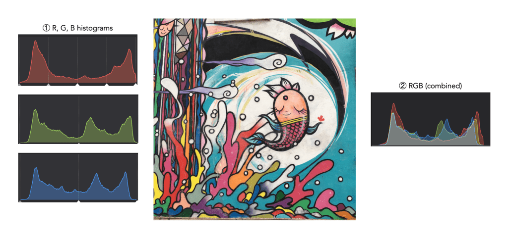
When taking an image on a digital camera, we are often provided with one or two histograms – the luminance histogram, and the RGB histogram. The latter is often depicted in various forms: as a single histogram showing all three channels of the RGB image, or three separate histograms, one for each of R, G, and B. So how useful is the RGB histogram on a camera? In the context of improving image quality RGB histograms provide very little in the way of value. Some people might disagree, but fundamentally adjusting a picture based on the individual colour channels on a camera, is not realistic (and usually it is because they don’t have a real understanding about how colour spaces work).

Consider the image example shown in Figure 1. This 3024×3024 pixel image has 9,144,576 pixels. On the left are the three individual RGB histograms, while on the right is the integral RGB histogram with the R, G, B, histograms overlapped. As I have mentioned before, there is very little information which can be gleaned by looking at the these two-dimensional RGB histograms – they do not really indicate how much red (R), green (G), or blue (B) there is in an image, because these three components can only be used together to produce information that is useful. This is because RGB is a coupled colour space where luminance and chrominance are coupled together. The combined RGB histogram is especially poor from an interpretation perspective, because it just muddles the information.

Fig.1: The types of RGB histograms found in-camera.

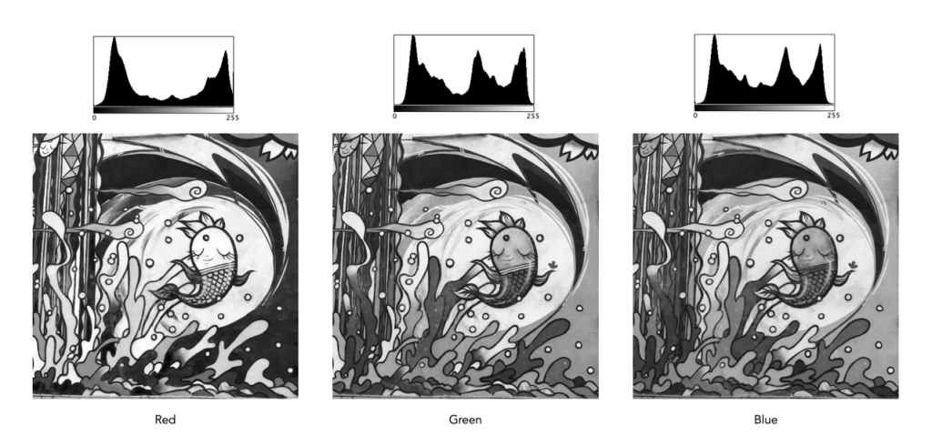
But to understand it better, we need to look at what information is contained in a colour image. An RGB colour image can be conceptualized as being composed of three layers: a red layer, a green layer, and a blue layer. Figure 2 shows the three layers of the image in Figure 1. Each layer represents the values associated with red, green, and blue. Each pixel in a colour image is therefore a set of triplet values: a red, a green, and a blue, or (R,G,B), which together form a colour. Each of the R, G, and B components is essentially an 8-bit (grayscale) image, then can be viewed in the form of a histogram (also shown in Figure 2 and nearly always falsely coloured with the appropriate red, green or blue colour).

Fig.2: The R, G, B components of RGB.

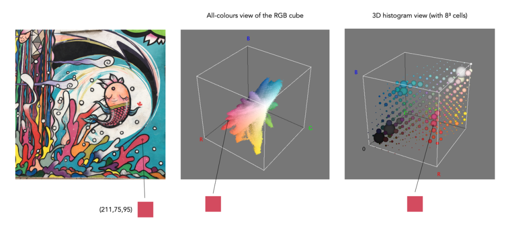
To understand a colour image further, we have to look at the RGB colour model, the method used in most image formats, e.g. JPEG. The RGB model can be visualized in the shape of a cube, formed using the R, G, and B data. Each pixel in an image has an (R, G, B) value which provides a coordinate in the 3D space of the cube (which contains 2563, or 16,777,216 colours). Figure 3 shows two different ways of viewing image colour in 3D. The first is an all-colours view of the colours. This basically just indicates all the colours contained in the image without frequency information. This gives an overall indication on how colours are distributed. In the case of the example image, there are 526,613 distinct colours. The second cube is a frequency-based 3D histogram, grouping like data together in “bins”, in this example the 3D histogram has 83 or 512 bins (which is honestly easier to digest than 16 million-odd bins). Within the image there is shown one pixel with the RGB value (211,75,95), and its location in the 3D histograms.

Fig.3: How to really view the colours in RGB

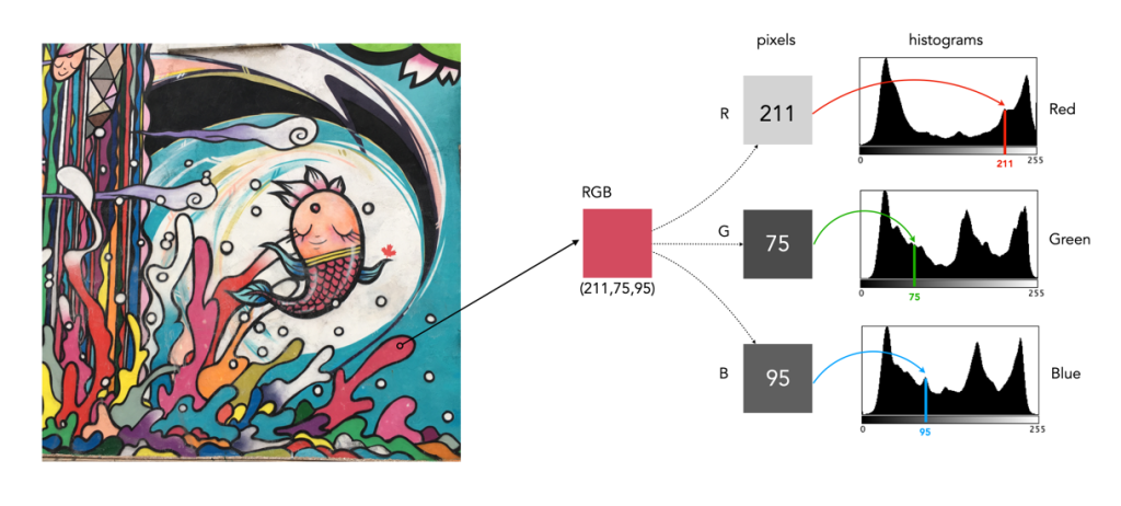
In either case, visually you can see the distribution of colours. The same can not be said of many of the 2D representations. Let’s look at how the colour information pans out in 2D form. The example image pixel in Figure 3 at location (2540,2228) has the RGB value (211,75,95). If we look at this pixel in the context of the red, green, and blue histograms it exists in different bins (Figure 4). There is no way that these 2D histograms provide anything in the way of context on the distribution of colours. All they do is show the distribution of red, green, and blue values, from 0 to 255. What the red histogram tells us is that at value 211 there are 49972 colour pixels in the image whose first value of the triplet (R) is 211. It may also tell us that the contribution of red in pixels appears to be constrained to the upper and lower bounds of the histogram (as shown by the two peaks). There is only one pure value of red, (255,0,0). Change the value from (211,75,95) to (211,75,195) and we get a purple colour.

Fig.4: A single RGB pixel shown in the context of the separate histograms.

The information in the three histograms is essentially decoupled, and does not provide a cohesive interpretation of colours in the image, for that you need a 3D image of sorts. Modifying one or more of the individual histograms will just lead to a colour shift in the image, which is fine if that is the what is to be achieved. Should you view the colour histograms on a camera viewscreen? I honestly wouldn’t bother. They are more useful in an image manipulation app, but not in the confines of a small screen – stick to the luminance histogram.

the histogram exposed (vi) – multipeak

This series of photographs and their associated histograms covers images with multipeak histograms, which come is many differing forms. None of these images is perfect, but they illustrate the fact that sometimes the perfect image is not possible given the constraints of the scene – shadows, bright skies and haze, sometimes they are just unavoidable.

Histogram 1: A church and hazy hills

This photograph is taken in Locarno, Switzerland, with the church in the foreground the Madonna del Sasso. The histogram is of the multipeak variety, with few highlights. The left-most hump (①) represents the majority of the darker colours in the foreground, e.g. vegetation, and the parts of the building in shadow. The remaining two peaks are in the midtones, and represent various portions of the sky (③) as well as the lake, and hazed over mountains in the distance (②). Finally a small amount of highlights (④) represent the clouds and brightly lit portions of the church.

Fujifilm X10 (12MP): 7.1mm; f/5; 1/850

Histogram 2: Light hillside, dark forest

This is the Norwegian countryside, taken from the Bergen Line train. It is a well contrasted image, with only one core patch of shadow (①), behind the trees in the bottom left (there are a few other shadows in foreground objects such as the trees on the right). The midtones, ②, represent the rest of the landscape, with the lightest midtones and highlights composing the sky, ③.

Olympus E-M5II (12MP): 12mm; f/5; 1/400

Histogram 3: Gray station

This photograph is of the train station in Voss, Norway. It is an image with a good distribution of intensities, with four dominant peaks. The first peak, ①, is representative of the dark vegetation, and metal railings in the scene, overlapping somewhat into the mid-tones. The central peak (②) which is in the midtones, represents the light green pastures, and the large segments of asphalt on the station platform. The third peak, ③, which transitions into the highlights mostly deals with the light concreted areas. Finally there is a fourth peak, ④, which is really just a clipping artifact related to the small region of white sky.

Olympus E-M5II (12MP): 40mm; f/5; 1/320

the histogram exposed (v) – indistinct

This series of photographs and their associated histograms covers indistinctly shaped histograms, i.e. images which have a histogram which does not really have any distinct shape.

Histogram 1: Dark depths

This is a good example of a low-key image, but contains content which makes this an aesthetically pleasing image. The histogram shows as asymmetric unimodal, tiered towards the darker tones. The dark tones, ①, are naturally provided by the black hull of the ship, the dark vegetation, and the water. The midtones, ②, are associated with the lighter vegetation, and the ships reflection in the water. The larger of the two peaks in the highlights, ③, is the side of the ship, and the building on-shore, and the smaller one, ④, basically is the white on the front of the ship.

Olympus E-M5II (12MP): 20mm; f/4; 1/160

Histogram 2: Light buildings

This is an excellent example of an image (Bergen, Norway) which has white clipping, but it doesn’t have much to do with blown-out regions. The whites in the image are entirely associated with the sides of the two larger buildings which are exposed to direct sunlight. This is not a distinct multipeak histogram, but it is divided into four tonal zones: ① the shadows; ② the midtones; ③ the upper midtones and highlights; and ④ the whites.The sun was intense on this day leading to a slightly paler sky, and bleached buildings facing into the sun.

Olympus E-M5II (12MP): 17mm; f/5.6; 1/250

Histogram 3: Red train

This image of a train at the station in Voss (Norway) which has a histogram which covers a broad range of tones. The image has good contrast overall with only two distinct peaks: ① Values 87-124 comprise most of the red and dark gray portions of the train, as well as fine detail throughout the image; and ② Values 234-245 comprises the edge of the train roof. Images which contain a lot of detail and varied tones typically produce histograms containing a lot of “spiky” detail.

Olympus E-M5II (12MP): 19mm; f/4.5; 1/200

the histogram exposed (iv) – multipeak-unimodal

This series of photographs and their associated histograms covers multipeak-unimodal histograms, i.e. images which have a histogram which has a core unimodal shape, yet is festooned with peaks.

Histogram 1: A statue against the sky

This image, taken near Glasgow Scotland, has a broad spectrum of intensity values. The histogram has an underlying core “unimodal” shape, bias towards highlights, a result of both the statue and the clouds. The image has exceptionally good contrast. The jagged, multipeak appearance is an artifact of the broad distribution of intensities, and intricate details, i.e. non-uniform regions, in the image.

iPhone 6s (12MP): 4.15mm; f/2; 1/3077

Histogram 2: Oslo lion

This image, taken in Oslo (Norway), is the “poster-boy” for good histograms (well almost). It has an underlying unimodal shape, mostly in the midtones. It is a well-formed image with good contrast and colour. There are shadows in the image, but that is to be expected considering the clear sky and the orientation of the sun. There are no pure blacks in the image, the shadow tones created by the dark windows. There are also few whites, less than 1% of pixels, that are the result of light reflecting off light surfaces (such as the lion).

iPhone 6s (12MP): 4.15mm; f/2; 1/1012

Histogram 3: Plateau river

This image, taken from a moving train on the Bergen Line in Norway, high up on a mountain plateau. The histogram has an underlying core unimodal shape, composed predominantly of midtones, in addition to the lighter end of the shadows (①). There are no blacks and few highlights to speak off. The image has exceptionally good contrast. The jagged, multipeak appearance is an artifact of the image detail, i.e. non-uniform regions, in the image. For instance the sky tapers gradually from 150 to 190 near the top of the hill.

Olympus E-M5(II) (12MP): 12mm; f/7.1; 1/400

the histogram exposed (iii) – bimodal

This series of photographs and their associated histograms covers aesthetically pleasing bimodal histograms.

Histogram 1: A sky with texture

This image (of a building in Edinburgh) has a broad spectrum of intensity values. The histogram is bi-modal with two distinct humps. The right peak is associated with the overcast sky (and white van). The left shallow mound comprising both midtones and shadows makes up most of the remaining image content. There is a small flat region in between the two that makes up features like the lighter portions of the building. Note that pixels maps on the right of the histogram below show the associated pixels in black.

Histogram 2: Out on the lake

This photograph of the Kapellbrücke was taken in Lucerne, Switzerland. The histogram is bimodal, and asymmetric, and reflects the information in the image: the left hump (①) is associated with the lower portion of the image (shadows and midtones), and the right peak (② highlights) with the sky. There is relatively well contrasted image. The clouds have some good variation in colour, as opposed to begin pushed completely into the whites.

Fujifilm X10 (12MP): 7.1mm; f/9; 1/800

Histogram 3: Carved in stone

This is a photograph of the Lion of Lucerne, in Lucerne, Switzerland. It provides a classic asymmetric bimodal shaped histogram. The left mound, ①, contributes the images dark, shadowy regions, whereas the remaining, larger peak ②, bias towards highlights, defines most of the remaining image. It is well contrasted given that a shadow is cast on the sculpture as it is relief into the wall. The overlapping region between the two entities, ③, forms the transition regions from ① to ②, often visualized in the picture as regions of low “shadow”.

Fujifilm X10 (12MP): 21mm; f/3.2; 1/850

the histogram exposed (ii) – highlight-clipping

This series of photographs and their associated histograms covers good renditions of highlight clipping, i.e. photographs in which there are regions of white pixels, but they either genuinely exist in the image as white regions, or do not directly impact the aesthetics of the image.

Histogram 1: A bright overcast sky

The image was taken on a very overcast day in Montreal. This is a good example of an image with highlight-clipping in the histogram, which is neither good nor bad. The building itself does not suffer from a lack of contrast, although the non-sky region can be enhanced slightly with no ill effects on the sky (because it is already basically white). This is a common situation in outdoor, overcast scenes. In an ideal world, more texture and contrast in the sky would be great, but in reality you have to use what nature provides.

Histogram 2: White buildings

This photograph was taken in Luzern, Switzerland. It is a well contrasted image, with a somewhat indistinct, multipeak histogram. The pixels are well distributed over the range of intensities, except for the spike at values 240-255. Here highlight clipping seems as though it has occurred because there are quite a number of white pixels in the image. However this density of white pixels comes not from anything being overblown, but rather from the white buildings in the image (of which there are many).

Fujifilm X10 (12MP): 7.1mm; f/4.5; 1/950

Histogram 3: A bit of overblown sky

This photograph was taken in Grabs, Switzerland. The histogram is a nonuniform, and basically unimodal in shape, with the exception of a huge spike in the whites causing clipping. But this is a case of the highlight clipping not really affecting the core content of the image, i.e. it comprises the overblown sky in the top-left of the image. On a bright, partially overcast day, this is not an unusual scenario.

Fujifilm X10 (12MP): 7.1mm; f/2; 1/900

the histogram exposed (i) – unimodal

This is the first post in an ongoing series that looks at the intensity histograms of various images, and what they help tell us about the image. The idea behind it is to try and dispel the myths behind the “ideal” histogram phenomena, as well as helping to learn to read a histogram. The hope is to provide a series of posts (each containing three images and their histograms) based on histogram concepts such as shape, of clipping etc. Histograms are interpreted in tandem with the image.

Histogram 1: Ideal with a hint of clipping

The first image is the poster-boy for “ideal” histograms (almost). A simple image of a track through a forest in Scotland, it has a beautiful bell-shaped (unimodal) curve, almost entiorely in the midtones. A small amount of pixels, less than 1%, form a highlight clipping issue in the histogram, a result of the blown-out, overcast sky. Otherwise it is a well-formed image with good contrast and colour.

Histogram 2: The witches hat

This is a picture taken along the route of the Bergen-Line train in Norway. A symmetric, unimodal histogram, taking on a classic “witches hat” shape. The tail curving towards 0 (①) deals with the darker components of the upper rock-face, and the house. The tail curving towards 255 (③) deals with the lighter components of the lower rock face, and the house. The majority of midtone pixels form the sky, grassland, and rock face.

Olympus E-M5MArkII (16MP): 12mm; f/6.3; 1/400

Histogram 3: An odd peak

This is a photograph of the statue of Leif Eriksson which is in front of Reykjavik’s Hallgrímskirkja. It provides for a truly odd histogram – basically the (majority of) pixels form a unimodal histogram, ③ , which represents the sky surrounding the statue. The tiny hillocks to either side (①,②) form the sculpture itself – the left forming the shadows, and the right forming the bright regions. However overall, this is a well formed image, even though it may appear as if the sculpture is low contrast.

Leica D-Lux 6 (10MP): 14.7mm; f/2.8; 1/1600

the image histogram (vii) – log histograms

Sometimes a histogram is depicted logarithmically. A histogram will typically depict only large frequencies, i.e. histogram intensities with limited values will not be visualized. The logarithmic form helps to accentuate low frequency occurrences, making them readily apparent. In the example histogram shown below, intensity level 39 has a value of 9, which would not show up in a regular histogram given the scale, e.g. intensity 206 has a count of 9113.

the image histogram (vi) – contrast and clipping

Understanding shape and tonal characteristics is part of the picture, but there are some other things about exposure that can be garnered from a histogram that are related to these characteristics. Remember, a histogram is merely a guide. The best way to understand an image is to look at the image itself, not just the histogram.

Contrast

Contrast is the difference in brightness between elements of an image, and can determine how dull or crisp an image appears with respect to intensity values. Note that the contrast described here is luminance or tonal contrast, as opposed to colour contrast. Contrast is represented as a combination of the range of intensity values within an image and the difference between the maximum and minimum pixel values. A well contrasted image typically makes use of the entire gamut of n intensity values from 0..n-1.

Image contrast is often described in terms of low and high contrast. If the difference between the lightest and darkest regions of an image is broad, e.g. if the highlights are bright, and the shadows very dark, then the image is high contrast. If an image’s tonal range is based more on gray tones, then the image is considered to have a low contrast. In between there are infinite combinations, and histograms where there is no distinguishable pattern. Figure 1 shows an example of low and high contrast on a grayscale image.

Fig.1: Examples of differing types of tonal contrast

The histogram of a high contrast image will have bright whites, dark blacks, and a good amount of mid-tones. It can often be identified by edges that appear very distinct. A low-contrast image has little in the way of tonal contrast. It will have a lot of regions that should be white but are off-white, and black regions that are gray. A low contrast image often has a histogram that appears as a compact band of intensities, with other intensity regions completely unoccupied. Low contrast images often exist in the midtones, but can also appear biased to the shadows or highlights. Figure 2 shows images with low and high contrast, and one which sits midway between the two.

Fig.2: Examples of low, medium, and high contrast in colour images

Sometimes an image will exhibit a global contrast which is different to the contrast found in different regions within the image. The example in Figure 3 shows the lack of contrast in an aerial photograph. The image histogram shows an image with medium contrast, yet if the image were divided into two sub-images, both would exhibit low-contrast.

Fig.3: Global contrast versus regional contrast

Clipping

A digital sensor is much more limited than the human eye in its ability to gather information from a scene that contains both very bright, and very dark regions, i.e. a broad dynamic range. A camera may try to create an image that is exposed to the widest possible range of lights and darks in a scene. Because of limited dynamic range, a sensor might leave the image with pitch-black shadows, or pure white highlights. This may signify that the image contains clipping.

Clipping represents the loss of data from that region of the image. For example a spike on the very left edge of a histogram may suggest the image contains some shadow clipping. Conversely, a spike on the very right edge suggests highlight clipping. Clipping means that the full extent of tonal data is not present in an image (or in actually was never acquired). Highlight clipping occurs when exposure is pushed a little too far, e.g. outdoor scenes where the sky is overcast – the white clouds can become overexposed. Similarly, shadow clipping means a region in an image is underexposed,

In regions that suffer from clipping, it is very hard to recover information.

Fig.4: Shadow versus highlight clipping

Some describe the idea of clipping as “hitting the edge of the histogram, and climbing vertically”. In reality, not all histograms exhibiting this tonal cliff may be bad images. For example images taken against a pure white background are purposely exposed to produce these effects. Examples of images with and without clipping are shown in Figure 5.

Fig.5: Not all edge spikes in a histogram are clipping

Are both forms of clipping equally bad, or is one worse than the other? From experience, highlight clipping is far worse. That is because it is often possible to recover at least some detail from shadow clipping. On the other hand, no amount of post-processing will pull details from regions of highlight-clipping in an image.

the image histogram (v) – tone

In addition to shape, a histogram can be described using different tonal regions. The left side of the histogram represents the darker tones, or shadows, whereas the right side represents the brighter tones, or highlights, and the middle section represents the midtones. Many different examples of histograms displaying these tonal regions exist. Figure 1 shows a simplified version containing 16 different regions. This is somewhat easier to visualize than a continuous band of 256 grayscale values. The histogram depicts the movement from complete darkness to complete light.

Fig.1: An example of a tonal range – 4-bit (0-15 gray levels)e

The tonal regions within a histogram can be described as:

  • highlights – The areas of a image which contain high luminance values yet still contain discernable detail. A highlight might be specular (a mirror-like reflection on a polished surface), or diffuse (a refection on a dull surface).
  • mid tones – A midtone is an area of an image that is intermediate between the highlights and the shadows. The areas of the image where the intensity values are neither very dark, nor very light. Mid-tones ensure a good amount of tonal information is contained in an image.
  • shadows – The opposite of highlights. Areas that are dark but still retain a certain level of detail.

Like the idealized view of the histogram shape, there can also be a perception of an idealized tonal region – the midtones. However an image containing only midtones tends to lack contrast. In addition, some interpretations of histograms add additional an additional tonal category at either extreme. Both can contribute to clipping.

  • blacks – Regions of an image that have near-zero luminance. Completely black areas are a dark abyss.
  • whites – Regions of an image where the brightness has been increased to the extent that highlights become “blown out”, i.e. completely white, and therefore lack detail.

Figure 2 shows an image which illustrates nearly all the regions (with a very weird histogram). The numbers on the image indicate where in the histogram those intensities exist. The peak at ① shows the darkest regions of the image, i.e. the deepest shadows. Next, the regions associated with ② include some shadow (ironically they are in shadow), graduating to midtones. The true mid-tonal region, ③, are regions of the buildings in sunlight. The highlights, ④, are almost completely attributed to the sky, and finally there is a “white” region, ⑤, signifying a region of blow-out, i.e. where the sun is reflecting off the white-washed parts of the building.

Fig.2: An example of the various tonal regions in an image histogram

Figure 3 shows how tonal regions in a histogram are associated with pixels in the image. This image has a bimodal histogram, with the majority of pixels in one of two humps. The dominant hump to the left, indicates a good portion of the image is in the shadows. The right-sided smaller hump is associated with the highlights, i.e. the sky, and sunlit pavement. There is very little in the way of midtones, which is not surprising considering the harsh lighting in the scene.

Fig.3: Tonal regions associated with image regions.

Two other commonly used terms are low-key and high-key.

  • A high-key image is one composed primarily of light tones, and whose histogram is biased towards 255. Although exposure and lightning can influence the effect, a light-toned subject is almost essential. High-key pictures usually have a pure or nearly pure white background, for example scenes with bright sunlight or a snowy landscape. The high-key effect requires tonal graduations, or shadows, but precludes extremely dark shadows.
  • A low-key image describes one composed primarily of dark tones, where the bias is towards 0. Subject matter, exposure and lighting contribute to the effect. A dark-toned subject in a dark-toned scene will not necessarily be low-key if the lighting does not produce large areas of shadow. An image taken at night is a good example of a low-key image.

Examples are shown in Figure 4.

Fig.4: Examples of low-key and high-key images.