Can blurry images be fixed?

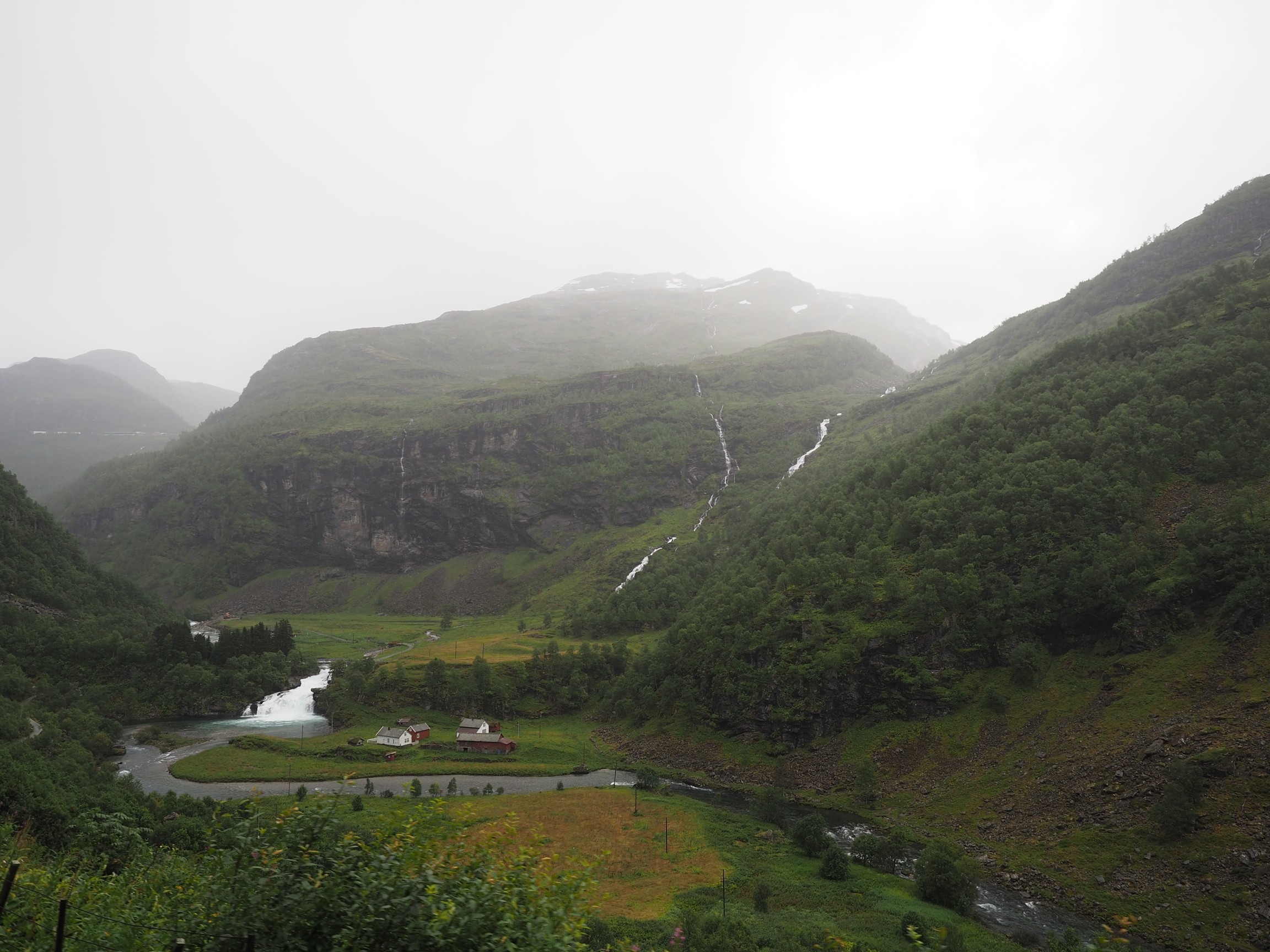
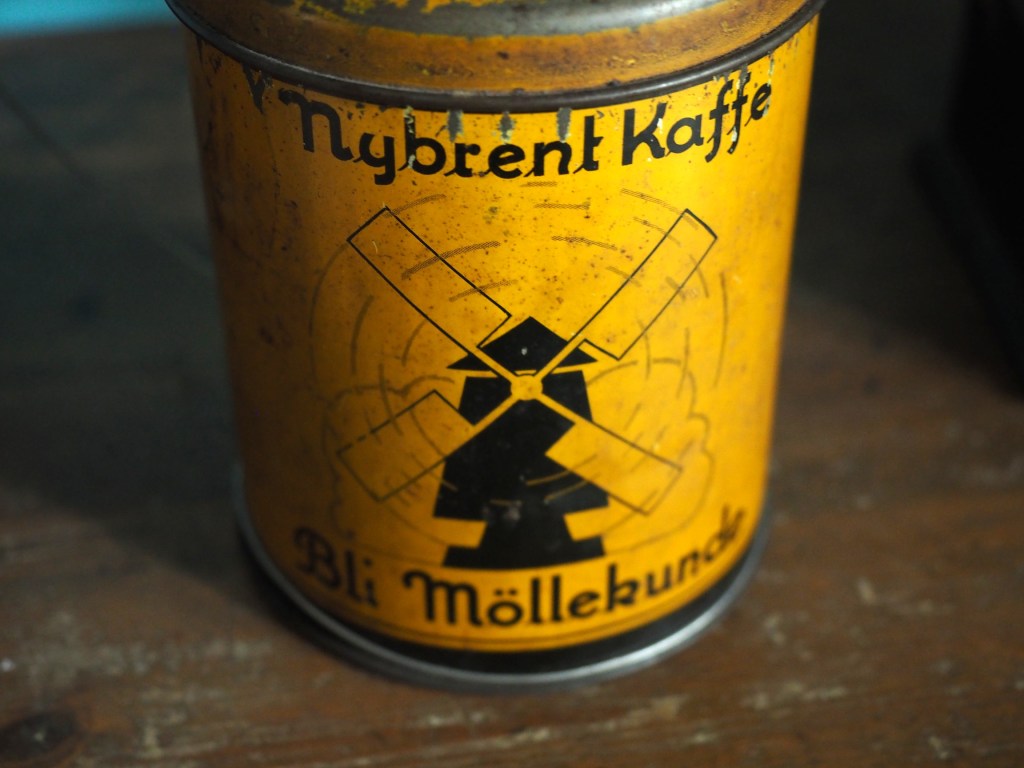
Some photographs contain blur which is very challenging to remove. Large scale blur, which is the result of motion, or defocus can’t really be suppressed in any meaningful manner. What can usually be achieved by means of image sharpening algorithms is that finer structures in an image can be made to look more crisp. Take for example the coffee can image shown below, in which the upper lettering on the label in almost in focus, while the lower lettering has the softer appearance associated with de-focus.

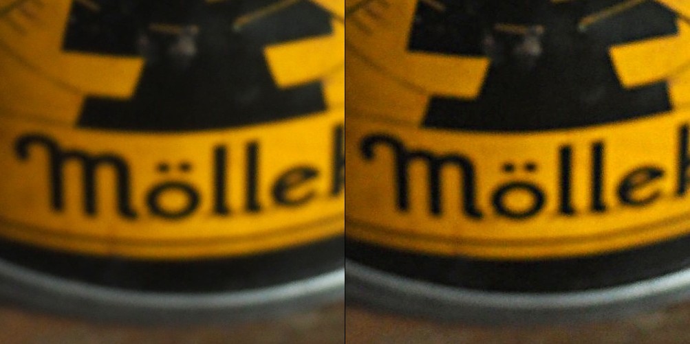
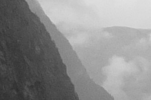
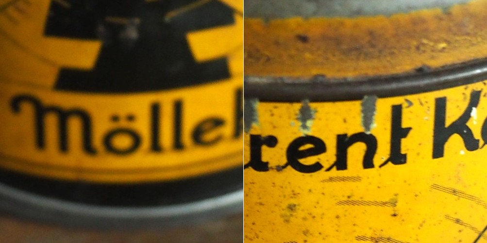
The problem with this image is partially the fact that the blur is not uniform. Below are two regions enlarged:containing text from opposite ends of the blur spectrum.

Reducing blur, involves a concept known as image sharpening(which is different from removing motion blur, a much more challenging task). The easiest technique for image sharpening, and the one most often found in software such as Photoshop is known as unsharp masking. It is derived from analog photography, and basically works by subtracting a blurry version of the original image from the original image. It is by no means perfect, and is problematic in images where there is noise, as it tends to accentuate the noise, but it is simple.

Here I am using the “Unsharp Mask” filter from ImageJ. It subtracts a blurred copy of the image and rescales the image to obtain the same contrast of low frequency structures as in the input image. It works in the following manner:

  1. Obtain a Gaussian blurred image, by specifying a blur radius (in the example below the radius = 5).
  2. Filter the blurred image using a “Mask Weight, which determines the strength of filtering. A value from 0.1-0.9. (In the example below, the mask weight =0.4)
  3. Subtract the filtering image from the original image.
  4. Divide the resulting image by (1.0-mask weight) – 0.6 in the case of the example.
1. Original image; 2. Gaussian blurred image (radius=5); 3. Filtered image (multiplied by 0.4); 4. Subtracted image (original-filtered); 5. Final image (subtracted image / 0.6)

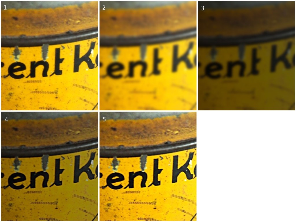
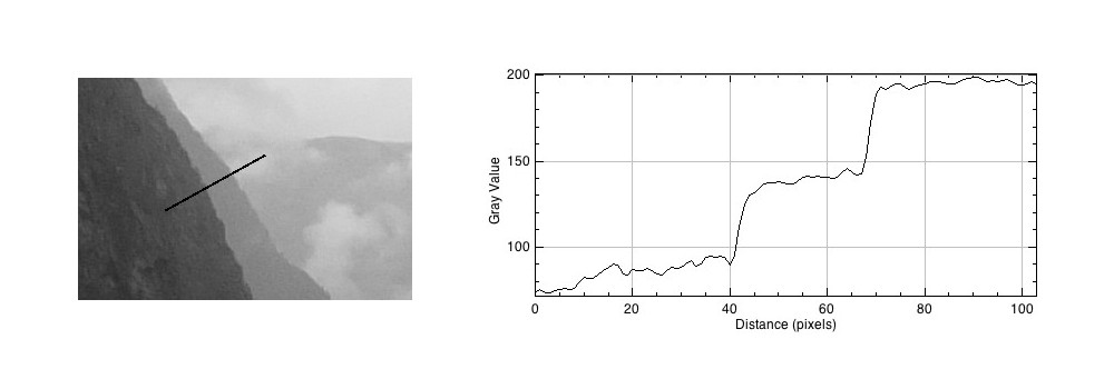
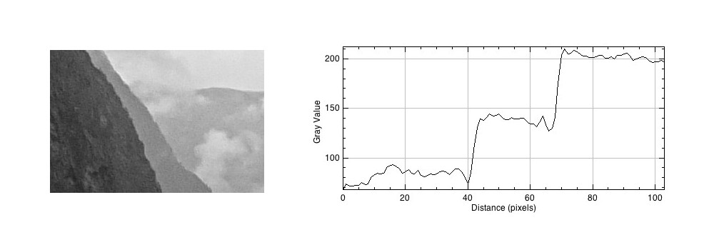
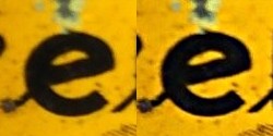
If we compare the resulting images, using an enlarged region, we find the unsharp masking filter has slightly improved the sharpness of the text in the image, but this may also be attributed to the slight enhancement in contrast. This part of the original image has less blur though, so let’s apply the filter to the second image.

The original image (left) vs. the filtered image (right)

Below is the result on the second portion of the image. There is next to no improvement in the sharpness of the image. So while it may be possible to slightly improve sharpness, where the picture is not badly blurred, excessive blur is impossible to “remove”. Improvements in acuity may be more to the slight contrast adjustments and how they are perceived by the eye.

More on Mach bands

Consider the following photograph, taken on a drizzly day in Norway with a cloudy sky, and the mountains somewhat obscured by mist and clouds.

Now let’s look at the intensity image (the colour image has been converted to 8-bit monochrome):

If we look at a region near the top of the mountain, and extract a circular region, there are three distinct regions along a line. To the human eye, these appear as quite uniform regions, which transition along a crisp border. In the profile of a line through these regions though, there are two “cliffs” (Aand B) that marks the shift from one region to the next. Human eyes don’t perceive these “cliffs”.

The Mach bands is an illusion that suggests edges in an image where in fact the intensity is changing in a smooth manner.

The downside to Mach bands is that they are an artificial phenomena produced by the human visual system. As such, it might actually interfere with visual inspection to determine the sharpness contained in an image.

Mach bands and the perception of images

Photographs, and the results obtained through image processing are at the mercy of the human visual system. A machine cannot interpret how visually appealing an image is, because aesthetic perception is different for everyone. Image sharpening takes advantage of one of the tricks of our visual system. Human eyes see what are termed “Mach bands” at the edges of sharp transitions, which affect how we perceive images. This optical illusion was first explained by Austrian physicist and philosopher Ernst Mach (1838–1916) in 1865. Mach discovered how our eyes leverage the use of contrast to compensate for its inability to resolve fine detail. Consider the image below containing ten squares of differing levels of gray.

Notice how the gray squares appear to scallop, with a lighter band on the left, and a darker band on the right of the squares? This is an optical illusion, in fact the gray squares are all uniform in intensity. To resolve the brain/eyes deficiency in being able to resolve detail, incoming light gets processed in such a manner than the contrast between two different tones is exaggerated. This gives the perception of more detail. The dark and light bands seen on either side of the gradation are the Mach bands. Here is an example of what human eyes see:

What does this have to do with manipulation techniques such as image sharpening? The human brain perceives exaggerated intensity changes near edges – so image sharpening uses this notion to introduce faux Mach bands by amplifying intensity edges. Consider as an example the following  image, which basically shows two mountain sides, one behind the other. Without looking too closely you can see the Mach bands.

Taking a profile perpendicular to the mountain sides provides an indication of the intensity values along the profile, and shows the edges.

The profile shows three plateaus, and two cliffs (the cliffs are ignored by the human eyes). The first plateau is the foreground mountainside, the middle plateau is the mountainside behind that, and the uppermost plateau is some cloud cover. Now we apply an unsharp masking filter to the image, to sharpen the image (radius=10, mask weight=0.4)

Notice how the UM filter has the effect of adding a Mach band to each of the cliff regions.

Creating art-like effects in photographs

Art-like effects are easy to create in photographs. The idea is to remove textures, and sharpen edges in a photograph to make it appear more like abstract art. Consider the image below. An art-like effect has been created on this image using a filter known as Kuwahara. It has the effect of homogenizing regions of colour, hence you will notice a loss of detail within the image, and colours within a region. It was originally designed to process angiocardiographic images. The usefulness of filters such as Kuwahara is that they remove detail and  increase abstraction. Another example of such a filter is the bilateral filter.

Image (before) and (after)

The Kuwahara is based on local area “flattening”, removing detail in high-contrast regions while protecting shape boundaries in low-contrast areas. The only issue with Kuwahara is that is can produce somewhat “blocky” results. Choosing a different shaped “neighbourhood” will have a different affect on the image. A close-up view of the beetle in the image above shows the distinct edges of the processed image. Note also how some of the features have changed colour slightly (the beetles legs have transformed from dark brown to a pale brown colour), due to the influence of the surrounding pink petal colour.

Close-up detail (before) and (after)

Filters like Kuwahara are also used to remove noise from images.

The perception of enhanced colour images

Image processing becomes more difficult when you involve colour images. That’s primarily because there is more data involved. With monochrome images, there is really only intensity. With colour images comes chromaticity – and the possibility of modifying the intrinsic colours within an image whilst performing some form of image enhancement. Often, image enhancement in colour images is challenging because the impact of the enhancement is very subjective.

Consider this image of Schynige Platte in Switzerland. It is very colourful, and seems quite vibrant.

The sky however seems too aquamarine. The whole picture seems like some sort of “antique photo filter” has been applied to it. How do we enhance it, and what do we want to enhance? Do we want to make the colours more vibrant? Do we want to improve the contrast?

In the first instance, we merely stretch the histogram to reduce the gray tonality of the image. Everything becomes much brighter, and there is a slight improvement in contrast. There are parts of the image that do seem too yellow, but it is hard to know whether this is an artifact of the original scene, or the photograph (likely an artifact of dispersing yellow flower petals).

Alternatively, we can improve the images contrast. In this case, this is achieved by applying a Retinex filter to the image, and then taking the average of the filter result and the original image. The resulting image is not as “bright”, but shows more contrast, especially in the meadows.

Are either of these enhanced images better? The answer of course is in the eye of the beholder. All three images have certain qualities which are appealing. At the end of the day, improving the aesthetic appeal of a colour image is not an easy task, and there is no “best” algorithm.

How many colours are in a photograph?

The number of colours in a 24-bit colour image is 256³ or 16,777,216 colours. So how many colours are there in a 8 MP photo? Consider the following beautiful photograph:

Picture of a flower on a Japanese quince tree.
A picture of a flower from a Japanese quince

In this image there are 515,562 unique colours. Here’s what is looks like as a 3D RGB histogram:

Most photographs will not contain 16 million colours (obviously if they have less than 16 MP, that’s a given). If you want to check out some images that do, try allrgb.com. Here is another image with more colours: 1,357,892 to be exact. In reality, very few real everyday photographs contain that amount of hue varieties.

Stained glass window at Metro Charlevoix in Montreal

Now as the average number of colours humans can perceive is only around a million, having 16 million colours in an image is likely overkill.

The realization of colour

Colour is a complex sensation, but we should remember that an object has no single characteristic colour because its appearance is affected by a number of factors. If we ask what the colour of the girls kimonos are from the image below (from a series of ca.1880s-90s full-plate images printed by sunlight on simple “salted paper”, and hand-tinted with transparent water colours), our first reaction may be to say that they are purple. By this means we identify the hue of the object. However, this description is clearly inadequate. To be more specific, we could say that one kimono is light purple and the other is dark purple. This describes the brightness of the colour. Colour could also be described as bright, dull or vivid, a characteristic known as saturation. Therefore the perception of colour is comprised of three characteristics, any one of which can be varied independently. But we are really describing sensations, not the object, nor the physical stimuli reaching the eye.

A colour image from Japan

Photographic blur you can’t get rid of

Photographs sometimes contain blur. Sometimes the blur is so bad that it can’t be removed, no matter the algorithm. Algorithms can’t solve everything, even those based on physics. Photography ultimately exists because of the existence of glass lenses – you can’t make any sort of camera without them. Lenses have aberrations (although lenses these days are pretty flawless) – some of these can be dealt with in-situ using corrective algorithms.

Some of this blur is attributable to vibration – no one has hands *that* steady, and tripods aren’t always convenient. Image stabilization, or vibration reduction has done a great job in retaining image sharpness. This is especially important in low-light situations where the photograph may require a longer exposure. The rule of thumb is that a camera should not be hand-held at shutter speeds slower than the equivalent focal length of the lens. So a 200mm lens should not be handheld at speeds slower than 1/200 sec.

Sometimes though, the screen on a digital camera doesn’t tell the full story either. The resolution may be too small to appreciate the sharpness present in the image – and a small amount of blur can reduce the quality of an image. Here is a photograph taken in a low light situation, which, with the wrong settings, resulted in a longer exposure time, and some blur.

Another instance relates to close-up, or macro photography, where the depth-of-field can be quiet shallow. Here is an  example of a close-up shot of the handle of a Norwegian mangle board. The central portion of the horse, near the saddle, is in focus, the parts to either side are not – and this form of blur is impossible to suppress. Ideally in order to have the entire handle in focus, one would have to use a technique known as focus stacking (available in some cameras).

Here is another example of a can where the writing at the top of the can is almost in focus, whereas the writing at the bottom is out-of-focus – due in part to the angle the shot was taken, and the shallow depth of field. It may be possible to sharpen the upper text, but reducing the blur at the bottom may be challenging.

The Bayer filter

Without the colour filters in a camera sensor, the images acquired would be monochromatic. The most common colour filter used by many camera is the Bayer filter array. The pattern was introduced by Bryce Bayer of Eastman Kodak Company in a 1975 patent (No.3,971,065). The raw output of the Bayer array is called a Bayer pattern image. The most common arrangement of colour filters in Bayer uses a mosaic of the RGBG quartet, where every 2×2 pixel square is composed of a Red and Green pixel on the top row, and a Green and Blue pixel on the bottom row. This means that not every pixel is sampled as Red-Green-Blue, but rather one colour for each photosite. The image below shows how the Bayer mosaic is decomposed.

bayer-array
Decomposing the Bayer colour filter.

But why are there more green filters? This is largely because human vision is more sensitive to colour green, so the ratio is 50% green, 25% red and 25% blue. So in a sensor with 4000×6000 pixels, 12,000 would be green, and red and blur would have 6,000 each. The green channels are used to gather luminance information. The Red and Blue channels each have half the sampling resolution of the luminance detail captured by the green channel. However human vision is much more sensitive to luminance resolution than it is to colour information so this is usually not an issue. An example of what a “raw” Bayer pattern image would look like is shown below.

bayer-testout
Actual image (left) versus raw Bayer pattern image (right)

So how do we get pixels that are full RGB? To obtain a full-color image, a demosaicing algorithm has to be applied to interpolate a set of red, green, and blue values for each pixel. These algorithms make use of the surrounding pixels of the corresponding colors to estimate the values for a particular pixel. The simplest form of algorithm averages the surrounding pixels to derive the missing data. The exact algorithm used depends on the camera manufacturer.

Of course Bayer is not the only filter pattern. Fuji created its own version, the X-Trans colour filter array which uses a larger 6×6 pattern of red, green, and blue.

How do camera sensors work?

So we have described photosites, but how does a camera sensor actually work? What sort of magic happens inside a digital camera? When the shutter button is pressed, and the sensor exposed to light, the light passes through the lens, and then through a series of filters, a microlens array, and a colour filter, before being deposited in the photosite. A photodiode then converts the light into an electrical signal produced into a quantifiable digital value.

Cross-section of a sensor.

The uppermost layer of a sensor typically contains certain filters. One of these is the infrared (IR) filter. Light contains both ultraviolet and infrared parts, and most sensors are very sensitive to infrared radiation. Hence the IR filter is used to eliminate the IR radiation. Other filters include anti-aliasing (AA) filters which blur the lines between repeating patterns in order to avoid wavy lines (moiré).

Next come the microlenses. One would assume that photosites are butted up against one another, but in reality that’s not the case. Camera sensors have a “microlens” above each photosite to concentrate the amount of light gathered.

Photosites by themselves have a problem distinguishing colour.  To capture colour, a filter has to be placed over each photosite, to capture only specific colours. A red filter allows only red light to enter the photosite, a green filter only green, and a blue filter only blue. Therefore, each photosite contributes information about one of the three colours that, together, comprise the complete colour system of a photograph (RGB).

sensor-colour1
Filtering light using colour filters, in this case showing a Bayer filter.

The most common type of colour filter array is called a Bayer filter. The array in a Bayer filter consists of a repetitive pattern of 2×2 squares comprised of a red, blue, and two green filters. The Bayer filter has more green than red or blue because human vision is more sensitive to green light.

A basic diagram of the overall process looks something like this:

Light photons enter the aperture, and a portion are allowed through the shutter. The camera sensor (photosites) then absorbs the light photons producing an electrical signal which may be amplified by the ISO amplifier before it is turned into the pixels of a digital image.