In every photograph the moment is fixed forever. In some it is the very moment that we prize, because it is such vivid history. In a few the moment magically becomes forever.
Beaumont Newhall in The History of Photography, the Museum of Modern Art, New York, 1949.
Uncategorized
Pixels and resolution
Pixels actually help define image resolution. Image resolution is the level of visual detail in an image, and is usually represented as the number of pixels in an image. An image with a high density of pixels will have a higher resolution, providing both better definition, and more details. An image with low resolution will have less pixels and consequently less details and definition. Resolution is the difference between a 24MP image, and a 4MP image. Consider the example below which shows four different resolutions of the same image, shown as they would appear on a screen.
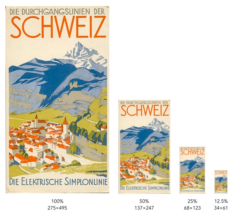
Each image is ¼ the size of the previous image, meaning it has 75% less detail. However it is hard to determine how much detail has been lost. In some cases the human visual system will compensate for details lost by filling in information. To understand how resolution impacts the quality of an image, it is best to look the images using the same image dimensions. This means zooming in the images with less resolution so they appear the same size as the 100% image.
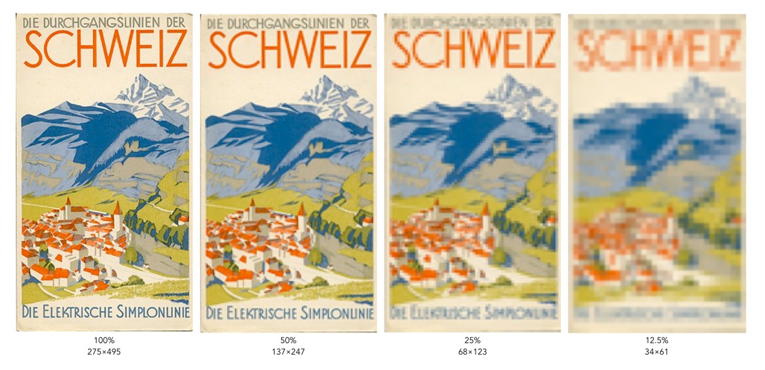
You can clearly see that when the resolution of an image decreases, the finer details tend to get washed out. This is especially prevalent in regions of this image which have text. Low resolution essentially means details become pixelated or blobby. These examples are quite extreme of course. With the size of modern camera sensors, taking a 24MP (6000×4000) image, and reducing it 25% would still result in an image 1500×1000 pixels in size. The quality of these lower resolution images is actually perceived to be quite good, because of the limited resolution of screens. Below is an example of a high resolution image and the same image in low resolution at 1/8th the size.
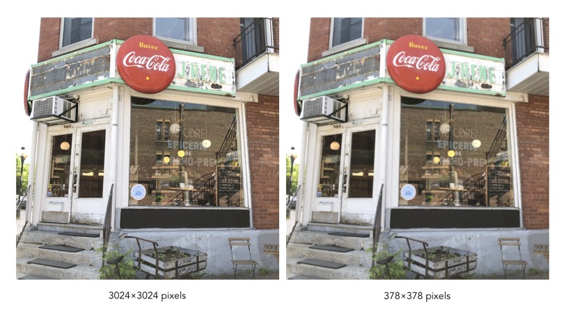
They are perceptually quite similar. It is not until one enlarges a region that the degradation becomes clear. These artifacts are particularly prevalent in fine details, such as text.

How do camera sensors work?
So we have described photosites, but how does a camera sensor actually work? What sort of magic happens inside a digital camera? When the shutter button is pressed, and the sensor exposed to light, the light passes through the lens, and then through a series of filters, a microlens array, and a colour filter, before being deposited in the photosite. A photodiode then converts the light into an electrical signal produced into a quantifiable digital value.
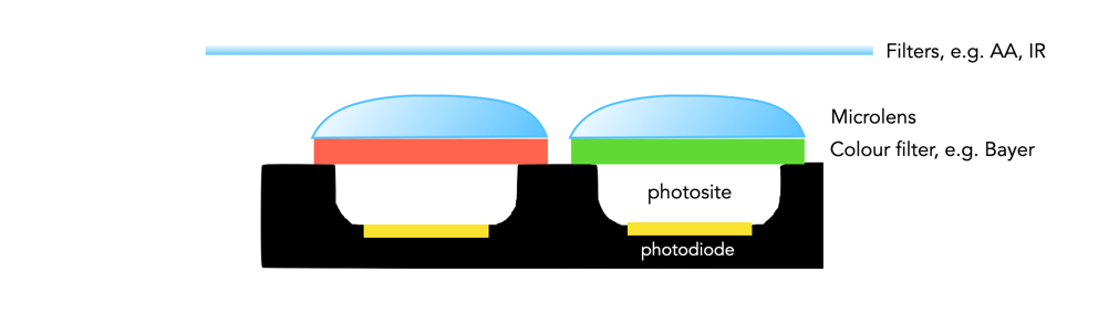
The uppermost layer of a sensor typically contains certain filters. One of these is the infrared (IR) filter. Light contains both ultraviolet and infrared parts, and most sensors are very sensitive to infrared radiation. Hence the IR filter is used to eliminate the IR radiation. Other filters include anti-aliasing (AA) filters which blur the lines between repeating patterns in order to avoid wavy lines (moiré).
Next come the microlenses. One would assume that photosites are butted up against one another, but in reality that’s not the case. Camera sensors have a “microlens” above each photosite to concentrate the amount of light gathered.
Photosites by themselves have a problem distinguishing colour. To capture colour, a filter has to be placed over each photosite, to capture only specific colours. A red filter allows only red light to enter the photosite, a green filter only green, and a blue filter only blue. Therefore, each photosite contributes information about one of the three colours that, together, comprise the complete colour system of a photograph (RGB).
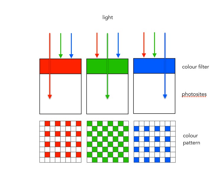
The most common type of colour filter array is called a Bayer filter. The array in a Bayer filter consists of a repetitive pattern of 2×2 squares comprised of a red, blue, and two green filters. The Bayer filter has more green than red or blue because human vision is more sensitive to green light.
A basic diagram of the overall process looks something like this:
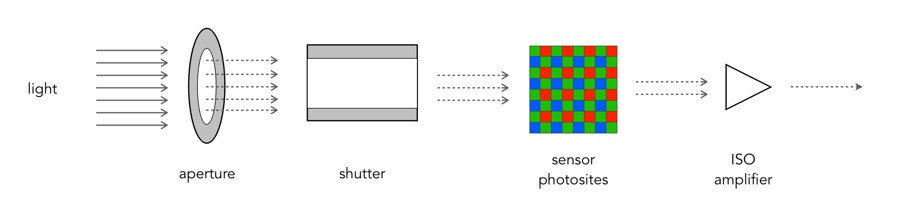
Light photons enter the aperture, and a portion are allowed through the shutter. The camera sensor (photosites) then absorbs the light photons producing an electrical signal which may be amplified by the ISO amplifier before it is turned into the pixels of a digital image.
What is a grayscale image?
If you are starting to learn about image processing then you will likely be dealing with grayscale or 8-bit images. This effectively means that they contain 2^8 or 256 different shades of gray, from 0 (black), to 255 (white). They are the simplest form of image to create image processing algorithms for. There are some image types that are more than 8-bit, e.g. 10-bit (1024 shades of grey), but in reality these are only used in specialist applications. Why? Doesn’t more shades of grey mean a better image? Not necessarily.
The main reason? Blame the human visual system. It is designed for colour, having three cone photoreceptors for conveying colour information that allows humans to perceive approximately 10 million unique colours. It has been suggested that from the perspective of grays, human eyes cannot perceptually see the difference between 32 and 256 graylevel intensities (there is only one photoreceptor with deals with black and white). So 256 levels of gray are really for the benefit of the machine, and although the machine would be just as happy processing 1024, it is likely not needed.
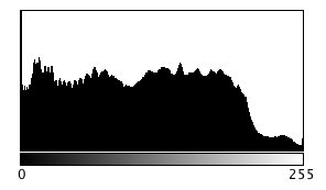
Here is an example. Consider the following photo of the London Blitz, WW2 (New Times Paris Bureau Collection).

This is a nice grayscale image, because it has a good distribution of intensity values from 0 to 255 (which is not always easy to find). Here is the histogram:
Now consider the image, reduced to 8, 16, 32, 64, and 128 intensity levels. Here is a montage of the results, shown in the form of a region extracted form he original image.

Not that there is very little perceivable difference, except at 8 intensity levels, where the image starts to become somewhat grainy. Now consider a companion of this enlarged region showing only 256 (left) versus 32 (right) intensity levels.

Can you see the difference? There is very little difference, especially when viewed in the over context of the complete image.
Many historic images look like they are grayscale, but in fact they are anything but. They may be slightly yellowish or brown in colour, either due to the photographic process, or due to aging of the photographic medium. There is no benefit to processing these type of photographs as colour images however, they should be converted to 8-bit.
Does flash photography affect museum artifacts?
On a trip to the Louvre in Paris (10 years ago now), I noticed that the information guide stated “flash photography is strongly discouraged throughout the galleries”. The only place I really saw this enforced was in front of the Mona Lisa. Not a problem you say, everyone will abide by this. Well, not so it appears. I would imagine a good proportion of visitors have some form of digital camera, usually of the “point-and-shoot” (PS) type where the use of flash is automatic if light levels are low. There are of course two reasons for prohibiting the use of flash photography. One is that it disturbs other patrons. The second is that the flash has a direct effect, causing accelerated fading in artifacts such paintings and textiles. So what is the scientific basis for these restrictions? Well very little has actually been written about the effect of photographic flashes on exhibits. In 1994 Evans[1] wrote a small 3-page note discussing whether exhibits can be harmed by photographic flash, but there seems to be very little scientific data to back up claims that flashes cause accelerated fading. The earliest experiment was performed in 1970 using multiple flash (25,000) exposures [2]. Evans has written another article [3], which looks at the quantitative evidence behind banning flash photography in museums.
“Photographic flashes can damage art”. This is sort of a very broad statement. Strictly speaking, I would imagine the damaging affects of 1000 sweaty hands touching the Venus de Milowould greatly outweigh 1000 photographic flashes. It is doubtful that flash photography does any real damage. Should it be used? Unless you are using a professional lighting setup, you can probably achieve better pictures by not using a flash. Frankly if you are taking photographs of paintings in an art gallery you might be better off buying a book on the artist at the gallery shop. That, and flashes in enclosed spaces are annoying. Here is an example of a photo taken in the National Gallery of Norway, without the use of a flash. Actually, the biggest problem taking photographs indoors is possibly too many lights, and reflections off glass.

[1] Evans, M.H., “Photography: Can gallery exhibits be harmed by visitors using photographic flash?,” Museum Management and Curatorship, vol. 13, pp. 104-106, 1994.
[2] Hanlan, J.F., “The effect of electronic photographic lamps on the materials of works of art.,” Museum News, vol. 48, pp. 33, 1970.
[3] Evans, M.H., “Amateur photographers in art galleries: Assessing the harm done by flash photography”.
Digital photography: some things just aren’t possible
Despite the advances in digital photography, we are yet to see a camera which views a scene the same way that our eyes do. True, we aren’t able to capture and store scenes with our eyes, but they do have inherently advanced ability to optically analyze our surroundings, thanks in part to millions of years of coevolution with our brains.
There are some things that just aren’t possible in post-processing digital images. One is removing glare, and reflections from glass. Consider the image below, which was taken directly in front of a shop window. The photograph basically reflects the image from the opposite side of the street. Now getting rid of this is challenging. One idea might be to use a polarizing filter, but that won’t work directly in front of a window (a polarising filter removes light beams with a specific angle. As the sensor doesn’t record the angle of the light beams, it can’t be recreated in post-processing.). Another option is to actually take the shot at a different part of the day, or the night. There is no fancy image processing algorithm that will remove the reflection, although someone has undoubtedly tried. This is a case where the photographic acquisition process is all.
Glass reflection in a shop window.
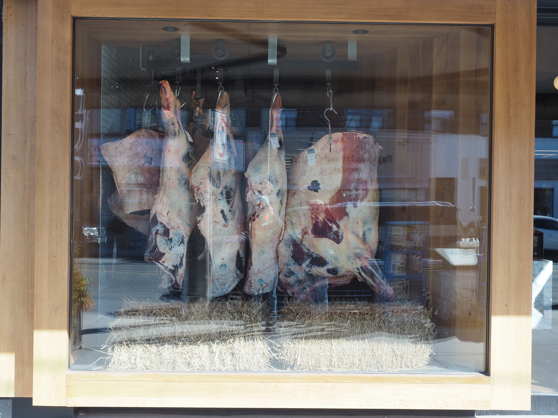
Any filter that changes properties of the light that isn’t captured by the digital sensor (or film), is impossible to reproduce in post-processing. Sometimes the easiest approach to taking a photograph of something in a window is to wait for an overcast day, or even photograph the scene at night. Here is a similar image taken of a butcher shop in Montreal.

Nighttime image, no reflection, and backlit.
This image works well, because the contents of the image are back-lit from within the building. If we aren’t that concerned about the lighting on the building itself, this works nicely – just changes the aesthetics of the image to concentrate more on the meat in the window.
In image processing, have we have forgotten about aesthetic appeal?
In the golden days of photography, the quality and aesthetic appeal of the photograph was unknown until after the photograph was processed, and the craft of physically processing it played a role in how it turned out. These images were rarely enhanced because it wasn’t as simple as just manipulating it in Photoshop. Enter the digital era. It is now easier to take photographs, from just about any device, anywhere. The internet would not be what it is today without digital media, and yet we have moved from a time when photography was a true art, to one in which photography is a craft. Why a craft? Just like a woodworker crafts a piece of wood into a piece of furniture, so to do photographers crafting their photographs in the like of Lightroom,or Photoshop.There is nothing wrong with that, although I feel like too much processing takes away from the artistic side of photography.
Ironically the image processing community has spent years developing filters to process images, to make them look more visually appealing – sharpening filters to improve acuity, contrast enhancement filters to enhance features. The problem is that many of these filters were designed to work in an “automated” manner (and many really don’t work well), and the reality is that people prefer to use interactive filters. A sharpening filter may work best when the user can modify its strength, and judge its aesthetic appeal through qualitative means. The only place “automatic” image enhancement algorithms exist are those in-app filters, and in-camera filters. The problem is that it is far too difficult to judge how a generic filter will affect a photograph, and each photograph is different. Consider the following photograph.

A vacation pic.
The photograph was taken using the macro feature on my 12-40mm Olympus m4/3 lens. The focal area is the top-part of the bottom of the wooden bucket. So some of the cherries are in focus, others are not, and there is a distinct soft blur in the remainder of the picture. This is largely because of the low depth of field associated with close-ip photographs… but in this case I don’t consider this a limitation, and would not necessarily want to suppress it through sharpening, although I might selectively enhance the cherries, either through targeted sharpening or colour enhancement. The blur is intrinsic to the aesthetic appeal of the image.
Most filters that have been incredibly successful are usually proprietary, and so the magic exists in a black box. The filters created by academics have never faired that well. Many times they are targeted to a particular application, poorly tested (on Lena perhaps?), or not at all designed from the perspective of aesthetics. It is much easier to manipulate a photograph in Photoshop because the aesthetics can be tailored to the users needs. We in the image processing community have spent far too many years worrying about quantitative methods of determining the viability of algorithms to improve images, but the reality is that aesthetic appeal is all that really matters. Aesthetic appeal matters, and it is not something that is quantifiable. Generic algorithms to improve the quality of images don’t exist, it’s just not possible in the overall scope of the images available. Filters like Instagram’s Larkwork because they are not changing the content of the image really, they are modifying the colour palette, and they do that applying the same look-up table for all images (derived from some curve transformation).
People doing image processing or computer vision research need to move beyond the processing and get out and take photographs. Partially to learn first hand the problems associated with taking photographs, but also to gain an understanding of the intricacies of aesthetic appeal.
30-odd shades of gray – the importance of gray in vision
Gray (or grey) means a colour “without colour”… and it is a colour. But in terms of image processing we more commonly use gray as a term synonymous to monochromatic (although monochrome means single colour). Now grayscale images can potentially come with limitless levels of gray, but while this is practical for a machine, it’s not useful for humans. Why? Because the structure of human eyes is composed of a system for conveying colour information. This allows humans to distinguish between approximately 10 million colours, but only about 30 shades of gray.
The human eye has two core forms of photoreceptor cells: rods and cones. Cones deal with visioning colour, while rods allow us to see grayscale in low-light conditions, e.g. night. The human eye has three types of cones sensitive to magenta, green, and yellow-to-red. Each of these cones react to an interval of different wavelengths, for example blue light stimulates the green receptors. However, of all the possible wavelengths of light, our eyes detect only a small band, typically in the range of 380-720 nanometres, what we known as the visible spectrum. The brain then combines signals from the receptors to give us the impression of colour. So every person will perceive colours slightly differently, and this might also be different depending on location, or even culture.
After the light is absorbed by the cones, the responses are transformed into three signals: a black-white (achromatic) signal and two colour-difference signals: a red-green and a blue-yellow. This theory was put forward by German physiologist Ewald Hering in the late 19th century. It is important for the vision system to properly reproduce blacks, grays, and whites. Deviations from these norms are usually very noticeable, and even a small amount of hue can produce a noticeable defect. Consider the following image which contains a number of regions that are white, gray, and black.
Now consider the photograph with a slight blue colour cast. The whites, grays, *and* blacks have taken on the cast (giving the photograph a very cold feel to it).
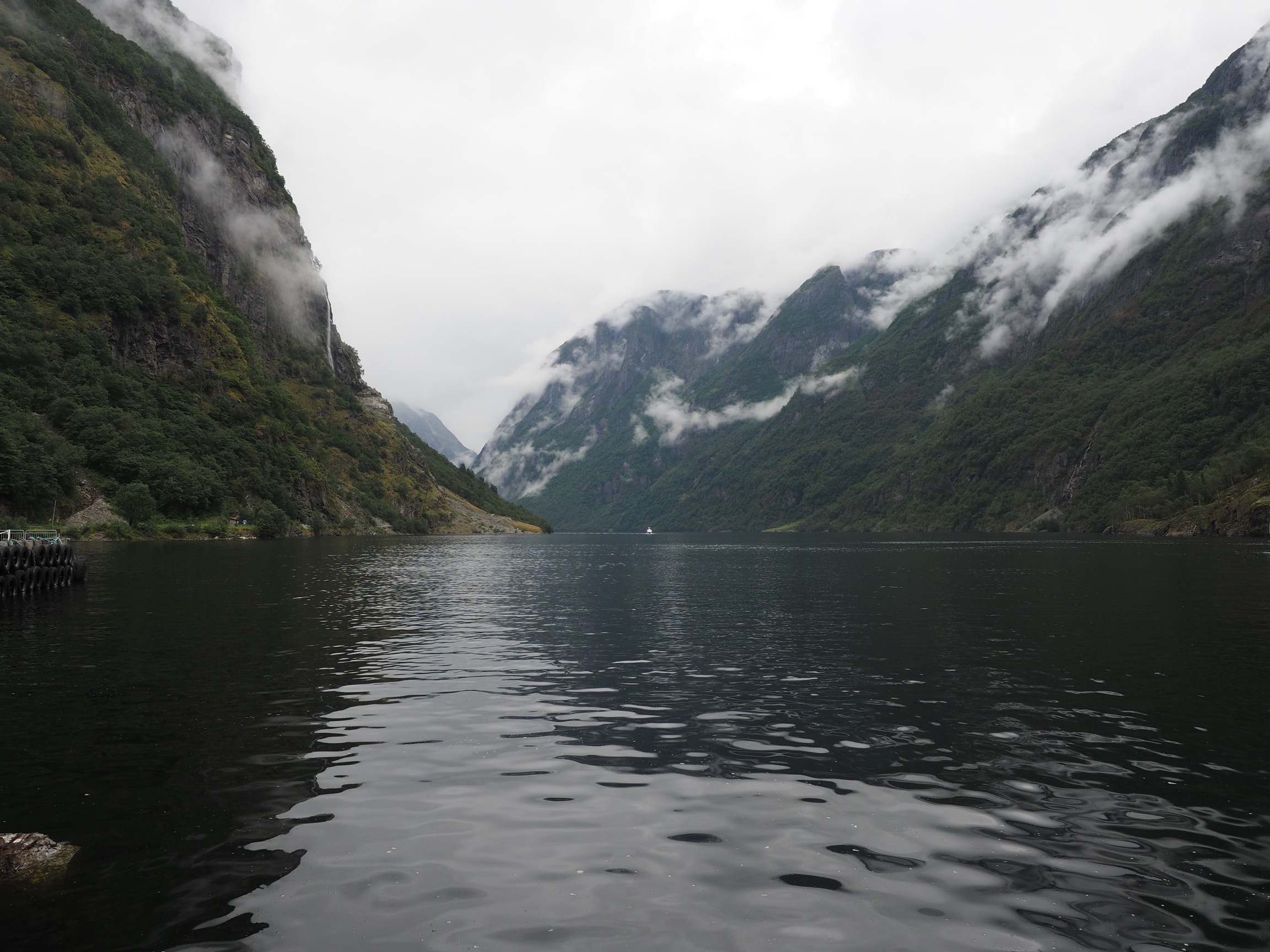
The grayscale portion of our vision also provides contrast, without which images would have very little depth. This is synonymous with removing the intensity portion of an image. Consider the following image of some rail snowblowers on the Oslo-Bergen railway in Norway.

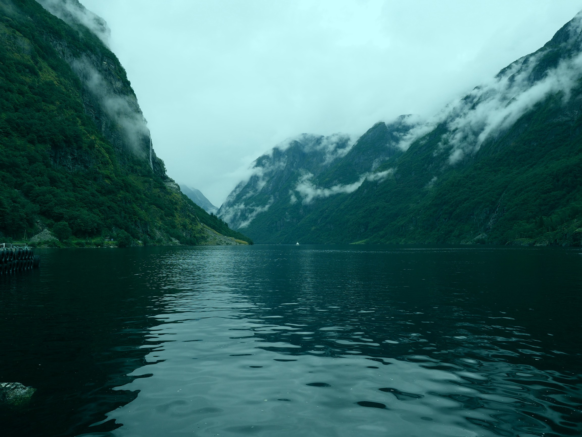
Now, let’s take away the intensity component (by converting it to HSB, and replacing the B component with white, i.e. 255). This is what you get:

The image shows the hue and saturation components, but no contrast, making it appear extremely flat. The other issue is that sharpness depends much more on the luminance than the chrominance component of images (as you will also notice in the example above). It does make a nice art filter though.
A move back to manual photography
When I was in university I dabbled in some photography. I had two Fuji cameras, I think one was a Fuji STX-2 35mm SLR. I had a couple of standard lenses, and a 300mm telephoto that I found at home and bought an adapter for. I did some nature photography, mostly birds, putting the 300mm to good use. I did some B&W and did some of my own processing (our residence had a darkroom). But I grew tired of lugging photographic gear on trips, and eventually in the late 90’s traded in that gear, and bought a compact 35mm camera. It was just handier. When my wife and I went to Arizona in 2000, we both took our 35mm compact cameras with us. When we came back from that trip we had 12-15 rolls of film, and at that point I concluded that I was done with analogue film, largely because of the inconvenience, and cost (I think some are still unprocessed!). The next year we bought our first digital camera, a 2MP Olympus. We took it on a trip to Switzerland and Germany, and it was great. I never went back to analogue.
Now, 18 off years later, a change of plan. There seems to be an increasing trend, unlike that of records, towards analogue cameras, and film. To this end, I went and bought an Olympus OM-2 with a 50mm f1.4 lens. It feels *awesome*. Film is readily available, and actually quite inexpensive to process. Don’t get me wrong, I’m not ditching digital, in fact I’m going to use the analogue lens on my Olympus EM-5(II), and maybe even pick up an E-1. But what I long for is the feel and artistic appeal of the analogue camera… not necessarily for travel afar, but for local photography. I long to experiment with a camera that is very simple. I want to teach my daughter (who uses one of those instant Polaroid type cameras), about the true basic art of photography., and explore the inner workings of the analogue system. In part I believe that playing with film will help me better understand the subtle nuances with taking good photographs, without the aid of extensive digital controls. The need for more control was brought on when I started using the Voigtländer lens on my EM-5, something that required me to manually focus. It’s easy to forget how much tactile knowledge is discarded when we give over to digital control.
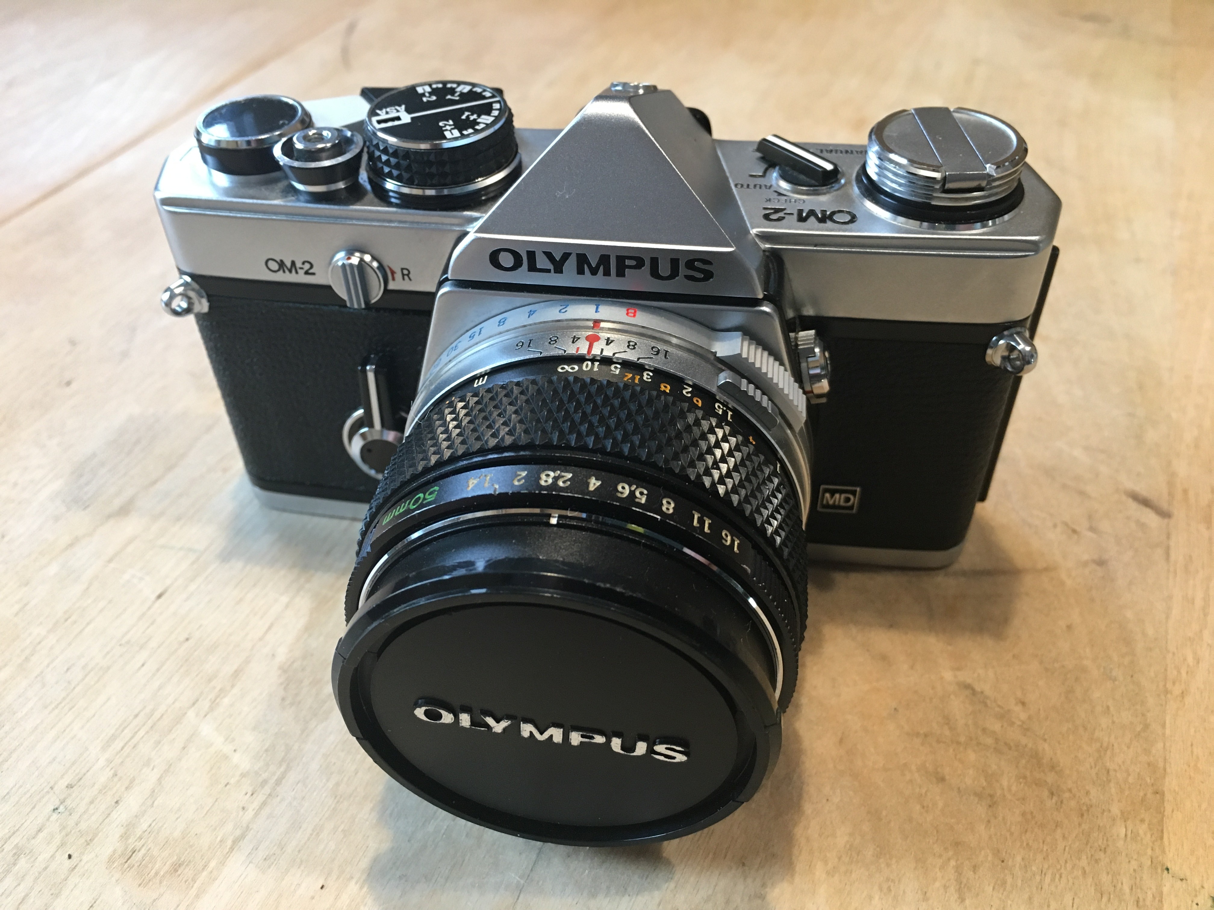
Olympus OM-2
The problem with anything digital is that we hand over our innovative processes to the machine… and I’m somewhat over that. I don’t need AI to take the perfect picture, in fact I don’t need the perfect picture. Analog photography was never perfect, but that was its beauty, just as nothing in the world is completely perfect, and maybe we should stop trying to manipulate it so that it is.
P.S. If you’re looking for a manual camera in the GTA, try F-STOP Photo Accessories, in downtown TO. That’s where I bought this camera. It’s a small shop, but they have an amazing selection of manual cameras, at *exceptional* prices.
In-camera keystone compensation (Olympus) (ii)
So I took some photographs using the Olympus keystone compensation on a trip to Montreal. Most of them deal with buildings that are leaning back, which is the classic case when trying to photograph a building. The first set deal with some landscape photographs. In both these photographs I could not move any further back to take the photographs, and both were taken with the Olympus 12-40mm, set as wide angle (12mm or 24mm full frae equivalent).It was possible to correct both images, without loosing any of the building.
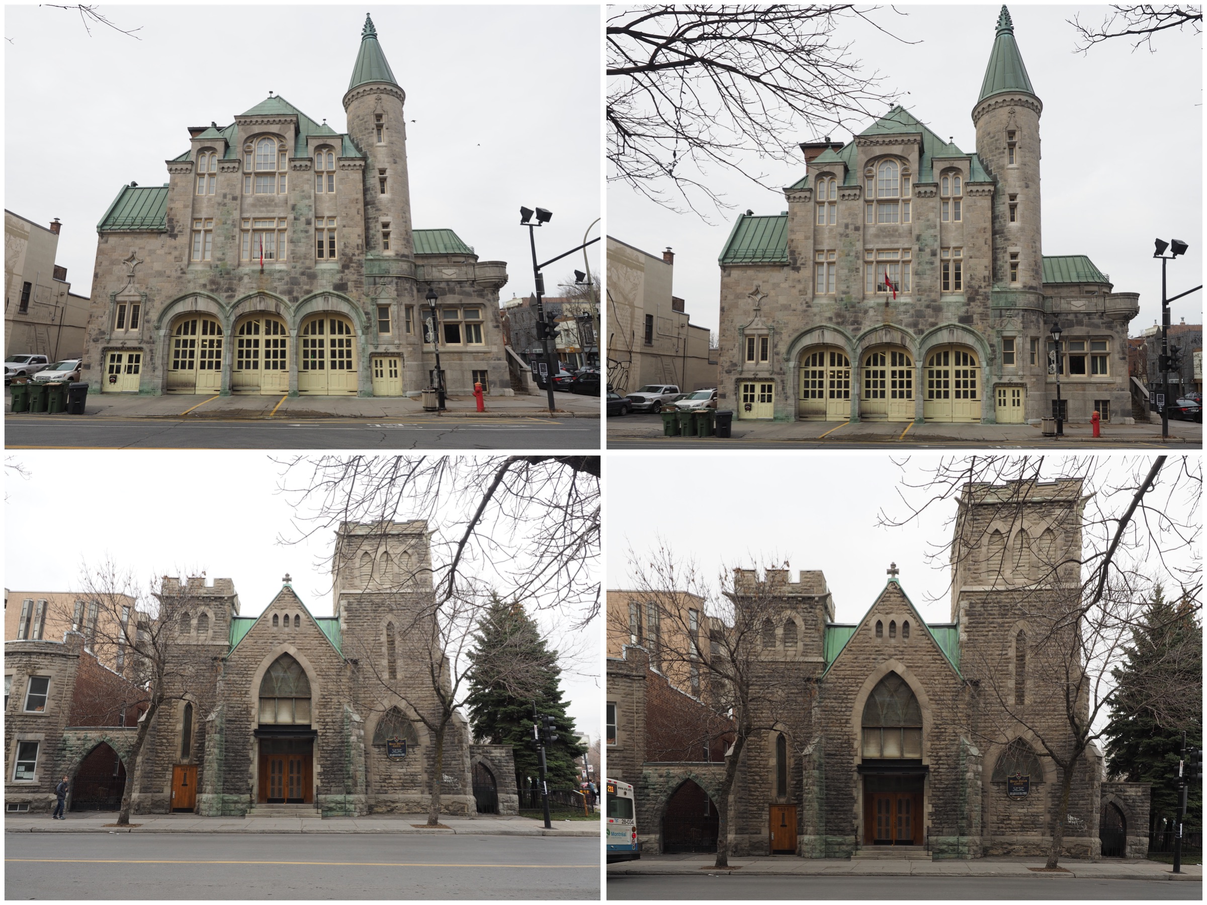
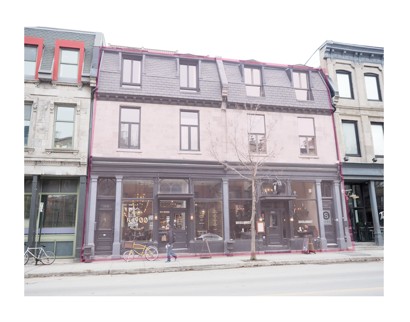
The second case deals with portrait format photographs. In both cases it was slightly more challenging to make sure the entire picture was in the frame, but doing it in-situ it was possible to assure this happened. Doing in post-processing may result in the lose of a portion of the photograph. In the lower image I had enough leeway to position the keystone-corrected frame in such a manner that the building is surrounded by ample space.

Compensating for perspective distortion often comes at a price. Modifying the geometry of a photograph means that less will fit in the photograph. Taking a photograph too close to a building may mean something is cut off.
Horizontal keystone correction can sometimes be more difficult, because the distortion is usually a compound distortion. In the example below, the photograph was taken slightly off-centre, producing an image which is distorted both from a horizontal and a vertical perspective.
Is there a loss in aesthetic appeal? Maybe. Food for future thought.
