Sometimes there is a need to perform a task on a whole bunch of images. I’m not talking about any sort of in depth image manipulation, but rather tasks that are tedious to do image by image. A good example is reducing the size of a series of images to be used on a website, or perhaps converting them from one image format to another. The easiest way of doing this is by means of the ImageMagick command line utility mogrify. Here is an example:
mogrify -auto-orient -format png *.jpg
This converts all the jpg files in a folder to png files. The -auto-orient option adjusts an image so that its orientation is suitable for viewing. To add the additional task of reducing the size of the image by 50%, we just have to add the -resize 50% option.
Now using ImageMagick does require one to learn about the command line. On a Mac this is best provided by iTerm2. It basically provides access to all the folders in a low-level way, so that commands are provided by means of a command-line interface (a bit old-fashioned, but highly efficient for processing files).
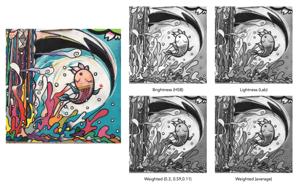
Digital cameras often provide one or more “monochrome” filters, essentially converting the colour image to grayscale (and perhaps adding some form of contrast etc.). How is this done? There are a number of ways, and each will produce a slightly different grayscale image.
All photographs are simulacra, imitations of a reality that is captured by a camera’s film or sensor, and converted to a physical representation. Take a colour photograph, and in most cases there will be some likeness between the colours shown in the picture, and the colours which occur in real life. This may not be perfect, because it is almost impossible to 100% accurately reproduce the colours of real life. Part of this has to do with each person’s intrinsic human visual system, and how it reproduces the colour in a scene. Another part has to do with the type of film/sensor used to acquire the image in the first place. But greens are green, and blues are blue.
Black-and-white images are in a realm of their own, because humans don’t visualize in achromatic terms. So what is a true grayscale equivalent of a colour image? The truth is there is no one single rendition. Though the term B&W derives from the world of achromatic films, even there there is no gold standard. Different films, and different cameras will present the same reality in different ways. There are various ways of acquiring a B&W picture. In an analog world there is film. In a digital world, one can choose a B&W film-simulation from a cameras repertoire of choices, or covert a colour image to B&W. No two cameras necessarily produce the same B&W image.
The conversion of an RGB colour image to a grayscale image involves computing the equivalent gray (or luminance) value Y, for each RGB pixel. There are many ways of converting a colour image to grayscale, and all will produce slightly different results.
Convert the colour image to the Lab colour space, and extract the Luminance channel.
Extract one of the RGB channels. The one closest is the Green channel.
Combine all three channels of the RGB colour space, using a particular weighted formula.
Convert the colour image to a colour space such as HSV or HSB, and extract the value or brightness components.
Examples of grayscale images produced using various methods – they may all seem the same, but there are actually subtle differences.
The lightness method
This averages the most prominent and least prominent colours.
Y = (max(R, G, B) + ,min(R, G, B)) / 2
The average method
The easiest way of calculating Y is by averaging the R, G, and B components.
Y = (R + G + B) / 3
Since we perceive red and green substantially brighter than blue, the resulting grayscale image will appear too dark in the red and green regions, and too light in the blue regions. A better approach is using a weighted sum of the colour components.
The weighted method
The weighted method weighs the red, green and blue according to their wavelengths. The weights most commonly used were created for encoding colour NTSC signals for analog television using the YUV colour model. The YUV color model represents the human perception of colour more closely than the standard RGB model used in computer graphics hardware. The Y component of the model provides a grayscale image:
Y = 0.299R + 0.587G + 0.114B
It is the same formula used in the conversion of RGB to YIQ, and YCbCr. According to this, red contributes approximately 30%, green 59% and blue 11%. Another common techniques is to converting RGB to a form of luminance using an equation like Rec 709 (ITU-BT.709), which is used on contemporary monitors.
Y = 0.2126R + 0.7152G + 0.0722B
Note that while it may seem strange to use encodings developed for TV signals, they are optimized for linear RGB values. In some situations however, such as sRGB, the components are nonlinear.
Colour space components
Instead of using a weighted sum, it is also possible to use the “intensity” component of an alternate colour space, such as the value from HSV, brightness from HSB, or Luminance from the Lab colour space. This again involves converting from RGB to another colour space. This is the process most commonly used when there is some form of manipulation to be performed on a colour image via its grayscale component, e.g. luminance stretching.
Huelessness and desaturation ≠ gray
An RGB image is hueless, or gray, when the RGB components of each pixel are the same, i.e. R=G=B. Technically, rather than a grayscale image, this is a hueless colour image.
One of the simplest ways of removing colour from an image is desaturation. This effectively means that a colour image is converted to a colour space such as HSB (Hue-Saturation-Brightness), where the saturation value is effectively set to zero for all pixels. This pushes the hues towards gray. Setting it to zero is the similar to extracting the brightness component of the image. In many image manipulation apps, desaturation creates an image that appears to be grayscale, but it is not (it is still stored as an RGB image with R=G=B).
Ultimately the particular monochrome filter used by a camera strongly depends on the colour being absorbed by the photosites, because they do not work in monochrome space. In addition certain camera simulation recipes for monochrome digital images manipulate the grayscale image produced in some manner, e.g. increase contrast.
I have worked on image processing algorithms on and off for nearly 30 years. I really don’t have much to show for it because in reality I found it was hard to build on algorithms that already existed. What am I talking about, don’t all techniques evolve? Well, yes and no. What I have learned over the years is that although it is possible to create unique, automated algorithms to process images, in most cases it is very hard to make those algorithms generic, i.e. apply the algorithm to all images, and get aesthetically pleasing results. And I am talking about image processing here, i.e. improving or changing the aesthetic appeal of images, not image analysis, whereby the information in an image is extracted in some manner – there are some good algorithms out there, especially in machine vision, but predominantly for tasks that involve repetition in controlled environments, such as food production/processing lines.
The number one thing to understand about the aesthetics of an image is that it is completely subjective. In fact image processing would be better termed image aesthetics, or aesthetic processing. Developing algorithms for sharpening an image is all good and well, but it has to actually make a difference to an image from the perspective of human perception. Take unsharp masking for example – it is the classic means of applying sharpening to an image. I have worked on enhanced algorithms for sharpening, involving morphological shapes that can be tailored to the detail in an image, and while they work better, for the average user, there may not be any perceivable difference. This is especially true of images obtained using modern sharp optics.
How does an algorithm perceive this image? How does an algorithm know exactly what needs sharpening? Does an algorithm understand the aesthetics underlying the use of Bokeh in this image?
Part of the process of developing these algorithms is understanding the art of photography, and how simple things like lenses, and how various methods of taking a photo effect the outcome. If you ignore all those and just deal with the mathematical side of things, you will never develop a worthy algorithm. Or possibly you will, but it will be too complicated for a user to understand, let alone use. As for algorithms that supposedly quantify aesthetics in some manner – they will never be able to aesthetically interpret an image in the same way as a human.
Finally, improving the aesthetic appeal of an image can never be completely given over to an automated process, although the algorithms provided in many apps these days are good. Aesthetic manipulation is still a very fluid, dynamic, subjective process accomplished best through the use of tools in an app, making subtle changes until you are satisfied with the outcome. The problem with many academically-motivated algorithms is that they are driven more from a mathematical stance, rather than one based on aesthetics.
As amateur photographers, one of the best photographic experiences is taking photographs when travelling. But it’s also often somewhat of a gamble. Sure, those perfect images you see on tourist websites and the like are truly spectacular, but they are usually taken by professional photographers who have the time to wait for the most optimal moment, and often don’t have to contend with masses of people spoiling the vista, or poor weather. Or they are photographs taken from above with a professional drone. But as don’t all have the ability, or the ability to wait all day to take the perfect photograph.
Indeed, there are some pictures you will not be able to duplicate. In many places the best photographs are the ones you can buy, i.e. postcards (doesn’t that seem old fashioned?) or photo books (before leaving Iceland on a visit years ago, I picked up a copy of I Was Here: Iceland, a small photo book by Icelandic photographer Kristján Ingi Einarsson). It’s not surprising that these images are so good, because they are taken using full-frame of medium-frame cameras, and high-resolution drones (with the proper permissions). They are often full of detail, brightly coloured and lack the cars and people that always seem to ruin a shot.
When you are somewhere for a short period of time, you hope you’ll get a good series of photographs, but you can never be sure of that, and it usually has to do with two things – weather and people. People are only a problem in so much as in popular places they are everywhere. It’s sometimes hard to capture a good photograph of something, sans the people. But it’s not insurmountable – go early or late, or I guess post-process it to remove unwanted objects. Weather is more of an issue, especially in places where the weather can change quickly.
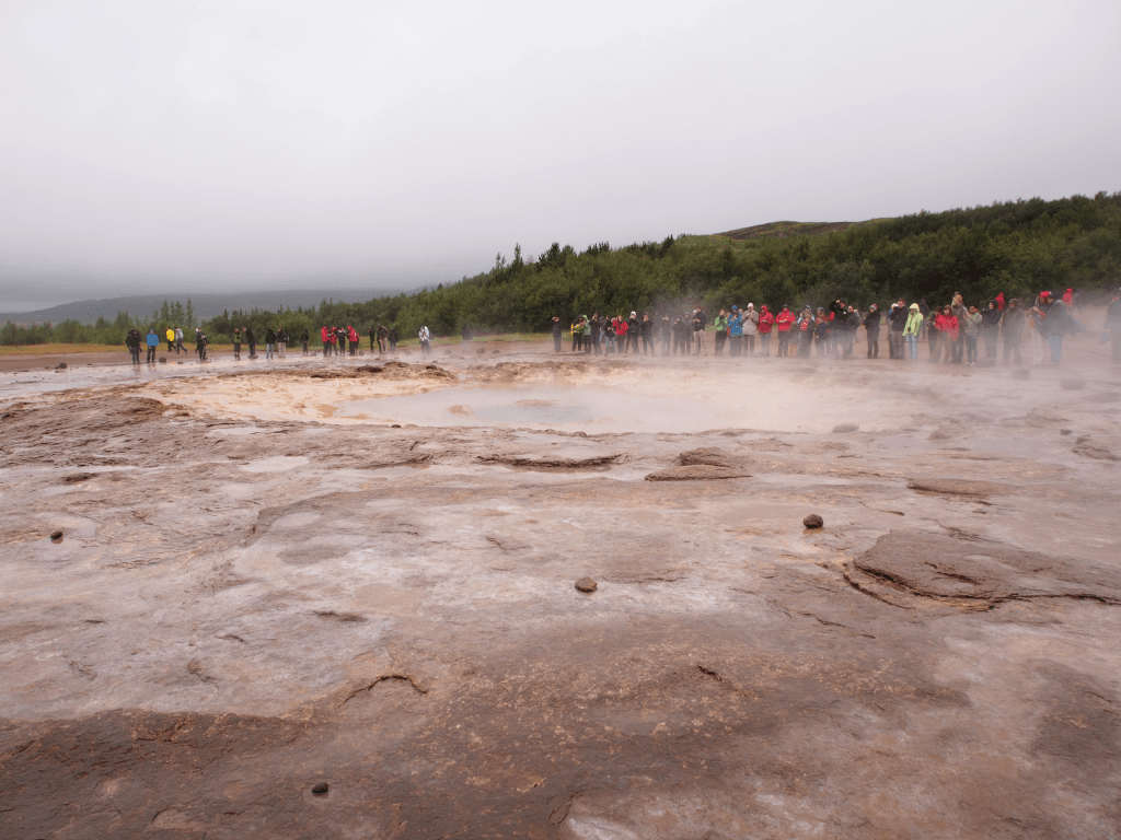
The perfect storm – A geysir at the Geysir Hot Springs, an attraction along the Golden Circle in Iceland. But the weather is never guaranteed to be perfect, and there are always a lot of people, making the perfect photograph extremely hard to obtain.
A good example of this is travelling in Iceland. Look at the tourism website and you will see fantastic photographs of the natural landscape. However if you visit, your photography will be largely affected by both the weather and the hoards of tourists at some sites. During the short summer there can be a huge number of tourists, and natural attractions such as those along the Golden Circle are packed to the rafters with tourist buses. Go early or late if you can there is ample daylight until late, and you might avoid the latest if the masses. The weather in Iceland can also turn on a dime, even in the height of summer. Rain and fog are abundant. Weather is always a factor, and not something you can process away. On a summer day, you can experience a sunny day, a windy day, a rainy day or even sometimes unexpectedly, a winter day.
But when the weather gives you lemons, you just have to learn to adjust. You may be in a place you will never return to, and you want to make the most of the time you have. Sometimes this means having the most appropriate gear. A camera and lenses with good weather sealing makes the world of difference in both wet and dry, dusty conditions. An optimal choice of a lens that is good in all circumstances – you don’t really want to be changing lenses too often. Also if venturing off to a place with weather extremes take precautions, like purchasing a camera shell to keep out the rain and dust.
P.S. There is some great drone footage out there of places like Iceland, however with newer regulations it has become harder to actually fly drones in some places. For example in Iceland, flying a drone in national parks, protected areas, nature reserves, and monuments is not permitted. It is becoming stricter in many places, because let’s face it, drones can sometimes be quite annoying.
P.P.S. For a great introduction to Iceland get a copy of Stunning Iceland: The Hedonist’s Guide, by Bertrand Jouanne and Gunnar Freyr (just released this year).
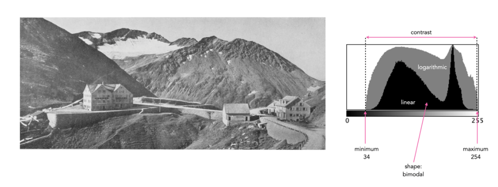
Sometimes a histogram is depicted logarithmically. A histogram will typically depict only large frequencies, i.e. histogram intensities with limited values will not be visualized. The logarithmic form helps to accentuate low frequency occurrences, making them readily apparent. In the example histogram shown below, intensity level 39 has a value of 9, which would not show up in a regular histogram given the scale, e.g. intensity 206 has a count of 9113.
Understanding shape and tonal characteristics is part of the picture, but there are some other things about exposure that can be garnered from a histogram that are related to these characteristics. Remember, a histogram is merely a guide. The best way to understand an image is to look at the image itself, not just the histogram.
Contrast
Contrast is the difference in brightness between elements of an image, and can determine how dull or crisp an image appears with respect to intensity values. Note that the contrast described here is luminance or tonal contrast, as opposed to colour contrast. Contrast is represented as a combination of the range of intensity values within an image and the difference between the maximum and minimum pixel values. A well contrasted image typically makes use of the entire gamut of n intensity values from 0..n-1.
Image contrast is often described in terms of low and high contrast. If the difference between the lightest and darkest regions of an image is broad, e.g. if the highlights are bright, and the shadows very dark, then the image is high contrast. If an image’s tonal range is based more on gray tones, then the image is considered to have a low contrast. In between there are infinite combinations, and histograms where there is no distinguishable pattern. Figure 1 shows an example of low and high contrast on a grayscale image.
Fig.1: Examples of differing types of tonal contrast
The histogram of a high contrast image will have bright whites, dark blacks, and a good amount of mid-tones. It can often be identified by edges that appear very distinct. A low-contrast image has little in the way of tonal contrast. It will have a lot of regions that should be white but are off-white, and black regions that are gray. A low contrast image often has a histogram that appears as a compact band of intensities, with other intensity regions completely unoccupied. Low contrast images often exist in the midtones, but can also appear biased to the shadows or highlights. Figure 2 shows images with low and high contrast, and one which sits midway between the two.
Fig.2: Examples of low, medium, and high contrast in colour images
Sometimes an image will exhibit a global contrast which is different to the contrast found in different regions within the image. The example in Figure 3 shows the lack of contrast in an aerial photograph. The image histogram shows an image with medium contrast, yet if the image were divided into two sub-images, both would exhibit low-contrast.
Fig.3: Global contrast versus regional contrast
Clipping
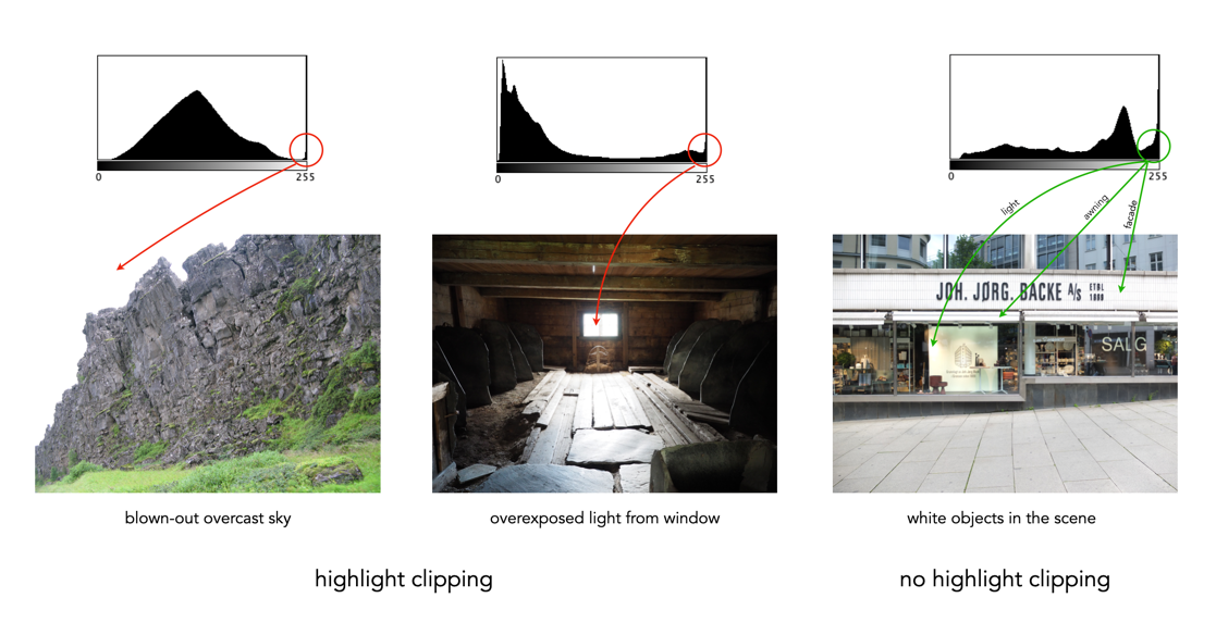
A digital sensor is much more limited than the human eye in its ability to gather information from a scene that contains both very bright, and very dark regions, i.e. a broad dynamic range. A camera may try to create an image that is exposed to the widest possible range of lights and darks in a scene. Because of limited dynamic range, a sensor might leave the image with pitch-black shadows, or pure white highlights. This may signify that the image contains clipping.
Clipping represents the loss of data from that region of the image. For example a spike on the very left edge of a histogram may suggest the image contains some shadow clipping. Conversely, a spike on the very right edge suggests highlight clipping. Clipping means that the full extent of tonal data is not present in an image (or in actually was never acquired). Highlight clipping occurs when exposure is pushed a little too far, e.g. outdoor scenes where the sky is overcast – the white clouds can become overexposed. Similarly, shadow clipping means a region in an image is underexposed,
In regions that suffer from clipping, it is very hard to recover information.
Fig.4: Shadow versus highlight clipping
Some describe the idea of clipping as “hitting the edge of the histogram, and climbing vertically”. In reality, not all histograms exhibiting this tonal cliff may be bad images. For example images taken against a pure white background are purposely exposed to produce these effects. Examples of images with and without clipping are shown in Figure 5.
Fig.5: Not all edge spikes in a histogram are clipping
Are both forms of clipping equally bad, or is one worse than the other? From experience, highlight clipping is far worse. That is because it is often possible to recover at least some detail from shadow clipping. On the other hand, no amount of post-processing will pull details from regions of highlight-clipping in an image.
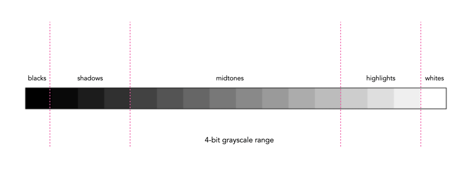
In addition to shape, a histogram can be described using different tonal regions. The left side of the histogram represents the darker tones, or shadows, whereas the right side represents the brighter tones, or highlights, and the middle section represents the midtones. Many different examples of histograms displaying these tonal regions exist. Figure 1 shows a simplified version containing 16 different regions. This is somewhat easier to visualize than a continuous band of 256 grayscale values. The histogram depicts the movement from complete darkness to complete light.
Fig.1: An example of a tonal range – 4-bit (0-15 gray levels)e
The tonal regions within a histogram can be described as:
highlights – The areas of a image which contain high luminance values yet still contain discernable detail. A highlight might be specular (a mirror-like reflection on a polished surface), or diffuse (a refection on a dull surface).
mid tones – A midtone is an area of an image that is intermediate between the highlights and the shadows. The areas of the image where the intensity values are neither very dark, nor very light. Mid-tones ensure a good amount of tonal information is contained in an image.
shadows – The opposite of highlights. Areas that are dark but still retain a certain level of detail.
Like the idealized view of the histogram shape, there can also be a perception of an idealized tonal region – the midtones. However an image containing only midtones tends to lack contrast. In addition, some interpretations of histograms add additional an additional tonal category at either extreme. Both can contribute to clipping.
blacks – Regions of an image that have near-zero luminance. Completely black areas are a dark abyss.
whites – Regions of an image where the brightness has been increased to the extent that highlights become “blown out”, i.e. completely white, and therefore lack detail.
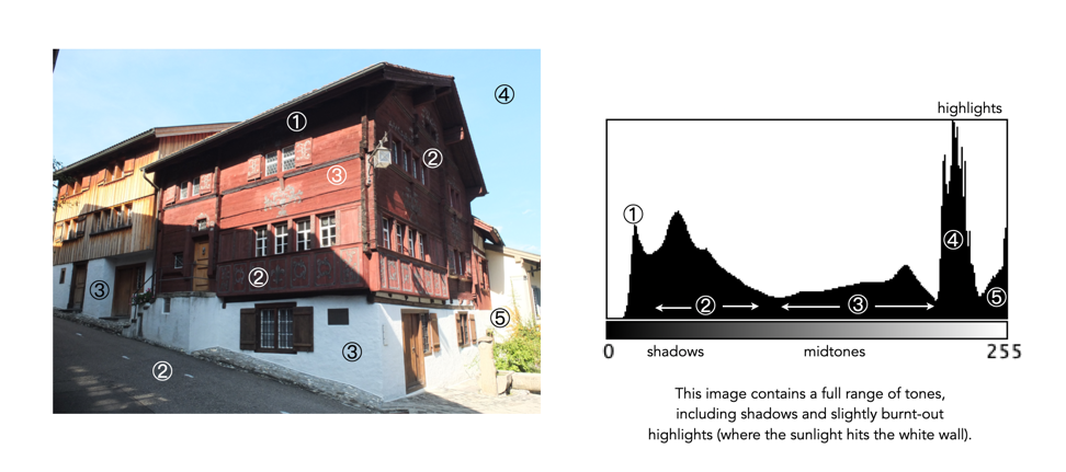
Figure 2 shows an image which illustrates nearly all the regions (with a very weird histogram). The numbers on the image indicate where in the histogram those intensities exist. The peak at ① shows the darkest regions of the image, i.e. the deepest shadows. Next, the regions associated with ② include some shadow (ironically they are in shadow), graduating to midtones. The true mid-tonal region, ③, are regions of the buildings in sunlight. The highlights, ④, are almost completely attributed to the sky, and finally there is a “white” region, ⑤, signifying a region of blow-out, i.e. where the sun is reflecting off the white-washed parts of the building.
Fig.2: An example of the various tonal regions in an image histogram
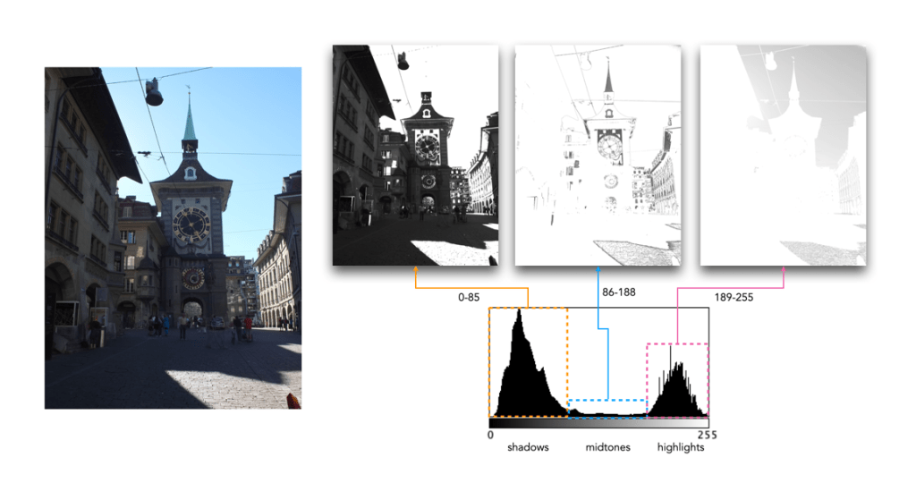
Figure 3 shows how tonal regions in a histogram are associated with pixels in the image. This image has a bimodal histogram, with the majority of pixels in one of two humps. The dominant hump to the left, indicates a good portion of the image is in the shadows. The right-sided smaller hump is associated with the highlights, i.e. the sky, and sunlit pavement. There is very little in the way of midtones, which is not surprising considering the harsh lighting in the scene.
Fig.3: Tonal regions associated with image regions.
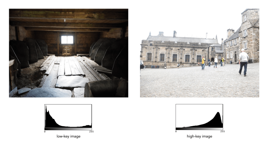
Two other commonly used terms are low-key and high-key.
A high-key image is one composed primarily of light tones, and whose histogram is biased towards 255. Although exposure and lightning can influence the effect, a light-toned subject is almost essential. High-key pictures usually have a pure or nearly pure white background, for example scenes with bright sunlight or a snowy landscape. The high-key effect requires tonal graduations, or shadows, but precludes extremely dark shadows.
A low-key image describes one composed primarily of dark tones, where the bias is towards 0. Subject matter, exposure and lighting contribute to the effect. A dark-toned subject in a dark-toned scene will not necessarily be low-key if the lighting does not produce large areas of shadow. An image taken at night is a good example of a low-key image.
One of the most important characteristics of a histogram is its shape. A histogram’s shape offers a good indicator of an image’s ability to tolerate manipulation. A histogram shape can help elucidate the overall contrast in the image. For example a broad histogram usually reflects a scene with significant contrast, whereas a narrow histogram reflects less contrast, with an image which may appear dull or flat. As mentioned previously, some people believe an “ideal” histogram is one having a shape like a hill, mountain, or bell. The reality is that there are as many shapes as there are images. Remember, a histogram represents the pixels in an image, not their position. This means that it is possible to have a number of images that look very different, but have similar histograms.
The shape of a histogram is usually described in terms of simple shape features. These shape features are often described using geographical terms (because a histogram often reminds people of the profile view of a geographical feature): e.g. “hillock” or “mound”, which is a shallow, low feature, “hill” or “hump”, which is a feature rising higher than the surrounding areas, a “peak”, which is a feature with a distinctly top, a “valley”, which is a low area between two peaks, or a “plateau” which is a level region between other features. Features can either be distinct, i.e. recognizably different, or indistinct, i.e. not clearly defined, often blended with other features. These terms are often used when describing the shape of a particular histogram in detail.
Fig.1: A sample of feature shapes in a histogram
From the perspective of simplicity, however histogram shapes can be broadly classified into three basic categories (examples are shown in Fig.2):
Unimodal – A histogram where there is one distinct feature, typically a hump or peak, i.e. a good amount of an image’s pixels are associated with the feature. The feature can exist anywhere in the histogram. A good example of a unimodal histogram is the classic “bell-shaped” curve with a prominent ‘mound’ in the center and similar tapering to the left and right (e.g. Fig.2: ①).
Bimodal – A histogram where there are two distinct features. Bimodal features can exist as a number of varied shapes, for example the features could be very close, or at opposite ends of the histogram.
Multipeak – A histogram with many prominent features, sometimes referred to as multimodal. These histograms tend to differ vastly in their appearance. The peaks in a multipeak histogram can themselves be composed of unimodal or bimodal features.
These categories can can be used in combination with some qualifiers (numeric examples refer to Figure 2). For example a symmetric histogram, is a histogram where each half is the same. Conversely an asymmetric histogram is one which is not symmetric, typically skewed to one side. One can therefore have a unimodal, asymmetric histogram, e.g. ⑥ which shows a classic “J” shape. Bimodal histograms can also be asymmetric (⑪) or symmetric (⑬).
Fig.2: Core categories of histograms: unimodal, bimodal, multi-peak and other.
Histograms can also be qualified as being indistinct, meaning that it is hard to categorize it as any one shape. In ㉓ there is a peak to the right end of the histogram, however the major of the pixels are distributed in the uniform plateau to the right. Sometimes histogram shapes can also be quite uniform, with no distinct groups of pixels, such as in example ㉒ (in reality though these images are quite rare). It it also possible that the histogram exhibits quite a random pattern, which might only indicate quite a complex scene.
But a histogram’s shape is just its shape. To interpet a histogram requires understanding the shape in context to the contents of the scene within the image. For example, one cannot determine an image is too dark from a left-skewed unimodal histogram without knowledge of what the scene entails. Figure 3 shows some sample colour images and their corresponding histograms, illustrating the variation existing in histograms.
Fig.3: Various colour images and their corresponding intensity histograms
On the basis of the previous posts, this posts presents a method of generating a digital contact sheet using another ImageMagick command, montage. It can be used for pure images, or as I like to do, create a contact sheet with the images and their intensity histograms. Like many commands there are a myriad of options, but a basic use of montage might be:
This takes all PNG files in the current directory and creates an 8×5 montage (8 columns by 5 rows) with 200×150 thumbnails of the images, and saves the montage in a file named contact.png. This will hold 40 images, and if there are more than this, they spill over into a second image. This is a little bit awkward, so to make things nicer, we can write a script to process the images. Below is a bash shell script called contactsheet.sh :
#!/bin/bash
ls *.png > imglist
read nImgs <<< $(sed -n '$=' imglist)
let nrows=nImgs/8
let lefto=nImgs%8
if [ $lefto -gt 0 ]
then
   let nrows=nrows+1
fi
montage @imglist -geometry 200x150 -tile 8x$nrow $1
rm imglist
Now let’s look through this script based on what each line does.
Line 1 Identifies the script as a bash shell script.
Line 2 uses the ls command to list all the PNG image files in the current directory, and outputs the list to a text file called imglist. The files will be sorted in alphabetical order.
Line 3 counts the number of lines in the file imglist, using the sed (stream editor) command, sed -n '$=' imglist. The number of lines represents the number of PNG files, as there is one filename per line. The number of files calculated is stored in the variable nImgs.
Line 4 calculates the number of rows by dividing nImgs by 8, and stores the value in the variable nrows (assuming we want 8 images across in the montage). This will produce an integer result. For example if the number of images is 41, then 41/8 = 5.
Line 5 calculates the leftover from the division of nImgs by 8, and stores it in the variable lefto. For example 41%8 = 1.
Line 6 questions if the leftover, i.e. the value in lefto, is greater than 0. If it is, it indicates a extra row should be added to the variable nrows (Line 8). This deals with the issue of montage creating an extra image should the number of images go beyond the 8×5 tiles.
Line 10, generates the contact sheet using montage. It uses the list in imglist, and uses the variable nrows to specify the number of rows in the montage, i.e. 8x$nrow. The $1 at the end of the command is the output filename for the montage, which is specified when contactsheet is run, for example (result shown in Fig.1):
./contactsheet.sh photosheet1.png
Line 11 deletes the file containing the list of images.
Fig.1: A sample digital contact sheet using the script.
It may seem quite complicated, but once you get the hang of it, writing these scripts save a lot of time. If you have a folder with a lot of images in it, then you may prefer to produce a series of smaller contact sheets, in which case the script becomes much simpler. In the simpler version below, the tile size remains at 8×5. So 190 images would produce 5 contact sheets.
There are lots of things which can be customized. Perhaps you want smaller images, which can be achieved by modifying the geometry size. Or perhaps you want each image in the montage labelled? Or perhaps you want to process JPGs?
Some people think that the histogram is some sort of panacea for digital photography, a means of deciding whether an image is “perfect” enough. Others tend to disregard the statistical response it provides completely. This leads us to question what useful information is there in a histogram, and how we go about interpreting it.
A plethora of information
A histogram maps the brightness or intensity of every pixel in an image. But what does this information tell us? One of the main roles of a histogram is to provide information on the tonal distributions in an image. This is useful to help determine if there is something askew with the visual appearance of an image. Histograms can be viewed live/in-camera, for the purpose of determining whether or not an image has been corrected exposed, or used during post-processing to fix aesthetic inadequacies. Aesthetic deficiencies can occur during the acquisition process, or can be intrinsic to the image itself, e.g. faded vintage photographs. Examples of deficiencies include such things as blown highlights, or lack of contrast.
A histogram can tell us many differing things about how intensities are distributed throughout the image. Figure 1 shows an example of a colour image, photograph taken in Bergen, Norway, its associated grayscale image and histograms. The histogram spans the entire range of intensity values. Midtones comprise 66% of pixels in the image, with the majority tiered towards the lighter midtone values (the largest hump in the histogram). Shadow pixels comprise only 7% of the whole image, and are actually associated with shaded regions in the image. Highlights relate to regions like the white building on the left, and some of the clouds. There are very few pure white, the exception being the shopfront signs. Some of the major features in the histogram are indicated in the image.
Fig.1: A colour image and its histograms
There is no perfect histogram
Before we get into the nitty-gritty, there is one thing that should be made clear. Sometimes there are infographics on the internet that tout the myth of a “perfect” or “ideal” histogram. The reality is that such infographics are very misleading. There is no such thing as a perfect histogram. The notion of the ideal histogram is one that is shaped like a “bell”, but there is no reason why the distribution of intensities should be that even. Here is the usual description of an ideal image: “An ideal image has a histogram which has a centred hill type shape, with no obvious skew, and a form that is spread across the entire histogram (and without clipping)”.
Fig.2: A bell-shaped curve
But a scene may be naturally darker or lighter rather than midtones found in a bell-shaped histogram. Photographs taken in the latter part of the day will be naturally darker, as will photographs of dark objects. Conversely, a photograph of a snowy scene will skew to the right. Consider the picture of the Toronto skyline taken at night shown in Figure 3. Obviously the histogram doesn’t come close to being “perfect”, but the majority of the scene is dark – not unusual for a dark scene, and hence the histogram is representative of this. In this case the low-key histogram is ideal.
Fig.3: A dark image with a skewed histogram
Interpreting a histogram
Interpreting a histogram usually involves examining the size and uniformity of the distribution of intensities in the image. The first thing to do is to look at the overall curve of the histogram to get some idea about its shape characteristics. The curve visually communicates the number of pixels in any one particular intensity.
First, check for any noticeable peaks, dips, or plateaus. For example peaks generally indicate a large number of pixels of a certain intensity range within the image. Plateaus indicate a uniform distribution of intensities. Check to see if the histogram skewed to the left or right. A left-skewed histogram might indicate underexposure, the scene itself being dark (e.g. a night scene), or containing dark objects. A right-skewed histogram may indicate overexposure, or a scene full of white objects. A centred histogram may indicate a well-exposed image, because it is full of mid-tones. A small, uniform hill may indicate a lack of contrast.
Next look at the edges of the histogram. A histogram with peaks that are placed against either edge of the histogram may indicate some loss of information, a phenomena known as clipping. For example if clipping occurs on the right side, something known as highlight clipping, the image may be overexposed in some areas. This is a common occurrence in semi-bright overcast days, where the clouds can become blown-out. But of course this is relative to the scene content of the image. As well as shape, the histogram shows how pixels are groups into tonal regions, i.e. the highlights, shadows, and midtones.
Consider the example shown below in Figure 4. Some might interpret this as somewhat of an “ideal” histogram. Most of the pixels appear in the midtones region of the histogram, with no great amount of blacks below 17, nor whites above 211. This is a well-formed image, except that it lacks some contrast. Stretching the histogram over the entire range of 0-255 could help improve the contrast.
Fig.4: An ideal image with a central “hump” (but lacking some contrast)
Now consider a second example. This picture in Figure 5 is of a corner grocery store in Montreal and has a histogram with a multipeak shape. The three distinct features almost fit into the three tonal regions: the shadows (dark blue regions, and empty dark space to the right of the building), the midtones (e.g. the road), and the highlights (the light upper brick portion of the building). There is nothing intrinsically wrong with this histogram, as it accurately represents the scene in the image.
Fig.4: An ideal imagewith multiple peaks in the histogram
Remember, if the image looks okay from a visual perspective, don’t second-guess minor disturbances in the histogram.