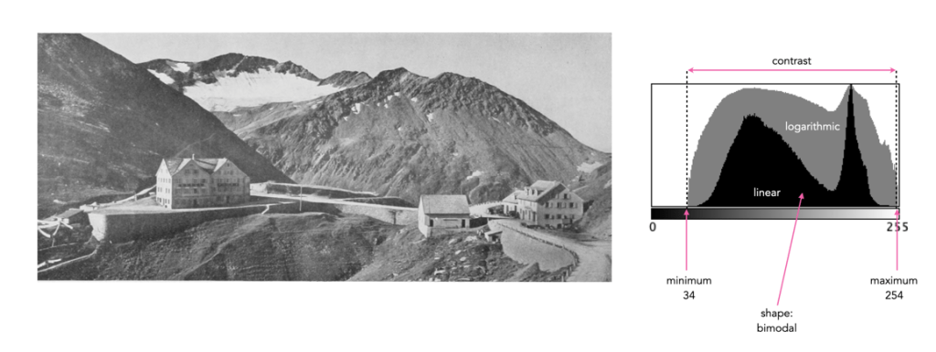
Sometimes a histogram is depicted logarithmically. A histogram will typically depict only large frequencies, i.e. histogram intensities with limited values will not be visualized. The logarithmic form helps to accentuate low frequency occurrences, making them readily apparent. In the example histogram shown below, intensity level 39 has a value of 9, which would not show up in a regular histogram given the scale, e.g. intensity 206 has a count of 9113.
Understanding shape and tonal characteristics is part of the picture, but there are some other things about exposure that can be garnered from a histogram that are related to these characteristics. Remember, a histogram is merely a guide. The best way to understand an image is to look at the image itself, not just the histogram.
Contrast
Contrast is the difference in brightness between elements of an image, and can determine how dull or crisp an image appears with respect to intensity values. Note that the contrast described here is luminance or tonal contrast, as opposed to colour contrast. Contrast is represented as a combination of the range of intensity values within an image and the difference between the maximum and minimum pixel values. A well contrasted image typically makes use of the entire gamut of n intensity values from 0..n-1.
Image contrast is often described in terms of low and high contrast. If the difference between the lightest and darkest regions of an image is broad, e.g. if the highlights are bright, and the shadows very dark, then the image is high contrast. If an image’s tonal range is based more on gray tones, then the image is considered to have a low contrast. In between there are infinite combinations, and histograms where there is no distinguishable pattern. Figure 1 shows an example of low and high contrast on a grayscale image.
Fig.1: Examples of differing types of tonal contrast
The histogram of a high contrast image will have bright whites, dark blacks, and a good amount of mid-tones. It can often be identified by edges that appear very distinct. A low-contrast image has little in the way of tonal contrast. It will have a lot of regions that should be white but are off-white, and black regions that are gray. A low contrast image often has a histogram that appears as a compact band of intensities, with other intensity regions completely unoccupied. Low contrast images often exist in the midtones, but can also appear biased to the shadows or highlights. Figure 2 shows images with low and high contrast, and one which sits midway between the two.
Fig.2: Examples of low, medium, and high contrast in colour images
Sometimes an image will exhibit a global contrast which is different to the contrast found in different regions within the image. The example in Figure 3 shows the lack of contrast in an aerial photograph. The image histogram shows an image with medium contrast, yet if the image were divided into two sub-images, both would exhibit low-contrast.
Fig.3: Global contrast versus regional contrast
Clipping
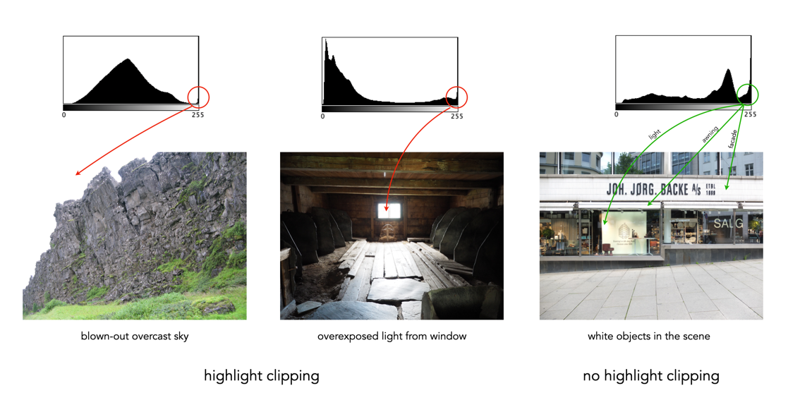
A digital sensor is much more limited than the human eye in its ability to gather information from a scene that contains both very bright, and very dark regions, i.e. a broad dynamic range. A camera may try to create an image that is exposed to the widest possible range of lights and darks in a scene. Because of limited dynamic range, a sensor might leave the image with pitch-black shadows, or pure white highlights. This may signify that the image contains clipping.
Clipping represents the loss of data from that region of the image. For example a spike on the very left edge of a histogram may suggest the image contains some shadow clipping. Conversely, a spike on the very right edge suggests highlight clipping. Clipping means that the full extent of tonal data is not present in an image (or in actually was never acquired). Highlight clipping occurs when exposure is pushed a little too far, e.g. outdoor scenes where the sky is overcast – the white clouds can become overexposed. Similarly, shadow clipping means a region in an image is underexposed,
In regions that suffer from clipping, it is very hard to recover information.
Fig.4: Shadow versus highlight clipping
Some describe the idea of clipping as “hitting the edge of the histogram, and climbing vertically”. In reality, not all histograms exhibiting this tonal cliff may be bad images. For example images taken against a pure white background are purposely exposed to produce these effects. Examples of images with and without clipping are shown in Figure 5.
Fig.5: Not all edge spikes in a histogram are clipping
Are both forms of clipping equally bad, or is one worse than the other? From experience, highlight clipping is far worse. That is because it is often possible to recover at least some detail from shadow clipping. On the other hand, no amount of post-processing will pull details from regions of highlight-clipping in an image.
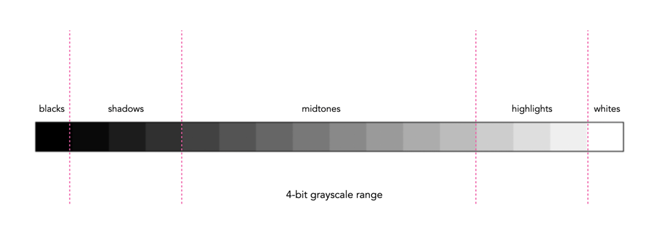
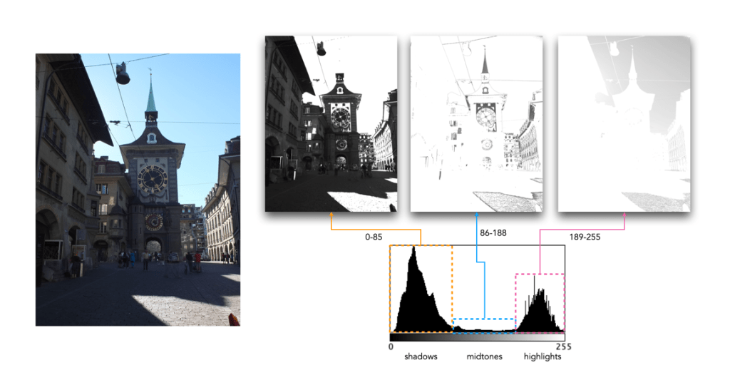
In addition to shape, a histogram can be described using different tonal regions. The left side of the histogram represents the darker tones, or shadows, whereas the right side represents the brighter tones, or highlights, and the middle section represents the midtones. Many different examples of histograms displaying these tonal regions exist. Figure 1 shows a simplified version containing 16 different regions. This is somewhat easier to visualize than a continuous band of 256 grayscale values. The histogram depicts the movement from complete darkness to complete light.
Fig.1: An example of a tonal range – 4-bit (0-15 gray levels)e
The tonal regions within a histogram can be described as:
highlights – The areas of a image which contain high luminance values yet still contain discernable detail. A highlight might be specular (a mirror-like reflection on a polished surface), or diffuse (a refection on a dull surface).
mid tones – A midtone is an area of an image that is intermediate between the highlights and the shadows. The areas of the image where the intensity values are neither very dark, nor very light. Mid-tones ensure a good amount of tonal information is contained in an image.
shadows – The opposite of highlights. Areas that are dark but still retain a certain level of detail.
Like the idealized view of the histogram shape, there can also be a perception of an idealized tonal region – the midtones. However an image containing only midtones tends to lack contrast. In addition, some interpretations of histograms add additional an additional tonal category at either extreme. Both can contribute to clipping.
blacks – Regions of an image that have near-zero luminance. Completely black areas are a dark abyss.
whites – Regions of an image where the brightness has been increased to the extent that highlights become “blown out”, i.e. completely white, and therefore lack detail.
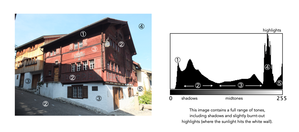
Figure 2 shows an image which illustrates nearly all the regions (with a very weird histogram). The numbers on the image indicate where in the histogram those intensities exist. The peak at ① shows the darkest regions of the image, i.e. the deepest shadows. Next, the regions associated with ② include some shadow (ironically they are in shadow), graduating to midtones. The true mid-tonal region, ③, are regions of the buildings in sunlight. The highlights, ④, are almost completely attributed to the sky, and finally there is a “white” region, ⑤, signifying a region of blow-out, i.e. where the sun is reflecting off the white-washed parts of the building.
Fig.2: An example of the various tonal regions in an image histogram
Figure 3 shows how tonal regions in a histogram are associated with pixels in the image. This image has a bimodal histogram, with the majority of pixels in one of two humps. The dominant hump to the left, indicates a good portion of the image is in the shadows. The right-sided smaller hump is associated with the highlights, i.e. the sky, and sunlit pavement. There is very little in the way of midtones, which is not surprising considering the harsh lighting in the scene.
Fig.3: Tonal regions associated with image regions.
Two other commonly used terms are low-key and high-key.
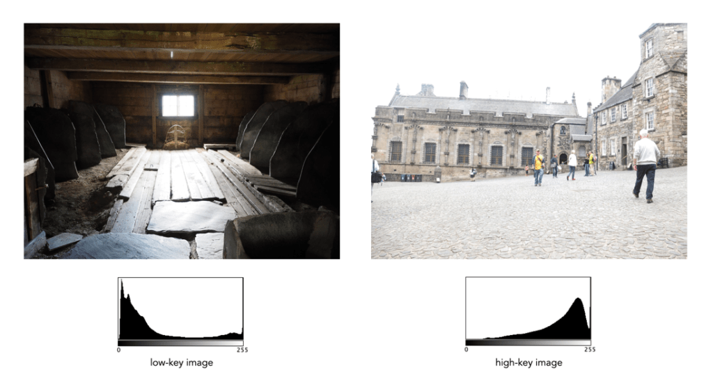
A high-key image is one composed primarily of light tones, and whose histogram is biased towards 255. Although exposure and lightning can influence the effect, a light-toned subject is almost essential. High-key pictures usually have a pure or nearly pure white background, for example scenes with bright sunlight or a snowy landscape. The high-key effect requires tonal graduations, or shadows, but precludes extremely dark shadows.
A low-key image describes one composed primarily of dark tones, where the bias is towards 0. Subject matter, exposure and lighting contribute to the effect. A dark-toned subject in a dark-toned scene will not necessarily be low-key if the lighting does not produce large areas of shadow. An image taken at night is a good example of a low-key image.
One of the most important characteristics of a histogram is its shape. A histogram’s shape offers a good indicator of an image’s ability to tolerate manipulation. A histogram shape can help elucidate the overall contrast in the image. For example a broad histogram usually reflects a scene with significant contrast, whereas a narrow histogram reflects less contrast, with an image which may appear dull or flat. As mentioned previously, some people believe an “ideal” histogram is one having a shape like a hill, mountain, or bell. The reality is that there are as many shapes as there are images. Remember, a histogram represents the pixels in an image, not their position. This means that it is possible to have a number of images that look very different, but have similar histograms.
The shape of a histogram is usually described in terms of simple shape features. These shape features are often described using geographical terms (because a histogram often reminds people of the profile view of a geographical feature): e.g. “hillock” or “mound”, which is a shallow, low feature, “hill” or “hump”, which is a feature rising higher than the surrounding areas, a “peak”, which is a feature with a distinctly top, a “valley”, which is a low area between two peaks, or a “plateau” which is a level region between other features. Features can either be distinct, i.e. recognizably different, or indistinct, i.e. not clearly defined, often blended with other features. These terms are often used when describing the shape of a particular histogram in detail.
Fig.1: A sample of feature shapes in a histogram
From the perspective of simplicity, however histogram shapes can be broadly classified into three basic categories (examples are shown in Fig.2):
Unimodal – A histogram where there is one distinct feature, typically a hump or peak, i.e. a good amount of an image’s pixels are associated with the feature. The feature can exist anywhere in the histogram. A good example of a unimodal histogram is the classic “bell-shaped” curve with a prominent ‘mound’ in the center and similar tapering to the left and right (e.g. Fig.2: ①).
Bimodal – A histogram where there are two distinct features. Bimodal features can exist as a number of varied shapes, for example the features could be very close, or at opposite ends of the histogram.
Multipeak – A histogram with many prominent features, sometimes referred to as multimodal. These histograms tend to differ vastly in their appearance. The peaks in a multipeak histogram can themselves be composed of unimodal or bimodal features.
These categories can can be used in combination with some qualifiers (numeric examples refer to Figure 2). For example a symmetric histogram, is a histogram where each half is the same. Conversely an asymmetric histogram is one which is not symmetric, typically skewed to one side. One can therefore have a unimodal, asymmetric histogram, e.g. ⑥ which shows a classic “J” shape. Bimodal histograms can also be asymmetric (⑪) or symmetric (⑬).
Fig.2: Core categories of histograms: unimodal, bimodal, multi-peak and other.
Histograms can also be qualified as being indistinct, meaning that it is hard to categorize it as any one shape. In ㉓ there is a peak to the right end of the histogram, however the major of the pixels are distributed in the uniform plateau to the right. Sometimes histogram shapes can also be quite uniform, with no distinct groups of pixels, such as in example ㉒ (in reality though these images are quite rare). It it also possible that the histogram exhibits quite a random pattern, which might only indicate quite a complex scene.
But a histogram’s shape is just its shape. To interpet a histogram requires understanding the shape in context to the contents of the scene within the image. For example, one cannot determine an image is too dark from a left-skewed unimodal histogram without knowledge of what the scene entails. Figure 3 shows some sample colour images and their corresponding histograms, illustrating the variation existing in histograms.
Fig.3: Various colour images and their corresponding intensity histograms
Some people think that the histogram is some sort of panacea for digital photography, a means of deciding whether an image is “perfect” enough. Others tend to disregard the statistical response it provides completely. This leads us to question what useful information is there in a histogram, and how we go about interpreting it.
A plethora of information
A histogram maps the brightness or intensity of every pixel in an image. But what does this information tell us? One of the main roles of a histogram is to provide information on the tonal distributions in an image. This is useful to help determine if there is something askew with the visual appearance of an image. Histograms can be viewed live/in-camera, for the purpose of determining whether or not an image has been corrected exposed, or used during post-processing to fix aesthetic inadequacies. Aesthetic deficiencies can occur during the acquisition process, or can be intrinsic to the image itself, e.g. faded vintage photographs. Examples of deficiencies include such things as blown highlights, or lack of contrast.
A histogram can tell us many differing things about how intensities are distributed throughout the image. Figure 1 shows an example of a colour image, photograph taken in Bergen, Norway, its associated grayscale image and histograms. The histogram spans the entire range of intensity values. Midtones comprise 66% of pixels in the image, with the majority tiered towards the lighter midtone values (the largest hump in the histogram). Shadow pixels comprise only 7% of the whole image, and are actually associated with shaded regions in the image. Highlights relate to regions like the white building on the left, and some of the clouds. There are very few pure white, the exception being the shopfront signs. Some of the major features in the histogram are indicated in the image.
Fig.1: A colour image and its histograms
There is no perfect histogram
Before we get into the nitty-gritty, there is one thing that should be made clear. Sometimes there are infographics on the internet that tout the myth of a “perfect” or “ideal” histogram. The reality is that such infographics are very misleading. There is no such thing as a perfect histogram. The notion of the ideal histogram is one that is shaped like a “bell”, but there is no reason why the distribution of intensities should be that even. Here is the usual description of an ideal image: “An ideal image has a histogram which has a centred hill type shape, with no obvious skew, and a form that is spread across the entire histogram (and without clipping)”.
Fig.2: A bell-shaped curve
But a scene may be naturally darker or lighter rather than midtones found in a bell-shaped histogram. Photographs taken in the latter part of the day will be naturally darker, as will photographs of dark objects. Conversely, a photograph of a snowy scene will skew to the right. Consider the picture of the Toronto skyline taken at night shown in Figure 3. Obviously the histogram doesn’t come close to being “perfect”, but the majority of the scene is dark – not unusual for a dark scene, and hence the histogram is representative of this. In this case the low-key histogram is ideal.
Fig.3: A dark image with a skewed histogram
Interpreting a histogram
Interpreting a histogram usually involves examining the size and uniformity of the distribution of intensities in the image. The first thing to do is to look at the overall curve of the histogram to get some idea about its shape characteristics. The curve visually communicates the number of pixels in any one particular intensity.
First, check for any noticeable peaks, dips, or plateaus. For example peaks generally indicate a large number of pixels of a certain intensity range within the image. Plateaus indicate a uniform distribution of intensities. Check to see if the histogram skewed to the left or right. A left-skewed histogram might indicate underexposure, the scene itself being dark (e.g. a night scene), or containing dark objects. A right-skewed histogram may indicate overexposure, or a scene full of white objects. A centred histogram may indicate a well-exposed image, because it is full of mid-tones. A small, uniform hill may indicate a lack of contrast.
Next look at the edges of the histogram. A histogram with peaks that are placed against either edge of the histogram may indicate some loss of information, a phenomena known as clipping. For example if clipping occurs on the right side, something known as highlight clipping, the image may be overexposed in some areas. This is a common occurrence in semi-bright overcast days, where the clouds can become blown-out. But of course this is relative to the scene content of the image. As well as shape, the histogram shows how pixels are groups into tonal regions, i.e. the highlights, shadows, and midtones.
Consider the example shown below in Figure 4. Some might interpret this as somewhat of an “ideal” histogram. Most of the pixels appear in the midtones region of the histogram, with no great amount of blacks below 17, nor whites above 211. This is a well-formed image, except that it lacks some contrast. Stretching the histogram over the entire range of 0-255 could help improve the contrast.
Fig.4: An ideal image with a central “hump” (but lacking some contrast)
Now consider a second example. This picture in Figure 5 is of a corner grocery store in Montreal and has a histogram with a multipeak shape. The three distinct features almost fit into the three tonal regions: the shadows (dark blue regions, and empty dark space to the right of the building), the midtones (e.g. the road), and the highlights (the light upper brick portion of the building). There is nothing intrinsically wrong with this histogram, as it accurately represents the scene in the image.
Fig.4: An ideal imagewith multiple peaks in the histogram
Remember, if the image looks okay from a visual perspective, don’t second-guess minor disturbances in the histogram.
In terms of image processing there are two basic types of histogram: (i) colour, and (ii) intensity (or luminance/grayscale) histograms. Figure 1 shows a colour image (an aerial shot of Montreal), and its associated RGB and intensity histograms. Colour histograms are essentially RGB histograms, typically represented by three separate histograms, one for each of the components – Red, Green, and Blue. The three R,G,B histograms are sometimes shown in one mixed histogram with all three R,G,B, components overlaid with one another (sometimes including an intensity histogram).
Fig.1: Colour and grayscale histograms
Both RGB and intensity histograms contain the same basic information – the distribution of values. The difference lies in what the values represent. In an intensity histogram, the values represent the intensity values in a grayscale image (typically 0 to 255). In an RGB histogram, divided into individual R, G, B histograms, each colour channel is just a graph of the frequencies of each of the RGB component values of each pixel.
An example is shown in Figure 2. Here a single pixel is extracted from an image. The RGB triplet for the pixel is (230,154,182) i.e. it has a red value of 230, a green value of 154, and a blue value of 182. Each value is counted in its respective bin in the associated component histogram. So red value 230 is counted in the bin marked as “230” in the red histogram. The three R,G, B histograms are visually no different than an intensity histogram. The individual R, G, and B histograms do not represent distributions of colours, but merely distributions of components – for that you need a 3D histogram (see bottom).
Fig.2: How an RGB histogram works: From single RGB pixel to RGB component histograms
Applications portray colour histograms in many different forms. Figure 3 shows the RGB histograms from three differing applications: Apple Photos, ImageJ, and ImageMagick. Apple Photos provides the user with the option of showing the luminance histogram, the mixed RGB, or the individual R, G, B histograms. The combined histogram shows all the overlaid R, G, B histograms, and a gray region showing where all three overlap. ImageJ shows the three components in separate histograms, and ImageMagick provides an option for their combined or separate. Note that some histograms (ImageMagick) seem a little “compressed”, because of the chosen x-scale.
Fig.3: How RGB histograms are depicted in applications
One thing you may notice when comparing intensity and RGB histograms is that the intensity histogram is very similar to the green channel or the RGB image (see Figure 4). The human eye is more sensitive to green light than red or blue light. Typically the green intensity levels within an image are most representative of the brightness distribution of the colour image.
Fig.4: The RGB-green histogram verus intensity histogram
An intensity image is normally created from an RGB image by converting each pixel so that it represents a value based on a weighted average of the three colours at that pixel. This weighting assumes that green represents 59% of the perceived intensity, while the red and blue channels account for just 30% and 11%, respectively. Here is the actual formula used:
gray = 0.299R + 0.587G + 0.114B
Once you have a grayscale image, it can be used to derive an intensity histogram. Figure 5 illustrates how a grayscale image is created from an RGB image using this formula.
Fig.5: Deriving a grayscale image from an RGB image
Honestly there isn’t really that much useful data in RGB histograms, although they seem to be very common in image manipulation applications, and digital cameras. The problem lies with the notion of the RGB colour space. It is a space in which chrominance and luminance are coupled together, and as such it is difficult to manipulate any one of the channels without causing shifts in colour. Typically, applications that allow manipulation of the histogram do so by first converting the image to a decoupled colour space such as HSB (Hue-Saturation-Brightness), where the brightness can be manipulated independently of the colour information.
A Note on 3D RGB: Although it would be somewhat useful, there are very few applications that provide a 3D histogram, constructed from the R, G, and B information. One reason is that these 3D matrices could be very sparse. Instead of three 2D histograms, each with 256 pieces of information, there is now a 3D histogram with 2563 or 16,777,216 pieces of information. The other reason is that 3D histograms are hard to visualize.
An image is really just a collection of pixels of differing intensities, regardless of whether it is a grayscale (achromatic) or colour image. Exploring the pixels collectively helps provide an insight into the statistical attributes of an image. One way of doing this is by means of a histogram, which represents statistical information in a visual format. Using a histogram it is easy to determine whether there are issues with an image, such as over-exposure. In fact histograms are so useful that most digital cameras offer some form of real-time histogram in order to prevent poorly exposed photographs. Histograms can also be used in post-processing situations to improve the aesthetic appeal of an image.
Fig.1: A colour image with its intensity histogram overlaid.
A histogram is simply a frequency distribution, represented in the form of a graph. An image histogram, sometimes called an intensity histogram, describes the frequency of intensity (brightness) values that occur in an image. Sometimes as in Figure 1, the histogram is represented as a bar graph, while other times it appears as a line graph. The graph typically has “brightness” on the horizontal axis, and “number of pixels” on the vertical axis. The “brightness” scale describes a series of values in a linear scale from 0, which represents black, to some value N, which represents white.
Fig.2: A grayscale image and its histogram.
A image histogram, H, contains Nbins, with each bin containing a value representing the number of times an intensity value occurs in an image. So a histogram for a typical 8-bit grayscale image with 256 gray levels would have N=256 bins. Each bin in the histogram, H[i] represents the number of pixels in the image with intensity i. Therefore H[0] is the number of pixels with intensity 0 (black), H[1] the number of pixels with intensity 1, and so forth until H[255] which is the number of pixels with the maximum intensity value, 255 (i.e. white).
A histogram can be used to explore the overall information in an image. It provides a visual characterization of the intensities, but does not confer any spatial information, i.e. how the pixels physically relate to one another in the image. This is normal because the main function of a histogram is to represent statistical information in a compact form. The frequency data can be used to calculate the minimum and maximum intensity values, the mean, and even the median.
This series will look at the various types of histograms, how they can be used to produce better pictures, and how they can be manipulated to improve the aesthetics of an image.
There are likely thousands of different algorithms out in the ether to “enhance” images. Many are just “improvements” of existing algorithms, and offer a “better” algorithm – better in the eyes of the beholder of course. Few are tested in any extensive manner, for that would require subjective, qualitative experiments. Retinex is a strange little algorithm, and like so many “enhancement” algorithms is often plagued by being described in a too “mathy” manner. The term Retinex was coined by Edwin Land [2] to describe the theoretical need for three independent colour channels to describe colour constancy. The word was a contraction or “retina”, and “cortex”. There is an exceptional article [3] on the colour theory written by McCann which can be found here.
The Retinex theory was introduced by Land and McCann [1] in 1971 and is based on the assumption of a Mondrian world, referring to the paintings by the dutch painter Piet Mondrian. Land and McCann argue that human color sensation appears to be independent of the amount of light, that is the measured intensity, coming from observed surfaces [1]. Therefore, Land and McCann suspect an underlying characteristic guiding human color sensation [1].
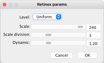
There are many differing algorithms for implementing Retinex. The algorithm illustrated here can be found in the image processing software ImageJ. This algorithm for Retinex is based on the multiscale retinex with colour restoration algorithm (MSRCR) – it combines colour constancy with local contrast enhancement. In reality it’s quite a complex little algorithm with four parameters, as shown in Figure 1.
Fig.1: ImageJ Retinex parameters
The Level specifies the distribution of the [Gaussian] blurring used in the algorithm.
Uniform treats all image intensities similarly.
Low enhances dark regions in the image.
High enhances bright regions in the image.
The Scale specifies the depth of the Retinex effect
The minimum value is 16, a value providing gross, unrefined filtering. The maximum value is 250. Optimal and default value is 240.
The Scale division specifies the number of iterations of the multiscale filter.
The minimum required is 3. Choosing 1 or 2 removes the multiscale characteristic and the algorithm defaults to a single scale Retinex filtering. A value that is too high tends to introduce noise in the image.
The Dynamic adjusts the colour of the result, with large valued producing less saturated images.
Extremely image dependent, and may require tweaking.
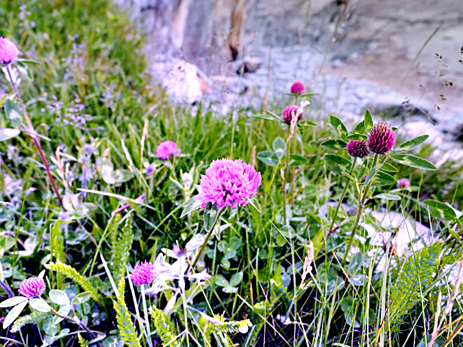
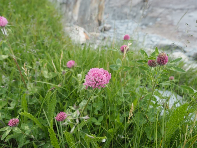
The thing with Retinex, like so many of its enhancement brethren is that the quality of the resulting image is largely dependent on the person viewing it. Consider the following, fairly innocuous picture of some clover blooms in a grassy cliff, with rock outcroppings below (Figure 2). There is a level of one-ness about the picture, i.e. perceptual attention is drawn to the purple flowers, the grass is secondary, and the rock, tertiary. There is very little in the way of contrast in this image.
Fig.2: A picture showing some clover blooms in a grassy meadow.
The algorithm is suppose to be able to do miraculous things, but that does involve a *lot* of tweaking the parameters. The best approach is actually to use the default parameters. Figure 3 shows Figure 2 processed with the default values shown in Figure 1. The image appears to have a lot more contrast in it, and in some cases features in the image have increased their acuity.
Fig.3: Retinex applied with default values.
I don’t find these processed images are all that useful when used by themselves, however averaging the image with the original produces an image with a more subdued contrast (see Figure 4), having features with increased sharpness.
Fig.4: Comparing the original with the averaged (Original and Fig.3)
What about the Low and High versions? Examples are shown below in Figures 5 and 6, for the Low and High settings respectively (with the other parameters used as default). The Low setting produces an image full of contrast in the low intensity regions.
Fig.5: Low
Fig.6: High
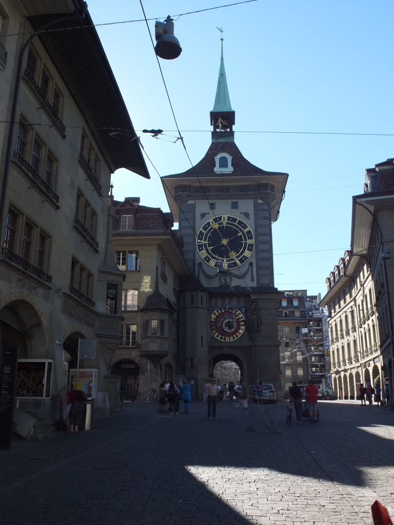
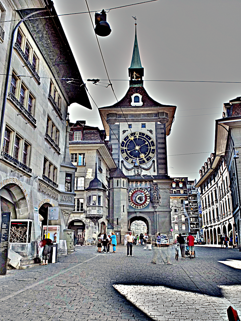
Retinex is quite a good algorithm for dealing with suppressing shadows in images, although even here there needs to be some serious post-processing in order to create an aesthetically pleasing. The picture in Figure 7 shows a severe shadow in a inner-city photograph of Bern (Switzerland). Using the Low setting, the shadow is suppressed (Figure 8), but the algorithm processes the whole image, so other details such as the sky are affected. That aside, it has restored the objects hidden in the shadow quite nicely.
Fig.7: Photograph with intense shadow
Fig.8: Shadow suppressed using “Low” setting in Retinex
In reality, Retinex acts like any other filter, and the results are only useful if they invoke some sense of aesthetic appeal. Getting the write aesthetic often involves quite a bit of parameter manipulation.
Further reading:
Land, E.H., McCann, J.J., ” Lightness and retinex theory”, Journal of the Optical Society of America, 61(1), pp. 1-11 (1971).
Land, E., “The Retinex,” American Scientist, 52, pp.247-264 (1964).
After Ranger 7, NASA moved on to Mars, deploying Mariner 4 in November 1964. It was the first probe to send signals back to Earth in digital form, which was necessitated by the fact that the signals had to travel 216 million km back to earth. The receiver on board could send and receive data via the low- and high-gain antennas at 8⅓ or 33⅓ bits-per-second. So at the low end, one pixel (8-bit) per second. All images were transmitted twice to insure no data were missing or corrupt. In 1965, JPL established the Image Processing Laboratory (IPL).
The next series of lunar probes, Surveyor, were also analog (due to construction being too advanced to make changes), providing some 87,000 images for processing by IPL. The Mariner images also contained noise artifacts that made them look as if they were printed on “herringbone tweed”. It was Thomas Rindfleisch of IPL who applied nonlinear algebra, creating a program called Despike – it performed a 2D Fourier transform to create a frequency spectrum with spikes representing the noise elements, which could then be isolated, removed and the data transformed back into an image.
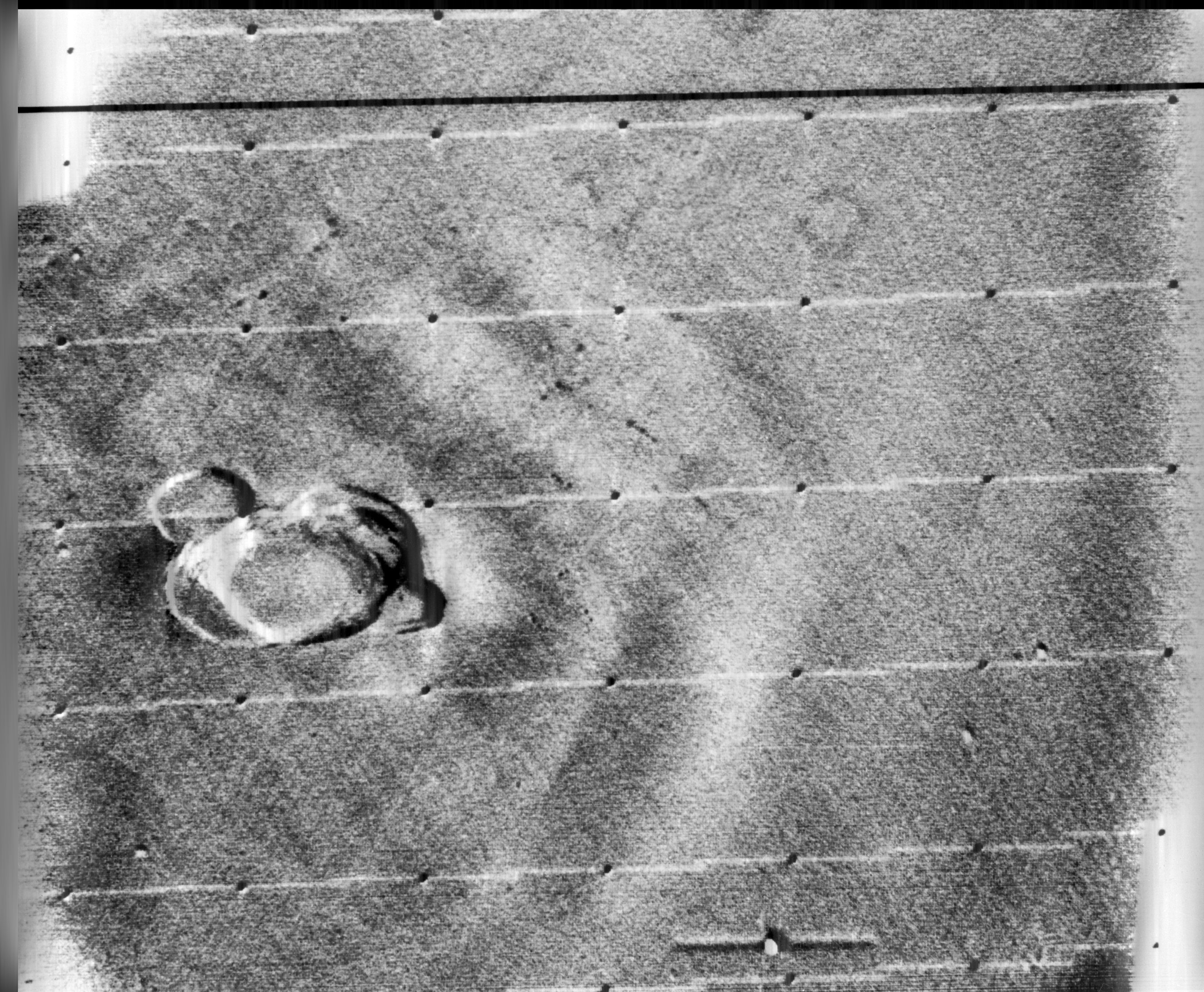
Below is an example of this process applied to an image from Mariner 9 taken in 1971 (PIA02999), containing a herringbone type artifact (Figure 1). The image is processed using a Fast Fourier Transform (FFT – see examples FFT1, FFT2, FFT3) in ImageJ.
Fig.1: Image before (left) and after (right) FFT processing
Applying a FFT to the original image, we obtain a power spectrum (PS), which shows differing components of the image. By enhancing the power spectrum (Figure 2) we are able to look for peaks pertaining to the feature of interest. In this case the vertical herringbone artifacts will appear as peaks in the horizontal dimension of the PS. Now in ImageJ these peaks can be removed from the power spectrum, (setting them to black), effectively filtering out those frequencies (Figure 3). By applying the Inverse FFT to the modified power spectrum, we obtain an image with the herringbone artifacts removed (Figure 1, right).
Fig.2: Power spectrum (enhanced to show peaks)
Fig.3: Power spectrum with frequencies to be filtered out marked in black.
Research then moved to applying the image enhancement techniques developed at IPL to biomedical problems. Robert Selzer processed chest and skull x-rays resulting in improved visibility of blood vessels. It was the National Institutes of Health (NIH) that ended up funding ongoing work in biomedical image processing. Many fields were not using image processing because of the vast amounts of data involved. Limitations were not posed by algorithms, but rather hardware bottlenecks.
Some people probably think image processing was designed for digital cameras (or to add filters to selfies), but in reality many of the basic algorithms we take for-granted today (e.g. improving the sharpness of images) evolved in the 1960s with the NASA space program. The space age began in earnest in 1957 with the USSR’s launch of Sputnik I, the first man-made satellite to successfully orbit Earth. A string of Soviet successes lead to Luna III, which in 1959 transmitted back to Earth the first images ever seen of the far side of the moon. The probe was equipped with an imaging system comprised of a 35mm dual-lens camera, an automatic film processing unit, and a scanner. The camera sported a 200mm f/5.6, and a 500mm f/9.5 lens, and carried temperature and radiation resistant 35mm isochrome film. Luna III took 29 photographs over a 40-minute period, covering 70% of the far side, however only 17 of the images were transmitted back to earth. The images were low-resolution, and noisy.
The first image obtained from the Soviet Luna III probe on October 7, 1959 (29 photos were taken of the dark side of the moon).
In response to the Soviet advances, NASA’s Jet Propulsion Lab (JPL) developed the Ranger series of probes, designed to return photographs and data from the moon. Many of the early probes were a disaster. Two failed to leave Earth orbit, one crashed onto the moon, and two left Earth orbit but missed the moon. Ranger 6 got to the moon, but its television cameras failed to turn on, so not a single image could be transmitted back to earth. Ranger 7 was the last hope for the program. On July 31, 1964 Ranger 7 neared its lunar destination, and in the 17 minutes before it impacted the lunar surface it relayed the first detailed images of the moon, 4,316 of them, back to JPL.
Image processing was not really considered in the planning for the early space missions, and had to gain acceptance. The development of the early stages of image processing was led by Robert Nathan. Nathan received a PhD in crystallography in 1952, and by 1955 found himself running CalTech’s computer centre. In 1959 he moved to JPL to help develop equipment to map the moon. When he viewed pictures from the Luna III probe he remarked “I was certain we could do much better“, and “It was quite clear that extraneous noise had distorted their pictures and severely handicapped analysis” [1].
The cameras† used on the Ranger were Vidicon television cameras produced by RCA. The pictures were transmitted from space in analog form, but enhancing them would be difficult if they remained in analog. It was Nathan who suggested digitizing the analog video signals, and adapting 1D signal processing techniques to process the 2D images. Frederick Billingsley and Roger Brandt of JPL devised a Video Film Converter (VFC) that was used to transform the analog video signals into digital data (which was 6-bit, 64 gray levels).
The images had a number of issues. First there was the geometricdistortion. The beam that swept electrons across the face of the tube in the spacecraft’s camera moved at nonuniform rates that varied from the beam on the playback tube reproducing the image on Earth. This resulted in images that were stretched or distorted. A second problem was that of photometric nonlinearity. The cameras had a tendency to display brightness in the centre, and a darkness around the edge which was caused by a nonuniform response of the phosphor on the tube’s surface. Thirdly, there was an oscillation in the electronics of the camera which was “bleeding” into the video signal, causing a visible period noise pattern. Lastly there was scan-line noise, which was the nonuniform response of the camera with respect to successive scan lines (the noise is generated at right-angles to the scan). Nathan and the JPL team designed a series of algorithms to correct for the limitations of the camera. The image processing algorithms [2] were programmed on JPL’s IBM 7094, likely in the programming language Fortran.
The geometricdistortion was corrected using a “rubber sheeting” algorithm that stretched the images to match a pre-flight calibration.
The photometricnonlinearity was calculated before flight, and filtered from the images.
The oscillation noise was removed by isolating the noise on a featureless portion of the image, created a filter, and subtracted the pattern from the rest of the image.
The scan-line noise was removed using a form of mean filtering.
Ranger VII was followed by the successful missions of Ranger VIII and Ranger IX. The image processing algorithms were used to successfully process 17,259 images of the moon from Rangers 7, 8, and 9 (the link includes the images and documentation from the Ranger missions). Nathan and his team also developed other algorithms which dealt with random-noise removal, Sine-wave correction.
Refs: [1] NASA Release 1966-0402 [2] Nathan, R., “Digital Video-Data Handling”, NASA Technical Report No.32-877 (1966) [3] Computers in Spaceflight: The NASA Experience, Making New Reality: Computers in Simulations and Image Processing.
† The Ranger missions used six cameras, two wide-angle and four narrow angle.
Camera A was a 25mm f/1 with a FOV of 25×25° and a Vidicon target area of 11×11mm.
Camera B was a 76mm f/2 with a FOV of 8.4×8.4° and a Vidicon target area of 11×11mm.
Camera P used two type A and two type B cameras with a Vidicon target area of 2.8×2.8mm.