When people talk about cameras, they invariably talk about pixels, or rather megapixels. The new Fujifilm X-S20 has 26 megapixels. This means that the image produced by the camera will contain 26 million pixels. But the sensor itself does not have any pixels, the sensor has photosites.
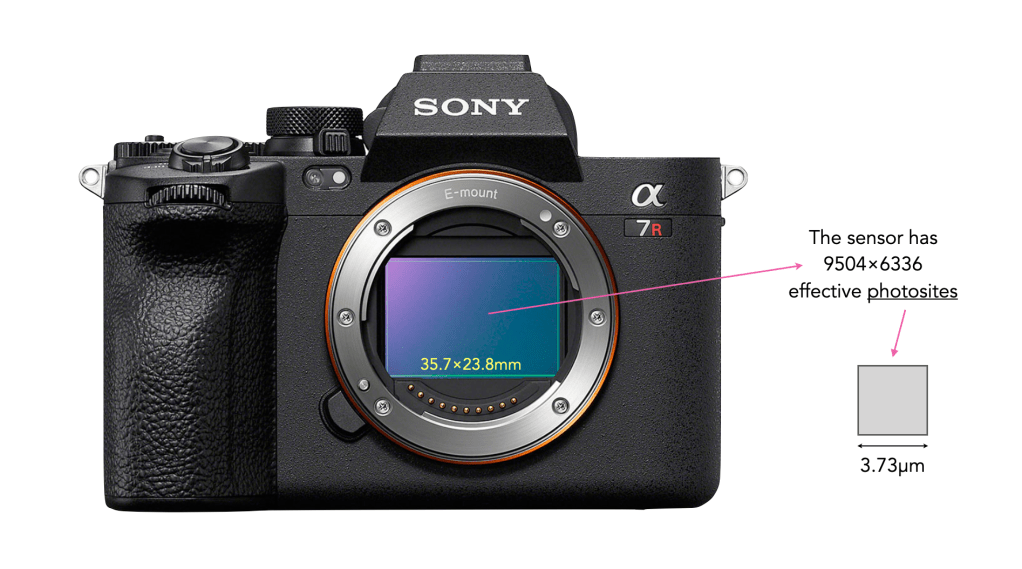
The job of photosites is to capture photons of light. After a bunch of processing, the data captured by each photosite is converted into a digital signal, and processed into a pixel. All the photosites on a sensor contribute to the resultant image. On a sensor there are two numbers used to define the number of photosites. The first is the physical sensor resolution which is the actual number of physical photosites found on the sensor. For example on the Sony a7RV (shown below), there are 9566×6377 physical photosites (61MP). However not all the photosites are used to create an image – the ones that are form the maximum image resolution, i.e. the maximum number of pixels in an image. For the Sony a7RV this is 9504×6336 photosites (60.2MP) used to create an image. This is sometimes known as the effective number of photosites.
The Sony a7R V
There are two major differences between photosites and pixels. Firstly, photosites are physical entities, pixels are not, they are digital entities. Secondly, while photosites have a size, and are different based on the sensor type, and number of photosites on a sensor, pixels are dimensionless. For example each photosite on the Sony a7RV has a pitch (width) of 3.73µm, and an area of 13.91µm2.
So when people create images for the web they are often told that the optimal resolution is 72dpi. First of all, dpi (dots-per-inch) has nothing to do with screens – it is used only in printing. When we talk about screen resolution, we are talking about ppi (points-per-inch), so the concept of dpi is already a misinterpretation.
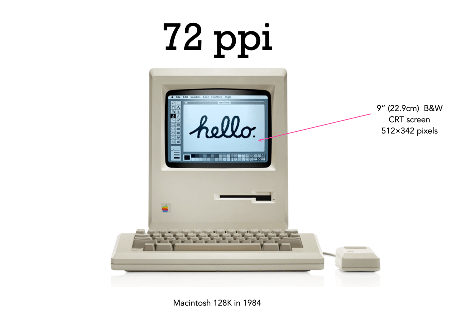
There is still a lot of talk about the magical 72dpi. This harkens back to the time decades ago when computer screens commonly had 72ppi (the Macintosh 128K had a 512×342 pixel display), as opposed to the denser screens we have now (to put this into perspective, it had 0.175 megapixels versus the 4MP on the 13.3” Retina display). This had to do with Apple’s attempt to match the size of the graphics on the screen to the size when it is printed. The most common resolution of the bits of a bitmapped image on the screen of a Macintosh was 72dpi. In a 1989 InfoWorld article (June 19), a review of colour display systems mentioned that “… the closer the display is to 72 dpi, the more ‘real world’ the image will appear, compared with printed output.” This was no coincidence, as Apple’s first printer, the “ImageWriter” could produce print up to a resolution of 144dpi, doubled the resolution of the Mac, so this made scaling images easy.
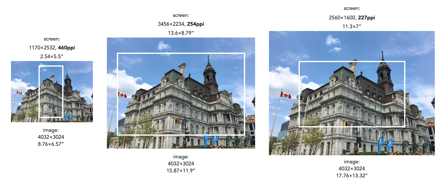
Saving an image using 72ppi makes no sense, because it makes no difference to what is seen on the screen. An image by itself is just a quadrilateral of pixels, it has no context until it is viewed on a screen or printed out. Viewing devices have pixels that don’t change unless the resolution of the monitor changes. This means how an image is displayed is dependent on the resolution of the screen. For example, a 13” MacBook Pro with Retina screen has a size of 2560×1600 with a resolution of 227ppi. This means an image that is 4000×3000 pixels will take up 17.6×13.2” – it would be much larger than the screen if displayed at full resolution. When these images are opened on the laptop they are generally displayed at around 30% of their size, so that the entire image can be viewed.
A 12MP image overlaid on various screen sizes (the white rectangle). The size of the pictures have been modified based on the ppi of the screen.
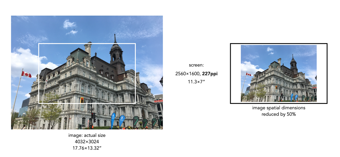
Most webpages are designed in a similar manner, and auto-adjust image sizes to fit the constraints of the webpage design template. It also shows why 12MP or even 6MP images really aren’t needed for webpages. If we instead reduce the spatial dimensions of a 12MP image by 50% we get a 2016×1512, 3MP image – which would only take up 8.8×6.6” of space on the screen (illustrated below). Less screen space is needed, and the smaller file size will benefit things like site loading. If a 6 or 12MP image were used it will just be a larger image to load, and will resized within the webpage by the browser.
Two different sizes of an image in relation to a screen which has a resolution of approximately 4MP: a 12MP image which is too large for the screen (left) and an image which has its spatial dimensions reduced to 50%, which fits inside the screen (right).
What about viewing an image on a 4K television? 4K televisions all have a resolution of 3840×2160. The only caveat here is that if the size of the television changes, the ppi also changes. A 50” TV will have a resolution of 88ppi, whereas an 80” TV will only be 55ppi. This means the 2016×1512 image will appear to be 23×17” on the 50” TV, and 37×27” on the 80” TV. It’s all relative.
So changing an image to 72dpi has what effect? Basically, none. You cannot change the ppi or dpi of an image, because they are dependent on the screen, and printer respectively. So modifying this field in a file to 72ppi/dpi makes no difference to how it is viewed on the screen, or printed on a printer. No screens today have a resolution of 72ppi, unless you are still using a 1980s era Macintosh.
An image which is automatically resized in a webpage, versus the actual image (right).
When it comes to megapixels, the bottom line might be how an image ends up being used. If viewed on a digital device, be it an ultra-resolution monitor or TV, there are limits to what you can see. To view an image on an 8K TV at full resolution, we would need a 33MP image. However any device smaller than this will happily work with a 24MP image, and still not display all the pixels. Printing is however another matter all together.
The standard for quality in printing is 300dpi, or 300 dots-per-inch. If we equate a pixel to a dot, then we can work out the maximum size an image can be printed. 300 dpi is generally the “standard”, because that is the resolution most commonly used. To put this into perspective, at 300dpi, or 300 dots per 25.4mm, each pixel printed on a medium would be 0.085mm, or about as thick as 105 GSM weight paper. That means a dot area of roughly 0.007mm². For example a 24MP image containing 6000×4000 pixels can be printed to a maximum size of 13.3×20 inches (33.8×50.8cm) at 300dpi. The print sizes for a number of different sized images printed using 300dpi are shown in Figure 1.
Fig.1: Maximum printing sizes for various image sizes at 300dpi
The thing is that you may not even need 300dpi? At 300dpi the minimum viewing distance is theoretically 11.46”, whereas dropping it down to 180dpi means the viewing distance increases to 19.1” (but the printed size of an image can increase). In the previous post we discussed visual acuity in terms of the math behind it. Knowing that a print will be viewed from a minimum of 30” away allows us to determine that the optimal DPI required is 115. Now if we have a large panoramic print, say 80″ wide, printed at 300dpi, then the calculated minimum viewing distance is ca. 12″ – but it is impossible to view the entire print being only one foot away from it. So how do we calculate the optimal viewing distance, and then use this to calculate the actual number of DPI required?
The amount of megapixels required of a print can be guided in part by the viewing distance, i.e. the distance from the centre of the print to the eyes of the viewer. The golden standard for calculating the optimal viewing distance involves the following process:
Calculate the diagonal of the print size required.
Multiply the diagonal by 1.5 to calculate the minimum viewing distance
Multiply the diagonal by 2.0 to calculate the maximum viewing distance.
For example a print which is 20×30″ will have a diagonal of 36″, so the optimal viewing distance range from minimum to maximum is 54-72 inches (137-182cm). This means that we are no longer reliant on the use of 300dpi for printing. Now we can use the equations set out in the previous post to calculate the minimum DPI for a viewing distance. For the example above, the minimum DPI required is only 3438/54=64dpi. This would imply that the image size required to create the print is (20*64)×(30*64) = 2.5MP. Figure 2 shows a series of sample print sizes, viewing distances, and minimum DPI (calculated using dpi=3438/min_dist).
Fig.2: Viewing distances and minimum DPI for various common print sizes
Now printing at such a low resolution likely has more limitations than benefits, for example there is no guarantee that people will view the panorama from a set distance. So there likely is a lower bound to the practical amount of DPI required, probably around 180-200dpi because nobody wants to see pixels. For the 20×30″ print, boosting the DPI to 200 would only require a modest 24MP image, whereas a full 300dpi print would require a staggering 54MP image! Figure 3 simulates a 1×1″ square representing various DPI configurations as they might be seen on a print. Note that even at 120dpi the pixels are visible – the lower the DPI, the greater the chance of “blocky” features when view up close.
Fig.3: Various DPI as printed in a 1×1″ square
Are the viewing distances realistic? As an example consider the viewing of a 36×12″ panorama. The diagonal for this print would be 37.9″, so the minimum distance would be calculated as 57 inches. This example is illustrated in Figure 4. Now if we work out the actual viewing angle this creates, it is 37.4°, which is pretty close to 40°. Why is this important? Well THX recommends that the “best seat-to-screen distance” (for a digital theatre) is one where the view angle approximates 40 degrees, and it’s probably not much different for pictures hanging on a wall. The minimum resolution for the panoramic print viewed at this distance would be about 60dpi, but it can be printed at 240dpi with an input image size of about 25MP.
Fig.4: An example of viewing a 36×12″ panorama
So choosing a printing resolution (DPI) is really a balance between: (i) the number of megapixels an image has, (ii) the size of the print required, and (iii) the distance a print will be viewed from. For example, a 24MP image printed at 300dpi will allow a maximum print size of 13.3×20 inches, which has an optimal viewing distance of 3 feet, however by reducing the DPI to 200, we get an increased print size of 20×30 inches, with an optimal viewing distance of 4.5 feet. It is an interplay of many differing factors, including where the print is to be viewed.
P.S. For small prints, such as 5×7 and 4×6, 300dpi is still the best.
P.P.S. For those who who can’t remember how to calculate the diagonal, it’s using the Pythagorean Theorem. So for a 20×30″ print, this would mean:
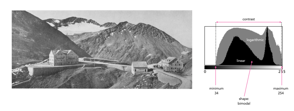
Sometimes a histogram is depicted logarithmically. A histogram will typically depict only large frequencies, i.e. histogram intensities with limited values will not be visualized. The logarithmic form helps to accentuate low frequency occurrences, making them readily apparent. In the example histogram shown below, intensity level 39 has a value of 9, which would not show up in a regular histogram given the scale, e.g. intensity 206 has a count of 9113.
Understanding shape and tonal characteristics is part of the picture, but there are some other things about exposure that can be garnered from a histogram that are related to these characteristics. Remember, a histogram is merely a guide. The best way to understand an image is to look at the image itself, not just the histogram.
Contrast
Contrast is the difference in brightness between elements of an image, and can determine how dull or crisp an image appears with respect to intensity values. Note that the contrast described here is luminance or tonal contrast, as opposed to colour contrast. Contrast is represented as a combination of the range of intensity values within an image and the difference between the maximum and minimum pixel values. A well contrasted image typically makes use of the entire gamut of n intensity values from 0..n-1.
Image contrast is often described in terms of low and high contrast. If the difference between the lightest and darkest regions of an image is broad, e.g. if the highlights are bright, and the shadows very dark, then the image is high contrast. If an image’s tonal range is based more on gray tones, then the image is considered to have a low contrast. In between there are infinite combinations, and histograms where there is no distinguishable pattern. Figure 1 shows an example of low and high contrast on a grayscale image.
Fig.1: Examples of differing types of tonal contrast
The histogram of a high contrast image will have bright whites, dark blacks, and a good amount of mid-tones. It can often be identified by edges that appear very distinct. A low-contrast image has little in the way of tonal contrast. It will have a lot of regions that should be white but are off-white, and black regions that are gray. A low contrast image often has a histogram that appears as a compact band of intensities, with other intensity regions completely unoccupied. Low contrast images often exist in the midtones, but can also appear biased to the shadows or highlights. Figure 2 shows images with low and high contrast, and one which sits midway between the two.
Fig.2: Examples of low, medium, and high contrast in colour images
Sometimes an image will exhibit a global contrast which is different to the contrast found in different regions within the image. The example in Figure 3 shows the lack of contrast in an aerial photograph. The image histogram shows an image with medium contrast, yet if the image were divided into two sub-images, both would exhibit low-contrast.
Fig.3: Global contrast versus regional contrast
Clipping
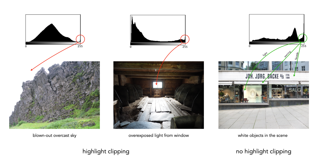
A digital sensor is much more limited than the human eye in its ability to gather information from a scene that contains both very bright, and very dark regions, i.e. a broad dynamic range. A camera may try to create an image that is exposed to the widest possible range of lights and darks in a scene. Because of limited dynamic range, a sensor might leave the image with pitch-black shadows, or pure white highlights. This may signify that the image contains clipping.
Clipping represents the loss of data from that region of the image. For example a spike on the very left edge of a histogram may suggest the image contains some shadow clipping. Conversely, a spike on the very right edge suggests highlight clipping. Clipping means that the full extent of tonal data is not present in an image (or in actually was never acquired). Highlight clipping occurs when exposure is pushed a little too far, e.g. outdoor scenes where the sky is overcast – the white clouds can become overexposed. Similarly, shadow clipping means a region in an image is underexposed,
In regions that suffer from clipping, it is very hard to recover information.
Fig.4: Shadow versus highlight clipping
Some describe the idea of clipping as “hitting the edge of the histogram, and climbing vertically”. In reality, not all histograms exhibiting this tonal cliff may be bad images. For example images taken against a pure white background are purposely exposed to produce these effects. Examples of images with and without clipping are shown in Figure 5.
Fig.5: Not all edge spikes in a histogram are clipping
Are both forms of clipping equally bad, or is one worse than the other? From experience, highlight clipping is far worse. That is because it is often possible to recover at least some detail from shadow clipping. On the other hand, no amount of post-processing will pull details from regions of highlight-clipping in an image.
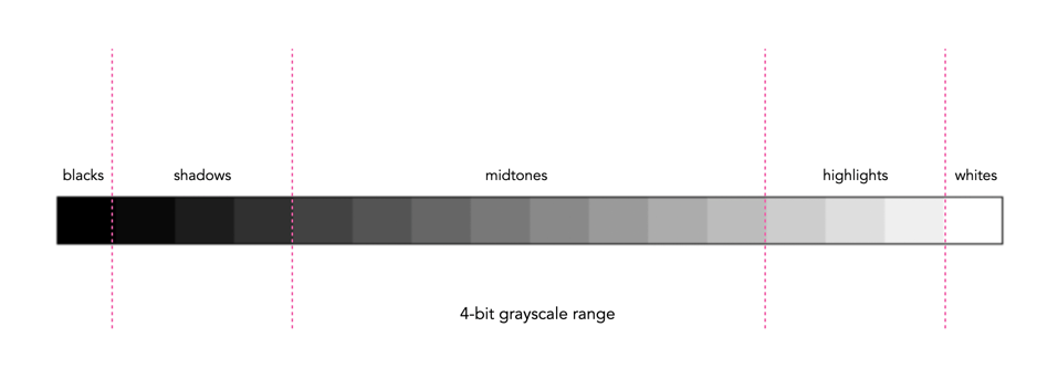
In addition to shape, a histogram can be described using different tonal regions. The left side of the histogram represents the darker tones, or shadows, whereas the right side represents the brighter tones, or highlights, and the middle section represents the midtones. Many different examples of histograms displaying these tonal regions exist. Figure 1 shows a simplified version containing 16 different regions. This is somewhat easier to visualize than a continuous band of 256 grayscale values. The histogram depicts the movement from complete darkness to complete light.
Fig.1: An example of a tonal range – 4-bit (0-15 gray levels)e
The tonal regions within a histogram can be described as:
highlights – The areas of a image which contain high luminance values yet still contain discernable detail. A highlight might be specular (a mirror-like reflection on a polished surface), or diffuse (a refection on a dull surface).
mid tones – A midtone is an area of an image that is intermediate between the highlights and the shadows. The areas of the image where the intensity values are neither very dark, nor very light. Mid-tones ensure a good amount of tonal information is contained in an image.
shadows – The opposite of highlights. Areas that are dark but still retain a certain level of detail.
Like the idealized view of the histogram shape, there can also be a perception of an idealized tonal region – the midtones. However an image containing only midtones tends to lack contrast. In addition, some interpretations of histograms add additional an additional tonal category at either extreme. Both can contribute to clipping.
blacks – Regions of an image that have near-zero luminance. Completely black areas are a dark abyss.
whites – Regions of an image where the brightness has been increased to the extent that highlights become “blown out”, i.e. completely white, and therefore lack detail.
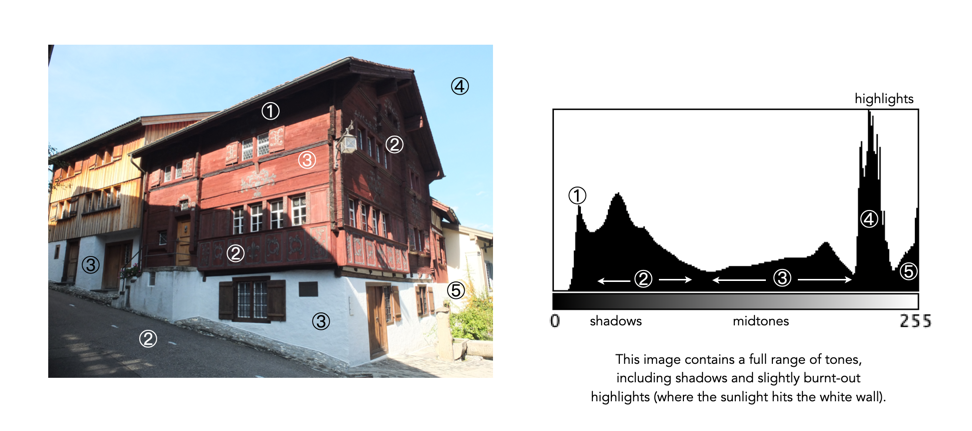
Figure 2 shows an image which illustrates nearly all the regions (with a very weird histogram). The numbers on the image indicate where in the histogram those intensities exist. The peak at ① shows the darkest regions of the image, i.e. the deepest shadows. Next, the regions associated with ② include some shadow (ironically they are in shadow), graduating to midtones. The true mid-tonal region, ③, are regions of the buildings in sunlight. The highlights, ④, are almost completely attributed to the sky, and finally there is a “white” region, ⑤, signifying a region of blow-out, i.e. where the sun is reflecting off the white-washed parts of the building.
Fig.2: An example of the various tonal regions in an image histogram
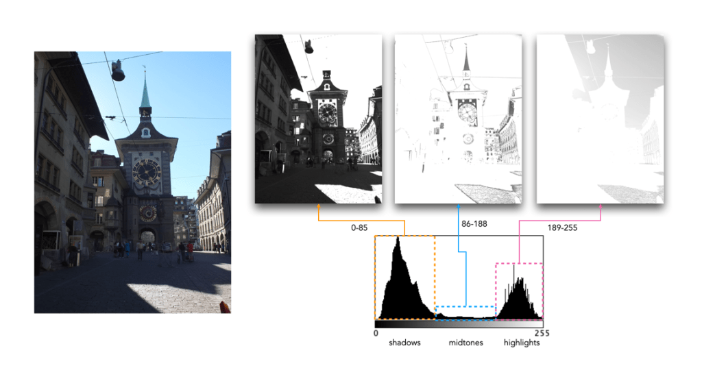
Figure 3 shows how tonal regions in a histogram are associated with pixels in the image. This image has a bimodal histogram, with the majority of pixels in one of two humps. The dominant hump to the left, indicates a good portion of the image is in the shadows. The right-sided smaller hump is associated with the highlights, i.e. the sky, and sunlit pavement. There is very little in the way of midtones, which is not surprising considering the harsh lighting in the scene.
Fig.3: Tonal regions associated with image regions.
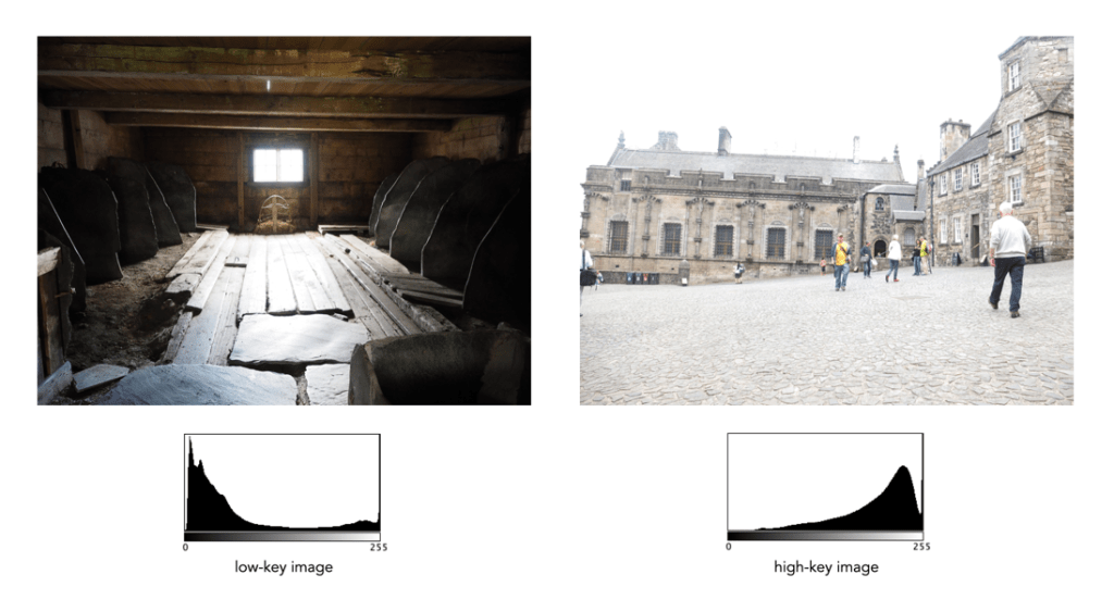
Two other commonly used terms are low-key and high-key.
A high-key image is one composed primarily of light tones, and whose histogram is biased towards 255. Although exposure and lightning can influence the effect, a light-toned subject is almost essential. High-key pictures usually have a pure or nearly pure white background, for example scenes with bright sunlight or a snowy landscape. The high-key effect requires tonal graduations, or shadows, but precludes extremely dark shadows.
A low-key image describes one composed primarily of dark tones, where the bias is towards 0. Subject matter, exposure and lighting contribute to the effect. A dark-toned subject in a dark-toned scene will not necessarily be low-key if the lighting does not produce large areas of shadow. An image taken at night is a good example of a low-key image.
One of the most important characteristics of a histogram is its shape. A histogram’s shape offers a good indicator of an image’s ability to tolerate manipulation. A histogram shape can help elucidate the overall contrast in the image. For example a broad histogram usually reflects a scene with significant contrast, whereas a narrow histogram reflects less contrast, with an image which may appear dull or flat. As mentioned previously, some people believe an “ideal” histogram is one having a shape like a hill, mountain, or bell. The reality is that there are as many shapes as there are images. Remember, a histogram represents the pixels in an image, not their position. This means that it is possible to have a number of images that look very different, but have similar histograms.
The shape of a histogram is usually described in terms of simple shape features. These shape features are often described using geographical terms (because a histogram often reminds people of the profile view of a geographical feature): e.g. “hillock” or “mound”, which is a shallow, low feature, “hill” or “hump”, which is a feature rising higher than the surrounding areas, a “peak”, which is a feature with a distinctly top, a “valley”, which is a low area between two peaks, or a “plateau” which is a level region between other features. Features can either be distinct, i.e. recognizably different, or indistinct, i.e. not clearly defined, often blended with other features. These terms are often used when describing the shape of a particular histogram in detail.
Fig.1: A sample of feature shapes in a histogram
From the perspective of simplicity, however histogram shapes can be broadly classified into three basic categories (examples are shown in Fig.2):
Unimodal – A histogram where there is one distinct feature, typically a hump or peak, i.e. a good amount of an image’s pixels are associated with the feature. The feature can exist anywhere in the histogram. A good example of a unimodal histogram is the classic “bell-shaped” curve with a prominent ‘mound’ in the center and similar tapering to the left and right (e.g. Fig.2: ①).
Bimodal – A histogram where there are two distinct features. Bimodal features can exist as a number of varied shapes, for example the features could be very close, or at opposite ends of the histogram.
Multipeak – A histogram with many prominent features, sometimes referred to as multimodal. These histograms tend to differ vastly in their appearance. The peaks in a multipeak histogram can themselves be composed of unimodal or bimodal features.
These categories can can be used in combination with some qualifiers (numeric examples refer to Figure 2). For example a symmetric histogram, is a histogram where each half is the same. Conversely an asymmetric histogram is one which is not symmetric, typically skewed to one side. One can therefore have a unimodal, asymmetric histogram, e.g. ⑥ which shows a classic “J” shape. Bimodal histograms can also be asymmetric (⑪) or symmetric (⑬).
Fig.2: Core categories of histograms: unimodal, bimodal, multi-peak and other.
Histograms can also be qualified as being indistinct, meaning that it is hard to categorize it as any one shape. In ㉓ there is a peak to the right end of the histogram, however the major of the pixels are distributed in the uniform plateau to the right. Sometimes histogram shapes can also be quite uniform, with no distinct groups of pixels, such as in example ㉒ (in reality though these images are quite rare). It it also possible that the histogram exhibits quite a random pattern, which might only indicate quite a complex scene.
But a histogram’s shape is just its shape. To interpet a histogram requires understanding the shape in context to the contents of the scene within the image. For example, one cannot determine an image is too dark from a left-skewed unimodal histogram without knowledge of what the scene entails. Figure 3 shows some sample colour images and their corresponding histograms, illustrating the variation existing in histograms.
Fig.3: Various colour images and their corresponding intensity histograms
Most colour images are stored using a colour model, and RGB is the most commonly used one. Digital cameras typically offer a specific RGB colourspace such as sRGB. It is commonly used because it is based on how humans perceive colours, and has a good amount of theory underpinning it. For instance, a camera sensor detects the wavelength of light reflected from an object and differentiates it into the primary colours red, green, and blue.
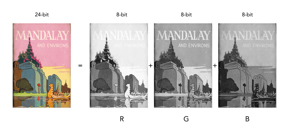
An RGB image is represented by M×N colour pixels (M = width, N = height). When viewed on a screen, each pixel is displayed as a specific colour. However, deconstructed, an RGB image is actually composed of three layers. These layers, or component images are all M×N pixels in size, and represent the values associated with Red, Green and Blue. An example of an RGB image decoupled into its R-G-B component images is shown in Figure 1. None of the component images contain any colour, and are actually grayscale. An RGB image may then be viewed as a stack of three grayscale images. Corresponding pixels in all three R, G, B images help form the colour that is seen when the image is visualized.
Fig.1: A “deconstructed” RGB image
The component images typically have pixels with values in the range 0 to 2B-1, where B is the number of bits of the image. If B=8, the values in each component image would range from 0..255. The number of bits used to represent the pixel values of the component images determines the bit depth of the RGB image. For example if a component image is 8-bit, then the corresponding RGB image would be a 24-bit RGB image (generally the standard). The number of possible colours in an RGB image is then (2B)3, so for B=8, there would be 16,777,216 possible colours.
Coupled together, each RGB pixel is described using a triplet of values, each of which is in the range 0 to 255. It is this triplet value that is interpreted by the output system to produce a colour which is perceived by the human visual system. An example of an RGB pixel’s triplet value, and the associated R-G-B component values is shown in Figure 2. The RGB value visualized as a lime-green colour is composed of the RGB triplet (193, 201, 64), i.e. Red=193, Green=201 and Blue=64.
Fig.2: Component values of an RGB pixel
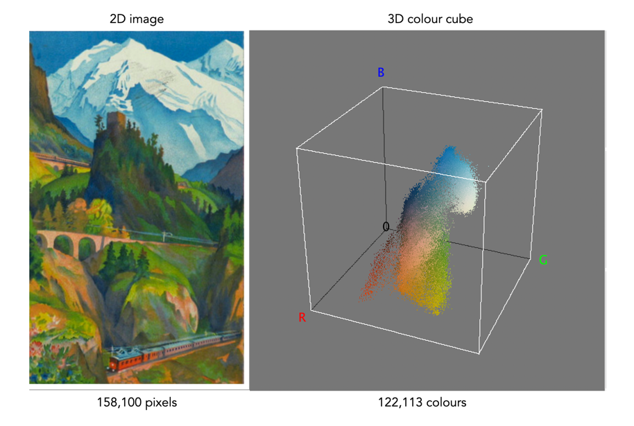
One way of visualizing the R,G,B, components of an image is by means of a 3D colour cube. An example is shown in Figure 3. The RGB image shown has 310×510, or 158,100 pixels. Next to it is a colour cube with the three axes, R, G, and B, each with a range of values 0-255, producing a cube with 16,777,216 elements. Each of the images 122,113 unique colours is represented as a point in the cube (representing only 0.7% of available colours).
Fig 2 Example of colours in an RGB 3D cube
The caveat of the RGB colour model is that it is not a perceptual one, i.e. chrominance and luminance are not separated from one another, they are coupled together. Note that there are some colour models/space that are decoupled, i.e. they separate luminance information from chrominance information. A good example is HSV (Hue, Saturation, Value).
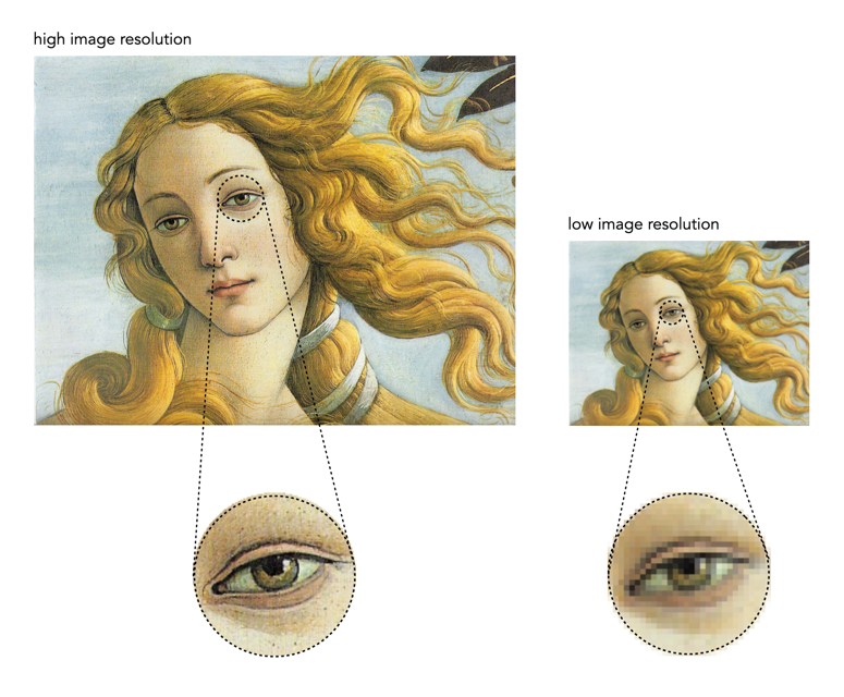
Sometimes a technical term gets used without any thought to its meaning, and before you know it becomes an industry standard. This is the case with the term “image resolution”, which has become the standard means of describing how much detail is portrayed in an image. The problem is that the term resolution can mean different things in photography. In one context it is used in describing the pixel density of devices (in DPI or PPI). For example a screen may have a resolution of 218 ppi (pixels-per-inch), and a smartphone might have a resolution of 460ppi. There is also sensor resolution, which is concerned with photosite density on a sensor based on sensor size. You can see how this can get confusing.
Fig.1: Image resolution is about detail in the image(the image on the right becomes pixelated when enlarged)
The term image resolution really just refers to the number of pixels in an image, i.e. pixel count. It is usually expressed in terms of two numbers for the number of pixel rows and columns in an image, often known as the linear resolution. For example the Ricoh GR III has an APS-C sensor with a sensor resolution of 6051×4007, or about 24.2 million photosites on the physical sensor. The effective number of pixels in an image derived from the sensor is 6000×4000, or a pixel count of 24 million pixels – this is considered the image resolution. Image resolution can be used in the context of describing a camera in broad context, e.g., the Sony A1 has 50 megapixels, or based on dimensions, “8640×5760”. It is often used in the context of comparing images, e.g. the Sony A1 with 50MP has a higher resolution than the Sony ZV-1 with 20MP. The image resolution of two images is shown in Figure 1 – a high resolution image has more detail than an image with lower resolution.
Fig.2: Image resolution and sensor size for 24MP.
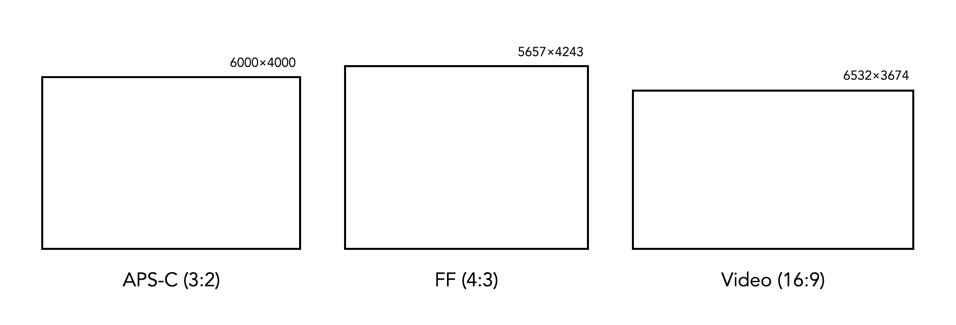
Technically when talking about the sensor we are talking about photosites, but image resolution is not about the sensor, it is about the image produced from the sensor. This is because it is challenging to attempt to compare cameras based on photosites, as they all have differing properties, e.g. photosite area. Once the data from the sensor has been transformed into an image, then the photosite data becomes pixels, which are dimensionless entities. Note that the two dimensions representing the image resolution will change depending on the aspect ratio of the sensor. So while a 24MP image on a 3:2 sensor (APS-C) will have dimensions of 6000 and 4000, a full-frame sensor with the same pixel count will have dimensions of roughly 5657×4243.
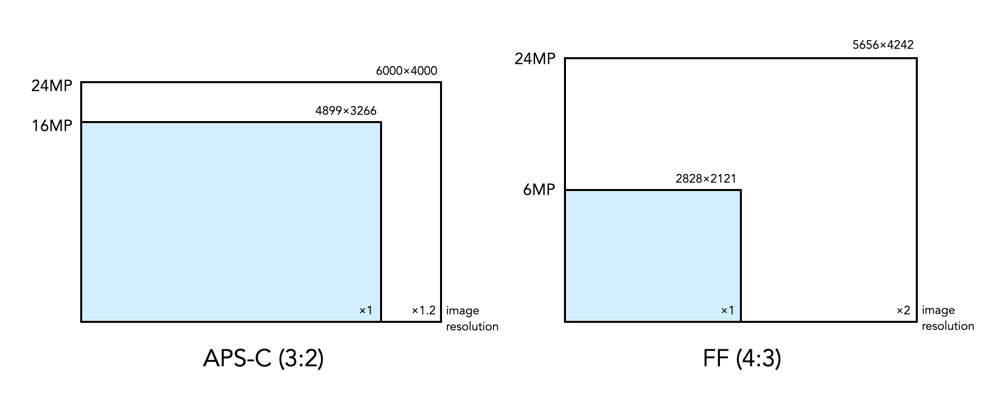
Fig.3: Changes in image resolution within different sensors.
Increasing image resolution does not always mean increasing the linear resolution, or detail in the same amount. For example a 16MP image from 3:2 ratio sensor would produce an image with resolution of 4899×3266. A 24MP images from the same type of sensor would increase the pixel count by 50%, however the vertical and horizontal dimensions would only increase by 20% – so a much lower change in linear resolution. To double the linear resolution would require an increase in resolution to a 64MP image.
Is image resolution the same as sharpness? Not really, this has more to do with an images spatial resolution (this is where the definition of the word resolution starts to betray itself). Sharpness concerns how clearly defined details within images appear, and is somewhat subjective. It’s possible to have a high resolution image that is not sharp, just like its possible to have a low resolution image that has a good amount of acuity. It really depends on the situation it is being viewed in, i.e. back to device pixel density.
When it comes to bits and images it can become quite confusing. For example, are JPEGs 8-bit, or 24-bit? Well they are both.
Basic bits
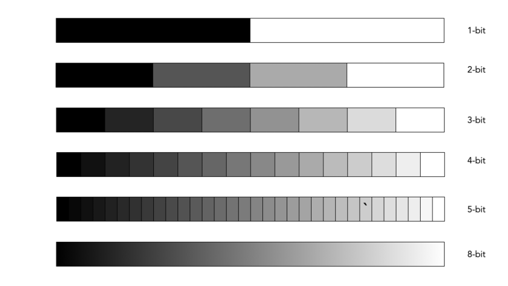
A bit is a binary digit, i.e. it can have a value of 0 or 1. When something is X-bit, it means that it has X binary digits, and 2X possible values. Figure 1 illustrates various values for X as grayscale tones. For example a 2-bit image will have 22, or 4 values (0,1,2,3).
Fig.1: Various bits
An 8-bit image has 28 possible values for bits – i.e. 256 values ranging from 0..255. In terms of binary values, 255 in binary is 11111111, 254 is 11111110, …, 1 is 00000001, and 0 is 00000000. Similarly, a 16-bit means there are 216 possible values, from 0..65535. The number of bits is sometimes called the bit-depth.
Bits-per-pixel
Images typically describe bits in terms of bits-per-pixel (BPP). For example a grayscale image may have 8-BPP, meaning each pixel can have one of 256 values from 0 (black) to 255 (white). Colour images are a little different because they are typically composed of three component images, red (R), green (G), and blue (B). Each component image has its own bit-depth. So a typical 24-bit RGB image is composed of three 8-BPP component images, i.e. 24-BPP RGB = 8-BPP (R) + 8-BPP (G) + 8-BPP (B).
The colour depth of the image is then 2563 or 16,777,216 colours (or 2563, 28=256 for each of the component images). A 48-bit RGB image contains three component images, R, G, and B, each having 16-BPP, for 248 or 281,474,976,710,656 colours.
Bits and file formats
JPEG stores images with a precision of 8-bits per component image, for a total of 24-BPP. The TIFF format supports various bit depths. There are also RGB images stored as 32-bit images. Here 8 bits are used to represent each of the RGB component images, with individual values 0-255. The remaining 8 bits are reserved for the transparency, or alpha (α) component. The transparency component represents the ability to see through a colour pixel onto the background. However only some image file formats support transparency. For example JPEG does not support transparency. Typically of the more common formats, only PNG and TIFF support transparency.
Bits and RAW
Then there are RAW images. Remember RAW images are not RGB images. They maintain the 2D array of pixel values extracted from photosite array of the camera sensor (they only become RGB after post-processing using off-camera software). Therefore they maintain the bit-depth of the camera’s ADC. Common bit depths are 12, 14, and 16. For example a camera that outputs 12-bits will have pixels in the raw image which will be 12-bits. A 12-bit image has 4096 levels of luminance per colour pixel. Once the RGB image is generated that means 4096^3 possible colours, which is 68,719,476,736 possible colours for each pixel. That’s 4096 times the amount of colours of an 8-bit per component RGB image. For example the Ricoh GR III stores its RAW images using 14-bits. This means that a RAW image has the potential of 16,384 colour for each component (once processed), versus a JPEG produced by the same camera, which only has 256 colours for each component.
Do more bits matter?
So theoretically its nice to have 68 billion odd colours, but is it practical. The HVS can distinguish between 7 and 10 million colours, so for visualization purposes 8-bits per colour component is fine. For editing an image, often the more colour depth the better. When an image has been processed it can then be stored as a 16-bit TIFF image, and JPEGs produced as needed (for applications such as the web).