Can humans discern 16 million colours in an image?

A standard colour image is 8-bit (or 24-bit) containing 2563 = 16,777,216 colours. That seems like a lot right? But can that many colours even be distinguished by the human visual system? The quick answer is no, or rather we don’t exactly know for certain. Research into the number of actual discernible colours is actually a bit of a rabbit’s hole.

A 1998 paper [1] suggests that the number of discernible colours may be around 2.28 million – the authors determined this by calculating the number of colours within the boundary of the MacAdam Limits in CIELAB Uniform Colour Space [2] (for those who are interested). However even the authors suggested this 2.28M may be somewhat of an overestimation. An larger figure of 10 million colours (from 1975) is often cited [3], but there is no information on the origin of this figure. A similar figure of 2.5 million colours was cited in a 2012 article [4]. A more recent article [5] gives a conservative estimate of 40 million distinguishable object color stimuli. Is it even possible to realistically prove such large numbers? Somewhat unlikely, because it may be impossible to quantify – ever. Indications based on existing colour spaces may be as good as it gets, and frankly even 1-2 million colours is a lot.

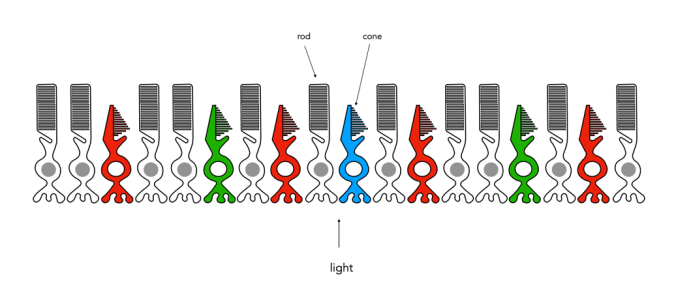
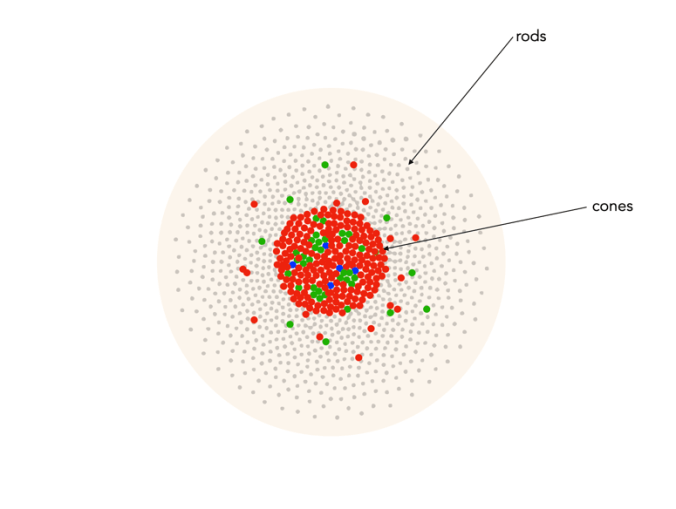
Of course the actual number of colours someone sees is also dependent on the number and distribution of cones in the eye. For example, dichromat’s only have two types of cones which are able to perceive colour. This colour deficiency manifests differently depending on which cone is missing. The majority of the population are trichromats, i.e. they have three types of cones. Lastly there are the very rare individuals, the tetrachromats who have four different cones. Supposedly tetrachromats can see 100 million colours, but it is thought the condition only exists in women, and in reality, nobody really knows how many are potentially tetrachromatic [6] (and the only definitive way of finding out if you have tetrachromacy is via a genetic test).

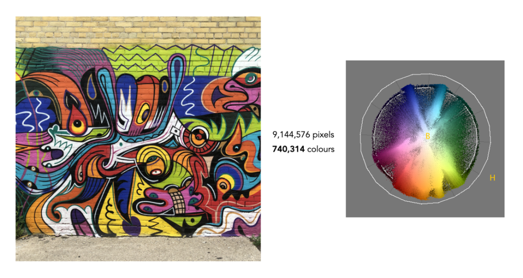
The reality is that few if any real pictures contain 16 million colours. Here are some examples (all images contain 9 million pixels). Note the images are shown in association with the hue distribution from the HSB colour-space. The first example is a picture of a wall of graffiti art in Toronto. Now this is an atypical image because it contains a lot of varied colours, most images do not. This image has only 740,314 distinct colours – that’s only 4.4% of the potential colours available.

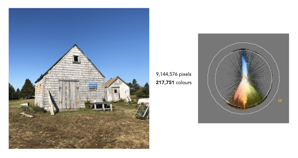
The next example is a more natural picture, a picture of two building (Nova Scotia). This picture is quite representative of images such as landscapes, that are skewed towards quite a narrow band of colours. It only contains 217,751 distinct colours, or 1.3% of the 16.77 million colours.

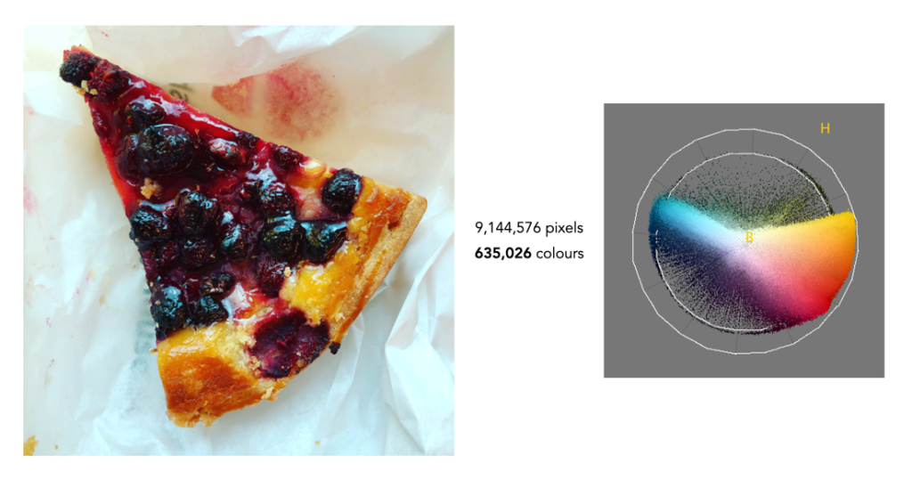
Finally we have foody-type image that doesn’t seem to have a lot of differing colours, but in reality it does. There are 635,026 (3.8%) colours in the image. What these examples show is that most images contain fewer than one million different colours. So while there is the potential for an image to contain 16,777,216 colours, in all likely they won’t.

What about 10-bit colour? We’re taking about 10243 or 1,073,741,824 colours – which is really kind of ridiculous.

Further reading:

  1. Pointer, M.R., Attridge, G.G., “The number of discernible colours”, Color Research and Application, 23(1), pp.52-54 (1998)
  2. MacAdam, D.L., “Maximum visual efficiency of colored materials”, Journal of the Optical Society of America, 25, pp.361-367 (1935)
  3. Judd, D.B., Wyszecki, G., Color in Business, Science and Industry, Wiley, p.388 (1975)
  4. Flinkman, M., Laamanen, H., Vahimaa, P., Hauta-Kasari, M., “Number of colors generated by smooth nonfluorescent reflectance spectra”, J Opt Soc Am A Opt Image Sci Vis., 29(12), pp.2566-2575 (2012)
  5. Kuehni, R.G., “How Many Object Colors Can We Distinguish?”, Color Research and Application, 41(5), pp.439-444 (2016)
  6. Jordan, G., Mollon, J., “Tetrachromacy: the mysterious case of extra-ordinary color vision”, Current Opinion in Behavioral Sciences, 30, pp.130-134 (2019)
  7. All the Colors We Cannot See, Carl Jennings (June 24, 2019)
  8. How Many Colors Can Most Of Us Actually See, USA Art News (July 23, 2020)
Advertisement

Viewing distances, DPI and image size for printing

When it comes to megapixels, the bottom line might be how an image ends up being used. If viewed on a digital device, be it an ultra-resolution monitor or TV, there are limits to what you can see. To view an image on an 8K TV at full resolution, we would need a 33MP image. However any device smaller than this will happily work with a 24MP image, and still not display all the pixels. Printing is however another matter all together.

The standard for quality in printing is 300dpi, or 300 dots-per-inch. If we equate a pixel to a dot, then we can work out the maximum size an image can be printed. 300 dpi is generally the “standard”, because that is the resolution most commonly used. To put this into perspective, at 300dpi, or 300 dots per 25.4mm, each pixel printed on a medium would be 0.085mm, or about as thick as 105 GSM weight paper. That means a dot area of roughly 0.007mm². For example a 24MP image containing 6000×4000 pixels can be printed to a maximum size of 13.3×20 inches (33.8×50.8cm) at 300dpi. The print sizes for a number of different sized images printed using 300dpi are shown in Figure 1.

Fig.1: Maximum printing sizes for various image sizes at 300dpi

The thing is that you may not even need 300dpi? At 300dpi the minimum viewing distance is theoretically 11.46”, whereas dropping it down to 180dpi means the viewing distance increases to 19.1” (but the printed size of an image can increase). In the previous post we discussed visual acuity in terms of the math behind it. Knowing that a print will be viewed from a minimum of 30” away allows us to determine that the optimal DPI required is 115. Now if we have a large panoramic print, say 80″ wide, printed at 300dpi, then the calculated minimum viewing distance is ca. 12″ – but it is impossible to view the entire print being only one foot away from it. So how do we calculate the optimal viewing distance, and then use this to calculate the actual number of DPI required?

The amount of megapixels required of a print can be guided in part by the viewing distance, i.e. the distance from the centre of the print to the eyes of the viewer. The golden standard for calculating the optimal viewing distance involves the following process:

  • Calculate the diagonal of the print size required.
  • Multiply the diagonal by 1.5 to calculate the minimum viewing distance
  • Multiply the diagonal by 2.0 to calculate the maximum viewing distance.

For example a print which is 20×30″ will have a diagonal of 36″, so the optimal viewing distance range from minimum to maximum is 54-72 inches (137-182cm). This means that we are no longer reliant on the use of 300dpi for printing. Now we can use the equations set out in the previous post to calculate the minimum DPI for a viewing distance. For the example above, the minimum DPI required is only 3438/54=64dpi. This would imply that the image size required to create the print is (20*64)×(30*64) = 2.5MP. Figure 2 shows a series of sample print sizes, viewing distances, and minimum DPI (calculated using dpi=3438/min_dist).

Fig.2: Viewing distances and minimum DPI for various common print sizes

Now printing at such a low resolution likely has more limitations than benefits, for example there is no guarantee that people will view the panorama from a set distance. So there likely is a lower bound to the practical amount of DPI required, probably around 180-200dpi because nobody wants to see pixels. For the 20×30″ print, boosting the DPI to 200 would only require a modest 24MP image, whereas a full 300dpi print would require a staggering 54MP image! Figure 3 simulates a 1×1″ square representing various DPI configurations as they might be seen on a print. Note that even at 120dpi the pixels are visible – the lower the DPI, the greater the chance of “blocky” features when view up close.

Fig.3: Various DPI as printed in a 1×1″ square

Are the viewing distances realistic? As an example consider the viewing of a 36×12″ panorama. The diagonal for this print would be 37.9″, so the minimum distance would be calculated as 57 inches. This example is illustrated in Figure 4. Now if we work out the actual viewing angle this creates, it is 37.4°, which is pretty close to 40°. Why is this important? Well THX recommends that the “best seat-to-screen distance” (for a digital theatre) is one where the view angle approximates 40 degrees, and it’s probably not much different for pictures hanging on a wall. The minimum resolution for the panoramic print viewed at this distance would be about 60dpi, but it can be printed at 240dpi with an input image size of about 25MP.

Fig.4: An example of viewing a 36×12″ panorama

So choosing a printing resolution (DPI) is really a balance between: (i) the number of megapixels an image has, (ii) the size of the print required, and (iii) the distance a print will be viewed from. For example, a 24MP image printed at 300dpi will allow a maximum print size of 13.3×20 inches, which has an optimal viewing distance of 3 feet, however by reducing the DPI to 200, we get an increased print size of 20×30 inches, with an optimal viewing distance of 4.5 feet. It is an interplay of many differing factors, including where the print is to be viewed.

P.S. For small prints, such as 5×7 and 4×6, 300dpi is still the best.

P.P.S. For those who who can’t remember how to calculate the diagonal, it’s using the Pythagorean Theorem. So for a 20×30″ print, this would mean:

diagonal = √(20²+30²)
         = √1300
         = 36.06

The math behind visual acuity

The number of megapixels required to print something, or view a television is ultimately determined by the human eye’s visual acuity, and the distance the object is viewed from. For someone with average vision (i.e. 20/20), their acuity would be defined as one arcminute, or 1/60th of a degree. For comparison, a full moon in the sky appears about 31 arcminutes (1/2 a degree) across (Figure 1).

Fig.1: Looking at the moon

Now generally, some descriptions skip from talking about arcminutes to describing how the distance between an observer and an object can calculated given the resolution of the object. For example, the distance (d, in inches) at which the eye reaches its resolution limit is often calculated using:

d = 3438 / h

Where h, is the resolution, and can be ppi for screens, and dpi for prints. So if h=300, then d=11.46 inches. Now to calculate the optimal viewing distance involves a magic number – 3438. Where does this number come from? Few descriptions actually give any insights, but we can can start with some basic trigonometry. Consider the diagram in Figure 2, where h is the pixel pitch, d is the viewing distance, and θ is the angle of viewing.

Fig.2: Viewing an object

Now we can use the basic equation for calculating an angle, Theta (θ), given the length of the opposite and adjacent sides:

tan(θ) = opposite/adjacent

In order to apply this formula to the diagram in Figure 2, only θ/2 and h/2 are used.

tan(θ/2) = (h/2)/d

So now, we can solve for h.

d tan(θ/2) = h/2
2d⋅tan(θ/2) = h

Now if we use visual acuity as 1 arcminute, this is equivalent to 0.000290888 radians. Therefore:

h = 2d⋅tan(0.000290888/2) 
  = 2d⋅0.000145444

So for d=24”, h= 0.00698 inches, or converted to mm (by multiplying by 25.4), h=0.177mm. To convert this into PPI/DPI, we simply take the inverse, so 1/0.00698 = 143 ppi/dpi. How do we turn this equation into one with the value 3438 in it? Well, given that the resolution can be calculated by taking the inverse, we can modify the previous equation:

h = 1/(2d⋅0.000145444)
  = 1/d * 1/2 * 1/0.000145444
  = 1/d * 1/2 * 6875.49847
  = 1/d * 3437.749
  = 3438/d

So for a poster viewed at d=36″, the value of h=95dpi (which is the minimum). The viewing distance can be calculated by rearranging the equation above to:

d = 3438 / h

As an example, consider the Apple Watch Series 8, whose screen has a resolution of 326ppi. Performing the calculation gives d=3438/326 = 10.55”. So the watch should be held 10.55” from one’s face. For a poster printed at 300dpi, d=11.46”, and for a poster printed at 180dpi, d=19.1”. This is independent of the size of the poster, just printing resolution, and represents the minimum resolution at a particular distance – only if you move closer do you need a higher resolution. This is why billboards can be printed at a low resolution, even 1dpi, because when viewed from a distance it doesn’t really matter how low the resolution is.

Note that there are many different variables at play when it comes to acuity. These calculations provide the simplest case scenario. For eyes outside the normal range, visual acuity is different, which will change the calculations (i.e. radians expressed in θ). The differing values for the arcminutes are: 0.75 (20/15), 1.5 (20/30), 2.0 (20/40), etc. There are also factors such as lighting, how eye prescriptions modify acuity, etc. to take into account. Finally, it should be added that these acuity calculations only take into account what is directly in front of our eyes, i.e. the narrow, sharp, vision provided by the foveola in the eye – all other parts of a scene, will have slightly less acuity moving out from this central point.

Fig.3: At 1-2° the foveola provides the greatest amount of acuity.

p.s. The same system can be used to calculate ideal monitor and TV sizes. For a 24″ viewing distance, the pixel pitch is h= 0.177mm. For a 4K (3840×2160) monitor, this would mean 3840*0.177=680mm, and 2160*0.177=382mm which after calculating the diagonal results in a 30.7″ monitor.

p.p.s. If using cm, the formula becomes: d = 8595 / h

The human visual system : focus and acuity

There is a third difference between cameras and the human visual system (HVS). While some camera lenses may share a similar perspective of the world with the HVS with respect to the angle-of view, where they differ is what is actually in the area of focus. Using any lens on a camera means that a picture will have an area where the scene is in-focus, with the remainder being out-of-focus. This in-focus region generally occurs in a plane, and is associated with the depth-of-field. On the other hand, the in-focus region of the picture our mind presents us does not have a plane of focus.

While binocular vision allows approximately 120° of (horizontal) vision, it is only highly focused in the very centre, with the remaining picture being increasingly out-of-focus depending on how far a point is away from the central focused region. This may be challenging to visualize, but if you look at an object, only the central point is in focus, the remainder of the picture is out-of-focus. That does not mean it is necessarily blurred, because the brain is still able to discern shape and colour, just not fine details. Blurring it usually a function of distance from the object being focused on, i.e. the point-of-focus. If you look at a close object, distant objects will be out-of-focus, and vice versa.

Fig.1: Parts of the macula

Focused vision is related to the different parts of the macula, an oval-shaped pigmented area in the centre of the retina which is responsible for interpreting vision, colour, fine details, and symbols (see Figure 1). It is composed almost entirely of cones, into a series of zones:

  • perifovea (5.5mm∅, 18°) : Details that appear in up to 9-10° of visual angle.
  • parafovea (3mm∅, 8°) : Details that appear in peripheral vision, not as sharp as the fovea.
  • fovea (1.5mm∅, 5°) : Or Fovea centralis, comprised entirely of cones, and responsible for high-acuity, and colour vision.
  • foveola (0.35mm∅, 1°) : A central pit within the fovea, which contains densely packed cones. Within the foveola is a small depression known as the umbo (0.15mm∅), which is the microscopic centre of the foveola.
Fig.2: Angle-of-view of the whole macula region, versus the foveola. The foveola provides the greatest region of acuity, i.e. fine details.

When we fixate on an object, we bring an image of that object onto the fovea. The foveola provides the greatest amount of visual acuity, in the area 1-2° outwards from the point of fixation. As the distance from fixation increases, visual acuity decreases quite rapidly. To illustrate this effect, try reading the preceding text in this paragraph while fixating on the period at the end of the sentence. It is likely challenging, if not impossible, to read text outside a small circle of focus from the point of fixation. A seven letter word, like “outside”, is about 1cm wide, which when read on a screen 60cm from your eye represents about an angle of 1°. The 5° of the fovea region allows for a “preview” of the words either side, and parafovea region, 8° of peripheral words (i.e. their shape). This is illustrated in Figure 3.

Fig.3: Reading text from 60cm

To illustrate how this differential focus affects how humans view a scene, consider the image shown in Figure 4. The point of focus is a building in the background roughly 85m from where the person is standing. This image has been modified by adding radial blur from a central point-of-focus to simulate in-focus versus out-of-focus regions as seen by the eye (the blur has been exaggerated). The sharpest region is the point of fixation in the centre – from this focus on a particular object, anything either side of that object will be unsharp, and the further away from that point, the more unsharp is becomes. The

Fig.4: A simulation of focused versus out-of-focus regions in the HVS (the point of fixation is roughly 85m from the eyes)

It is hard to effectively illustrate exactly how the HVS perceives a scene as there is no way of taking a snapshot and analyzing it. However we do know that focus is a function of distance from the point-of-focus. Other parts of an image as essentially de-emphasized, there is still information there, and the way our minds process it, it provides a complete vision, but there is a central point of focus.

Further reading:

  1. Ruch, T.C., “Chapter 21: Binocular Vision, and Central Visual Pathways”, in Neurophysiology (Ruch, T.C. et al. (eds)) p.441-464 (1965)

The human visual system : image shape and binocular vision

There are a number of fundamental differences between a “normal” 50mm lens and the human visual system (HVS). Firstly, a camera extracts a rectangular image from the circular view of the lens. The HVS on the other hand is not circular, nor rectangular – if anything it has somewhat of an oval shape. This can be seen in the diagram of binocular field of vision shown in Figure 1 (from [1]). The central shaded region is the field of vision seen by both eyes, i.e. binocular (stereoscopic) vision, the white areas on both sides are the monocular crescents, seen by only by each eye, and the blackened area is not seen.

Fig.1: One of the original diagrams illustrating both the shape of vision, and the extent of binocular vision [1].

Figure 1 illustrates a second difference, the fact that normal human vision is largely binocular, i.e. uses both eyes to produce an image, whereas most cameras are monocular. Figure 2 illustrates binocular vision more clearly, comparing it to the total visual field.

Fig.2: Shape and angle-of-view, total versus binocular vision (horizontal).

The total visual field of the HVS is 190-200° horizontally, which is composed of 120° of binocular vision, and two fields of 35-40° seen by one one eye. Vertically, the visual field of view is about 130° (and the binocular field is roughly the same), comprised of 50° above the horizontal line-of-sight, and 70-80° below it. An example to illustrate binocular vision (horizontal) is shown in Figure 3.

Fig.3: A binocular (horizontal – 120°) view of Bergen, Norway

It is actually quite challenging to provide an exact example of what a human sees – largely because trying to take the same picture would require a lens such as a fish-eye which would introduce distortions, something the HVS is capable of filtering out.

Further reading:

  1. Ruch, T.C., “Chapter 21: Binocular Vision, and Central Visual Pathways”, in Neurophysiology (Ruch, T.C. et al. (eds)) p.441-464 (1965)

32 shades of gray

Humans don’t interpret gray tones very well – the human visual system perceiving approximately 32 shades of gray. So an 8-bit image with 256 tones already contains too much information for humans to interpret. That’s why you don’t really see any more clarity in a 10-bit image with 1024 shades of gray than a 5-bit image with 32 shades of gray. But why do we only see approximately 32 shades of gray?

It is the responsibility of the rod receptors to deal with black and white. The rods are far less precise than the cones which deal with colour, but are more sensitive to low levels of light that are typically associated with being able to see in a dimly lit room, or at night. There are supposedly over 100 million rods in the retina, but this doesn’t help distinguish any more than 30-32 shades of gray. This may stem from evolutionary needs – in the natural world there are very few things that are actually gray – stones, some trunks of trees, weathered wood, so there was very little need to distinguish between more than a few shades of gray. From an evolutionary perspective, humans needed night vision because they lived half their lives in darkness. This advantage remained crucial, apart perhaps form the past 150 years or so.

The rods work so well that dark adapted humans can detect just a handful of photons hitting the retina. It is likely this is the reason there are so many rods in the retina – so that in exceedingly low levels of light as many as possible of the scarce photons are captured by rods. Figure 1 illustrates two grayscale optical illusions, which rely on our eyes insensitivity to shades of gray. In the image on the left, the horizontal strip of gray is actually the same shade throughout, although our eyes deceive us into thinking that it is light on the left and dark on the right. in the image on the right, the inner boxes are all the same shade of gray, even though they appear to be different.

Fig.1: Optical illusions

To illustrate this further, consider the series of images in the figure below. The first image is the original colour image. The middle image shows that image converted to grayscale with 256 shades of gray. The image on the right shows the colour image converted to 4-bit grayscale, i.e. 16 shades of gray. Is there any perceptual difference between Fig.2b and 2c? Hardly.

Fig.2a: Original colour
Fig.2b: 8-bit grayscale
Fig.2c: 4-bit grayscale

You will see articles that suggest humans can see anywhere from 500-750 shades of gray. They are usually articles related to radiology, where radiologists interpret images like x-rays. The machines that take these medical images are capable of producing 10-bit or 12-bit images which are interpreted on systems capable of improving contrast. There may of course be people that can see more shades of gray, just like there are people with a condition called aphakia that possess ultraviolet vision (aphakia is a lack of a lens which normally blocks UV light, so they are able to perceive wavelengths up to 300nm). There are also tetrachromats who posses a fourth cone cell, allowing them to see up to 100 million colours.

Demystifying Colour (ii) : the basics of colour perception

How humans perceive colour is interesting, because the technology of how digital cameras capture light is adapted from the human visual system. When light enters our eye it is focused by the cornea and lens into the “sensor” portion of the eye – the retina. The retina is composed of a number of different layers. One of these layers contains two types of photosensitive cells (photoreceptors), rods and cones, which interpret the light, and convert it into a neural signal. The neural signals are collected and further processed by other layers in the retina before being sent to the brain via the optic nerve. It is in the brain that some form of colour association is made. For example, an lemon is perceived as yellow, and any deviation from this makes us question what we are looking at (like maybe a pink lemon?).

Fig.1: An example of the structure and arrangement of rods and cones

The rods, which are long and thin, interpret light (white) and darkness (black). Rods work only at night, as only a few photons of light are needed to activate a rod. Rods don’t help with colour perception, which is why at night we see everything in shades of gray. The human eye is suppose to have over 100 million rods.

Cones have tapered shape, and are used to process the the three wavelengths which our brains interpret as colour. There are three types of cones – short-wavelength (S), medium-wavelength (M), and long-wavelength (L). Each cone absorbs light over a broad range of wavelengths: L ∼ 570nm, M ∼ 545nm, and S ∼ 440nm. The cones are usually called R, G, and B for L, M, and S respectively. Of course these cones have nothing to do with their colours, just wavelengths that our brain interprets as colours. There are roughly 6-7 million cones in the human eye, divided up into 64% “red” cones, 32% “green” cones, and 2% “blue” cones. Most of these are packed into the fovea. Figure 2 shows how rods and cones are arranged in the retina. Rods are located mainly in the peripheral regions of the retina, and are absent from the middle of the fovea. Cones are located throughout the retina, but concentrated on the very centre.

Fig.2: Rods and cones in the retina.

Since there are three types of cones, how are other colours formed? The ability to see millions of colours is a combination of the overlap of the cones, and how the brain interprets the information. Figure 3 shows roughly how the red, green, and blue sensitive cones interpret different wavelengths as colour. As different wavelengths stimulate the colour sensitive cones in differing proportions, the brain interprets the signals as differing colours. For example, the colour yellow results from the red and green cones being stimulated while the blues cones are not.

Fig.3: Response of the human visual system to light

Below is a list of approximately how the cones make the primary and secondary colours. All other colours are composed of varying strengths of light activating the red, green and blues cones. when the light is turned off, black is perceived.

  • The colour violet activates the blue cone, and partially activates the red cone.
  • The colour blue activates the blue cone.
  • The colour cyan activates the blue cone, and the green cone.
  • The colour green activates the green cone, and partially activates the red and blue cones.
  • The colour yellow activates the green cone and the red cone.
  • The colour orange activates the red cone, and partially activates the green cone.
  • The colour red activates the red cones.
  • The colour magenta activates the red cone and the blue cone.
  • The colour white activates the red, green and blue cones.

So what about post-processing once the cones have done their thing? The sensor array receives the colours, and stores the information by encoding it in the bipolar and ganglion cells in the retina before it is passed to the brain. There are three types of encoding.

  1. The luminance (brightness) is encoded as the sum of the signals coming from the red, green and blue cones and the rods. These help provide the fine detail of the image in black and white. This is similar to a grayscale version of a colour image.
  2. The second encoding separates blue from yellow.
  3. The third encoding separates red and green.
Fig.4: The encoding of colour information after the cones do their thing.

In the fovea there are no rods, only cones, so the luminance ganglion cell only receives a signal from one cone cell of each colour. A rough approximation of the process is shown in Figure 4.

Now, you don’t really need to know that much about the inner workings of the eye, except that colour theory is based a great deal on how the human eye perceives colour, hence the use of RGB in digital cameras.

Does a lack of colour make it harder to extract the true context of pictures?

For many decades, achromatic black-and-white (B&W) photographs were accepted as the standard photographic representation of reality. That is until the realization of colour photography for the masses. Kodak introduced Kodachrome in 1936 and Ektachrome in the 1940s which lead to the gradual, popular adoption of colour photography. It only became practical for everyday photographers during the mid-1950s after film manufacturers had invented processes that made colour pictures sufficiently easy to develop. That didn’t mean that B&W disappeared from society, as in certain fields like journalistic photography they remained the norm. There were a number of reasons for this – news photos were generally printed in B&W, and B&W film was faster, meaning less light was needed to take an image, allowing photojournalists to shoot in a variety of conditions. So from a journalistic viewpoint, people interpreted the news of the world in B&W for nearly a century.

The difference between B&W and colour is that humans don’t see the world in monochromatic terms. Humans have the potential to discern millions of colours, and yet are limited to approximately 32 shades of gray. We have evolved in this manner because the world around us is not monochromatic, and our very survival once depended on our ability to separate good food from the not so good. Many things can be inferred from colour. Many things are lost in B&W. Colour catches the eye, and highlights regions of interest. For instance, setting and time of day/year can be inferred from a photograph’s colours. Mood can also be communicated based on colour. 

Black-and-white photographs offer a translation of our view of the world into a unique achromatic medium. Shooting B&W photographs is clearly more challenging because unlike the 16 million odd colours available to describe a scene, B&W typically offers only 256, from pure black (0), to pure white (255). Take for example a photograph taken during the First World War. These photographs were typically B&W, and grainy, painting a rather grim picture of all aspects of society during this period. We typically associated B&W with nostalgia. There was some colour photography during the early 20th century, provided by the Autochrome Lumière technology, and resulting in some 72,000 photographs of the time period from places all over the world. But seeing things in B&W means having to interpret a scene without the advantage of colour. Consider the following photograph from Paris during the early 1900s. It offers a very vibrant rendition of the street scene, with the eye drawn to the varied colour posters on the wall of the building. 

Two forms of reality: Colour versus black-and-white

Without the colour, we are left with a somewhat drab and gloomy scene, befitting the somber mood associated with the early years of the early 20th century. In the B&W we cannot see the colour of the posters festooning the buildings. What is interesting is that we are likely not use to seeing colour photographs from before the 1950s. It’s almost like we expect images from the before 1950 to be monochromatic, maybe because we perceive these years filled with hardship and suffering. But there is something unique about the monochrome domain. 

The aesthetic of black-and-white photographs is based on many factors, including lighting, any colour filters that were used during acquisition of the photograph, and the colour sensitivity of the B&W film. Sergei Mikhailovich Prokudin-Gorskii (1863-1944) was a man well ahead of his time. He developed an early technique for taking colour photographs involving a series of monochrome photographs and colour (R-G-B) filters. The images below show an example of Alim Khan, Emir of Bukhara. It is shown in comparison with two grayscale renditions of the photograph. The first is the lightness component from the Lab colour space, and the second is a grayscale image extracted from RGB using G=0.299R+0.587G+0.114B. Both offer a different perspective of how the colour in the image could be rendered by the camera. None present the vibrance of the image in the same way as the colour image.

Why bother with film photography?

About a year ago I decided to take a relook at film photography. After so many years taking digital photographs it seemed like an odd sort of move. My trip back to film began when I bought a Voigtländer 25mm lens for my Olympus MFT camera. It is completely manual, and at the moment I started focusing, I knew that I had been missing something with digital. Harking back to film seems a move that many amateur photographers have decided to make. Maybe it is a function of becoming a camera aficionado… the form and aesthetic appeal of vintage cameras brings something that modern digital cameras don’t – a sense of character. There is a reason some modern cameras are modelled on the appearance of vintage cameras. Here are some thoughts.

Digital has changed the way we photograph, and although we know we will never bungle a holiday snap, it does verge on clinical at times. I can take 1000 photographs on a 2-week trip, and I do enjoy having instant access to the photograph. Digital is convenient, no doubt about that, but there is some aesthetic appeal missing that algorithms just can not reproduce. Taking a digital image means that each pixel is basically created using an algorithm. Light in, pixel out. Giving an image a “film-look” means applying some form of algorithmic filter after the image is taken. Film on the other hand is more of an organic process, because of how the film is created. Film grains, i.e. silver crystals are not all created equal. Different films have different sized grains, and different colour profiles.

“Tea, Earl Grey, Hot”

There are many elements of photography that are missing with digital. Yes, a digital camera can be used in manual mode, but it’s just not the same. For the average person, one thing missing with digital is an appreciation for the theory behind taking photographs – film speed (meaningless in digital), shutter speed, apertures. Some digital lenses allow a switch over to manual focusing, which opens the door to control over how much of a photograph is in focus – much more fun that auto-focus. Moving to pure analog means that you have to have an understanding of camera fundamentals, and film types.

What type of camera to experiment with? While digital cameras tend to have the same underpinning technology, film cameras can be quite different. A myriad of differing manufacturers, and film sizes. Do you want to use a box camera (aka Brownie), or a foldable one with bellows? A vintage German camera (East or West?), Japanese, or Russian? Full frame or half-frame? SLR or rangefinder? Zone focusing? Fully manual, or with light meter (assuming they work). So many choices.

Another part of the organic nature of film photography is the lenses. Unlike modern lenses which can be extremely complex, and exact, vintage lenses often contain a level of imperfections which means they provide a good amount of character. If you want good Bokeh, or differing colour renditions, then a vintage lens will provide that. They are manual, but that’s the point isn’t it? Lastly there is the film. Each film has it’s own character. Monochrome film to render cinematic ambiance, or colour film that desaturates colours. There are also films which have no (inexpensive) digital equivalent – like infrared film (from Rollei, and not really the same as using a filter).

Apart from pure analog, there is also the cross-over of analog to digital, the hybrid form of photography. This is achieved by using vintage analog lenses on digital cameras, providing the best of both worlds. It does mean that functions such as aperture control, and focusing have to be done manually (which isn’t a bad thing), but also allows for much more creative control. There are also effects such as Bokeh, which can not be reproduced algorithmically in any sort of organic manner.

There is some irony in film though. Many people of course end up digitizing the film. But the essence of the photograph is captured in the film and digitizing it does not take all of that away (it does loose something as the transferral from film to paper adds another layer of appeal). To display your work, digital is still the best way (hard to write a blog post with a paper photograph). My foray into film is partly a longing to relive the experiential side of photography, to play with apertures, to focus a lens – it doesn’t have to be exact, and that’s the point.

The downside is of course you will never get to see the photograph until after it is developed. However it’s best to look at this more from a more expressive point-of-view. The art may lie partially in the unveiling. Maybe film photography lends itself more to an art form.

How do we perceive photographs?

Pictures are flat objects that contain pigment (either colour, or monochrome), and are very different from the objects and scenes they represent. Of course pictures must be something like the objects they depict, otherwise they could not adequately represent them. Let’s consider depth in a picture. In a picture, it is often easy to find cues relating to the depth of a scene. The depth-of-field often manifests itself as a region of increasing out-of-focus away from the object which is in focus. Other possibilities are parallel lines than converge in the distance, e.g. railway tracks, or objects that are blocked by closer objects. Real scenes do not always offer such depth cues, as we perceive “everything” in focus, and railway tracks do not converge to a point! In this sense, pictures are very dissimilar to the real world.

If you move while taking a picture, the scene will change. Objects that are near move more in the field-of-view than those that are far away. As the photographer moves, so too does the scene, as a whole. Take a picture from a moving vehicle, and the near scene will be blurred, the far not as much, regardless of the speed (motion parallax). This then is an example of a picture for which there is no real world scene.

A photograph is all about how it is interpreted

Photography then, is not about capturing “reality”, but rather capturing our perception, our interpretation of the world around us. It is still a visual representation of a “moment in time”, but not one that necessarily represents the world around us accurately. All perceptions of the world are unique, as humans are individual beings, with their own quirks and interpretations of the world. There are also things that we can’t perceive. Humans experience sight through the visible spectrum, but UV light exists, and some animals, such as reindeer are believed to be able to see in UV.

So what do we perceive in a photograph?

Every photograph, no matter how painstaking the observation of the photographer or how long the actual exposure, is essentially a snapshot; it is an attempt to penetrate and capture the unique esthetic moment that singles itself out of the thousands of chance compositions, uncrystallized and insignificant, that occur in the course of a day.

Lewis Mumford, Technics and Civilization (1934)