Does image super-resolution work?

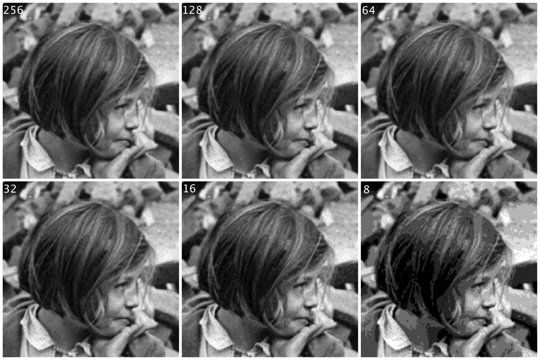
Everyone has some image that they wish had better resolution, i.e. the image would have finer detail. The problem with this concept is that it is almost impossible to create pixels from information that did not exist in the original image. For example if you want to increase the size of an image 4 times, that basically means that a 100×100 pixel image would be transformed into an image 400×400 pixels in size. There is a glitch here though, increasing the dimensions of the image by four times, actually increases the data within the image by 16 times. The original image had 10,000 pixels, yet the new image will have 160,000 pixels. That means 150,000 pixels of information will have to be interpreted from the original 10,000 pixels. That’s a lot of “padding” information that doesn’t exist.

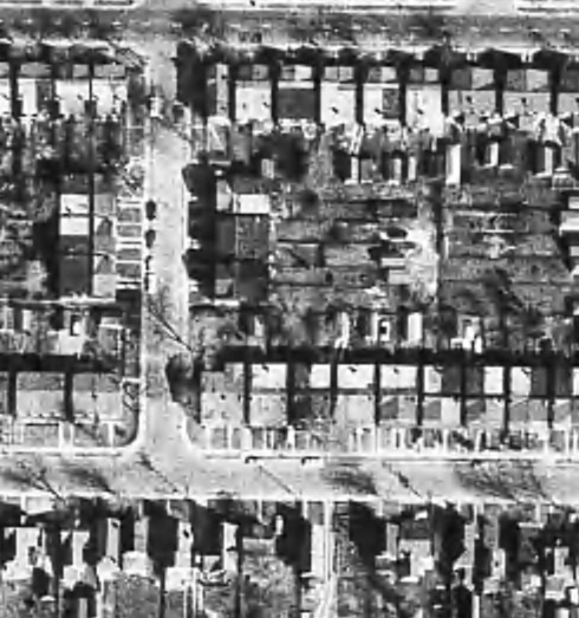
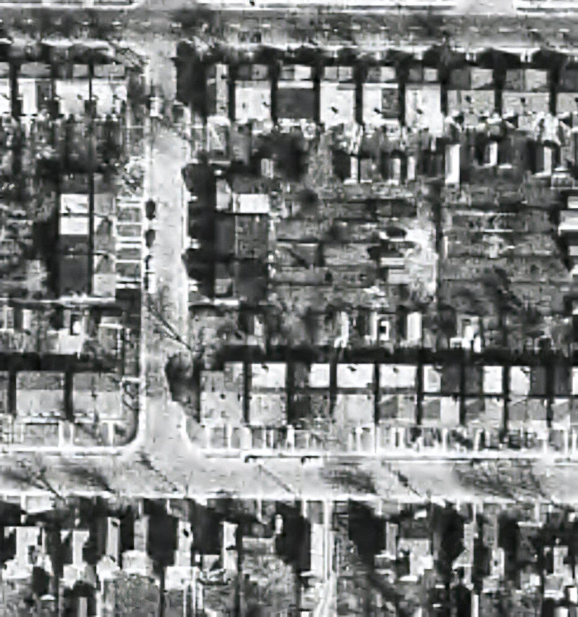
There are a lot of algorithms out there that suggest that they can increase the resolution of an image anywhere from 2-16 times. It is easy to be skeptical about these claims, so do they work? I tested two of these platforms on two vastly different images. Images where I was interested in seeing a higher resolution. The first image is a segment of an B&W aerial photograph of my neighbourhood from 1959. I have always been interested in seeing the finer details, so will super-resolution fix this problem? The second image is a small image of a vintage art poster which I would print were it to have better resolution.

My experiments were performed on two online systems: (i) AI Image Enlarger, and (ii) Deep Image. Now both seem to use AI in some manner to perform the super-resolution. I upscaled both images 4 times (the max of the free settings). Now these experiments are quick-and-dirty, offering inputs from the broadest ends of the spectrum. They are compared to the original image “upscaled” four times using a simple scaling algorithm, i.e. each pixel in the input image becomes 4 pixels in the output image.

The first experiment with the B&W aerial photograph (490×503) increased the size of the image to 1960×2092 pixels. Neither super-resolution algorithm produced any results which are perceptually different from the original, i.e. there is no perceived enhanced resolution. This works to the theory of “garbage-in, garbage-out”, i.e. you cannot make information from nothing. Photographs are inherently harder to upsize than other forms of image.

The original aerial image (left) compared with the super-resolution image produced by AI Image Enlarger (right).

The original aerial image (left) compared with the super-resolution image produced by Deep Image (right).

The next experiment with the coloured poster (318×509) increased the size of the image to 1272×2036 pixels. Here the results from both algorithms are quite good. Both algorithms enhance detail within the images, making things more crisp, aesthetically pleasing, and actually increasing the detail resolution. Why did the poster turn out better? This is mainly because artwork contains a lot more distinct edges between objects, and the colour also likely contributes to the algorithms success.

The original poster image (left) compared with the super-resolution image produced by AI Image Enlarger (right).

The original poster image (left) compared with the super-resolution image produced by Deep Image (right).

To compare the algorithms, I have extracted two segments from the poster image, to show how the differing algorithms deal with the super-resolution. The AI Image Enlarger seems to retain more details, while producing a softer look, whereas Deep Image enhances some details (river flow) at the expense of others, some of which it almost erodes (bridge structure, locomotive windows).

It’s all in the details: AI Image Enlarger (left) vs. Deep Image (right)

The other big difference is that AI Image Enlarger was relatively fast, whereas Deep Image was as slow as molasses. The overall conclusion? I think super-resolution algorithms work fine for tasks that have a good amount of contrast in them, and possibly images with distinct transitions, such as artwork. However trying to get details out of images with indistinct objects in them is not going to work too well.

What happens to “extra” photosites on a sensor?

So in a previous post we talked about effective pixels versus total photosites, i.e. the effective number of pixels in a image (active photosites on a sensor) is usually smaller than the total number of photosites on a sensor. That leaves a small number of photosites that don’t contribute to forming an image. These “extra” photosites sit beyond the camera’s image mask, and so are shielded from receiving light. But they are still useful.

These extra photosites receive a signal that tells the sensor how much dark current (unwanted free electrons generated in the CCD due to thermal energy) has built up during an exposure, essentially establishing a reference dark current level. The camera can then use this information to compensate for how the dark current contributes to the effective (active) photosites by adjusting their values (through subtraction). Light leakage may occur at the edge of this band of “extra” photosites, and these are called “isolation” photosites. The figure below shows the establishment of the dark current level.

Creation of dark current reference pixels

Photosite size and noise

Photosites have a definitive amount of noise that occurs when the sensor is read (electronic/readout noise), and a definitive amount of noise per exposure (photon/shot noise). Collecting more light in photosites allows for a higher signal-to-noise ratio (SNR), meaning more signal, less noise. The lower amount of noise has to do with the accuracy of the light photons measured – a photosite that collects 10 photons will be less accurate than one that collects 50 photons. Consider the figure below. The larger photosite on the left is able to collect many four times as many light photons as the smaller photosite on the right. However the photon “shot” noise acquired by the larger photosite is not four times that of the smaller photosite, and as a consequence, the larger photosite has a much better SNR.

Large versus small photosites

A larger photosite size has less noise fundamentally because the accuracy of the measurement from a sensor is proportional to the amount of light it collects. Photon or shot noise can be approximately described as the square root of signal (photons). So as the number of photons being collected by a photosite (signal) increases, the shot noise increases more slowly, as the square root of the signal.

Two different photosite sizes from differing sensors

Consider the following example, using two differing size photosites from differing sensors. The first is from a Sony A7 III, a full frame (FF) sensor, with a photosite area of 34.9μm²; the second is from an Olympus EM-1(ii) Micro-Four-Thirds (MFT) sensor with a photosite area of 11.02μm². Let’s assume that for the signal, one photon strikes every square micron of the photosite (a single exposure at 1/250s), and calculated photon noise is √signal. Then the Olympus photosite will receive 11 photons for every 3 electrons of noise, a SNR of 11:3. The Sony will receive 35 photons for every 6 electrons of noise, a SNR of 35:6. If both are normalized, we get rations of 3.7:1 versus 5.8:1, so the Sony has the better SNR (for photon noise).

Photon (signal) versus noise

If the amount of light is reduced, by stopping down the aperture, or decreasing the exposure time, then larger photosites will still receive more photons than smaller ones. For example, stopping down the aperture from f/2 to f/2.8 means the amount of light passing through the lens is halved. Larger pixels are also often situated better when long exposures are required, for example low-light scenes such as astrophotography. For example, if we were to increase the shutter speed from 1/250s to 1/125s, then the number of photons collected by a photosite would double. The shot noise SNR in the Sony would increase from 5.8:1 to 8.8:1, that of the Olympus would only increase from 3.7:1 to 4.7:1.

Photosite size and light

It doesn’t really matter what the overall size of a sensor is, it is the size of the photosites that matter. The area of the photosite affects how much light can be gathered. The larger the area, the more light that can be collected, resulting in a greater dynamic range, and potentially a better signal quality. Conversely, smaller photosites can provide more detail for a given sensor size. Let’s compare a series of sensors: a smartphone (Apple XR), a MFT sensor (Olympus E-M1(II)), an APS-C sensor (Ricoh GRII) and a full frame sensor (Sony A7 III).

A comparison of different photosite sizes (both photosize pitch and area are shown)

The surface area of the photosites on the Sony sensor is 34.93µm², meaning there are roughly 3× more photons hitting the full-frame photosite than the MFT photosite (11.02µm²), and nearly 18× more than the photosite on the smartphone. So how does this affect the images created?

The size of a photosite relates directly to the amount of light that can be captured. Large photosites are able to perform well in low-light situations, whereas small photosites struggle to capture light, leading to an increase in noise. Being able to capture more light means a higher signal output from a photosite. This means it will require less amplification (a lower ISO), than a sensor with smaller photosites. Collecting more light with the same exposure time and, therefore, respond with higher sensitivity. An exaggerated example is shown in the figure below.

Small vs. large photosites, normal vs. low light

Larger photosites are usually associated with larger sensors, and that’s the reason why many full-frame cameras are good in low-light situations. Photosites do not exist in isolation, and there are other factors which contribute to the light capturing abilities of photosites, e.g. the microlenses that help to gather more light for a photosite, and the small non-functional gaps between each photosite.

The size of photosites

Photosites on image sensors come in different sizes. The size of a photosite on a sensor is based on the size of the sensor, and number of photosites on the sensor. Some sensor sizes have differing sizes of photosites, because more have been crammed onto the sensor. However different sensor sizes can also have the same sized photosites. For example the Olympus E-M5(II) (16.1MP) has a photosite size of 13.99 µm², and a Fujifilm X-T3 sporting 26.1MP has the same photosite size.

The size of a photosite, is often termed pixel pitch, and is measured in micrometres (or in old terms microns). A micrometre, represented by the symbol µm, is a unit of measure equivalent to one millionth of a metre. It is equivalent to 0.001mm. To put this into context, the nominal diameter of a human hair is 75µm. The area of a photosite is represented by µm². For example, the Olympus E-M5(II) has a pitch of 3.74µm, or 0.00374mm, which is 20 times smaller than a human hair.

comparison of human hair and photosite
Comparison the size of a photosite with a human hair

In order to increase the number of photosites a sensor has, their size has to decrease. Consider an example using a Micro-Four-Thirds (MFT) sensor. An Olympus OM-D E-M5 Mark II fits 16.1 million photosites onto the sensor, whereas an Olympus OM-D E-M1 Mark II fits 20.4 million. This means the pixels on the E-M1(II) will be smaller. This works out to a pixel area of roughly 13.99 µm² versus 11.02µm². This may seem trivial, but even a small difference in size may impact how a photosite functions.

How big are pixels?

A pixel is an abstract, size-less thing. A pixels size is relative to the resolution of the physical device on which it is being viewed. The photosites on a camera sensor do have a set dimension, but once an image is acquired, and the signal are digitized, image pixels are size-less.

For example, let’s consider TVs, and in particular 4K Ultra HD TVs. A 43″ version of this TV might have a resolution of 3840×2160 pixels (w×h). The 75″ version of this TV has *exactly* the same number of pixels – about 8 million of them. What changes is the pixel size, but then so does the distance you should view the TV from. The iPhone 11 in comparison has a screen size of 1792×828. For example, the 43″ 4K TV has dimensions of roughly 37″×20.8″, which means that the size of a pixel is 0.24mm. A 75″ 4K TV would have a pixel size of 0.41mm. An Apple Macbook Air with a 13.3″ screen (2560×1600 pixels) has a pixel size of 0.11mm.

As an example consider the image below. Two sizes of pixels are shown, to represent different resolutions on two different physical devices. The content of the pixel doesn’t change, it just adapts to fill the physical pixels on the device.

Pixel sizes on different screens

Likely more important than the size of pixels is how many of them there are, so a better measure is PPI, or pixels-per-inch. The iPhone 11 has 326ppi, a typical 43″ TV has 102ppi, and the 75″ TV has 59ppi.

How many colours are in a photograph?

The number of colours in a 24-bit colour image is 256³ or 16,777,216 colours. So how many colours are there in a 8 MP photo? Consider the following beautiful photograph:

Picture of a flower on a Japanese quince tree.
A picture of a flower from a Japanese quince

In this image there are 515,562 unique colours. Here’s what is looks like as a 3D RGB histogram:

Most photographs will not contain 16 million colours (obviously if they have less than 16 MP, that’s a given). If you want to check out some images that do, try allrgb.com. Here is another image with more colours: 1,357,892 to be exact. In reality, very few real everyday photographs contain that amount of hue varieties.

Stained glass window at Metro Charlevoix in Montreal

Now as the average number of colours humans can perceive is only around a million, having 16 million colours in an image is likely overkill.

The realization of colour

Colour is a complex sensation, but we should remember that an object has no single characteristic colour because its appearance is affected by a number of factors. If we ask what the colour of the girls kimonos are from the image below (from a series of ca.1880s-90s full-plate images printed by sunlight on simple “salted paper”, and hand-tinted with transparent water colours), our first reaction may be to say that they are purple. By this means we identify the hue of the object. However, this description is clearly inadequate. To be more specific, we could say that one kimono is light purple and the other is dark purple. This describes the brightness of the colour. Colour could also be described as bright, dull or vivid, a characteristic known as saturation. Therefore the perception of colour is comprised of three characteristics, any one of which can be varied independently. But we are really describing sensations, not the object, nor the physical stimuli reaching the eye.

A colour image from Japan

The Bayer filter

Without the colour filters in a camera sensor, the images acquired would be monochromatic. The most common colour filter used by many camera is the Bayer filter array. The pattern was introduced by Bryce Bayer of Eastman Kodak Company in a 1975 patent (No.3,971,065). The raw output of the Bayer array is called a Bayer pattern image. The most common arrangement of colour filters in Bayer uses a mosaic of the RGBG quartet, where every 2×2 pixel square is composed of a Red and Green pixel on the top row, and a Green and Blue pixel on the bottom row. This means that not every pixel is sampled as Red-Green-Blue, but rather one colour for each photosite. The image below shows how the Bayer mosaic is decomposed.

bayer-array
Decomposing the Bayer colour filter.

But why are there more green filters? This is largely because human vision is more sensitive to colour green, so the ratio is 50% green, 25% red and 25% blue. So in a sensor with 4000×6000 pixels, 12,000 would be green, and red and blur would have 6,000 each. The green channels are used to gather luminance information. The Red and Blue channels each have half the sampling resolution of the luminance detail captured by the green channel. However human vision is much more sensitive to luminance resolution than it is to colour information so this is usually not an issue. An example of what a “raw” Bayer pattern image would look like is shown below.

bayer-testout
Actual image (left) versus raw Bayer pattern image (right)

So how do we get pixels that are full RGB? To obtain a full-color image, a demosaicing algorithm has to be applied to interpolate a set of red, green, and blue values for each pixel. These algorithms make use of the surrounding pixels of the corresponding colors to estimate the values for a particular pixel. The simplest form of algorithm averages the surrounding pixels to derive the missing data. The exact algorithm used depends on the camera manufacturer.

Of course Bayer is not the only filter pattern. Fuji created its own version, the X-Trans colour filter array which uses a larger 6×6 pattern of red, green, and blue.

What is a grayscale image?

If you are starting to learn about image processing then you will likely be dealing with grayscale or 8-bit images. This effectively means that they contain 2^8 or 256 different shades of gray, from 0 (black), to 255 (white). They are the simplest form of image to create image processing algorithms for. There are some image types that are more than 8-bit, e.g. 10-bit (1024 shades of grey), but in reality these are only used in specialist applications. Why? Doesn’t more shades of grey mean a better image? Not necessarily.

The main reason? Blame the human visual system. It is designed for colour, having three cone photoreceptors for conveying colour information that allows humans to perceive approximately 10 million unique colours. It has been suggested that from the perspective of grays, human eyes cannot perceptually see the difference between 32 and 256 graylevel intensities (there is only one photoreceptor with deals with black and white). So 256 levels of gray are really for the benefit of the machine, and although the machine would be just as happy processing 1024, it is likely not needed.

Here is an example. Consider the following photo of the London Blitz, WW2 (New Times Paris Bureau Collection).

blitz

This is a nice grayscale image, because it has a good distribution of intensity values from 0 to 255 (which is not always easy to find). Here is the histogram:

blitzHST

Now consider the image, reduced to 8, 16, 32, 64, and 128 intensity levels. Here is a montage of the results, shown in the form of a region extracted form he original image.

The same image with differing levels of grayscale.

Not that there is very little perceivable difference, except at 8 intensity levels, where the image starts to become somewhat grainy. Now consider a companion of this enlarged region showing only 256 (left) versus 32 (right) intensity levels.

blitz256vs32

Can you see the difference? There is very little difference, especially when viewed in the over context of the complete image.

Many historic images look like they are grayscale, but in fact they are anything but. They may be slightly yellowish or brown in colour, either due to the photographic process, or due to aging of the photographic medium. There is no benefit to processing these type of photographs as colour images however, they should be converted to 8-bit.