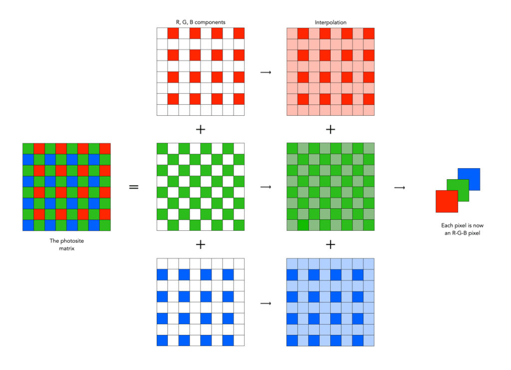
How natural light and meaningful darkness tell a story

Have you ever been somewhere, and want to take a photograph, and there just isn’t much natural light, or perhaps the light is only coming from a single source, such as a window? Are you tempted to use a flash? Well don’t even think about it, because doing so takes away from the story of what you are photographing. Usually this sort of scenario manifests itself inside historical buildings where there just isn’t much natural light, and in context, no artificial light. Think anything before electric lighting – houses, castles, outbuildings, etc. Photography in historical buildings can be burdened by a lack of light – but that’s how they were when inhabited.

I photograph mostly using natural light. I don’t like using a flash, because ultimately there are certain qualities of natural light that enhance the colours and aesthetics of an object or scene. I find flash light too harsh, even when used with diffusers. But that’s just me. Below is an image from the attic space of a building at the Voss Folkemuseum in Norway. The room contained some beds, and storage chests, so obviously it was used as a bedroom. The light streaming through the window is enough to bathe the room with enough light to show its use (typically windows would only have been installed where the light would be most concentrated, in this case south-facing). Notice the spinning wheel next to the window where the light is most concentrated?

An attic space in a building at the Voss Folkemuseum in Voss, Norway.

A lack of light often tells a story. It shows you what the space really was like for those who inhabited it long ago. Before the advent of electricity, most buildings relied on natural light during the day, and perhaps candle-light at night. Windows were small because glass was inherently expensive, and the more glass one had, the more heat that was lost in winter. If you were documenting a scene in a more archival manner, you might naturally flood the scene with artificial light of a sort, but historical photography should not be harshly lit.

Many historic buildings were built at a time of very little beyond natural light and candles. The light today is that very same light, and to bath it with artificial light would be unnatural. These nooks and crannies were never meant to be bathed in complete light. Consider the images below, taken at different folke-museums in Norway. The images are of cooking fires inside historic buildings, which had no openings except in the roof. The one from the Norsk Folkemuseum is Saga-Stau, a replica of an open-hearth house from about 3000 years ago.

The inside of an open-hearth house at the Norsk Folkemuseum
Eldhus (house with fireplace and bakehouse) at Voss Folkemuseum

On a bright sunny day, dark spaces are bathed in whatever available light is able to seep through every opening. In a dark space this light can often appear harsh, blinding window openings to the point where there is little cognition of the scene beyond the window. Yet it also tends to produce shards of light puncturing into a space. On clouded days, the light can be more muted. In the image below of the living space, the light coming through the window is harsh enough to produce highlight clipping of both the window frame and part of the table. However the light adds a sense of Norwegian Hygge to the entire scene. To light this scene with a flash would simply reduce the scene to a series of artifacts, rather than a slice of history.

An indoor scene at the Voss Folkemuseum.

Upgrading camera sensors – the megapixel phenomena

So if you are planning to purchase a new camera with “upgraded megapixels”, what makes the most sense? In many cases, people will tend to continue using the same brand or sensor. This makes sense from the perspective of existing equipment such as lenses, but sometimes an increase in resolution requires moving to a new sensor. There are of course many things to consider, but the primary ones when it comes to the images produced by a sensor are: aggregate MP and linear dimensions (we will consider image pixels rather than sensor photosites). Aggregate MP are the total number of pixels in an image, whereas linear dimensions relate to the width and height of an image. Doubling the number of pixels in an image does not double an images linear dimensions. Basically doubling the megapixels will double the aggregate megapixels in an image. To double the linear dimensions of an image, the megapixels need to be quadrupled. So 24MP needs to ramp up to 96MP in order to double the linear dimensions.

Table 1 shows some sample multiplication factors for aggregate and linear dimensions when upgrading megapixels, ignoring sensor size. The image sizes offer a sense of what is what is offered, with the standard MP sizes offered by various manufacturers shown in Table 2.

16MP24MP30MP40MP48MP60MP
16MP1.5 (1.2)1.9 (1.4)2.5 (1.6)3.0 (1.7)3.75 (1.9)
24MP1.25 (1.1)1.7 (1.3)2.0 (1.4)2.5 (1.6)
30MP1.3 (1.2)1.6 (1.3)2.0 (1.4)
40MP1.2 (1.1)1.5 (1.2)
48MP1.25 (1.1)
Table 1: Changes in aggregate megapixels, and (linear dimensions) shown as multiplication factors.

Same sensor, more pixels

First consider a different aggregate of megapixels on the same size sensor – the example compares two Fuji cameras, both of which use an APS-C sensor (23.6×15.8mm).

Fuji X-H2 − 40MP, 7728×5152
Fuji X-H2S − 26MP, 6240×4160

So there are 1.53 times more pixels in the 40MP sensor, however from the perspective of linear resolution (comparing dimensions), there is only a 1.24 times differential. This means that horizontally (and vertically) there are only one-quarter more pixels in the 40MP versus the 26MP. But because they are on the same size sensor, the only thing that really changes is the size of the photosites (known as the pitch). Cramming more photosites on a sensor means that the photosites get smaller. In this case the pitch reduces from 3.78µm (microns) in the X-H2S to 3.05µm in the X-H2. Not an incredible difference, but one that may affect things such as low-light performance (if you care about these sort of things).

A visualization of differing sensor size changes

Larger sensor, same pixels

Then there is the issue of upgrading to a larger sensor. If we were to upgrade from an APS-C sensor to an FF sensor, then we typically get more photosites on the sensor. But not always. For example consider the following upgrade from a Fuji X-H2 to a Leica M10-R:

FF: Leica M10-R (41MP, 7864×5200)
APS-C: Fuji X-H2 (40MP, 7728×5152)

So there are very few differences from the perspective of either image resolution, or linear resolution (dimensions). The big difference here is the photosite pitch. The Leica has a pitch of 4.59µm, versus the 3.05µm of the Fuji. From the perspective of photosite area, this means that 21µm² versus 9.3µm², or 2.25 times the light-gathering space on the full-frame sensor. How much difference this makes from the perspective of the end-picture is uncertain due to the multiplicities of factors involved, and computational post-processing each camera provides. But it is something to consider.

Larger sensor, more pixels

Finally there is upgrading to more pixels on a larger sensor. If we were to upgrade from an APS-C sensor (Fuji X-H2S) to a FF sensor (Sony a7R V) with more pixels:

FF: Sony a7R V (61MP, 9504×6336)
APS-C: Fuji X-H2S (26MP, 6240×4160)

Like the first example, there are 2.3 times more pixels in the 61 MP sensor, however from the perspective of linear resolution, there is only a 1.52 times differential. The challenge here can be that the photosite pitch can actually remain the same. The pitch on the Fuji sensor is 3.78µm, versus the 3.73µm of the Sony.

brandMFTAPS-CFull-frameMedium
Canon24, 3324, 45
Fuji16, 24, 26, 4051, 102
Leica1716, 2424, 41, 47, 60
Nikon21, 2424, 25, 46
OM/Olympus16, 20
Panasonic20, 2524, 47
Sony24, 2633, 42, 50, 60, 61
Table 2: General megapixel sizes for the core brands

Upgrading cameras is not a trivial thing, but one of the main reasons people do so is more megapixels. Of all the brands listed above, only one, Fuji, has taken the next step, and introduced a medium format camera (apart from the medium format camera manufacturers, e.g. Hasselblad), allowing for increased sensor size and increased pixels, but not at the expense of photosite size. The Fujifilm GFX 100S has a medium format sensor, 44×33mm in size, providing 102MP with 3.76µm. This means it provides approximately double the dimensional pixels as a Fuji 24MP APS-C camera (and yes it costs almost three times as much, but there’s no such thing as a free lunch).

At the end of the day, you have to justify why more pixels are needed to yourself. They are only part of the equation in the acquisition of good images, but small upgrades like 24MP to 40MP may not actually provide much of a payback.

Vintage lens makers – Piesker (Germany)

Paul Piesker & Co. was founded in 1936 as a Berlin manufacturer of lenses and lens accessories for reflex cameras (in West Germany). After WW2 the company focused on lenses with long focal lengths for the Exakta and cameras with M42 mounts. Like its competitors, Astro-Berlin, and Tewe, Piesker lenses don’t seem to very common, at least not in Europe. Most of the lenses produced seem to have been for the US market, where they appeared in ads in Popular Photography in the mid 1950s. The lenses can also be found under the “Kalimar” trademark, and also rebranded for Sterling Howard, under the trademark “Astra”, and “Voss” (in addition to other brands: Picon, Votar, Telegon). Production at Piesker was discontinued in 1964.

Are (camera-based) RGB histograms useful?

When taking an image on a digital camera, we are often provided with one or two histograms – the luminance histogram, and the RGB histogram. The latter is often depicted in various forms: as a single histogram showing all three channels of the RGB image, or three separate histograms, one for each of R, G, and B. So how useful is the RGB histogram on a camera? In the context of improving image quality RGB histograms provide very little in the way of value. Some people might disagree, but fundamentally adjusting a picture based on the individual colour channels on a camera, is not realistic (and usually it is because they don’t have a real understanding about how colour spaces work).

Consider the image example shown in Figure 1. This 3024×3024 pixel image has 9,144,576 pixels. On the left are the three individual RGB histograms, while on the right is the integral RGB histogram with the R, G, B, histograms overlapped. As I have mentioned before, there is very little information which can be gleaned by looking at the these two-dimensional RGB histograms – they do not really indicate how much red (R), green (G), or blue (B) there is in an image, because these three components can only be used together to produce information that is useful. This is because RGB is a coupled colour space where luminance and chrominance are coupled together. The combined RGB histogram is especially poor from an interpretation perspective, because it just muddles the information.

Fig.1: The types of RGB histograms found in-camera.

But to understand it better, we need to look at what information is contained in a colour image. An RGB colour image can be conceptualized as being composed of three layers: a red layer, a green layer, and a blue layer. Figure 2 shows the three layers of the image in Figure 1. Each layer represents the values associated with red, green, and blue. Each pixel in a colour image is therefore a set of triplet values: a red, a green, and a blue, or (R,G,B), which together form a colour. Each of the R, G, and B components is essentially an 8-bit (grayscale) image, then can be viewed in the form of a histogram (also shown in Figure 2 and nearly always falsely coloured with the appropriate red, green or blue colour).

Fig.2: The R, G, B components of RGB.

To understand a colour image further, we have to look at the RGB colour model, the method used in most image formats, e.g. JPEG. The RGB model can be visualized in the shape of a cube, formed using the R, G, and B data. Each pixel in an image has an (R, G, B) value which provides a coordinate in the 3D space of the cube (which contains 2563, or 16,777,216 colours). Figure 3 shows two different ways of viewing image colour in 3D. The first is an all-colours view of the colours. This basically just indicates all the colours contained in the image without frequency information. This gives an overall indication on how colours are distributed. In the case of the example image, there are 526,613 distinct colours. The second cube is a frequency-based 3D histogram, grouping like data together in “bins”, in this example the 3D histogram has 83 or 512 bins (which is honestly easier to digest than 16 million-odd bins). Within the image there is shown one pixel with the RGB value (211,75,95), and its location in the 3D histograms.

Fig.3: How to really view the colours in RGB

In either case, visually you can see the distribution of colours. The same can not be said of many of the 2D representations. Let’s look at how the colour information pans out in 2D form. The example image pixel in Figure 3 at location (2540,2228) has the RGB value (211,75,95). If we look at this pixel in the context of the red, green, and blue histograms it exists in different bins (Figure 4). There is no way that these 2D histograms provide anything in the way of context on the distribution of colours. All they do is show the distribution of red, green, and blue values, from 0 to 255. What the red histogram tells us is that at value 211 there are 49972 colour pixels in the image whose first value of the triplet (R) is 211. It may also tell us that the contribution of red in pixels appears to be constrained to the upper and lower bounds of the histogram (as shown by the two peaks). There is only one pure value of red, (255,0,0). Change the value from (211,75,95) to (211,75,195) and we get a purple colour.

Fig.4: A single RGB pixel shown in the context of the separate histograms.

The information in the three histograms is essentially decoupled, and does not provide a cohesive interpretation of colours in the image, for that you need a 3D image of sorts. Modifying one or more of the individual histograms will just lead to a colour shift in the image, which is fine if that is the what is to be achieved. Should you view the colour histograms on a camera viewscreen? I honestly wouldn’t bother. They are more useful in an image manipulation app, but not in the confines of a small screen – stick to the luminance histogram.

What is a micron?

The nitty-gritty of digital camera sensors takes things down to the micron. For example the width of photosites on a sensor is measured in microns, more commonly represented using the unit µm, e.g. 3.71µm. But what is a micron?

Various sensor photosite sizes compared to spider silk (size is exaggerated of course).

Basically a micron is a micrometre, a metric unit of measure for length equal to 0.001 mm (or 1/1000mm). I mean it’s small, like really small. To put it also into perspective table salt has a particle size of 120µm. Human hair has an average diameter of 70µm, milled flour can be anywhere in the range 25-200µm, and spider silk is a measly 3µm.

To put it another way, for a photosite that is 3.88µm in size, we could fit 257 of them in just 1mm of space.

What is a photosite?

When people talk about cameras, they invariably talk about pixels, or rather megapixels. The new Fujifilm X-S20 has 26 megapixels. This means that the image produced by the camera will contain 26 million pixels. But the sensor itself does not have any pixels, the sensor has photosites.

The job of photosites is to capture photons of light. After a bunch of processing, the data captured by each photosite is converted into a digital signal, and processed into a pixel. All the photosites on a sensor contribute to the resultant image. On a sensor there are two numbers used to define the number of photosites. The first is the physical sensor resolution which is the actual number of physical photosites found on the sensor. For example on the Sony a7RV (shown below), there are 9566×6377 physical photosites (61MP). However not all the photosites are used to create an image – the ones that are form the maximum image resolution, i.e. the maximum number of pixels in an image. For the Sony a7RV this is 9504×6336 photosites (60.2MP) used to create an image. This is sometimes known as the effective number of photosites.

The Sony a7R V

There are two major differences between photosites and pixels. Firstly, photosites are physical entities, pixels are not, they are digital entities. Secondly, while photosites have a size, and are different based on the sensor type, and number of photosites on a sensor, pixels are dimensionless. For example each photosite on the Sony a7RV has a pitch (width) of 3.73µm, and an area of 13.91µm2.

The Eyes of Eagles (and why Zeiss used them to advertise its lenses)

It was Zeiss who came up with the “the eagle eye of your camera” slogan in the 1930s to advertise their lenses (or in German “Das Adlerauge Ihrer Kamera” – eagle eye being Adlerauge) [1]. Of course they were mostly talking about the Tessar series of lenses.

“The objective should be as the eagle’s eye, whose acuity is proverbial. Where its glance falls, every finest detail is laid bare. Just as the wonderful acuity of the eagle’s eye has its origin, partly in the sharpness of the image produced by its cornea and lens, and partly in the ability of the retina – far exceeding that of man’s vision – to resolve and comprehend the finest details of this delicate image, so, for efficiency, must the camera be provided on the one hand with a ‘retina’ (the plate or film) of the highest resolving power – a fine grain emulsion – and on the other hand with an objective which can produce the needle sharp picture of the eagle’s lens and cornea.”

The Eagle Eye of your Camera (1932)

Zeiss took great lengths to use this simile to describe their lenses. A lens must have the sharpness of an eagle’s eye, and the ability to admit a large amount of light – sharpness and rapidity over a wide field of view – the Zeiss Tessar. While Leica named their lenses to indicate their widest aperture, Zeiss instead opted to name their lenses for the design used. Indeed the Tessar came in numerous focal length/aperture combinations, from a 3¾cm f/2.8 to a 60cm f/6.3.

Zeiss “Eagle Eye” advertising in the 1930s

The Tessar is an unsymmetrical system of lenses : 7 different curvatures, 4 types of glass, 4 lens thicknesses, 2 air separations, i.e. 17 elements which can be varied. Zeiss went to great lengths to disseminate the message about Tessar lenses:

  • sharp, flare-free definition
  • great rapidity (allowing short instantaneous exposures)
  • exceptional freedom from distortion (obviating any objectionable curvature)
  • good colour correction
  • compact design (so that light falling off near the edge is reduced to a minimum)
  • sufficient separation of the components of the lens (to allow a between lens shutter)
  • the use of types of glass as free as possible of colour
  • reduction to the minimum of the number of lenses, and particularly of glass-air surfaces
“It must have the sharpness of the eagle’s eye”

It is then not surprising that Zeiss choose to compare the lens to an eagle’s eye. The eagle is considered to be the pinnacle of visual evolution. They can see prey from a distance – it is said they can see a rabbit in a field while soaring at 10,000 feet (1.9 miles or 3km). It was Aristotle (in 350BCE) who in his manuscript “Aristotle, History of Animals” pointed out that “the eagle is very sharp-sighted”. The problem however is that it’s not really possible to compare a simple lens against the eye of a living organism. Zeiss was really comparing the lens of an eagle’s eye against the Tessar, or rather the Tessar and the human eye behind it, because the camera lens is just a part of the equation of analog picture taking. So how does an eagle eye compare to a human one?

It’s kind of hard to really compare eyes from different species because they are all designed to do different things. In all likelihood, human eyes have evolved over time as our environment changed. In birds, unlike humans, each eye looks outwards at a differing scene, and the overlap of the visual field of both eyes, i.e. the binocular region, is relatively small. This is typically less than 60° in birds, versus 120° in humans, and can be as narrow as 5-10° in some species. Because of this a birds total visual field is quite extensive, with just a narrow blind region behind the head. Eagle’s have a highly developed sense of sight which allows them to easily spot prey. They have 20/5 vision compared to the average human who has 20/20 vision. This means they can see things at 20’ away that humans only have the ability to see at 5’. They have fixed eye sockets, angled 30° from the mid-line of their face, giving them a 340° view. Many also have violet-sensitive visual systems, i.e. the ability to see ultraviolet light and detect more colours than human eyes can.

A Golden eagle, and a cross-section of an eagle’s eye

The first thing to consider may be the size of the eye. We will pick one eagle to compare against human vision, and the best option is the (European) Golden Eagle, because it is quite common in Germany. The average weight of a Golden Eagle is 6.1kg, versus the average weight of a European (human) at 70.8kg. If we work on the principle that an eagle’s eye is similar in weight to a human eye (ca. 7.5g) then an eagle’s eye would comprise 0.12% of its body weight, versus 0.01% of a human. So for the human’s eye to be equivalent in mass based on eye:body weight ration, it would need to be 85g. But this is really an anecdotal comparison, the bigger picture lies with the construction of the eye.

One of the reasons birds of prey have such incredible eye-sight is the fact that their deeper fovea allows them to accommodate a greater number of photoreceptors and cones. The central fovea in an eagle’s eye has 1 million cones per square millimetre, compared to 200,000 in a human eye. One way that eagles do this is by having increased resolution. This is achieved by have reduced space between their photoreceptors. Due to the physics of light, the absolute minimum separation between cones for an eye to function correctly is 2µm (0.002mm). As the space between the photoreceptors decreases, so too does the minimum size of the detail.

Parts of an eagle’s vision

The other thing of relevance is that while humans have one fovea, eagles generally have two – a central fovea used for hunting (cone separation 2µm, versus human cone separation of 3µm), and a secondary fovea which provides a high resolution field of view to the side of their head. So like a camera sensor, more cones means better resolution. In context Robert Shlaer [2] suggested that the resolution of a Golden eagle’s eye may be anywhere from 2.4 to 2.9 times that of a human, with the Martial Eagle somewhere between 3.0 and 3.6 times. The spatial resolution of a Wedge-Tailed eagle is between 138-142 cycles per degree [3], while that of a human is a mere 60. Their foveae are also distinctly shaped, deep and convex, as opposed to the rounded and shallow single fovea of human eyes. In a 1978 article for the scientific journal Nature, Snyder and Miller [4] proposed that the unique shape of foveae found in some birds of prey may act like a telephoto lens, magnifying their vision, which is perhaps why these feathered predators can spot food from so far in the sky. Like humans, eagles can change the shape of their lens, however in addition they can also change the shape of their corneas. This allows them more precise focusing and accommodation than humans.

But Zeiss themselves harked on the limitations of the simile: The fact that an eagle can quickly turn its head to allow for viewing in any direction; the fact that the retina is curved, not flat. From the perspective of resolution the ads were true to form, however the other aspects of the an eagle’s vision did not ring true. Yes, telephoto lenses based on the Tessar design could certainly see further than a human, and given the right lens and film could see into the violet spectrum, but Zeiss’s claim was really more about finding a way to describe it’s lenses in a provoking manner, one which would ultimately sell lenses.

Further reading:

  1. Zeiss Brochure: “The Eagle Eye of your Camera”, Carl Zeiss, Jena (1932)
  2. Robert Shlaer, “An Eagle’s Eye: Quality of the Retinal Image”, Science, 176, pp. 920-922 (1972)
  3. Reymond, L. (1985). Spatial visual acuity of the eagle Aquila audax: A behavioural, optical and anatomical investigation. Vision Research, 25(10), 1477–1491.
  4. Snyder, A.W., Miller, W.H., “Telephoto lens system of falconiform eyes”, Nature, 275, pp.127-129 (1978)

The whole “compact” thing

There was a time when the compact camera had quite a market. These cameras sat somewhere between the larger sensor cameras (full-frame/APS-C), and tiny sensor “pocket” cameras. The tiny sensor cameras died off with the evolution of the smartphone. Nowadays there aren’t many compacts left, perhaps victims to the success of the smartphone cameras, or to the success of mirrorless. Contenders now include the Ricoh GR series, the Fujifilm X100V, and Sony RX100. A mirrorless offers almost the same form factor with interchangeable lenses, and more features. Compacts often try to do too much, and maybe that is a function of modern technology where smaller does not mean reduced functional capacity. Many compacts do nothing at all particularly well, but maybe they were never meant to. They offer too many controls to be simple, but too few to show versatility. They are often built by trying to cram too much technology into the one thing that unifies them all – space. For a compact camera should be exactly that, compact. If they are compact, it is unlikely they will win awards for ergonomics. Compact cameras with small footprints, may not fit into everyone’s hands comfortably.

Compact cameras are exceptional for the purposes of street photography. The best example of this is legendary Japanese street photographer Daidō Moriyama. He has used Ricoh compacts for years, from the early GR film series to the digital GR.

“The GR has been my favorite since it was a film camera. Because I’m so used to it, I felt comfortable with the new GR III immediately. When I shoot with a 28mm fixed lens machine, I remember my old days. Comfortable enough to take photographs to your heart’s content. For my street photography, the camera must be compact and light-weighted.”

Daidō Moriyama

But here’s the thing, I don’t buy a compact to be the pinnacle of cameras. The job of the compact is to be compact. It should offer a good amount of features, but obviously cannot offer them all. The role of the compact in my life is simple – pocketable, easy to use, small, inconspicuous. It’s for that reason, my GR III sits around the kitchen for photographing recipes, or slips into a pocket for a walk about town. It’s small, compact, and oh so discreet. You can get into trouble in places like transit systems using mirrorless cameras because they seem too professional, but compacts? Compacts scream inconspicuous.

Comparing some features of the Ricoh GR III (compact) against the Fuji X-H1 (mirrorless). Both have the same 24MP APS-C sensor and IBIS.

It is of course impossible to find the perfect camera – it doesn’t exist. Compact cameras are even less so, but the modern ones offers a good amount of technology and convenience. The Ricoh GR III for example offers image stabilization, and snappy focus, at the expense of loosing the flash (not something I use much anyways), not a great battery life (carry an extra), and no weather sealing (not that big a deal). It’s low-light performance is impressive, and I don’t need much more than a 28mm equivalent lens. It’s role is street-photography, or kitchen-photography, or back-up travel camera, for taking photographs in those places where photography is technically “not allowed”. It also offers a 24MP APS-C sensor, which is more pixels than anyone needs. In fact these cameras could likely get even better if we ditched some of the onboard shrot. Compacts don’t necessarily need 4K video, or 300-point AF tracking. The more features, and customization, the more the likelihood that you will loose track of what is going on.

Prosversatility – Fills a niche between smartphones and mirrorless cameras.
macro – Many provide some sort of capacity to take close-up photos.
small – Unobtrusive, and lightweight, making them easy to carry.
automatic – No fiddling with settings and missing the shot.
Conslimited control – Lacks low-level controls found in interchangeable lens cameras.
low-light – Often not well suited to low-light conditions.
fixed lens – Not as flexible as interchangeable lens cameras.
battery – Shorter battery life because of the smaller battery.
Pros and cons of compact cameras

This is the fourth compact I’ve owned. The first was a Canon Powershot G9, then the Fuji X10, followed by the Leica D-Lux6 (likely the only Leica I will ever own). The Ricoh GR III provides me with the same sensor size as my Fuji X-H1, but is much easier to take some places when travelling, and provides much more in the way of versatility than does my iPhone 14, and twice the resolution.

Further reading:

Vintage lens makers – Heinz Kilfitt (Germany)

If it were not for one particular point in time, Kilfitt may not be as well known a brand as it is. That event was the use of the Kilfitt Fern-Kilar f/5.6 400mm lens in Alfred Hitchcock’s 1954 movie “Rear Window”, where the lens, as well as the Exakta camera it was attached to, played a prominent role in the movie (in fact no other camera/lens combination likely ever had such a leading role).

Kilfitt was one of the most innovative lens makers of the 1950s. Born in Westphalia in 1898, Heinz Kilfitt had quite a pedigree for design. Before the war he had established his reputation designing the Robot I camera (24×24mm format), the first motorized camera, introduced in 1934. Rejected by Agfa and Kodak, Kilfitt partnered with Hans-Heinrich Berning to develop the camera. In 1939 Kilfitt sold his interests in the Robot to Berning. In Munich, Kilfitt acquired a small optical company, Werkstätte für Präzisionsoptik und Mechanik GmbH, where he began developing lenses for the like of 35mm systems.

The Kilfott lens used in Rear Window.

By the end of the war in 1945 Kilfitt had very little left, basically a run-down plant, and few workers. He started a camera repair shop for US army personnel, and by 1948 had started to manufacture precision lenses. Kilfitt devoted himself to what he considered an inherent problem with the photographic industry – the lack of lens mount universality. Every camera had to have its own set of lenses. This led him to introduce the “basic lens” system in 1949. In this system, each lens was supplied with a “short mount”, the rear of which had a male thread which accommodated a series of adapters [1]. Some for SLR, some for C-mount, or reflex housings.

Like many independent lens companies, Kilfitt produced a series of lenses which could be adapted to almost any camera by means of lens mounts. One of their core brands was Kilar.

While the company is famous for its telephoto lenses, it actually specialized in another area: macro. Early SLR lenses such as the Biotar 58mm f/2 were able to focus as close as 18 inches, which likely seemed quite amazing, considering the best a rangefinder could do was 60-100cm. Kilfitt thought he could do better, producing the world’s first 35mm macro lens, the 40mm f/2.8 Makro-Kilar in 1955 [3]. It would be what Norman Rothschild called the first “infinity-to-gnats’-eyeball” [2]. It was offered in two versions: one that focuses from ∞ to 10cm, with a reproduction of 1:2, and one that focused from ∞ to 5cm, with 1:1.

The early version of the Makro-Kilar, showing the Edixa-Reflex version.

Heinz Kilfitt also continued developing cameras. The Kilfitt-Reflex 6×6 appeared around 1952, a camera that had a new system for quickly changing lenses, a complex viewfinder and a swing-back mirror. It influenced the design of other 6×6 format cameras, e.g. Kowa 6. There was also the Mecaflex SLR, another 24×24mm camera produced from 1953-1958 (first by Metz Apparatefabrik, Fürth, Germany later by S.E.R.A.O. Monaco). It was constructed by Heinz Kilfitt, who also supplied the lenses (Kilfitt Kamerabau, Vaduz, Liechtenstein).

LensSmallest apertureAOVShortest focusWeight
40mm Makro-Kilar f/2.8f/2254°2-4″150g
90mm Makro-Kilar f/2.8f/2228°8″480g
135mm KILAR f/3.8f/3218°60″260g
150mm KILAR f/3.5f/2216°60″400g
300mm TELE-KILAR f/5.6f/32120″990g
300mm PAN-TELE-KILAR f/4f/3266″1930g
400mm FERN-KILAR f/4f/4530′1760g
400mm SPORT-FERN-KILAR f/4f/4516′2720g
600mm SPORT-FERN-KILAR f/5.6f/4535′4080g
The more commonly available Kilfitt lenses

When Heinz Kilfitt retired in 1968 he sold the company to Dr. Back, who operated it under the Zoomar name from its headquarters in Long Island, New York. Dr. Back designed the first production 35mm SLR zoom, the famous 36-82/2.8 Zoomar in 1959. The company eventually transitioned the brand to Zoomar-Kilfitt, and then merged it completely into Zoomar. By this stage the company was providing lenses for 12.84×17.12mm, 24×36mm and 56×56mm cameras. The most notable addition to the line-up was a Macro Zoomar 50-125mm f/4.

The lens selection provided by Zoomar-Kilfitt

Note that the Zoomar lenses are often cited as products of Kilfitt, however although some of them may have been produced in the Kilfitt factories, Zoomar was its own entity. Kilfitt was contracted to manufacture the groundbreaking 1960 Zoomar 36-82mm lens for Voigtländer.

The evolution of the Kilfitt brand logos

Notable lenses: FERN-KILAR 400mm f/4, Makro-Kilar 40mm f/2.8

Further reading:

  1. Norman Rothschild, “An updated view of the Kilfitt system”, The Camera Craftsman, 10(2), pp.10-15 (1964)
  2. Norman Rothschild, “The revolution in SLR lenses”, Popular Photography, (60(6), pp.90-91,130-131 (1967)
  3. Berkowitz, G., “New.. Makro Kilar Lens”, Popular Photography, pp.86-87,106,108 (Mar, 1955)
  4. Kilfitt Optik, Photo But More
  5. ROBOT – Who came up with the idea? Kilfitt or Berning? Two genealogists come together to new discoveries…, fotosaurier (2021) article in German

Is luminance the true reality?

Like our sense of taste and smell, colour helps us perceive and understand the world around us. It enriches our lives, and helps us comprehend the aesthetic quality of art, or differentiate between many things in the world around us. Yet colour is not everything. Pablo Picasso, said that “Colors are only symbols. Reality is to be found in luminance alone.” But is this a valid reality?

There is a biological basis for the fact that colour and luminance (what most people think of as B&W) play distinct roles in our perception of art, or of real life – colour and luminance are analyzed by different portions of our visual system, and as such they are responsible for different aspects of visual perception. The parts of our brain that process information about colour are located several cm away from the parts that analyze luminance – as anatomically distinct as vision is from hearing. The part that processes colour information is found in the temporal lobe, whereas luminance information is processed in the parietal lobe.

Below is a comparison of Vincent van Gogh’s Green Wheat Field with Cypress (1889), with a version containing only luminance. Our ability to recognize the various regions of vegetation and to perceive their three-dimensional shape and the spatial organization of this scene depends almost entirely on the luminance of the paints used, and not their colours.

Green Wheat Field with Cypress (1889)

Yet a world without colour is one that forfeit’s crucial elements. While luminance provides the structure for a scene, colours allow us to see the scene more precisely. In the colour image above, it allows us to better differentiate the different greens of the grasses, and the blues of the sky. In the B&W image, the grasses are less distinct, the vibrancy in the green trees and bushes is absent, and there is very little differentiation between the colours of the sides and roof of the cottage. Of course we must always remember that colour is almost never seen exactly as it physically is. All colour perception is relative. The images below compare the luminance and chrominance information for the image above – the chrominance information is extracted from the HSB colour space, which incorporate the hue and saturation components. Note how it lacks the “structural” information which is bestowed by light and dark.

Luminance
Chrominance (i.e. colour information)

Is luminance more important than colour? In some ways yes, because of the way our eyes have evolved. Our eyes perceive light and dark as well as colour through rods and cones. Rods are very sensitive to light and dark (and help give us good vision in low light), whereas cones are responsible for colour information. But rods are more plentiful than cones. In the central fovea there may be about 20 times more rods (≈100-120 million) than cones (≈5-6 million). In reality, the details in what we perceive in a scene are carried mostly by the information we perceive about light and dark. So reality can be found in luminance alone, because even without colour we can still perceive what is in a scene (people with achromatopsia, which is a complete lack of colour, do exactly that).

But for most humans colour is an integral part of our vision, we cannot switch it off at will, in the same way that we engage a B&W mode in a camera. It allowed our early ancestors to see colourful ripe fruit more easily against a background of mostly green forest, and it allows us to appreciate the world around us.

Further reading:

Margaret Livingston, Light Vision, Harvard Medical Alumni Bulletin, pp.15-23 (Autumn, 2003)