Image processing becomes more difficult when you involve colour images. That’s primarily because there is more data involved. With monochrome images, there is really only intensity. With colour images comes chromaticity – and the possibility of modifying the intrinsic colours within an image whilst performing some form of image enhancement. Often, image enhancement in colour images is challenging because the impact of the enhancement is very subjective.
Consider this image of Schynige Platte in Switzerland. It is very colourful, and seems quite vibrant.
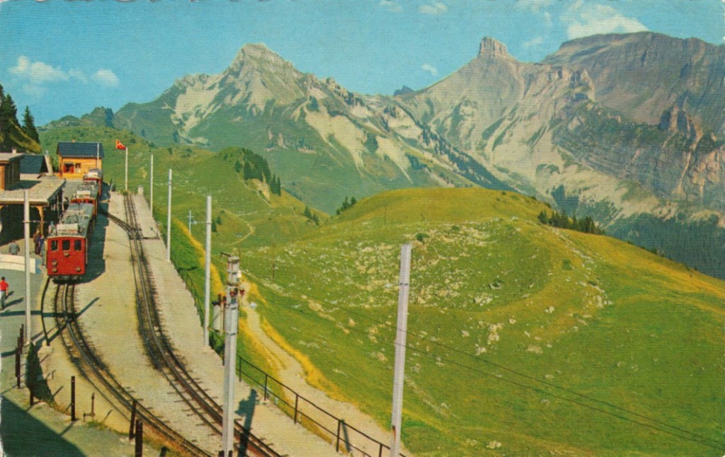
The sky however seems too aquamarine. The whole picture seems like some sort of “antique photo filter” has been applied to it. How do we enhance it, and what do we want to enhance? Do we want to make the colours more vibrant? Do we want to improve the contrast?
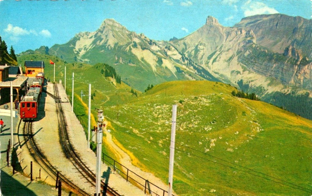
In the first instance, we merely stretch the histogram to reduce the gray tonality of the image. Everything becomes much brighter, and there is a slight improvement in contrast. There are parts of the image that do seem too yellow, but it is hard to know whether this is an artifact of the original scene, or the photograph (likely an artifact of dispersing yellow flower petals).
Alternatively, we can improve the images contrast. In this case, this is achieved by applying a Retinex filter to the image, and then taking the average of the filter result and the original image. The resulting image is not as “bright”, but shows more contrast, especially in the meadows.
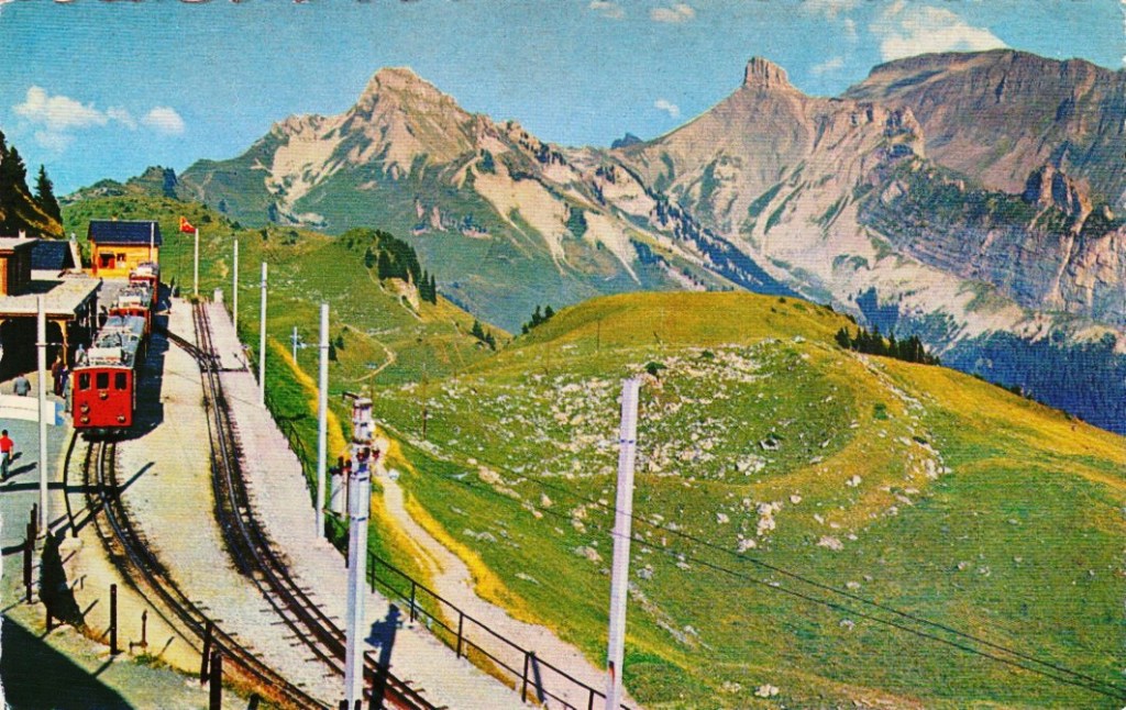
Are either of these enhanced images better? The answer of course is in the eye of the beholder. All three images have certain qualities which are appealing. At the end of the day, improving the aesthetic appeal of a colour image is not an easy task, and there is no “best” algorithm.
