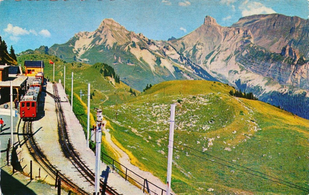
Digital cameras often provide one or more “monochrome” filters, essentially converting the colour image to grayscale (and perhaps adding some form of contrast etc.). How is this done? There are a number of ways, and each will produce a slightly different grayscale image.
All photographs are simulacra, imitations of a reality that is captured by a camera’s film or sensor, and converted to a physical representation. Take a colour photograph, and in most cases there will be some likeness between the colours shown in the picture, and the colours which occur in real life. This may not be perfect, because it is almost impossible to 100% accurately reproduce the colours of real life. Part of this has to do with each person’s intrinsic human visual system, and how it reproduces the colour in a scene. Another part has to do with the type of film/sensor used to acquire the image in the first place. But greens are green, and blues are blue.
Black-and-white images are in a realm of their own, because humans don’t visualize in achromatic terms. So what is a true grayscale equivalent of a colour image? The truth is there is no one single rendition. Though the term B&W derives from the world of achromatic films, even there there is no gold standard. Different films, and different cameras will present the same reality in different ways. There are various ways of acquiring a B&W picture. In an analog world there is film. In a digital world, one can choose a B&W film-simulation from a cameras repertoire of choices, or covert a colour image to B&W. No two cameras necessarily produce the same B&W image.
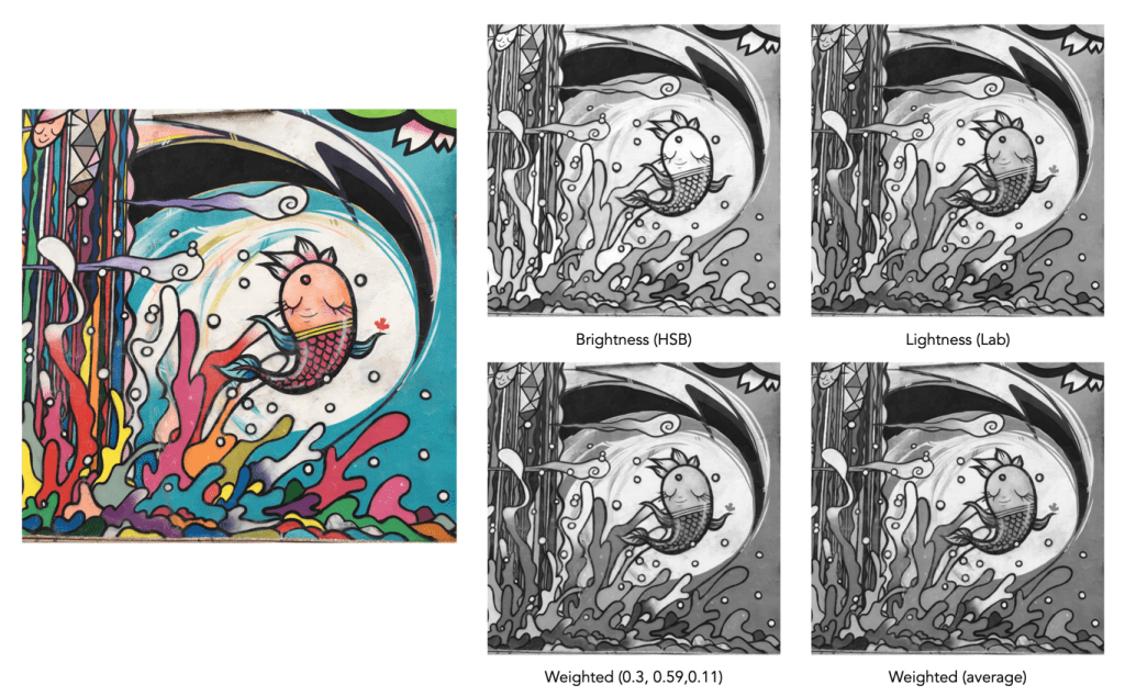
The conversion of an RGB colour image to a grayscale image involves computing the equivalent gray (or luminance) value Y, for each RGB pixel. There are many ways of converting a colour image to grayscale, and all will produce slightly different results.
- Convert the colour image to the Lab colour space, and extract the Luminance channel.
- Extract one of the RGB channels. The one closest is the Green channel.
- Combine all three channels of the RGB colour space, using a particular weighted formula.
- Convert the colour image to a colour space such as HSV or HSB, and extract the value or brightness components.
The lightness method
This averages the most prominent and least prominent colours.
Y = (max(R, G, B) + ,min(R, G, B)) / 2
The average method
The easiest way of calculating Y is by averaging the R, G, and B components.
Y = (R + G + B) / 3
Since we perceive red and green substantially brighter than blue, the resulting grayscale image will appear too dark in the red and green regions, and too light in the blue regions. A better approach is using a weighted sum of the colour components.
The weighted method
The weighted method weighs the red, green and blue according to their wavelengths. The weights most commonly used were created for encoding colour NTSC signals for analog television using the YUV colour model. The YUV color model represents the human perception of colour more closely than the standard RGB model used in computer graphics hardware. The Y component of the model provides a grayscale image:
Y = 0.299R + 0.587G + 0.114B
It is the same formula used in the conversion of RGB to YIQ, and YCbCr. According to this, red contributes approximately 30%, green 59% and blue 11%. Another common techniques is to converting RGB to a form of luminance using an equation like Rec 709 (ITU-BT.709), which is used on contemporary monitors.
Y = 0.2126R + 0.7152G + 0.0722B
Note that while it may seem strange to use encodings developed for TV signals, they are optimized for linear RGB values. In some situations however, such as sRGB, the components are nonlinear.
Colour space components
Instead of using a weighted sum, it is also possible to use the “intensity” component of an alternate colour space, such as the value from HSV, brightness from HSB, or Luminance from the Lab colour space. This again involves converting from RGB to another colour space. This is the process most commonly used when there is some form of manipulation to be performed on a colour image via its grayscale component, e.g. luminance stretching.
Huelessness and desaturation ≠ gray
An RGB image is hueless, or gray, when the RGB components of each pixel are the same, i.e. R=G=B. Technically, rather than a grayscale image, this is a hueless colour image.
One of the simplest ways of removing colour from an image is desaturation. This effectively means that a colour image is converted to a colour space such as HSB (Hue-Saturation-Brightness), where the saturation value is effectively set to zero for all pixels. This pushes the hues towards gray. Setting it to zero is the similar to extracting the brightness component of the image. In many image manipulation apps, desaturation creates an image that appears to be grayscale, but it is not (it is still stored as an RGB image with R=G=B).
Ultimately the particular monochrome filter used by a camera strongly depends on the colour being absorbed by the photosites, because they do not work in monochrome space. In addition certain camera simulation recipes for monochrome digital images manipulate the grayscale image produced in some manner, e.g. increase contrast.