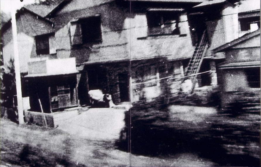
It is possible to experience the Are-Bure-Boke aesthetic in a very simple manner using the Provoke app. Developed by Toshihiko Tambo in collaboration with iPhoneography founder Glyn Evans, it was inspired by Japanese photographers of the late 1960’s like Daidō Moriyama, Takuma Nakahira and Yutaka Takanashi. This means it produces black and white images with the same gritty, grainy, blurry look reminiscent of the “Provoke” era of photography.
There isn’t much in the way of explanation on the app website, but it is fairly easy to use. There aren’t a lot of controls (the discussion below assumes the iPhone is held in landscape mode). The most obvious one is the huge red shutter release button. The button is obviously well proportioned in order to easily touch it, even though it does somewhat impede the use of the other option buttons. Two formats are provided: a square format 126 [1:1] and 35mm format 135 [3:2]. There is an exposure compensation setting which allows changes to be made up and down. The slider can be adjusted up to three stops in either direction: −3 to +3 in 1/3 steps. On the top-right is a button for the flash settings (Auto/On/Off). On the top-left there is a standard camera flip switch, and a preferences button which allows settings of Grid, TIFF, or GeoTag (all On/Off).
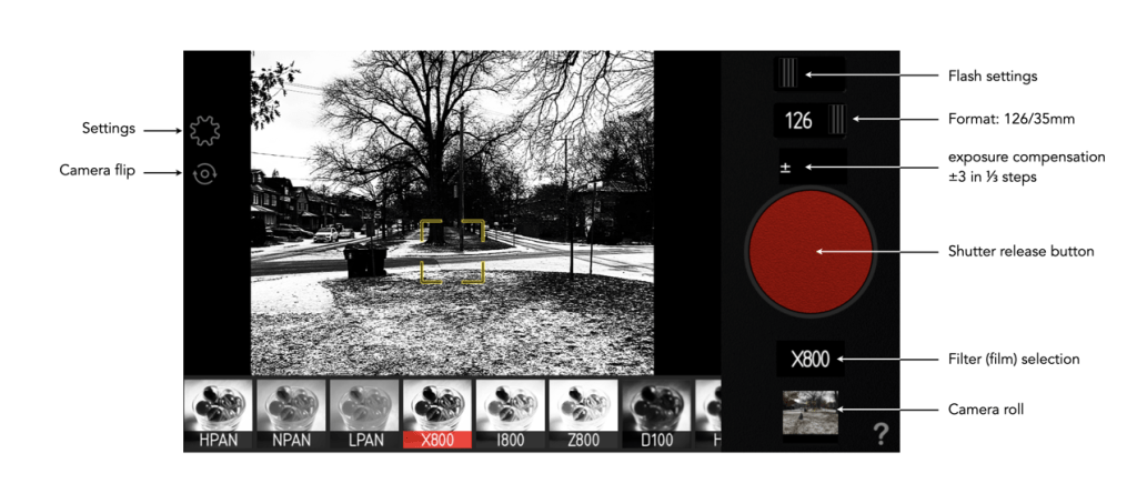
One of the things I dislike most about the app is related to its usability. Both the preferences and camera-flip buttons are very pale, making them hard to see in all but dark scenes when using 35mm format. The other thing I don’t particularly like is the inability to pull in a photograph from the camera roll. It is possible to access the camera roll to apply the B&W filters to photos on the camera roll, but the other functionality is restricted to live use. I do however like the fact that the app supports TIFF.
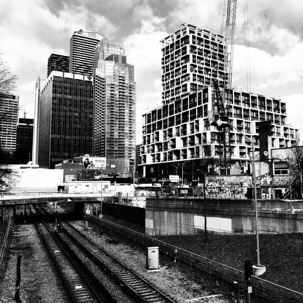
The app provides nine B&W filters, or rather “films” as the app puts it. They are in reality just filters, as they don’t seem to coincide with any panchromatic films that I could find. The first three options offer differing levels of contrast.
- HPAN High Contrast – a high contrast film with fine grain.
- NPAN Normal – normal contrast
- LPAN Low Contrast – low contrast
The next three are contrast + noise:
- X800 – more High Contrast with more noise
- I800 – IR like filter
- Z800 – +2EV with more noise
The film types with “100” designators introduce blur and grain.
- D100 – Darken with Blur (4Pixel)
- H100 – High Contrast with Blur(4Pixel)
- E100 : +1.5EV with Blur(4Pixel)
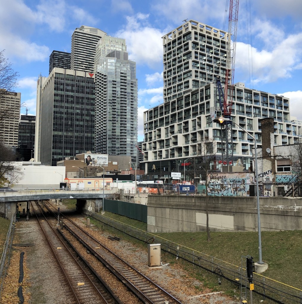
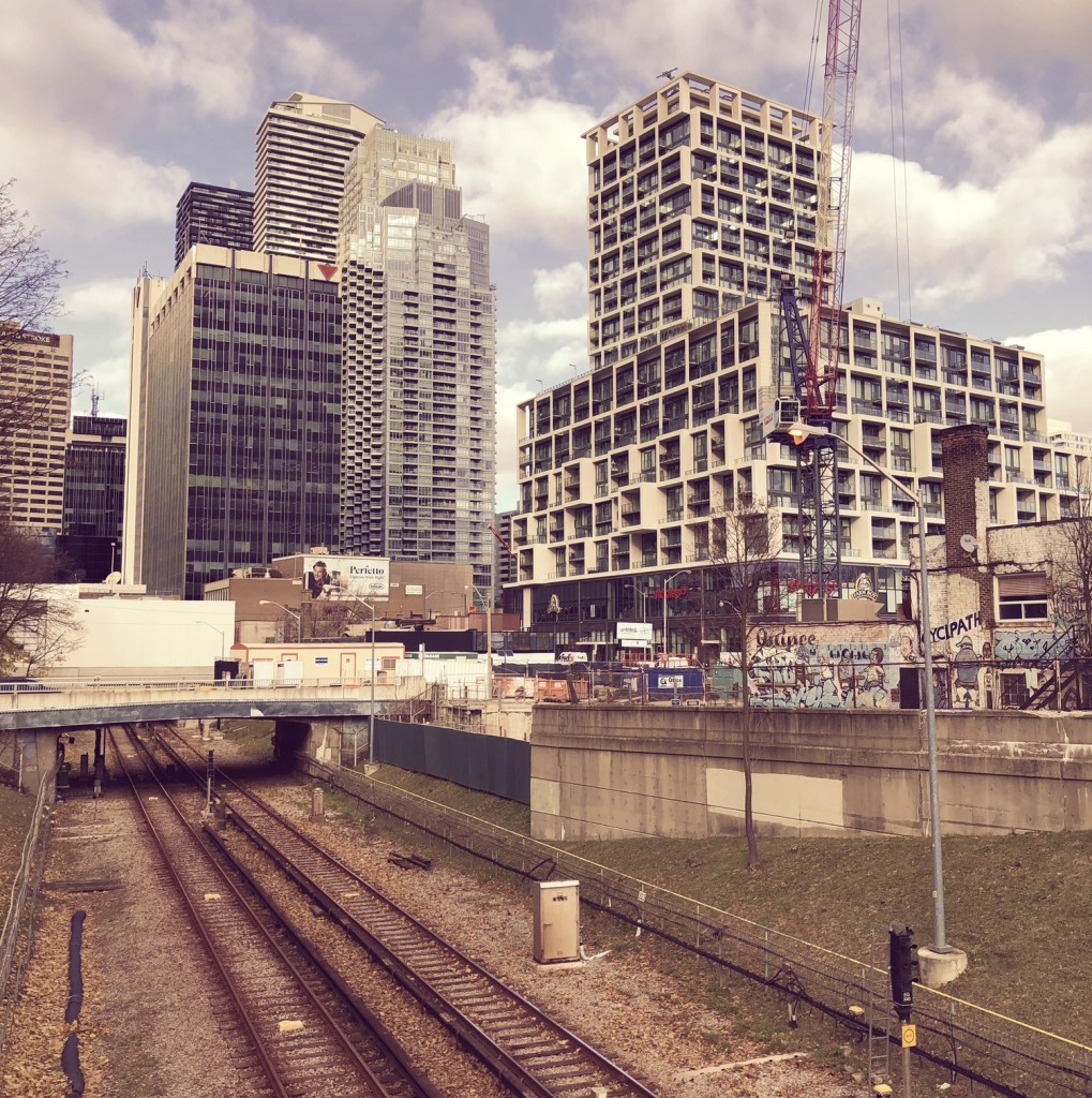
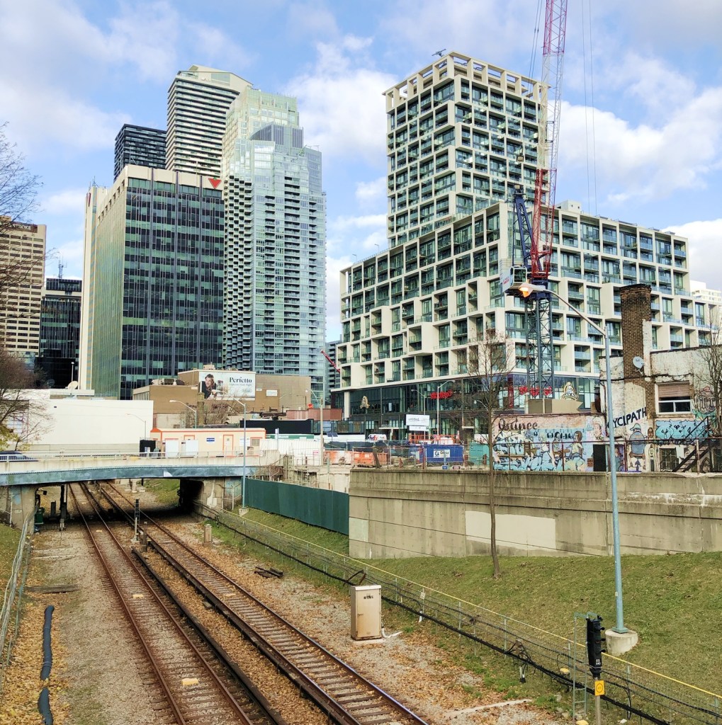
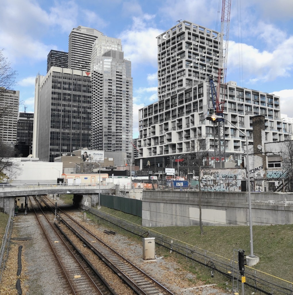
Examples of each of the filters are shown below. I have not adjusted any of the images for exposure compensation.
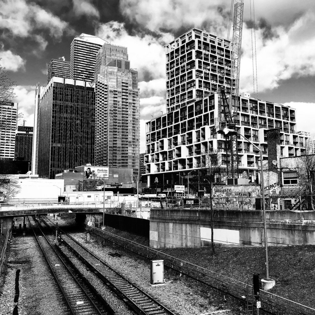
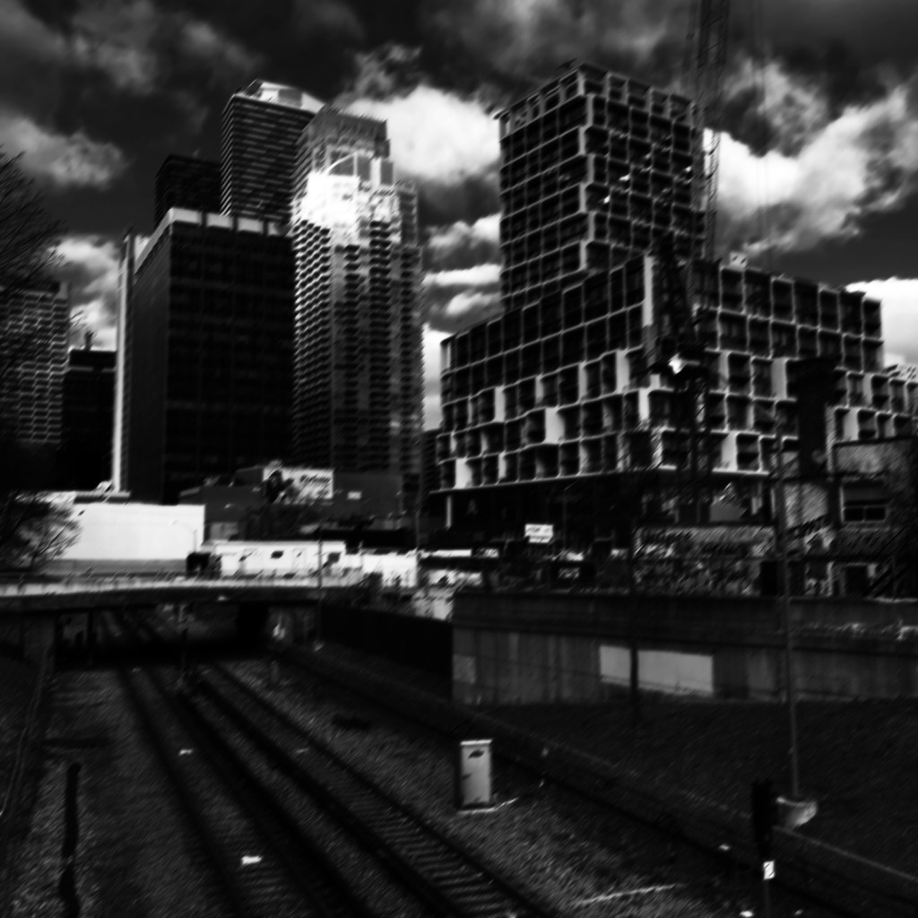
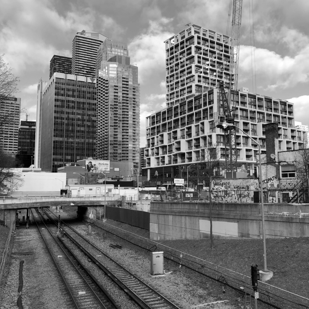
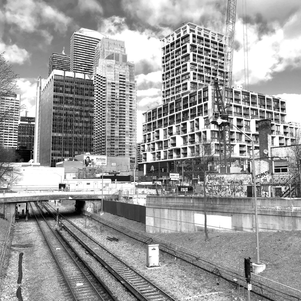
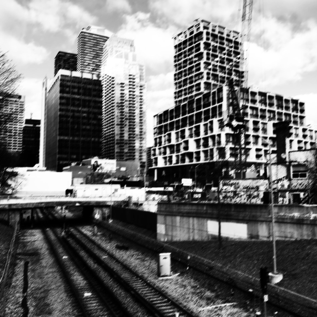
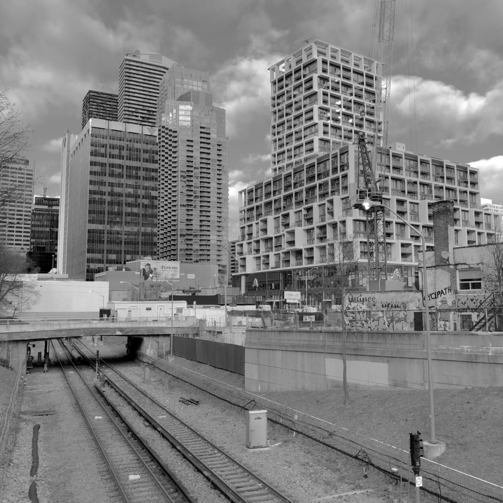
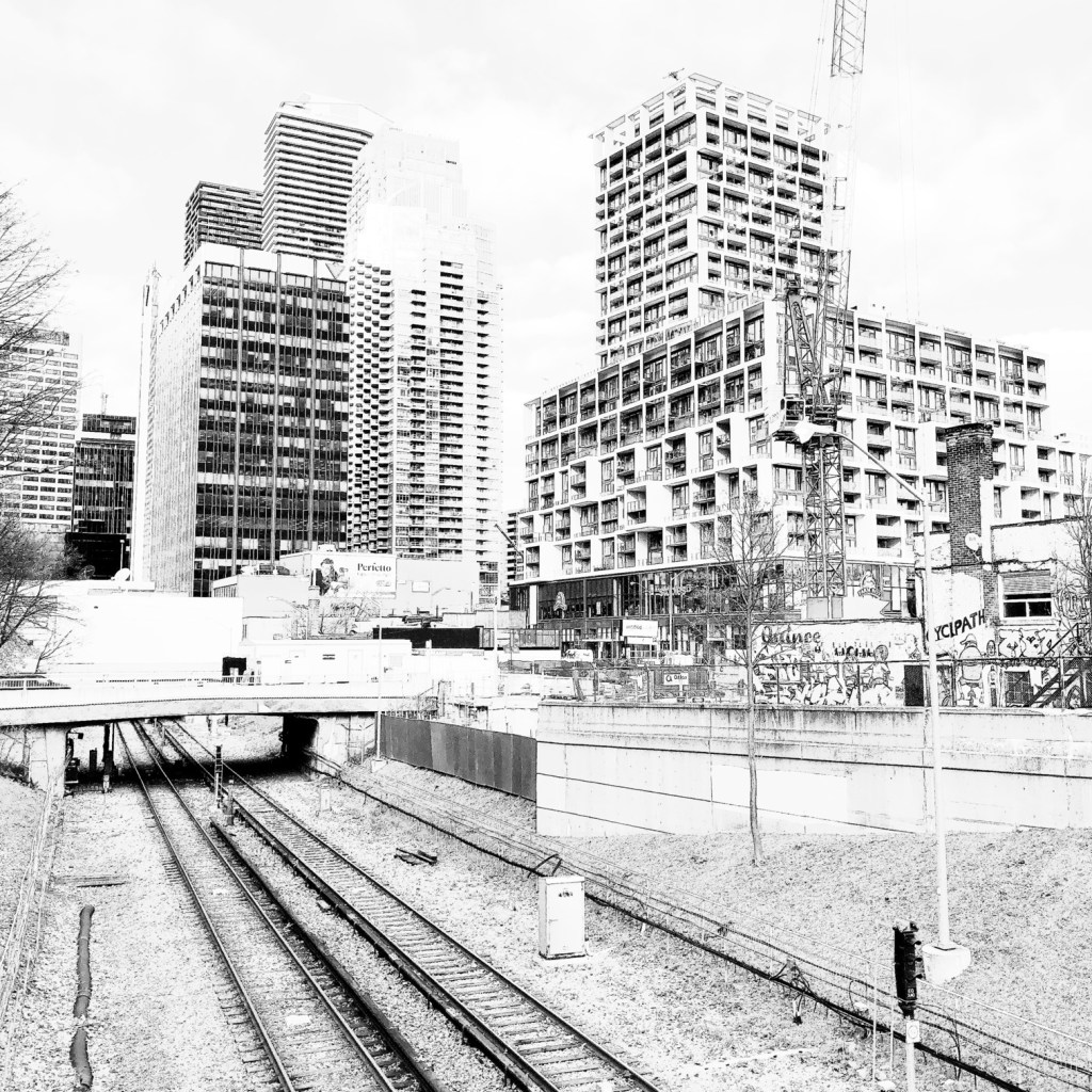
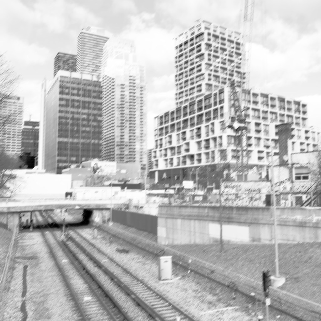
The Are-Bure-Boke aesthetic produces images which have characteristics of being grainy (Are), blurry (Bure) and out-of-focus (Boke). With the use of film cameras, these characteristics were intrinsic to the camera or film. The use of half-frame cameras allowed image grain to be magnified, low shutter speeds provide blur, and a fixed-focal length (providing a shallow DOF) provides out-of-focus. It is truly hard to replicate all these things in software. Contrast was likely added during the photo-printing stage.
What the app really lacks is the ability to specify a shutter-speed, meaning that Bure can not really be replicated. Blur is added by means of an algorithm, however is added across the whole image, simulating the entire camera panning across the scene using a low shutter speed, rather than capturing movement using a low-shutter speed (where some objects will not be blurred because they are stationary). It doesn’t seem like there is anything in the way of Boke, out-of-focus. Grain is again added by means of filter which adds noise. Whatever algorithm is used to replicate film grain also doesn’t work well, with uniform, high intensity regions showing little in the way of grain.
In addition Provoke also provides three colour modes, and a fourth no-filter option.
- Nofilter
- 100 Old Color
- 100U Vivid and Sharp
- 160N Soft
Honestly, I don’t know why these are here. Colour filters are a dime a dozen in just about every photo app… no need to crowd this app with them, although they are aesthetically pleasing. I rarely use anything except HPAN, and X800. Most of the other filters really don’t provide anything in the way of the contrast I am looking for, of course it depends on the particular scene. I like the app, I just don’t think it truly captures the point-and-shoot feel of the Provoke era.
The inherent difference between traditional Are-Bure-Boke vs the Provoke app is one is based on physical characteristics versus algorithms. The aesthetics of the photographs found in Provoke-era photographs is one of in-the-moment photography, capturing slices of time without much in the way of setting changes. That’s what sets cameras apart from apps. Rather than providing filters, it might have been better to provide a control for basic “grain”, the ability to set a shutter speed, and a third control for “out-of-focus”. Adding contrast could be achieved in post-processing with a single control.