What is a grayscale image?

If you are starting to learn about image processing then you will likely be dealing with grayscale or 8-bit images. This effectively means that they contain 2^8 or 256 different shades of gray, from 0 (black), to 255 (white). They are the simplest form of image to create image processing algorithms for. There are some image types that are more than 8-bit, e.g. 10-bit (1024 shades of grey), but in reality these are only used in specialist applications. Why? Doesn’t more shades of grey mean a better image? Not necessarily.

The main reason? Blame the human visual system. It is designed for colour, having three cone photoreceptors for conveying colour information that allows humans to perceive approximately 10 million unique colours. It has been suggested that from the perspective of grays, human eyes cannot perceptually see the difference between 32 and 256 graylevel intensities (there is only one photoreceptor with deals with black and white). So 256 levels of gray are really for the benefit of the machine, and although the machine would be just as happy processing 1024, it is likely not needed.

Here is an example. Consider the following photo of the London Blitz, WW2 (New Times Paris Bureau Collection).

blitz

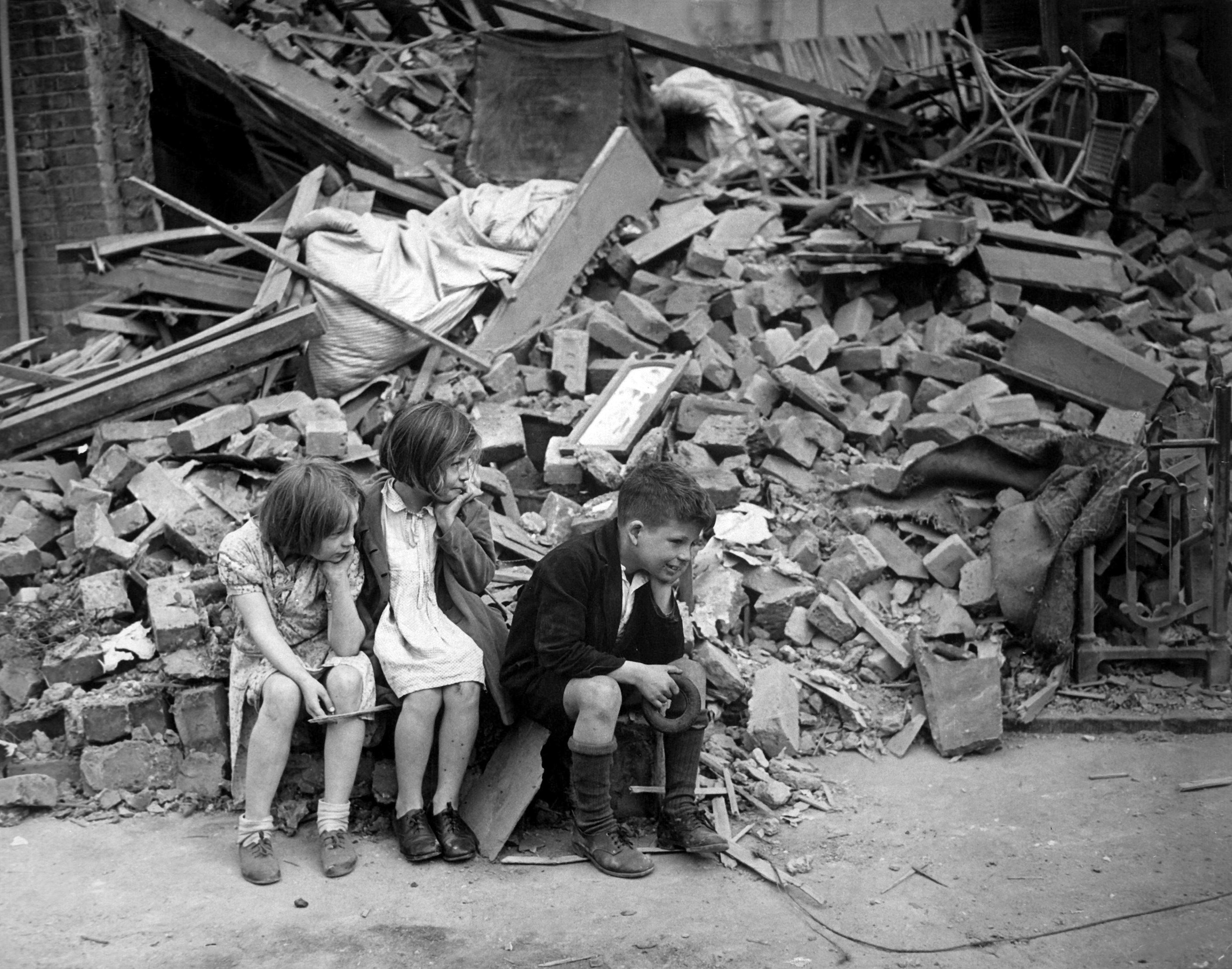
This is a nice grayscale image, because it has a good distribution of intensity values from 0 to 255 (which is not always easy to find). Here is the histogram:

blitzHST

Now consider the image, reduced to 8, 16, 32, 64, and 128 intensity levels. Here is a montage of the results, shown in the form of a region extracted form he original image.

The same image with differing levels of grayscale.

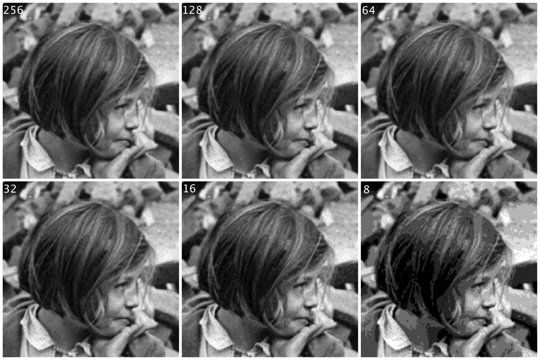
Not that there is very little perceivable difference, except at 8 intensity levels, where the image starts to become somewhat grainy. Now consider a companion of this enlarged region showing only 256 (left) versus 32 (right) intensity levels.

blitz256vs32

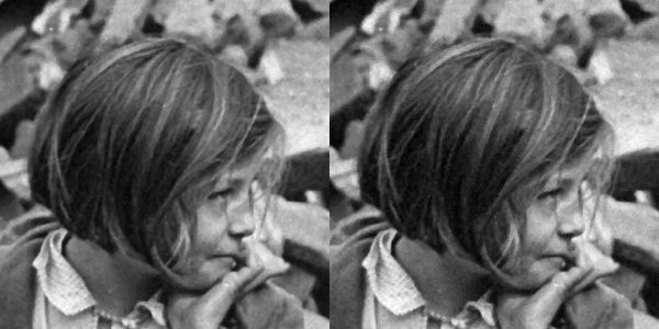
Can you see the difference? There is very little difference, especially when viewed in the over context of the complete image.

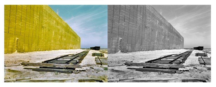
Many historic images look like they are grayscale, but in fact they are anything but. They may be slightly yellowish or brown in colour, either due to the photographic process, or due to aging of the photographic medium. There is no benefit to processing these type of photographs as colour images however, they should be converted to 8-bit.

How colour changes our perspective of photographs

The first permanent photograph was produced in 1825 by the French inventor Joseph Nicéphore Niépce. Since then photographs have become the epitome of our visual history. Until becoming widespread in the 1950s, colour images were more of an aberration, with monochrome, i.e. black-and-white, being the norm, partially due to the more simplistic processing requirements. As a result, history of good portion of the 19th/20th centuries is perceived in terms of monochromic images. This determines how we perceive history, for humans perceive monochromatic images in a vastly differing manner to colour ones.

The use of black-and-white in historical photographs implies certain ideas about history. There is the perception that such photos are authentic historical images. By the mid half of the 19th century, photography had become an important means of creating a visual record of life. However the process was inherently monochromatic, and the resulting photographs provided a representation of the structure of a subject, but lacked the colour which would have provided a more realistic context. There were some photographic processes which yielded an overall colour, such as cyanotypes, however such colour was unrealistic. The first colourization of photographic occurred in the early 1840s, when Swiss painter Johann Baptist Isenring used a mixture of gum arabic and pigments to make the first coloured daguerreotype. Such hand colouring continued in successive mediums including albumen and gelatin silver prints. The purpose of this hand-colouring may have been to increase the realism of the photographic prints (in lieu of a colour photographic process) .

The major failing of monochromatic images may be the fact that they suffer from a lack of context. Removing the colour from an image provides us with a different perception of the scene. Take for example the picture of the Russian peasant girls shown in Fig. 1. The image is from the US Library of Congress Prokudin Gorskii Collection, and depicts three young women offering berries to visitors to their izba, a traditional wooden house, in a rural area along the Sheksna River, near the town of Kirillov. Shown in colour, we perceive a richness in the girls garments, even though they are peasant girls in some small Russian town. When we think of peasant Russia in the early 20th century, we are unlikely to associate such vibrant colours with their place in society. Had we viewed only the panchromatic image, our perception would be vastly different.

Gorskii photographs
Russian peasant girls in colour and grayscale (Prokudin Gorskii)

Humans are capable of perceiving approximately 32 shades of gray and millions of colours. When we interpret an image to extract descriptors, some of those descriptors will be influenced by the perceived colour of objects within the image. A monochrome image relies on a spectrum of intensities that range from black to white, so when we view a monochromatic image, we perceive the image based on tone, texture and contrast, rather than colour. In the photograph of the peasant girls we are awed by the dazzling red and purple dresses, when viewing the monochrome image we are drawn to the shape of the dresses, the girls pose, and the content of the image.

Here is a second example of a sulfur stack shown in both colour and grayscale. The loss of meaning in the monochrome image is clear. The representative stack of sulphur is readily identifiable in the colour image, however in the monochrome image, the identifying attribute has been removed, leaving only the structure of the image with a loss of context.

Extracted sulfur stacked in a “vat” 60 feet tall at Freeport Sulphur Co. in Hoskins Mound, Texas.
Extracted sulfur stacked in a “vat” 60 feet tall at Freeport Sulphur Co. in Hoskins Mound, Texas. Kodachrome transparency by John Vachon

Does flash photography affect museum artifacts?

On a trip to the Louvre in Paris (10 years ago now), I noticed that the information guide stated “flash photography is strongly discouraged throughout the galleries”. The only place I really saw this enforced was in front of the Mona Lisa. Not a problem you say, everyone will abide by this. Well, not so it appears. I would imagine a good proportion of visitors have some form of digital camera, usually of the “point-and-shoot” (PS) type where the use of flash is automatic if light levels are low. There are of course two reasons for prohibiting the use of flash photography. One is that it disturbs other patrons. The second is that the flash has a direct effect, causing accelerated fading in artifacts such paintings and textiles. So what is the scientific basis for these restrictions? Well very little has actually been written about the effect of photographic flashes on exhibits. In 1994 Evans[1] wrote a small 3-page note discussing whether exhibits can be harmed by photographic flash, but there seems to be very little scientific data to back up claims that flashes cause accelerated fading. The earliest experiment was performed in 1970 using multiple flash (25,000) exposures [2]. Evans has written another article [3], which looks at the quantitative evidence behind banning flash photography in museums.

“Photographic flashes can damage art”. This is sort of a very broad statement. Strictly speaking, I would imagine the damaging affects of  1000 sweaty hands touching the Venus de Milowould greatly outweigh 1000 photographic flashes. It is doubtful that flash photography does any real damage. Should it be used? Unless you are using a professional lighting setup, you can probably achieve better pictures by not using a flash. Frankly if you are taking photographs of paintings in an art gallery you might be better off buying a book on the artist at the gallery shop. That, and flashes in enclosed spaces are annoying. Here is an example of a photo taken in the National Gallery of Norway, without the use of a flash. Actually, the biggest problem taking photographs indoors is possibly too many lights, and reflections off glass.

noflashPhoto

[1] Evans, M.H., “Photography: Can gallery exhibits be harmed by visitors using photographic flash?,” Museum Management and Curatorship, vol. 13, pp. 104-106, 1994.

[2] Hanlan, J.F.,  “The effect of electronic photographic lamps on the materials of works of art.,” Museum News, vol. 48, pp. 33, 1970.

[3] Evans, M.H., “Amateur photographers in art galleries: Assessing the harm done by flash photography”.

Digital photography: some things just aren’t possible

Despite the advances in digital photography, we are yet to see a camera which views a scene the same way that our eyes do. True, we aren’t able to capture and store scenes with our eyes, but they do have inherently advanced ability to optically analyze our surroundings, thanks in part to millions of years of coevolution with our brains.

There are some things that just aren’t possible in post-processing digital images. One is removing glare, and reflections from glass. Consider the image below, which was taken directly in front of a shop window. The photograph basically reflects the image from the opposite side of the street. Now getting rid of this is challenging. One idea might be to use a polarizing filter, but that won’t work directly in front of a window (a polarising filter removes light beams with a specific angle. As the sensor doesn’t record the angle of the light beams, it can’t be recreated in post-processing.). Another option is to actually take the shot at a different part of the day, or the night. There is no fancy image processing algorithm that will remove the reflection, although someone has undoubtedly tried. This is a case where the photographic acquisition process is all.

windowReflection

Glass reflection in a shop window.

Any filter that changes properties of the light that isn’t captured by the digital sensor (or film), is impossible to reproduce in post-processing. Sometimes the easiest approach to taking a photograph of something in a window is to wait for an overcast day, or even photograph the scene at night. Here is a similar image taken of a butcher shop in Montreal.

nightviewGlass

Nighttime image, no reflection, and backlit.

This image works well, because the contents of the image are back-lit from within the building. If we aren’t that concerned about the lighting on the building itself, this works nicely – just changes the aesthetics of the image to concentrate more on the meat in the window.

In image processing, have we have forgotten about aesthetic appeal?

In the golden days of photography, the quality and aesthetic appeal of the photograph was unknown until after the photograph was processed, and the craft of physically processing it played a role in how it turned out. These images were rarely enhanced because it wasn’t as simple as just manipulating it in Photoshop. Enter the digital era. It is now easier to take photographs, from just about any device, anywhere. The internet would not be what it is today without digital media, and yet we have moved from a time when photography was a true art, to one in which photography is a craft. Why a craft? Just like a woodworker crafts a piece of wood into a piece of furniture, so to do photographers  crafting their photographs in the like of Lightroom,or Photoshop.There is nothing wrong with that, although I feel like too much processing takes away from the artistic side of photography.

Ironically the image processing community has spent years developing filters to process images, to make them look more visually appealing – sharpening filters to improve acuity, contrast enhancement filters to enhance features. The problem is that many of these filters were designed to work in an “automated” manner (and many really don’t work well), and the reality is that people prefer to use interactive filters. A sharpening filter may work best when the user can modify its strength, and judge its aesthetic appeal through qualitative means. The only place “automatic” image enhancement algorithms exist are those in-app filters, and in-camera filters. The problem is that it is far too difficult to judge how a generic filter will affect a photograph, and each photograph is different. Consider the following photograph.

Cherries in a wooden bowl, medieval.

A vacation pic.

The photograph was taken using the macro feature on my 12-40mm Olympus m4/3 lens. The focal area is the top-part of the bottom of the wooden bucket. So some of the cherries are in focus, others are not, and there is a distinct soft blur in the remainder of the picture. This is largely because of the low depth of field associated with close-ip photographs… but in this case I don’t consider this a limitation, and would not necessarily want to suppress it through sharpening, although I might selectively enhance the cherries, either through targeted sharpening or colour enhancement. The blur is intrinsic to the aesthetic appeal of the image.

Most filters that have been incredibly successful are usually proprietary, and so the magic exists in a black box. The filters created by academics have never faired that well. Many times they are targeted to a particular application, poorly tested (on Lena perhaps?), or not at all designed from the perspective of aesthetics. It is much easier to manipulate a photograph in Photoshop because the aesthetics can be tailored to the users needs. We in the image processing community have spent far too many years worrying about quantitative methods of determining the viability of algorithms to improve images, but the reality is that aesthetic appeal is all that really matters. Aesthetic appeal matters, and it is not something that is quantifiable. Generic algorithms to improve the quality of images don’t exist, it’s just not possible in the overall scope of the images available. Filters like Instagram’s Larkwork because they are not changing the content of the image really, they are modifying the colour palette, and they do that applying the same look-up table for all images (derived from some curve transformation).

People doing image processing or computer vision research need to move beyond the processing and get out and take photographs. Partially to learn first hand the problems associated with taking photographs, but also to gain an understanding of the intricacies of aesthetic appeal.

30-odd shades of gray – the importance of gray in vision

Gray (or grey) means a colour “without colour”… and it is a colour. But in terms of image processing we more commonly use gray as a term synonymous to monochromatic (although monochrome means single colour). Now grayscale images can potentially come with limitless levels of gray, but while this is practical for a machine, it’s not useful for humans. Why? Because the structure of human eyes is composed of a system for conveying colour information. This allows humans to distinguish between approximately 10 million colours, but only about 30 shades of gray.

The human eye has two core forms of photoreceptor cells: rods and cones. Cones deal with visioning colour, while rods allow us to see grayscale in low-light conditions, e.g. night. The human eye has three types of cones sensitive to magenta, green, and yellow-to-red. Each of these cones react to an interval of different wavelengths, for example blue light stimulates the green receptors. However, of all the possible wavelengths of light, our eyes detect only a small band, typically in the range of 380-720 nanometres, what we known as the visible spectrum. The brain then combines signals from the receptors to give us the impression of colour. So every person will perceive colours slightly differently, and this might also be different depending on location, or even culture.

After the light is absorbed by the cones, the responses are transformed into three signals:  a black-white (achromatic) signal and two colour-difference signals: a red-green and a blue-yellow. This theory was put forward by German physiologist Ewald Hering in the late 19th century. It is important for the vision system to properly reproduce blacks, grays, and whites. Deviations from these norms are usually very noticeable, and even a small amount of hue can produce a noticeable defect. Consider the following image which contains a number of regions that are white, gray, and black.

A fjord in Norway

Now consider the photograph with a slight blue colour cast. The whites, grays, *and* blacks have taken on the cast (giving the photograph a very cold feel to it).

Photograph of a fjord in Norway with a cast added.

The grayscale portion of our vision also provides contrast, without which images would have very little depth. This is synonymous with removing the intensity portion of an image. Consider the following image of some rail snowblowers on the Oslo-Bergen railway in Norway.

Rail snowblowers on the Oslo-Bergen railway in Norway.

Now, let’s take away the intensity component (by converting it to HSB, and replacing the B component with white, i.e. 255). This is what you get:

Rail snowblowers on the Oslo-Bergen railway in Norway. Photo has intensity component removed.

The image shows the hue and saturation components, but no contrast, making it appear extremely flat. The other issue is that sharpness depends much more on the luminance than the chrominance component of images (as you will also notice in the example above). It does make a nice art filter though.

A move back to manual photography

When I was in university I dabbled in some photography. I had two Fuji cameras, I think one was a Fuji STX-2 35mm SLR. I had a couple of standard lenses, and a 300mm telephoto that I found at home and bought an adapter for. I did some nature photography, mostly birds, putting the 300mm to good use. I did some B&W and did some of my own processing (our residence had a darkroom). But I grew tired of lugging photographic gear on trips, and eventually in the late 90’s traded in that gear, and bought a compact 35mm camera. It was just handier. When my wife and I went  to Arizona in 2000, we both took our 35mm compact cameras with us. When we came back from that trip we had 12-15 rolls of film, and at that point I concluded that I was done with analogue film, largely because of the inconvenience, and cost (I think some are still unprocessed!). The next year we bought our first digital camera, a 2MP Olympus. We took it on a trip to Switzerland and Germany, and it was great. I never went back to analogue.

Now, 18 off years later, a change of plan. There seems to be an increasing trend, unlike that of records, towards analogue cameras, and film. To this end, I went and bought an Olympus OM-2 with a 50mm f1.4 lens. It feels *awesome*. Film is readily available, and actually quite inexpensive to process. Don’t get me wrong, I’m not ditching digital, in fact I’m going to use the analogue lens on my Olympus EM-5(II), and maybe even pick up an E-1. But what I long for is the feel and artistic appeal of the analogue camera… not necessarily for travel afar, but for local photography. I long to experiment with a camera that is very simple. I want to teach my daughter (who uses one of those instant Polaroid type cameras), about the true basic art of photography., and explore the inner workings of the analogue system. In part I believe that playing with film will help me better understand the subtle  nuances with taking good photographs, without the aid of extensive digital controls. The need for more control was brought on when I started using the Voigtländer lens on my EM-5, something that required me to manually focus. It’s easy to forget how much tactile knowledge is discarded when we give over to digital control.

olympus manual camera

Olympus OM-2

The problem with anything digital is that we hand over our innovative processes to the machine… and I’m somewhat over that. I don’t need AI to take the perfect picture, in fact I don’t need the perfect picture. Analog photography was never perfect, but that was its beauty, just as nothing in the world is completely perfect, and maybe we should stop trying to manipulate it so that it is.

P.S. If you’re looking for a manual camera in the GTA, try F-STOP Photo Accessories, in downtown TO. That’s where I bought this camera. It’s a small shop, but they have an amazing selection of manual cameras, at *exceptional* prices.

How good is High Dynamic Range (HDR) photography?

There are photographic situations where the lighting conditions are not ideal, even for the most modern “smart” camera – and they occur quite often. On vacation, taking landscapes, with the vast contrast difference between the sky and land, or low-light situations, scenes with shadows. These situations are unavoidable, especially when on vacation when the weather can be unpredictable.

The problem is one of perception. A scene that we view with our eyes, does not always translate into a photograph. This is because the human eye has more capacity to differentiate between tones than a camera. A good example of this is taking a photo from the inside of a building, through a window – the camera will likely produce an underexposed room, or an overexposed sky. Here is an example of a photograph taken during a sunny, yet slightly overcast day. One side of the building is effectively in shadow, whilst the other side is brightly lit-up.

HDR photography before shot

Olympus EM-5(MII), 12mm, f8.0, 1/640, ISO200 (P mode)

One way of compensating for the inability of a camera to take a good photograph in these situations is a computational photography technique known as High Dynamic Range(HDR). HDR is a technique which can be applied in-camera, or through an application such as Photoshop. For example, a camera such as the Olympus EM5(Mark II), has a button marked HDR, and even the iPhone camera has a HDR function.

In its simplest form, HDR takes three images of the exact same scene, with different exposures, and combines them together. The three exposures are normally (i) an exposure for shadows, (ii) an exposure for highlights, and (iii) an exposure for midtones. This is sometimes done by modifying the shutter speed, and keeping the aperture and ISO constant. Here is a HDR version of the photograph above, with the effect of the shadow very much reduced. Is it a better image? That is in the eye of the beholder. It does seem to loose something in translation.

HDR photography after processing

Olympus EM-5(MII), 12mm, f7.1, 1/500, ISO200 (HDR)

But HDR is not a panacea. – it won’t solve everything, and should be used sparingly. it is sometimes easier to perform exposure bracketing, and choose an appropriate image from those generated.

Why photographs need very little processing

I recently read an article on photographing a safari in Kenya, in which the author, Sarfaraz Niazi, made an interesting statement. While describing the process of taking 8000 photos on the trip he made a remark about post-processing, and said his father taught him a lesson when he was aged 5 – that “every picture is carved out in perpetuity as soon as you push the shutter“. There is so much truth in this statement. Photographs are snapshots of life, and the world around us is rarely perfect, so why should a photograph be any different? It is not necessary to vastly process images – there are of course ways to adjust the contrast, maybe improve the sharpness, or adjust the exposure somewhat, but beyond that, what is necessary? Add a filter? Sure that’s fun on Instagram, but shouldn’t be necessary on camera-based photographs.

Many years of attempting to derive algorithms to improve images have taught me that there are no generic one-fits-all algorithms. Each photograph must be modified in a manner that suits the ultimate aesthetic appeal of the image. An algorithm manipulates through quantitative evaluation, having no insight into the content, or qualitative aspects of the photograph. No AI algorithm will ever be able to replicate the human eyes ability to determine aesthetic value – and every persons aesthetic interpretation will be different. Add too much computational photography into a digital camera, and you end up with too much of a machine-driven photograph. Photography is a craft as much as an art and should not be controlled solely by algorithms. Consider the following photograph, taken in Glasgow, Scotland. The photograph suffers from being taken on quite a hot day in the summer, when the sky was somewhat hazy. The hazy sky is one factor which causes a reduction in colour intensity in the photograph.

glasgowAestheticpre

Original photograph

In every likelihood, this photograph represents the true scene quite accurately. An increase in saturation, and modification of exposure will produce a more vivid photograph, shown below. Likely one of the Instagram filters would also have done a nice job in “improving” the image. Was the enhancement necessary? Maybe, maybe not. The enhancement does improve the colours within the image, and the contrast between objects.

glasgowAestheticpost

Post-processed photograph

Aesthetically motivated picture processing

For years I wrote scientific papers on various topics in image processing, but what I learnt from that process was that few of the papers written are actually meaningful. For instance, in trying to create new image sharpening algorithms many people forgot the whole point of sharpening. Either a photographer strives for sharpness in an entire image or endeavours to use blur as a means of focusing the attention on something of interest in the image (which is in focus, and therefore sharp). Many sharpening algorithms have been developed with the concept of sharpening the whole image… but this is often a falsehood. Why does the photo need to be sharpened? What is the benefit? A simple sharpening with unsharp masking (which is an unfortunate name for a filter) works quite well in its task. But it was designed at a time when images were small, and filters were generally simple 3×3 constructs. Applying the original filter to a 24MP 4000×6000 pixel image will make little, if any difference. On the other hand, blurring an image does nothing for its aesthetics unless it is selective, in essence trying to mimic bokeh in some manner.

Much of what happens in image processing (aside from machine vision) is aesthetically based. The true results of image processing cannot be provided in a quantitative manner and that puts it at odds with scientific methodology. But who cares? Scientific thought in an academic realm is far too driven by pure science with little in the way of pure inventing. But alas few academics think this way, most take on the academic mantra and are hogtied to doing things in a specified way. I no longer prescribe to this train of thoughts, and I don’t really know if I ever did.

aesthetic appeal, picture of Montreal metro with motion blur

This picture shows motion blur which results from a moving subway car, whilst the rest of the picture remains in focus. The motion blur is a part of the intrinsic appeal of the photograph – yet there is no way of objectively quantifying the aesthetic value – it is something that can only be qualitatively and subjectively evaluated.

Aesthetically motivated Image processing is a perfect fit for photographs because while there are theoretical underpinnings to how lenses are designed, and technical principles of how a camera works, the ultimate result – a photograph, is the culmination of the mechanical ability of the camera and the artistic ability of the photographer. Machine vision, the type used in manufacturing facilities to determine things like product defects is different, because it is tasked with precision automated photography in ideal controlled conditions. To develop algorithms to remove haze from natural scenes, or reduce glare is extremely difficult, and may be best taken when thee is no haze. Aesthetic-based picture processing is subjectively qualitative and there is nothing wrong with that. It is one of the criteria that sets humans apart from machines – the inherent ability to visualize things differently. Some may find bokeh creamy while others may find it too distractive, but that’s okay. You can’t create an algorithm to describe bokeh because it is an aesthetic thing. The same way it’s impossible to quantify taste, or distinguish exactly what umami is.

Consider the following quote from Bernard Berenson (Aesthetics, Ethics, and History) –

‘The eyes without the mind would perceive in solids nothing but spots or pockets of shadow and blisters of light, chequering and criss-crossing a given area. The rest is a matter of mental organization and intellectual construction. What the operator will see in his camera will depend, therefore, on his gifts, and training, and skill, and even more on his general education; ultimately it will depend on his scheme of the universe.’