Every colour photograph is a manipulation of the truth

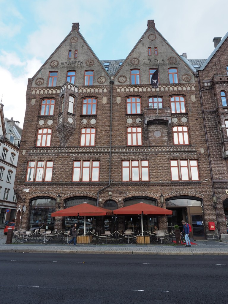
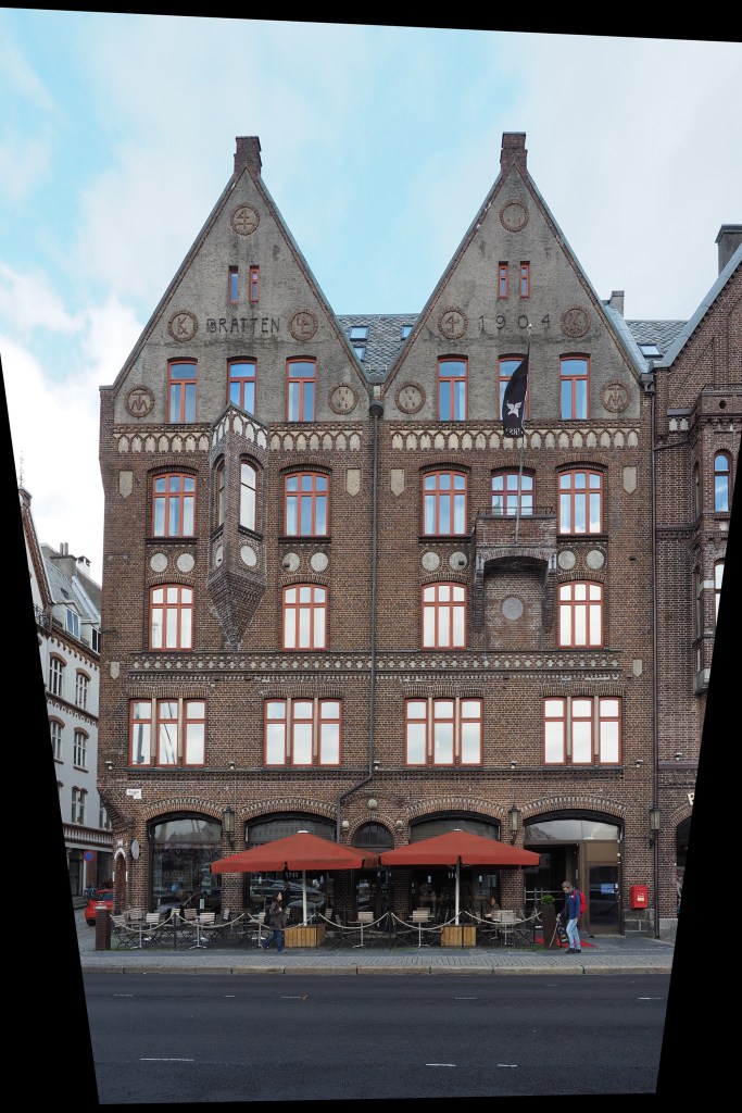
Previous discussions have focused on the quasi untruths the camera produces. What is the greatest of them? The freezing or blur of movement? The distortion of perspective? Or maybe the manipulation of colour? When it comes to colour, where does the truth lie? Colour is interpreted differently by each person, and even the camera itself. No one may truly understand the complexities of how colour is actually perceived. Most people see a blue sky, but what shade of blue? Consider the following photograph taken at Point Pleasant Park, in Halifax (Nova Scotia). The sky seems over-saturated, but there was no processing done. Is it natural, or an affect of being in the right place at the right time?

Prince of Wales Tower, Point Pleasant Park, Halifax

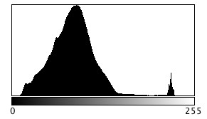
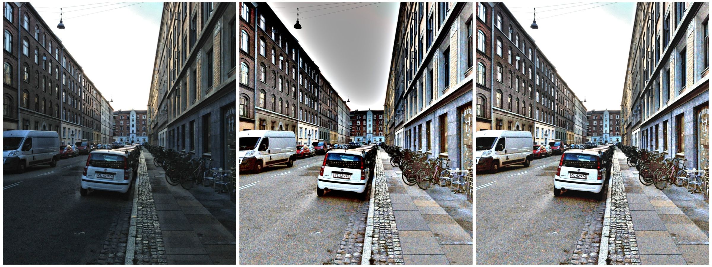
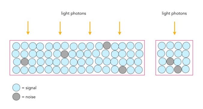
Colours in a digital photograph are a result of many differing processes – light passes through the various glass optics of the lens, and is absorbed by the sensor which converts the photons into a digital signal. This does not mean that the colours which exist in a scene will be properly interpreted. The pure “light” of white can be used to manipulate the colours of a photograph, something called white balancing. Scroll through the available choices, and the colour temperature of the photograph will change. Sometimes we manipulate colours through white balancing, other times through manipulation of the colour histogram, all to make the contents of the photograph seem more akin to our perception of realism. Sometimes we add colour to add a sense of non-realism. Sometimes we saturate the colours to make them seem bright, and other times we mute them. 

Take a photograph of something. Look at the colours in the scene, and try to remember what they looked like. Maybe take the same photo with different cameras. It is hard to reproduce the exact colour… so in many ways the photograph the camera produces is something of a generic interpretation to be manipulated in a human way to some visual aesthetic. Which takes us to the question of what is the truth? Is there any real truth to a photograph? 

Nothing has a true colour- it is all varying perceptions of the interaction of light and colour pigments, and the human eye. We apply filters in Instagram to make things seem more vivid and hyper real, or desaturated and contemplative. There is no right or wrong way of understanding colour, although our experiences are influenced by the other senses such as smell. I mean, as far as wavelengths go, the Earth’s sky is really more of a bluish violet colour, but because of the human visual system we perceive it as pale blue. So maybe our own eyes are manipulating the truth?

What is unsharp masking?

Many image post-processing applications use unsharp masking (UM) as their choice of sharpening algorithm. It is one of the most ubiquitous methods of image sharpening. Unsharp masking was introduced by Schreiber [1] in 1970 for the purpose of improving the quality of wirephoto pictures for newspapers. It is based on the principle of photographic masking whereby a low-contrast positive transparency is made of the original negative. The mask is then “sandwiched” with the negative, and the amalgam used to produce the final print. The effect is an increase in sharpness.

The process of unsharp masking accentuates the high-frequency components of an image, i.e. the edge regions where there is a sharp transition in image intensity. It does this by extracting the high-frequency details from an image, and adding them to the original image. This process can be better understood by first considering a 1D signal shown in the figure below.

An example of unsharp masking using a 1D signal

This is the process of what happens to the signal

  1. The original signal.
  2. The signal is “blurred”, by a filter which enhances the “low-frequency” components of the signal.
  3. The blurred signal, ➁, is subtracted from ➀, to extract the “high-frequency” components of the signal, i.e. the “edge” signal.
  4. The “edge” signal is added to the original signal ➀ to produce the sharpened signal.

In the context of digital images unsharp masking works by subtracting a blurred form of an image from the original image itself to create an “edge” image which is then used to improve the acuity of the original image. There are many different approaches to unsharp masking which use differing forms of filters. Some use a more traditional approach using the process outlines above, with the blurring actuated using a Gaussian blur, while others use specific filters which create “edge” images directly, which can be either added to, or subtracted from the original image.

[1] Schreiber, W., “Wirephoto quality improvement by unsharp masking,” Pattern Recognition, Vol.2, pp.117-121 (1970). 

Fixing photographs (e.g. travel snaps) (ii)

3︎⃣ Fixing light with B&W

There are some images which contain shafts of light. Sometimes this light helps highlight certain objects in the photograph, be it as hard light or soft light. Consider the following photo of a viking carving from the Viking Ship Museum in Oslo. There are some nice shadows caused by the light streaming in from the right side of the scene. One way to reduce the effects of light is to convert the photograph to black-and-white.

By suppressing the role colour plays in the image, the eyes become more fixated on the fine details, and less on the light and shadows.

4︎⃣ Improving on sharpness

Sometimes it is impossible to take a photograph with enough sharpness. Tweaking the sharpness just slightly can help bring an extra crispness to an image. This is especially true in macro photographs, or photographs with fine detail. If the image is blurry, there is every likelihood that it can not be salvaged. There is only so much magic that can be performed by image processing. Here is a close-up of some water droplets on a leaf.

If we filter the image using some unsharp masking to sharpen the image, we get:

5︎⃣ Saturating colour

Photographs of scenes containing vivid colour may sometimes appear quite dull, or maybe you want to boost the colour in the scene. By adjusting the colour balance, or manipulating the colour histogram, it is possible to boost the colours in a photograph, although they may end up “unrealistic” colours in the processed image. Here is a street scene of some colourful houses in Bergen, Norway.

Here the image has been processed with a simple contrast adjustment, although the blue parts of the sky have all but disappeared.

Fixing photographs (e.g. travel snaps) (i)

When travelling, it is not always possible to get a perfect photograph. You can’t control the weather – sometimes it is too sunny, and other times there is not enough light. So the option of course is to modify the photographs in some way, fixing what is considered “unaesthetic”. The problem lies in the fact that cameras, as good as they are, don’t always capture a scene the way human eyes do. Your eyes, and brain correct for many things that aren’t possible with a camera. Besides which we are all tempted to make photographs look brighter – a legacy of the filters in apps like Instagram. Should we fix photographs? It’s one of the reasons the RAW file format exists, so we can easily modify an images characteristics. At the end of the day, we fix photographs to make them more aesthetically pleasing. I don’t own a copy of Photoshop, so I don’t spend copious hours editing my photographs, it’s usually a matter of adjusting the contrast, or performing some sharpening.

There is of course the adage that photographs shouldn’t be modified too much. I think performing hundreds of tweaks on a photograph results in an over-processed image that may not really represent what the scene actually looked like. A couple of fixes to improve the aesthetic appeal?

So what sort of fixes can be done?

1︎⃣ Fixing for contrast issues

Sometimes its not possible to take a photograph with the right amount of contrast. In an ideal world, the histogram of a “good” photograph should be uniformly distributed. Sometimes, there are things like the sky being overcast that get in the way. Consider the following photo, which I took from a moving train using shutter-priority with an overcast sky.

A lack of contrast

The photograph seems quite nice right? Does it truly reflect the scene I encountered? Likely not quite. If we investigate the histogram (the intensity histogram), we notice that there is one large peak towards the low end of the spectrum. There is also a small spike near the higher intensity regions, most likely related to the light regions such as the sky.

So now if we stretch the histogram, the contrast in the image will improve, and the photograph becomes more aesthetically pleasing, with much brighter tones.

Improving contrast

2︎⃣ Fixing for straight lines

In the real world, the lines of buildings are most often straight. The problem with lenses is that they are curved, and sometimes this impacts the form of photograph being acquired. The wider the lens, the more straight lines converse to the centre of the image. The worse case scenario are fish-eye lenses, which can have a field of view of up to 180°, and result in a barrel distortion. Take a photograph of a building, and the building will appear distorted. Human eyes compensate for this with the knowledge that it is a building, and its sides should be parallel – they do not consciously notice converging vertical lines. However when you view a photograph, things are perceived differently – it often appears as though a building is leaning backwards. Here is an photograph of a building in Bergen, Norway.

Performing a perspective correction creates an image where the vertical lines of the building are truly vertical. The downside is of course that the lower portion of the image has been compressed, so if the plan is to remove distortion in this manner, make sure to allow enough foreground in the image. Obviously it would be better to avoid these problems when photographing buildings.

Could blur be the new cool thing in photography?

For many years the concept of crisp, sharp images was paramount. It lead to the development of a variety of image sharpening algorithms to suppress the effect of blurring in an image. Then tilt-shift appeared, and was in vogue for a while (it’s still a very cool effect). Here blur was actually being introduced into an image. But what about actually taking blurry images?

I have been experimenting with adding blur to an image, either through the process of  manually defocusing the lens, or by taking a picture of a moving object. The results? I think they are just as good, if not better than if I had “stopped the motion”, or created a crisp photograph. We worry far too much about defining every single feature in an image, and too little on a bit of creativity. Sometimes it would be nice to leave something in an image that inspires thought.

Here’s an example of motion-blur, a Montreal Metro subway car coming into a platform. It is almost the inverse of tilt-shift. Here the object of interest is blurred, and the surround area is kept crisp. Special equipment needed? Zip.

What if we interpret photographs differently?

Have you ever taken a photo in portrait mode, and viewed it in landscape mode like this?

Îles de la Madeleine

Yes, this is how I meant to view it. A normal photograph doesn’t give any perspective of how large and wonderful this planet truly is. Viewing a photograph in this manner one sees earth on the right, and the vastness of the sky and the space beyond on the left. It provides an abrupt edge of the world perspective. We should do more to protect our home. Here is a second one, taking the opposite view from the sea to land.

Iceland near Reykjavik

One may now look at this as one piece of a jigsaw puzzle of millions of photographs, each showing the limits of our existence.

Why image processing is an art

There are lots of blogs that extol some piece of code that does some type of “image processing”. Classically this is some type of image enhancement – an attempt to improve the aesthetics of an image. But the problem with image processing is that there are aspects of if that are not really a science. Image processing is an art fundamentally because the quality of the outcome is often intrinsically linked to an individuals visual preferences. Some will say the operations used in image processing are inherently scientific because they are derived using mathematical formula. But so are paint colours. Paint is made from chemical substances, and deriving a particular colour is nothing more than a mathematical formula for combining different paint colours. We’re really talking about processing here, and not analysis (operations like segmentation). So what forms of processing are artistic?

  1. Anything that is termed a “filter”. The Instagram-type filters that make an ordinary photo look like a Polaroid. 
  2. Anything with the word enhancement in it. This is an extremely loose term – for it literally means “an increase in quality” – what does this mean to different people? This could involve improving the contrast in an image, removing blur through sharpening, or maybe suppressing noise artifacts.

These processes are partially artistic because there is no tried-and-true method of determining whether the processing has resulted in an improvement in the quality of the image. Take an image, improve its contrast. Does it have a greater aesthetic appeal? Are the colours more vibrant? Do vibrant colours contribute to aesthetic appeal? Are the blues really blue?

Contrast enhancement: (a) original, (b) Retinex-processed, (c) MAXimum of (a) and (b)

Consider the photograph above. To some, the image on the left suffers from being somewhat underexposed, i.e. dark. The image in the middle is the same image processed using a filter called Retinex. Retinex helps remove unfavourable illumination conditions – the result is not perfect, however the filter can help recover detail from an image in which it is enveloped in darkness. Whilst a good portion of the image has been “lightened”, the overcast sky has darkened through the process. There is no exact science for “automagically” making an image have greater aesthetic appeal. The art of image processing often requires tweaking settings, and adjusting the image until it appears to have improved visually. In the final image of the sequence below, the original and Retinex processed images are used to create a composite by retaining only the maximum value at each pixel location. The result is a brighter, contrasty, more visually appealing image.

What happens to “extra” photosites on a sensor?

So in a previous post we talked about effective pixels versus total photosites, i.e. the effective number of pixels in a image (active photosites on a sensor) is usually smaller than the total number of photosites on a sensor. That leaves a small number of photosites that don’t contribute to forming an image. These “extra” photosites sit beyond the camera’s image mask, and so are shielded from receiving light. But they are still useful.

These extra photosites receive a signal that tells the sensor how much dark current (unwanted free electrons generated in the CCD due to thermal energy) has built up during an exposure, essentially establishing a reference dark current level. The camera can then use this information to compensate for how the dark current contributes to the effective (active) photosites by adjusting their values (through subtraction). Light leakage may occur at the edge of this band of “extra” photosites, and these are called “isolation” photosites. The figure below shows the establishment of the dark current level.

Creation of dark current reference pixels

Photosite size and noise

Photosites have a definitive amount of noise that occurs when the sensor is read (electronic/readout noise), and a definitive amount of noise per exposure (photon/shot noise). Collecting more light in photosites allows for a higher signal-to-noise ratio (SNR), meaning more signal, less noise. The lower amount of noise has to do with the accuracy of the light photons measured – a photosite that collects 10 photons will be less accurate than one that collects 50 photons. Consider the figure below. The larger photosite on the left is able to collect many four times as many light photons as the smaller photosite on the right. However the photon “shot” noise acquired by the larger photosite is not four times that of the smaller photosite, and as a consequence, the larger photosite has a much better SNR.

Large versus small photosites

A larger photosite size has less noise fundamentally because the accuracy of the measurement from a sensor is proportional to the amount of light it collects. Photon or shot noise can be approximately described as the square root of signal (photons). So as the number of photons being collected by a photosite (signal) increases, the shot noise increases more slowly, as the square root of the signal.

Two different photosite sizes from differing sensors

Consider the following example, using two differing size photosites from differing sensors. The first is from a Sony A7 III, a full frame (FF) sensor, with a photosite area of 34.9μm²; the second is from an Olympus EM-1(ii) Micro-Four-Thirds (MFT) sensor with a photosite area of 11.02μm². Let’s assume that for the signal, one photon strikes every square micron of the photosite (a single exposure at 1/250s), and calculated photon noise is √signal. Then the Olympus photosite will receive 11 photons for every 3 electrons of noise, a SNR of 11:3. The Sony will receive 35 photons for every 6 electrons of noise, a SNR of 35:6. If both are normalized, we get rations of 3.7:1 versus 5.8:1, so the Sony has the better SNR (for photon noise).

Photon (signal) versus noise

If the amount of light is reduced, by stopping down the aperture, or decreasing the exposure time, then larger photosites will still receive more photons than smaller ones. For example, stopping down the aperture from f/2 to f/2.8 means the amount of light passing through the lens is halved. Larger pixels are also often situated better when long exposures are required, for example low-light scenes such as astrophotography. For example, if we were to increase the shutter speed from 1/250s to 1/125s, then the number of photons collected by a photosite would double. The shot noise SNR in the Sony would increase from 5.8:1 to 8.8:1, that of the Olympus would only increase from 3.7:1 to 4.7:1.