Use of the camera in Hitchcock’s “Rear Window”

Last week I watched Rear Window, an Alfred Hitchcock directed thriller from 1954 starring James Stewart and Grace Kelly. The story follows photojournalist, L.B. “Jeff” Jefferies, who breaks his leg while shooting an action shot at a car race (supposedly working for LIFE Magazine). Confined to a wheelchair in his New York apartment, he spends time watching the occupants of neighbouring apartments through his apartments rear window, as they go about their daily lives.  He begins to suspect that a man across the courtyard may have murdered his wife. Jeff enlists the help of his high society fashion-consultant girlfriend Lisa Freemont and his visiting nurse Stella to investigate. It’s a great movie from a period when life was likely a little simpler than it is now.

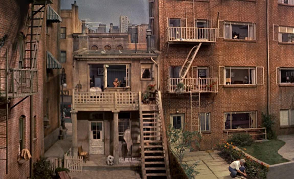
For the early part of the movie, Jeff is just looking out the window, bored with being confined to his apartment while his cast covered leg recovers. When he deduces something is amiss across the courtyard, he pulls out his camera, with its telephoto lens to view the scene a little closer. The courtyard was supposedly 98′ wide and 185′ in length.

Part of the courtyard.

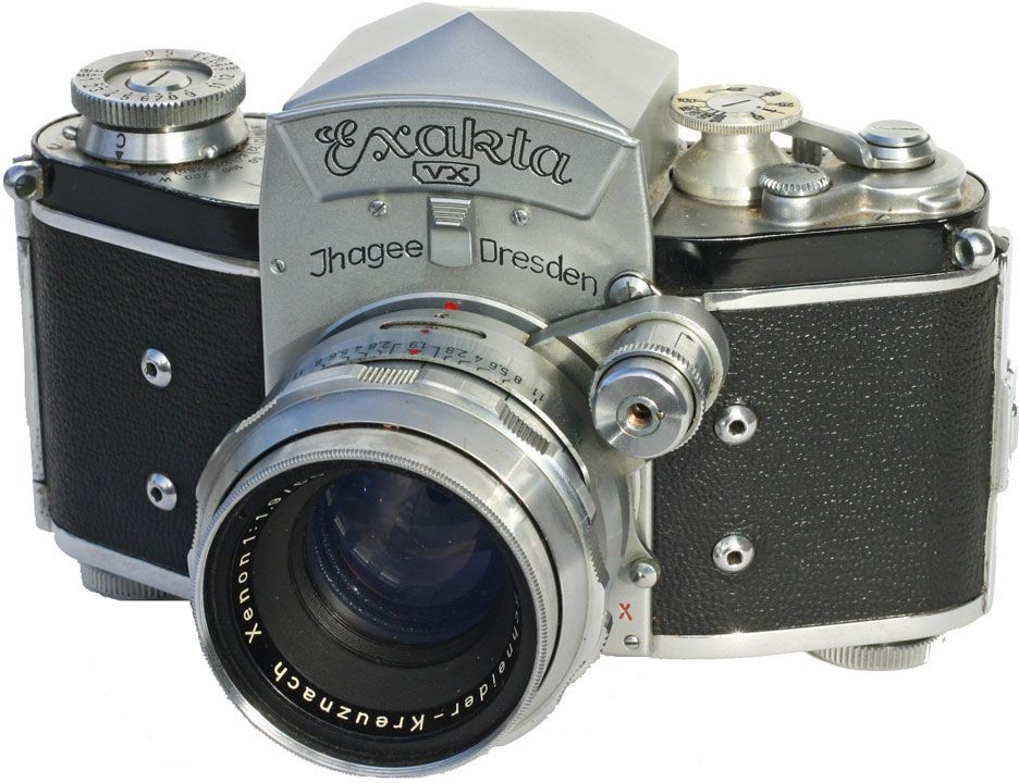
The 35mm film camera used by Jeff is an Exakta VX Ihagee Dresden, with the Exakta logo covered by a piece of black material in the movie. Why choose the Exakta? In the time the film was shot, there were really only three 35mm camera systems with global recognition: Leica, Contax, and Exakta. Hitchcock could have used a Leica with a reflex housing for the telephoto lens (e.g. Visoflex II), but a solution with a one-eyed reflex with a prism viewfinder was more elegant. Why was the brand covered with black tape? To cover up its East German / Communist origins? This may have played a role, but more likely just an avoidance of advertising in film.

The Exakta is an interesting choice of camera for the period, made by Ihagee Kamerawerk Steenbergen & Co, Dresden, in former East Germany and was produced between 1951-56. The Exakta is notable as being the first ever Single Lens Reflex (SLR) camera for both 127 roll film (1933), and 135 format 35mm film (1936). It’s not surprising that Jeff was using a Exakta, as before Japanese started to dominate the camera market the Exakta dominated the market, capturing perhaps 95% of SLR sales (they did kind of invent the SLR in 1936). The lens being used on the camera is a Kilfitt Fern-Kilar f/5.6 400mm telephoto lens.

The Exakta VX

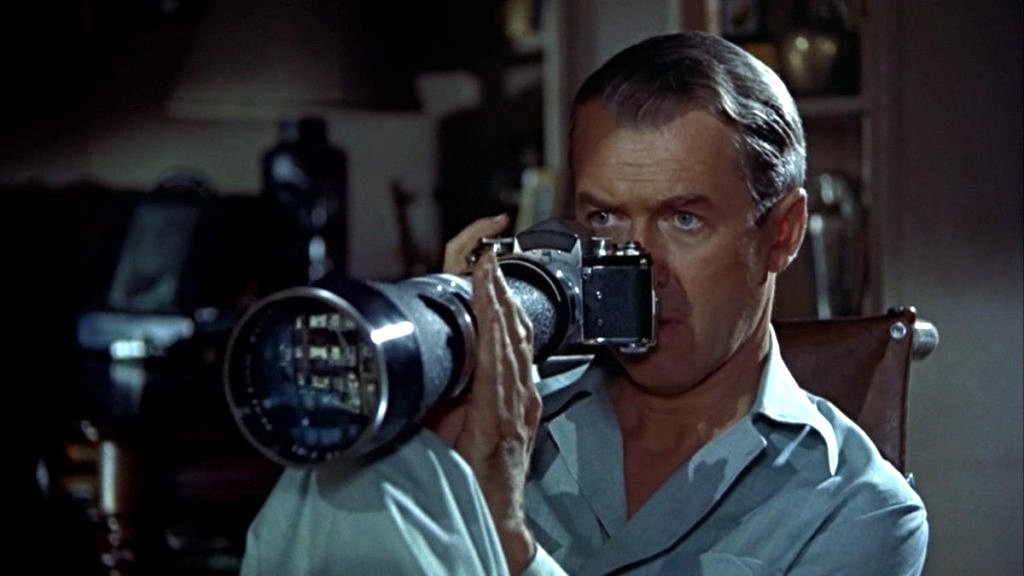
There are a number of things that are of interest with the use of the camera. I know this is a movie, and the camera was used as a prop, but here goes. Firstly, as a press photographer, it is unlikely he would have used a 400mm lens. Jeff’s character was supposedly based on war photographer Robert Capa, used a Contax II with a 50mm lens. (Ironically Capa was killed covering the First Indochina War in 1954, which is where Jeff’s editor wanted to send him). A 400mm lens would be more useful for a sports photographer shooting field based sports like football (soccer) or a bird watcher. The lens Jefferies uses to take the photograph on the racetrack is clearly a wide-angle (and frankly taken from a very dangerous viewpoint).

Is Jeff pushing the shutter button?

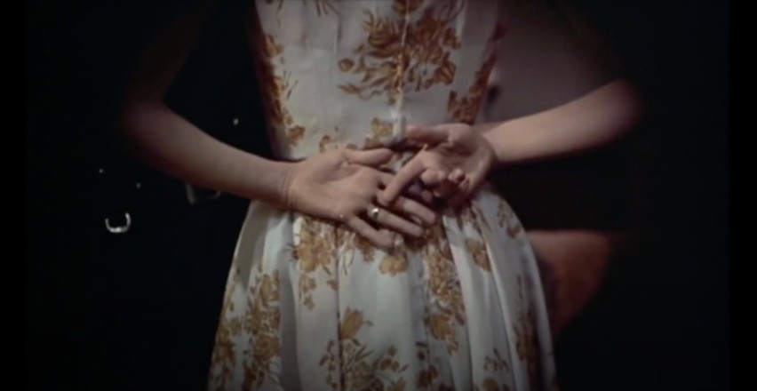
Next there is the issue of the view through the lens itself, which it seems is solely for cinematic effect. I know from a cinematography point-of-view, Hitchcock was trying to imply that the view was through a camera, showing a circular view, but camera views are rectangular. Next there is the issue of the “focal length” of the lens, which seems to be quite flexible. There are two scenes (shown below) taken seconds apart in Thorwald’s apartment, and viewed through the Kilfitt Fern-Kilar 400mm lens. One shows a close-up of Lisa’s hand behind her back (showing where she has slipped on the victim’s wedding ring). This would mean that the 400mm lens had the ability to zoom, which was not possible (and likely act like a 800-1200mm lens). There is also the issue of light intensity, which doesn’t seem to change, even though it is nighttime. The wonders of artistic license.

Two shots, seconds apart, taken with the 400mm lens.

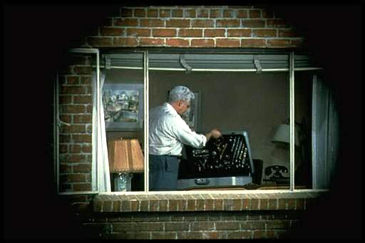
The field-of-view for the 400mm lens is about right for most shots, at 8-9 feet horizontally, and 5-6 feet vertically. At times it looks as though Jeff is taking photos, however the shutter release button is on the photographers left side of the camera, so from this we know he did not take any photographs. In addition, Jeff never actually cocks the shutter, which is a requirement for looking through the viewfinder – the mirror stays up after exposure, so viewfinder is dark, cocking the shutter returns the mirror to normal position (and transports the film to the next exposure).

Lars Thorwald, shown through the framed camera shot, and approximates the FOV of the lens quite well.

Which leads us to the issue of photographs. why would a photojournalist, who takes photographs for a living, not take any photographs of things happening across the courtyard? If he would have taken some photographs, then he would of at least had pictures of suspicious behaviour to show his friend Det. Lt. Doyle. But not once did we hear Jeffries depress the shutter button (and you would hear it because it is noisy). He may have taken photographs at other times, but not during the setting in the movie.

P.S. The lens was manufactured by Heinz Kilfitt Optische Fabrik (1946-64) from Munich (West Germany). Kilfitt was an innovative lens maker, producing the world’s first 35mm macro lens, the Kilfitt 4 cm f/3.5 Makro-Kilar in 1955.

Further reading:

Tracking Down and Testing the Camera from ‘Rear Window’ (1954), Thomas Bloomfield (PetaPixel, 2024)

Why do buildings lean? (the keystone effect)

Some types of photography lend themselves to inherent distortions in the photograph, most notably those related to architectural photography. The most prominent of these is the keystone effect, a form of perspective distortion which is caused by shooting a subject at an extreme angle, which results in converging vertical (and also horizontal) lines. The name is derived from the archetypal shape of the distortion, which is similar to a keystone, the wedge-shaped stone at the apex of a masonry arch.

keystone effect in buildings
Fig.1: The keystone effect

The most common form of keystone effect is a vertical distortion. It is most obvious when photographing man-made objects with straight edges, like buildings. If the object is taller than the photographer, then an attempt will be made to fit the entire object into the frame, typically by tilting the camera. This causes vertical lines that seem parallel to the human visual system to converge at the top of the photograph (vertical convergence). In photographs containing tall linear structures, it appears as though they are “falling” or “leaning” within the picture. The keystone effect becomes very pronounced with wide-angle lenses.

Fig.2: Why the keystone effect occurs

Why does it occur? Lenses are designed to show straight lines, but only if the camera is pointed directly at the object being photographed, such that the object and image plane are parallel. As soon as a camera is tilted, the distance between the image plane and the object is no longer uniform at all points. In Fig.2, two examples are shown. The left example shows a typical scenario where a camera is pointed at an angle towards a building so that the entire building is in the frame. The angle of both the image plane and the lens plane are different to the vertical plane of the building, and so the base of the building appears closer to the image plane than the top, resulting in a skewed building in the resulting image. Conversely the right example shows an image being taken with the image plane parallel to the vertical plane of the building, at the mid-point. This is illustrated further in Fig.3.

Fig.3: Various perspectives of a building

There are a number of ways of alleviating the keystone effect. The first method involves the use of specialized perspective control and tilt-shift lenses. The best way to avoid the keystone effect is to move further back from the subject, with the reduced angle resulting in straighter lines. The effects of this perspective distortion can be removed through a process known as keystone correction, or keystoning. This can be achieved in-camera using the cameras proprietary software, before the shot is taken, or in post processing on mobile devices using apps such as SKRWT. It is also possible to perform the correction with post-processing using software such as Photoshop.

Fig.4: Various keystone effects

How do we perceive photographs?

Pictures are flat objects that contain pigment (either colour, or monochrome), and are very different from the objects and scenes they represent. Of course pictures must be something like the objects they depict, otherwise they could not adequately represent them. Let’s consider depth in a picture. In a picture, it is often easy to find cues relating to the depth of a scene. The depth-of-field often manifests itself as a region of increasing out-of-focus away from the object which is in focus. Other possibilities are parallel lines than converge in the distance, e.g. railway tracks, or objects that are blocked by closer objects. Real scenes do not always offer such depth cues, as we perceive “everything” in focus, and railway tracks do not converge to a point! In this sense, pictures are very dissimilar to the real world.

If you move while taking a picture, the scene will change. Objects that are near move more in the field-of-view than those that are far away. As the photographer moves, so too does the scene, as a whole. Take a picture from a moving vehicle, and the near scene will be blurred, the far not as much, regardless of the speed (motion parallax). This then is an example of a picture for which there is no real world scene.

A photograph is all about how it is interpreted

Photography then, is not about capturing “reality”, but rather capturing our perception, our interpretation of the world around us. It is still a visual representation of a “moment in time”, but not one that necessarily represents the world around us accurately. All perceptions of the world are unique, as humans are individual beings, with their own quirks and interpretations of the world. There are also things that we can’t perceive. Humans experience sight through the visible spectrum, but UV light exists, and some animals, such as reindeer are believed to be able to see in UV.

So what do we perceive in a photograph?

Every photograph, no matter how painstaking the observation of the photographer or how long the actual exposure, is essentially a snapshot; it is an attempt to penetrate and capture the unique esthetic moment that singles itself out of the thousands of chance compositions, uncrystallized and insignificant, that occur in the course of a day.

Lewis Mumford, Technics and Civilization (1934)

Taking photos with an iPhone from a moving vehicle

It’s funny when you are on vacation and see people taking photos from a moving vehicle using an iPhone. The standard iPhone App has no ability to really increase its shutter speed to 1/800 of a second, so you have to install an app like Halide. The photograph below is taken from a train, and has a somewhat artistic flair to it. The closer to the horizon, the less blur there is, because the train is moving slower with respect to distance closer to the horizon (i.e. motion parallax).

iphoneMovingVehicle
A photo taken from a moving train.

But if you are using the Apple camera app, you can’t control shutter speed. Of course it is easier to adjust these sort of settings on a DSLR, using shutter-priority. If you want to control aspects like the shutter speed, you have to turn to an app like Halide. The only problem with this is I find changing settings on an app to be fiddly… one of the reasons to travel with a real camera, and not rely solely on mobile devices. Regardless, it is almost impossible to remove these types of motion blur from an image, where the blur only exists in one plane of the depth of field.

Here’s a great intro to shutter speed on the iPhone, an intro into advanced photo shooting on the iPhone, and some info on the manual controls in Halide.

How do we perceive depth from flat pictures?

Hang a large, scenic panorama from a wall, and the picture of the scene looks like the scene itself. Photographs are mere imitations of life, albeit flat renditions. Yet although they represent different realities, there are cues on the flat surface of a photograph which help us perceive the scene in depth. We perceive depth is photographs (or even paintings) because the same type of information reaches our visual system from photographs of scenes as from the scenes themselves.

Consider the following Photochrom print (from the Library of Congress) of the Kapellbrücke in the Swiss city of Lucerne, circa 1890-1900. There is no difficulty perceiving the scene as it relates to depth. It is possible to identify buildings and objects in the scene, and obtain an understanding of the relative distances of objects in the scene from one another. These things help define its “3D” ness. The picture can be seen from another perspective as well. The buildings on the far side of the river get progressively smaller as they progress along the river from the left to right, and the roof of the bridge is much larger in the foreground than it is in the distance. There is no motion parallax, which is the relative movement of near and far objects were we physically moving around the scene. These things work together to define our perception of the prints flatness.

Kapellbrücke in Lucerne
Fig. 1: Flatness – The Kapellbrücke in Lucerne

Our perception of the 3D nature of a flat photograph comes from the similarity of information reaching the human visual system from an actual 3D scene, and one described in a photograph of the same scene.

What depth cues exist in an image?

  • Occlusion – i.e. overlapping or superimposition. If object A overlaps object B, then it is presumed object A is closer than object B. The water tower in Fig.1 hides the buildings on the hill behind it, hence it is closer.
  • Converging lines – As parallel lines go into the distant, they become closer together. The bridge’s roofline in Fig.1 gets smaller as it moves higher in the picture.
  • Relative size – Objects that are larger in an image are perceived to be closer than those which are further away. For example, the houses along the far riverbank in Fig. 1 are roughly the same height, but become smaller as they progress from the left of the picture towards the centre.
  • Lighting and shading – Lighting is what brings out the form of a subject/object. The picture in Fig. 1 is light on the right, and darker on the right, this is effectively shown in the water tower which has a light side, and a side with shadows. This provides information about the shape of the tower.
  • Contrast – For scenes where there is a large distance between objects, those further away will have a lower contrast, and may appear blurrier.
  • Texture gradient – The amount of detail on an object helps understand depth. Objects that are closer appear to have more detail, and as it begins to loose detail those areas are perceived to be further away.
  • Height in the plane – An object closer to the horizon is perceived as being more distant than objects above or below it.

Examples of some of these depth cues are explained visually below.

Examples of depth cues in pictures

What is motion parallax?

Motion parallax is one of those perceptual things that you notice the most when looking out the window of a fast moving vehicle, like a train. It refers to the fact that objects moving at a constant speed across the frame will appear to move a greater amount if they are nearer to an observer (or camera) than they would if they were at a great distance (parallax = change in position). This phenomenon is true whether (i) the observer/camera is moving relative to the object, or (ii) object itself that is moving relative to the observer/camera. The rationale for this effect has to do with the distance the object moves with respect to the percentage of the camera’s field of view that it moves across. This helps provide perceptual cues about difference in distance and motion, and is associated with depth perception.

Consider the example below simulating taking a photograph out of a moving vehicle. The tree that is 300m away will move 20m in a particular direction (opposite the direction of the vehicle), but only traverse 25% of the field-of-view. The closer tree, which is only 100m away will move out of the frame completely with the same 20m displacement.

Motion parallax is an attribute of perception, so it exists in real scenes, but not when one views a photograph. Can a photograph contain artifacts of motion parallax? Yes, and it is easy – just take a photograph from a moving vehicle (trains are best), using a relatively slow shutter speed. The picture below was taken on the VIA train to Montreal, using my iPhone pressed up against the glass, with the focus plane approximately in the middle of the window.

The disposable image

Smartphone cameras have lead to the age of the disposable image. 

It is not the first time this has happened of course, there have been other instances since the birth of photography. During the Victorian period, technologies such a albumen prints brought photographs to the masses. But then photography was a new phenomena, and seeing visual depictions of the world far away through photographs such as stereoviews, likely left people in awe.  New technology displaces old, and old photographs were soon forgotten in a drawer somewhere. For a good many years snapshots of time were captured using black-and-white paper photographs, which were then displaced by colour in various mediums – print, slide, instant photograph.

The concept of film slowly gave way to digital, which swept away the constraints of the physical medium. All of a sudden you could take hundreds of photographs, view them instantly, and not have to worry about having them developed. In 2018 alone, over 1 trillion photos were taken. How many photographs are there of the Eiffel Tower? The vast difference of course it that film technology left us with physical prints that sat in cupboards, or were framed. Digital photographs offer another form of disposable image, one which has an uber short lifespan. We don’t dispose of them, but rather just forget them. 

A ballad of the senses

When you’re an infant those memories made aren’t really that accessible when you get older. That’s because humans generally suffer from something scientists term infant amnesia. Something to do with rapid neuron growth disrupting the brain circuitry that stores old memories, making them inaccessible (they are not lost, but tucked away). Of course you don’t want to remember everything that happens in life… that would clog our brains with a bunch of nothingness. But we all have selective memories from infancy which we can visualize when they are triggered. For me there are but a couple, and they are usually triggered by an associative sense.

The first is the earthy smell of a cellar, which triggers fleeting memories of childhood times at my grandmothers house in Switzerland. The second is also of the same time and place – the deep smell of wild raspberries. These memories are triggered by olfactory senses, making the visual, however latent, emerge even if for a brief moment. It is no different to the other associations we make between vision, smell, and taste. Dragonfruit is a beautiful looking tropical fruit, but it can have a bitter/tart taste. Some of these associations have helped us survive over the millennia.

Raspberries on a bush.
Mmmm… raspberries… but you can’t smell them, or taste the ethyl formate (the chemical partially responsible for their flavour)

It makes you wonder then if these sense-experiences don’t allow us to better retain memories. If you travel to somewhere like Iceland, and take a picture of a geyser, you may also smell faint wisps of sulphur. There is now an association between a photograph of geyser, and physically experiencing it. The same could be said of the salty Atlantic air of Iles de la Madeleine, or the resinous smell of walking through a pine forest. Memory associations. Or maybe an Instagram of a delicious ice cream from Bang Bang ice-cream. Again an association. But how many of the photos we view lack context because we don’t have an association between the visual, and information gathered from our other senses. You can view a picture of the ice cream on Instagram, but you won’t know what it tastes or smells like, and therefore the picture only provides half the experience.

When visual data becomes a dull noise

There was a time when photographs had meaning, and held our attention, embedded something inside our minds. Photographs like The Terror of War taken by Nick Ut in 1972 during the Vietnam War.  But the digital age has changed the way we consume photographs. Every day we are bombarded with visual content, and due to the sheer volume, most of it makes little if any lasting impact.

Eventually, the visual data around us becomes an amalgam of blurriness and noise, limiting the amount of information we gain from it.

The human visual system is extremely adept at processing visual information. It can process something like 70 images per second [1,2], and identify images in as little as 13 milliseconds. But it was never really designed to see the variety of visual data now thrust at it. When we evolved, vision was purely to used to interpret the world directly surrounding us, primarily from a perspective of survival, and the visual data it provided was really quite simple. It was never really designed to look at screens, or read books. There was no real need for Palaeolithic humans to view something as small as text in a book. Over time visual processing systems evolved as human life evolved.

The greatest change in visual perception likely occurred when the first civilizations appeared. Living in communities meant that the scope and type of visual information changed. The world became a busier place, more cluttered from a sensory perspective. People no long had to use their vision as much for hunting and gathering, but adapted to live in a community setting, and an agricultural way of life. There likely was very little change in thousands of years, maybe even until the advent of the Industrial Revolution. Society became much more fast paced, and again our vision had to adapt. Now in addition to the world around us, people were viewing static images called photographs, often of far-flung exotic places. In the ensuing century, visual information would play an increasing role in people’s lives. Then came the 21st century, and the digital age.

The transient nature of digital information has likely changed the way we perceive the visual world around us. There was a time when viewing a photograph may have been more of an ethereal experience. It can still be a magical experience, but few people likely realize this. We are so bombarded with images that they fill every niche of our lives, and many people likely take them for granted. Our visual world has become super-saturated. How many Instagram photographs do we view every day? How many of these really make an impact on our lives? It may be that too much visual information has effectively morphed what we perceive on a daily basis into a dull noise. It’s like living next to a busy rail-line – what seems noisy at first over time gets filtered out. But what are we loosing in the process?

[1] Potter, M., “Meaning in visual search”, Science, 187(4180), pp.965–966 (1975)
[2] Thorpe, S., Fize, D., & Marlot, C., “Speed of processing in the human visual system”, Nature, 381(6582), pp.520–522 (1996)

Lightning strikes!

Sometimes we tend to forget how exciting first achievements are. You get a good sense of these if you peruse vintage science journals from the late 1800s, many of which are available online as PDFs. When I was looking for an article from La Nature Revue Des Sciences recently from 1884, I came across another interesting article on the photography of lightning strikes by Gaston Tissandier (Vol.12, No.548., pp.118-119), entitled “Les Éclairs, Reproduits par la Photographie Instantanée“, or “The Flashes reproduced by instant photography”. The images show photographic prints of lightning taken by Mr. Robert Haensel of Reichenberg, Bohemia.

Photographs of lightning, taken on July 6th, 1883 at 10pm, when the sky was very dark

These photographs seem very simple, but are like pieces of artwork. They were acquired using silver-bromide gelatin plates, and activated by the lightning flashes themselves. Now the average duration of a flash of lightning is 0.1-0.2 seconds, so it says a lot about the sensitivity of film at the time. Haensel exposed 10 plates, of which four good negatives were produced. The photographs were reproduced for publication using the photogravure process.

This article was also published in The Popular Science Monthly, as, “Photographing a Streak of Lightning”, Vol. 24 pp.752-754 (April 1884). An earlier article appeared in The Photographic News, on January 4th, 1884 (London).