Does a lack of colour make it harder to extract the true context of pictures?

For many decades, achromatic black-and-white (B&W) photographs were accepted as the standard photographic representation of reality. That is until the realization of colour photography for the masses. Kodak introduced Kodachrome in 1936 and Ektachrome in the 1940s which lead to the gradual, popular adoption of colour photography. It only became practical for everyday photographers during the mid-1950s after film manufacturers had invented processes that made colour pictures sufficiently easy to develop. That didn’t mean that B&W disappeared from society, as in certain fields like journalistic photography they remained the norm. There were a number of reasons for this – news photos were generally printed in B&W, and B&W film was faster, meaning less light was needed to take an image, allowing photojournalists to shoot in a variety of conditions. So from a journalistic viewpoint, people interpreted the news of the world in B&W for nearly a century.

The difference between B&W and colour is that humans don’t see the world in monochromatic terms. Humans have the potential to discern millions of colours, and yet are limited to approximately 32 shades of gray. We have evolved in this manner because the world around us is not monochromatic, and our very survival once depended on our ability to separate good food from the not so good. Many things can be inferred from colour. Many things are lost in B&W. Colour catches the eye, and highlights regions of interest. For instance, setting and time of day/year can be inferred from a photograph’s colours. Mood can also be communicated based on colour. 

Black-and-white photographs offer a translation of our view of the world into a unique achromatic medium. Shooting B&W photographs is clearly more challenging because unlike the 16 million odd colours available to describe a scene, B&W typically offers only 256, from pure black (0), to pure white (255). Take for example a photograph taken during the First World War. These photographs were typically B&W, and grainy, painting a rather grim picture of all aspects of society during this period. We typically associated B&W with nostalgia. There was some colour photography during the early 20th century, provided by the Autochrome Lumière technology, and resulting in some 72,000 photographs of the time period from places all over the world. But seeing things in B&W means having to interpret a scene without the advantage of colour. Consider the following photograph from Paris during the early 1900s. It offers a very vibrant rendition of the street scene, with the eye drawn to the varied colour posters on the wall of the building. 

Two forms of reality: Colour versus black-and-white

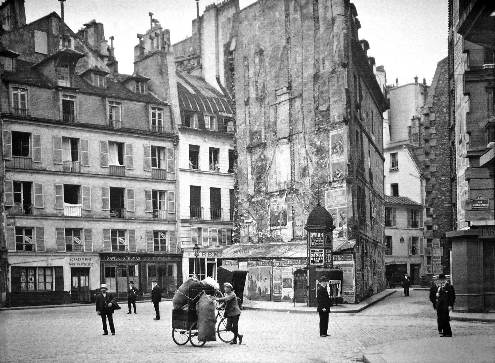
Without the colour, we are left with a somewhat drab and gloomy scene, befitting the somber mood associated with the early years of the early 20th century. In the B&W we cannot see the colour of the posters festooning the buildings. What is interesting is that we are likely not use to seeing colour photographs from before the 1950s. It’s almost like we expect images from the before 1950 to be monochromatic, maybe because we perceive these years filled with hardship and suffering. But there is something unique about the monochrome domain. 

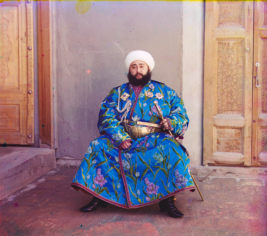
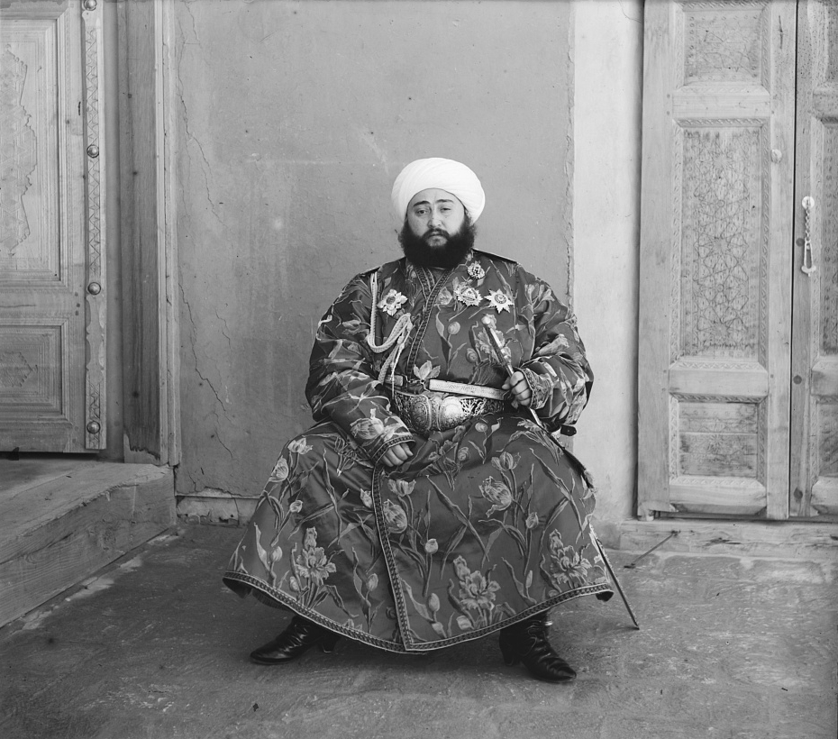
The aesthetic of black-and-white photographs is based on many factors, including lighting, any colour filters that were used during acquisition of the photograph, and the colour sensitivity of the B&W film. Sergei Mikhailovich Prokudin-Gorskii (1863-1944) was a man well ahead of his time. He developed an early technique for taking colour photographs involving a series of monochrome photographs and colour (R-G-B) filters. The images below show an example of Alim Khan, Emir of Bukhara. It is shown in comparison with two grayscale renditions of the photograph. The first is the lightness component from the Lab colour space, and the second is a grayscale image extracted from RGB using G=0.299R+0.587G+0.114B. Both offer a different perspective of how the colour in the image could be rendered by the camera. None present the vibrance of the image in the same way as the colour image.

The facts about camera aspect ratio

Digital cameras usually come with the ability to change the aspect ratio of the image being captured. The aspect ratio has a little to do with the size of the image, but more to do with its shape. The aspect ratio describes the relationship between an image’s width (W) and height (H), and is generally expressed as a ratio W:H (the width always comes first). For example a 24MP sensor with 6000×4000 pixels has an aspect ratio of 3:2.

Choosing a different sized aspect ratio will change the shape of the image, and the number of pixels stored in it. When using a different aspect ratio, the image is effectively cropped with the pixels outside the frame of the aspect ratio thrown away. 

The core forms of aspect ratios.

The four most common examples of aspect ratios are:

  • 4:3
    • Used when photos to be printed are 5×7″, or 8×10″.
    • Quite good for landscape photographs.
    • The standard ratio for MFT sensor cameras.
  • 3:2
    • The closest to the Golden Ratio of 1.618:1, which makes things appear aesthetically pleasing.
    • Corresponds to 4×6″ printed photographs.
    • The default ratio for 35mm cameras, and many digital cameras, e.g FF, APS-C sensors.
  • 16:9
    • Commonly used for panarama’s, or cinematographic purposes.
    • The most common ratio for video formats, e.g. 1920×1080
    • The standard aspect ratio of HDTV and cinema screens.
  • 1:1
    • Used for capturing square images, and to simplify scenes.
    • The standard ratio for many medium-format cameras.
    • Commonly used in social media, e.g. Instagram.

How an aspect ratio appears on a sensor is dependent on the sensors default aspect ratio.

Aspect ratios visualized on different sensors.

Analog 35mm cameras rarely had the ability to change the aspect ratio. One exception to the rule is the Konica Auto-Reflex, a 35mm camera with the ability to switch between full and half-frame (18×24mm) in the middle of a roll of film. It achieved this by moving a set of blinds in to change the size of the exposed area of the film plane to half-frame.

PPI and the problem with Retina displays

I have always had Macs of one form or another. All have the ubiquitous Retina display. In earlier Macs, you could easily change the resolution to whatever was required, but the Retina displays are somewhat bewildering when it comes to their resolution. A 13.3″ display has a resolution of 2560×1600 pixels at 227ppi, but it isn’t actually possible to obtain that sort of resolution using the system control on the Mac, i.e. there is no 1:1 correspondence between image pixel and screen pixel. The best they can do is “Scaled” resolution which provides one of four options:

  • 1024 × 640 = ×2.5
  • 1280 × 800 = ×2
  • 1440 × 900 (default) ×1.77
  • 1680 × 1050 = ×1.52

Why? Because the Retina display uses pixel-scaling, so the display at the setting of 1280 × 800 is scaled at 2 times the actual resolution, giving a “high-resolution” of 2560 × 1600 pixels. So every pixel is doubled to four times the detail. So a 280 × 280 pixel image displayed using the default setting is scaled 1.77 times, which means it displays as 496 pixels, which at 227ppi, means it is 2.1875 odd inches on the screen.

Pixels shown on a standard versus Retina display (at 2× scaling)

How to fix it? Use one of the 3rd party utilities like EasyRes. It installs in the top menu, and you can easily convert between screen settings… although the negative is that at 2560×1600 pixels, things other than images appear *very* small.

FOV and AOV

Photography, like many fields is full of acronyms, and sometimes two terms seem to merge into one, when the reality is not the case. DPI, and PPI for instance. Another is FOV and AOV, representing Field-Of-View, and Angle-Of-View respectively. Is there a difference between the two, or can the terms be used interchangeably? As the name suggests, AOV relates to angles, and FOV measures linear distance. But look across the net and you will find a hodge-podge of different uses of both terms. So let’s clarify the two terms.

Angle-of-View

The Angle-of-view (AOV) of a lens describes the angular coverage of a scene. It can be specified as a horizontal, vertical, or diagonal AOV. For example, a 50mm lens on a 35mm film camera would have a horizontal AOV of 39.6°, a vertical AOV of 27°, and a diagonal AOV of 46.8°. It can be calculated using the following formula (calculated in degrees):

      AOV = 2 × arctan(SD / (2×FL)) × (180 / π)°

Here SD represents the dimension of the sensor (or film) in the direction being measured, and FL is the focal length of the lens. For example a full-frame sensor will have a horizontal dimension that is 36mm, so SD=36. A visual depiction of a horizontal AOV is shown in Figure 1.

Fig.1: A horizontal AOV

A short focal length will hence produce a wide angle of view. Consider the Fuji XF 23mm F1.4 R lens. The specs give it an AOV of 63.4°, if used on a Fuji camera with an APS-C sensor (23.6×15.6mm). Using this information the equation works well, but you have to be somewhat careful because manufacturers often specify AOV for the diagonal, as is the case for the lens above. The horizontal AOV is 54.3°.

Field-of-View

The Field-of-view (FOV) is a measurement of the field dimension a lens will cover at a certain distance from the lens. The FOV can be described in terms of horizontal, vertical or diagonal dimensions. A visual depiction of a horizontal FOV is shown in Figure 2.

Fig.2: A horizontal FOV

To calculate it requires the AOV and the distance to the subject/object. It can be calculated with this equation:

      FOV = 2 ( tan(AOV/2) × D )°

Here D is the distance from the object to the lens. Using this to calculate the horizontal FOV for an object 100ft from the camera, using the AOV as 0.9477138 radians (54.3°). The FOV=102 feet. It does not matter if the value of D is feet or metres, as the result will be in the same units. There is another formula to use, without the need for calculating the AOV.

      FOV = (SD × D)/FL

For the same calculation (horizontal FOV) using SD=23.6, FL=23mm, D=100ft, the value calculated is 102ft.

Shorter focal lengths will have a higher FOV than longer focal lengths, hence the reason why wide-angle lenses have such as broad FOV, and telephoto lens have a narrow FOV. A visual depiction of a the effect of differing focal lengths is shown in Figure 3.

Fig.3: FOV changes with focal length

FOV also changes with sensor size, as the dimension of the sensor, SD, changes. A visual depiction of the effect of differing sensor sizes on FOV is shown in Figure 4. Here two different sized sensors use lenses with differing focal lengths to achieve the same FOV.

Fig.4: FOV changes with sensor size

AOV versus FOV

The AOV remains constant for a given sensor and lens, whereas the FOV varies with the distance to the subject being photographed.

Quite a good AOV/FOV visualizer can be found here.

PPI vs. DPI: what is the difference?

Image resolution for devices is commonly expressed in one of two forms: PPI or DPI. Two terms that are both similar and different. Both relate to pixel density in different mediums, and although many use them interchangeably, there are differences between the two. Neither one has any direct relation to the content of an image, because regardless of how it is acquired, images are made of pixels, which are dimensionless. Both relate to how an image is either viewed on screen, or printed.

PPI

PPI stands for pixels-per-inch, and is the pixel density associated with digital devices typically used to view images. PPI only becomes useful when an image is brought into the real world, for example displaying it on a screen. It refers to the number of pixels that a device (e.g. screen) can display within one inch of space. For example the iMac Pro has 5120×2880 pixels in its display, and its pixel density is 218ppi. The 6.1″ iPhone 12 has a 2532×1170 display with 460ppi. The higher the value for PPI, the greater the pixel density, and the smaller the size of the pixels. Images shown on devices with higher dpi often appear sharper than those displayed on low resolution devices. However this is also dependent on your distance to the device, and the how good your eyes are. The examples in Fig.1 show examples of various pixel densities.

Fig.1: Various pixel densities

To illustrate how PPI of a device affects the display of an image, consider the example shown in Fig.2. A 280×280 image has been shown simulated on four devices with differing values of PPI: 210, 280, 140, and 70. Higher pixel densities makes the image look sharper – for example at 280ppi, the entire image fits into the 1″×1″ region on the screen. At 70ppi it takes 4″×4″=16in2 to display the same image, which means a much lower resolution where parts of the image may start to look “blocky” and edges appear jagged.

Fig.2: An example of a 280×280 image shown on devices with differing PPI.

Different sized devices, can have the same resolution, but differing pixel densities. For example consider a series of televisions with 55″, 60″, and 65″ displays. The display resolution for each of these TV’s is the same, at 3840×2160 pixels. The 55″ TV will have 80ppi, the 60″ 73ppi, and the 65″ 68ppi. All have differing PPI because although the number of pixels is the same, the size of the pixels on each device is slightly different. To determine the size of an image on a particular screen, take the dimensions of the image and divide those values by the resolution of the screen. For example, an image that is 3000×2000 pixels in size shown on a device that has a resolution of 218ppi will display as 3000/218=13.76″ wide, and 2000/218=9.17″ high.

DPI

DPI implies dots-per-inch, and refers to the resolution value of a physical printing (or scanning) device. Printers reproduce an image by spraying out tiny dots, and the number of dots per inch affects the amount of detail and overall quality of a print. Figure 3 shows the 280×280 image printed out on three devices, one with 280dpi, one with 560dpi, and a third with 140dpi. The lower DPI results in a larger, if somewhat coarser, image. In all cases, the ratio of dot to pixel is 1:1, it’s just the size of the dots that changes. In the first case, 280dpi means that each dot is 1/280″ in size, and the image is printed in an area of 1″×1″. In the second case, the size of each dot is 1/560″, so the image printed in a space of ½”×½”. In the final case, the size of each dot is 1/140″, so the image printed in an area of 2″×2″.

Fig.3: The effect of DPI on printing.

The trick with DPI is how many dots can be packed into an inch? An inkjet printer can produce a resolution of between 720-2880dpi, whereas a laser printer produced images between 600-2400dpi. Theoretically the more dots, the crisper the image, but 300 DPI is already packing 90,000 dots on colour in a square inch, so how much better 1200dpi is, is likely debatable.

Sometimes, the metadata for an image will include the DPI, e.g. DPI=72. This makes no difference to the how an image is viewed on a screen, nor does it impact the size of the image file. Three different copies of the same file can have DPI values of 72, 150, and 300. All three will have the same number of pixels, and the same file size. Only when they are printed out will they appear as different sizes.

DPI and scanning

DPI also relates to scanning. The larger the DPI set on a scan, the more detail the image will contain, however there are limits with respect to the quality of the scanner, and the quality of the image. For example, a 5″×7″ photographed scanned at 150dpi will result in an image of size 750×1050 pixels in size, whereas if it were scanned at 300dpi, the resulting image would be 1500×2100 pixels.

What about LPI?

There is of course a third measure, LPI, or lines-per-inch, which is used in offset printing. This is used to measure resolution in images that are converted into a pattern of dots – halftones. Standard newspapers are printed at 85lpi, and offset-presses are 130-150lpi.

The 72dpi Myth

There is still a lot of talk about the magical 72dpi. This harkens back to the time decades ago when computer screens commonly had 72ppi (the Macintosh 128K had a 512×342 pixel display), as opposed to the denser screens we have now. This had to do with Apple’s attempt to match the size of the text on the screen to the size when it is printed, known as WYSIWYG (What-You-See-Is-What-You-Get). Apple basically matching the 128K to their dot matrix printer, the “ImageWriter”.

Dots and printers

There are different types of printers where dots are perceived a little differently. For example a colour inkjet printer can only create droplets of a few different colours for each dot, so small dots are combined to simulate continuous colour. Modern inkjet printers have high resolutions like 2400×1200, or 2880×1440. A dye-sublimation colour printer on the other hand produce continuous tone colour, meaning that every “dot” in an image can be an arbitrary colour (although there aren’t really any dots). Dye-sub printers normally have a resolution of between 300-500dpi. Many inkjet printers have resolutions like 2880×1440dpi, however this usually describes how many droplets of ink are placed in the 1in2 area, considering many are overlaid to create various colours.

The problem with image processing

I have done image processing in one form or another for over 30 years. What I have learnt may only come with experience, but maybe it is an artifact of growing up in the pre-digial age, or having interests outside computer science that are more of an aesthetic nature. Image processing started out being about enhancing pictures, and extracting information in an automated manner from them. It evolved primarily in the fields of aerial and aerospace photography, and medical imaging, before there was any real notion that digital cameras would become ubiquitous items. 

The problem is as the field evolved, people started to forget about the context of what they were doing, and focused solely on the pixels. Image processing became about mathematical algorithms. It is like a view of painting that focuses just on the paint, or the brushstrokes, with little care about what they form (and having said that, those paintings do exist, but I would be hesitant to call them art). Over the past 20 years, algorithms have become increasingly complex, often to perform the same task that simple algorithms would perform. Now we see the emergence of AI-focused image enhancement algorithms, just because it is the latest trend. They supposedly fix things like underexposure, overexposure, low contrast, incorrect color balance and subjects that are out of focus. I would almost say we should just let the AI take the photo, still cameras are so automated it seems silly to think you would need any of these “fixes”. 

There are now so many publications on subjects like image sharpening, that it is truly hard to see the relevance of many of them. If you spend long enough in the field, you realize that the simplest methods like unsharp masking still work quite well on most photographs. All the fancy techniques do little to produce a more aesthetically pleasing image. Why? Because the aesthetics of something like “how sharp an image is”, is extremely subjective. Also, as imaging systems gain more resolution, and lenses become more “perfect”, more detail is present, actually reducing the need for sharpening. There is also the specificity of some of these algorithms, i.e. there are few inherently generic image processing algorithms. Try to find an algorithm that will accurately segment ten different images?

Part of the struggle is that few have stopped to think about what they are processing. They don’t consider the relevance of the content of a picture. Some pictures contain blur that is intrinsic to the context of the picture. Others create algorithms to reproduce effects which are really only relevant to creation through physical optical systems, e.g. bokeh. Fewer still do testing of any great relevance. There are people who publish work which is still tested in some capacity using Lena, an image digitized in 1973. It is hard to take such work seriously. 

Many people doing image processing don’t understand the relevance of optics, or film. Or for that matter even understand the mechanics of how pictures are taken, in an analog or digital realm. They just see pixels and algorithms. To truly understand concepts like blur and sharpness, one has to understand where they come from and where they fit in the world of photography.

Image resolution and human perception

Sometimes we view a poster or picture from afar and are amazed at the level of detail, or the crispness of the features, yet viewed from up close this just isn’t the case. Is this a trick of the eye? It has to do with the resolving power of the eye.

Images, whether they are analog photographs, digital prints, or paintings, can contain many different things. There are geometric patterns, shapes, colours – everything needed in order to perceive the contents of the image (or in the case of some abstract art, not perceive it). Now as we have mentioned before, the sharpest resolution in the human eye occurs in the fovea, which represents about 1% of the eyes visual field – not exactly a lot. The rest of the visual field until the peripheral vision has progressively less ability to discern sharpness. Of course the human visual system does form a picture, because the brain is able to use visual memory to form a mental model of the world as you move around.

Fig.1: A photograph of a photograph stitched together (photographed at The Rooms, St.John’s, NFLD). .

Image resolution plays a role in our perception of images. The human eye is only able to resolve a certain amount of resolution based on viewing distance. There is actually an equation used to calculate this: 2/(0.000291×distance(inches)). A normal human eye (i.e. 20-20 vision) can distinguish patterns of alternating black and white lines with a feature size as small as one minute of an arc, i.e. 1/60 degree or π/(60*180) = 0.000291 radians.

So if a poster were viewed from a distance of 6 feet, the resolution capable of being resolved by the eye is 95 PPI. That’s why the poster in Fig.1, comprised of various separate photographs stitched together (digitally) to form a large image, appears crisp from that distance. It could be printed at 100 DPI, and still look good from that distance. Up close though it is a different story, as many of the edge features are quiet soft, and lack the sharpness expected from the “distant” viewing. The reality it that the poster could be printed at 300 DPI, but viewed from the same distance of 6 feet, it is unlikely the human eye could discern any more detail. It would only be useful if the viewer comes closer, however coming closer then means you may not be able to view the entire scene. Billboards offer another a good example. Billboards are viewed from anywhere from 500-2500 feet away. At 573ft, the human eye can discern 1.0 PPI, at 2500ft it would be 0.23 PPI (it would take 16 in2 to represent 1 pixel). So the images used for billboards don’t need to have a very high resolution.

Fig.2: Blurry details up close

Human perception is then linked to the resolving power of the eye. Resolving power is the ability of the eye to distinguish between very small objects that are very close together. To illustrate this further, consider the images shown in Fig.3. They have been extracted from a digital scan of a vintage brochure taken at various enlargement scales. When viewing the brochure it is impossible to see the dots associated with the printing process, because they are too small to discern (and that’s the point). The original, viewed on the screen is shown in Fig.3D. Even in Fig.3C it is challenging to see the dot pattern that makes up the print. In both Fig.3A and 3B, the dot pattern can be identified. It is no different with any picture. But looking at the picture close up, the perception of the picture is one of blocky, dot matrix, not the continuous image which exists when viewed from afar.

Fig.3: Resolving detail

Note that this is an exaggerated example, as the human eye does not have the discerning power to view the dots of the printing process without assistance. If the image were blown up to poster size however, a viewer would be able to discern the printing pattern. Many vintage photographs, such as the vacation pictures sold in 10-12 photo sets work on the same principle. When provided as a 9cm×6cm black-and-white photograph, they seem to show good detail when viewed from 16-24 inches away. However when viewed through a magnifying glass, or enlarged post-digitization, they lack the same sharpness as viewed from afar.

Note that 20-20 vision is based on the 20ft distance from the patient to the acuity chart when taking an eye exam. Outside of North America, the distance is normally 6 metres, and so 20-20 = 6-6.

Making a simple panorama

Sometimes you want to take a photograph of something, like close-up, but the whole scene won’t fit into one photo, and you don’t have a fisheye lens on you. So what to do? Enter the panorama. Now many cameras provide some level of built-in panorama generation. Some will guide you through the process of taking a sequence of photographs that can be stitched into a panorama, off-camera, and others provide panoramic stitching in-situ (I would avoid doing this as it eats battery life). Or you can can take a bunch of photographs of a scene and use a image stitching application such as AutoStitch, or Hugin. For simplicities sake, let’s generate a simple panorama using AutoStitch.

In Oslo, I took a three pictures of a building because obtaining a single photo was not possible.

The three individual images

This is a very simple panorama, with feature points easy to find because of all the features on the buildings. Here is the result:

The panorama built using AutoStitch

It’s not perfect, from the perspective of having some barrel distortion, but this could be removed. In fact the AutoStitch does an exceptional job, without having to set 1001 parameters. There are no visible seams, and the photograph seems like it was taken with a fisheye lens. Here is a second example, composed of three photographs taken on the hillside next to Voss, Norway. This panorama has been cropped.

A stitched scene with moving objects.

This scene is more problematic, largely because of the fluid nature of some of the objects. There are some things that just aren’t possible to fix in software. The most problematic object is the tree in the centre of the picture. Because tree branches move with the slightest breeze, it is hard to register the leaves between two consecutive shots. In the enlarged segment below, you can see the ghosting effect of the leaves, which almost gives that region in the resulting panorama a blurry effect. So panorama’s containing natural objects that move are more challenging.

Ghosting of leaves.

Image sharpening – image content and filter types

Using a sharpening filter is really contingent upon the content of an image. Increasing the size of a filter may have some impact, but it may also have no perceptible impact – what-so-ever. Consider the following photograph of the front of a homewares store taken in Oslo.

A storefront in Oslo with a cool font

The image (which is 1500×2000 pixels – down sampled from a 12MP image) contains a lot of fine details, from the stores signage, to small objects in the window, text throughout the image, and even the lines on the pavement. So sharpening would have an impact on the visual acuity of this image. Here is the image sharpened using the “Unsharp Mask” filter in ImageJ (radius=10, mask-weight=0.3). You can see the image has been sharpened, as much by the increase in contrast than anything else.

Image sharpened with Unsharp masking radius=10, mask-weight=0.3

Here is a close-up of two regions, showing how increasing the sharpness has effectively increased the contrast.

Pre-filtering (left) vs. post-sharpening (right)

Now consider an image of a landscape (also from a trip to Norway). Landscape photographs tend to lack the same type of detail found in urban photographs, so sharpening will have a different effect on these types of image. The impact of sharpening will be reduced in most of the image, and will really only manifest itself in the very thin linear structures, such as the trees.

Sharpening tends to work best on features of interest with existing contrast between the feature and its surrounding area. Features that are too thin can sometimes become distorted. Indeed sometimes large photographs do not need any sharpening, because the human eye has the ability to interpret the details in the photograph, and increasing sharpness may just distort that. Again this is one of the reasons image processing relies heavily on aesthetic appeal. Here is the image sharpened using the same parameters as the previous example:

Image sharpened with Unsharp masking radius=10, mask-weight=0.3

There is a small change in contrast, most noticeable in the linear structures, such as the birch trees.  Again the filter uses contrast to improve acuity (Note that if the filter were small, say with a radius of 3 pixels, the result would be minimal). Here is a close-up of two regions.

Pre-filtering (left) vs. post-sharpening (right)

Note that the type of filter also impacts the quality of the sharpening. Compare the above results with those of the ImageJ “Sharpen” filter, which uses a kernel of the form:

ImageJ “Sharpen” filter

Notice that the “Sharpen” filter produces more detail, but at the expense of possibly overshooting some regions in the image, and making the image appear grainy. There is such as thing as too much sharpening.

Original vs. ImageJ “Unsharp Masking” filter vs. ImageJ “Sharpen” filter

So in conclusion, the aesthetic appeal of an image which has been sharpened is a combination of the type of filter used, the strength/size of the filter, and the content of the image.

Image sharpening in colour – how to avoid colour shifts

It is unavoidable – processing colour images using some types of algorithms may cause subtle changes in the colour of an image which affect its aesthetic value. We have seen this in certain forms of the unsharp masking parameters used in ImageJ. How do we avoid this? One way is to create a more complicated algorithm, but the reality is that without knowing exactly how a pixel contributes to an object that’s basically impossible. Another way, which is way more convenient is to use a separable colour space. RGB is not separable – the red, green and blue components must work together to form an image. Modify one of these components, and it will have an affect on the rest of them. However if we use a colour space such as HSV (Hue-Saturation-Value), HSB (Hue-Saturation-Brightness) or CIELab, we can avoid colour shifts altogether. This is because these colour spaces separate luminance from colour information, therefore image sharpening can be performed on the luminance layer only – something known as luminance sharpening.

Luminance,  brightness, or intensity can be thought of as the “structural” information in the image. For example first we convert an image from RGB to HSB, then process only the brightness layer of the HSB image. Then convert back to RGB. For example, below are two original regions extracted from an image, both containing differing levels of blur.

Original “blurry” image

Here is the RGB processed image (UM, radius=10, mask weight=0.5):

Sharpened using RGB colour space

Note the subtle changes in colour in the region surrounding the letters? Almost a halo-type effect. This sort of colour shift should be avoided. Now below is the HSB processed image using the same parameters applied to only the brightness layer:

Sharpened using the Brightness layer of HSB colour space

Notice that there are acuity improvements in both images, however it is more apparent in the right half, “rent K”. The black objects in the left half, have had their contrast improved, i.e. the black got blacker against the yellow background, and hence their acuity has been marginally enhanced. Neither suffers from colour shifts.