The basics of the X-Trans sensor filter

Many digital cameras use the Bayer filter as a means of capturing colour information at the photosite level. Bayer filters have colour filters which repeat in 2×2 pattern. Some companies, like Fuji use a different type of filter, in Fuji’s case the X-Trans filter. The X-Trans filter appeared in 2012 with the debut of the Fuji X-Pro1.

The problem with regularly repeating patterns of coloured pixels is that they can result in moiré patterns when the photograph contains fine details. This is normally avoided by adding an optical low-pass filter in front of the sensor. This has the affect of applying a controlled blur on the image, so sharp edges and abrupt colour changes and tonal transitions won’t cause problems. This process makes the moiré patterns disappear, but at the expense of some image sharpness. In many modern cameras the sensor resolution often outstrips the resolving power of lenses, so the lens itself acts as a low-pass filter, and so the LP filter has been dispensed with.

Bayer (left) versus X-Trans colour filter arrays

C-Trans uses a more complex array of colour filters. Rather than the 2×2 RGBG Bayer pattern, the X-Trans colour filter uses a larger 6×6 array, comprised of differing 3×3 patterns. Each pattern has 55% green, 22.5% blue and 22.5% red light sensitive photosite elements. The main reason for this pattern was to eliminate the need for a low-pass filter, because this patterning reduces moiré. This theoretically strikes a balance between the presence of moiré patterns, and image sharpness.

The X-Trans filter provides a for better colour production, boosts sharpness, and reduces colour noise at high ISO. On the other hand, more processing power is needed to process the images. Some people say it even has a more pleasing “film-like” grain.

CharacteristicX-TransBayer
Pattern6×6 allows for more organic colour reproduction.2×2 results in more false-colour artifacts.
MoiréPattern makes images less susceptible to moiré.Bayer filters contribute to moiré.
Optical filterNo low-pass filer = higher resolution.Low-pass filter compromises image sharpness.
ProcessingMore complex to process.Less complex to process.
Pros and Cons between X-Trans and Bayer filters.

Further reading:

Spectre – Does it work?

Over a year ago I installed Spectre (for IOS). The thought of having a piece of software that could remove moving objects from photographs seemed like a real cool idea. It is essentially a long-exposure app which uses multiple images to create two forms of effects: (i) an image sans moving objects, and (ii) images with light (or movement) trails. It is touted as using AI and computational photography to produce these long exposures. The machine learning algorithms provide the scene recognition, exposure compensation, and “AI stabilization”, supposedly allowing for up to a 9-second handheld exposure without the need for a tripod.

It seems as though the effects are provided by means of a computational photography technique known as “image stacking“. Image stacking just involves taking multiple images, and post-processing the series to produce a single image. For removing objects, the images are averaged. The static features will be retained in the image, the moving features will be removed through the image averaging process – which is why a stable image is important. For the light trails it works similar to a long exposure on a digital camera, where moving objects in the image become blurred, which is usually achieved by superimposing the moving features from each frame on the starting frame.

Fig.1: The Spectre main screen.

The app is very easy to use. Below the viewing window are a series of basic controls: camera flip; camera stabilization, and settings. The stabilization control, when activated, provides a small visual feature that determines when the iPhone is STABLE. As Spectre can perform a maximum of 9 seconds worth of processing, stabilization is an important attribute. The length of exposure is controlled by a dial in the lower-right corner of the app – you can choose between 3, 5, and 9 seconds. The Settings really only allows the “images” to be saved as Live Photos. The button at the top-middle turns light trails to ON, OFF, or AUTO. The button in the top-right allows for exposure compensation, which can be adjusted using a slider. The viewing window can also be tapped to set the focus point for the shot.

Fig.2: The use of Spectre to create a motion trail (9 sec). The length of the train, and the slow speed it was moving at created slow-motion perception.

Using this app allows one of two types of processing. As mentioned, one of these modes is the creation of trails – during the day these are motion trails, and at night these are light trails. Motion trails are added by turning “light trails” to the “ON” position (Fig.4). The second mode, with “light trails” to the “OFF” position, basically removes moving objects from the scene (Fig.3)

Fig.3: Light trails off with moving objects removed.
Fig.4: Light trails on with motion trails shown during daylight.

It is a very simple app, for which I do congratulate the app designers. Too many photo-type app designers try and cram 1001 features into an app, often overwhelming the user.

Here are some caveats/suggestions:

  • Sometimes motion trails occur because the moving object is too long to fundamentally change the content of the image stack. A good example is a slow moving train – the train never leaves the scene, during a 9-second exposure, and hence gets averaged into a motion trail. This is an example of a long-exposure image, as aptly shown in Figure 2. It’s still cool from as aesthetics point-of-view.
  • Objects must move in and out of frame during the exposure time. So it’s not great for trying to remove people from tourist spots, because there may be too many of them, and they may not move quick enough.
  • Long exposures tend to suffer from camera shake. Although Spectre offers an indication of stability, it is best to rest the camera on at least one stable surface, otherwise there is a risk of subtle motion artifacts being introduced.
  • Objects moving too slowly might be blurred, and still leave some residual movement in a scene where moving objects are to be removed.

Does this app work? The answer is both yes and no. During the day the ideal situation for his app is a crowded scene, but the objects/people have to be moving at a good rate. Getting rid of parked cars, and slow people is not going to happen. Views from above are obviously ideal, or scenes where the objects to be removed are moving. For example, doing light trails of moving cars at night produces cool images, but only if they are taken from a vantage point – photos taken at the same level of the cars only results in producing a band of bright light.

It would actually be cool if they could extend this app to allow for times above nine seconds, specifically for removing people from crowded scenes. Or perhaps allowing the user to specify a frame count and delay. For example, 30 frames with a 3 second delay between each frame. It’s a fun app to play around with, and well worth the $2.99 (although how long it will be maintained is another question, the last update was 11 months ago).

Are-Bure-Boke aesthetic using the Provoke app

It is possible to experience the Are-Bure-Boke aesthetic in a very simple manner using the Provoke app. Developed by Toshihiko Tambo in collaboration with iPhoneography founder Glyn Evans, it was inspired by Japanese photographers of the late 1960’s like Daidō Moriyama, Takuma Nakahira and Yutaka Takanashi. This means it produces black and white images with the same gritty, grainy, blurry look reminiscent of the “Provoke” era of photography.

There isn’t much in the way of explanation on the app website, but it is fairly easy to use. There aren’t a lot of controls (the discussion below assumes the iPhone is held in landscape mode). The most obvious one is the huge red shutter release button. The button is obviously well proportioned in order to easily touch it, even though it does somewhat impede the use of the other option buttons. Two formats are provided: a square format 126 [1:1] and 35mm format 135 [3:2]. There is an exposure compensation setting which allows changes to be made up and down. The slider can be adjusted up to three stops in either direction: −3 to +3 in 1/3 steps. On the top-right is a button for the flash settings (Auto/On/Off). On the top-left there is a standard camera flip switch, and a preferences button which allows settings of Grid, TIFF, or GeoTag (all On/Off).

One of the things I dislike most about the app is related to its usability. Both the preferences and camera-flip buttons are very pale, making them hard to see in all but dark scenes when using 35mm format. The other thing I don’t particularly like is the inability to pull in a photograph from the camera roll. It is possible to access the camera roll to apply the B&W filters to photos on the camera roll, but the other functionality is restricted to live use. I do however like the fact that the app supports TIFF.

The original used to illustrate how the Provoke filters work (the “no filter” option).

The app provides nine B&W filters, or rather “films” as the app puts it. They are in reality just filters, as they don’t seem to coincide with any panchromatic films that I could find. The first three options offer differing levels of contrast.

  • HPAN High Contrast – a high contrast film with fine grain.
  • NPAN Normal – normal contrast
  • LPAN Low Contrast – low contrast

The next three are contrast + noise:

  • X800 – more High Contrast with more noise
  • I800 – IR like filter
  • Z800 – +2EV with more noise

The film types with “100” designators introduce blur and grain.

  • D100 – Darken with Blur (4Pixel)
  • H100 – High Contrast with Blur(4Pixel)
  • E100 : +1.5EV with Blur(4Pixel)

Examples of each of the filters are shown below. I have not adjusted any of the images for exposure compensation.

HPAN
X800
D100
NPAN
I800
H100
LPAN
Z800
E100

The Are-Bure-Boke aesthetic produces images which have characteristics of being grainy (Are), blurry (Bure) and out-of-focus (Boke). With the use of film cameras, these characteristics were intrinsic to the camera or film. The use of half-frame cameras allowed image grain to be magnified, low shutter speeds provide blur, and a fixed-focal length (providing a shallow DOF) provides out-of-focus. It is truly hard to replicate all these things in software. Contrast was likely added during the photo-printing stage.

What the app really lacks is the ability to specify a shutter-speed, meaning that Bure can not really be replicated. Blur is added by means of an algorithm, however is added across the whole image, simulating the entire camera panning across the scene using a low shutter speed, rather than capturing movement using a low-shutter speed (where some objects will not be blurred because they are stationary). It doesn’t seem like there is anything in the way of Boke, out-of-focus. Grain is again added by means of filter which adds noise. Whatever algorithm is used to replicate film grain also doesn’t work well, with uniform, high intensity regions showing little in the way of grain.

In addition Provoke also provides three colour modes, and a fourth no-filter option.

  • Nofilter
  • 100 Old Color
  • 100U Vivid and Sharp
  • 160N Soft
100
100U
160N

Honestly, I don’t know why these are here. Colour filters are a dime a dozen in just about every photo app… no need to crowd this app with them, although they are aesthetically pleasing. I rarely use anything except HPAN, and X800. Most of the other filters really don’t provide anything in the way of the contrast I am looking for, of course it depends on the particular scene. I like the app, I just don’t think it truly captures the point-and-shoot feel of the Provoke era.

The inherent difference between traditional Are-Bure-Boke vs the Provoke app is one is based on physical characteristics versus algorithms. The aesthetics of the photographs found in Provoke-era photographs is one of in-the-moment photography, capturing slices of time without much in the way of setting changes. That’s what sets cameras apart from apps. Rather than providing filters, it might have been better to provide a control for basic “grain”, the ability to set a shutter speed, and a third control for “out-of-focus”. Adding contrast could be achieved in post-processing with a single control.

More myths about travel photography

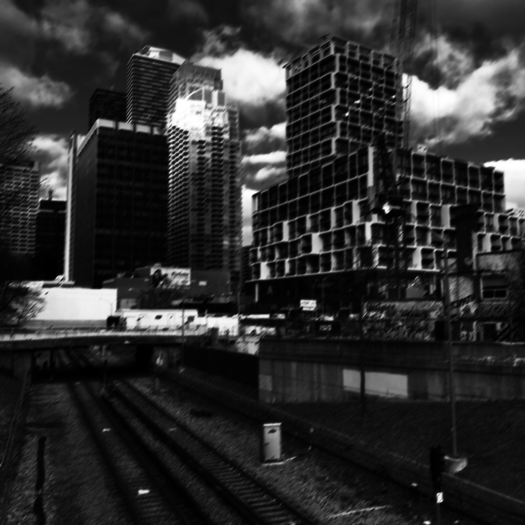
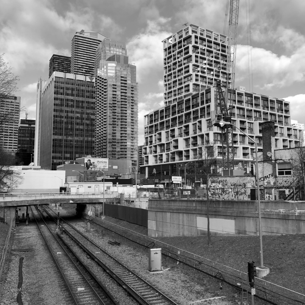
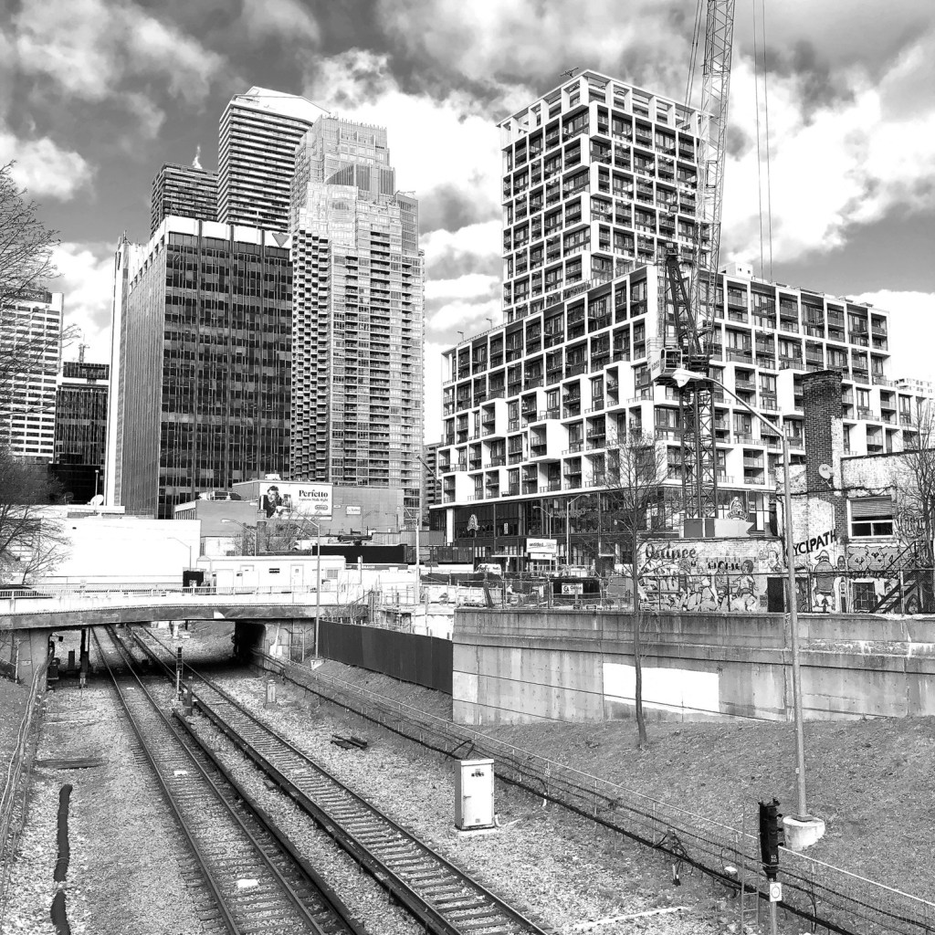
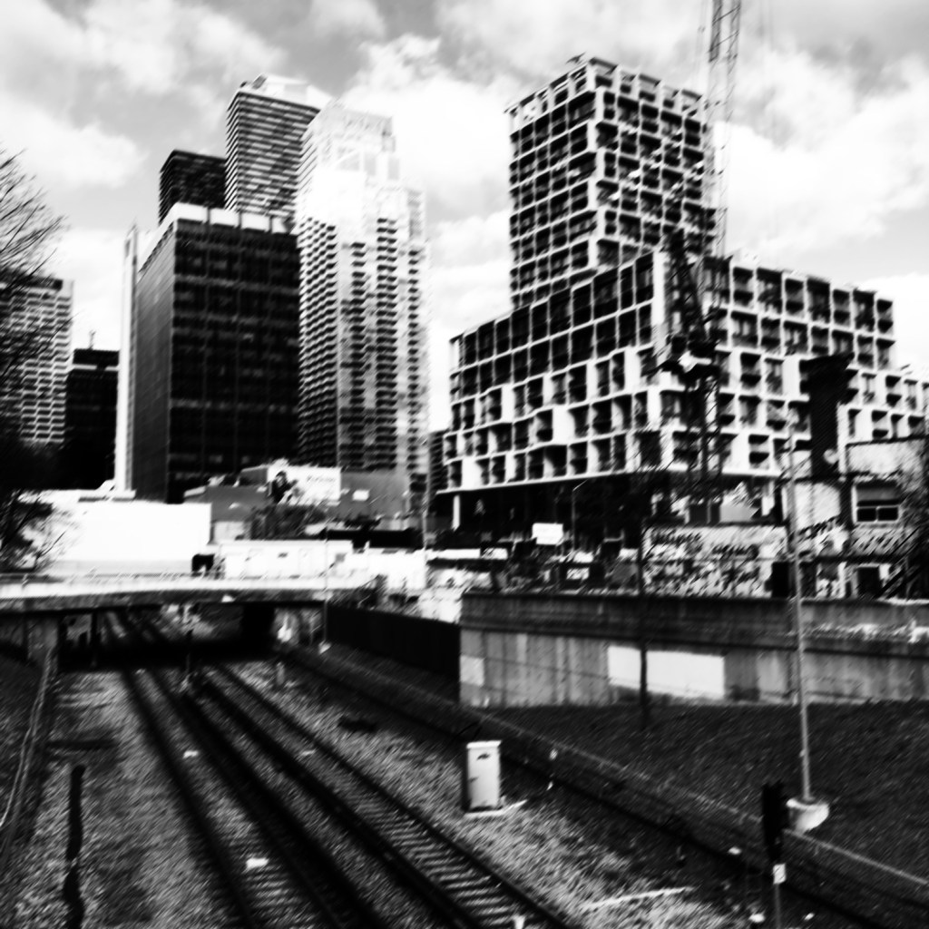
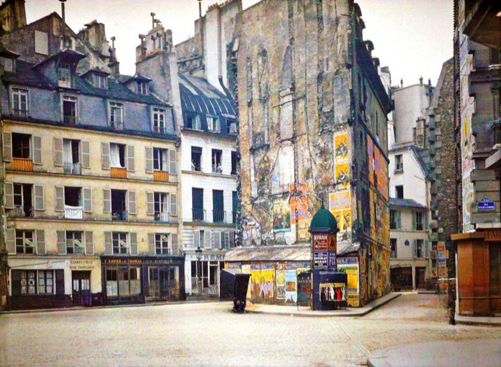
Below are some more myths associated with travel.

MYTH 13: Landscape photographs need good light.

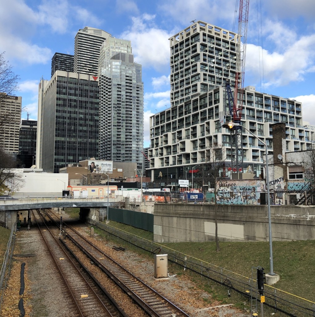
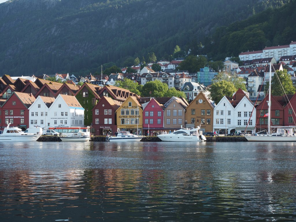
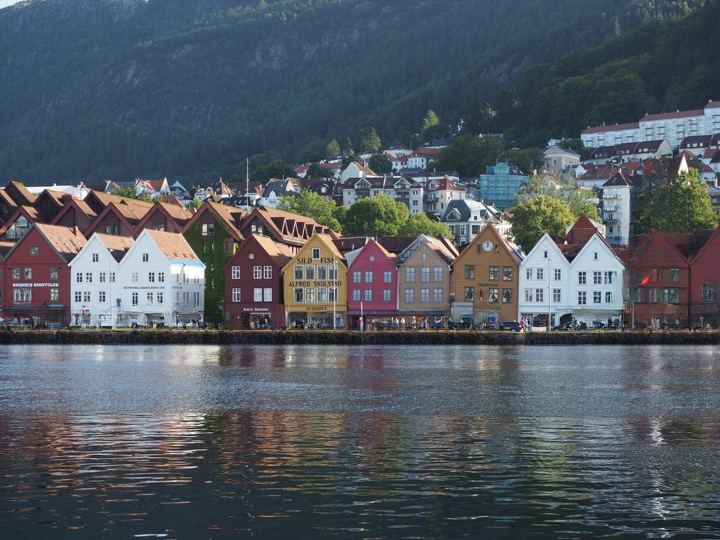
REALITY: In reality there is no such thing as bad light, or bad weather, unless it is pouring. You can never guarantee what the weather will be like anywhere, and if you are travelling to places like Scotland, Iceland, or Norway the weather can change on the flip of a coin. There can be a lot of drizzle, or fog. You have to learn to make the most the situation, exploiting any kind of light.

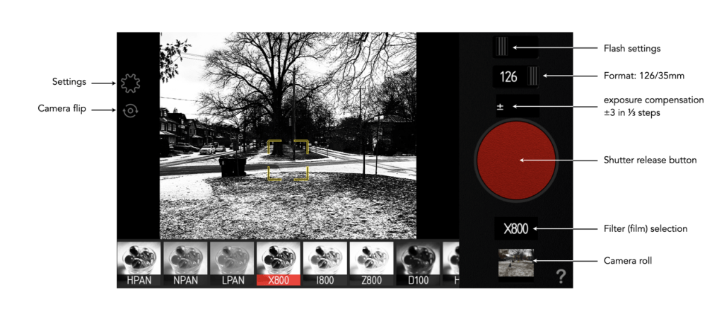
MYTH 14: Manual exposure produces the best images.

REALITY: Many photographers use aperture-priority, or the oft-lauded P-mode. If you think something will be over- or under-exposed, then use exposure-bracketing. Modern cameras have a lot of technology to deal with taking optimal photographs, so don’t feel bad about using it.

MYTH 15: The fancy camera features are cool.

REALITY: No, they aren’t. Sure, try the built-in filters. They may be fun for a bit, but filters can always be added later. If you want to add filters, try posting to Instagram. For example, high-resolution mode is somewhat fun to play with, but it will eat battery life.

MYTH 16: One camera is enough.

REALITY: I never travel with less than two cameras, a primary, and a secondary, smaller camera, one that fits inside a jacket pocket easily (in my case a Ricoh GR III). There are risks when you are somewhere on vacation and your main camera stops working for some reason. A backup is always great to have, both for breakdowns, lack of batteries, or just for shooting in places where you don’t want to drag a bigger camera along, or would prefer a more inconspicuous photographic experience, e.g. museums, art galleries.

MYTH 17: More megapixels are better.

REALITY: I think optimally, anything from 16-26 megapixels is good. You don’t need 50MP unless you are going to print large posters, and 12MP likely is not enough these days.

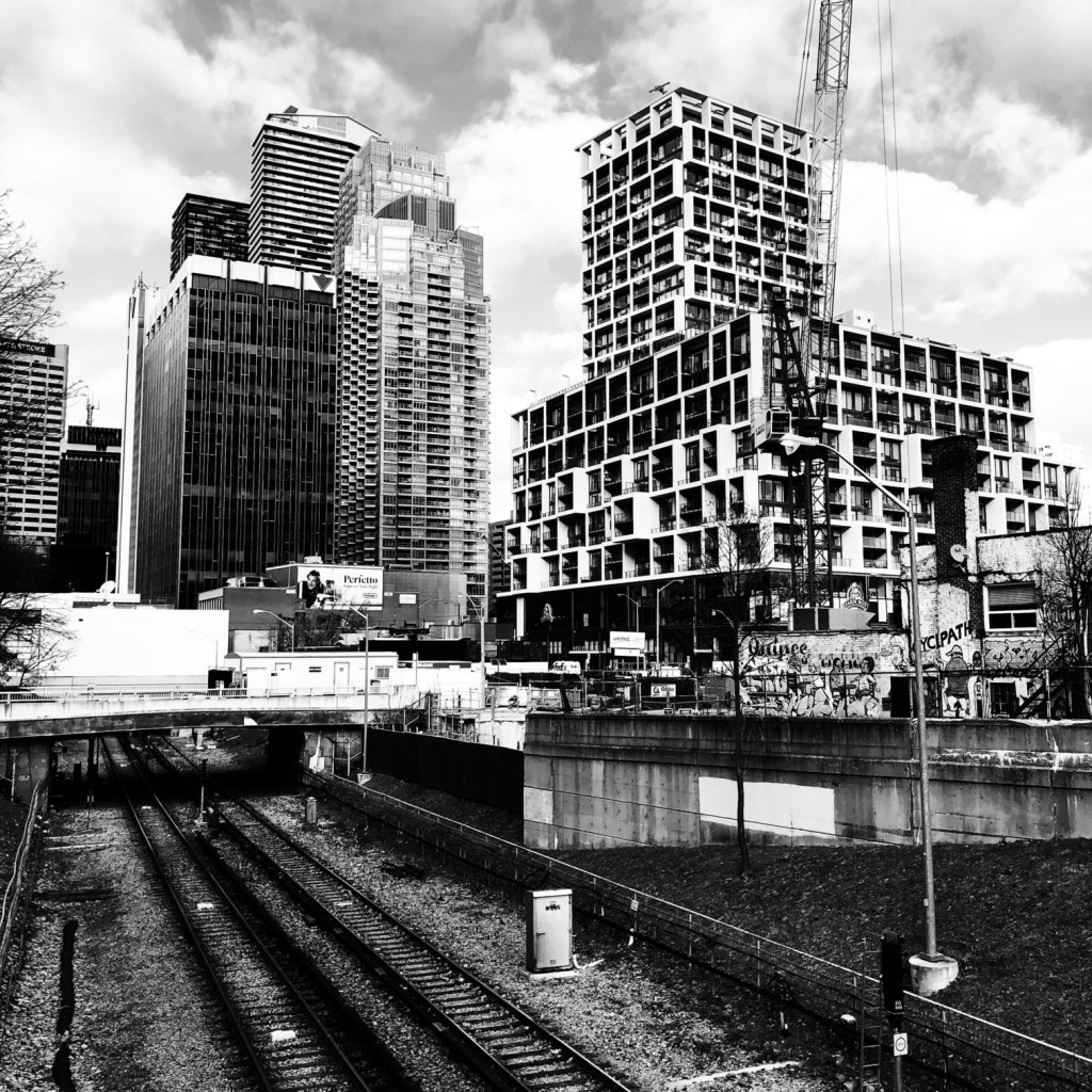
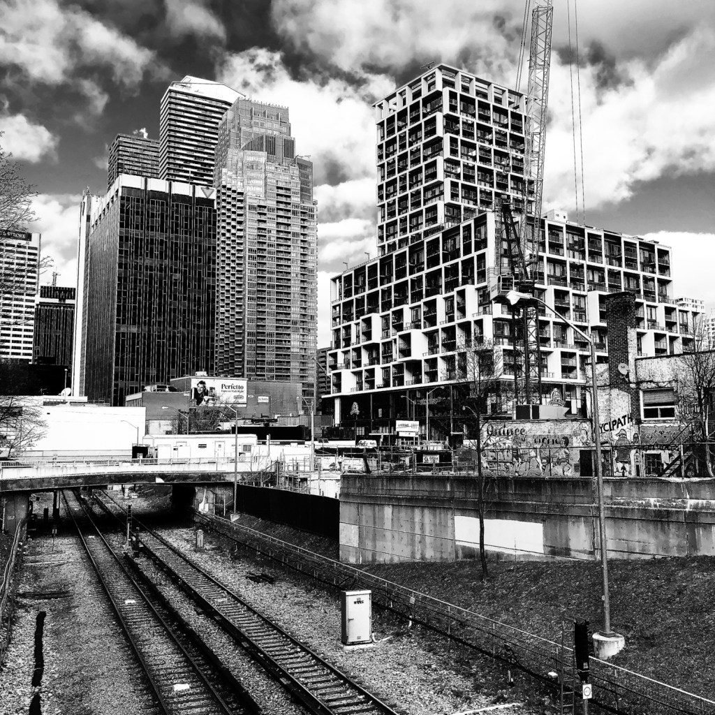
MYTH 18: Shooting in RAW is the best.

REALITY: Probably, but here’s the thing, for the amateur, do you want to spend a lot of time post-processing photos? Maybe not? Setting the camera to JPEG+RAW is the best of both worlds. There is the issue of JPEG editing being destructive and RAW not.

MYTH 19: Backpacks offer the best way of carrying equipment.

REALITY: This may be true getting equipment from A to B, but schlepping a backpack loaded with equipment around every day during the summer can be brutal. No matter the type, backpacks + hot weather = a sweaty back. They also make you stand out, just as much as a FF camera with a 300mm lens. Opt instead for a camera sling, such as one from Peak Design. It has a much lower form factor and with a non-FF camera offers enough space for the camera, an extra lens, and a few batteries and memory cards. I’m usually able to shove in the secondary camera as well. They make you seem much more incognito as well.

MYTH 20: Carrying a film-camera is cumbersome.

REALITY: Film has made a resurgence, and although I might not carry one of my Exakta cameras, I might throw a half-frame camera in my pack. On a 36-roll film, this gives me 72 shots. The film camera allows me to experiment a little, but not at the expense of missing a shot.

MYTH 21: Travel photos will be as good as those in photo books.

REALITY: Sadly not. You might be able to get some good shots, but the reality is those shots in coffee-table photo books, and on TV shows are done with much more time than the average person has on location, and with the use of specialized equipment like drones. You can get some awesome imagery with drones, especially for video, because they can get perspectives that a person on the ground just can’t. If you spend an hour at a place you will have to deal with the weather that exists – someone who spends 2-3 days can wait for optimal conditions.

MYTH 22: If you wait long enough, it will be less busy.

REALITY: Some places are always busy, especially so it if is a popular landmark. The reality is short of getting up at the crack of dawn, it may be impossible to get a perfect picture. A good example is Piazza San Marco in Venice… some people get a lucky shot in after a torrential downpour, or some similar event that clears the streets, but the best time is just after sunrise, otherwise it is swamped with tourists. Try taking pictures of lesser known things instead of waiting for the perfect moment.

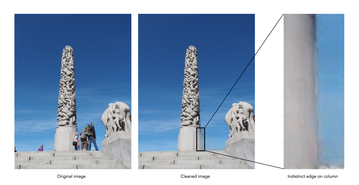
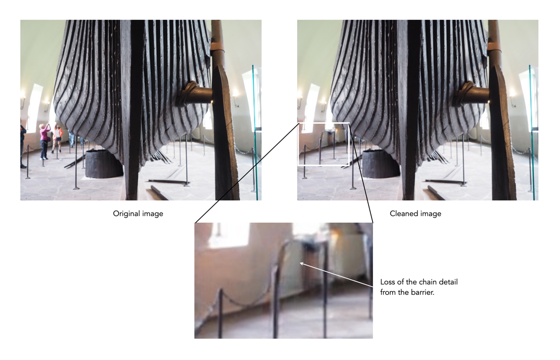
MYTH 23: Unwanted objects can be removed in post-processing.

REALITY: Sometimes popular places are full of tourists… like they are everywhere. In the past it was impossible to remove unwanted objects, you just had to come back at a quieter time. Now there are numerous forms of post-processing software like Cleanup-pictures that will remove things from a picture. A word of warning though, this type of software may not always work perfectly.

MYTH 24: Drones are great for photography.

REALITY: It’s true, drones make for some exceptional photographs, and video footage. You can actually produce aerial photos of scenes like the best professional photographers, from likely the best vantage points. However there are a number of caveats. Firstly, travel drones have to be a reasonable size to actually be lugged about from place to place. This may limit the size of the sensor in the camera, and also the size of the battery. Is the drone able to hover perfectly still? If not, you could end up with somewhat blurry images. Flight time on drones is usually 20-30 minutes, so extra batteries are a requirement for travel. The biggest caveat of course is where you can fly drones. For example in the UK, non-commercial drone use is permitted, however there are no-fly zones, and permission is needed to fly over World heritage sites such as Stonehenge. In Italy a license isn’t required, but drones can’t be used over beaches, towns or near airports.

A review of SKRWT – keystone correction for IOS

For a few years now, I have been using  SKRWT, an app that does perspective correction in IOS.

The goal was to have some way of quickly fixing issues with perspective, and distortions, in photographs. The most common form of this is the keystone effect (see previous post) which occurs when the image plane is not parallel to the lines that are required to be parallel in the photograph. This usually occurs when taking photographs of buildings where we tilt the camera backwards, in order to include the whole scene. The building appears to be “falling away” from the camera. Fig.1 shows a photograph of a church in Montreal. Notice, the skew as the building seems to tilt backwards.

The process of correcting distortions with SKRWT is easy. Pick an image, and then a series of options are provided in the icon bar below the imported picture. The option that best approximates the types of perspective distortion is selected, and a new window opens, with a grid overlaid upon the image. A slider below the image can be used to select the magnitude of the distortion correction, with the image transformed as the slider is moved. When the image looks geometrically corrected, pressing the tick stores the newly corrected image.

Using the SKRWT app, the perspective distortion can be fixed, but at a price. The problem is that correcting for the perspective distortion requires distorting the image, which means it will likely be larger than the original, and will need to be cropped (otherwise the image will contain black background regions).

Here is a third example, of Toronto’s flatiron building, with the building surrounded by enough “picture” to allow for corrective changes that don’t cut off any of the main object.

Overall the app is well designed and easy to use. In fact it will remove quite complex distortions, although there is some loss of content in the images processed. To use this, or any similar perspective correction software properly, you  really have to frame the building with enough background to allow for corrections – not so you are left with half a building.

The sad thing about this app is something that plagues a lot of apps – it has become a zombie app. The developer was suppose to release version 1.5 in December 2020, but alas nothing has appeared, and the website has had no updates. Zombie apps work while the system they are on works, but upgrade the phone, or OS, and there is every likelihood it will no longer work.

The photography of Daidō Moriyama

Daidō Moriyama was born in Ikeda, Osaka, Japan in 1938, and came to photography in the late 1950s. Moriyama studied photography under Takeji Iwamiya before moving to Tokyo in 1961 to work as an assistant to Eikoh Hosoe. In his early 20’s he bought a Canon 4SB and started photographing on the streets on Osaka. Moriyama was the quintessential street photographer focused on the snapshot. Moriyama likened snapshot photography to a cast net – “Your desire compels you to throw it out. You throw the net out, and snag whatever happens to come back – it’s like an ‘accidental moment’” [1]. Moriyama’s advice on street photography was literally “Get outside. It’s all about getting out and walking.” [1]

In the late 1960s Japan was characterized by street demonstrations protesting the Vietnam War and the continuing presence of the US in Japan. Moriyama joined a group of photographers, associated with the short-lived (3-issue) magazine Provoke (1968-69), which really dealt with elements of experimental photography. His most provocative work during the Provoke-era was the are-bure-boke style that illustrates a blazing immediacy. His photographic style is characterized by snapshots which are gritty, grainy black and white, out-of-focus, extreme contrast, Chiaroscuro (dark, harsh spotlighting, mysterious backgrounds). Moriyama is “drawn to black and white because monochrome has stronger elements of abstraction or symbolism, colour is something more vulgar…”.

“My approach is very simple — there is no artistry, I just shoot freely. For example, most of my snapshots I take from a moving car, or while running, without a finder, and in those instances I am taking the pictures more with my body than my eye… My photos are often out of focus, rough, streaky, warped etc. But if you think about I, a normal human being will in one day receive an infinite number of images, and some are focused upon, other are barely seen out of the corners of one’s eye.”

Moriyama is an interesting photographer, because he does not focus on the camera (or its make), instead shoots with anything, a camera is just a tool. He photographs mostly with compact cameras, because with street photography large cameras tend to make people feel uncomfortable. There were a number of cameras which followed the Canon 4SB, including a Nikon S2 with a 25/4, Rolleiflex, Minolta Autocord, Pentax Spotmatic, Minolta SR-2, Minolta SR-T 101 and Olympus Pen W. One of Moriyama’s favourite film camera’s was the Ricoh GR series, using a Ricoh GR1 with a fixed 28mm lens (which appeared in 1996) and sometimes a Ricoh GR21 for a wider field of view (21mm). Recently he was photographing with a Ricoh GR III.

“I’ve always said it doesn’t matter what kind of camera you’re using – a toy camera, a polaroid camera, or whatever – just as long as it does what a camera has to do. So what makes digital cameras any different?”

Yet Moriyama’s photos are made in the post-processing stage. He captures the snapshot on the street and then makes the photo in the darkroom (or in Silver Efex with digital). Post-processing usually involves pushing the blacks and whites, increasing contrast and adding grain. In his modern work it seems as though Moriyama photographs in colour, and converts to B&W in post-processing (see video below). It is no wonder that Moriyama is considered by some to be the godfather of street photography, saying himself that he is “addicted to cities“.

“[My] photos are often out of focus, rough, streaky, warped, etc. But if you think about it, a normal human being will in one day perceive an infinite number of images, and some of them are focused upon, others are barely seen out of the corner of one’s eye.”

For those interested, there are a number of short videos. The one below shows Moriyama in his studio and takes a walk around the atmospheric Shinjuku neighbourhood, his home from home in Tokyo. There is also a longer documentary called Daidō Moriyama: Near Equal, and one which showcases some of his photographs, Daido Moriyama – Godfather of Japanese Street Photography.

Artist Daido Moriyama – In Pictures | Tate (2012)

Further Reading:

Removing unwanted objects from pictures with Cleanup.pictures

Ever been on vacation somewhere, and wanted to take a picture of something, only to be thwarted by the hordes of tourists? Typically for me it’s buildings of architectural interest, or wide-angle photos in towns. It’s quite a common occurrence, especially in places where tourists tend to congregate. There aren’t many choices – if you can come back at a quieter time that may be the best approach, but often you are at a place for a limited time-frame. So what to do?

Use software to remove the offending objects, or people. Now this type of algorithm designed to remove objects from an image has been around for about 20 years, known in the early years as digital inpainting, akin to the conservation process where damaged, deteriorating, or missing parts of an artwork are filled in to present a complete image. In its early forms digital inpainting algorithms worked well in scenes where the object to be removed was surrounded by fairly uniform background, or pattern. In complex scenes they often didn’t fair so well. So what about the newer generation of these algorithms?

There are many different types of picture cleaning software, some stand-alone such as the AI-powered IOS app Inpaint, others in the form of features in photo processing software such as Photoshop. One new-comer to the scene is web-based, open-source, Cleanup.pictures. It is incredibly easy to use. Upload a picture, choose the size of the brush tool, paint over the unwanted object with the brush tool, and voila! a new image, sans the offending object. Then you can just download the “cleaned” image. So how well does it work? Below are some experiments.

The first image is a vintage photograph of Paris, removing all the people from the streets. The results are actually quite exceptional.

The second image is a photograph taken in Glasgow, where the people and passing car have been erased.

The third image is from a trip to Norway, specifically the harbour in Bergen. This area always seems to have both people and boats, so it is hard to take clear pictures of the historical buildings.

The final image is a photograph taken by Prokudin-Gorskii Collection at the Library of Congress. The image is derived from a series of glass plates, and suffers from some of the original glass plates being broken, with missing pieces of glass. The result of cleaning up the image, actually has done a better job than I could ever have imagined.

The AI used in this algorithm is really good at what it does, like *really good*, and it is easy to use. You just keep cleaning up unwanted things until you are happy with the result. The downsides? It isn’t exactly perfect all the time. In regions to be removed where there are fine details you want to retain, they are often removed. Sometimes areas become “soft” because they have to be “created” because they were obscured by objects before – especially prevalent in edge detail. Some examples are shown below:

Creation of detail during inpainting

Loss of fine detail during inpainting

It only produces low-res images, with a maximum width of 720 pixels. You can upgrade to the Pro version to increase resolution (2K width). It would be interesting to see this algorithm produce large scale cleaned images. There is also the issue of uploading personal photos to a website, although they do make the point of saying that images are discarded once processed.

For those interested in the technology behind the inpainting, it is based on an algorithm known as large mask inpainting, developed by a group at Samsung, and associates [1]. The code can be obtained directly from github for those who really want to play with things.

  1. Suvorov, R., et al. Resolution-robust Large Mask Inpainting with Fourier Convolutions (2022)

Demystifying Colour (viii) : CIE colour model

The Commission Internationale de l’Eclairage (French for International Commission on Illumination) , or CIE is an organization formed in 1913 to create international standards related to light and colour. In 1931, CIE introduced CIE1931, or CIEXYZ, a colorimetric colour space created in order to map out all the colours that can be perceived by the human eye. CIEXYZ was based on statistics derived from extensive measurements of human visual perception under controlled conditions.

In the 1920s, colour matching experiments were performed independently by physicists W. David Wright and John Guild, both in England [2]. The experiments were carried out with 7 (Guild) and 10 (Wright) people. Each experiment involved a subject looking through a hole which allowed for a 2° field of view. On one side was a reference colour projected by a light source, while on the other were three adjustable light sources (the primaries were set to R=700.0nm, G=546.1nm, and B=435.8nm.). The observer would then adjust the values of three primary lights until they can produce a colour indistinguishable from a reference light. This was repeated for every visible wavelength. The result of the colour-matching experiments was a table of RGB triplets for each wavelength. These experiments were not about describing colours with qualities like hue and saturation, but rather just attempt to explain how combinations of light appear to be the same colour to most people.

Fig.1: An example of the experimental setup of Guild/Wright

In 1931 CIE amalgamated Wright and Guild’s data and proposed two sets of of colour matching functions: CIE RGB and CIE XYZ. Based on the responses in the experiments, values were plotted to reflect how the average human eye senses the colours in the spectrum, producing three different curves of intensity for each light source to mix all colours of the colour spectrum (Figure 2), i.e. Some of the values for red were negative, and the CIE decided it would be more convenient to work in a colour space where the coefficients were always positive – the XYZ colour matching functions (Figure 3). The new matching functions had certain characteristics: (i) the new functions must always be greater than or equal to zero; (ii) the y function would describe only the luminosity, and (iii) the white-point is where x=y=z=1/3. This produced the CIE XYZ colour space, also known as CIE 1931.

Fig.2: CIE RGB colour matching functions

Fig.3: CIE XYZ colour matching functions

The CIE XYZ colour space defines a quantitative link between distributions of wavelengths in the electromagnetic visible spectrum, and physiologically perceived colours in human colour vision. The space is based on three fictional primary colours, X, Y, and Z, where the Y component corresponds to the luminance (as a measure of perceived brightness) of a colour. All the visible colours reside inside an open cone-shaped region, as shown in Figure 4. CIE XYZ is then a mathematical generalization of the colour portion of the HVS, which allows us to define colours.

Fig.4: CIE XYZ colour space (G denotes the axis of neutral gray).
Fig.5: RGB mapped to CIE XYZ space

The luminance in XYZ space increases along the Y axis, starting at 0, the black point (X=Y=Z=0). The colour hue is independent of the luminance, and hence independent of Y. CIE also defines a means of describing hues and saturation, by defining three normalized coordinates: x, y, and z (where x+y+z=1).

x = X / (X+Y+Z)
y = Y / (X+Y+Z)
z = Z / (X+Y+Z)
z = 1 - x - y

The x and y components can then be taken as the chromaticity coordinates, determining colours for a certain luminance. This system is called CIE xyY, because a colour value is defined by the chromaticity coordinates x and y in addition to the luminance coordinate Y. More on this in the next post on chromaticity diagrams.

The RGB colour space is related to XYZ space by a linear coordinate transformation. The RGB colour space is embedded in the XYZ space as a distorted cube (see Figure 5). RGB can be mapped onto XYZ using the following set of equations:

X = 0.41847R - 0.09169G - 0.0009209B
Y = -0.15866R + 0.25243G - 0.0025498B (luminance)
Z = -0.082835R + 0.015708G + 0.17860B

CIEXYZ is non-uniform with respect to human visual perception, i.e. a particular fixed distance in XYZ is not perceived as a uniform colour change throughout the entire colour space. CIE XYZ is often used as an intermediary space in determining a perceptually uniform space such as CIE Lab (or Lab), or CIE LUV (or Luv).

  • CIE 1976 CIEL*u*v*, or CIELuv, is an easy to calculate transformation of CIE XYZ which is more perceptually uniform. Luv was created to correct the CIEXYZ distortion by distributing colours approximately proportional to their perceived colour difference.
  • CIE 1976 CIEL*a*b*, or CIELab, is a perceptually uniform colour differences and L* lightness parameter has a better correlation to perceived brightness. Lab remaps the visible colours so that they extend equally on two axes. The two colour components a* and b* specify the colour hue and saturation along the green-red and blue-yellow axes respectively.

In 1964 another set of experiments were done allowing for a 10° field of view, and are known as the CIE 1964 supplementary standard colorimetric observer. CIE XYZ is still the most commonly used reference colour space, although it is slowly being pushed to the wayside by CIE1976. There is a lot of information on CIE XYZ and its derivative spaces. The reader interested in how CIE1931 came about in referred to [1,4]. CIELab is the most commonly used CIE colour space for imaging, and the printing industry.

Further Reading

  1. Fairman, H.S., Brill, M.H., Hemmendinger, H., “How the CIE 1931 color-matching functions were derived from Wright-Guild data”, Color Research and Application, 22(1), pp.11-23, 259 (1997)
  2. Service, P., The Wright – Guild Experiments and the Development of the CIE 1931 RGB and XYZ Color Spaces (2016)
  3. Abraham, C., A Beginners Guide to (CIE) Colorimetry
  4. Zhu, Y., “How the CIE 1931 RGB Color Matching Functions Were Developed from the Initial Color Matching Experiments”.
  5. Sharma, G. (ed.), Digital Color Imaging Handbook, CRC Press (2003)

What is (camera) sensor resolution?

What is sensor resolution? It is not the number of photosites on the sensor, that is just photosite count. In reality sensor resolution is a measure of density, usually the number of photosites per some area, e.g. MP/cm2. For example a full-frame sensor with 24MP has an area of 36×24mm = 864mm2, or 8.64cm2. Dividing 24MP by this gives us 2.77 MP/cm2. It could also mean the actual area of a photosite, usually expressed in terms of μm2.

Such measures are useful in comparing different sensors from the perspective of density, and characteristics such as the amount of light which is absorbed by the photosites. A series of differing sized sensors with the same pixel count (image resolution) will have differing sized photosites and sensor resolutions. For 16 megapixels, a MFT sensor will have 7.1 MP/cm2, APS-C 4.4 MP/cm2, full-frame 1.85 MP/cm2, and medium format 1.1 MP/cm2. For the same pixel count, the larger the sensor, the larger the photosite.

Sensor resolution for the same image resolution, i.e. the same pixel count (e.g. 16MP)

It can also be used in comparing the same sized sensor. Consider the following three Fujifilm cameras and their associated APS-C sensors (with an area of 366.6mm2):

  • The X-T30 has 26MP, 6240×4160 photosites on its sensor. The photosite pitch is 3.74µm (dimensions), and the pixel density is 7.08 MP/cm2.
  • The X-T20 has a pixel count of 24.3MP, or 6058×4012 photosites with a photosite pitch is 3.9µm (dimensions), and a pixel density is 6.63 MP/cm2.
  • The X-T10 has a pixel count of 16.3MP, or 4962×3286 photosites with a photosite pitch is 4.76µm (dimensions), and a pixel density is 4.45 MP/cm2.

The X-T30 has a higher sensor resolution than both the X-T20 and X-T10. The X-T20 has a higher sensor resolution than the X-T10. The sensor resolution of the X-T30 is 1.61 times as dense as that of the X-T10.

Sometimes different sensors have similar photosite sizes, and similar photosite densities. For example the Leica SL2 (2019), is full-frame 47.3MP sensor with a photosite area of 18.23 µm2 and a density of 5.47 MP/cm2. The antiquated Olympus PEN E-P1 (2009) is MFT 12MP sensor with a photosite area of 18.32 µm2 and a density of 5.47 MP/cm2.

How does high-resolution mode work?

One of the tricks of modern digital cameras is a little thing called “high-resolution mode” (HRM), which is sometimes called pixel-shift. It effectively boosts the resolution of an image, even though the number of pixels used by the camera’s sensor does not change. It can boost a 24 megapixel image into a 96 megapixel image, enabling a camera to create images at a much higher resolution than its sensor would normally be able to produce.

So how does this work?

In normal mode, using a colour filter array like Bayer, each photosite acquires one particular colour, and the final colour of each pixel in an image is achieved by means of demosaicing. The basic mechanism for HRM works through sensor-shifting (or pixel-shifting) i.e. taking a series of exposures and processing the data from the photosite array to generate a single image.

  1. An exposure is obtained with the sensor in its original position. The exposure provides the first of the RGB components for the pixel in the final image.
  2. The sensor is moved by one photosite unit in one of the four principal directions. At each original array location there is now another photosite with a different colour filter. A second exposure is made, providing the second of the components for the final pixel.
  3. Step 2 is repeated two more times, in a square movement pattern. The result is that there are four pieces of colour data for every array location: one red, one blue, and two greens.
  4. An image is generated with each RGB pixel derived from the data, the green information is derived by averaging the two green values.

No interpolation is required, and hence no demosaicing.

The basic high-resolution mode process (the arrows represent the direction the sensor shifts)

In cameras with HRM, it functions using the motors that are normally dedicated to image stabilization tasks. The motors effectively move the sensor by exactly the amount needed to shift the photosites by one whole unit. The shifting moves in such a manner that the data captured includes one Red, one Blue and two Green photosites for each pixel.

There are many benefits to this process:

  • The total amount of information is quadrupled, with each image pixel using the actual values for the colour components from the correct physical location, i.e. full RGB information, no interpolation required.
  • Quadrupling the light reaching the sensor (four exposures) should also cut the random noise in half.
  • False-colour artifacts often arising in the demosaicing process are no longer an issue.

There are also some limitations:

  • It requires a very steady scene. It doesn’t work well if the camera is on a tripod, yet there is a slight breeze, moving the leaves on a tree.
  • It can be extremely CPU-intensive to generate a HRM RAW image, and subsequently drain the battery. Some systems, like Fuji’s GFX100 uses off-camera, post-processing software to generate the RAW image.

Here are some examples of the high resolution modes offered by camera manufacturers:

  • Fujifilm – Cameras like the GFX100 (102MP) have a Pixel Shift Multi Shot mode where the camera moves the image sensor by 0.5 pixels over 16 images and composes a 400MP image (yes you read that right).
  • Olympus – Cameras like the OM-D E-M5 Mark III (20.4MP), has a High-Resolution Mode which takes 8 shots using 1 and 0.5 pixel shifts, which are merged into a 50MP image.
  • Panasonic – Cameras like the S1 (24.2MP) have a High-Resolution mode that results in 96MP images. The Panasonic S1R at 47.3MP produces 187MP images.
  • Pentax – Cameras like the K-1 II (36.4MP) use a Pixel Shift Resolution System II with a Dynamic Pixel Shift Resolution mode (for handheld shooting).
  • Sony – Cameras like the A7R IV (61MP) uses a Pixel Shift Multi Shooting mode to produce a 240MP image.

Further Reading: