The myth of the 72ppi web image

So when people create images for the web they are often told that the optimal resolution is 72dpi. First of all, dpi (dots-per-inch) has nothing to do with screens – it is used only in printing. When we talk about screen resolution, we are talking about ppi (points-per-inch), so the concept of dpi is already a misinterpretation.

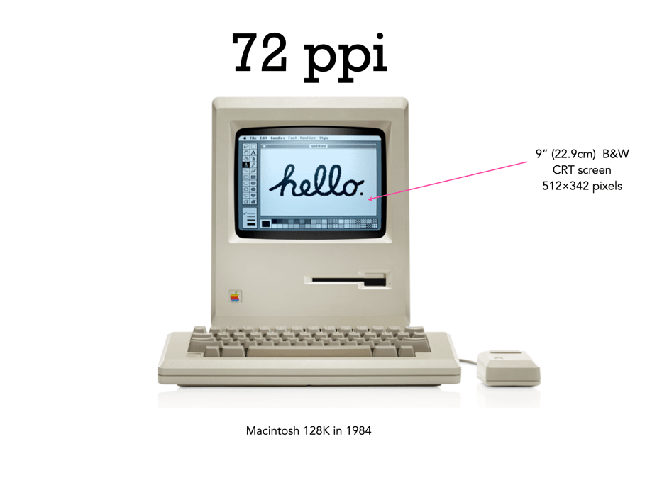
There is still a lot of talk about the magical 72dpi. This harkens back to the time decades ago when computer screens commonly had 72ppi (the Macintosh 128K had a 512×342 pixel display), as opposed to the denser screens we have now (to put this into perspective, it had 0.175 megapixels versus the 4MP on the 13.3” Retina display). This had to do with Apple’s attempt to match the size of the graphics on the screen to the size when it is printed. The most common resolution of the bits of a bitmapped image on the screen of a Macintosh was 72dpi. In a 1989 InfoWorld article (June 19), a review of colour display systems mentioned that “… the closer the display is to 72 dpi, the more ‘real world’ the image will appear, compared with printed output.” This was no coincidence, as Apple’s first printer, the “ImageWriter” could produce print up to a resolution of 144dpi, doubled the resolution of the Mac, so this made scaling images easy.

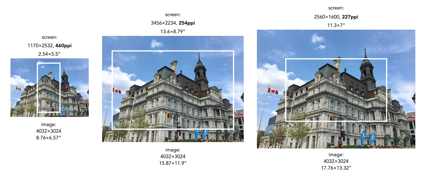
Saving an image using 72ppi makes no sense, because it makes no difference to what is seen on the screen. An image by itself is just a quadrilateral of pixels, it has no context until it is viewed on a screen or printed out. Viewing devices have pixels that don’t change unless the resolution of the monitor changes. This means how an image is displayed is dependent on the resolution of the screen. For example, a 13” MacBook Pro with Retina screen has a size of 2560×1600 with a resolution of 227ppi. This means an image that is 4000×3000 pixels will take up 17.6×13.2” – it would be much larger than the screen if displayed at full resolution. When these images are opened on the laptop they are generally displayed at around 30% of their size, so that the entire image can be viewed.

A 12MP image overlaid on various screen sizes (the white rectangle). The size of the pictures have been modified based on the ppi of the screen.

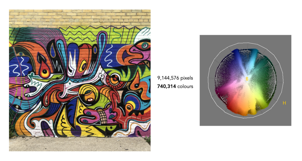
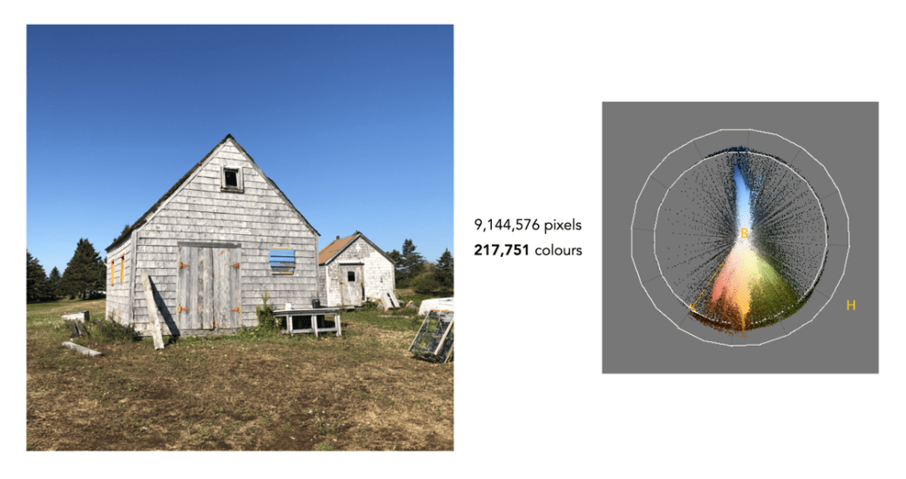
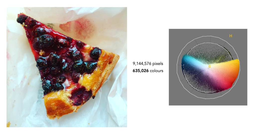
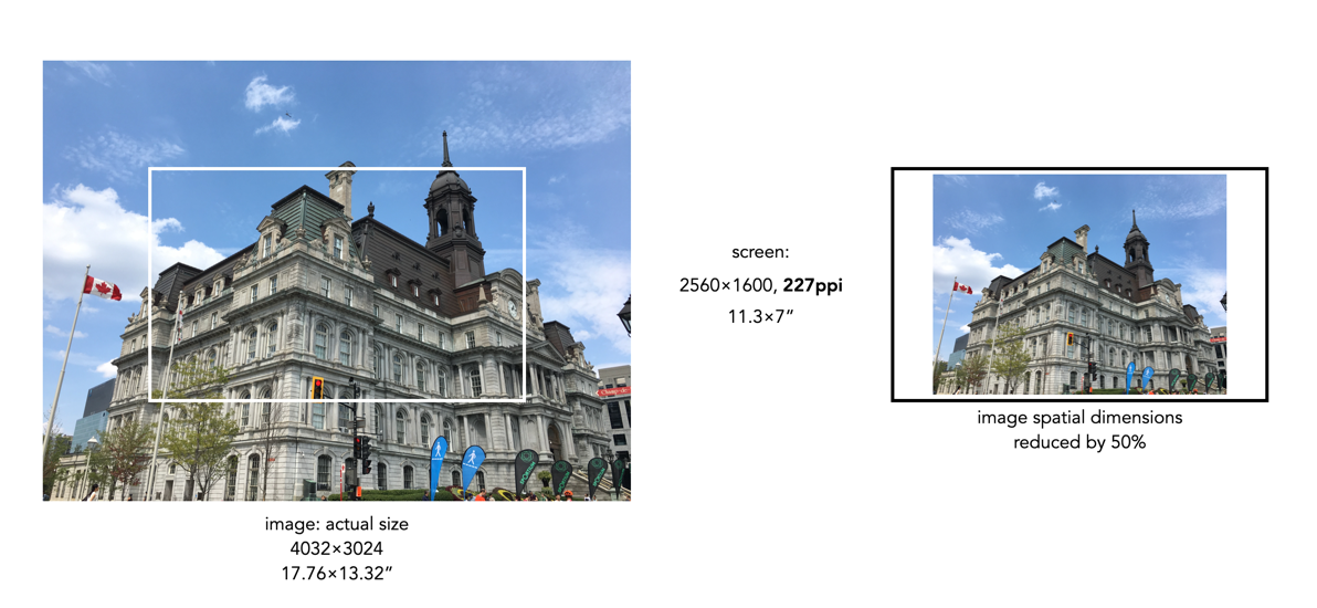
Most webpages are designed in a similar manner, and auto-adjust image sizes to fit the constraints of the webpage design template. It also shows why 12MP or even 6MP images really aren’t needed for webpages. If we instead reduce the spatial dimensions of a 12MP image by 50% we get a 2016×1512, 3MP image – which would only take up 8.8×6.6” of space on the screen (illustrated below). Less screen space is needed, and the smaller file size will benefit things like site loading. If a 6 or 12MP image were used it will just be a larger image to load, and will resized within the webpage by the browser.

Two different sizes of an image in relation to a screen which has a resolution of approximately 4MP: a 12MP image which is too large for the screen (left) and an image which has its spatial dimensions reduced to 50%, which fits inside the screen (right).

What about viewing an image on a 4K television? 4K televisions all have a resolution of 3840×2160. The only caveat here is that if the size of the television changes, the ppi also changes. A 50” TV will have a resolution of 88ppi, whereas an 80” TV will only be 55ppi. This means the 2016×1512 image will appear to be 23×17” on the 50” TV, and 37×27” on the 80” TV. It’s all relative.

So changing an image to 72dpi has what effect? Basically, none. You cannot change the ppi or dpi of an image, because they are dependent on the screen, and printer respectively. So modifying this field in a file to 72ppi/dpi makes no difference to how it is viewed on the screen, or printed on a printer. No screens today have a resolution of 72ppi, unless you are still using a 1980s era Macintosh.

An image which is automatically resized in a webpage, versus the actual image (right).

Eric de Maré on seeing

“What is reality? The very act of seeing is to a large degree creative, for we never perceive reality as such, nor can we ever do so. Seeing is the result of training from birth and of the effects of the cultural inheritance of that training. The mind created images from the rough, raw material of the light waves picked up by the optic nerves and transmitted upside-down to the brain, where it is transmuted, the right way up, into significant forms which help us to survive.

From the very limitations of all our senses we are able to create a human world from the chaos of that so-called reality which we do not, and may never be able, fully to comprehend. Seeing is too often taken for granted, but it is by no means the simple, obvious activity it is generally taken to be. It is, indeed, the most extraordinary and inexplicable mystery.”

Eric de Maré, Colour Photography

Vintage lens makers – Astro-Berlin (Germany)

Astro-Optik is one of a number of German optical companies that flew under the radar, due to its speciality lenses. It was founded in 1922 as Astro-Gesellschaft Bielicke & Co and based in Neukölln, Berlin (which would become part of West-Berlin). The founders were William (Willy) F. Bielicke, Hugh Ivan Gramatzki and Otto (?). Gramatzki (1882-1957) was a successful amateur astronomer and astrophotographer who published in the journal Astronomische Nachrichten, and headed the local branch of “Berliner Astronomische Vereinigung” for a number of years. Gramatzki invented the Transfokator in 1928. Bielicke (1881-1945) a German-American optical designer was involved in the technical development of the lenses and was responsible for the “Tachar” and “Tachon” lenses.

The 1000mm lens

So it is then not surprising that Astro-Berlin’s product range included lenses suitable for astrophotography and astronomical photometry. After the war the company focused on its film technology (Astro-Kino, Astro-Kino Color) developing lenses that had long and extremely long focal lengths, sometimes called “optical heavy artillery”. The company ceased operations in 1991.

The company produced a multitude of lenses, many under the brand Astro-Berlin. Astro-Berlin is likely most famous for its long lenses for cinematography and photography. These lenses were very simple consisting of one (f/5, f/6.3) or two (f/2.3) achromatic doublets. The f/5 lenses for 35mm came in 300mm, 400mm, 500mm, and 640mm lengths. The 800mm f/5 lens was designed for medium 60×60mm format, and the 1000mm f/6.6 for 60×90mm format.

mm12515015020030030040050050064080010002000
f/2.32.31.83.53.5554.55556.310
Focal lengths (mm), and apertures of Astro lenses for 35mm/6×6 reflex mounts

In addition they produced quite fast lenses. In 1933 they introduced the Tachor f/0.95 which was available in various focal lengths. The 75mm version was suitable for an 18×24mm format (half-frame) but it was a large lens at 110mm in length with a frontal diameter of 81mm. The longest lens produced was possibly the 2000mm f/10 Astro Telastan. At times Astro also cooperated with the other Berlin optics manufacturers Piesker and Tewe.

Ads from Das Atelier des Photographen (1936)

These days, Astro-Berlin lenses are expensive on the secondhand market. For example the Astro Berlin Pan Tachar 100mm f/1.8 can sell for up to C$6000 depending on condition. However it is possible to find a 500mm f/5 lens for between C$900-1200.

Further reading:

Rangefinder or reflex?

35mm photography evolved in rangefinder cameras. In the early pre-prism days, photographers using “minicams” had a simple choice of Leica, or Contax. Post WW2, other Leica “knock-offs” would appear, mostly from Japan, but also from countries like Italy, and the USSR. So why did rangefinders languish? To answer that we will look back at two 1956 articles in Popular Photography under the banner: “Which 35 – Reflex or Rangefinder?” [1,2].

Rangefinder versus reflex?

Bob Schwalberg, an advocate for rangefinder cameras, described two of their limitations [1]: long and short views. Rangefinder couplings it seemed had a limitation of 135mm focal length for the purposes of long views, and a limit of 3½ feet in close-up (without accessories like a mirror reflex housing). In fact Schwalberg even commented that “Rangefinders just aren’t worth a speck of dust on your negative for focusing lenses longer than 135mm”. After this he focused on their strengths:

  • Speed in focusing – “With a rangefinder camera you move straight into focus instead of having to twist the lens back and forth several times…”.
  • Ease of focusing – Rangefinder cameras can be “focused under light levels so dim as to make photography unfeasible.”
  • Accuracy of focusing – “Rangefinder focusing is inherently more accurate than ground-glass focusing because the rangefinder mechanism can distinguish much more critically than the human eye.”
  • Time lag #1 (from focusing to stop down) – does not apply because the rangefinder is stopped down before focusing begins.
  • Time lag #2 (from pressing the release button to exposing the film) – rangefinders don’t have mirrors which add 1/50 sec. Reflex cameras have mirror lag.

Schwalberg actually considered the mirror lag to be the single most serious disadvantage of the SLR in as much as “You never see the picture you make with a single-lens reflex until you, develop the film. It all happened why you weren’t looking.” (unfortunately this was before the returning mirror). He goes on to say that “The prism reflex is a useful tool which brings many advantages to a number of specific, and I think special, photographic applications.”

Barrett Gallagher meanwhile made the case for the single-lens reflex [2]. His choice of the SLR was because, in his words, “I couldn’t see clearly through the viewfinders on the rangefinder cameras.” Or in other words “… any separate rangefinder-viewfinder system requires you to shift your eye from one peephole to another at the crucial moment, and with a moving target, you’re dead.” Rangefinder accuracy also falls off with long telephoto lenses, requiring of all things the addition of a clumsy reflex housing.

  • Close-up – it is possible to focus down to 3.5” with no parallax problems. Reflex cameras focus down to 2.5 feet, versus 3.5 feet for rangefinders.
  • Ease of focusing – rangefinders are easier to focus, however in dim light the reflex lens can open wide enough to allow focusing.
  • DOF – the SLR allows the photographer to see the DOF a lens offers at different f-stops.
  • Viewfinders – SLR’s have one viewfinder for all lenses. Rangefinders require supplementary rangefinders for lenses outside 50mm.

Gallagher summed up by saying that “The single-lens reflex is the versatile camera with no parallax, no viewfinders, no mechanical rangefinder limits. It lets you see full size with any lens exactly what you get – including actual depth of field.”

Further reading:

  1. Bob Schwalberg, “Which 35 – Reflex or Rangefinder? – The coupled rangefinder is for me”, Popular Photography, 39(2), pp. 38,108,110 (1956)
  2. Barrett Gallagher, “Which 35 – Reflex or Rangefinder? – I like a single-lens reflex best”, Popular Photography, 39(2), pp. 39,112 (1956)

Feininger on B&W versus colour

“Black-and-white photography is essentially an abstract medium, while color photography is primarily realistic. Furthermore, in black-and-white a photographer is limited to two dimensions – perspective and contrast – whereas in color a photographer works with three: perspective, contrast, and color. In order to be able to exploit the abstract qualities of his medium, a photographer who works in black-and-white deliberately trains himself to disregard color; instead, he evaluates color in terms of black-and-white, shades of gray, and contrast of light and dark. A color photographer’s approach is the exact reverse: not only is he very much aware of color as ‘color’, but he decidedly tries to develop a ‘color eye’ – a sensitivity to the slightest shifts in hue, saturation, and brightness of color.”


Andreas Feininger, “Successful Color Photography (1966)

The HSV−HSB colour space

RGB is used to store colour images in image file formats, and view images on a screen, but it’s honestly not very useful in day-to-day image processing. This is because in an RGB image the luminance and chrominance information is coupled together. Therefore when one of the R, G, or B components is modified, the colours within the image will change. For performing many operations we need another form of colour space – one where the characteristics of chrominance and luminance can be separated. One of the most common of these is HSV, or Hue−Saturation−Value.

HSV as an upside-down,
six-sided pyramid
HSV/HSB as a cylindrical space

HSV is derived from the RGB model, and is sometimes known as HSB (Hue, Saturation, Brightness) and characterizes colour in terms of hue and saturation. It was created by Alvy Ray Smith in 1978 [1]. Now the space is traditionally represented using an an upside-down hex-cone or six-sided pyramid – however mathematically the space is actually conceptualized as a cylinder. HSV/HSB is a perceptual colour space, i.e. it decomposes colour based on how it is perceived rather than how it is physically sensed, as is the case with RGB. This means HSV (and its associated colour spaces) is more aligned with a more intuitive understanding of colour.

The top of the HSB colour space cylinder showing hue and saturation (left), and a slice through the cylinder showing brightness versus saturation (right).

A point within the HSB space is defined by hue, saturation, and brightness.

  1. Hue represents the chromaticity or pure colour. It is specified by an angular measure from 0 to 360° – red corresponds to 0°, green to 120°, and blue to 240°.
  2. Saturation is the vibrancy, vividness/colourfulness, or purity of a colour. It is defined as a percentage measure from the central vertical axis (0%) to the exterior shell of the cylinder (100%). A colour with 100% saturation will be the purest color possible, while 0% saturation yields grayscale, i.e. completely desaturated.
  3. Value/Brightness is a measure of the lightness or darkness of a colour. It is specified by the central axis of the cylinder, and ranges from white at the top to black at the bottom. Here 0% indicates no intensity (pure blackness), and 100% indicates full intensity (white).

The values are very much interdependent, i.e. if the value of a colour is set to zero, then the amount of hue and saturation will not matter, as the colour will be black. Similarly, if the saturation is set to zero, then hue will not matter, as there will be no colour.

An example of a colour image, and two views of its respective HSB colour space.

Manipulating images in HSB is much more intuitive. In order to lighten a colour in HSB, it is as simple as increasing the brightness value, while a similar technique applied to an RGB image requires scaling each of the R, G, B components proportionally. The task of increasing saturation, i.e. making an image more vivid is easily achieved in this colour space.

Note that converting an image from RGB to HSB involves a nonlinear transformation.

  1. Smith, A.R., “Color gamut transform pairs”, Computer Graphics, 12(3), pp.12-19 (1978)

Steinbeck on Robert Capa

“Capa’s pictures were made in his brain – the camera only completed them. You can no more mistake his work than you can the canvas of a fine painter. Capa knew what to look for and what to do with it when he found it. He knew, for example, that you cannot photograph war because it is largely an emotion. But he did photograph that emotion by shooting beside it. He could show the horror of a whole people in the face of a child. His camera caught and held emotion.”


John Steinbeck, “Robert Capa” in The Best of Popular Photography (1979)

Can humans discern 16 million colours in an image?

A standard colour image is 8-bit (or 24-bit) containing 2563 = 16,777,216 colours. That seems like a lot right? But can that many colours even be distinguished by the human visual system? The quick answer is no, or rather we don’t exactly know for certain. Research into the number of actual discernible colours is actually a bit of a rabbit’s hole.

A 1998 paper [1] suggests that the number of discernible colours may be around 2.28 million – the authors determined this by calculating the number of colours within the boundary of the MacAdam Limits in CIELAB Uniform Colour Space [2] (for those who are interested). However even the authors suggested this 2.28M may be somewhat of an overestimation. An larger figure of 10 million colours (from 1975) is often cited [3], but there is no information on the origin of this figure. A similar figure of 2.5 million colours was cited in a 2012 article [4]. A more recent article [5] gives a conservative estimate of 40 million distinguishable object color stimuli. Is it even possible to realistically prove such large numbers? Somewhat unlikely, because it may be impossible to quantify – ever. Indications based on existing colour spaces may be as good as it gets, and frankly even 1-2 million colours is a lot.

Of course the actual number of colours someone sees is also dependent on the number and distribution of cones in the eye. For example, dichromat’s only have two types of cones which are able to perceive colour. This colour deficiency manifests differently depending on which cone is missing. The majority of the population are trichromats, i.e. they have three types of cones. Lastly there are the very rare individuals, the tetrachromats who have four different cones. Supposedly tetrachromats can see 100 million colours, but it is thought the condition only exists in women, and in reality, nobody really knows how many are potentially tetrachromatic [6] (and the only definitive way of finding out if you have tetrachromacy is via a genetic test).

The reality is that few if any real pictures contain 16 million colours. Here are some examples (all images contain 9 million pixels). Note the images are shown in association with the hue distribution from the HSB colour-space. The first example is a picture of a wall of graffiti art in Toronto. Now this is an atypical image because it contains a lot of varied colours, most images do not. This image has only 740,314 distinct colours – that’s only 4.4% of the potential colours available.

The next example is a more natural picture, a picture of two building (Nova Scotia). This picture is quite representative of images such as landscapes, that are skewed towards quite a narrow band of colours. It only contains 217,751 distinct colours, or 1.3% of the 16.77 million colours.

Finally we have foody-type image that doesn’t seem to have a lot of differing colours, but in reality it does. There are 635,026 (3.8%) colours in the image. What these examples show is that most images contain fewer than one million different colours. So while there is the potential for an image to contain 16,777,216 colours, in all likely they won’t.

What about 10-bit colour? We’re taking about 10243 or 1,073,741,824 colours – which is really kind of ridiculous.

Further reading:

  1. Pointer, M.R., Attridge, G.G., “The number of discernible colours”, Color Research and Application, 23(1), pp.52-54 (1998)
  2. MacAdam, D.L., “Maximum visual efficiency of colored materials”, Journal of the Optical Society of America, 25, pp.361-367 (1935)
  3. Judd, D.B., Wyszecki, G., Color in Business, Science and Industry, Wiley, p.388 (1975)
  4. Flinkman, M., Laamanen, H., Vahimaa, P., Hauta-Kasari, M., “Number of colors generated by smooth nonfluorescent reflectance spectra”, J Opt Soc Am A Opt Image Sci Vis., 29(12), pp.2566-2575 (2012)
  5. Kuehni, R.G., “How Many Object Colors Can We Distinguish?”, Color Research and Application, 41(5), pp.439-444 (2016)
  6. Jordan, G., Mollon, J., “Tetrachromacy: the mysterious case of extra-ordinary color vision”, Current Opinion in Behavioral Sciences, 30, pp.130-134 (2019)
  7. All the Colors We Cannot See, Carl Jennings (June 24, 2019)
  8. How Many Colors Can Most Of Us Actually See, USA Art News (July 23, 2020)

Szarkowski on the history of photography

“The history of photography has been less a journey than a growth. Its movement has not been linear and consecutive, but centrifugal. Photography, and our understanding of it, has spread from a center; it has, by infusion, penetrated our consciousness. Like an organism, photography was born whole. It is in out progressive discovery of it that its history lies.”


John Szarkowski, The Photographer’s Eye (1966)