Smartphone cameras have lead to the age of the disposable image.
It is not the first time this has happened of course, there have been other instances since the birth of photography. During the Victorian period, technologies such a albumen prints brought photographs to the masses. But then photography was a new phenomena, and seeing visual depictions of the world far away through photographs such as stereoviews, likely left people in awe. New technology displaces old, and old photographs were soon forgotten in a drawer somewhere. For a good many years snapshots of time were captured using black-and-white paper photographs, which were then displaced by colour in various mediums – print, slide, instant photograph.
The concept of film slowly gave way to digital, which swept away the constraints of the physical medium. All of a sudden you could take hundreds of photographs, view them instantly, and not have to worry about having them developed. In 2018 alone, over 1 trillion photos were taken. How many photographs are there of the Eiffel Tower? The vast difference of course it that film technology left us with physical prints that sat in cupboards, or were framed. Digital photographs offer another form of disposable image, one which has an uber short lifespan. We don’t dispose of them, but rather just forget them.
Previous discussions have focused on the quasi untruths the camera produces. What is the greatest of them? The freezing or blur of movement? The distortion of perspective? Or maybe the manipulation of colour? When it comes to colour, where does the truth lie? Colour is interpreted differently by each person, and even the camera itself. No one may truly understand the complexities of how colour is actually perceived. Most people see a blue sky, but what shade of blue? Consider the following photograph taken at Point Pleasant Park, in Halifax (Nova Scotia). The sky seems over-saturated, but there was no processing done. Is it natural, or an affect of being in the right place at the right time?
Prince of Wales Tower, Point Pleasant Park, Halifax
Colours in a digital photograph are a result of many differing processes – light passes through the various glass optics of the lens, and is absorbed by the sensor which converts the photons into a digital signal. This does not mean that the colours which exist in a scene will be properly interpreted. The pure “light” of white can be used to manipulate the colours of a photograph, something called white balancing. Scroll through the available choices, and the colour temperature of the photograph will change. Sometimes we manipulate colours through white balancing, other times through manipulation of the colour histogram, all to make the contents of the photograph seem more akin to our perception of realism. Sometimes we add colour to add a sense of non-realism. Sometimes we saturate the colours to make them seem bright, and other times we mute them.
Take a photograph of something. Look at the colours in the scene, and try to remember what they looked like. Maybe take the same photo with different cameras. It is hard to reproduce the exact colour… so in many ways the photograph the camera produces is something of a generic interpretation to be manipulated in a human way to some visual aesthetic. Which takes us to the question of what is the truth? Is there any real truth to a photograph?
Nothing has a true colour- it is all varying perceptions of the interaction of light and colour pigments, and the human eye. We apply filters in Instagram to make things seem more vivid and hyper real, or desaturated and contemplative. There is no right or wrong way of understanding colour, although our experiences are influenced by the other senses such as smell. I mean, as far as wavelengths go, the Earth’s sky is really more of a bluish violet colour, but because of the human visual system we perceive it as pale blue. So maybe our own eyes are manipulating the truth?
For many years the concept of crisp, sharp images was paramount. It lead to the development of a variety of image sharpening algorithms to suppress the effect of blurring in an image. Then tilt-shift appeared, and was in vogue for a while (it’s still a very cool effect). Here blur was actually being introduced into an image. But what about actually taking blurry images?
I have been experimenting with adding blur to an image, either through the process of manually defocusing the lens, or by taking a picture of a moving object. The results? I think they are just as good, if not better than if I had “stopped the motion”, or created a crisp photograph. We worry far too much about defining every single feature in an image, and too little on a bit of creativity. Sometimes it would be nice to leave something in an image that inspires thought.
Here’s an example of motion-blur, a Montreal Metro subway car coming into a platform. It is almost the inverse of tilt-shift. Here the object of interest is blurred, and the surround area is kept crisp. Special equipment needed? Zip.
Have you ever taken a photo in portrait mode, and viewed it in landscape mode like this?
Îles de la Madeleine
Yes, this is how I meant to view it. A normal photograph doesn’t give any perspective of how large and wonderful this planet truly is. Viewing a photograph in this manner one sees earth on the right, and the vastness of the sky and the space beyond on the left. It provides an abrupt edge of the world perspective. We should do more to protect our home. Here is a second one, taking the opposite view from the sea to land.
Iceland near Reykjavik
One may now look at this as one piece of a jigsaw puzzle of millions of photographs, each showing the limits of our existence.
There are lots of blogs that extol some piece of code that does some type of “image processing”. Classically this is some type of image enhancement – an attempt to improve the aesthetics of an image. But the problem with image processing is that there are aspects of if that are not really a science. Image processing is an art fundamentally because the quality of the outcome is often intrinsically linked to an individuals visual preferences. Some will say the operations used in image processing are inherently scientific because they are derived using mathematical formula. But so are paint colours. Paint is made from chemical substances, and deriving a particular colour is nothing more than a mathematical formula for combining different paint colours. We’re really talking about processing here, and not analysis (operations like segmentation). So what forms of processing are artistic?
Anything that is termed a “filter”. The Instagram-type filters that make an ordinary photo look like a Polaroid.
Anything with the word enhancement in it. This is an extremely loose term – for it literally means “an increase in quality” – what does this mean to different people? This could involve improving the contrast in an image, removing blur through sharpening, or maybe suppressing noise artifacts.
These processes are partially artistic because there is no tried-and-true method of determining whether the processing has resulted in an improvement in the quality of the image. Take an image, improve its contrast. Does it have a greater aesthetic appeal? Are the colours more vibrant? Do vibrant colours contribute to aesthetic appeal? Are the blues really blue?
Contrast enhancement: (a) original, (b) Retinex-processed, (c) MAXimum of (a) and (b)
Consider the photograph above. To some, the image on the left suffers from being somewhat underexposed, i.e. dark. The image in the middle is the same image processed using a filter called Retinex. Retinex helps remove unfavourable illumination conditions – the result is not perfect, however the filter can help recover detail from an image in which it is enveloped in darkness. Whilst a good portion of the image has been “lightened”, the overcast sky has darkened through the process. There is no exact science for “automagically” making an image have greater aesthetic appeal. The art of image processing often requires tweaking settings, and adjusting the image until it appears to have improved visually. In the final image of the sequence below, the original and Retinex processed images are used to create a composite by retaining only the maximum value at each pixel location. The result is a brighter, contrasty, more visually appealing image.
Yesterday I was out int he backyard, cleaning out a sled that had tipped over and filled up with snow in the last snowstorm. Since then the snow had melted, and then refroze when it got cold again. Today there was a ½” (1cm) thick coating of ice, and about 4″ of water underneath. As I poured it out, it shattered. But then I picked up a piece and looked at it. It was consistently thick, and very clear. I put this down to the relative purity of the snow falling, and the process of refreezing. Then I thought, what would happen if I used a piece of this as a filter, through which I would take a photo?
Fig 1: A piece of the ice filter
There are likely very few organic substances which can be used to make camera (lens) filters. Water has to be pure enough so as to create somewhat transparent ice filters. Most water is not 100% pure, due to dissolved gases like oxygen, and impurities like suspended sediments, dust particles or flecks of minerals like calcium. When the water freezes, these internal impurities become concentrated, impeding light, and making the ice seem cloudy. Clear ice is almost entirely free of impurities. Also, when ice freezes quickly, ice crystals are small and numerous making the ice appear whiter. Transparent ice usually has larger and fewer crystals, a result of slow freezing. This ice was transparent because water freezing outside freezes from the top down. As a layer of water freezes, it pushes any air below it down, then the next layer freezes, etc.
Fig 2: A close-up of the the ice surface (the camera focused on the surface of the ice)
These pieces of ice reminded me of vintage pieces of glass that are imperfect, with bubbles, albeit melting. The image above shows a photograph of the ice surface, showing a few air trails (the white dots). I took some photographs using my Leica D-LUX 6, largely because I could easily take photos singe-handed while holding the piece of ice in the other hand.
Fig 3: A woozy, warped sense of the world
What are the results? Well, firstly these ice filters are not perfect – they are organic in natural, and therefore the effect may be dependent on how the layers of ice froze to create the slab. In Fig. 2, the image becomes quite defocused without any inherent warping. In Fig.3, objects are both organically warped, and blurred. The blur may be caused in part by the fact that the filter actually melts as it is being used, causing melt water to move down the filter.
Fig 4: Another show, showing ice bokeh.
In Fig.4, things are again warped, but what is special here is that due to the angle of sunlight, the air trails through the ice have formed circular, bokeh type effects, something we will term ice-bokeh. These images are very organic, and no two will be the same. This is made even more evident by the fact that the filter melts.
These filters are more for fun than anything else, adding a surreal art-like effect to a photograph. As each piece of ice is unique, each photograph taken again becomes a unique entity. It would be fun to experiment with different thicknesses, and different shapes. The one caveat is that these filters are cold and wet.
Sometimes the best fauna related photographs are taken when you least expect it. We were having lunch at a picnic table in The Hermitage (Scotland) a couple of summers ago when an inquisitive Robin started jumping along the nearby fence. A few shots got one good one. The picture is cropped from the original, and only some minor histogram stretching was performed.
British Robin: Olympus E-M5(II) + M.12-40mm F2.8, picture taken at 40mm, f/3,2, 1/125 sec.
Photographs sometimes contain blur. Sometimes the blur is so bad that it can’t be removed, no matter the algorithm. Algorithms can’t solve everything, even those based on physics. Photography ultimately exists because of the existence of glass lenses – you can’t make any sort of camera without them. Lenses have aberrations (although lenses these days are pretty flawless) – some of these can be dealt with in-situ using corrective algorithms.
Some of this blur is attributable to vibration – no one has hands *that* steady, and tripods aren’t always convenient. Image stabilization, or vibration reduction has done a great job in retaining image sharpness. This is especially important in low-light situations where the photograph may require a longer exposure. The rule of thumb is that a camera should not be hand-held at shutter speeds slower than the equivalent focal length of the lens. So a 200mm lens should not be handheld at speeds slower than 1/200 sec.
Sometimes though, the screen on a digital camera doesn’t tell the full story either. The resolution may be too small to appreciate the sharpness present in the image – and a small amount of blur can reduce the quality of an image. Here is a photograph taken in a low light situation, which, with the wrong settings, resulted in a longer exposure time, and some blur.
Another instance relates to close-up, or macro photography, where the depth-of-field can be quiet shallow. Here is an example of a close-up shot of the handle of a Norwegian mangle board. The central portion of the horse, near the saddle, is in focus, the parts to either side are not – and this form of blur is impossible to suppress. Ideally in order to have the entire handle in focus, one would have to use a technique known as focus stacking (available in some cameras).
Here is another example of a can where the writing at the top of the can is almost in focus, whereas the writing at the bottom is out-of-focus – due in part to the angle the shot was taken, and the shallow depth of field. It may be possible to sharpen the upper text, but reducing the blur at the bottom may be challenging.
On a trip to the Louvre in Paris (10 years ago now), I noticed that the information guide stated “flash photography is strongly discouraged throughout the galleries”. The only place I really saw this enforced was in front of the Mona Lisa. Not a problem you say, everyone will abide by this. Well, not so it appears. I would imagine a good proportion of visitors have some form of digital camera, usually of the “point-and-shoot” (PS) type where the use of flash is automatic if light levels are low. There are of course two reasons for prohibiting the use of flash photography. One is that it disturbs other patrons. The second is that the flash has a direct effect, causing accelerated fading in artifacts such paintings and textiles. So what is the scientific basis for these restrictions? Well very little has actually been written about the effect of photographic flashes on exhibits. In 1994 Evans[1] wrote a small 3-page note discussing whether exhibits can be harmed by photographic flash, but there seems to be very little scientific data to back up claims that flashes cause accelerated fading. The earliest experiment was performed in 1970 using multiple flash (25,000) exposures [2]. Evans has written another article [3], which looks at the quantitative evidence behind banning flash photography in museums.
“Photographic flashes can damage art”. This is sort of a very broad statement. Strictly speaking, I would imagine the damaging affects of 1000 sweaty hands touching the Venus de Milowould greatly outweigh 1000 photographic flashes. It is doubtful that flash photography does any real damage. Should it be used? Unless you are using a professional lighting setup, you can probably achieve better pictures by not using a flash. Frankly if you are taking photographs of paintings in an art gallery you might be better off buying a book on the artist at the gallery shop. That, and flashes in enclosed spaces are annoying. Here is an example of a photo taken in the National Gallery of Norway, without the use of a flash. Actually, the biggest problem taking photographs indoors is possibly too many lights, and reflections off glass.
[1] Evans, M.H., “Photography: Can gallery exhibits be harmed by visitors using photographic flash?,” Museum Management and Curatorship, vol. 13, pp. 104-106, 1994.
[2] Hanlan, J.F., “The effect of electronic photographic lamps on the materials of works of art.,” Museum News, vol. 48, pp. 33, 1970.
I recently read an article on photographing a safari in Kenya, in which the author, Sarfaraz Niazi, made an interesting statement. While describing the process of taking 8000 photos on the trip he made a remark about post-processing, and said his father taught him a lesson when he was aged 5 – that “every picture is carved out in perpetuity as soon as you push the shutter“. There is so much truth in this statement. Photographs are snapshots of life, and the world around us is rarely perfect, so why should a photograph be any different? It is not necessary to vastly process images – there are of course ways to adjust the contrast, maybe improve the sharpness, or adjust the exposure somewhat, but beyond that, what is necessary? Add a filter? Sure that’s fun on Instagram, but shouldn’t be necessary on camera-based photographs.
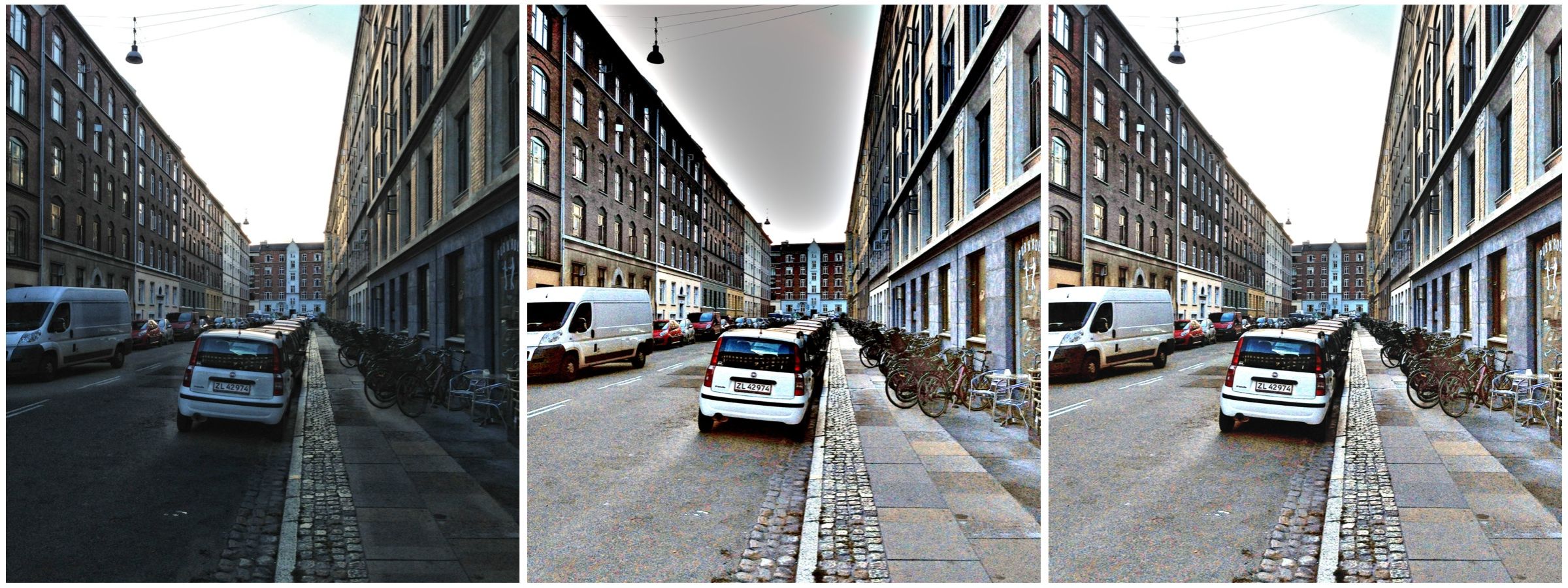
Many years of attempting to derive algorithms to improve images have taught me that there are no generic one-fits-all algorithms. Each photograph must be modified in a manner that suits the ultimate aesthetic appeal of the image. An algorithm manipulates through quantitative evaluation, having no insight into the content, or qualitative aspects of the photograph. No AI algorithm will ever be able to replicate the human eyes ability to determine aesthetic value – and every persons aesthetic interpretation will be different. Add too much computational photography into a digital camera, and you end up with too much of a machine-driven photograph. Photography is a craft as much as an art and should not be controlled solely by algorithms. Consider the following photograph, taken in Glasgow, Scotland. The photograph suffers from being taken on quite a hot day in the summer, when the sky was somewhat hazy. The hazy sky is one factor which causes a reduction in colour intensity in the photograph.
Original photograph
In every likelihood, this photograph represents the true scene quite accurately. An increase in saturation, and modification of exposure will produce a more vivid photograph, shown below. Likely one of the Instagram filters would also have done a nice job in “improving” the image. Was the enhancement necessary? Maybe, maybe not. The enhancement does improve the colours within the image, and the contrast between objects.