The smartest camera?

People tend to believe that the more intelligent a camera they have, the better the resulting photographs will be. And there may be an air of truth to that, particularly in the realm of smartphones brimming with algorithms to produce reasonably good pictures. But the thing it that the subject of the photographs, and characteristics like the perspective of the shot are not decided by the camera – they are decided by the artistic-process of the person behind the camera.

It is a combination of the human brain, visual system and intrinsic aesthetic abilities of the photographer that decides what to photograph. The camera is but a tool. You can have the most expensive Leica, with the sharpest lenses, but all that is moot if you cannot take good photographs. Sure, everyone thinks they are a photographer these days. The ubiquity of cameras in mobile devices means that photography is all around us, but apart from a documentary purpose, very little of this is meaningful or even artful photography.

The reality is that human intelligence is much smarter than the artificial intelligence found in digital cameras. Yes, such AI can efficiently process photosites into pixels, and apply intelligent “improvement” algorithms in the process, but they cannot decide what to photograph.

B&W versus colour

“In black-and-white the photographer has to translate in his mind’s eye the colours of his subject into a range of tones before he presses the trigger, and that effort alone makes black-and-white in a way more creative than colour. It paraphrases and formalizes more. Structure, texture, and rich tonal quality are all weakened by colour, for colour tends to distract the eye from strong forms and their pure architecture. A decorative prettiness may be gained by colour, and sometimes emotional force too, but drama is often lost, not least the drama of a significant instant of action which will never recur. Light in its various moods has deep emotional meanings for everyone, and black-and-white can often convey those meanings more powerfully than colour.”

Eric de Maré, Color Photography (1973)

the histogram exposed (vi) – multipeak

This series of photographs and their associated histograms covers images with multipeak histograms, which come is many differing forms. None of these images is perfect, but they illustrate the fact that sometimes the perfect image is not possible given the constraints of the scene – shadows, bright skies and haze, sometimes they are just unavoidable.

Histogram 1: A church and hazy hills

This photograph is taken in Locarno, Switzerland, with the church in the foreground the Madonna del Sasso. The histogram is of the multipeak variety, with few highlights. The left-most hump (①) represents the majority of the darker colours in the foreground, e.g. vegetation, and the parts of the building in shadow. The remaining two peaks are in the midtones, and represent various portions of the sky (③) as well as the lake, and hazed over mountains in the distance (②). Finally a small amount of highlights (④) represent the clouds and brightly lit portions of the church.

Fujifilm X10 (12MP): 7.1mm; f/5; 1/850

Histogram 2: Light hillside, dark forest

This is the Norwegian countryside, taken from the Bergen Line train. It is a well contrasted image, with only one core patch of shadow (①), behind the trees in the bottom left (there are a few other shadows in foreground objects such as the trees on the right). The midtones, ②, represent the rest of the landscape, with the lightest midtones and highlights composing the sky, ③.

Olympus E-M5II (12MP): 12mm; f/5; 1/400

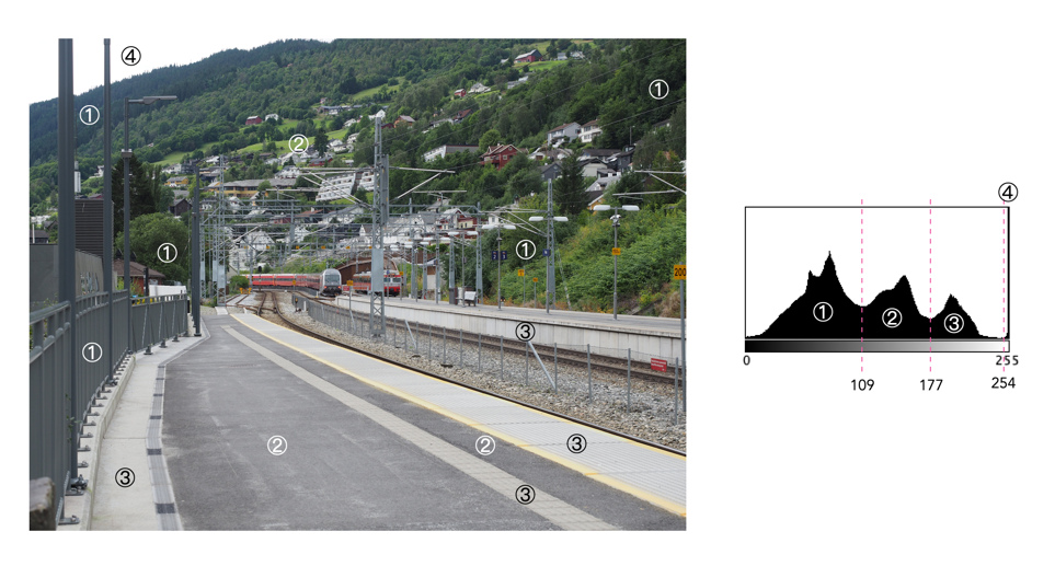
Histogram 3: Gray station

This photograph is of the train station in Voss, Norway. It is an image with a good distribution of intensities, with four dominant peaks. The first peak, ①, is representative of the dark vegetation, and metal railings in the scene, overlapping somewhat into the mid-tones. The central peak (②) which is in the midtones, represents the light green pastures, and the large segments of asphalt on the station platform. The third peak, ③, which transitions into the highlights mostly deals with the light concreted areas. Finally there is a fourth peak, ④, which is really just a clipping artifact related to the small region of white sky.

Olympus E-M5II (12MP): 40mm; f/5; 1/320

the histogram exposed (v) – indistinct

This series of photographs and their associated histograms covers indistinctly shaped histograms, i.e. images which have a histogram which does not really have any distinct shape.

Histogram 1: Dark depths

This is a good example of a low-key image, but contains content which makes this an aesthetically pleasing image. The histogram shows as asymmetric unimodal, tiered towards the darker tones. The dark tones, ①, are naturally provided by the black hull of the ship, the dark vegetation, and the water. The midtones, ②, are associated with the lighter vegetation, and the ships reflection in the water. The larger of the two peaks in the highlights, ③, is the side of the ship, and the building on-shore, and the smaller one, ④, basically is the white on the front of the ship.

Olympus E-M5II (12MP): 20mm; f/4; 1/160

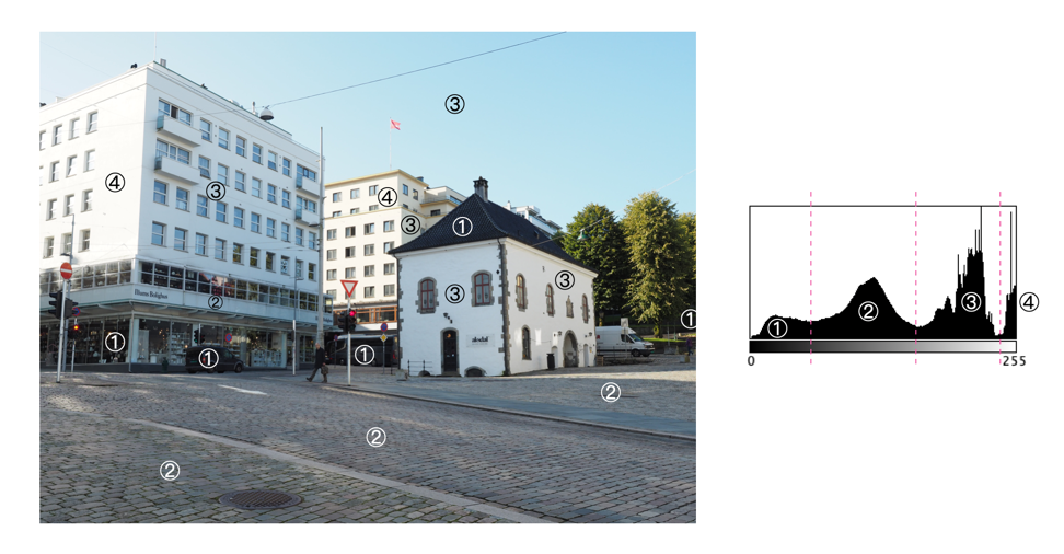
Histogram 2: Light buildings

This is an excellent example of an image (Bergen, Norway) which has white clipping, but it doesn’t have much to do with blown-out regions. The whites in the image are entirely associated with the sides of the two larger buildings which are exposed to direct sunlight. This is not a distinct multipeak histogram, but it is divided into four tonal zones: ① the shadows; ② the midtones; ③ the upper midtones and highlights; and ④ the whites.The sun was intense on this day leading to a slightly paler sky, and bleached buildings facing into the sun.

Olympus E-M5II (12MP): 17mm; f/5.6; 1/250

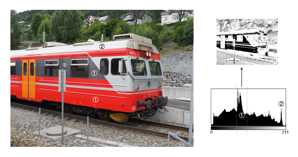
Histogram 3: Red train

This image of a train at the station in Voss (Norway) which has a histogram which covers a broad range of tones. The image has good contrast overall with only two distinct peaks: ① Values 87-124 comprise most of the red and dark gray portions of the train, as well as fine detail throughout the image; and ② Values 234-245 comprises the edge of the train roof. Images which contain a lot of detail and varied tones typically produce histograms containing a lot of “spiky” detail.

Olympus E-M5II (12MP): 19mm; f/4.5; 1/200

the histogram exposed (iv) – multipeak-unimodal

This series of photographs and their associated histograms covers multipeak-unimodal histograms, i.e. images which have a histogram which has a core unimodal shape, yet is festooned with peaks.

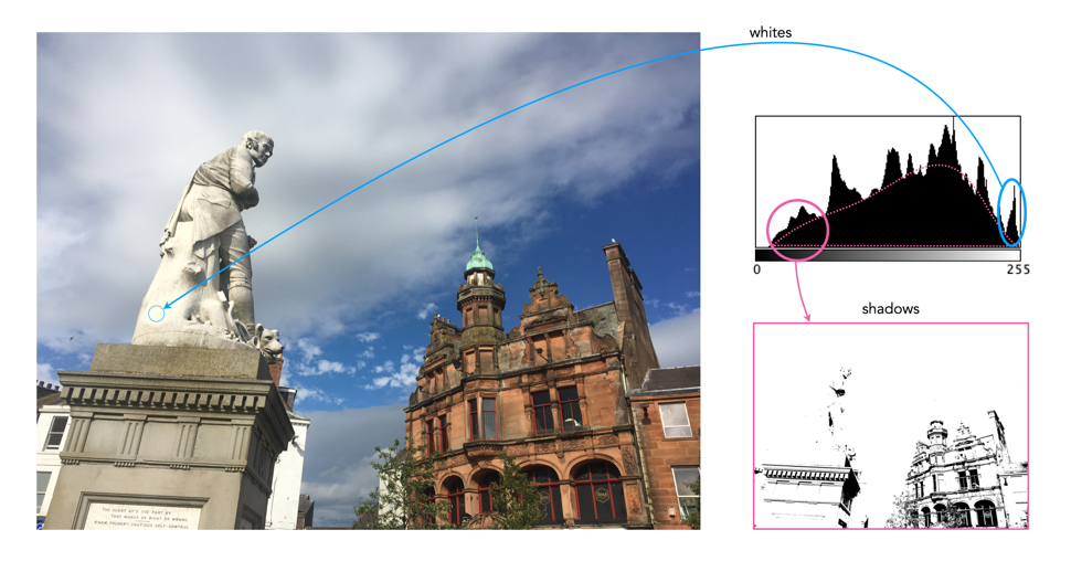
Histogram 1: A statue against the sky

This image, taken near Glasgow Scotland, has a broad spectrum of intensity values. The histogram has an underlying core “unimodal” shape, bias towards highlights, a result of both the statue and the clouds. The image has exceptionally good contrast. The jagged, multipeak appearance is an artifact of the broad distribution of intensities, and intricate details, i.e. non-uniform regions, in the image.

iPhone 6s (12MP): 4.15mm; f/2; 1/3077

Histogram 2: Oslo lion

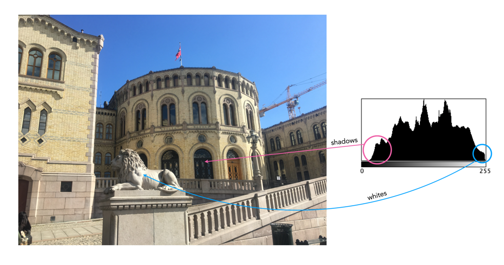
This image, taken in Oslo (Norway), is the “poster-boy” for good histograms (well almost). It has an underlying unimodal shape, mostly in the midtones. It is a well-formed image with good contrast and colour. There are shadows in the image, but that is to be expected considering the clear sky and the orientation of the sun. There are no pure blacks in the image, the shadow tones created by the dark windows. There are also few whites, less than 1% of pixels, that are the result of light reflecting off light surfaces (such as the lion).

iPhone 6s (12MP): 4.15mm; f/2; 1/1012

Histogram 3: Plateau river

This image, taken from a moving train on the Bergen Line in Norway, high up on a mountain plateau. The histogram has an underlying core unimodal shape, composed predominantly of midtones, in addition to the lighter end of the shadows (①). There are no blacks and few highlights to speak off. The image has exceptionally good contrast. The jagged, multipeak appearance is an artifact of the image detail, i.e. non-uniform regions, in the image. For instance the sky tapers gradually from 150 to 190 near the top of the hill.

Olympus E-M5(II) (12MP): 12mm; f/7.1; 1/400

the histogram exposed (iii) – bimodal

This series of photographs and their associated histograms covers aesthetically pleasing bimodal histograms.

Histogram 1: A sky with texture

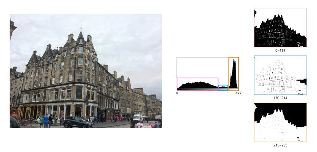
This image (of a building in Edinburgh) has a broad spectrum of intensity values. The histogram is bi-modal with two distinct humps. The right peak is associated with the overcast sky (and white van). The left shallow mound comprising both midtones and shadows makes up most of the remaining image content. There is a small flat region in between the two that makes up features like the lighter portions of the building. Note that pixels maps on the right of the histogram below show the associated pixels in black.

Histogram 2: Out on the lake

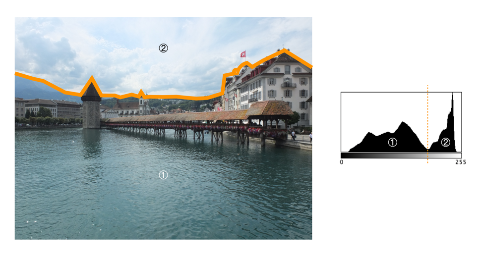
This photograph of the Kapellbrücke was taken in Lucerne, Switzerland. The histogram is bimodal, and asymmetric, and reflects the information in the image: the left hump (①) is associated with the lower portion of the image (shadows and midtones), and the right peak (② highlights) with the sky. There is relatively well contrasted image. The clouds have some good variation in colour, as opposed to begin pushed completely into the whites.

Fujifilm X10 (12MP): 7.1mm; f/9; 1/800

Histogram 3: Carved in stone

This is a photograph of the Lion of Lucerne, in Lucerne, Switzerland. It provides a classic asymmetric bimodal shaped histogram. The left mound, ①, contributes the images dark, shadowy regions, whereas the remaining, larger peak ②, bias towards highlights, defines most of the remaining image. It is well contrasted given that a shadow is cast on the sculpture as it is relief into the wall. The overlapping region between the two entities, ③, forms the transition regions from ① to ②, often visualized in the picture as regions of low “shadow”.

Fujifilm X10 (12MP): 21mm; f/3.2; 1/850

the histogram exposed (ii) – highlight-clipping

This series of photographs and their associated histograms covers good renditions of highlight clipping, i.e. photographs in which there are regions of white pixels, but they either genuinely exist in the image as white regions, or do not directly impact the aesthetics of the image.

Histogram 1: A bright overcast sky

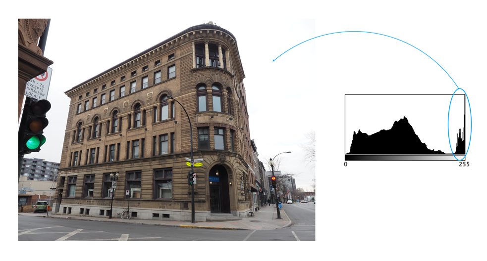
The image was taken on a very overcast day in Montreal. This is a good example of an image with highlight-clipping in the histogram, which is neither good nor bad. The building itself does not suffer from a lack of contrast, although the non-sky region can be enhanced slightly with no ill effects on the sky (because it is already basically white). This is a common situation in outdoor, overcast scenes. In an ideal world, more texture and contrast in the sky would be great, but in reality you have to use what nature provides.

Histogram 2: White buildings

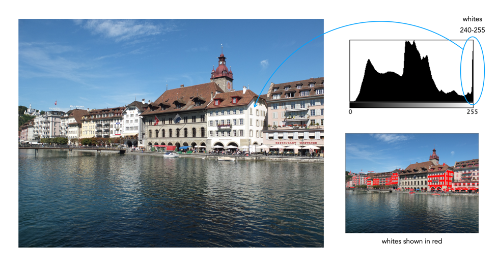
This photograph was taken in Luzern, Switzerland. It is a well contrasted image, with a somewhat indistinct, multipeak histogram. The pixels are well distributed over the range of intensities, except for the spike at values 240-255. Here highlight clipping seems as though it has occurred because there are quite a number of white pixels in the image. However this density of white pixels comes not from anything being overblown, but rather from the white buildings in the image (of which there are many).

Fujifilm X10 (12MP): 7.1mm; f/4.5; 1/950

Histogram 3: A bit of overblown sky

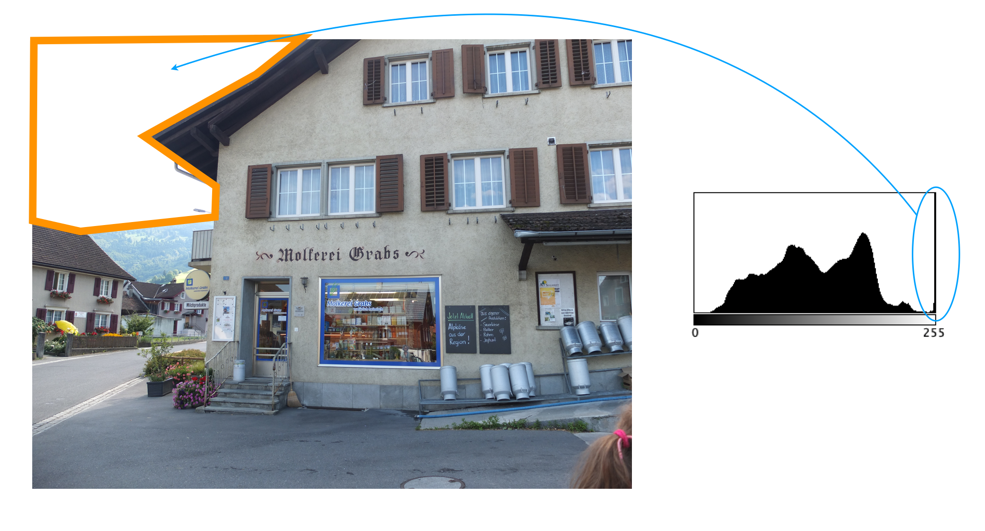
This photograph was taken in Grabs, Switzerland. The histogram is a nonuniform, and basically unimodal in shape, with the exception of a huge spike in the whites causing clipping. But this is a case of the highlight clipping not really affecting the core content of the image, i.e. it comprises the overblown sky in the top-left of the image. On a bright, partially overcast day, this is not an unusual scenario.

Fujifilm X10 (12MP): 7.1mm; f/2; 1/900

the histogram exposed (i) – unimodal

This is the first post in an ongoing series that looks at the intensity histograms of various images, and what they help tell us about the image. The idea behind it is to try and dispel the myths behind the “ideal” histogram phenomena, as well as helping to learn to read a histogram. The hope is to provide a series of posts (each containing three images and their histograms) based on histogram concepts such as shape, of clipping etc. Histograms are interpreted in tandem with the image.

Histogram 1: Ideal with a hint of clipping

The first image is the poster-boy for “ideal” histograms (almost). A simple image of a track through a forest in Scotland, it has a beautiful bell-shaped (unimodal) curve, almost entiorely in the midtones. A small amount of pixels, less than 1%, form a highlight clipping issue in the histogram, a result of the blown-out, overcast sky. Otherwise it is a well-formed image with good contrast and colour.

Histogram 2: The witches hat

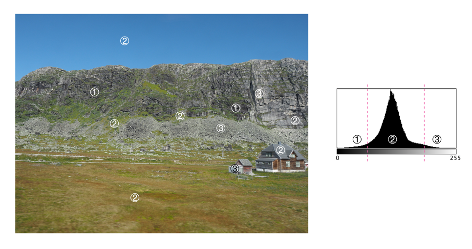
This is a picture taken along the route of the Bergen-Line train in Norway. A symmetric, unimodal histogram, taking on a classic “witches hat” shape. The tail curving towards 0 (①) deals with the darker components of the upper rock-face, and the house. The tail curving towards 255 (③) deals with the lighter components of the lower rock face, and the house. The majority of midtone pixels form the sky, grassland, and rock face.

Olympus E-M5MArkII (16MP): 12mm; f/6.3; 1/400

Histogram 3: An odd peak

This is a photograph of the statue of Leif Eriksson which is in front of Reykjavik’s Hallgrímskirkja. It provides for a truly odd histogram – basically the (majority of) pixels form a unimodal histogram, ③ , which represents the sky surrounding the statue. The tiny hillocks to either side (①,②) form the sculpture itself – the left forming the shadows, and the right forming the bright regions. However overall, this is a well formed image, even though it may appear as if the sculpture is low contrast.

Leica D-Lux 6 (10MP): 14.7mm; f/2.8; 1/1600

More myths about travel photography

Below are some more myths associated with travel.

MYTH 13: Landscape photographs need good light.

REALITY: In reality there is no such thing as bad light, or bad weather, unless it is pouring. You can never guarantee what the weather will be like anywhere, and if you are travelling to places like Scotland, Iceland, or Norway the weather can change on the flip of a coin. There can be a lot of drizzle, or fog. You have to learn to make the most the situation, exploiting any kind of light.

MYTH 14: Manual exposure produces the best images.

REALITY: Many photographers use aperture-priority, or the oft-lauded P-mode. If you think something will be over- or under-exposed, then use exposure-bracketing. Modern cameras have a lot of technology to deal with taking optimal photographs, so don’t feel bad about using it.

MYTH 15: The fancy camera features are cool.

REALITY: No, they aren’t. Sure, try the built-in filters. They may be fun for a bit, but filters can always be added later. If you want to add filters, try posting to Instagram. For example, high-resolution mode is somewhat fun to play with, but it will eat battery life.

MYTH 16: One camera is enough.

REALITY: I never travel with less than two cameras, a primary, and a secondary, smaller camera, one that fits inside a jacket pocket easily (in my case a Ricoh GR III). There are risks when you are somewhere on vacation and your main camera stops working for some reason. A backup is always great to have, both for breakdowns, lack of batteries, or just for shooting in places where you don’t want to drag a bigger camera along, or would prefer a more inconspicuous photographic experience, e.g. museums, art galleries.

MYTH 17: More megapixels are better.

REALITY: I think optimally, anything from 16-26 megapixels is good. You don’t need 50MP unless you are going to print large posters, and 12MP likely is not enough these days.

MYTH 18: Shooting in RAW is the best.

REALITY: Probably, but here’s the thing, for the amateur, do you want to spend a lot of time post-processing photos? Maybe not? Setting the camera to JPEG+RAW is the best of both worlds. There is the issue of JPEG editing being destructive and RAW not.

MYTH 19: Backpacks offer the best way of carrying equipment.

REALITY: This may be true getting equipment from A to B, but schlepping a backpack loaded with equipment around every day during the summer can be brutal. No matter the type, backpacks + hot weather = a sweaty back. They also make you stand out, just as much as a FF camera with a 300mm lens. Opt instead for a camera sling, such as one from Peak Design. It has a much lower form factor and with a non-FF camera offers enough space for the camera, an extra lens, and a few batteries and memory cards. I’m usually able to shove in the secondary camera as well. They make you seem much more incognito as well.

MYTH 20: Carrying a film-camera is cumbersome.

REALITY: Film has made a resurgence, and although I might not carry one of my Exakta cameras, I might throw a half-frame camera in my pack. On a 36-roll film, this gives me 72 shots. The film camera allows me to experiment a little, but not at the expense of missing a shot.

MYTH 21: Travel photos will be as good as those in photo books.

REALITY: Sadly not. You might be able to get some good shots, but the reality is those shots in coffee-table photo books, and on TV shows are done with much more time than the average person has on location, and with the use of specialized equipment like drones. You can get some awesome imagery with drones, especially for video, because they can get perspectives that a person on the ground just can’t. If you spend an hour at a place you will have to deal with the weather that exists – someone who spends 2-3 days can wait for optimal conditions.

MYTH 22: If you wait long enough, it will be less busy.

REALITY: Some places are always busy, especially so it if is a popular landmark. The reality is short of getting up at the crack of dawn, it may be impossible to get a perfect picture. A good example is Piazza San Marco in Venice… some people get a lucky shot in after a torrential downpour, or some similar event that clears the streets, but the best time is just after sunrise, otherwise it is swamped with tourists. Try taking pictures of lesser known things instead of waiting for the perfect moment.

MYTH 23: Unwanted objects can be removed in post-processing.

REALITY: Sometimes popular places are full of tourists… like they are everywhere. In the past it was impossible to remove unwanted objects, you just had to come back at a quieter time. Now there are numerous forms of post-processing software like Cleanup-pictures that will remove things from a picture. A word of warning though, this type of software may not always work perfectly.

MYTH 24: Drones are great for photography.

REALITY: It’s true, drones make for some exceptional photographs, and video footage. You can actually produce aerial photos of scenes like the best professional photographers, from likely the best vantage points. However there are a number of caveats. Firstly, travel drones have to be a reasonable size to actually be lugged about from place to place. This may limit the size of the sensor in the camera, and also the size of the battery. Is the drone able to hover perfectly still? If not, you could end up with somewhat blurry images. Flight time on drones is usually 20-30 minutes, so extra batteries are a requirement for travel. The biggest caveat of course is where you can fly drones. For example in the UK, non-commercial drone use is permitted, however there are no-fly zones, and permission is needed to fly over World heritage sites such as Stonehenge. In Italy a license isn’t required, but drones can’t be used over beaches, towns or near airports.