3︎⃣ Fixing light with B&W
There are some images which contain shafts of light. Sometimes this light helps highlight certain objects in the photograph, be it as hard light or soft light. Consider the following photo of a viking carving from the Viking Ship Museum in Oslo. There are some nice shadows caused by the light streaming in from the right side of the scene. One way to reduce the effects of light is to convert the photograph to black-and-white.
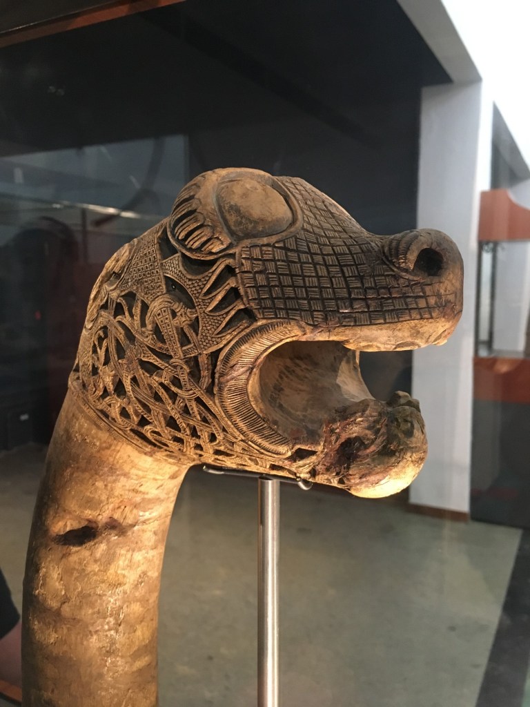
Before 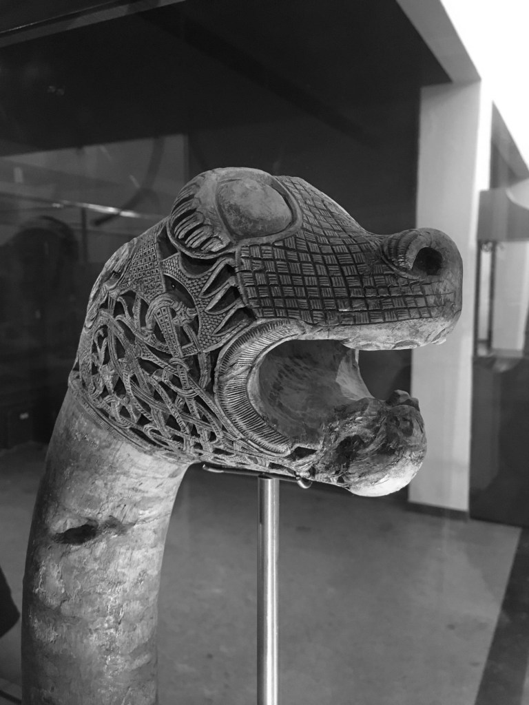
After
By suppressing the role colour plays in the image, the eyes become more fixated on the fine details, and less on the light and shadows.
4︎⃣ Improving on sharpness
Sometimes it is impossible to take a photograph with enough sharpness. Tweaking the sharpness just slightly can help bring an extra crispness to an image. This is especially true in macro photographs, or photographs with fine detail. If the image is blurry, there is every likelihood that it can not be salvaged. There is only so much magic that can be performed by image processing. Here is a close-up of some water droplets on a leaf.
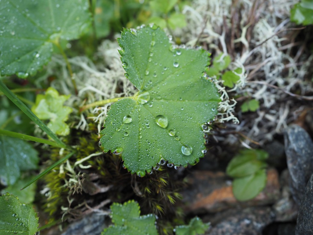
If we filter the image using some unsharp masking to sharpen the image, we get:

5︎⃣ Saturating colour
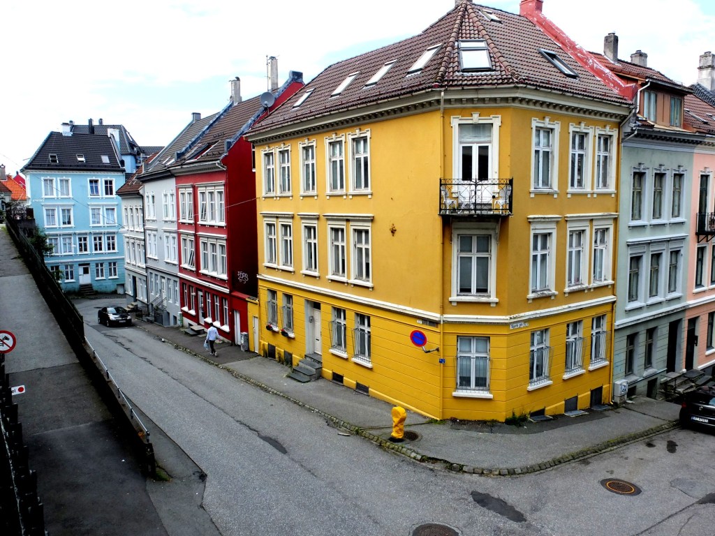
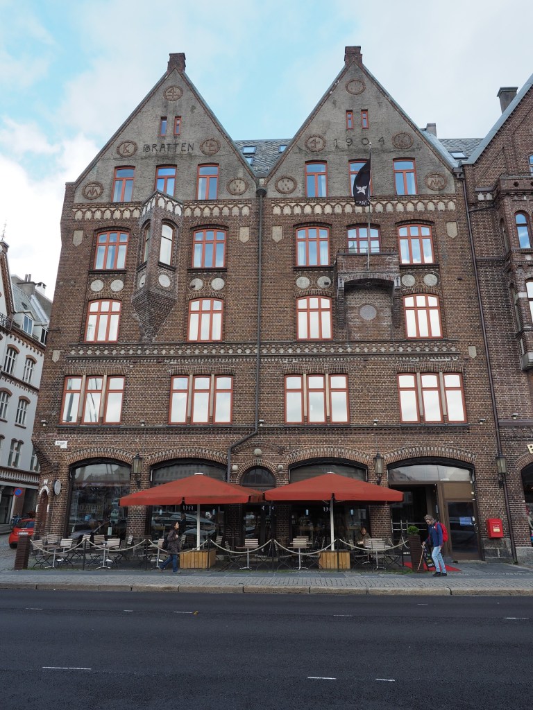
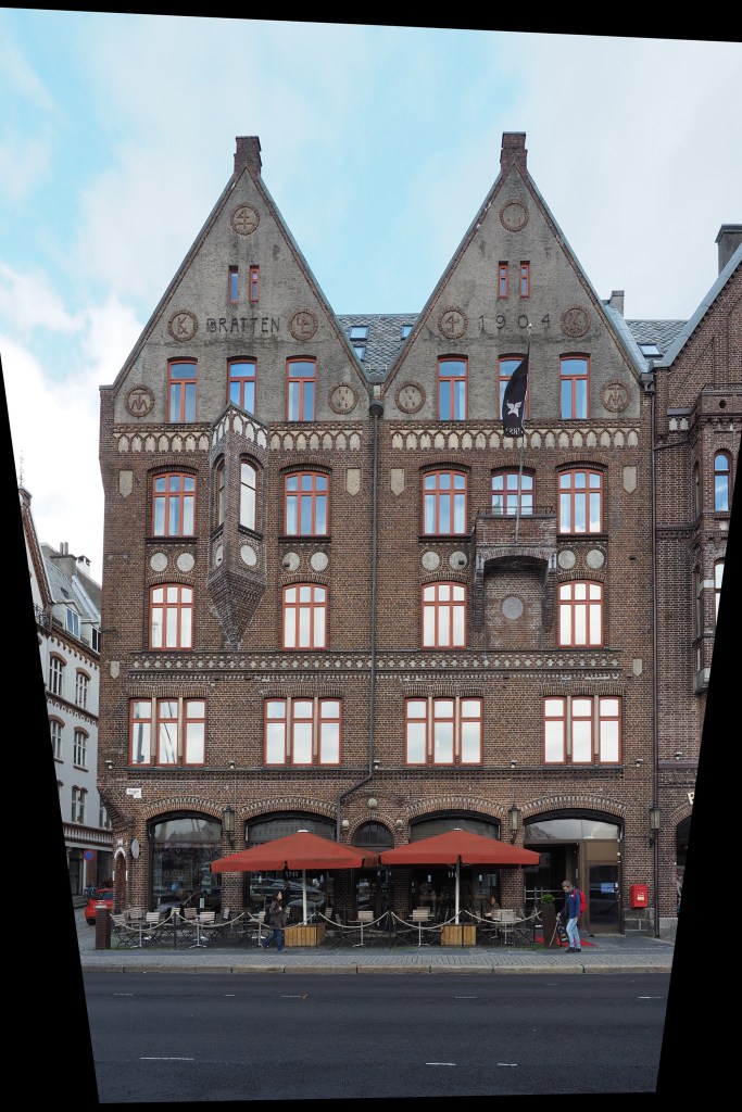
Photographs of scenes containing vivid colour may sometimes appear quite dull, or maybe you want to boost the colour in the scene. By adjusting the colour balance, or manipulating the colour histogram, it is possible to boost the colours in a photograph, although they may end up “unrealistic” colours in the processed image. Here is a street scene of some colourful houses in Bergen, Norway.
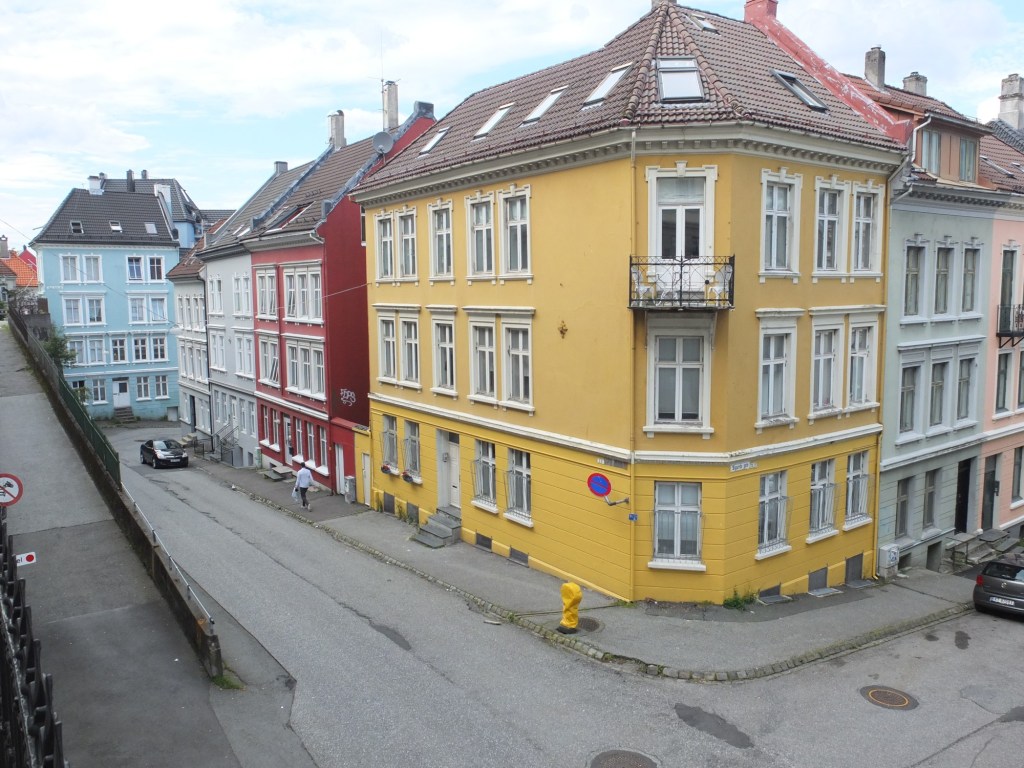
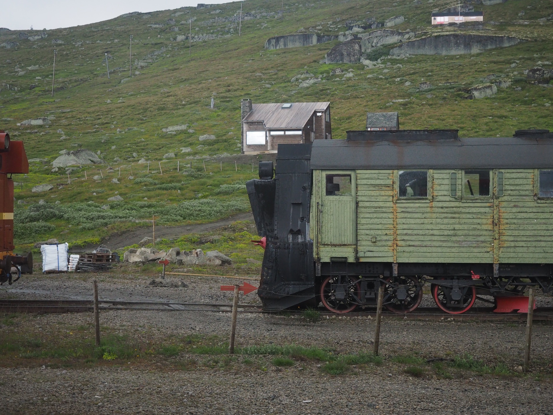
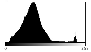
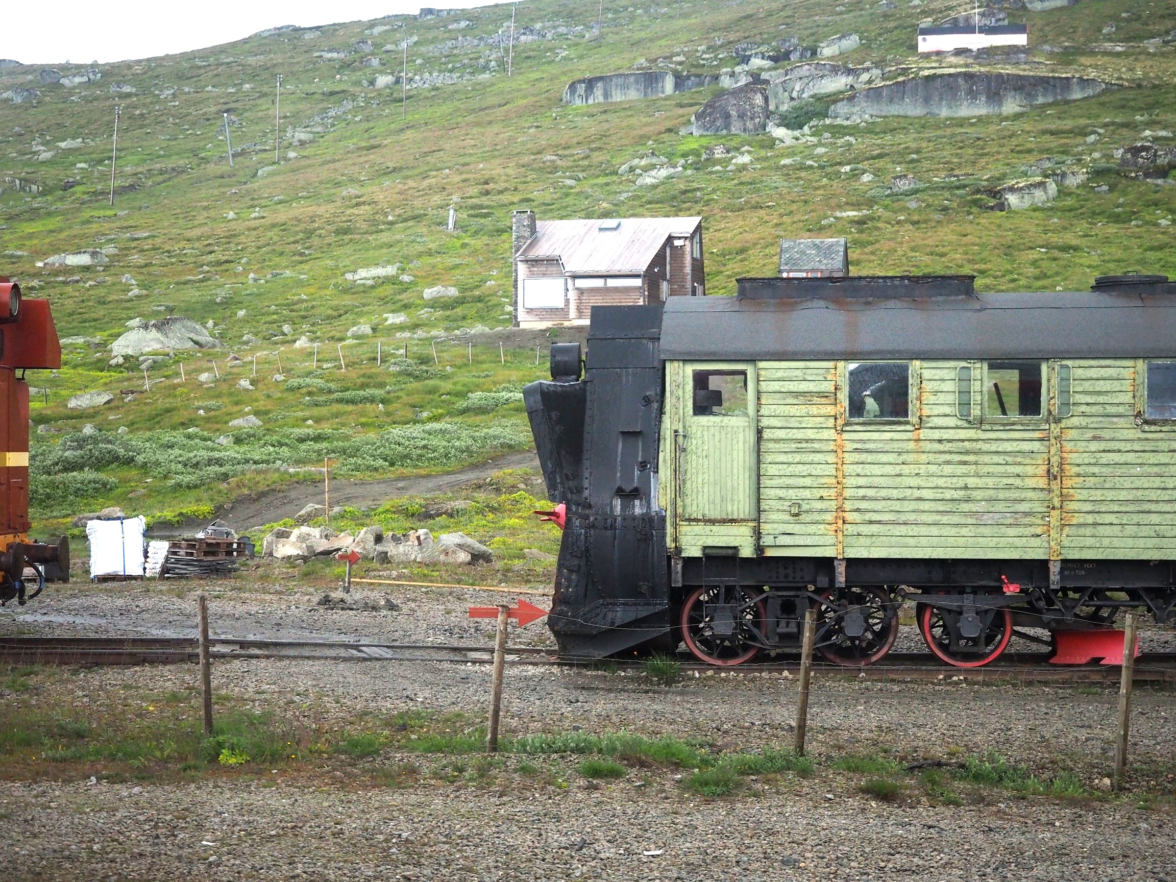
Here the image has been processed with a simple contrast adjustment, although the blue parts of the sky have all but disappeared.