Sometimes you want to take a photograph of something, like close-up, but the whole scene won’t fit into one photo, and you don’t have a fisheye lens on you. So what to do? Enter the panorama. Now many cameras provide some level of built-in panorama generation. Some will guide you through the process of taking a sequence of photographs that can be stitched into a panorama, off-camera, and others provide panoramic stitching in-situ (I would avoid doing this as it eats battery life). Or you can can take a bunch of photographs of a scene and use a image stitching application such as AutoStitch, or Hugin. For simplicities sake, let’s generate a simple panorama using AutoStitch.
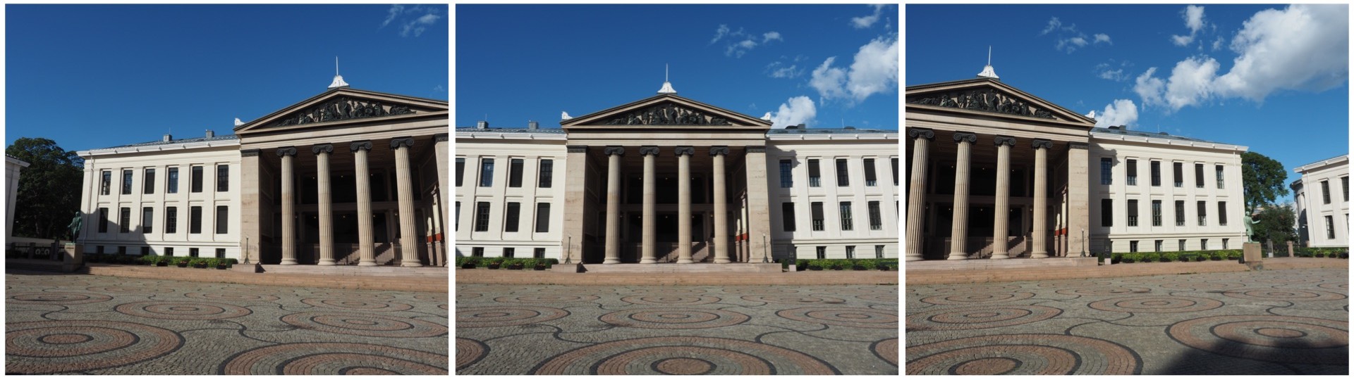
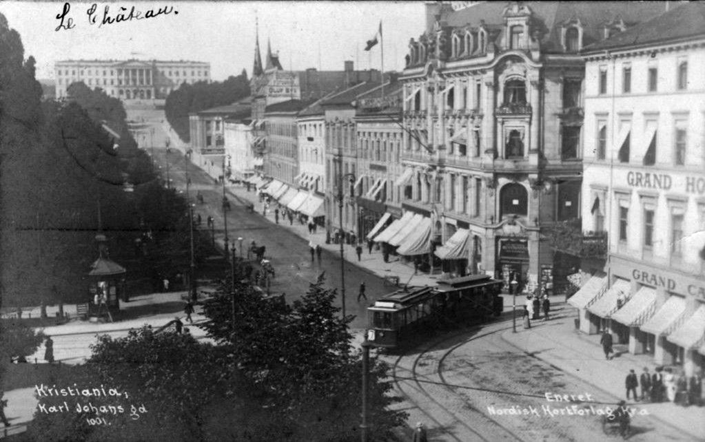
In Oslo, I took a three pictures of a building because obtaining a single photo was not possible.
The three individual images
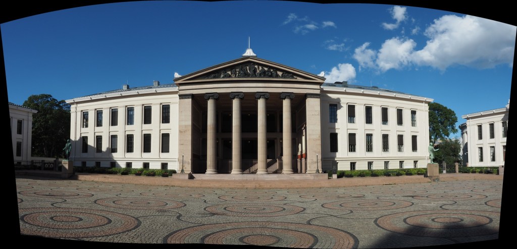
This is a very simple panorama, with feature points easy to find because of all the features on the buildings. Here is the result:
The panorama built using AutoStitch
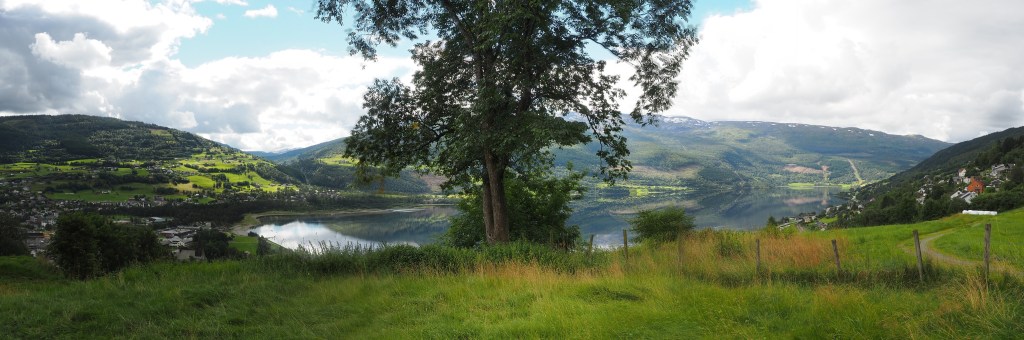
It’s not perfect, from the perspective of having some barrel distortion, but this could be removed. In fact the AutoStitch does an exceptional job, without having to set 1001 parameters. There are no visible seams, and the photograph seems like it was taken with a fisheye lens. Here is a second example, composed of three photographs taken on the hillside next to Voss, Norway. This panorama has been cropped.
A stitched scene with moving objects.
This scene is more problematic, largely because of the fluid nature of some of the objects. There are some things that just aren’t possible to fix in software. The most problematic object is the tree in the centre of the picture. Because tree branches move with the slightest breeze, it is hard to register the leaves between two consecutive shots. In the enlarged segment below, you can see the ghosting effect of the leaves, which almost gives that region in the resulting panorama a blurry effect. So panorama’s containing natural objects that move are more challenging.
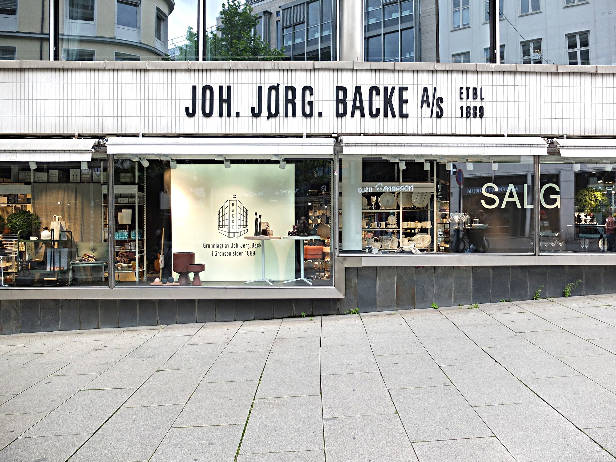
Using a sharpening filter is really contingent upon the content of an image. Increasing the size of a filter may have some impact, but it may also have no perceptible impact – what-so-ever. Consider the following photograph of the front of a homewares store taken in Oslo.
A storefront in Oslo with a cool font
The image (which is 1500×2000 pixels – down sampled from a 12MP image) contains a lot of fine details, from the stores signage, to small objects in the window, text throughout the image, and even the lines on the pavement. So sharpening would have an impact on the visual acuity of this image. Here is the image sharpened using the “Unsharp Mask” filter in ImageJ (radius=10, mask-weight=0.3). You can see the image has been sharpened, as much by the increase in contrast than anything else.
Image sharpened with Unsharp masking radius=10, mask-weight=0.3
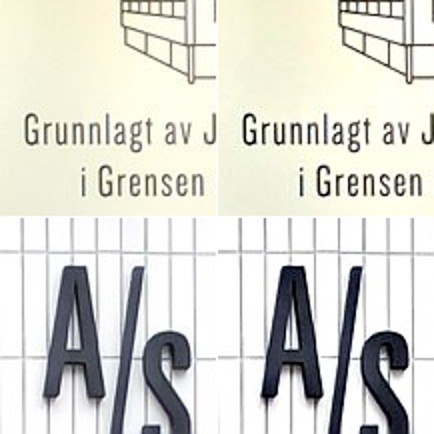
Here is a close-up of two regions, showing how increasing the sharpness has effectively increased the contrast.
Pre-filtering (left) vs. post-sharpening (right)
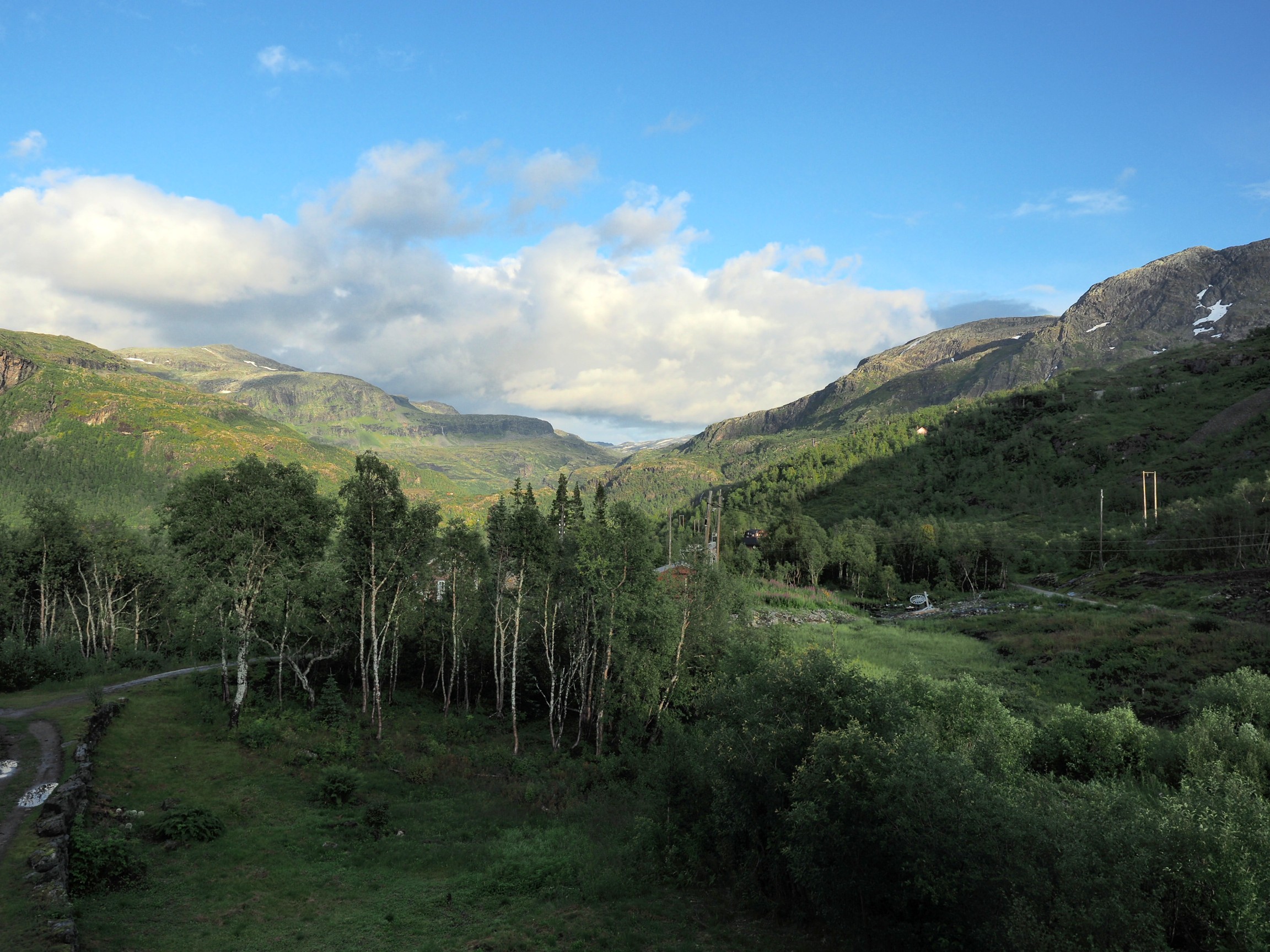
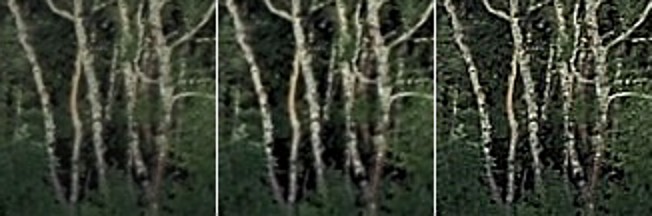
Now consider an image of a landscape (also from a trip to Norway). Landscape photographs tend to lack the same type of detail found in urban photographs, so sharpening will have a different effect on these types of image. The impact of sharpening will be reduced in most of the image, and will really only manifest itself in the very thin linear structures, such as the trees.
Sharpening tends to work best on features of interest with existing contrast between the feature and its surrounding area. Features that are too thin can sometimes become distorted. Indeed sometimes large photographs do not need any sharpening, because the human eye has the ability to interpret the details in the photograph, and increasing sharpness may just distort that. Again this is one of the reasons image processing relies heavily on aesthetic appeal. Here is the image sharpened using the same parameters as the previous example:
Image sharpened with Unsharp masking radius=10, mask-weight=0.3
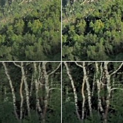
There is a small change in contrast, most noticeable in the linear structures, such as the birch trees. Again the filter uses contrast to improve acuity (Note that if the filter were small, say with a radius of 3 pixels, the result would be minimal). Here is a close-up of two regions.
Pre-filtering (left) vs. post-sharpening (right)
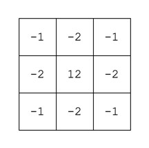
Note that the type of filter also impacts the quality of the sharpening. Compare the above results with those of the ImageJ “Sharpen” filter, which uses a kernel of the form:
ImageJ “Sharpen” filter
Notice that the “Sharpen” filter produces more detail, but at the expense of possibly overshooting some regions in the image, and making the image appear grainy. There is such as thing as too much sharpening.
Original vs. ImageJ “Unsharp Masking” filter vs. ImageJ “Sharpen” filter
So in conclusion, the aesthetic appeal of an image which has been sharpened is a combination of the type of filter used, the strength/size of the filter, and the content of the image.
It is unavoidable – processing colour images using some types of algorithms may cause subtle changes in the colour of an image which affect its aesthetic value. We have seen this in certain forms of the unsharp masking parameters used in ImageJ. How do we avoid this? One way is to create a more complicated algorithm, but the reality is that without knowing exactly how a pixel contributes to an object that’s basically impossible. Another way, which is way more convenient is to use a separable colour space. RGB is not separable – the red, green and blue components must work together to form an image. Modify one of these components, and it will have an affect on the rest of them. However if we use a colour space such as HSV (Hue-Saturation-Value), HSB (Hue-Saturation-Brightness) or CIELab, we can avoid colour shifts altogether. This is because these colour spaces separate luminance from colour information, therefore image sharpening can be performed on the luminance layer only – something known as luminancesharpening.
Luminance, brightness, or intensity can be thought of as the “structural” information in the image. For example first we convert an image from RGB to HSB, then process only the brightness layer of the HSB image. Then convert back to RGB. For example, below are two original regions extracted from an image, both containing differing levels of blur.
Original “blurry” image
Here is the RGB processed image (UM, radius=10, mask weight=0.5):
Sharpened using RGB colour space
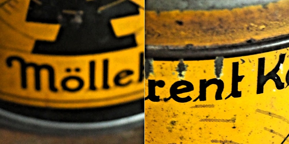
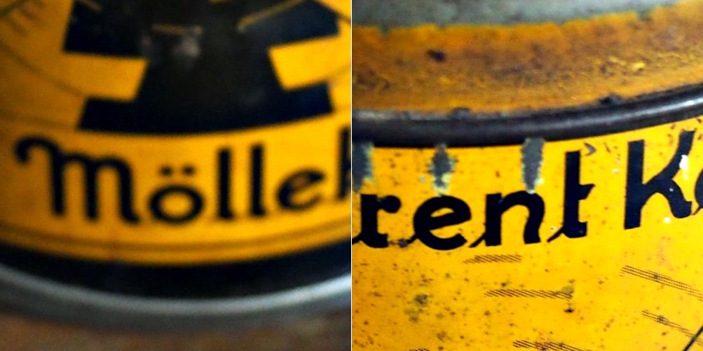
Note the subtle changes in colour in the region surrounding the letters? Almost a halo-type effect. This sort of colour shift should be avoided. Now below is the HSB processed image using the same parameters applied to only the brightness layer:
Sharpened using the Brightness layer of HSB colour space
Notice that there are acuity improvements in both images, however it is more apparent in the right half, “rent K”. The black objects in the left half, have had their contrast improved, i.e. the black got blacker against the yellow background, and hence their acuity has been marginally enhanced. Neither suffers from colour shifts.
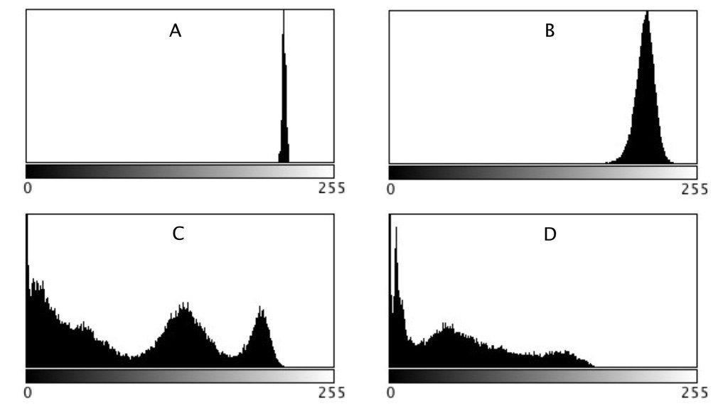
The simplest data about an image it that contained within its histogram, or rather the distribution of pixel intensities. In an 8-bit grayscale image, this results in a 256-bin histogram which tells a story about how the pixels are distributed within the image. Most digital cameras also have some form of colour histogram which can be used to determine distribution of colours in an image. This lets the photographer determine whether the photograph is over- under- or correctly exposed. A correctly exposed photograph will have a fairly uniform histogram, whereas an under-exposed one has a bias towards darker tones, and an over-exposed one will have a bias towards brighter tones.
This by no means means that a histogram that has two distinct modes does not represent a good image. As long as the histogram is well distributed between the lower and upper limits of the colour space. Consider the image below:
From an aesthetic perspective, this does not seem like a bad looking image. Its histogram somewhat collaborates this:
In fact there is limited scope for enhancement here. Application of contrast-stretching or histogram equalization will increase its aesthetic appeal marginally. One of the properties of an image that a histogram helps identify is contrast, or dynamic range. On the other end of the spectrum, consider this image which has a narrow dynamic range.
The histogram clearly shows the lack of range in the image.
Stretching the histogram to either end of the spectrum increases the contrast of the image. The result is shown below.
It has a broader dynamic range, and a greater contrast of features within the image.
In a previous post we looked at whether image blur could be fixed, and concluded that some of it could be slightly reduced, but heavy blur likely could not. Here is the image we used, showing blur at two ends of the spectrum.
Blur at two ends of the spectrum: heavy (left) and light (right).
Now the “Unsharp Masking” filter in ImageJ, is not terribly different from that found in other applications. It allows the user to specify a “radius” for the Gaussian blur filter, and a mask weight (0.1-0.9). How does modifying the parameters affect the filtered image? Here are some examples using a radius of 10 pixels, and a variable mask weight.
Radius = 10; Mask weight = 0.25
Radius = 10; Mask weight = 0.5
Radius = 10; Mask weight = 0.75
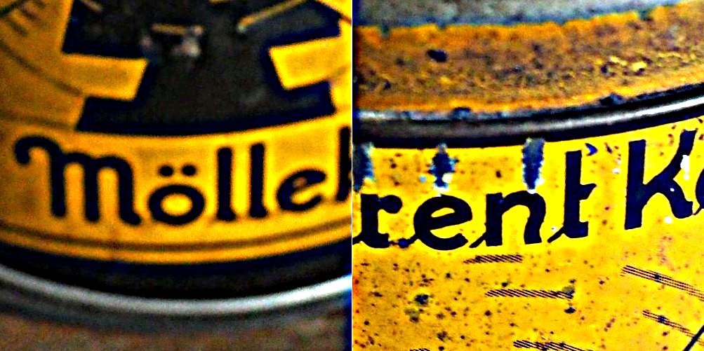
We can see that as the mask weight increases, the contrast change begins to affect the colour in the image. Our eyes may perceive the “rent K” text to be sharper in the third image with MW=0.75, but the colour has been impacted in such as way that the image aesthetics have been compromised. There is little change to the acuity of the “Mölle” text (apart from the colour contrast). A change in contrast can certainly improve the visibility of detail in the image (i.e. they are easier to discern), however maybe not their actual acuity. It is sometimes a trick of the eye.
What about if we changed the radius? Does a larger radius make a difference? Here is what happens when we use a radius of 40 pixels, and a MW=0.25.
Radius = 40; Mask weight = 0.25
Again, the contrast is slightly increased, and perceptual acuity may be marginally improved, but again this is likely due to the contrast element of the filter.
Note that using a small filter size, e.g. 3-5 pixels in a large image (12-16MP) will have little effect, unless there are features in the image that size. For example, in an image containing features 1-2 pixels in width (e.g. a macro image), this might be appropriate, however will likely do very little in a landscape image.
Sometimes algorithms talk about the mean or variance of a region of an image (sometimes called a neighbourhood, or window). But what does this refer to? The mean is the average of a series of numbers, and the variance measures the average degree to which each number is different from the mean. So the mean of a 3×3 pixel neighbourhood is average of the 9 pixels within it, and the variance is the degree to which every pixel in the neighbourhood varies from the mean. To obtain a better perspective, it’s best to actually explore some images. Consider the grayscale image in Fig.1.
Fig 1: The original image
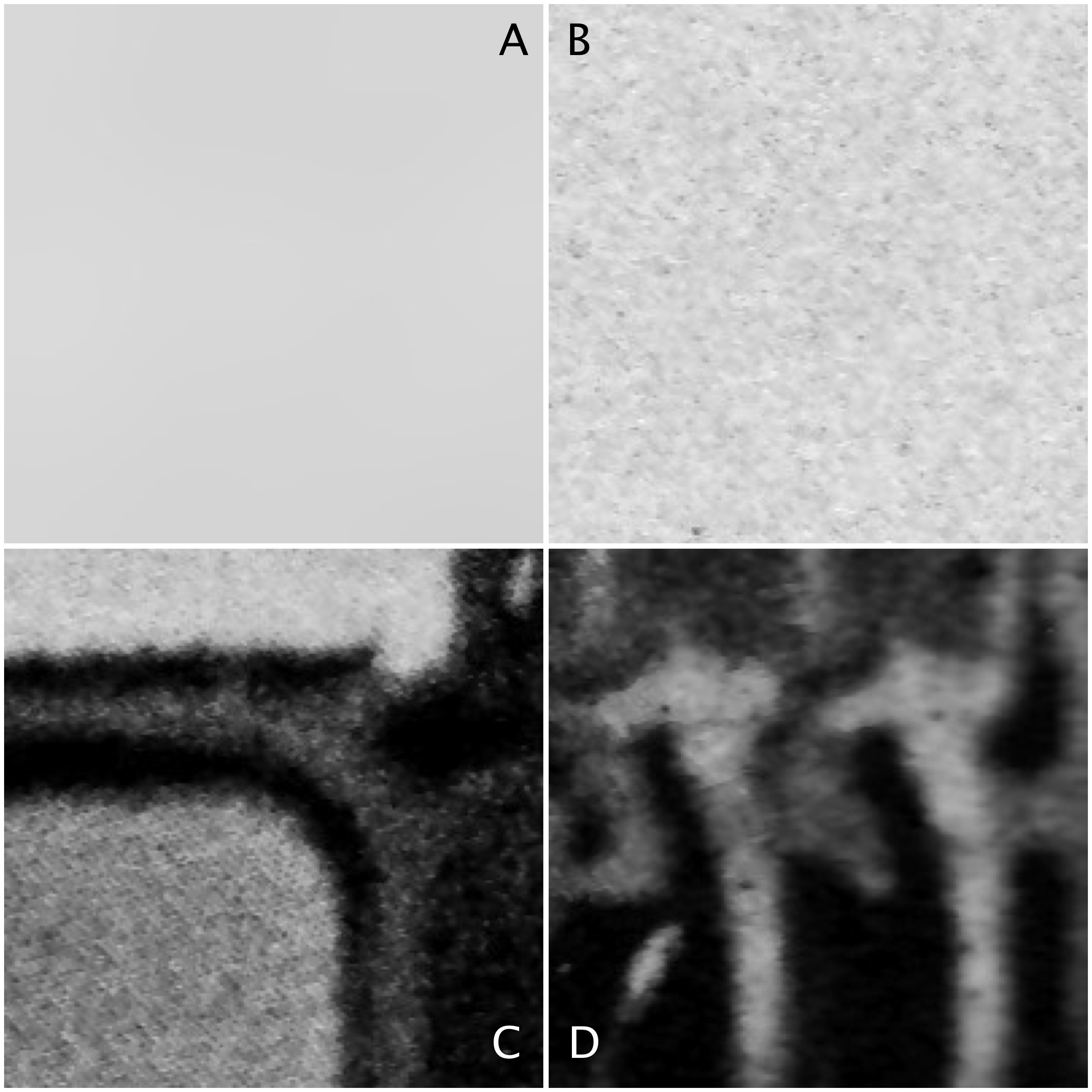
Four 200×200 regions have been extracted from the image, they are shown in Fig.2.
Fig.2: Different image regions
Statistics are given at the end of the post. Region B represents a part of the background sky. Region A is the same region processed using a median filter to smooth out discontinuities. In comparing region A and B, they both have similar means: 214.3 and 212.37 respectively. Yet their appearance is different – one is uniform, and the other seems to contain some variance, something we might attribute to noise in some circumstances. The variance of A is 2.65, versus 70.57 for B. Variance is a poor descriptive statistic, because it is hard to visualize, so many times it is converted to standard deviation (SD), which is just the square root of variance. For A and B, this is 1.63 and 8.4 respectively.
As shown in region C and D, more complex scenes introduce an increased variance, and SD. The variances can be associated with the distribution of the histograms shown below.
Fig 3: Comparison of histograms
When comparing two regions, a lower variance (or in reality a lower SD) usually implies a more uniform region of pixels. Generally, mean and variance are not good estimators for image content because two totally different images can have same mean, and variance.
Everyone has some image that they wish had better resolution, i.e. the image would have finer detail. The problem with this concept is that it is almost impossible to create pixels from information that did not exist in the original image. For example if you want to increase the size of an image 4 times, that basically means that a 100×100 pixel image would be transformed into an image 400×400 pixels in size. There is a glitch here though, increasing the dimensions of the image by four times, actually increases the data within the image by 16 times. The original image had 10,000 pixels, yet the new image will have 160,000 pixels. That means 150,000 pixels of information will have to be interpreted from the original 10,000 pixels. That’s a lot of “padding” information that doesn’t exist.
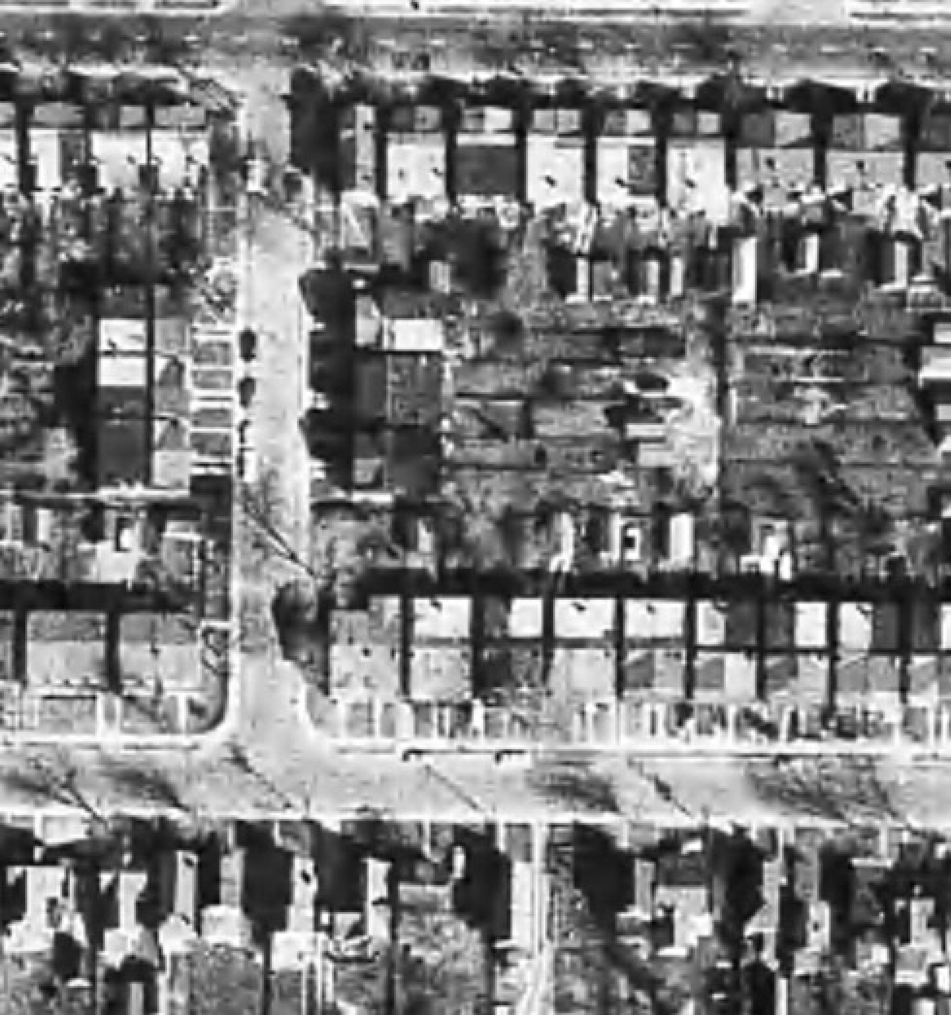
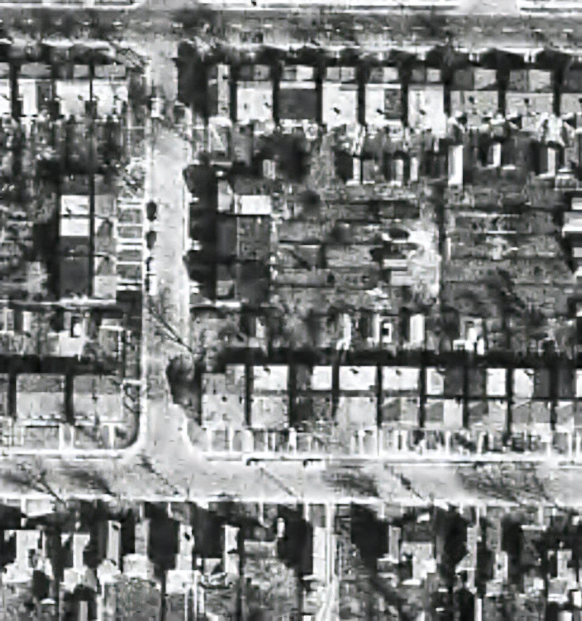
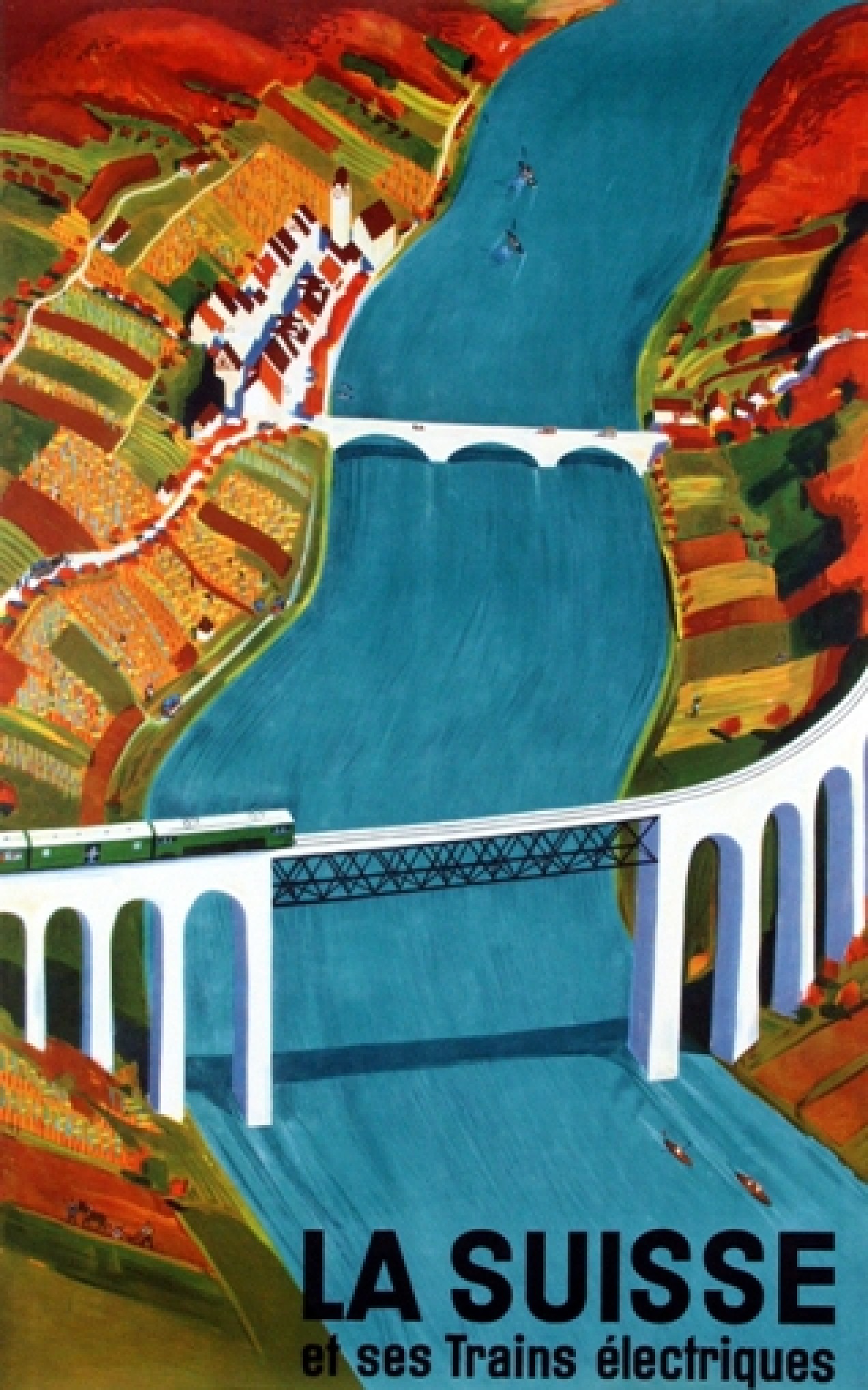
There are a lot of algorithms out there that suggest that they can increase the resolution of an image anywhere from 2-16 times. It is easy to be skeptical about these claims, so do they work? I tested two of these platforms on two vastly different images. Images where I was interested in seeing a higher resolution. The first image is a segment of an B&W aerial photograph of my neighbourhood from 1959. I have always been interested in seeing the finer details, so will super-resolution fix this problem? The second image is a small image of a vintage art poster which I would print were it to have better resolution.
My experiments were performed on two online systems: (i) AI Image Enlarger, and (ii) Deep Image. Now both seem to use AI in some manner to perform the super-resolution. I upscaled both images 4 times (the max of the free settings). Now these experiments are quick-and-dirty, offering inputs from the broadest ends of the spectrum. They are compared to the original image “upscaled” four times using a simple scaling algorithm, i.e. each pixel in the input image becomes 4 pixels in the output image.
The first experiment with the B&W aerial photograph (490×503) increased the size of the image to 1960×2092 pixels. Neither super-resolution algorithm produced any results which are perceptually different from the original, i.e. there is no perceived enhanced resolution. This works to the theory of “garbage-in, garbage-out”, i.e. you cannot make information from nothing. Photographs are inherently harder to upsize than other forms of image.
The original aerial image (left) compared with the super-resolution image produced by AI Image Enlarger (right).
The original aerial image (left) compared with the super-resolution image produced by Deep Image (right).
The next experiment with the coloured poster (318×509) increased the size of the image to 1272×2036 pixels. Here the results from both algorithms are quite good. Both algorithms enhance detail within the images, making things more crisp, aesthetically pleasing, and actually increasing the detail resolution. Why did the poster turn out better? This is mainly because artwork contains a lot more distinct edges between objects, and the colour also likely contributes to the algorithms success.
The original poster image (left) compared with the super-resolution image produced by AI Image Enlarger (right).
The original poster image (left) compared with the super-resolution image produced by Deep Image (right).
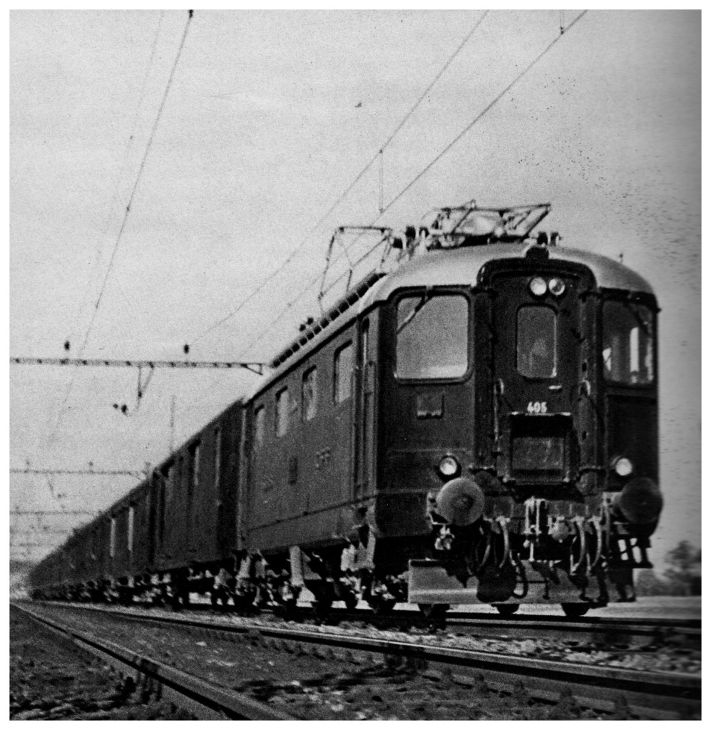
To compare the algorithms, I have extracted two segments from the poster image, to show how the differing algorithms deal with the super-resolution. The AI Image Enlarger seems to retain more details, while producing a softer look, whereas Deep Image enhances some details (river flow) at the expense of others, some of which it almost erodes (bridge structure, locomotive windows).
It’s all in the details: AI Image Enlarger (left) vs. Deep Image (right)
The other big difference is that AI Image Enlarger was relatively fast, whereas Deep Image was as slow as molasses. The overall conclusion? I think super-resolution algorithms work fine for tasks that have a good amount of contrast in them, and possibly images with distinct transitions, such as artwork. However trying to get details out of images with indistinct objects in them is not going to work too well.
Most modern cameras automatically focus a scene before a photograph is acquired. This is way easier than the manual focus that occurred in the ancient world of analog cameras. When part of a scene is blurry, then we consider this to be out-of-focus. This can be achieved in a couple of ways. One way is by means of using the Aperture Priority setting on a camera. Blur occurs when there is a shallow depth of field. Opening up the aperture to f/2.8 allows in more light, and the camera will compensate with the appropriate shutter speed. It also means that objects not in the focus plane will be blurred. Another way is through manually focusing a lens.
Either way, the result is optical blur. But optical blur is by no means shapeless, and has a lot to do with a concept known as the circle of confusion (CoC). The CoC occurs when the light rays passing through the lens are not perfectly focused. It is sometimes known as the disk of confusion, circle of indistinctness, blur circle, or blur spot. CoC is also associated with the concept of Bokeh, which I will discuss in a later post. Although honestly – circle of confusion may not be the best term. In German the term used is “Unschärfekreis”, which translates to “circle of non-sharpness“, which inherently makes more sense.
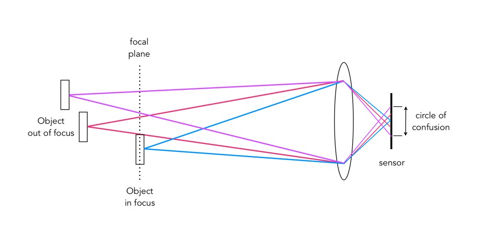
A photograph is basically an accumulation of many points – which represent the exact points in the real scene. Light striking an object reflects off many points on the object, which are then redirected onto the sensor by the lens. Each of these points is reproduced by the lens as a circle. When in focus, the circle appears as a sharp point, otherwise the out-of-focus region appears as circle to the eye. Naturally the “circle” normally takes the shape of the aperture, because the light passes through it. The following diagram illustrates the “circle of confusion“. A photograph is exactly sharp only on the focal plane, with more or less blur around it. The amount of blur depends on an objects distance from the focal plane. The further away, the more distinct the blur. The blue lines signify an object in focus. Both the red and purple lines show objects not in the focal plane, creating large circles of confusion (i.e. non-sharpness = blur).
The basics of the “circle of confusion”
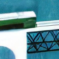
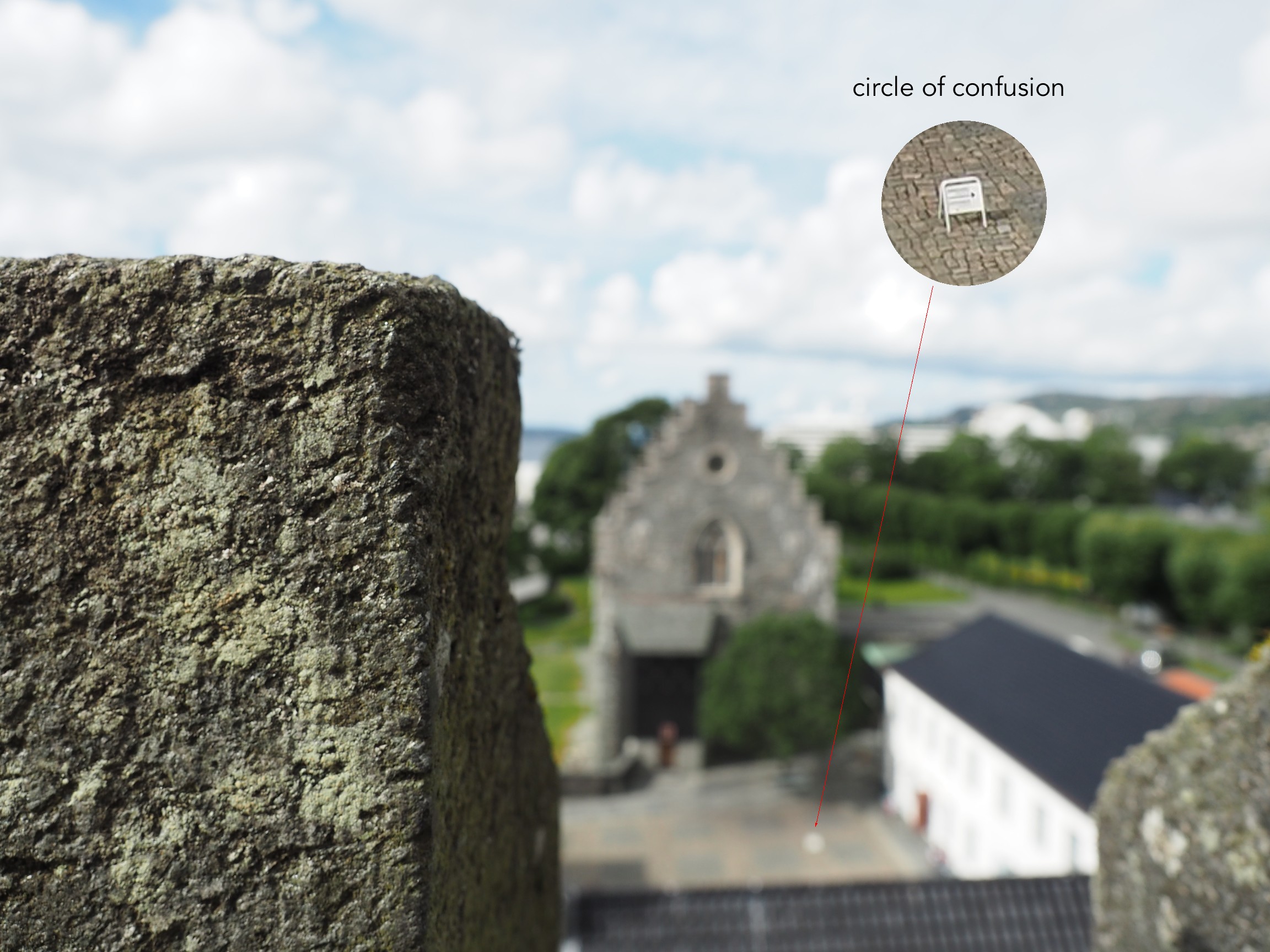
Here is a small example. The photograph below is taken in Bergen, Norway. The merlon on the battlement is in focus with the remainder of the photograph beyond that blurry. Circles of confusion are easiest to spot as small bright objects on darker backgrounds. Here a small white sign becomes a blurred circle-of-confusion.
An example of the circle of confusion as a bright object.
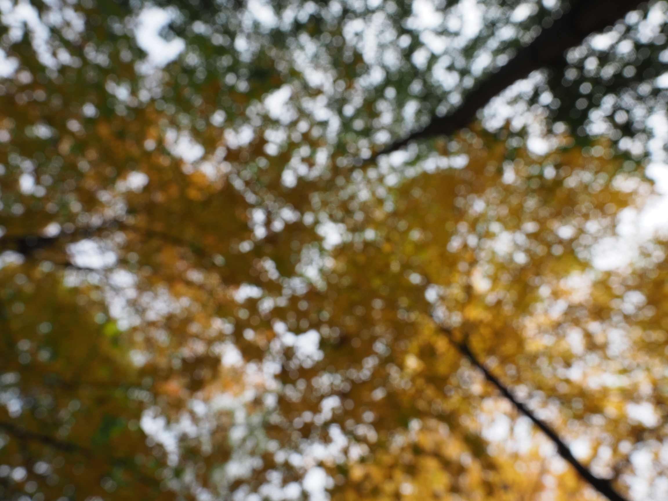
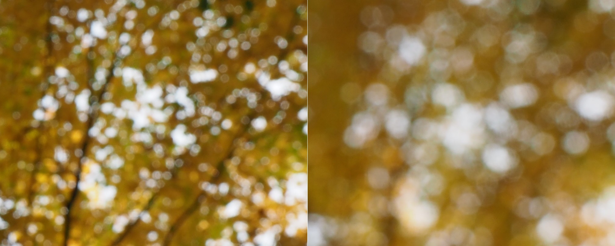
Here is a second example, of a forest canopy, taken through focusing manually. The CoC are very prevalent.
An example where the whole image is composed of blur.
As we de-focus the image further, the CoC’s become larger, as shown in the example below.
As the defocus increases (from left to right), so too does the blur, and the size of the CoC.
Note that due to the disparity in blurriness in a photograph, it may be challenging to apply a “sharpening” filter to such an image.
Some types of photography lend themselves to inherent distortions in the photograph, most notably those related to architectural photography. The most prominent of these is the keystone effect, a form of perspective distortion which is caused by shooting a subject at an extreme angle, which results in converging vertical (and also horizontal) lines. The name is derived from the archetypal shape of the distortion, which is similar to a keystone, the wedge-shaped stone at the apex of a masonry arch.
Fig.1: The keystone effect
The most common form of keystone effect is a vertical distortion. It is most obvious when photographing man-made objects with straight edges, like buildings. If the object is taller than the photographer, then an attempt will be made to fit the entire object into the frame, typically by tilting the camera. This causes vertical lines that seem parallel to the human visual system to converge at the top of the photograph (vertical convergence). In photographs containing tall linear structures, it appears as though they are “falling” or “leaning” within the picture. The keystone effect becomes very pronounced with wide-angle lenses.
Fig.2: Why the keystone effect occurs
Why does it occur? Lenses are designed to show straight lines, but only if the camera is pointed directly at the object being photographed, such that the object and image plane are parallel. As soon as a camera is tilted, the distance between the image plane and the object is no longer uniform at all points. In Fig.2, two examples are shown. The left example shows a typical scenario where a camera is pointed at an angle towards a building so that the entire building is in the frame. The angle of both the image plane and the lens plane are different to the vertical plane of the building, and so the base of the building appears closer to the image plane than the top, resulting in a skewed building in the resulting image. Conversely the right example shows an image being taken with the image plane parallel to the vertical plane of the building, at the mid-point. This is illustrated further in Fig.3.
Fig.3: Various perspectives of a building
There are a number of ways of alleviating the keystone effect. The first method involves the use of specialized perspective control and tilt-shift lenses. The best way to avoid the keystone effect is to move further back from the subject, with the reduced angle resulting in straighter lines. The effects of this perspective distortion can be removed through a process known as keystone correction, or keystoning. This can be achieved in-camera using the cameras proprietary software, before the shot is taken, or in post processing on mobile devices using apps such as SKRWT. It is also possible to perform the correction with post-processing using software such as Photoshop.
Many image post-processing applications use unsharp masking (UM) as their choice of sharpening algorithm. It is one of the most ubiquitous methods of image sharpening. Unsharp masking was introduced by Schreiber [1] in 1970 for the purpose of improving the quality of wirephoto pictures for newspapers. It is based on the principle of photographic masking whereby a low-contrast positive transparency is made of the original negative. The mask is then “sandwiched” with the negative, and the amalgam used to produce the final print. The effect is an increase in sharpness.
The process of unsharp masking accentuates the high-frequency components of an image, i.e. the edge regions where there is a sharp transition in image intensity. It does this by extracting the high-frequency details from an image, and adding them to the original image. This process can be better understood by first considering a 1D signal shown in the figure below.
An example of unsharp masking using a 1D signal
This is the process of what happens to the signal
The original signal.
The signal is “blurred”, by a filter which enhances the “low-frequency” components of the signal.
The blurred signal, ➁, is subtracted from ➀, to extract the “high-frequency” components of the signal, i.e. the “edge” signal.
The “edge” signal is added to the original signal ➀ to produce the sharpened signal.
In the context of digital images unsharp masking works by subtracting a blurred form of an image from the original image itself to create an “edge” image which is then used to improve the acuity of the original image. There are many different approaches to unsharp masking which use differing forms of filters. Some use a more traditional approach using the process outlines above, with the blurring actuated using a Gaussian blur, while others use specific filters which create “edge” images directly, which can be either added to, or subtracted from the original image.
[1] Schreiber, W., “Wirephoto quality improvement by unsharp masking,” Pattern Recognition, Vol.2, pp.117-121 (1970).