Programming to process images : scripting

If you don’t want to learn a programming language, but you do want to go beyond the likes of Photoshop and GIMP, then you should consider ImageMagick, and the use of scripts. ImageMagick is used to create, compose, edit and convert images. It can deal with over 200 image formats, and allows processing on the command-line.

1. Using the command line

Most systems like MacOS and Linux, provide what is known as a “shell”. For example in OSX it can be accessed through the “Terminal” app, although it is nicer to use an app like iTerm2. When a window is opened up in the Terminal (or iTerm2), the system applies a shell, which is essentially an environment that you can work in. In a Mac’s OSX, this is usually the “Z” shell, or zsh for short. It let’s you list files, change folders (directories), and manipulate files, among many other things. At this lower level of the system, aptly known as the command-line, programs can be executed using the keyboard. The command-line is different from using an app. It is not WYSIWYG, What-You-See-Is-What-You-Get, but it is perfect for tasks where you know what you want done, or you want to process a whole series of images in the same way.

2. Processing on the command line

Processing on the command-line is very much a text-based endeavour. No one is going to apply a curve-tool to an image in this manner because there is no way of seeing the process happen live. But for other tasks, things are just done way easier on the command line. A case in point is batch-processing. For example say we have a folder of 16 megapixel images, which we want to reduce in size for use on the web. It is uber tedious to have to open them up in an application, and then save each individually at a reduced size. Consider the following example which reduces the size of an image by 50%, i.e. its dimensions are reduced by 50%, using one of the ImageMagick commands:

magick yorkshire.png -resize 50% yorkshire50p.png

There is also a plethora of ready-made scripts out there, for example Fred’s ImageMagick Scripts.

3. Scripting

Command-line processing can be made more powerful using a scripting language. Now it is possible to do batch processing in ImageMagick using mogrify. For example to reduce all PNG images by 40% is simple:

magick mogrify -resize 40% *.png

The one problem here is that mogrify  will overwrite the existing images, so it should be run on copies of the original images. An easier way is to learn about shell scripts, which are small programs designed to run in the shell – basically they are just a list of commands to be performed. These scripts use some of the same constructs as normal programming languages to perform tasks, but also allow the use of a myriad of programs from the system. For example, below is a shell script written in bash (a type of shell), and using the convert command from ImageMagick to convert all the JPG files to PNG.

#!/bin/bash
for img in *.jpg
do
    filename=$(basename "$img")
    extension="${filename##*.}"
    filename="${filename%.*}"
    echo $filename
    convert "$img" "$filename.png"
done

It uses a loop to process each of the JPG files, without affecting the original files. There is some fancy stuff going on before we call convert, but all that does is split the filename and its extension (jpg), keeping the filename, and ditching the extension, so that a new extension (png) can be added to the processed image file.

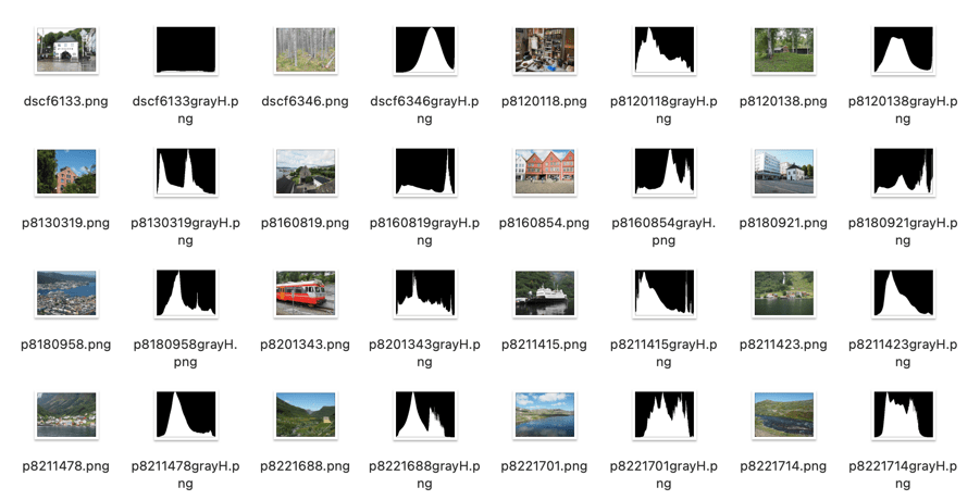
Sometimes I like to view the intensity histograms of a folder of images but don’t want to have to view them all in an app. Is there an easier way? Again we can write a script.

#!/bin/bash
var1="grayH"
for img in *.png
do
   # Extract basename, ditching extension
   filename=$(basename "$img")
   extension="${filename##*.}"
   filename="${filename%.*}"
   echo $filename

   # Create new filenames
   grayhist="$filename$var1"

   # Generate intensity / grayscale histograms
   convert $filename.png -colorspace Gray -define histogram:unique-colors=false histogram:$grayhist.png
done

Below is a sample of the output applied to a folder. Now I can easily see what the intensity histogram associated with each image looks like.

Histograms generated using a script.

Yes, some of these seem a bit complicated, but once you have a script it can be easily modified to perform other batch processing tasks.

Programming to process images : coding

People take photographs for a number of reasons. People process images for a number of reasons. Some people (like me) spend as little time as possible post-processing images, others spend hours in applications like Photoshop, tweaking every possible part of an image. To each their own. There are others still who like to tinker with the techniques themselves, writing their own software to process their images. There are many different things to consider, and my hope in this post is to try and look at what it means to create your own image processing programs to manipulate images.

Methods of image manipulation

1. What do you want to achieve?

The first thing to ask is what do you want to achieve? Do you want to implement algorithms you can’t find in regular photo manipulating programs? Do you want to batch process images? There are various different approaches here. If you want to batch process images, for example converting hundreds of images to another file format, or automatically generating histograms of images, then it is possible to learn some basic scripting, and use existing image manipulation programs such as ImageMagick. If you want to write heavier algorithms, for example some fancy new Instagram-like filter, then you will have to learn how to program using a programming language.

2. To program you need to understand algorithms

Programming of course is not a trivial thing, as much as people like to make it sound easy. It is all about taking an algorithm, which is a precise description of a method for solving a problem, and translating it into a program using a programming language. The algorithms can already exist, or they can be created from scratch. For example, a Clarendon-like (Instagram) image filter can be reproduced with the following algorithm (shown visually below):

  1. Read in an image from file.
  2. Add a blue tint to the image by blending it with a blue image of the same size (e.g. R=127, G=187, B=227, opacity = 20%).
  3. Increase the contrast of the image by 20%.
  4. Increase the saturation of the image by 35%.
  5. Save the new Clarendon-like filtered image in a new file.
A visual depiction of the algorithm for a Clarendon filter-like effect

To reproduce any of these tasks, we need to have an understanding of how to translate the algorithm into a program using a programming language, which is not always a trivial task. For example to perform the task of increasing the saturation of an image, we have to perform a number of steps:

  1. Convert the image to a colour model which allows saturation to be easily modified, for example HSI, which has three component layers: Hue, Saturation, and Intensity.
  2. Increase in saturation by manipulating the Saturation layer, i.e. multiplying all values by 1.2.
  3. Convert the image from HSI back to RGB.

Each of these tasks in turn requires additional steps. You can see this could become somewhat long-winded if the algorithm is complex.

3. To implement algorithms you need a programming language

The next trick is the programming language. Most people don’t really want to get bogged down in programming because of the idiosyncrasies of programming languages. But in order to convert an algorithm to a program, you have to choose a programming language, and learn how to code in it.

There are many programming languages, some are old, some are new. Some are easier to use than others. Novice programmers often opt for a language such as Python which is easy to learn, and offers a wide array of existing libraries or algorithms. The trick with programming is that you don’t necessarily want to reinvent the wheel. You don’t want to have to implement an algorithm that already exists. That’s why programming languages provide functions like sqrt() and log(), so people don’t have to implement them. For example, Akiomi Kamakura has already created a Python library called Pilgram, which contains a series of mimicked Instragram filters (26 of them), some CSS filters, and blend modes. So choosing Python means that you don’t have to build these from scratch, if anything they might provide inspiration to build your own filters. For example the following Python program uses Pilgram to apply the Clarendon filter to a JPG image:

from PIL import Image
import pilgram
import os

inputfile = input('Enter image filename (jpg): ')
base = os.path.splitext(inputfile)[0]
outputfile = base + '-clarendon.jpg'
print(base)
print(outputfile)

im = Image.open(inputfile)
pilgram.clarendon(im).save(outputfile)

The top part of the program imports the libraries, the middle portion deals with obtaining the filename of the image to be processed, and producing an output filename, and the last two lines actually open the image, process it with the filter, and save the filtered image. Fun right? But you still have to learn how to code in Python. Python comes with it’s own baggage (like dependencies, and being uber slow), but overall it is still a solid language, and easy to learn for novices. There are also other computer vision/image processing libraries such as scikit-image, SimpleCV and OpenCV. And in reality that is the crux here, programming for beginners.

If you really want to program in a more “complex” language, like C or C++ there is often a much steeper learning curve, and fewer libraries. I would not advocate for a fledgling programmer to learn any C-based language, only because it will result in being bogged down by the language itself. For the individual hell-bent on learning one of these languages I would suggest Fortran. Fortran was the first high-level programming language, introduced in 1957, however it has evolved, and modern Fortran is easy to learn, and use. It doesn’t come with much in the way of image processing libraries, but if you persevere you can build them.

Why are there no 3D colour histograms?

Some people probably wonder why there aren’t any 3D colour histograms. I mean if a colour image is comprised of red, green, and blue components, why not provide those in a combined manner rather than separate 2D histograms or a single 2D histogram with the R,G,B overlaid? Well, it’s not that simple.

A 2D histogram has 256 pieces of information (grayscale). A 24-bit colour image contains 2563 colours in it – that’s 16,777,216 pieces of information. So a three-dimensional “histogram” would contain the same number of elements. Well, it’s not really a histogram, more of a 3D representation of the diversity of colours in the image. Consider the example shown in Figure 1. The sample image contains 428,763 unique colours, representing just 2.5% of all available colours. Two different views of the colour cube (rotated) show the dispersion of colours. Both show the vastness of the 3D space, and conversely the sparsity of the image colour information.

Figure 1: A colour image and 3D colour distribution cubes shown at different angles

It is extremely hard to create a true 3D histogram. A true 3D histogram would have a count of the number of pixels with a particular RGB triplet at every point. For example, how many times does the colour (23,157,87) occur? It’s hard to visualize this in a 3D sense, because unlike the 2D histogram which displays frequency as the number of occurrences of each grayscale intensity, the same is not possible in 3D. Well it is, kind-of.

In a 3D histogram which already uses the three dimensions to represent R, G, and B, there would have to be a fourth dimension to hold the number of times a colour occurs. To obtain a true 3D histogram, we would have to group the colours into “cells” which are essentially clusters representing similar colours. An example of the frequency-weighted histogram with for the image in Figure 2, using 500 cells, is shown in Figure 2. You can see that while in the colour distribution cube in Figure 1 shows a large band of reds, because these colours exist in the image, the frequency weighted histogram shows that objects with red colours actually comprise a small number of pixels in the image.

Figure 2: The frequency-distributed histogram of the image in Fig.1

The bigger problem is that it is quite hard to visualize a 3D anything and actively manipulate it. There are very few tools for this. Theoretically it makes sense to deal with 3D data in 3D. The application ImageJ (Fiji) does offer an add-on called Color Inspector 3D, which facilitates viewing and manipulating an image in 3D, in a number of differing colour spaces. Consider another example, shown in Figure 3. The aerial image, taken above Montreal lacks contrast. From the example shown, you can see that the colour image takes up quite a thin band of colours, almost on the black-white diagonal (it has 186,322 uniques colours).

Figure 3: Another sample colour image and its 3D colour distribution cube

Using the contrast tool provided in ImageJ, it is possible to manipulate the contrast in 3D. Here we have increased the contrast by 2.1 times. You can easily see the result in Figure 4. difference working in 3D makes. This is something that is much harder to do in two dimensions, manipulating each colour independently.

Figure 4: Increasing contrast via the 3D cube

Another example of increasing colour saturation 2 times, and the associated 3D colour distribution is shown in Figure 5. The Color Inspector 3D also allows viewing and manipulating the image in other colour spaces such as HSB and CieLab. For example in HSB the true effect of manipulating saturation can be gauged. The downside is that it does not actually process the full-resolution image, but rather one reduced in size, largely because I imagine it can’t handle the size of the image, and allow manipulation in real-time.

Figure 5: Increasing saturation via the 3D cube

the image histogram (ii) – grayscale vs colour

In terms of image processing there are two basic types of histogram: (i) colour, and (ii) intensity (or luminance/grayscale) histograms. Figure 1 shows a colour image (an aerial shot of Montreal), and its associated RGB and intensity histograms. Colour histograms are essentially RGB histograms, typically represented by three separate histograms, one for each of the components – Red, Green, and Blue. The three R,G,B histograms are sometimes shown in one mixed histogram with all three R,G,B, components overlaid with one another (sometimes including an intensity histogram).

Fig.1: Colour and grayscale histograms

Both RGB and intensity histograms contain the same basic information – the distribution of values. The difference lies in what the values represent. In an intensity histogram, the values represent the intensity values in a grayscale image (typically 0 to 255). In an RGB histogram, divided into individual R, G, B histograms, each colour channel is just a graph of the frequencies of each of the RGB component values of each pixel.

An example is shown in Figure 2. Here a single pixel is extracted from an image. The RGB triplet for the pixel is (230,154,182) i.e. it has a red value of 230, a green value of 154, and a blue value of 182. Each value is counted in its respective bin in the associated component histogram. So red value 230 is counted in the bin marked as “230” in the red histogram. The three R,G, B histograms are visually no different than an intensity histogram. The individual R, G, and B histograms do not represent distributions of colours, but merely distributions of components – for that you need a 3D histogram (see bottom).

Fig.2: How an RGB histogram works: From single RGB pixel to RGB component histograms

Applications portray colour histograms in many different forms. Figure 3 shows the RGB histograms from three differing applications: Apple Photos, ImageJ, and ImageMagick. Apple Photos provides the user with the option of showing the luminance histogram, the mixed RGB, or the individual R, G, B histograms. The combined histogram shows all the overlaid R, G, B histograms, and a gray region showing where all three overlap. ImageJ shows the three components in separate histograms, and ImageMagick provides an option for their combined or separate. Note that some histograms (ImageMagick) seem a little “compressed”, because of the chosen x-scale.

Fig.3: How RGB histograms are depicted in applications

One thing you may notice when comparing intensity and RGB histograms is that the intensity histogram is very similar to the green channel or the RGB image (see Figure 4). The human eye is more sensitive to green light than red or blue light. Typically the green intensity levels within an image are most representative of the brightness distribution of the colour image.

Fig.4: The RGB-green histogram verus intensity histogram

An intensity image is normally created from an RGB image by converting each pixel so that it represents a value based on a weighted average of the three colours at that pixel. This weighting assumes that green represents 59% of the perceived intensity, while the red and blue channels account for just 30% and 11%, respectively. Here is the actual formula used:

gray = 0.299R + 0.587G + 0.114B

Once you have a grayscale image, it can be used to derive an intensity histogram. Figure 5 illustrates how a grayscale image is created from an RGB image using this formula.

Fig.5: Deriving a grayscale image from an RGB image

Honestly there isn’t really that much useful data in RGB histograms, although they seem to be very common in image manipulation applications, and digital cameras. The problem lies with the notion of the RGB colour space. It is a space in which chrominance and luminance are coupled together, and as such it is difficult to manipulate any one of the channels without causing shifts in colour. Typically, applications that allow manipulation of the histogram do so by first converting the image to a decoupled colour space such as HSB (Hue-Saturation-Brightness), where the brightness can be manipulated independently of the colour information.

A Note on 3D RGB: Although it would be somewhat useful, there are very few applications that provide a 3D histogram, constructed from the R, G, and B information. One reason is that these 3D matrices could be very sparse. Instead of three 2D histograms, each with 256 pieces of information, there is now a 3D histogram with 2563 or 16,777,216 pieces of information. The other reason is that 3D histograms are hard to visualize.

What is an RGB colour image?

Most colour images are stored using a colour model, and RGB is the most commonly used one. Digital cameras typically offer a specific RGB colour space such as sRGB. It is commonly used because it is based on how humans perceive colours, and has a good amount of theory underpinning it. For instance, a camera sensor detects the wavelength of light reflected from an object and differentiates it into the primary colours red, green, and blue.

An RGB image is represented by M×N colour pixels (M = width, N = height). When viewed on a screen, each pixel is displayed as a specific colour. However, deconstructed, an RGB image is actually composed of three layers. These layers, or component images are all M×N pixels in size, and represent the values associated with Red, Green and Blue. An example of an RGB image decoupled into its R-G-B component images is shown in Figure 1. None of the component images contain any colour, and are actually grayscale. An RGB image may then be viewed as a stack of three grayscale images. Corresponding pixels in all three R, G, B images help form the colour that is seen when the image is visualized.

A Decoupled RGB image
Fig.1: A “deconstructed” RGB image

The component images typically have pixels with values in the range 0 to 2B-1, where B is the number of bits of the image. If B=8, the values in each component image would range from 0..255. The number of bits used to represent the pixel values of the component images determines the bit depth of the RGB image. For example if a component image is 8-bit, then the corresponding RGB image would be a 24-bit RGB image (generally the standard). The number of possible colours in an RGB image is then (2B)3, so for B=8, there would be 16,777,216 possible colours.

Coupled together, each RGB pixel is described using a triplet of values, each of which is in the range 0 to 255. It is this triplet value that is interpreted by the output system to produce a colour which is perceived by the human visual system. An example of an RGB pixel’s triplet value, and the associated R-G-B component values is shown in Figure 2. The RGB value visualized as a lime-green colour is composed of the RGB triplet (193, 201, 64), i.e. Red=193, Green=201 and Blue=64.

Fig.2: Component values of an RGB pixel

One way of visualizing the R,G,B, components of an image is by means of a 3D colour cube. An example is shown in Figure 3. The RGB image shown has 310×510, or 158,100 pixels. Next to it is a colour cube with the three axes, R, G, and B, each with a range of values 0-255, producing a cube with 16,777,216 elements. Each of the images 122,113 unique colours is represented as a point in the cube (representing only 0.7% of available colours).

Fig 2 Example of colours in an RGB 3D cube

The caveat of the RGB colour model is that it is not a perceptual one, i.e. chrominance and luminance are not separated from one another, they are coupled together. Note that there are some colour models/space that are decoupled, i.e. they separate luminance information from chrominance information. A good example is HSV (Hue, Saturation, Value).

the image histogram (i) – what is it?

An image is really just a collection of pixels of differing intensities, regardless of whether it is a grayscale (achromatic) or colour image. Exploring the pixels collectively helps provide an insight into the statistical attributes of an image. One way of doing this is by means of a histogram, which represents statistical information in a visual format. Using a histogram it is easy to determine whether there are issues with an image, such as over-exposure. In fact histograms are so useful that most digital cameras offer some form of real-time histogram in order to prevent poorly exposed photographs. Histograms can also be used in post-processing situations to improve the aesthetic appeal of an image.

Fig.1: A colour image with its intensity histogram overlaid.

A histogram is simply a frequency distribution, represented in the form of a graph. An image histogram, sometimes called an intensity histogram, describes the frequency of intensity (brightness) values that occur in an image. Sometimes as in Figure 1, the histogram is represented as a bar graph, while other times it appears as a line graph. The graph typically has “brightness” on the horizontal axis, and “number of pixels” on the vertical axis. The “brightness” scale describes a series of values in a linear scale from 0, which represents black, to some value N, which represents white.

Fig.2: A grayscale image and its histogram.

A image histogram, H, contains N bins, with each bin containing a value representing the number of times an intensity value occurs in an image. So a histogram for a typical 8-bit grayscale image with 256 gray levels would have N=256 bins. Each bin in the histogram, H[i] represents the number of pixels in the image with intensity i. Therefore H[0] is the number of pixels with intensity 0 (black), H[1] the number of pixels with intensity 1, and so forth until H[255] which is the number of pixels with the maximum intensity value, 255 (i.e. white).

A histogram can be used to explore the overall information in an image. It provides a visual characterization of the intensities, but does not confer any spatial information, i.e. how the pixels physically relate to one another in the image. This is normal because the main function of a histogram is to represent statistical information in a compact form. The frequency data can be used to calculate the minimum and maximum intensity values, the mean, and even the median.

This series will look at the various types of histograms, how they can be used to produce better pictures, and how they can be manipulated to improve the aesthetics of an image.

The Retinex algorithm for beautifying pictures

There are likely thousands of different algorithms out in the ether to “enhance” images. Many are just “improvements” of existing algorithms, and offer a “better” algorithm – better in the eyes of the beholder of course. Few are tested in any extensive manner, for that would require subjective, qualitative experiments. Retinex is a strange little algorithm, and like so many “enhancement” algorithms is often plagued by being described in a too “mathy” manner. The term Retinex was coined by Edwin Land [2] to describe the theoretical need for three independent colour channels to describe colour constancy. The word was a contraction or “retina”, and “cortex”. There is an exceptional article [3] on the colour theory written by McCann which can be found here.

The Retinex theory was introduced by Land and McCann [1] in 1971 and is based on the assumption of a Mondrian world, referring to the paintings by the dutch painter Piet Mondrian. Land and McCann argue that human color sensation appears to be independent of the amount of light, that is the measured intensity, coming from observed surfaces [1]. Therefore, Land and McCann suspect an underlying characteristic guiding human color sensation [1].

There are many differing algorithms for implementing Retinex. The algorithm illustrated here can be found in the image processing software ImageJ. This algorithm for Retinex is based on the multiscale retinex with colour restoration algorithm (MSRCR) – it combines colour constancy with local contrast enhancement. In reality it’s quite a complex little algorithm with four parameters, as shown in Figure 1.

Fig.1: ImageJ Retinex parameters
  • The Level specifies the distribution of the [Gaussian] blurring used in the algorithm.
    • Uniform treats all image intensities similarly.
    • Low enhances dark regions in the image.
    • High enhances bright regions in the image.
  • The Scale specifies the depth of the Retinex effect
    • The minimum value is 16, a value providing gross, unrefined filtering. The maximum value is 250. Optimal and default value is 240.
  • The Scale division specifies the number of iterations of the multiscale filter.
    • The minimum required is 3. Choosing 1 or 2 removes the multiscale characteristic and the algorithm defaults to a single scale Retinex filtering. A value that is too high tends to introduce noise in the image.
  • The Dynamic adjusts the colour of the result, with large valued producing less saturated images.
    • Extremely image dependent, and may require tweaking.

The thing with Retinex, like so many of its enhancement brethren is that the quality of the resulting image is largely dependent on the person viewing it. Consider the following, fairly innocuous picture of some clover blooms in a grassy cliff, with rock outcroppings below (Figure 2). There is a level of one-ness about the picture, i.e. perceptual attention is drawn to the purple flowers, the grass is secondary, and the rock, tertiary. There is very little in the way of contrast in this image.

clover in grass
Fig.2: A picture showing some clover blooms in a grassy meadow.

The algorithm is suppose to be able to do miraculous things, but that does involve a *lot* of tweaking the parameters. The best approach is actually to use the default parameters. Figure 3 shows Figure 2 processed with the default values shown in Figure 1. The image appears to have a lot more contrast in it, and in some cases features in the image have increased their acuity.

Fig.3: Retinex applied with default values.

I don’t find these processed images are all that useful when used by themselves, however averaging the image with the original produces an image with a more subdued contrast (see Figure 4), having features with increased sharpness.

Fig.4: Comparing the original with the averaged (Original and Fig.3)

What about the Low and High versions? Examples are shown below in Figures 5 and 6, for the Low and High settings respectively (with the other parameters used as default). The Low setting produces an image full of contrast in the low intensity regions.

Fig.5: Low
Fig.6: High

Retinex is quite a good algorithm for dealing with suppressing shadows in images, although even here there needs to be some serious post-processing in order to create an aesthetically pleasing. The picture in Figure 7 shows a severe shadow in a inner-city photograph of Bern (Switzerland). Using the Low setting, the shadow is suppressed (Figure 8), but the algorithm processes the whole image, so other details such as the sky are affected. That aside, it has restored the objects hidden in the shadow quite nicely.

Fig.7: Photograph with intense shadow
Fig.8: Shadow suppressed using “Low” setting in Retinex

In reality, Retinex acts like any other filter, and the results are only useful if they invoke some sense of aesthetic appeal. Getting the write aesthetic often involves quite a bit of parameter manipulation.

Further reading:

  1. Land, E.H., McCann, J.J., ” Lightness and retinex theory”, Journal of the Optical Society of America, 61(1), pp. 1-11 (1971).
  2. Land, E., “The Retinex,” American Scientist, 52, pp.247-264 (1964).
  3. McCann, J.J., “Retinex at 50: color theory and spatial algorithms, a review“, Journal of Electronic Imaging, 26(3), 031204 (2017)

The early days of image processing: To Mars and beyond

After Ranger 7, NASA moved on to Mars, deploying Mariner 4 in November 1964. It was the first probe to send signals back to Earth in digital form, which was necessitated by the fact that the signals had to travel 216 million km back to earth. The receiver on board could send and receive data via the low- and high-gain antennas at 8⅓ or 33⅓ bits-per-second. So at the low end, one pixel (8-bit) per second. All images were transmitted twice to insure no data were missing or corrupt. In 1965, JPL established the Image Processing Laboratory (IPL).

The next series of lunar probes, Surveyor, were also analog (due to construction being too advanced to make changes), providing some 87,000 images for processing by IPL. The Mariner images also contained noise artifacts that made them look as if they were printed on “herringbone tweed”. It was Thomas Rindfleisch of IPL who applied nonlinear algebra, creating a program called Despike – it performed a 2D Fourier transform to create a frequency spectrum with spikes representing the noise elements, which could then be isolated, removed and the data transformed back into an image.

Below is an example of this process applied to an image from Mariner 9 taken in 1971 (PIA02999), containing a herringbone type artifact (Figure 1). The image is processed using a Fast Fourier Transform (FFT – see examples FFT1, FFT2, FFT3) in ImageJ.

Fig.1: Image before (left) and after (right) FFT processing

Applying a FFT to the original image, we obtain a power spectrum (PS), which shows differing components of the image. By enhancing the power spectrum (Figure 2) we are able to look for peaks pertaining to the feature of interest. In this case the vertical herringbone artifacts will appear as peaks in the horizontal dimension of the PS. Now in ImageJ these peaks can be removed from the power spectrum, (setting them to black), effectively filtering out those frequencies (Figure 3). By applying the Inverse FFT to the modified power spectrum, we obtain an image with the herringbone artifacts removed (Figure 1, right).

Fig.2: Power spectrum (enhanced to show peaks)
Fig.3: Power spectrum with frequencies to be filtered out marked in black.

Research then moved to applying the image enhancement techniques developed at IPL to biomedical problems. Robert Selzer processed chest and skull x-rays resulting in improved visibility of blood vessels. It was the National Institutes of Health (NIH) that ended up funding ongoing work in biomedical image processing. Many fields were not using image processing because of the vast amounts of data involved. Limitations were not posed by algorithms, but rather hardware bottlenecks.

The early days of image processing : the 1960s lunar probes

Some people probably think image processing was designed for digital cameras (or to add filters to selfies), but in reality many of the basic algorithms we take for-granted today (e.g. improving the sharpness of images) evolved in the 1960s with the NASA space program. The space age began in earnest in 1957 with the USSR’s launch of Sputnik I, the first man-made satellite to successfully orbit Earth. A string of Soviet successes lead to Luna III, which in 1959 transmitted back to Earth the first images ever seen of the far side of the moon. The probe was equipped with an imaging system comprised of a 35mm dual-lens camera, an automatic film processing unit, and a scanner. The camera sported a 200mm f/5.6, and a 500mm f/9.5 lens, and carried temperature and radiation resistant 35mm isochrome film. Luna III took 29 photographs over a 40-minute period, covering 70% of the far side, however only 17 of the images were transmitted back to earth. The images were low-resolution, and noisy.

The first image obtained from the Soviet Luna III probe on October 7, 1959 (29 photos were taken of the dark side of the moon).

In response to the Soviet advances, NASA’s Jet Propulsion Lab (JPL) developed the Ranger series of probes, designed to return photographs and data from the moon. Many of the early probes were a disaster. Two failed to leave Earth orbit, one crashed onto the moon, and two left Earth orbit but missed the moon. Ranger 6 got to the moon, but its television cameras failed to turn on, so not a single image could be transmitted back to earth. Ranger 7 was the last hope for the program. On July 31, 1964 Ranger 7 neared its lunar destination, and in the 17 minutes before it impacted the lunar surface it relayed the first detailed images of the moon, 4,316 of them, back to JPL.

Image processing was not really considered in the planning for the early space missions, and had to gain acceptance. The development of the early stages of image processing was led by Robert Nathan. Nathan received a PhD in crystallography in 1952, and by 1955 found himself running CalTech’s computer centre. In 1959 he moved to JPL to help develop equipment to map the moon. When he viewed pictures from the Luna III probe he remarked “I was certain we could do much better“, and “It was quite clear that extraneous noise had distorted their pictures and severely handicapped analysis” [1].

The cameras† used on the Ranger were Vidicon television cameras produced by RCA. The pictures were transmitted from space in analog form, but enhancing them would be difficult if they remained in analog. It was Nathan who suggested digitizing the analog video signals, and adapting 1D signal processing techniques to process the 2D images. Frederick Billingsley and Roger Brandt of JPL devised a Video Film Converter (VFC) that was used to transform the analog video signals into digital data (which was 6-bit, 64 gray levels).

The images had a number of issues. First there was the geometric distortion. The beam that swept electrons across the face of the tube in the spacecraft’s camera moved at nonuniform rates that varied from the beam on the playback tube reproducing the image on Earth. This resulted in images that were stretched or distorted. A second problem was that of photometric nonlinearity. The cameras had a tendency to display brightness in the centre, and a darkness around the edge which was caused by a nonuniform response of the phosphor on the tube’s surface. Thirdly, there was an oscillation in the electronics of the camera which was “bleeding” into the video signal, causing a visible period noise pattern. Lastly there was scan-line noise, which was the nonuniform response of the camera with respect to successive scan lines (the noise is generated at right-angles to the scan). Nathan and the JPL team designed a series of algorithms to correct for the limitations of the camera. The image processing algorithms [2] were programmed on JPL’s IBM 7094, likely in the programming language Fortran.

  • The geometric distortion was corrected using a “rubber sheeting” algorithm that stretched the images to match a pre-flight calibration.
  • The photometric nonlinearity was calculated before flight, and filtered from the images.
  • The oscillation noise was removed by isolating the noise on a featureless portion of the image, created a filter, and subtracted the pattern from the rest of the image.
  • The scan-line noise was removed using a form of mean filtering.

Ranger VII was followed by the successful missions of Ranger VIII and Ranger IX. The image processing algorithms were used to successfully process 17,259 images of the moon from Rangers 7, 8, and 9 (the link includes the images and documentation from the Ranger missions). Nathan and his team also developed other algorithms which dealt with random-noise removal, Sine-wave correction.

Refs:
[1] NASA Release 1966-0402
[2] Nathan, R., “Digital Video-Data Handling”, NASA Technical Report No.32-877 (1966)
[3] Computers in Spaceflight: The NASA Experience, Making New Reality: Computers in Simulations and Image Processing.

† The Ranger missions used six cameras, two wide-angle and four narrow angle.

  • Camera A was a 25mm f/1 with a FOV of 25×25° and a Vidicon target area of 11×11mm.
  • Camera B was a 76mm f/2 with a FOV of 8.4×8.4° and a Vidicon target area of 11×11mm.
  • Camera P used two type A and two type B cameras with a Vidicon target area of 2.8×2.8mm.

The problem with image processing

I have done image processing in one form or another for over 30 years. What I have learnt may only come with experience, but maybe it is an artifact of growing up in the pre-digial age, or having interests outside computer science that are more of an aesthetic nature. Image processing started out being about enhancing pictures, and extracting information in an automated manner from them. It evolved primarily in the fields of aerial and aerospace photography, and medical imaging, before there was any real notion that digital cameras would become ubiquitous items. 

The problem is as the field evolved, people started to forget about the context of what they were doing, and focused solely on the pixels. Image processing became about mathematical algorithms. It is like a view of painting that focuses just on the paint, or the brushstrokes, with little care about what they form (and having said that, those paintings do exist, but I would be hesitant to call them art). Over the past 20 years, algorithms have become increasingly complex, often to perform the same task that simple algorithms would perform. Now we see the emergence of AI-focused image enhancement algorithms, just because it is the latest trend. They supposedly fix things like underexposure, overexposure, low contrast, incorrect color balance and subjects that are out of focus. I would almost say we should just let the AI take the photo, still cameras are so automated it seems silly to think you would need any of these “fixes”. 

There are now so many publications on subjects like image sharpening, that it is truly hard to see the relevance of many of them. If you spend long enough in the field, you realize that the simplest methods like unsharp masking still work quite well on most photographs. All the fancy techniques do little to produce a more aesthetically pleasing image. Why? Because the aesthetics of something like “how sharp an image is”, is extremely subjective. Also, as imaging systems gain more resolution, and lenses become more “perfect”, more detail is present, actually reducing the need for sharpening. There is also the specificity of some of these algorithms, i.e. there are few inherently generic image processing algorithms. Try to find an algorithm that will accurately segment ten different images?

Part of the struggle is that few have stopped to think about what they are processing. They don’t consider the relevance of the content of a picture. Some pictures contain blur that is intrinsic to the context of the picture. Others create algorithms to reproduce effects which are really only relevant to creation through physical optical systems, e.g. bokeh. Fewer still do testing of any great relevance. There are people who publish work which is still tested in some capacity using Lena, an image digitized in 1973. It is hard to take such work seriously. 

Many people doing image processing don’t understand the relevance of optics, or film. Or for that matter even understand the mechanics of how pictures are taken, in an analog or digital realm. They just see pixels and algorithms. To truly understand concepts like blur and sharpness, one has to understand where they come from and where they fit in the world of photography.