Photographic blur you can’t get rid of

Photographs sometimes contain blur. Sometimes the blur is so bad that it can’t be removed, no matter the algorithm. Algorithms can’t solve everything, even those based on physics. Photography ultimately exists because of the existence of glass lenses – you can’t make any sort of camera without them. Lenses have aberrations (although lenses these days are pretty flawless) – some of these can be dealt with in-situ using corrective algorithms.

Some of this blur is attributable to vibration – no one has hands *that* steady, and tripods aren’t always convenient. Image stabilization, or vibration reduction has done a great job in retaining image sharpness. This is especially important in low-light situations where the photograph may require a longer exposure. The rule of thumb is that a camera should not be hand-held at shutter speeds slower than the equivalent focal length of the lens. So a 200mm lens should not be handheld at speeds slower than 1/200 sec.

Sometimes though, the screen on a digital camera doesn’t tell the full story either. The resolution may be too small to appreciate the sharpness present in the image – and a small amount of blur can reduce the quality of an image. Here is a photograph taken in a low light situation, which, with the wrong settings, resulted in a longer exposure time, and some blur.

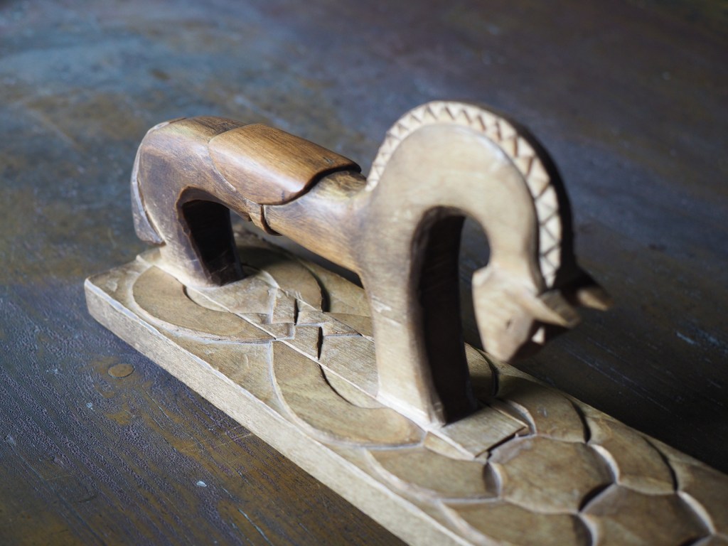
Another instance relates to close-up, or macro photography, where the depth-of-field can be quiet shallow. Here is an  example of a close-up shot of the handle of a Norwegian mangle board. The central portion of the horse, near the saddle, is in focus, the parts to either side are not – and this form of blur is impossible to suppress. Ideally in order to have the entire handle in focus, one would have to use a technique known as focus stacking (available in some cameras).

Here is another example of a can where the writing at the top of the can is almost in focus, whereas the writing at the bottom is out-of-focus – due in part to the angle the shot was taken, and the shallow depth of field. It may be possible to sharpen the upper text, but reducing the blur at the bottom may be challenging.

How do camera sensors work?

So we have described photosites, but how does a camera sensor actually work? What sort of magic happens inside a digital camera? When the shutter button is pressed, and the sensor exposed to light, the light passes through the lens, and then through a series of filters, a microlens array, and a colour filter, before being deposited in the photosite. A photodiode then converts the light into an electrical signal produced into a quantifiable digital value.

Cross-section of a sensor.

The uppermost layer of a sensor typically contains certain filters. One of these is the infrared (IR) filter. Light contains both ultraviolet and infrared parts, and most sensors are very sensitive to infrared radiation. Hence the IR filter is used to eliminate the IR radiation. Other filters include anti-aliasing (AA) filters which blur the lines between repeating patterns in order to avoid wavy lines (moiré).

Next come the microlenses. One would assume that photosites are butted up against one another, but in reality that’s not the case. Camera sensors have a “microlens” above each photosite to concentrate the amount of light gathered.

Photosites by themselves have a problem distinguishing colour.  To capture colour, a filter has to be placed over each photosite, to capture only specific colours. A red filter allows only red light to enter the photosite, a green filter only green, and a blue filter only blue. Therefore, each photosite contributes information about one of the three colours that, together, comprise the complete colour system of a photograph (RGB).

sensor-colour1
Filtering light using colour filters, in this case showing a Bayer filter.

The most common type of colour filter array is called a Bayer filter. The array in a Bayer filter consists of a repetitive pattern of 2×2 squares comprised of a red, blue, and two green filters. The Bayer filter has more green than red or blue because human vision is more sensitive to green light.

A basic diagram of the overall process looks something like this:

Light photons enter the aperture, and a portion are allowed through the shutter. The camera sensor (photosites) then absorbs the light photons producing an electrical signal which may be amplified by the ISO amplifier before it is turned into the pixels of a digital image.

Why camera sensors don’t have pixels

The sensor in a digital camera is equivalent to a frame of film. They both capture light and use it to generate a picture, it is just the medium which changes: film uses light sensitive particles, digital uses light sensitive diodes. These specks of light work together to form a cohesive continuous tone picture when viewed from a distance. 

One of the most confusing things about digital cameras is the concept of pixels. They are confusing because some people think they are a quantifiable entity. But here’s the thing, they aren’t. Typically a pixel, short for picture element, is a physical point in an image. It is the smallest single component of an image, and is square in shape – but it is just a unit of information, without a specific quantity, i.e. a pixel isn’t 1mm2. The interpreted size of a pixel depends largely on the device it is viewed on. The terms PPI (pixels per inch) and DPI (dots per inch) were introduced to relate the theoretical concept of a pixel to real-world resolution. PPI describes how many pixels there are in an image per inch of distance. DPI is used in printing, and varies from device to device because multiple dots are sometimes needed to create a single pixel. 

But sensors don’t really have “pixels”. They have an array of cavities, better known as “photosites”, which are photo detectors that represent the pixels. When the shutter opens, each photosite collects light photons and stores them as electrical signals. When the exposure ends, the camera then assesses the signals and quantifies them as digital values, i.e. the things we call pixels. We tend to use the term pixel interchangeably with photosite in relation to the sensor because it has a direct association with the pixels in the image the camera creates. However a photosite is physical entity on the sensor surface, whereas pixels are abstract concepts. On a sensor, the term “pixel area” is used to describe the size of the space occupied by each photosite on the sensor. For example, a Fuji X-H1 has a pixel area of 15.05 µm² (micrometres²), which is *really* tiny.

A basic photosite

NB: Sometimes you may see photosites called “sensor elements”, or sensels.

Does flash photography affect museum artifacts?

On a trip to the Louvre in Paris (10 years ago now), I noticed that the information guide stated “flash photography is strongly discouraged throughout the galleries”. The only place I really saw this enforced was in front of the Mona Lisa. Not a problem you say, everyone will abide by this. Well, not so it appears. I would imagine a good proportion of visitors have some form of digital camera, usually of the “point-and-shoot” (PS) type where the use of flash is automatic if light levels are low. There are of course two reasons for prohibiting the use of flash photography. One is that it disturbs other patrons. The second is that the flash has a direct effect, causing accelerated fading in artifacts such paintings and textiles. So what is the scientific basis for these restrictions? Well very little has actually been written about the effect of photographic flashes on exhibits. In 1994 Evans[1] wrote a small 3-page note discussing whether exhibits can be harmed by photographic flash, but there seems to be very little scientific data to back up claims that flashes cause accelerated fading. The earliest experiment was performed in 1970 using multiple flash (25,000) exposures [2]. Evans has written another article [3], which looks at the quantitative evidence behind banning flash photography in museums.

“Photographic flashes can damage art”. This is sort of a very broad statement. Strictly speaking, I would imagine the damaging affects of  1000 sweaty hands touching the Venus de Milowould greatly outweigh 1000 photographic flashes. It is doubtful that flash photography does any real damage. Should it be used? Unless you are using a professional lighting setup, you can probably achieve better pictures by not using a flash. Frankly if you are taking photographs of paintings in an art gallery you might be better off buying a book on the artist at the gallery shop. That, and flashes in enclosed spaces are annoying. Here is an example of a photo taken in the National Gallery of Norway, without the use of a flash. Actually, the biggest problem taking photographs indoors is possibly too many lights, and reflections off glass.

noflashPhoto

[1] Evans, M.H., “Photography: Can gallery exhibits be harmed by visitors using photographic flash?,” Museum Management and Curatorship, vol. 13, pp. 104-106, 1994.

[2] Hanlan, J.F.,  “The effect of electronic photographic lamps on the materials of works of art.,” Museum News, vol. 48, pp. 33, 1970.

[3] Evans, M.H., “Amateur photographers in art galleries: Assessing the harm done by flash photography”.

Digital photography: some things just aren’t possible

Despite the advances in digital photography, we are yet to see a camera which views a scene the same way that our eyes do. True, we aren’t able to capture and store scenes with our eyes, but they do have inherently advanced ability to optically analyze our surroundings, thanks in part to millions of years of coevolution with our brains.

There are some things that just aren’t possible in post-processing digital images. One is removing glare, and reflections from glass. Consider the image below, which was taken directly in front of a shop window. The photograph basically reflects the image from the opposite side of the street. Now getting rid of this is challenging. One idea might be to use a polarizing filter, but that won’t work directly in front of a window (a polarising filter removes light beams with a specific angle. As the sensor doesn’t record the angle of the light beams, it can’t be recreated in post-processing.). Another option is to actually take the shot at a different part of the day, or the night. There is no fancy image processing algorithm that will remove the reflection, although someone has undoubtedly tried. This is a case where the photographic acquisition process is all.

windowReflection

Glass reflection in a shop window.

Any filter that changes properties of the light that isn’t captured by the digital sensor (or film), is impossible to reproduce in post-processing. Sometimes the easiest approach to taking a photograph of something in a window is to wait for an overcast day, or even photograph the scene at night. Here is a similar image taken of a butcher shop in Montreal.

nightviewGlass

Nighttime image, no reflection, and backlit.

This image works well, because the contents of the image are back-lit from within the building. If we aren’t that concerned about the lighting on the building itself, this works nicely – just changes the aesthetics of the image to concentrate more on the meat in the window.

In image processing, have we have forgotten about aesthetic appeal?

In the golden days of photography, the quality and aesthetic appeal of the photograph was unknown until after the photograph was processed, and the craft of physically processing it played a role in how it turned out. These images were rarely enhanced because it wasn’t as simple as just manipulating it in Photoshop. Enter the digital era. It is now easier to take photographs, from just about any device, anywhere. The internet would not be what it is today without digital media, and yet we have moved from a time when photography was a true art, to one in which photography is a craft. Why a craft? Just like a woodworker crafts a piece of wood into a piece of furniture, so to do photographers  crafting their photographs in the like of Lightroom,or Photoshop.There is nothing wrong with that, although I feel like too much processing takes away from the artistic side of photography.

Ironically the image processing community has spent years developing filters to process images, to make them look more visually appealing – sharpening filters to improve acuity, contrast enhancement filters to enhance features. The problem is that many of these filters were designed to work in an “automated” manner (and many really don’t work well), and the reality is that people prefer to use interactive filters. A sharpening filter may work best when the user can modify its strength, and judge its aesthetic appeal through qualitative means. The only place “automatic” image enhancement algorithms exist are those in-app filters, and in-camera filters. The problem is that it is far too difficult to judge how a generic filter will affect a photograph, and each photograph is different. Consider the following photograph.

Cherries in a wooden bowl, medieval.

A vacation pic.

The photograph was taken using the macro feature on my 12-40mm Olympus m4/3 lens. The focal area is the top-part of the bottom of the wooden bucket. So some of the cherries are in focus, others are not, and there is a distinct soft blur in the remainder of the picture. This is largely because of the low depth of field associated with close-ip photographs… but in this case I don’t consider this a limitation, and would not necessarily want to suppress it through sharpening, although I might selectively enhance the cherries, either through targeted sharpening or colour enhancement. The blur is intrinsic to the aesthetic appeal of the image.

Most filters that have been incredibly successful are usually proprietary, and so the magic exists in a black box. The filters created by academics have never faired that well. Many times they are targeted to a particular application, poorly tested (on Lena perhaps?), or not at all designed from the perspective of aesthetics. It is much easier to manipulate a photograph in Photoshop because the aesthetics can be tailored to the users needs. We in the image processing community have spent far too many years worrying about quantitative methods of determining the viability of algorithms to improve images, but the reality is that aesthetic appeal is all that really matters. Aesthetic appeal matters, and it is not something that is quantifiable. Generic algorithms to improve the quality of images don’t exist, it’s just not possible in the overall scope of the images available. Filters like Instagram’s Larkwork because they are not changing the content of the image really, they are modifying the colour palette, and they do that applying the same look-up table for all images (derived from some curve transformation).

People doing image processing or computer vision research need to move beyond the processing and get out and take photographs. Partially to learn first hand the problems associated with taking photographs, but also to gain an understanding of the intricacies of aesthetic appeal.

How good is High Dynamic Range (HDR) photography?

There are photographic situations where the lighting conditions are not ideal, even for the most modern “smart” camera – and they occur quite often. On vacation, taking landscapes, with the vast contrast difference between the sky and land, or low-light situations, scenes with shadows. These situations are unavoidable, especially when on vacation when the weather can be unpredictable.

The problem is one of perception. A scene that we view with our eyes, does not always translate into a photograph. This is because the human eye has more capacity to differentiate between tones than a camera. A good example of this is taking a photo from the inside of a building, through a window – the camera will likely produce an underexposed room, or an overexposed sky. Here is an example of a photograph taken during a sunny, yet slightly overcast day. One side of the building is effectively in shadow, whilst the other side is brightly lit-up.

HDR photography before shot

Olympus EM-5(MII), 12mm, f8.0, 1/640, ISO200 (P mode)

One way of compensating for the inability of a camera to take a good photograph in these situations is a computational photography technique known as High Dynamic Range(HDR). HDR is a technique which can be applied in-camera, or through an application such as Photoshop. For example, a camera such as the Olympus EM5(Mark II), has a button marked HDR, and even the iPhone camera has a HDR function.

In its simplest form, HDR takes three images of the exact same scene, with different exposures, and combines them together. The three exposures are normally (i) an exposure for shadows, (ii) an exposure for highlights, and (iii) an exposure for midtones. This is sometimes done by modifying the shutter speed, and keeping the aperture and ISO constant. Here is a HDR version of the photograph above, with the effect of the shadow very much reduced. Is it a better image? That is in the eye of the beholder. It does seem to loose something in translation.

HDR photography after processing

Olympus EM-5(MII), 12mm, f7.1, 1/500, ISO200 (HDR)

But HDR is not a panacea. – it won’t solve everything, and should be used sparingly. it is sometimes easier to perform exposure bracketing, and choose an appropriate image from those generated.

Why photographs need very little processing

I recently read an article on photographing a safari in Kenya, in which the author, Sarfaraz Niazi, made an interesting statement. While describing the process of taking 8000 photos on the trip he made a remark about post-processing, and said his father taught him a lesson when he was aged 5 – that “every picture is carved out in perpetuity as soon as you push the shutter“. There is so much truth in this statement. Photographs are snapshots of life, and the world around us is rarely perfect, so why should a photograph be any different? It is not necessary to vastly process images – there are of course ways to adjust the contrast, maybe improve the sharpness, or adjust the exposure somewhat, but beyond that, what is necessary? Add a filter? Sure that’s fun on Instagram, but shouldn’t be necessary on camera-based photographs.

Many years of attempting to derive algorithms to improve images have taught me that there are no generic one-fits-all algorithms. Each photograph must be modified in a manner that suits the ultimate aesthetic appeal of the image. An algorithm manipulates through quantitative evaluation, having no insight into the content, or qualitative aspects of the photograph. No AI algorithm will ever be able to replicate the human eyes ability to determine aesthetic value – and every persons aesthetic interpretation will be different. Add too much computational photography into a digital camera, and you end up with too much of a machine-driven photograph. Photography is a craft as much as an art and should not be controlled solely by algorithms. Consider the following photograph, taken in Glasgow, Scotland. The photograph suffers from being taken on quite a hot day in the summer, when the sky was somewhat hazy. The hazy sky is one factor which causes a reduction in colour intensity in the photograph.

glasgowAestheticpre

Original photograph

In every likelihood, this photograph represents the true scene quite accurately. An increase in saturation, and modification of exposure will produce a more vivid photograph, shown below. Likely one of the Instagram filters would also have done a nice job in “improving” the image. Was the enhancement necessary? Maybe, maybe not. The enhancement does improve the colours within the image, and the contrast between objects.

glasgowAestheticpost

Post-processed photograph

Why aesthetic appeal in image processing matters

What makes us experience beauty?

I have spent over two decades writing algorithms for image processing, however I have never really created anything uber fulfilling . Why? Because it is hard to create generic filters, especially for tasks such as image beautification. In many ways improving the aesthetic appeal of photographs involves modifying the content on an image in more non natural ways. It doesn’t matter how AI-ish an algorithm is, it cannot fathom what the concept of aesthetic appeal is.  A photograph one person may find pleasing may be boring to others. Just like a blank canvas is considered art to some, but not to others. No amount of mathematical manipulation will lead to a algorithmic panacea of aesthetics. We can modify the white balance and play with curves, indeed we can make 1001 changes to a photograph, but the final outcome will be perceived differently by different people.

After spending years researching image processing algorithms, and designing some of my own, it wasn’t until I decided to take the art of acquiring images to a greater depth that I realized algorithms are all good and well, but there is likely little need for the plethora of algorithms created every year. Once you pick up a camera, and start playing with different lenses, and different camera settings, you begin to realize that part of the nuance any photograph is its natural aesthetic appeal. Sure, there are things that can be modified to improve aesthetic appeal, such as contrast enhancement or improving the sharpness, but images also contain unfocused regions that contribute to their beauty.

If you approach image processing purely from a mathematical (or algorithmic) viewpoint, what you are trying to achieve is some sort of utopia of aesthetics. But this is almost impossible, largely because every photography is unique.  It is possible to improve the acuity of objects in an image using techniques such as unsharp masking, but it is impossible to resurrect a blurred image – but maybe that’s the point. One could create an fantastic filter that sharpens an image beautifully, but with the sharpness of modern lenses, that may not be practical. Consider this example of a photograph taken in Montreal. The image has good definition of colour, and has a histogram which is fairly uniform. There isn’t a lot that can be done to this image, because it truly does represent the scene as it exists in real life. If I had taken this photo on my iPhone, I would be tempted to post it on Instagram, and add a filter… which might make it more interesting, but maybe only from the perspective of boosting colour.

aestheticAppeal1

A corner hamburger joint in Montreal – original image.

Here is the same image with only the colour saturation boosted (by ×1.6). Have its visual aesthetics been improved? Probably. Our visual system would say it is improved, but that is largely because our eyes are tailored to interpret colour.

aestheticAppeal2

A corner hamburger joint in Montreal – enhanced image.

If you take a step back from the abyss of algorithmically driven aesthetics, you begin to realize that too few individuals in the image processing community have taken the time to really understand the qualities of an image. Each photograph is unique, and so the idea of generic image processing techniques is highly flawed. Generic techniques work sufficiently well in machine vision applications where the lighting is uniform, and the task is also uniform, e.g. inspection of rice grains, or identification of burnt potato chips. No aesthetics are needed, just the ability to isolate an object and analyze it for whatever quality is needed. It’s one of the reasons unsharp masking has always been popular. Alternative algorithms for image sharpening really don’t work much better. And modern lenses are sharp, in fact many people would be more likely to add blur than take it away.


In-camera keystone compensation (Olympus) (ii)

So I took some photographs using the Olympus keystone compensation on a trip to Montreal. Most of them deal with buildings that are leaning back, which is the classic case when trying to photograph a building. The first set deal with some landscape photographs. In both these photographs I could not move any further back to take the photographs, and both were taken with the Olympus 12-40mm, set as wide angle (12mm or 24mm full frae equivalent).It was possible to correct both images, without loosing any of the building.

keystone correction of photographs
Originals (left), keystone corrected (right)

The second case deals with portrait format photographs. In both cases it was slightly more challenging to make sure the entire picture was in the frame, but doing it in-situ it was possible to assure this happened. Doing in post-processing may result in the lose of a portion of the photograph. In the lower image I had enough leeway to position the keystone-corrected frame in such a manner that the building is surrounded by ample space.

keystone correction of photographs
Originals (left), keystone corrected (right)

Compensating for perspective distortion often comes at a price. Modifying the geometry of a photograph means that less will fit in the photograph. Taking a photograph too close to a building may mean something is cut off.

Horizontal keystone correction can sometimes be more difficult, because the distortion is usually a compound distortion. In the example below, the photograph was taken slightly off-centre, producing an image which is distorted both from a horizontal and a vertical perspective.

keystone correction
Complex distortion

Is there a loss in aesthetic appeal? Maybe. Food for future thought.