Are black-and-white photographs really black and white?

Black-and-white photography is somewhat of a strange term, because it alludes to the fact that the photograph is black-AND-white. However black-and-white photographs if interpreted correctly would mean an image which contains only black and white (in digital imaging terms a binary image). Alternatively they are sometimes called monochromatic photographs, but that too is a broad term, literally meaning “all colours of a single hue“. This means that cyanotype and sepia-tone prints, are also to be termed monochromatic. A colour image that contains predominantly bright and dark variants of the same hue could also be considered monochromatic.

Using the term black-and-white is therefore somewhat of a misnomer. The correct term might be grayscale, or gray-tone photographs. Prior to the introduction of colour films, B&W film had no designation, it was just called film. With the introduction of colour film, a new term had to be created to differentiate the types of film. Many companies opted for the use terms like panchromatic, which is an oddity because the term means “sensitive to all visible colors of the spectrum“. However in the context of black-and-white films, it implies a B&W photographic emulsion that is sensitive to all wavelengths of visible light. Afga produced IsoPan and AgfaPan, and Kodak Panatomic. Differentially, colour films usually had the term “chrome” in their names.

Fig.1: A black-and-white image of a postcard

All these terms have one thing in common, they represent the shades of gray across the full spectrum from light to dark. In the digital realm, an 8-bit grayscale image has 256 “shades” of gray, from 0 (black) to 255 (white). A 10-bit grayscale image has 1024 shades, from 0→1023. The black-and-white image shown in Fig.1 illustrates quite aptly an 8-bit grayscale image. But grays are colours as well, albeit without chroma, so they would be better termed achromatic colours. It’s tricky because a colour is “a visible light with a specific wavelength”, and neither black nor white are colours because they do not have specific wavelengths. White contains all wavelengths of visible light and black is the absence of visible light. Ironically, true blacks and true whites are rare in photographs. For example the image shown in Fig.1 only contains grayscale values ranging from 24..222, with few if any blacks or whites. We perceive it as a black-and-white photograph only because of our association with that term.

From photosites to pixels (i) – the process

We have talked briefly about digital camera sensors work from the perspective of photosites, and digital ISO, but what happens after the light photons are absorbed by the photosites on the sensor? How are image pixels created? This series of posts will try and demystify some of the inner workings of a digital camera, in a way that is understandable.

A camera sensor is typically made up of millions of cavities called photosites (not pixels, they are not pixels until they are transformed from analog to digital values). A 24MP sensor has 24 million photosites, typically arranged in the form of a matrix, 6000 pixels wide by 4000 pixel high. Each photosite has a single photodiode which records a luminance value. Light photons enter the lens and pass through the lens aperture before a portion of light is allowed through to the camera sensor when the shutter is activated at the start of the exposure. Once the photons hit the sensor surface they pass through a micro-lens attached to the receiving surface of each of the photosites, which helps direct the photons into the photosite, and then through a colour filter (e.g. Bayer), used to help determine the colour of pixel in an image. A red filter allows red light to be captured, green allows green to be captured and blue allow blue light in.

Every photosite holds a specific number of photons (sometimes called the well depth). When the exposure is complete, the shutter closes, and the photodiode gathers the photons, converting them into an electrical charge, i.e. electrons. The strength of the electrical signal is based on how many photons were captured by the photosite. This signal then passes through the ISO amplifier, which makes adjustments to the signal based on ISO settings. The ISO uses a conversion factor, “M” (Multiplier) to multiply the tally of electrons based on the ISO setting of the camera. For higher ISO, M will be higher, requiring fewer electrons.

Photosite to pixel

The analog signal then passes on to the ADC, which is a chip that performs the role of analog-to-digital converter. The ADC converts the analog signals into discrete digital values (basically pixels). It takes the analog signals as input, and classifies them into a brightness level (basically a matrix of pixels). The darker regions of a photographed scene will correspond to a low count of electrons, and consequently a low ADU value, while brighter regions correspond to higher ADU values. At this point the image can follow one (or both) of two paths. If the camera is set to RAW, then information about the image, e.g. camera settings, etc. (the metadata) is added and the image is saved in RAW format to the memory card. If the setting is RAW+JPEG, or JPEG, then some further processing may be performed by way of the DIP system.

The “pixels” passes to the DIP system, short for Digital Image Processing. Here demosaicing is applied, which basically converts the pixels in the matrix into an RGB image. Other image processing techniques can also be applied based on particular camera settings, e.g. image sharpening, noise reduction, etc. is basically an image. The colour space specified in the camera is applied, before the image as well as its associated meta-data is converted to JPEG format and saved on the memory card.

Summary: A number of photons absorbed by a photosite during exposure time creates a number of electrons which form a charge that is converted by a capacitor to a voltage which is then amplified, and digitized resulting in a digital grayscale value. Three layers of these grayscale values form the Red, Green, and Blue components of a colour image.

Demystifying Colour (iii) : colour models and spaces

Colour is a challenging concept in digital photography and image processing, partially because it is not a physical property, but rather a perceptual entity. Light is made up of many wavelengths, and colour is a sensation that is caused when our brain interprets these wavelengths. In the digital world, colour is represented using global colour models and more specific colour spaces

Colour models

colour model is a means of mapping wavelengths of light to colours, based on some particular scientific process, and a mathematical model, i.e. a way to convert colour into numbers. A colour model on its own is abstract, with no specific association to how the colours are perceived. The components of colour models have a number of distinguishing features. The core feature is the component type (e.g. RGB primaries, hue) and its associated units (e.g. degrees, percent). Other features included scale type (e.g. linear/non-linear), and geometric shape of the model (e.g. cube, cone, etc).

Colour models can be expressed in many different ways, each with their own benefits and limitations. Colour models can be described based on how they are constructed:

  • Colorimetric – These are colour models based on physical measurements of spectral reflectance. One of the CIE chromaticity diagrams is usually the basis for these models.
  • Psychological – These colour models are based on the human perception of colour. They are either designed on subjective observation criteria, and some sort of comparative references, (e.g. Munsell), or are designed through experimentation to comply with the human perception of colour, e.g. HSV, HSL.
  • Physiological – These colour models are based on the three primary colours associated with the three types of cones in the human retina, e.g. RGB.
  • Opponent – Based on perception experiments using pairwise opponent primary colours, e.g. Y-B, R-G.

Sometimes colour models are distinguised based on how colour components are combined. There are two methods of colour mixing – additive or subtractive. Additive colour models use light to display colours, while subtractive models use printing inks. Colours received in additive models such as RGB are the result of transmitted light, whereas those perceived in subtractive models such as CMYK are the result of reflected light. An example of an image showing its colours as represented using the RGB colour model is shown in Fig.1.

Fig.1: A colour image and its associated RGB colour model

Colour models can be described using a geometric representation of colours in a three-dimensional space, such as a cube, sphere or cone. The geometric shape describes what the map for navigating a colour space looks like. For example RGB is shaped like a cube, HSV can be represented by a cylindrical or conical object, and YIQ is a convex-poyhedron (a somewhat skewed rectangular box). The geometric representations of the image in Figure 1 shown using three different colour models is shown in Figure 2.

Fig.2: Three different colour models with differing geometric representations

Colour spaces

colour space, is a specific implementation of a colour model, and usually defines a subset of a colour model. Different colour spaces can exist within a colour model. With a colour model we are able to determine a certain colour relative to other colours in the model. It is not possible to conclude how a certain colour will be perceived. A colour space can then be defined by a mapping of a colour model to a real-world colour reference standard. The most common reference standard is CIE XYZ which was developed in 1931. It defines the number of colours the human eye can distinguish in relation to wavelengths of light.

In the context of photographs colour space is the specific range of colours that can be represented. For example the RGB colour model has several different colour spaces, e.g. sRGB, Adobe RGB. sRGB is the most common colour space and is the standard for many cameras, and TVs. Adobe RGB was designed (by Adobe) to complete with sRGB, and is meant to offer a broader colour gamut (some 35% more). So a photograph taken using sRGB may have more subtle tones, than one taken using Adobe RGB. CIELab, and CIELuv are colour spaces within the CIE colour model.

That being said, the terms colour model and colour space are often used interchangeably, for example RGB is considered both a colour model and a colour space.

Demystifying Colour (ii) : the basics of colour perception

How humans perceive colour is interesting, because the technology of how digital cameras capture light is adapted from the human visual system. When light enters our eye it is focused by the cornea and lens into the “sensor” portion of the eye – the retina. The retina is composed of a number of different layers. One of these layers contains two types of photosensitive cells (photoreceptors), rods and cones, which interpret the light, and convert it into a neural signal. The neural signals are collected and further processed by other layers in the retina before being sent to the brain via the optic nerve. It is in the brain that some form of colour association is made. For example, an lemon is perceived as yellow, and any deviation from this makes us question what we are looking at (like maybe a pink lemon?).

Fig.1: An example of the structure and arrangement of rods and cones

The rods, which are long and thin, interpret light (white) and darkness (black). Rods work only at night, as only a few photons of light are needed to activate a rod. Rods don’t help with colour perception, which is why at night we see everything in shades of gray. The human eye is suppose to have over 100 million rods.

Cones have tapered shape, and are used to process the the three wavelengths which our brains interpret as colour. There are three types of cones – short-wavelength (S), medium-wavelength (M), and long-wavelength (L). Each cone absorbs light over a broad range of wavelengths: L ∼ 570nm, M ∼ 545nm, and S ∼ 440nm. The cones are usually called R, G, and B for L, M, and S respectively. Of course these cones have nothing to do with their colours, just wavelengths that our brain interprets as colours. There are roughly 6-7 million cones in the human eye, divided up into 64% “red” cones, 32% “green” cones, and 2% “blue” cones. Most of these are packed into the fovea. Figure 2 shows how rods and cones are arranged in the retina. Rods are located mainly in the peripheral regions of the retina, and are absent from the middle of the fovea. Cones are located throughout the retina, but concentrated on the very centre.

Fig.2: Rods and cones in the retina.

Since there are three types of cones, how are other colours formed? The ability to see millions of colours is a combination of the overlap of the cones, and how the brain interprets the information. Figure 3 shows roughly how the red, green, and blue sensitive cones interpret different wavelengths as colour. As different wavelengths stimulate the colour sensitive cones in differing proportions, the brain interprets the signals as differing colours. For example, the colour yellow results from the red and green cones being stimulated while the blues cones are not.

Fig.3: Response of the human visual system to light

Below is a list of approximately how the cones make the primary and secondary colours. All other colours are composed of varying strengths of light activating the red, green and blues cones. when the light is turned off, black is perceived.

  • The colour violet activates the blue cone, and partially activates the red cone.
  • The colour blue activates the blue cone.
  • The colour cyan activates the blue cone, and the green cone.
  • The colour green activates the green cone, and partially activates the red and blue cones.
  • The colour yellow activates the green cone and the red cone.
  • The colour orange activates the red cone, and partially activates the green cone.
  • The colour red activates the red cones.
  • The colour magenta activates the red cone and the blue cone.
  • The colour white activates the red, green and blue cones.

So what about post-processing once the cones have done their thing? The sensor array receives the colours, and stores the information by encoding it in the bipolar and ganglion cells in the retina before it is passed to the brain. There are three types of encoding.

  1. The luminance (brightness) is encoded as the sum of the signals coming from the red, green and blue cones and the rods. These help provide the fine detail of the image in black and white. This is similar to a grayscale version of a colour image.
  2. The second encoding separates blue from yellow.
  3. The third encoding separates red and green.
Fig.4: The encoding of colour information after the cones do their thing.

In the fovea there are no rods, only cones, so the luminance ganglion cell only receives a signal from one cone cell of each colour. A rough approximation of the process is shown in Figure 4.

Now, you don’t really need to know that much about the inner workings of the eye, except that colour theory is based a great deal on how the human eye perceives colour, hence the use of RGB in digital cameras.

Demystifying Colour (i) : visible colour

Colour is the basis of human vision. Everything appears coloured. Humans see in colour, or rather the cones in our eyes interpret wavelengths of red, green and blue when they enter the eye in varying proportions, enabling us to see a full gamut of colours. The miracle of the human eyes aside, how does colour exist? Are trees really green? Bananas yellow? Colour is not really inherent in objects, but the surface of an object reflects some colours and absorb others. So the human eye only perceives reflected colours. The clementine in the figure below reflects certain wavelengths, which we perceive as orange. Without light there is no colour.

Reflected wavelengths = perceived colours

Yet even for the simplest of colour theory related things, like the visible spectrum, it is hard to find an exact definition. Light is a form of electromagnetic radiation. Its physical property is described in terms of wavelength (λ) in units of nanometers (nm, which is 10-9 metres). Human eyes can perceive the colours associated with the visible light portion of the electromagnetic radiation spectrum. It was Isaac Newton who in 1666 described the spectrum of white light as being divided into seven distinct colours – red, orange, yellow, green, blue, indigo and violet. Yet in many renditions, indigo has been replaced by blue, and blue by cyan. In some renditions there are only six colours (like in Pink Floyd’s album cover for Dark Side of the Moon), others have eight. It turns out indigo likely doesn’t need to be there (because its hard to tell indigo apart from blue and violet). Another issue is the varied ranges of the visible spectrum in nanometers. Some sources define it as broadly as 380-800nm, while others narrow it to 420-680nm. Confusing right? Well CIE suggests that there are no precise limits for the spectral range of visible radiation – the lower limit is 360-400nm and the upper limit 760-830nm.

The visible spectrum of light (segmented into eight colours)

Thankfully for the purposes of photography we don’t have to delve that deeply into the specific wavelengths of light. In fact we don’t even have to think too much about the exact wavelength of colours like red, because frankly the colour “red” is just a cultural association with a particular wavelength. Basically colours are named for the sake of communications and so we can differentiate thousands of different paints chips. The reality is that while the human visual system can see millions of distinct colours, we only really have names for a small set of them. Most of the worlds languages only have five basic terms for colour. For example, the Berinmo tribe of Papua New Guinea have a term for light, dark, red, yellow, and one that denotes both blue and green [1]. Maybe we have overcomplicated things somewhat when it comes to colour.

But this does highlight some of the issues with colour theory – the overabundance of information. There are various terms which seem to lack a clear definition, or overlap with other terms. Who said colour wasn’t messy? It is. What is the difference between a colour model and a colour space? Why do we use RGB? Why do we care about HSV colour space? This series will look at some colour things as it relates to photography, explained as simply as possible.

  1. Davidoff, J., Davies, I., Roberson, D., “Colour categories in a stone-age tribe”, Nature, 398, pp.203-204 (1999)

Myths about travel photography

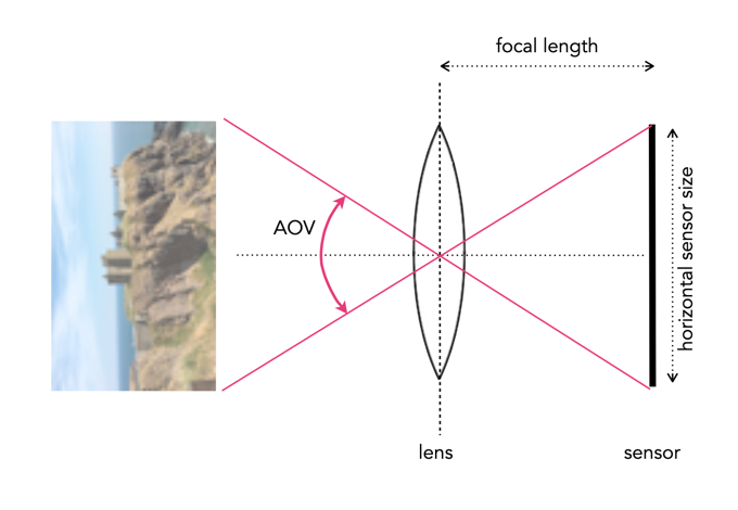
Travel snaps have been around since the dawn of photography. Their film heyday was likely the 1950s-1970s when photographs taken using slide film were extremely popular. Of course in the days of film it was hard to know what your holiday snaps would look like until they were processed. The benefit of analog was of course that most cameras offered similar functionality, with the aesthetic provided by the type of film used. While there were many differing lenses available, most cameras came with a stock 50mm lens, and most people travelled with a 50mm lens, possibly a wider lens for landscapes, and later zoom lenses.

With digital photography things got easier, but only in the sense of being able to see what you photograph immediately. Modern photography is a two-edged sword. On one side there are a lot more choices, in both cameras, and lenses, and on the other side digital cameras have a lot more dependencies, e.g. memory cards, batteries etc., and aesthetic considerations, e.g. colour rendition. Below are some of myths associated with travel photography, in no particular order, taken from my own experiences travelling as an amateur photographer. I generally travel with one main camera, either an Olympus MFT, or Fuji X-series APS-C, and a secondary camera, which is now a Ricoh GR III.

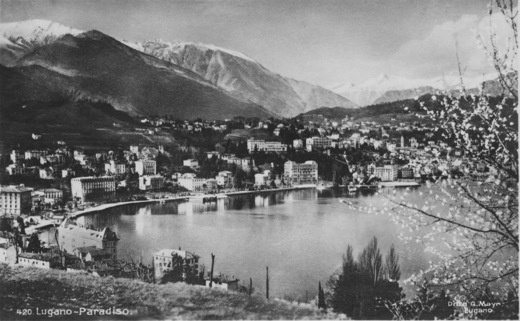
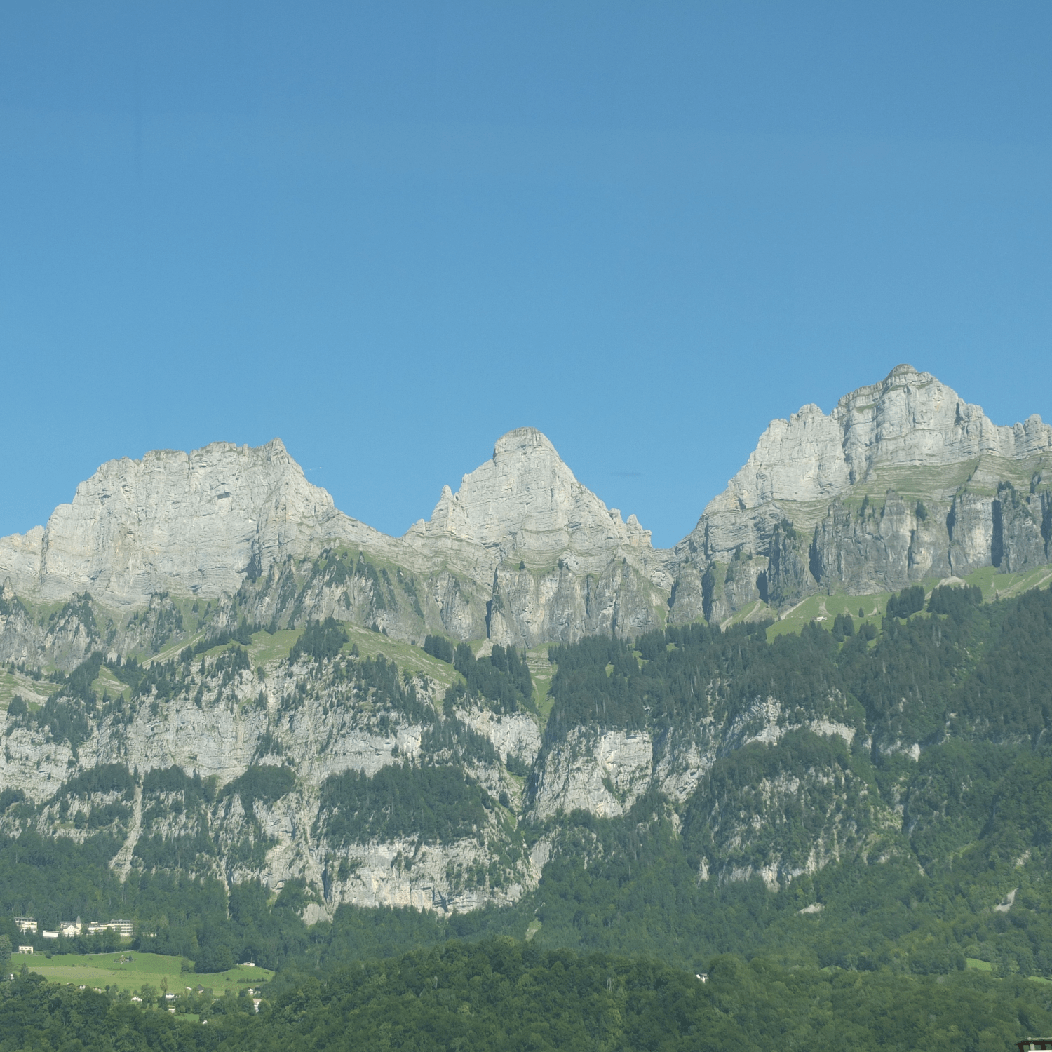
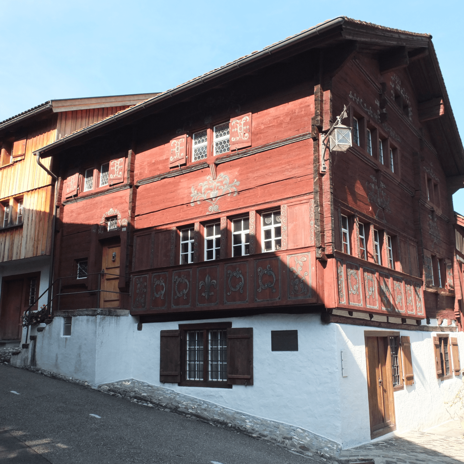
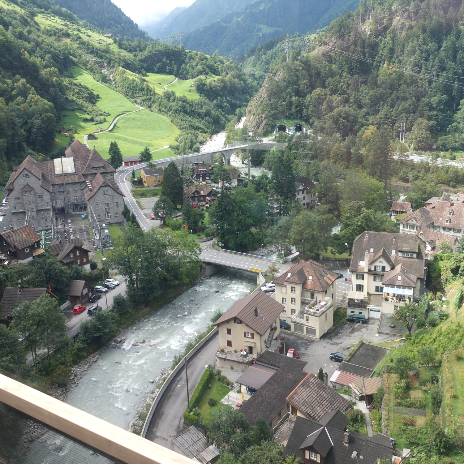
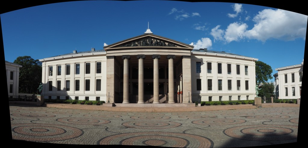
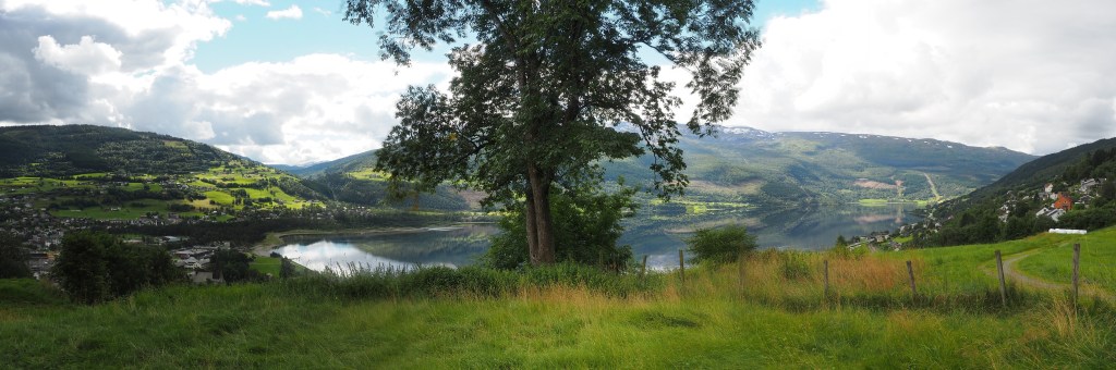
The photographs above illustrate three of the issues with travel photography – haze, hard shadows, and shooting photographs from a moving train.

MYTH 1: Sunny days are the best for taking photographs.

REALITY: A sunny or partially cloudy day is not always congenial to good outdoor photographs. It can produce a lot of glare, and scenes with hard shadows. On hot sunny days landscape shots can also suffer from haze. Direct sunlight in the middle of the day often produces the harshest of light. This can mean that shadows become extremely dark, and highlights become washed out. In reality you have to make the most of whatever lighting conditions you have available. There are a bunch of things to try when faced with midday light, such as using the “Sunny 16” rule, and using a neutral density (ND) filter.

MYTH 2: Full-frame cameras are the best for taking travel photography

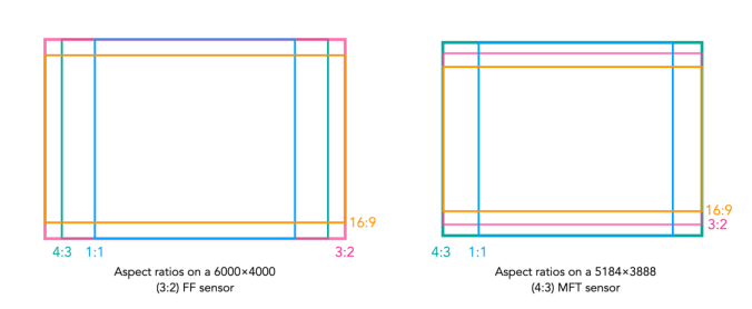
REALITY: Whenever I travel I always see people with full-frame (FF) cameras sporting *huge* lenses. I wonder if they are wildlife or sports photographers? In reality it’s not necessary to travel with a FF camera. They are much larger, and much heavy than APS-C or MFT systems. Although they produce exceptional photographs, I can’t imagine lugging a FF camera and accessories around for days at a time.

MYTH 3: It’s best to travel with a bunch of differing lenses.

REALITY: No. Pick the one or two lenses you know you are going to use. I travelled a couple of times with an extra super-wide, or telephoto lens in the pack, but the reality is that they were never used. Figure out what you plan to photograph, and pack accordingly. A quality zoom lens is always good because it provides the variability of differing focal lengths in one lens, however fixed focal length lenses often produce a better photograph. I would imagine a 50mm equivalent is a good place to start (25mm MFT, 35mm APS-C).

MYTH 4: The AUTO setting produces the best photographs.

REALITY: The AUTO setting does not guarantee a good photograph, and neither does M (manual). Ideally shooting in P (program) mode probably gives the most sense of flexibility. But there is nothing wrong with using AUTO, or even preset settings for particular circumstances.

MYTH 5: Train journeys are a great place to shoot photographs.

REALITY: Shooting photographs from a moving object, e.g. a train requires the use of S (shutter priority). You may not get good results from a mobile device, because they are not designed for that. Even using the right settings, photographs from a train may not always seem that great unless the scenery allows for a perspective shot, rather than just a linear shot out of the window, e.g. you are looking down into valleys etc. There is issues like glare, and dirty windows to contend with.

MYTH 6: A flash is a necessary piece of equipment.

REALITY: Not really for travelling. There are situations you could use it, like indoors, but usually indoor photos are in places like art galleries and museums who don’t take kindly to flash photography, and frankly it isn’t needed. If you have some basic knowledge it is easy to take indoor photographs with the light available. Even better this is where mobile devices tend to shine, as they often have exceptional low-light capabilities. Using a flash for landscapes is useless… but I have seen people do it.

MYTH 7: Mobile devices are the best for travel photography.

REALITY: While they are certainly compact and do produce some exceptional photographs, they are not always the best for travelling. Mobile devices with high-end optics excel at certain things, like taking inconspicuous photographs, or in low-light indoors etc. However to get the most optimal landscapes, a camera will always do a better job, mainly because it is easier to change settings, and the optics are clearly better.

MYTH 8: Shooting 1000 photographs a day is the best approach.

REALITY: Memory is cheap, so yes you could shoot 1000 frames a day, but is it the best approach? You may as well strap a Go-Pro to your head and video tape everything. At the end of a 10-day vacation you could have 10,000 photos, which is crazy. Try instead to limit yourself to 100-150 photos a day, which is like 3-4 36 exposure rolls of film. Some people suggest less, but then you might later regret not taking a photo. There is something about limiting the amount of photos you take and instead concentrate on taking creative shots.

MYTH 9: A tripod is essential.

REALITY: No, its not. They are cumbersome, and sometimes heavy, and the reality is that in some places, e.g. atop the Arc de Triomphe, you can’t use a tripod. Try walking around the whole day in a city like Zurich during the summer, lugging a bunch of camera gear, *and* a tripod. For a good compromise, consider packing a pocket tripod such as the Manfrotto PIXI. In reality cameras have such good stabilization these days that in most situations you don’t need a tripod.

MYTH 10: A better camera will take better pictures.

REALITY: Unlikely. I would love to have a Leica DLSR. Would it produce better photographs? Maybe, but the reality is that taking photographs is as much about the skill of the photographer than the quality of the camera. Contemporary cameras have so much technology in them, learn to understand it, and better your skills before thinking about upgrading a camera. There will always be new cameras, but it’s hard to warrant buying one.

MYTH 11: A single battery is fine.

REALITY: Never travel with less than two batteries. Cameras use a lot of juice, because features like image stabilization, and auto-focus aren’t free. I travel with at least 3 batteries for whatever camera I take. Mark them as A, B, and C, and use them in sequence. If the battery in the camera is C, then you know A and B need to be recharged, which can be done at night. There is nothing worse than running out of batteries half-way through the day.

MYTH 12: Post-processing will fix any photos.

REALITY: Not so, ever heard of the expression garbage-in, garbage-out? Some photographs are hard to fix, because not enough effort was taken when they were taken. If you take a photograph of a landscape with a hazy sky, it may be impossible to post-process it.

The facts about camera aspect ratio

Digital cameras usually come with the ability to change the aspect ratio of the image being captured. The aspect ratio has a little to do with the size of the image, but more to do with its shape. The aspect ratio describes the relationship between an image’s width (W) and height (H), and is generally expressed as a ratio W:H (the width always comes first). For example a 24MP sensor with 6000×4000 pixels has an aspect ratio of 3:2.

Choosing a different sized aspect ratio will change the shape of the image, and the number of pixels stored in it. When using a different aspect ratio, the image is effectively cropped with the pixels outside the frame of the aspect ratio thrown away. 

The core forms of aspect ratios.

The four most common examples of aspect ratios are:

  • 4:3
    • Used when photos to be printed are 5×7″, or 8×10″.
    • Quite good for landscape photographs.
    • The standard ratio for MFT sensor cameras.
  • 3:2
    • The closest to the Golden Ratio of 1.618:1, which makes things appear aesthetically pleasing.
    • Corresponds to 4×6″ printed photographs.
    • The default ratio for 35mm cameras, and many digital cameras, e.g FF, APS-C sensors.
  • 16:9
    • Commonly used for panarama’s, or cinematographic purposes.
    • The most common ratio for video formats, e.g. 1920×1080
    • The standard aspect ratio of HDTV and cinema screens.
  • 1:1
    • Used for capturing square images, and to simplify scenes.
    • The standard ratio for many medium-format cameras.
    • Commonly used in social media, e.g. Instagram.

How an aspect ratio appears on a sensor is dependent on the sensors default aspect ratio.

Aspect ratios visualized on different sensors.

Analog 35mm cameras rarely had the ability to change the aspect ratio. One exception to the rule is the Konica Auto-Reflex, a 35mm camera with the ability to switch between full and half-frame (18×24mm) in the middle of a roll of film. It achieved this by moving a set of blinds in to change the size of the exposed area of the film plane to half-frame.

FOV and AOV

Photography, like many fields is full of acronyms, and sometimes two terms seem to merge into one, when the reality is not the case. DPI, and PPI for instance. Another is FOV and AOV, representing Field-Of-View, and Angle-Of-View respectively. Is there a difference between the two, or can the terms be used interchangeably? As the name suggests, AOV relates to angles, and FOV measures linear distance. But look across the net and you will find a hodge-podge of different uses of both terms. So let’s clarify the two terms.

Angle-of-View

The Angle-of-view (AOV) of a lens describes the angular coverage of a scene. It can be specified as a horizontal, vertical, or diagonal AOV. For example, a 50mm lens on a 35mm film camera would have a horizontal AOV of 39.6°, a vertical AOV of 27°, and a diagonal AOV of 46.8°. It can be calculated using the following formula (calculated in degrees):

      AOV = 2 × arctan(SD / (2×FL)) × (180 / π)°

Here SD represents the dimension of the sensor (or film) in the direction being measured, and FL is the focal length of the lens. For example a full-frame sensor will have a horizontal dimension that is 36mm, so SD=36. A visual depiction of a horizontal AOV is shown in Figure 1.

Fig.1: A horizontal AOV

A short focal length will hence produce a wide angle of view. Consider the Fuji XF 23mm F1.4 R lens. The specs give it an AOV of 63.4°, if used on a Fuji camera with an APS-C sensor (23.6×15.6mm). Using this information the equation works well, but you have to be somewhat careful because manufacturers often specify AOV for the diagonal, as is the case for the lens above. The horizontal AOV is 54.3°.

Field-of-View

The Field-of-view (FOV) is a measurement of the field dimension a lens will cover at a certain distance from the lens. The FOV can be described in terms of horizontal, vertical or diagonal dimensions. A visual depiction of a horizontal FOV is shown in Figure 2.

Fig.2: A horizontal FOV

To calculate it requires the AOV and the distance to the subject/object. It can be calculated with this equation:

      FOV = 2 ( tan(AOV/2) × D )°

Here D is the distance from the object to the lens. Using this to calculate the horizontal FOV for an object 100ft from the camera, using the AOV as 0.9477138 radians (54.3°). The FOV=102 feet. It does not matter if the value of D is feet or metres, as the result will be in the same units. There is another formula to use, without the need for calculating the AOV.

      FOV = (SD × D)/FL

For the same calculation (horizontal FOV) using SD=23.6, FL=23mm, D=100ft, the value calculated is 102ft.

Shorter focal lengths will have a higher FOV than longer focal lengths, hence the reason why wide-angle lenses have such as broad FOV, and telephoto lens have a narrow FOV. A visual depiction of a the effect of differing focal lengths is shown in Figure 3.

Fig.3: FOV changes with focal length

FOV also changes with sensor size, as the dimension of the sensor, SD, changes. A visual depiction of the effect of differing sensor sizes on FOV is shown in Figure 4. Here two different sized sensors use lenses with differing focal lengths to achieve the same FOV.

Fig.4: FOV changes with sensor size

AOV versus FOV

The AOV remains constant for a given sensor and lens, whereas the FOV varies with the distance to the subject being photographed.

Quite a good AOV/FOV visualizer can be found here.

Making a simple panorama

Sometimes you want to take a photograph of something, like close-up, but the whole scene won’t fit into one photo, and you don’t have a fisheye lens on you. So what to do? Enter the panorama. Now many cameras provide some level of built-in panorama generation. Some will guide you through the process of taking a sequence of photographs that can be stitched into a panorama, off-camera, and others provide panoramic stitching in-situ (I would avoid doing this as it eats battery life). Or you can can take a bunch of photographs of a scene and use a image stitching application such as AutoStitch, or Hugin. For simplicities sake, let’s generate a simple panorama using AutoStitch.

In Oslo, I took a three pictures of a building because obtaining a single photo was not possible.

The three individual images

This is a very simple panorama, with feature points easy to find because of all the features on the buildings. Here is the result:

The panorama built using AutoStitch

It’s not perfect, from the perspective of having some barrel distortion, but this could be removed. In fact the AutoStitch does an exceptional job, without having to set 1001 parameters. There are no visible seams, and the photograph seems like it was taken with a fisheye lens. Here is a second example, composed of three photographs taken on the hillside next to Voss, Norway. This panorama has been cropped.

A stitched scene with moving objects.

This scene is more problematic, largely because of the fluid nature of some of the objects. There are some things that just aren’t possible to fix in software. The most problematic object is the tree in the centre of the picture. Because tree branches move with the slightest breeze, it is hard to register the leaves between two consecutive shots. In the enlarged segment below, you can see the ghosting effect of the leaves, which almost gives that region in the resulting panorama a blurry effect. So panorama’s containing natural objects that move are more challenging.

Ghosting of leaves.

Image sharpening in colour – how to avoid colour shifts

It is unavoidable – processing colour images using some types of algorithms may cause subtle changes in the colour of an image which affect its aesthetic value. We have seen this in certain forms of the unsharp masking parameters used in ImageJ. How do we avoid this? One way is to create a more complicated algorithm, but the reality is that without knowing exactly how a pixel contributes to an object that’s basically impossible. Another way, which is way more convenient is to use a separable colour space. RGB is not separable – the red, green and blue components must work together to form an image. Modify one of these components, and it will have an affect on the rest of them. However if we use a colour space such as HSV (Hue-Saturation-Value), HSB (Hue-Saturation-Brightness) or CIELab, we can avoid colour shifts altogether. This is because these colour spaces separate luminance from colour information, therefore image sharpening can be performed on the luminance layer only – something known as luminance sharpening.

Luminance,  brightness, or intensity can be thought of as the “structural” information in the image. For example first we convert an image from RGB to HSB, then process only the brightness layer of the HSB image. Then convert back to RGB. For example, below are two original regions extracted from an image, both containing differing levels of blur.

Original “blurry” image

Here is the RGB processed image (UM, radius=10, mask weight=0.5):

Sharpened using RGB colour space

Note the subtle changes in colour in the region surrounding the letters? Almost a halo-type effect. This sort of colour shift should be avoided. Now below is the HSB processed image using the same parameters applied to only the brightness layer:

Sharpened using the Brightness layer of HSB colour space

Notice that there are acuity improvements in both images, however it is more apparent in the right half, “rent K”. The black objects in the left half, have had their contrast improved, i.e. the black got blacker against the yellow background, and hence their acuity has been marginally enhanced. Neither suffers from colour shifts.