Demystifying Colour (viii) : CIE colour model

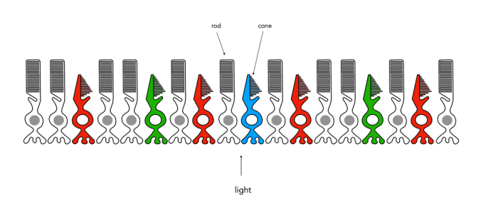
The Commission Internationale de l’Eclairage (French for International Commission on Illumination) , or CIE is an organization formed in 1913 to create international standards related to light and colour. In 1931, CIE introduced CIE1931, or CIEXYZ, a colorimetric colour space created in order to map out all the colours that can be perceived by the human eye. CIEXYZ was based on statistics derived from extensive measurements of human visual perception under controlled conditions.

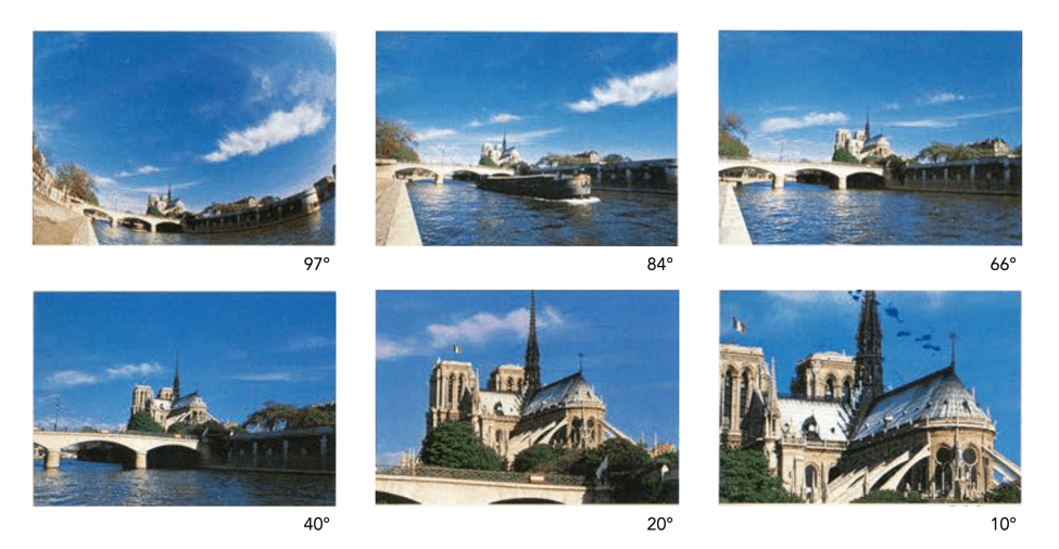
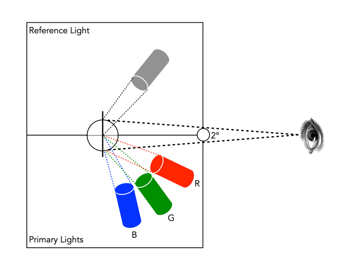
In the 1920s, colour matching experiments were performed independently by physicists W. David Wright and John Guild, both in England [2]. The experiments were carried out with 7 (Guild) and 10 (Wright) people. Each experiment involved a subject looking through a hole which allowed for a 2° field of view. On one side was a reference colour projected by a light source, while on the other were three adjustable light sources (the primaries were set to R=700.0nm, G=546.1nm, and B=435.8nm.). The observer would then adjust the values of three primary lights until they can produce a colour indistinguishable from a reference light. This was repeated for every visible wavelength. The result of the colour-matching experiments was a table of RGB triplets for each wavelength. These experiments were not about describing colours with qualities like hue and saturation, but rather just attempt to explain how combinations of light appear to be the same colour to most people.

Fig.1: An example of the experimental setup of Guild/Wright

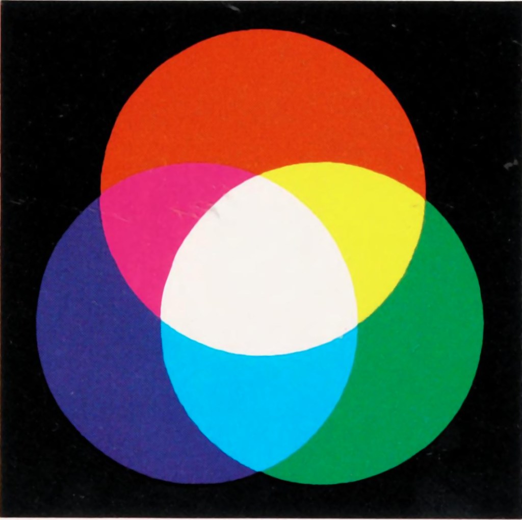
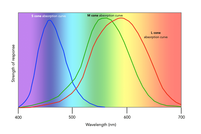
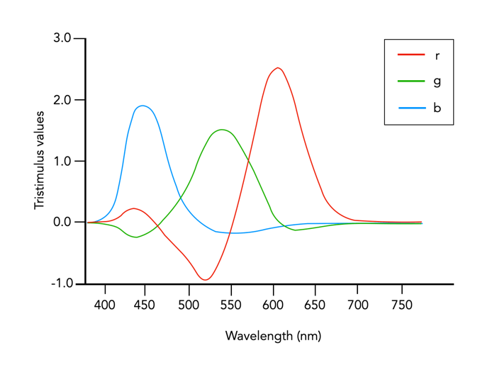
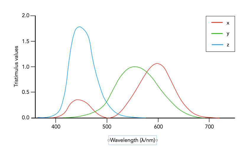
In 1931 CIE amalgamated Wright and Guild’s data and proposed two sets of of colour matching functions: CIE RGB and CIE XYZ. Based on the responses in the experiments, values were plotted to reflect how the average human eye senses the colours in the spectrum, producing three different curves of intensity for each light source to mix all colours of the colour spectrum (Figure 2), i.e. Some of the values for red were negative, and the CIE decided it would be more convenient to work in a colour space where the coefficients were always positive – the XYZ colour matching functions (Figure 3). The new matching functions had certain characteristics: (i) the new functions must always be greater than or equal to zero; (ii) the y function would describe only the luminosity, and (iii) the white-point is where x=y=z=1/3. This produced the CIE XYZ colour space, also known as CIE 1931.

Fig.2: CIE RGB colour matching functions

Fig.3: CIE XYZ colour matching functions

The CIE XYZ colour space defines a quantitative link between distributions of wavelengths in the electromagnetic visible spectrum, and physiologically perceived colours in human colour vision. The space is based on three fictional primary colours, X, Y, and Z, where the Y component corresponds to the luminance (as a measure of perceived brightness) of a colour. All the visible colours reside inside an open cone-shaped region, as shown in Figure 4. CIE XYZ is then a mathematical generalization of the colour portion of the HVS, which allows us to define colours.

Fig.4: CIE XYZ colour space (G denotes the axis of neutral gray).
Fig.5: RGB mapped to CIE XYZ space

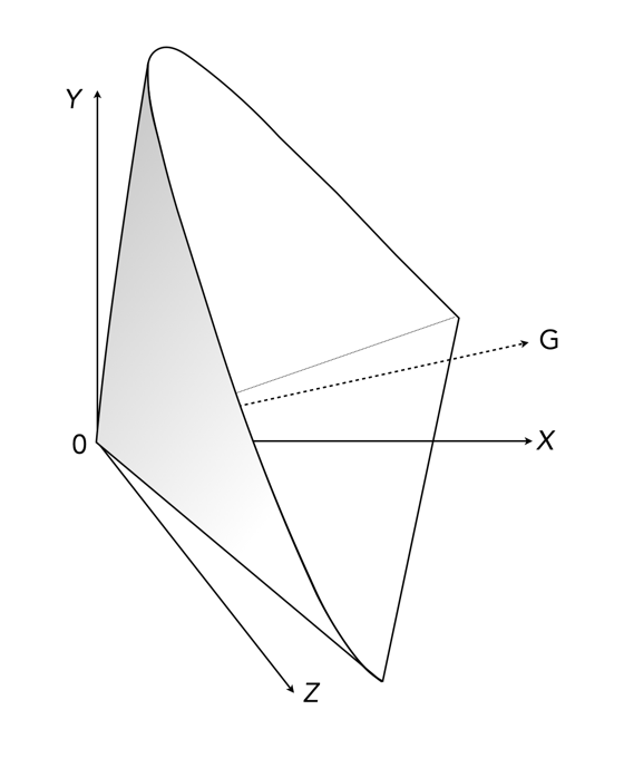
The luminance in XYZ space increases along the Y axis, starting at 0, the black point (X=Y=Z=0). The colour hue is independent of the luminance, and hence independent of Y. CIE also defines a means of describing hues and saturation, by defining three normalized coordinates: x, y, and z (where x+y+z=1).

x = X / (X+Y+Z)
y = Y / (X+Y+Z)
z = Z / (X+Y+Z)
z = 1 - x - y

The x and y components can then be taken as the chromaticity coordinates, determining colours for a certain luminance. This system is called CIE xyY, because a colour value is defined by the chromaticity coordinates x and y in addition to the luminance coordinate Y. More on this in the next post on chromaticity diagrams.

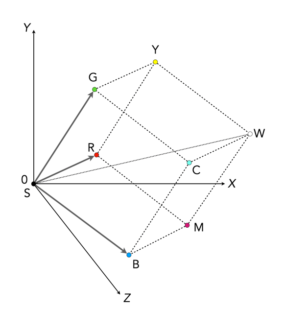
The RGB colour space is related to XYZ space by a linear coordinate transformation. The RGB colour space is embedded in the XYZ space as a distorted cube (see Figure 5). RGB can be mapped onto XYZ using the following set of equations:

X = 0.41847R - 0.09169G - 0.0009209B
Y = -0.15866R + 0.25243G - 0.0025498B (luminance)
Z = -0.082835R + 0.015708G + 0.17860B

CIEXYZ is non-uniform with respect to human visual perception, i.e. a particular fixed distance in XYZ is not perceived as a uniform colour change throughout the entire colour space. CIE XYZ is often used as an intermediary space in determining a perceptually uniform space such as CIE Lab (or Lab), or CIE LUV (or Luv).

  • CIE 1976 CIEL*u*v*, or CIELuv, is an easy to calculate transformation of CIE XYZ which is more perceptually uniform. Luv was created to correct the CIEXYZ distortion by distributing colours approximately proportional to their perceived colour difference.
  • CIE 1976 CIEL*a*b*, or CIELab, is a perceptually uniform colour differences and L* lightness parameter has a better correlation to perceived brightness. Lab remaps the visible colours so that they extend equally on two axes. The two colour components a* and b* specify the colour hue and saturation along the green-red and blue-yellow axes respectively.

In 1964 another set of experiments were done allowing for a 10° field of view, and are known as the CIE 1964 supplementary standard colorimetric observer. CIE XYZ is still the most commonly used reference colour space, although it is slowly being pushed to the wayside by CIE1976. There is a lot of information on CIE XYZ and its derivative spaces. The reader interested in how CIE1931 came about in referred to [1,4]. CIELab is the most commonly used CIE colour space for imaging, and the printing industry.

Further Reading

  1. Fairman, H.S., Brill, M.H., Hemmendinger, H., “How the CIE 1931 color-matching functions were derived from Wright-Guild data”, Color Research and Application, 22(1), pp.11-23, 259 (1997)
  2. Service, P., The Wright – Guild Experiments and the Development of the CIE 1931 RGB and XYZ Color Spaces (2016)
  3. Abraham, C., A Beginners Guide to (CIE) Colorimetry
  4. Zhu, Y., “How the CIE 1931 RGB Color Matching Functions Were Developed from the Initial Color Matching Experiments”.
  5. Sharma, G. (ed.), Digital Color Imaging Handbook, CRC Press (2003)

Fixing the “crop-factor” issue

We use the term “cropped sensor” only due to the desire to describe a sensor in terms of the 35mm standard. It is a relative term which compares two different types of sensor, but it isn’t really that meaningful. Knowing that a 24mm MFT lens “behaves” like a 48mm full-frame lens is pointless if you don’t understand how a 48mm lens behaves on a full-frame camera. All sensors could be considered “full-frame” in the context of their environment, i.e. a MFT camera has a full-frame sensor as it relates to the MFT standard.

As mentioned in a previous post, the “35mm equivalence” is used to relate a crop-factor lens to its full-frame equivalent. The biggest problem with this is the amount of confusion it creates for novice photographers. Especially as focal lengths on lenses are always the same, yet the angle-of-view changes according to the sensor. However there is a solution to the problem, and that is to stop using the focal length to define a lens, and instead use AOV. This would allow people to pick a lens based on its angle-of view, both in degrees, but also from a descriptive point of view. For example, a wide angle lens in full-frame is 28mm – its equivalent in APS-C in 18mm, and MFT is 14mm. It would be easier just to label these by the AOV as “wide-74°”.

It would be easy to categorize lenses into six core groups based on horizontal AOV (diagonal AOV in []) :

  • Ultra-wide angle: 73-104° [84-114°]
  • Wide-angle: 54-73° [63-84°]
  • Normal (standard): 28-54° [34-63°]
  • Medium telephoto: 20-28° [24-34°]
  • Telephoto: 6-20° [8-24°]
  • Super-telephoto: 3-6° [4-8°]
Lenses could be advertised using a graphic to illustrate the AOV (horizontal) of the lens. This effectively removes the need to talk about focal length.

They are still loosely based on how AOV related to 35mm focal lengths. For example 63° relates to the AOV of a 35mm lens, however it no longer really relates to the focal length directly. A “normal-40°” lens would be 40° no matter the sensor size, even though the focal lengths would be different (see table below). The only lenses left out of this are fish-eye lenses, which in reality are not that common, and could be put into a
specialty lens category, along with tilt-shift etc.

Instead of brochures containing focal lengths they could contain the AOV’s.

I know most lens manufacturers describe AOV using diagonal AOV, but this is actually more challenging for people to perceive, likely because looking through a camera we generally look at a scene from side-to-side, not corner-to-corner.

AOV98°84°65°
MFT8mm10mm14mm
APS-C10mm14mm20mm
FF16mm20mm28mm
Wide/ultra-wide angle lenses

AOV54°49°40°
MFT17mm20mm25mm
APS-C24mm28mm35mm
FF35mm40mm50mm
Normal lenses

AOV28°15°10°
MFT35mm70mm100mm
APS-C45mm90mm135mm
FF70mm135mm200mm
Telephoto lenses

Demystifying Colour (vi) : Additive vs. subtractive

In the real world there are two ways to produce colours, and they are very relevant because they deal with opposite ends of the photographic spectrum – additive and subtractive. Additive colours are formed by combining coloured light, whereas subtractive colours are formed by combining coloured pigments.

Additive colours are so-called because colours are built by combining wavelengths of light. As more colours are added, the overall colour becomes whiter. Add green and blue together and what you get is a washed out cyan. RGB is an example of an additive colour model. mixing various amounts of red, green, and blue produces the secondary colours: yellow, cyan, and magenta. Additive colour models are the norm for most systems of photograph acquisition or viewing.

Additive colour
Subtractive colour

Subtractive colour works the other way, by removing light. When we look at a clementine, what we see is the orange light not absorbed by the clementine, i.e. all other wavelengths are absorbed, except for orange. Or rather the clementine is subtracting the other wavelengths from the visible light, meaning there is only orange left to reflect off. CMYK and RYB (Red-Yellow-Blue) are good examples of subtractive colour models. Subtractive models are for most systems for printed material.

Different colour inks absorb and reflect specific wavelengths. CMYK (0,0,0,0) looks like white (no ink is laid down, so no light is absorbed), whereas (0,0,0,100) looks like black (maximum black is laid down meaning all colours are absorbed). CMYK values range from 0-100%. Below are some examples.

Ink colourabsorbsreflectsappears
cyanredgreen, bluecyan
magentagreenred, bluemagenta
yellowbluegreen, redyellow
magenta + yellowblue, greenredred
cyan + yellowred, bluegreengreen
cyan + magentared, greenblueblue

How many bits in an image?

When it comes to bits and images it can become quite confusing. For example, are JPEGs 8-bit, or 24-bit? Well they are both.

Basic bits

A bit is a binary digit, i.e. it can have a value of 0 or 1. When something is X-bit, it means that it has X binary digits, and 2X possible values. Figure 1 illustrates various values for X as grayscale tones. For example a 2-bit image will have 22, or 4 values (0,1,2,3).

Fig.1: Various bits

An 8-bit image has 28 possible values for bits – i.e. 256 values ranging from 0..255. In terms of binary values, 255 in binary is 11111111, 254 is 11111110, …, 1 is 00000001, and 0 is 00000000. Similarly, a 16-bit means there are 216 possible values, from 0..65535. The number of bits is sometimes called the bit-depth.

Bits-per-pixel

Images typically describe bits in terms of bits-per-pixel (BPP). For example a grayscale image may have 8-BPP, meaning each pixel can have one of 256 values from 0 (black) to 255 (white). Colour images are a little different because they are typically composed of three component images, red (R), green (G), and blue (B). Each component image has its own bit-depth. So a typical 24-bit RGB image is composed of three 8-BPP component images, i.e. 24-BPP RGB = 8-BPP (R) + 8-BPP (G) + 8-BPP (B).

The colour depth of the image is then 2563 or 16,777,216 colours (or 2563, 28=256 for each of the component images). A 48-bit RGB image contains three component images, R, G, and B, each having 16-BPP, for 248 or 281,474,976,710,656 colours.

Bits and file formats

JPEG stores images with a precision of 8-bits per component image, for a total of 24-BPP. The TIFF format supports various bit depths. There are also RGB images stored as 32-bit images. Here 8 bits are used to represent each of the RGB component images, with individual values 0-255. The remaining 8 bits are reserved for the transparency, or alpha (α) component. The transparency component represents the ability to see through a colour pixel onto the background. However only some image file formats support transparency. For example JPEG does not support transparency. Typically of the more common formats, only PNG and TIFF support transparency.

Bits and RAW

Then there are RAW images. Remember RAW images are not RGB images. They maintain the 2D array of pixel values extracted from photosite array of the camera sensor (they only become RGB after post-processing using off-camera software). Therefore they maintain the bit-depth of the camera’s ADC. Common bit depths are 12, 14, and 16. For example a camera that outputs 12-bits will have pixels in the raw image which will be 12-bits. A 12-bit image has 4096 levels of luminance per colour pixel. Once the RGB image is generated that means 4096^3 possible colours, which is 68,719,476,736 possible colours for each pixel. That’s 4096 times the amount of colours of an 8-bit per component RGB image. For example the Ricoh GR III stores its RAW images using 14-bits. This means that a RAW image has the potential of 16,384 colour for each component (once processed), versus a JPEG produced by the same camera, which only has 256 colours for each component.

Do more bits matter?

So theoretically its nice to have 68 billion odd colours, but is it practical. The HVS can distinguish between 7 and 10 million colours, so for visualization purposes 8-bits per colour component is fine. For editing an image, often the more colour depth the better. When an image has been processed it can then be stored as a 16-bit TIFF image, and JPEGs produced as needed (for applications such as the web).

Demystifying Colour (v) : colour gamuts

Terms used to describe colours are often confusing. If a colour space is a subset of a colour model, then what is a colour gamut? Is it the same as a colour space? How does it differ from a colour profile? In reality there is often very little difference between the terms. For example, depending on where you read it sRGB can be used to describe a colour space, a colour gamut, or a colour profile. Confused? Probably.

Colour gamuts

A gamut is a range or spectrum of some entity, for example “the complete gamut of human emotions“. A colour gamut describes a subset of colours within the entire spectrum of colours that are identifiable by the human eye, i.e. the visible colour spectrum. More specifically a gamut is the range of colours a colour space can represent.

While the range of colour imaging devices is very broad, e.g. digital cameras, scanners, monitors, printers, the range of colours they produce can vary considerably. Colour gamuts are designed to reconcile colours that can be used in common between devices. The term colour gamut is usually used in association with electronic devices, i.e. the devices range of reproducible colours, or the range of different colours that can be interpreted by a colour model. A colour gamut can therefore be used to express the difference between various colour spaces, and to illustrate the extent of coverage of a colour space.

Fig.1: CIE XYZ 2D Chromaticity Diagram depicting various colour spaces as gamuts

The colour gamut of a device is sometimes visualized as a volume of colours, typically in CIELab or CIELuv colour spaces, or as a project in the CIEXYZ colour space producing a 2D xy chromaticity diagram (CD). particularly the luminance of the primary colours. Typically a colour space specifies three (x,y) coordinates to define the three primary colours it uses. The triangle formed by the three coordinates encloses the gamut of colours that the device can reproduce. The table below shows the RGB coordinates for various colour spaces in the CIE chromaticity diagram, shown on the 2D diagram in Figure 1.

NameR(x)R(y)G(x)G(y)B(x)B(y)%CIE
sRGB0.640.330.30.60.150.0635
Adobe RGb0.640.330.210.710.150.0650
ProPhoto0.73470.26530.15960.84040.03660.000191
Apple RGB0.62500.340.280.59500.15500.0733.5
NTSC RGB0.670.330.210.710.140.0854
CIE RGB0.73460.26650.28110.70770.17060.0059

Note that colour gamuts are 3D which is more informative than the 2D CD – it captures the nuances of the colour space, particularly the luminance of the primary colours. However the problem with 3D is that it is not easy to plot, and hence the reason a 2D representation is often used (the missing dimension is brightness).

Two of the most common gamuts in the visual industry are sRGB, and Adobe RGB (which are also colour spaces). Each of these gamuts references a different range of colours, suited to particular applications and devices. sRGB is perhaps the most common gamut used in modern electronic devices. It is gamut that covers a good range of colours for average viewing needs, so much so that it is the default standard for the web, and most images taken using digital cameras. The largest RGB working space, ProPhoto is an RGB color space developed by Kodak, and encompasses 90% of the possible colours in the CIE XYZ chromaticity diagram.

Gamut mapping is the conversion of one devices colour space to another. For example the case where an image stored as sRGB is to be reproduced on a print medium with a CMYK colour space. The objective of a gamut mapping algorithm is to translate colours in the input space to achievable colours in the output space. The gamut of an output device depends on its technology. For example, colour monitors are not always capable of displaying all colours associated with sRGB.

Colour profiles

On many systems the colour gamut is described as a colour profile, and more specifically is associated with an ICC Color Profile, which is a standardized system put in place by the international colour consortium. Such profiles help convert the colours in the designated colour space associated with an image to the device. For example the standard profile on Apple laptops is “Color LCD”.Some of the most common RGB ICC profiles are sRGB (sRGB IEC61966-2.1).

Demystifying Colour (iii) : colour models and spaces

Colour is a challenging concept in digital photography and image processing, partially because it is not a physical property, but rather a perceptual entity. Light is made up of many wavelengths, and colour is a sensation that is caused when our brain interprets these wavelengths. In the digital world, colour is represented using global colour models and more specific colour spaces

Colour models

colour model is a means of mapping wavelengths of light to colours, based on some particular scientific process, and a mathematical model, i.e. a way to convert colour into numbers. A colour model on its own is abstract, with no specific association to how the colours are perceived. The components of colour models have a number of distinguishing features. The core feature is the component type (e.g. RGB primaries, hue) and its associated units (e.g. degrees, percent). Other features included scale type (e.g. linear/non-linear), and geometric shape of the model (e.g. cube, cone, etc).

Colour models can be expressed in many different ways, each with their own benefits and limitations. Colour models can be described based on how they are constructed:

  • Colorimetric – These are colour models based on physical measurements of spectral reflectance. One of the CIE chromaticity diagrams is usually the basis for these models.
  • Psychological – These colour models are based on the human perception of colour. They are either designed on subjective observation criteria, and some sort of comparative references, (e.g. Munsell), or are designed through experimentation to comply with the human perception of colour, e.g. HSV, HSL.
  • Physiological – These colour models are based on the three primary colours associated with the three types of cones in the human retina, e.g. RGB.
  • Opponent – Based on perception experiments using pairwise opponent primary colours, e.g. Y-B, R-G.

Sometimes colour models are distinguised based on how colour components are combined. There are two methods of colour mixing – additive or subtractive. Additive colour models use light to display colours, while subtractive models use printing inks. Colours received in additive models such as RGB are the result of transmitted light, whereas those perceived in subtractive models such as CMYK are the result of reflected light. An example of an image showing its colours as represented using the RGB colour model is shown in Fig.1.

Fig.1: A colour image and its associated RGB colour model

Colour models can be described using a geometric representation of colours in a three-dimensional space, such as a cube, sphere or cone. The geometric shape describes what the map for navigating a colour space looks like. For example RGB is shaped like a cube, HSV can be represented by a cylindrical or conical object, and YIQ is a convex-poyhedron (a somewhat skewed rectangular box). The geometric representations of the image in Figure 1 shown using three different colour models is shown in Figure 2.

Fig.2: Three different colour models with differing geometric representations

Colour spaces

colour space, is a specific implementation of a colour model, and usually defines a subset of a colour model. Different colour spaces can exist within a colour model. With a colour model we are able to determine a certain colour relative to other colours in the model. It is not possible to conclude how a certain colour will be perceived. A colour space can then be defined by a mapping of a colour model to a real-world colour reference standard. The most common reference standard is CIE XYZ which was developed in 1931. It defines the number of colours the human eye can distinguish in relation to wavelengths of light.

In the context of photographs colour space is the specific range of colours that can be represented. For example the RGB colour model has several different colour spaces, e.g. sRGB, Adobe RGB. sRGB is the most common colour space and is the standard for many cameras, and TVs. Adobe RGB was designed (by Adobe) to complete with sRGB, and is meant to offer a broader colour gamut (some 35% more). So a photograph taken using sRGB may have more subtle tones, than one taken using Adobe RGB. CIELab, and CIELuv are colour spaces within the CIE colour model.

That being said, the terms colour model and colour space are often used interchangeably, for example RGB is considered both a colour model and a colour space.

Demystifying Colour (ii) : the basics of colour perception

How humans perceive colour is interesting, because the technology of how digital cameras capture light is adapted from the human visual system. When light enters our eye it is focused by the cornea and lens into the “sensor” portion of the eye – the retina. The retina is composed of a number of different layers. One of these layers contains two types of photosensitive cells (photoreceptors), rods and cones, which interpret the light, and convert it into a neural signal. The neural signals are collected and further processed by other layers in the retina before being sent to the brain via the optic nerve. It is in the brain that some form of colour association is made. For example, an lemon is perceived as yellow, and any deviation from this makes us question what we are looking at (like maybe a pink lemon?).

Fig.1: An example of the structure and arrangement of rods and cones

The rods, which are long and thin, interpret light (white) and darkness (black). Rods work only at night, as only a few photons of light are needed to activate a rod. Rods don’t help with colour perception, which is why at night we see everything in shades of gray. The human eye is suppose to have over 100 million rods.

Cones have tapered shape, and are used to process the the three wavelengths which our brains interpret as colour. There are three types of cones – short-wavelength (S), medium-wavelength (M), and long-wavelength (L). Each cone absorbs light over a broad range of wavelengths: L ∼ 570nm, M ∼ 545nm, and S ∼ 440nm. The cones are usually called R, G, and B for L, M, and S respectively. Of course these cones have nothing to do with their colours, just wavelengths that our brain interprets as colours. There are roughly 6-7 million cones in the human eye, divided up into 64% “red” cones, 32% “green” cones, and 2% “blue” cones. Most of these are packed into the fovea. Figure 2 shows how rods and cones are arranged in the retina. Rods are located mainly in the peripheral regions of the retina, and are absent from the middle of the fovea. Cones are located throughout the retina, but concentrated on the very centre.

Fig.2: Rods and cones in the retina.

Since there are three types of cones, how are other colours formed? The ability to see millions of colours is a combination of the overlap of the cones, and how the brain interprets the information. Figure 3 shows roughly how the red, green, and blue sensitive cones interpret different wavelengths as colour. As different wavelengths stimulate the colour sensitive cones in differing proportions, the brain interprets the signals as differing colours. For example, the colour yellow results from the red and green cones being stimulated while the blues cones are not.

Fig.3: Response of the human visual system to light

Below is a list of approximately how the cones make the primary and secondary colours. All other colours are composed of varying strengths of light activating the red, green and blues cones. when the light is turned off, black is perceived.

  • The colour violet activates the blue cone, and partially activates the red cone.
  • The colour blue activates the blue cone.
  • The colour cyan activates the blue cone, and the green cone.
  • The colour green activates the green cone, and partially activates the red and blue cones.
  • The colour yellow activates the green cone and the red cone.
  • The colour orange activates the red cone, and partially activates the green cone.
  • The colour red activates the red cones.
  • The colour magenta activates the red cone and the blue cone.
  • The colour white activates the red, green and blue cones.

So what about post-processing once the cones have done their thing? The sensor array receives the colours, and stores the information by encoding it in the bipolar and ganglion cells in the retina before it is passed to the brain. There are three types of encoding.

  1. The luminance (brightness) is encoded as the sum of the signals coming from the red, green and blue cones and the rods. These help provide the fine detail of the image in black and white. This is similar to a grayscale version of a colour image.
  2. The second encoding separates blue from yellow.
  3. The third encoding separates red and green.
Fig.4: The encoding of colour information after the cones do their thing.

In the fovea there are no rods, only cones, so the luminance ganglion cell only receives a signal from one cone cell of each colour. A rough approximation of the process is shown in Figure 4.

Now, you don’t really need to know that much about the inner workings of the eye, except that colour theory is based a great deal on how the human eye perceives colour, hence the use of RGB in digital cameras.

Demystifying Colour (i) : visible colour

Colour is the basis of human vision. Everything appears coloured. Humans see in colour, or rather the cones in our eyes interpret wavelengths of red, green and blue when they enter the eye in varying proportions, enabling us to see a full gamut of colours. The miracle of the human eyes aside, how does colour exist? Are trees really green? Bananas yellow? Colour is not really inherent in objects, but the surface of an object reflects some colours and absorb others. So the human eye only perceives reflected colours. The clementine in the figure below reflects certain wavelengths, which we perceive as orange. Without light there is no colour.

Reflected wavelengths = perceived colours

Yet even for the simplest of colour theory related things, like the visible spectrum, it is hard to find an exact definition. Light is a form of electromagnetic radiation. Its physical property is described in terms of wavelength (λ) in units of nanometers (nm, which is 10-9 metres). Human eyes can perceive the colours associated with the visible light portion of the electromagnetic radiation spectrum. It was Isaac Newton who in 1666 described the spectrum of white light as being divided into seven distinct colours – red, orange, yellow, green, blue, indigo and violet. Yet in many renditions, indigo has been replaced by blue, and blue by cyan. In some renditions there are only six colours (like in Pink Floyd’s album cover for Dark Side of the Moon), others have eight. It turns out indigo likely doesn’t need to be there (because its hard to tell indigo apart from blue and violet). Another issue is the varied ranges of the visible spectrum in nanometers. Some sources define it as broadly as 380-800nm, while others narrow it to 420-680nm. Confusing right? Well CIE suggests that there are no precise limits for the spectral range of visible radiation – the lower limit is 360-400nm and the upper limit 760-830nm.

The visible spectrum of light (segmented into eight colours)

Thankfully for the purposes of photography we don’t have to delve that deeply into the specific wavelengths of light. In fact we don’t even have to think too much about the exact wavelength of colours like red, because frankly the colour “red” is just a cultural association with a particular wavelength. Basically colours are named for the sake of communications and so we can differentiate thousands of different paints chips. The reality is that while the human visual system can see millions of distinct colours, we only really have names for a small set of them. Most of the worlds languages only have five basic terms for colour. For example, the Berinmo tribe of Papua New Guinea have a term for light, dark, red, yellow, and one that denotes both blue and green [1]. Maybe we have overcomplicated things somewhat when it comes to colour.

But this does highlight some of the issues with colour theory – the overabundance of information. There are various terms which seem to lack a clear definition, or overlap with other terms. Who said colour wasn’t messy? It is. What is the difference between a colour model and a colour space? Why do we use RGB? Why do we care about HSV colour space? This series will look at some colour things as it relates to photography, explained as simply as possible.

  1. Davidoff, J., Davies, I., Roberson, D., “Colour categories in a stone-age tribe”, Nature, 398, pp.203-204 (1999)

How does digital ISO work?

The term ISO (International Standards Organization) is used to describe light sensitivity. In the world of film, ISO relates to film sensitivity – film with high ISO is made with crystals capable of holding more light. The trade-off is that the crystals need to be larger, therefore as ISO increases crystal size becomes more visible, manifesting as film grain. In the digital realm, photosites cannot increase in size, so in low light they record less information. To compensate for a lack of information, the signal is amplified, thereby mimicking film sensitivity.

A low ISO (e.g. 100) setting mimics a low-sensitivity film, so that a longer exposure time, or large aperture setting is required. Conversely a high ISO setting, e.g. 1600, mimics a high-sensitivity film, so allows for a short exposure time (fast shutter speed), or small aperture. Increasing the ISO setting will effectively increase the brightness of the resulting image. Note that changing the ISO has nothing to do with the sensitivity of the photosites, they are by no means affected. This is different to film cameras, where changing the ISO setting is directly associated with the sensitivity of the film. The ISO in a digital camera has everything to do with what happens to the signal after it has been captured by the photosite and converted from light to an electrical signal. The ISO setting determines what happens when the electrical signal passes through an analog amplifier, i.e. it determines how much the signal is amplified (this is known as the gain).

Digital ISO

A brightly lit scene will produce a strong electrical signal, which requires less amplification (lower ISO setting), and results in a smoother image with less “grain”. Conversely, less light in a scene means photosites are able to capture less information, and generate weaker electrical signals which have to be amplified (using a high ISO setting). Unfortunately, photosites also capture noise, and changing the ISO will also affect it. For example increasing ISO will increase the amount of noise. This is why photographs taken with a high ISO often have a grainy appearance (attributable to noise). The lower the ISO used, the better the quality of the image will be.

What is luminance?

Light is the building block of photographs. Luminance describes how much light comes from an object. In a grayscale image, there is only luminance. In many respects it is what provides the “structure” of an image. If no light were to come from an object, an image would appear black. Luminance is one of the primary cues that make you realize you are looking at a three-dimensional object rather than a flat picture.

The human visual system is designed to detect luminosity (light), and chroma (colour). The photoreceptors in human eyes include the cones which handle the chroma and the rods which handle the luminance. Luminance is perceived as different shades of light in grays while chroma are different hues of colour. Colours have intensity while light has brightness. Artists have known for a very long time that colour and luminance can be treated in an artistic sense quite independently. Picasso said, “Colours are only symbols. Reality is to be found in luminance alone.”

When high-luminance colours such as yellow are placed next to low-luminance colours such as dark blue, they create a strong contrast that the visual system interprets as a change in depth. The center-surround effect is also responsible for the optical illusion that colours look different depending on the colour of their surroundings.

To understand better the interplay of luminance and colour, consider Claude Monet’s 1874 painting, Impression, soleil levant (English Impression, Sunrise), which depicts the the port of Le Havre, France at sunrise.

Monet Impression, Sunrise
Monet’s Impression, Sunrise

It would seem as though the rising Sun is the brightest object on the canvas, however when the image is desaturated by removing the colour component, it is shown that the sun, as well as its reflection have the same luminance as the sky – for all intended purposes, disappears. This can be achieved by converting the colour space to HSL, and extracting the Lightness/Luminance component.

Monet's Impression, Sunrise devoid of colour
Monet’s Impression, Sunrise – devoid of colour

Why? Because Monet used colours which had equal luminance, so the sun blends into the sky. The sun appears brighter because Monet uses a saturated complementary colour to the blue of the sky, so the colours accentuate one another. Without colour, the painting loses some of its meaning. To illustrate this another way, we extracted circles with a diameter of 30 pixels from the sun, and the area adjacent to it. Then the luminance was calculated using the average pixel value found in each extracted region.

The results? Very similar luminance values.