Why are there no 3D colour histograms?

Some people probably wonder why there aren’t any 3D colour histograms. I mean if a colour image is comprised of red, green, and blue components, why not provide those in a combined manner rather than separate 2D histograms or a single 2D histogram with the R,G,B overlaid? Well, it’s not that simple.

A 2D histogram has 256 pieces of information (grayscale). A 24-bit colour image contains 2563 colours in it – that’s 16,777,216 pieces of information. So a three-dimensional “histogram” would contain the same number of elements. Well, it’s not really a histogram, more of a 3D representation of the diversity of colours in the image. Consider the example shown in Figure 1. The sample image contains 428,763 unique colours, representing just 2.5% of all available colours. Two different views of the colour cube (rotated) show the dispersion of colours. Both show the vastness of the 3D space, and conversely the sparsity of the image colour information.

Figure 1: A colour image and 3D colour distribution cubes shown at different angles

It is extremely hard to create a true 3D histogram. A true 3D histogram would have a count of the number of pixels with a particular RGB triplet at every point. For example, how many times does the colour (23,157,87) occur? It’s hard to visualize this in a 3D sense, because unlike the 2D histogram which displays frequency as the number of occurrences of each grayscale intensity, the same is not possible in 3D. Well it is, kind-of.

In a 3D histogram which already uses the three dimensions to represent R, G, and B, there would have to be a fourth dimension to hold the number of times a colour occurs. To obtain a true 3D histogram, we would have to group the colours into “cells” which are essentially clusters representing similar colours. An example of the frequency-weighted histogram with for the image in Figure 2, using 500 cells, is shown in Figure 2. You can see that while in the colour distribution cube in Figure 1 shows a large band of reds, because these colours exist in the image, the frequency weighted histogram shows that objects with red colours actually comprise a small number of pixels in the image.

Figure 2: The frequency-distributed histogram of the image in Fig.1

The bigger problem is that it is quite hard to visualize a 3D anything and actively manipulate it. There are very few tools for this. Theoretically it makes sense to deal with 3D data in 3D. The application ImageJ (Fiji) does offer an add-on called Color Inspector 3D, which facilitates viewing and manipulating an image in 3D, in a number of differing colour spaces. Consider another example, shown in Figure 3. The aerial image, taken above Montreal lacks contrast. From the example shown, you can see that the colour image takes up quite a thin band of colours, almost on the black-white diagonal (it has 186,322 uniques colours).

Figure 3: Another sample colour image and its 3D colour distribution cube

Using the contrast tool provided in ImageJ, it is possible to manipulate the contrast in 3D. Here we have increased the contrast by 2.1 times. You can easily see the result in Figure 4. difference working in 3D makes. This is something that is much harder to do in two dimensions, manipulating each colour independently.
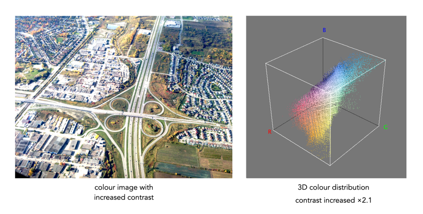
Figure 4: Increasing contrast via the 3D cube

Another example of increasing colour saturation 2 times, and the associated 3D colour distribution is shown in Figure 5. The Color Inspector 3D also allows viewing and manipulating the image in other colour spaces such as HSB and CieLab. For example in HSB the true effect of manipulating saturation can be gauged. The downside is that it does not actually process the full-resolution image, but rather one reduced in size, largely because I imagine it can’t handle the size of the image, and allow manipulation in real-time.

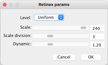
Figure 5: Increasing saturation via the 3D cube

The Retinex algorithm for beautifying pictures

There are likely thousands of different algorithms out in the ether to “enhance” images. Many are just “improvements” of existing algorithms, and offer a “better” algorithm – better in the eyes of the beholder of course. Few are tested in any extensive manner, for that would require subjective, qualitative experiments. Retinex is a strange little algorithm, and like so many “enhancement” algorithms is often plagued by being described in a too “mathy” manner. The term Retinex was coined by Edwin Land [2] to describe the theoretical need for three independent colour channels to describe colour constancy. The word was a contraction or “retina”, and “cortex”. There is an exceptional article [3] on the colour theory written by McCann which can be found here.

The Retinex theory was introduced by Land and McCann [1] in 1971 and is based on the assumption of a Mondrian world, referring to the paintings by the dutch painter Piet Mondrian. Land and McCann argue that human color sensation appears to be independent of the amount of light, that is the measured intensity, coming from observed surfaces [1]. Therefore, Land and McCann suspect an underlying characteristic guiding human color sensation [1].

There are many differing algorithms for implementing Retinex. The algorithm illustrated here can be found in the image processing software ImageJ. This algorithm for Retinex is based on the multiscale retinex with colour restoration algorithm (MSRCR) – it combines colour constancy with local contrast enhancement. In reality it’s quite a complex little algorithm with four parameters, as shown in Figure 1.

Fig.1: ImageJ Retinex parameters
  • The Level specifies the distribution of the [Gaussian] blurring used in the algorithm.
    • Uniform treats all image intensities similarly.
    • Low enhances dark regions in the image.
    • High enhances bright regions in the image.
  • The Scale specifies the depth of the Retinex effect
    • The minimum value is 16, a value providing gross, unrefined filtering. The maximum value is 250. Optimal and default value is 240.
  • The Scale division specifies the number of iterations of the multiscale filter.
    • The minimum required is 3. Choosing 1 or 2 removes the multiscale characteristic and the algorithm defaults to a single scale Retinex filtering. A value that is too high tends to introduce noise in the image.
  • The Dynamic adjusts the colour of the result, with large valued producing less saturated images.
    • Extremely image dependent, and may require tweaking.

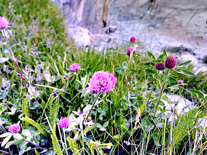
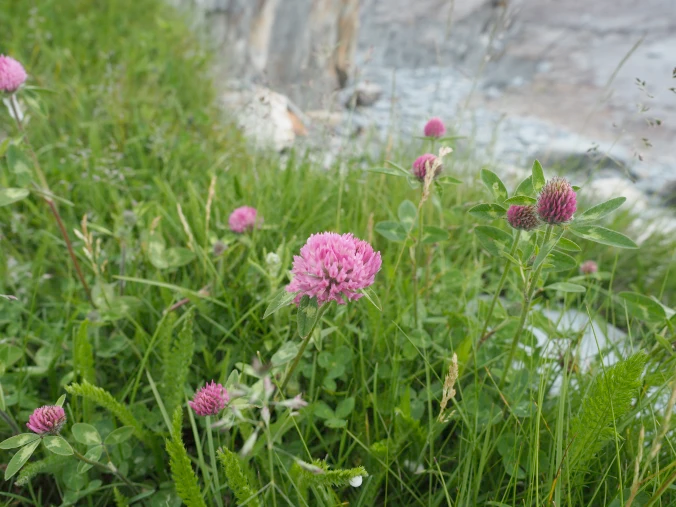
The thing with Retinex, like so many of its enhancement brethren is that the quality of the resulting image is largely dependent on the person viewing it. Consider the following, fairly innocuous picture of some clover blooms in a grassy cliff, with rock outcroppings below (Figure 2). There is a level of one-ness about the picture, i.e. perceptual attention is drawn to the purple flowers, the grass is secondary, and the rock, tertiary. There is very little in the way of contrast in this image.

clover in grass
Fig.2: A picture showing some clover blooms in a grassy meadow.

The algorithm is suppose to be able to do miraculous things, but that does involve a *lot* of tweaking the parameters. The best approach is actually to use the default parameters. Figure 3 shows Figure 2 processed with the default values shown in Figure 1. The image appears to have a lot more contrast in it, and in some cases features in the image have increased their acuity.

Fig.3: Retinex applied with default values.

I don’t find these processed images are all that useful when used by themselves, however averaging the image with the original produces an image with a more subdued contrast (see Figure 4), having features with increased sharpness.

Fig.4: Comparing the original with the averaged (Original and Fig.3)

What about the Low and High versions? Examples are shown below in Figures 5 and 6, for the Low and High settings respectively (with the other parameters used as default). The Low setting produces an image full of contrast in the low intensity regions.

Fig.5: Low
Fig.6: High

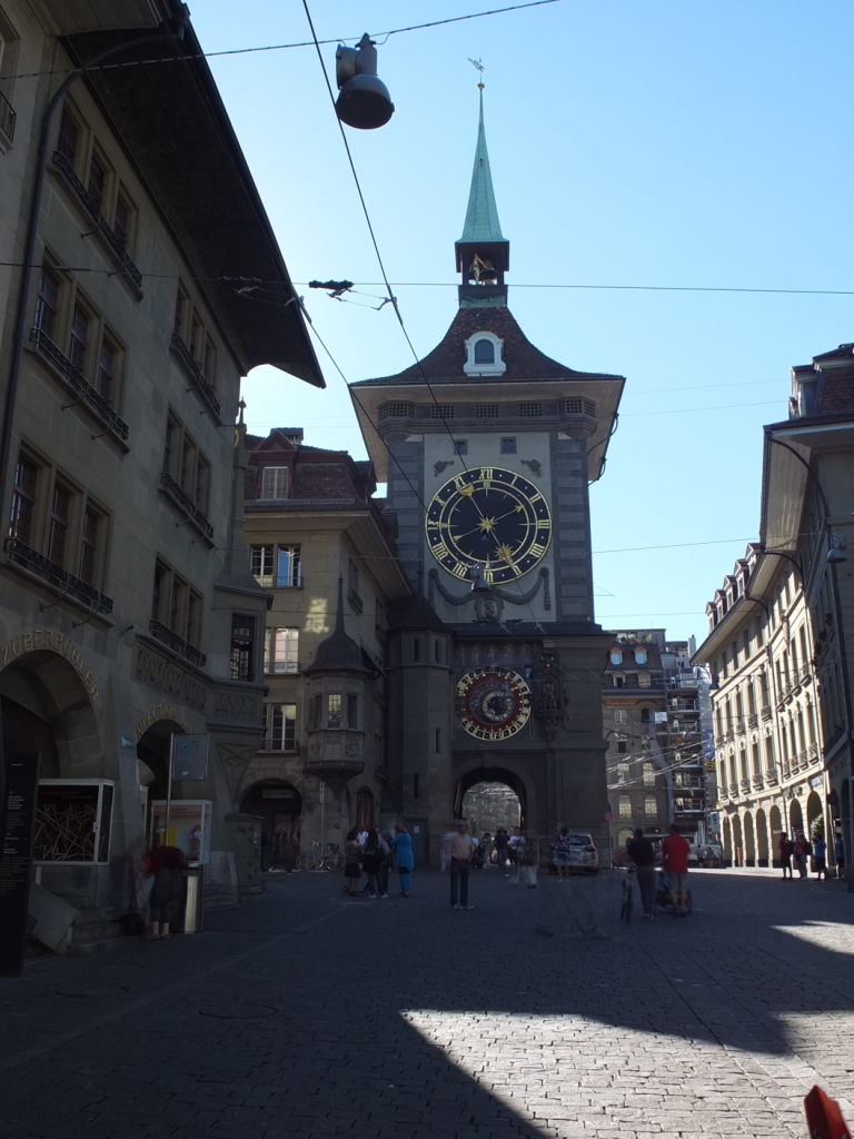
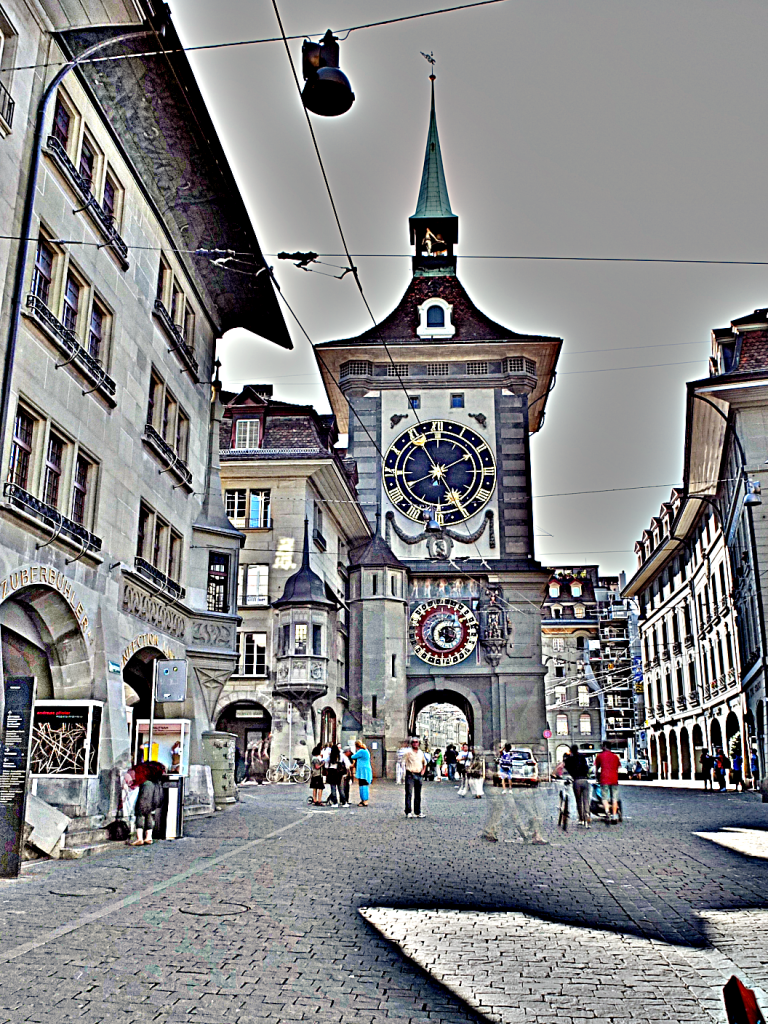
Retinex is quite a good algorithm for dealing with suppressing shadows in images, although even here there needs to be some serious post-processing in order to create an aesthetically pleasing. The picture in Figure 7 shows a severe shadow in a inner-city photograph of Bern (Switzerland). Using the Low setting, the shadow is suppressed (Figure 8), but the algorithm processes the whole image, so other details such as the sky are affected. That aside, it has restored the objects hidden in the shadow quite nicely.

Fig.7: Photograph with intense shadow
Fig.8: Shadow suppressed using “Low” setting in Retinex

In reality, Retinex acts like any other filter, and the results are only useful if they invoke some sense of aesthetic appeal. Getting the write aesthetic often involves quite a bit of parameter manipulation.

Further reading:

  1. Land, E.H., McCann, J.J., ” Lightness and retinex theory”, Journal of the Optical Society of America, 61(1), pp. 1-11 (1971).
  2. Land, E., “The Retinex,” American Scientist, 52, pp.247-264 (1964).
  3. McCann, J.J., “Retinex at 50: color theory and spatial algorithms, a review“, Journal of Electronic Imaging, 26(3), 031204 (2017)

Spectre – Does it work?

Over a year ago I installed Spectre (for IOS). The thought of having a piece of software that could remove moving objects from photographs seemed like a real cool idea. It is essentially a long-exposure app which uses multiple images to create two forms of effects: (i) an image sans moving objects, and (ii) images with light (or movement) trails. It is touted as using AI and computational photography to produce these long exposures. The machine learning algorithms provide the scene recognition, exposure compensation, and “AI stabilization”, supposedly allowing for up to a 9-second handheld exposure without the need for a tripod.

It seems as though the effects are provided by means of a computational photography technique known as “image stacking“. Image stacking just involves taking multiple images, and post-processing the series to produce a single image. For removing objects, the images are averaged. The static features will be retained in the image, the moving features will be removed through the image averaging process – which is why a stable image is important. For the light trails it works similar to a long exposure on a digital camera, where moving objects in the image become blurred, which is usually achieved by superimposing the moving features from each frame on the starting frame.

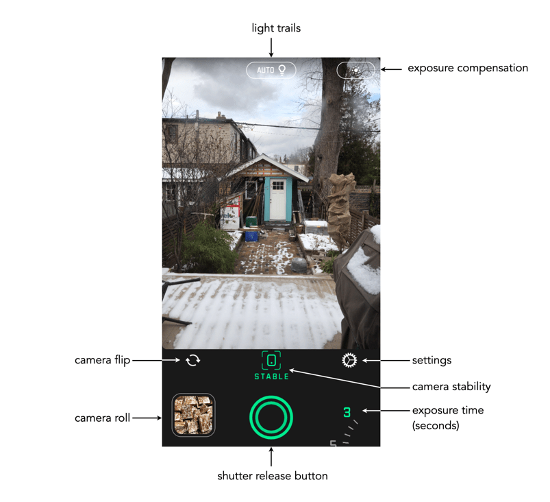
Fig.1: The Spectre main screen.

The app is very easy to use. Below the viewing window are a series of basic controls: camera flip; camera stabilization, and settings. The stabilization control, when activated, provides a small visual feature that determines when the iPhone is STABLE. As Spectre can perform a maximum of 9 seconds worth of processing, stabilization is an important attribute. The length of exposure is controlled by a dial in the lower-right corner of the app – you can choose between 3, 5, and 9 seconds. The Settings really only allows the “images” to be saved as Live Photos. The button at the top-middle turns light trails to ON, OFF, or AUTO. The button in the top-right allows for exposure compensation, which can be adjusted using a slider. The viewing window can also be tapped to set the focus point for the shot.

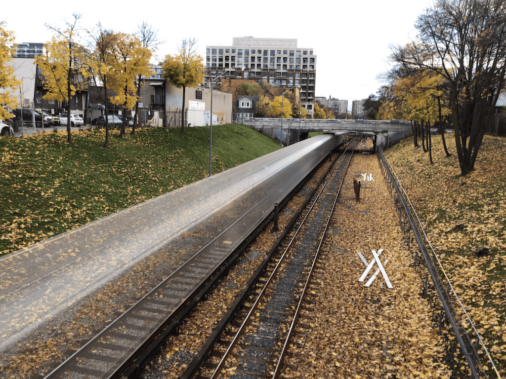
Fig.2: The use of Spectre to create a motion trail (9 sec). The length of the train, and the slow speed it was moving at created slow-motion perception.

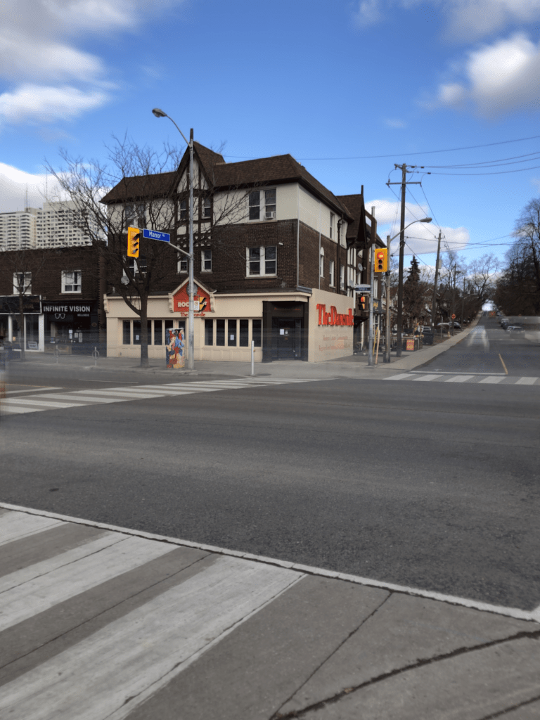
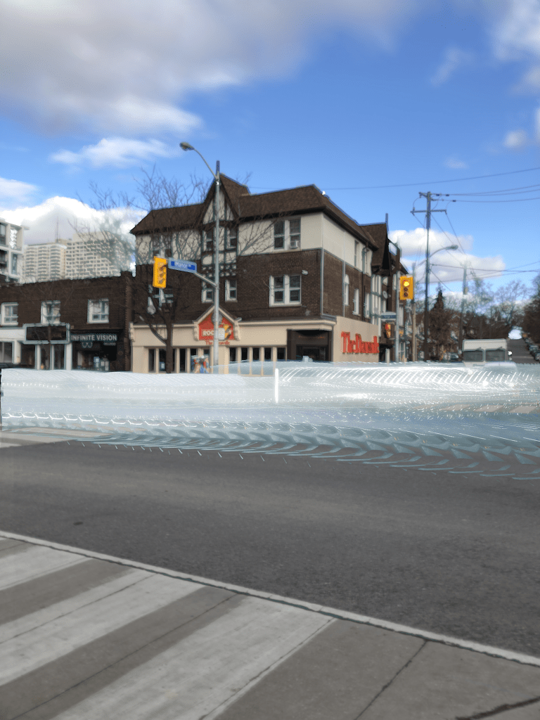
Using this app allows one of two types of processing. As mentioned, one of these modes is the creation of trails – during the day these are motion trails, and at night these are light trails. Motion trails are added by turning “light trails” to the “ON” position (Fig.4). The second mode, with “light trails” to the “OFF” position, basically removes moving objects from the scene (Fig.3)

Fig.3: Light trails off with moving objects removed.
Fig.4: Light trails on with motion trails shown during daylight.

It is a very simple app, for which I do congratulate the app designers. Too many photo-type app designers try and cram 1001 features into an app, often overwhelming the user.

Here are some caveats/suggestions:

  • Sometimes motion trails occur because the moving object is too long to fundamentally change the content of the image stack. A good example is a slow moving train – the train never leaves the scene, during a 9-second exposure, and hence gets averaged into a motion trail. This is an example of a long-exposure image, as aptly shown in Figure 2. It’s still cool from as aesthetics point-of-view.
  • Objects must move in and out of frame during the exposure time. So it’s not great for trying to remove people from tourist spots, because there may be too many of them, and they may not move quick enough.
  • Long exposures tend to suffer from camera shake. Although Spectre offers an indication of stability, it is best to rest the camera on at least one stable surface, otherwise there is a risk of subtle motion artifacts being introduced.
  • Objects moving too slowly might be blurred, and still leave some residual movement in a scene where moving objects are to be removed.

Does this app work? The answer is both yes and no. During the day the ideal situation for his app is a crowded scene, but the objects/people have to be moving at a good rate. Getting rid of parked cars, and slow people is not going to happen. Views from above are obviously ideal, or scenes where the objects to be removed are moving. For example, doing light trails of moving cars at night produces cool images, but only if they are taken from a vantage point – photos taken at the same level of the cars only results in producing a band of bright light.

It would actually be cool if they could extend this app to allow for times above nine seconds, specifically for removing people from crowded scenes. Or perhaps allowing the user to specify a frame count and delay. For example, 30 frames with a 3 second delay between each frame. It’s a fun app to play around with, and well worth the $2.99 (although how long it will be maintained is another question, the last update was 11 months ago).

Removing unwanted objects from pictures with Cleanup.pictures

Ever been on vacation somewhere, and wanted to take a picture of something, only to be thwarted by the hordes of tourists? Typically for me it’s buildings of architectural interest, or wide-angle photos in towns. It’s quite a common occurrence, especially in places where tourists tend to congregate. There aren’t many choices – if you can come back at a quieter time that may be the best approach, but often you are at a place for a limited time-frame. So what to do?

Use software to remove the offending objects, or people. Now this type of algorithm designed to remove objects from an image has been around for about 20 years, known in the early years as digital inpainting, akin to the conservation process where damaged, deteriorating, or missing parts of an artwork are filled in to present a complete image. In its early forms digital inpainting algorithms worked well in scenes where the object to be removed was surrounded by fairly uniform background, or pattern. In complex scenes they often didn’t fair so well. So what about the newer generation of these algorithms?

There are many different types of picture cleaning software, some stand-alone such as the AI-powered IOS app Inpaint, others in the form of features in photo processing software such as Photoshop. One new-comer to the scene is web-based, open-source, Cleanup.pictures. It is incredibly easy to use. Upload a picture, choose the size of the brush tool, paint over the unwanted object with the brush tool, and voila! a new image, sans the offending object. Then you can just download the “cleaned” image. So how well does it work? Below are some experiments.

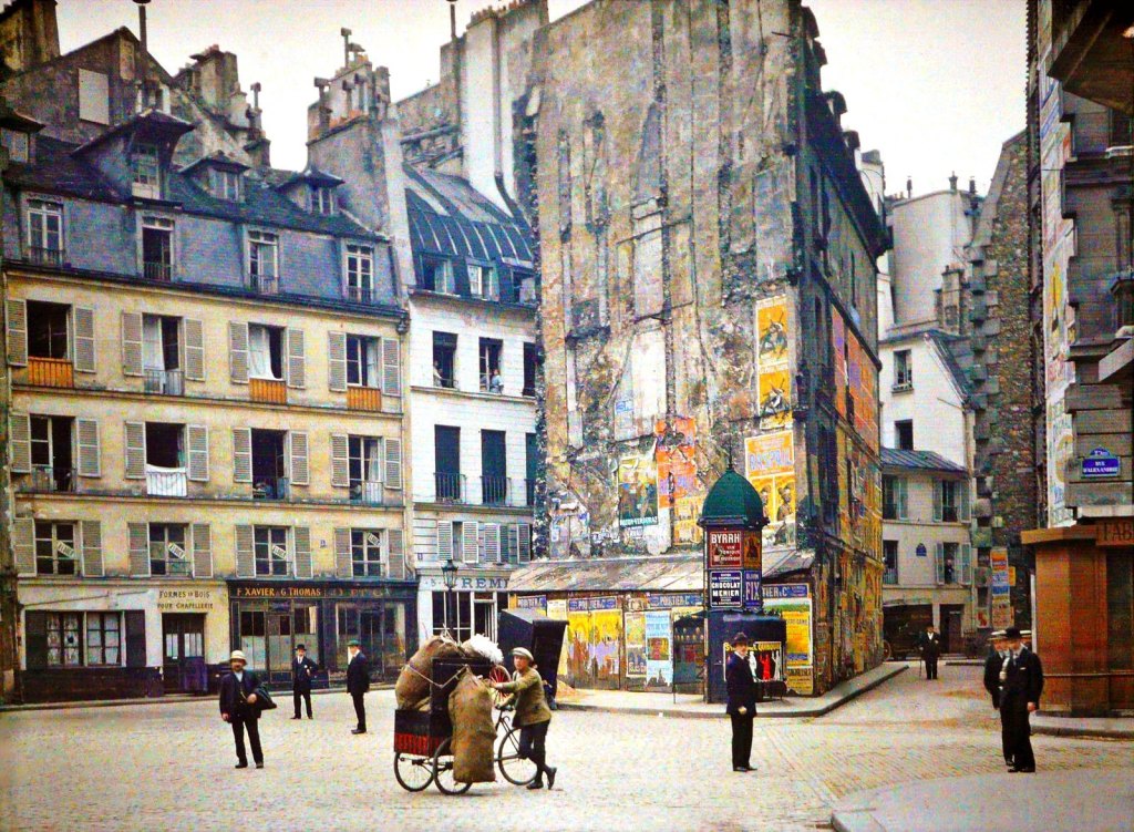
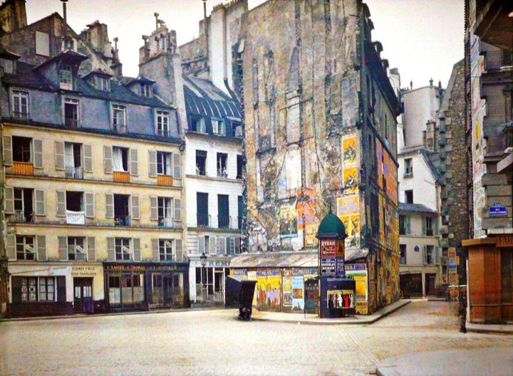
The first image is a vintage photograph of Paris, removing all the people from the streets. The results are actually quite exceptional.

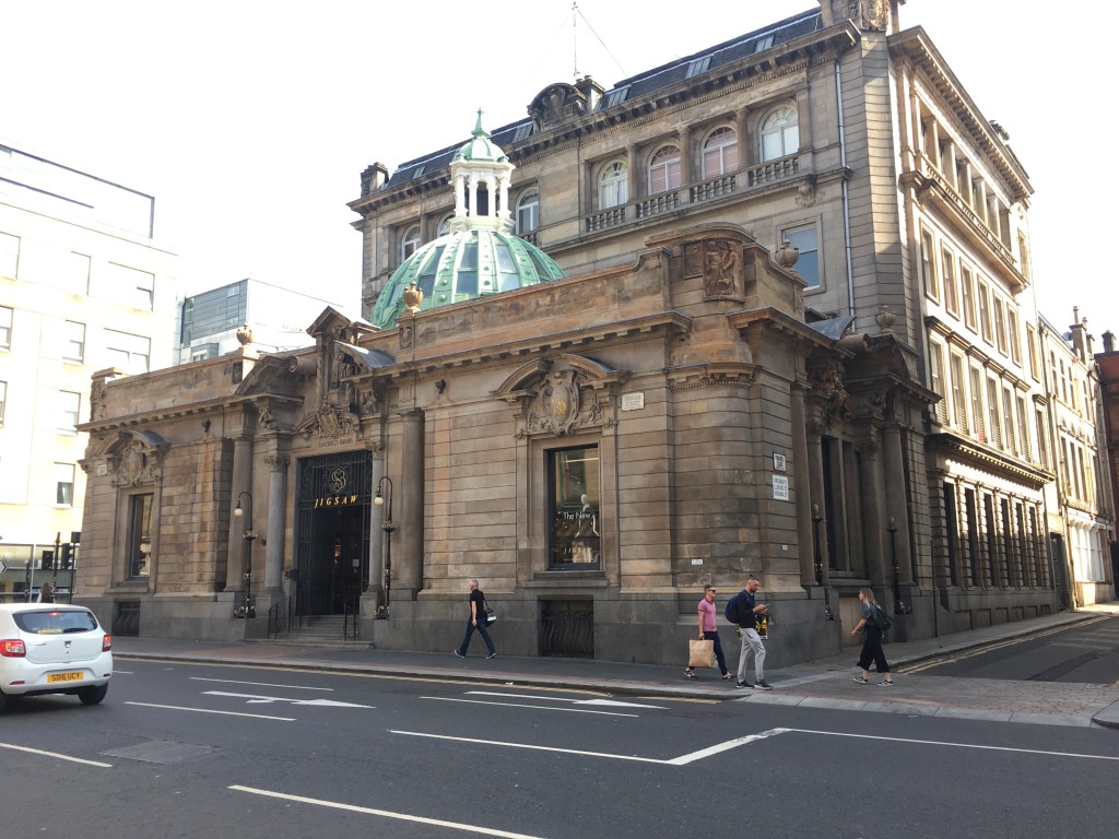
The second image is a photograph taken in Glasgow, where the people and passing car have been erased.

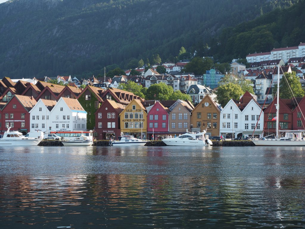
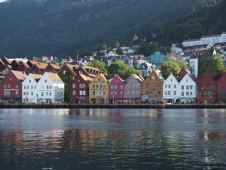
The third image is from a trip to Norway, specifically the harbour in Bergen. This area always seems to have both people and boats, so it is hard to take clear pictures of the historical buildings.

The final image is a photograph taken by Prokudin-Gorskii Collection at the Library of Congress. The image is derived from a series of glass plates, and suffers from some of the original glass plates being broken, with missing pieces of glass. The result of cleaning up the image, actually has done a better job than I could ever have imagined.

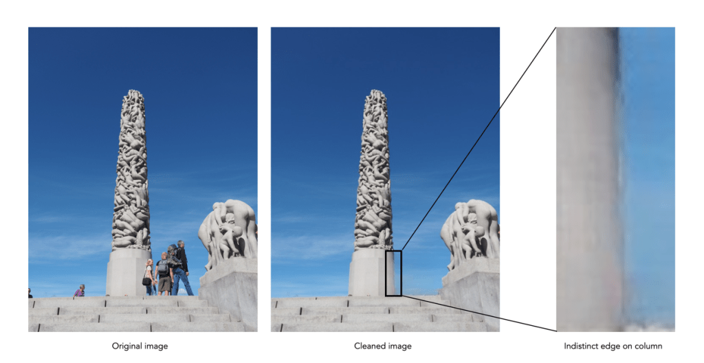
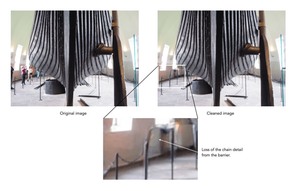
The AI used in this algorithm is really good at what it does, like *really good*, and it is easy to use. You just keep cleaning up unwanted things until you are happy with the result. The downsides? It isn’t exactly perfect all the time. In regions to be removed where there are fine details you want to retain, they are often removed. Sometimes areas become “soft” because they have to be “created” because they were obscured by objects before – especially prevalent in edge detail. Some examples are shown below:

Creation of detail during inpainting

Loss of fine detail during inpainting

It only produces low-res images, with a maximum width of 720 pixels. You can upgrade to the Pro version to increase resolution (2K width). It would be interesting to see this algorithm produce large scale cleaned images. There is also the issue of uploading personal photos to a website, although they do make the point of saying that images are discarded once processed.

For those interested in the technology behind the inpainting, it is based on an algorithm known as large mask inpainting, developed by a group at Samsung, and associates [1]. The code can be obtained directly from github for those who really want to play with things.

  1. Suvorov, R., et al. Resolution-robust Large Mask Inpainting with Fourier Convolutions (2022)

How does high-resolution mode work?

One of the tricks of modern digital cameras is a little thing called “high-resolution mode” (HRM), which is sometimes called pixel-shift. It effectively boosts the resolution of an image, even though the number of pixels used by the camera’s sensor does not change. It can boost a 24 megapixel image into a 96 megapixel image, enabling a camera to create images at a much higher resolution than its sensor would normally be able to produce.

So how does this work?

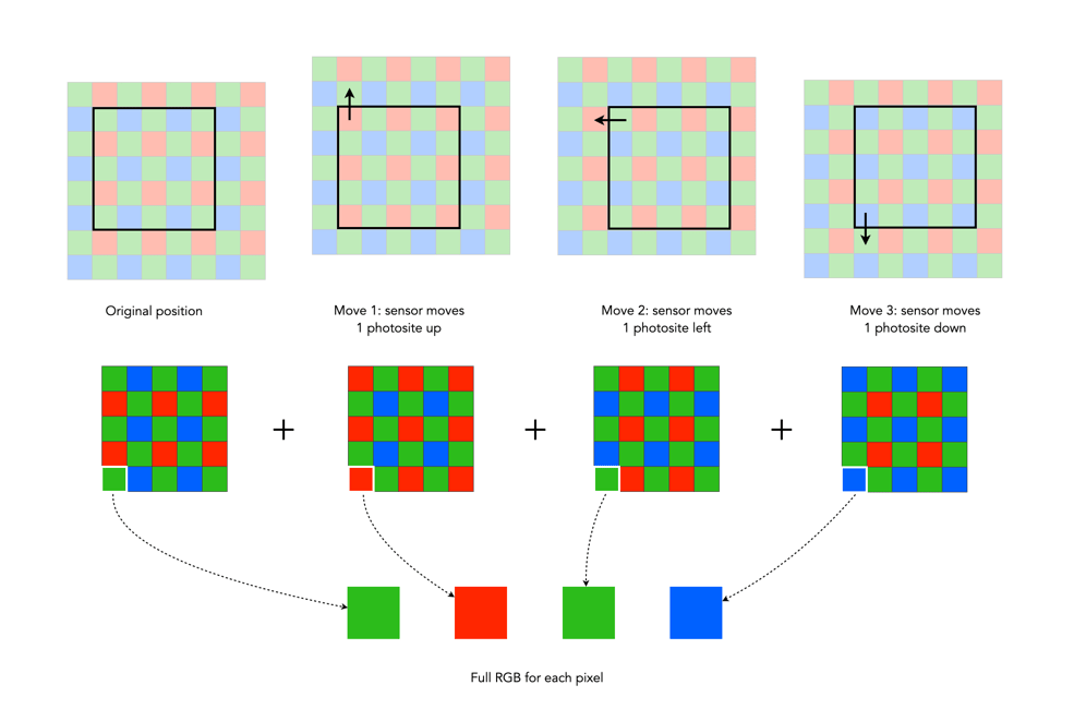
In normal mode, using a colour filter array like Bayer, each photosite acquires one particular colour, and the final colour of each pixel in an image is achieved by means of demosaicing. The basic mechanism for HRM works through sensor-shifting (or pixel-shifting) i.e. taking a series of exposures and processing the data from the photosite array to generate a single image.

  1. An exposure is obtained with the sensor in its original position. The exposure provides the first of the RGB components for the pixel in the final image.
  2. The sensor is moved by one photosite unit in one of the four principal directions. At each original array location there is now another photosite with a different colour filter. A second exposure is made, providing the second of the components for the final pixel.
  3. Step 2 is repeated two more times, in a square movement pattern. The result is that there are four pieces of colour data for every array location: one red, one blue, and two greens.
  4. An image is generated with each RGB pixel derived from the data, the green information is derived by averaging the two green values.

No interpolation is required, and hence no demosaicing.

The basic high-resolution mode process (the arrows represent the direction the sensor shifts)

In cameras with HRM, it functions using the motors that are normally dedicated to image stabilization tasks. The motors effectively move the sensor by exactly the amount needed to shift the photosites by one whole unit. The shifting moves in such a manner that the data captured includes one Red, one Blue and two Green photosites for each pixel.

There are many benefits to this process:

  • The total amount of information is quadrupled, with each image pixel using the actual values for the colour components from the correct physical location, i.e. full RGB information, no interpolation required.
  • Quadrupling the light reaching the sensor (four exposures) should also cut the random noise in half.
  • False-colour artifacts often arising in the demosaicing process are no longer an issue.

There are also some limitations:

  • It requires a very steady scene. It doesn’t work well if the camera is on a tripod, yet there is a slight breeze, moving the leaves on a tree.
  • It can be extremely CPU-intensive to generate a HRM RAW image, and subsequently drain the battery. Some systems, like Fuji’s GFX100 uses off-camera, post-processing software to generate the RAW image.

Here are some examples of the high resolution modes offered by camera manufacturers:

  • Fujifilm – Cameras like the GFX100 (102MP) have a Pixel Shift Multi Shot mode where the camera moves the image sensor by 0.5 pixels over 16 images and composes a 400MP image (yes you read that right).
  • Olympus – Cameras like the OM-D E-M5 Mark III (20.4MP), has a High-Resolution Mode which takes 8 shots using 1 and 0.5 pixel shifts, which are merged into a 50MP image.
  • Panasonic – Cameras like the S1 (24.2MP) have a High-Resolution mode that results in 96MP images. The Panasonic S1R at 47.3MP produces 187MP images.
  • Pentax – Cameras like the K-1 II (36.4MP) use a Pixel Shift Resolution System II with a Dynamic Pixel Shift Resolution mode (for handheld shooting).
  • Sony – Cameras like the A7R IV (61MP) uses a Pixel Shift Multi Shooting mode to produce a 240MP image.

Further Reading:

Making a simple panorama

Sometimes you want to take a photograph of something, like close-up, but the whole scene won’t fit into one photo, and you don’t have a fisheye lens on you. So what to do? Enter the panorama. Now many cameras provide some level of built-in panorama generation. Some will guide you through the process of taking a sequence of photographs that can be stitched into a panorama, off-camera, and others provide panoramic stitching in-situ (I would avoid doing this as it eats battery life). Or you can can take a bunch of photographs of a scene and use a image stitching application such as AutoStitch, or Hugin. For simplicities sake, let’s generate a simple panorama using AutoStitch.

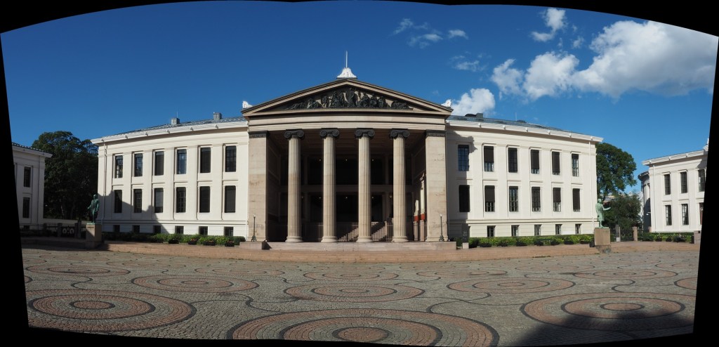
In Oslo, I took a three pictures of a building because obtaining a single photo was not possible.

The three individual images

This is a very simple panorama, with feature points easy to find because of all the features on the buildings. Here is the result:

The panorama built using AutoStitch

It’s not perfect, from the perspective of having some barrel distortion, but this could be removed. In fact the AutoStitch does an exceptional job, without having to set 1001 parameters. There are no visible seams, and the photograph seems like it was taken with a fisheye lens. Here is a second example, composed of three photographs taken on the hillside next to Voss, Norway. This panorama has been cropped.

A stitched scene with moving objects.

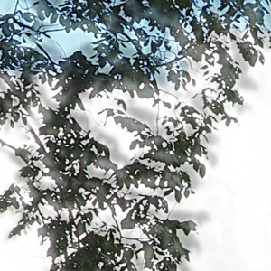
This scene is more problematic, largely because of the fluid nature of some of the objects. There are some things that just aren’t possible to fix in software. The most problematic object is the tree in the centre of the picture. Because tree branches move with the slightest breeze, it is hard to register the leaves between two consecutive shots. In the enlarged segment below, you can see the ghosting effect of the leaves, which almost gives that region in the resulting panorama a blurry effect. So panorama’s containing natural objects that move are more challenging.

Ghosting of leaves.

How good is High Dynamic Range (HDR) photography?

There are photographic situations where the lighting conditions are not ideal, even for the most modern “smart” camera – and they occur quite often. On vacation, taking landscapes, with the vast contrast difference between the sky and land, or low-light situations, scenes with shadows. These situations are unavoidable, especially when on vacation when the weather can be unpredictable.

The problem is one of perception. A scene that we view with our eyes, does not always translate into a photograph. This is because the human eye has more capacity to differentiate between tones than a camera. A good example of this is taking a photo from the inside of a building, through a window – the camera will likely produce an underexposed room, or an overexposed sky. Here is an example of a photograph taken during a sunny, yet slightly overcast day. One side of the building is effectively in shadow, whilst the other side is brightly lit-up.

HDR photography before shot

Olympus EM-5(MII), 12mm, f8.0, 1/640, ISO200 (P mode)

One way of compensating for the inability of a camera to take a good photograph in these situations is a computational photography technique known as High Dynamic Range(HDR). HDR is a technique which can be applied in-camera, or through an application such as Photoshop. For example, a camera such as the Olympus EM5(Mark II), has a button marked HDR, and even the iPhone camera has a HDR function.

In its simplest form, HDR takes three images of the exact same scene, with different exposures, and combines them together. The three exposures are normally (i) an exposure for shadows, (ii) an exposure for highlights, and (iii) an exposure for midtones. This is sometimes done by modifying the shutter speed, and keeping the aperture and ISO constant. Here is a HDR version of the photograph above, with the effect of the shadow very much reduced. Is it a better image? That is in the eye of the beholder. It does seem to loose something in translation.

HDR photography after processing

Olympus EM-5(MII), 12mm, f7.1, 1/500, ISO200 (HDR)

But HDR is not a panacea. – it won’t solve everything, and should be used sparingly. it is sometimes easier to perform exposure bracketing, and choose an appropriate image from those generated.