Photography and colour deficiency

How often do we stop and think about how colour blind people perceive the world around us? For many people there is a reduced ability to perceive colours in the same way that the average person perceives them. Colour blindness, which is also known as colour vision deficiency affects some 8% of males, and 5% of females. Colour blindness means that a person has difficulty seeing red, green, or blue, or certain hues of these colours. In extremely rare cases, a person have an inability to see any colour at all. And one term does not fit all, as there are many differing forms of colour deficiency.

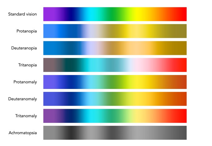
The most common form is red/green colour deficiency, split into two groups:

  • Deuteranomaly – 3 cones with a reduced sensitivity to green wavelengths. People with deuteranomaly may commonly confuse reds with greens, bright greens with yellows, pale pinks with light grey, and light blues with lilac.
  • Protanomaly – The opposite of deuteranomaly, a reduced sensitivity to red wavelengths. People with protanomaly may confuse black with shades of red, some blues with reds or purples, dark brown with dark green, and green with orange.

Then there is also blue/yellow colour deficiency. Tritanomaly is a rare color vision deficiency affecting the sensitivity of the blue cones. People with tritanomaly most commonly confuse blues with greens and yellows with purple or violet.

Standard vision
Deuteranomaly
Protanomaly
Tritanomaly

People with deuteranopia, protanopia, or tritanopia are the dichromatic forms where the associated cones (green, red, or blue) are missing completely. Lastly there is monochromacy, achromatopsia, or total colour blindness are conditions of having mostly defective or non-existent cones, causing a complete lack of ability to distinguish colours.

Standard vision
Deuteranopia
Protanopia
Tritanopia

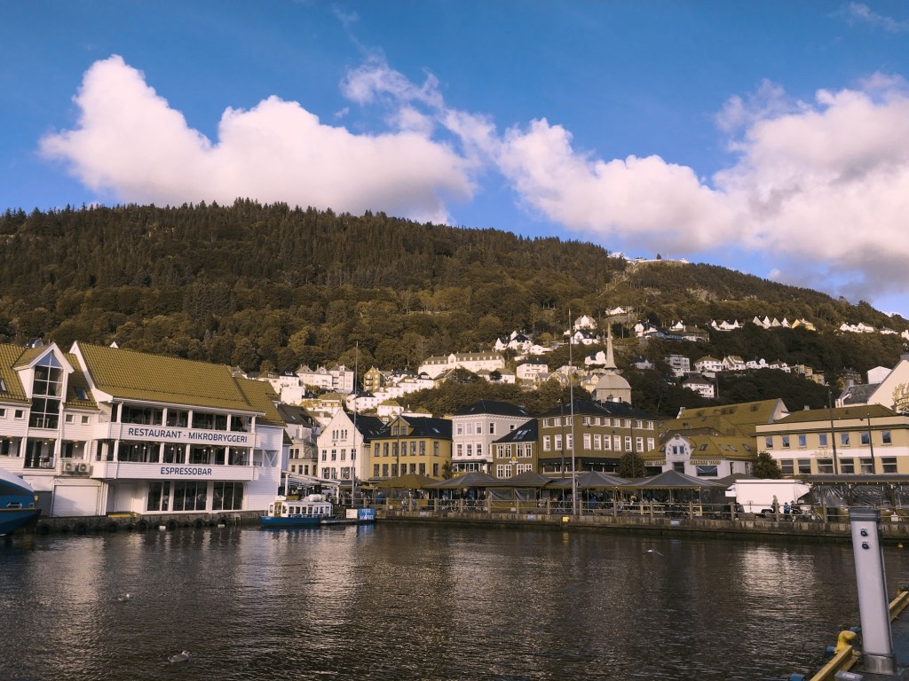
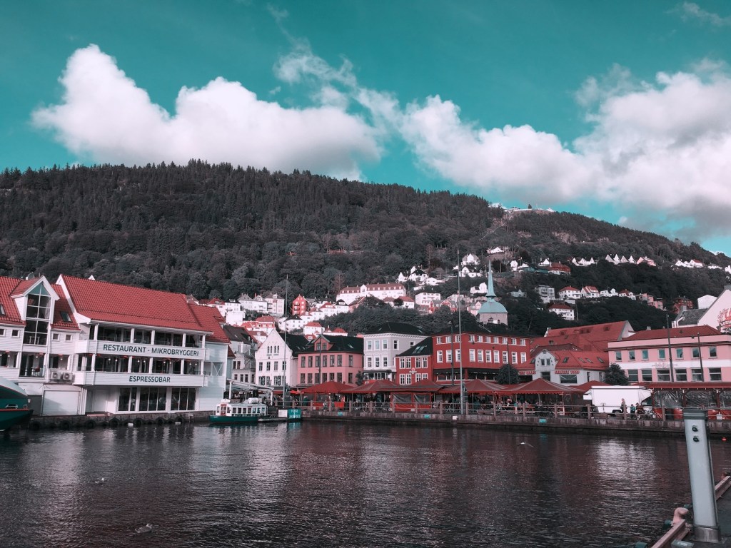
How does this affect photography? Obviously photographs will be the same, but photographers who have a colour deficiency will perceive a scene differently. For those interested, there are some fine articles on how photographers deal with colourblindness.

  • Check here for an exceptional article on how photographer Cameron Bushong approaches colour deficiency.
  • Photographer David Wilder offers some insights into working on location and some tips for editing.
  • David Wilder describes taking photographs in Iceland using special glasses which facilitate the perception of colour.
  • Some examples of what the world looks like when your colour-blind.

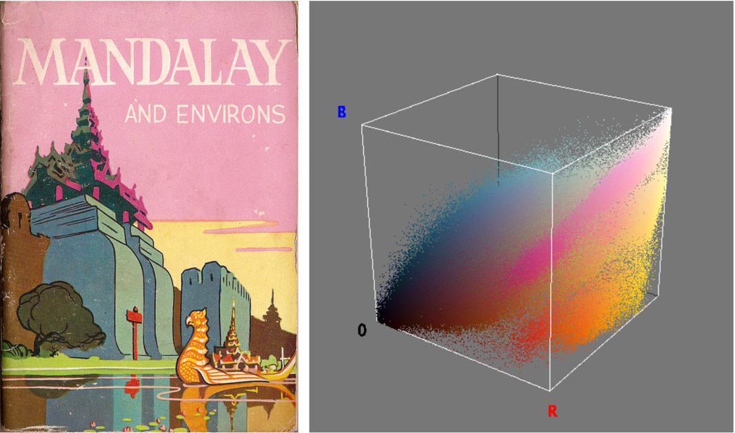
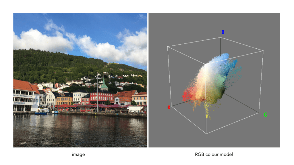
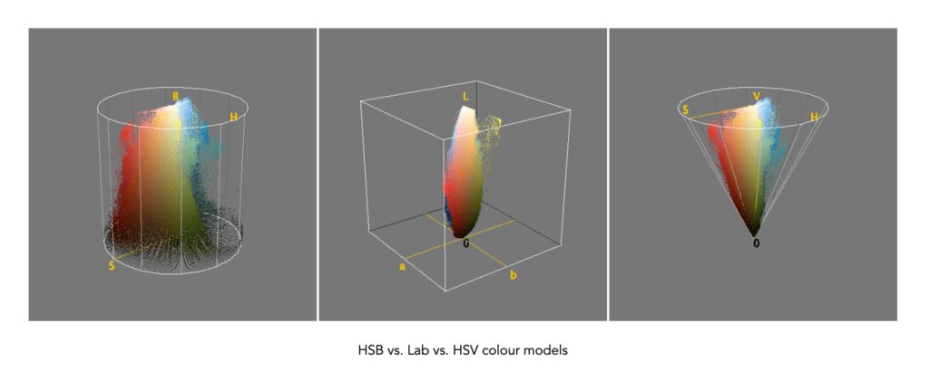
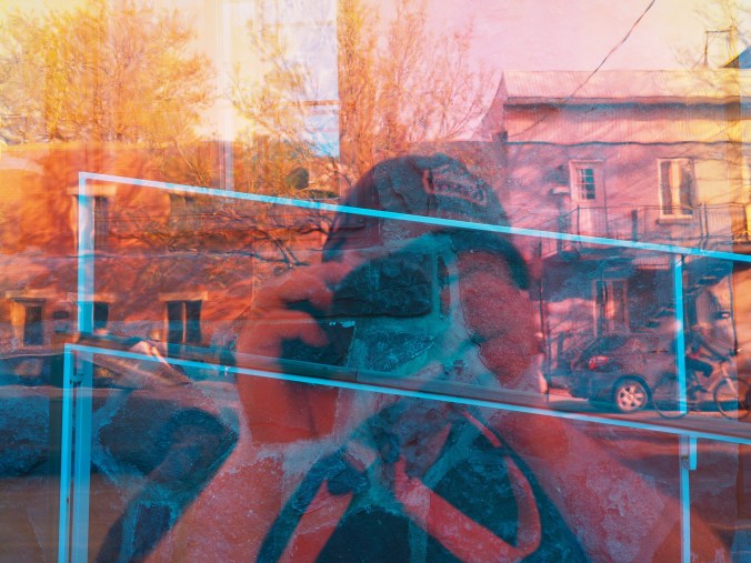
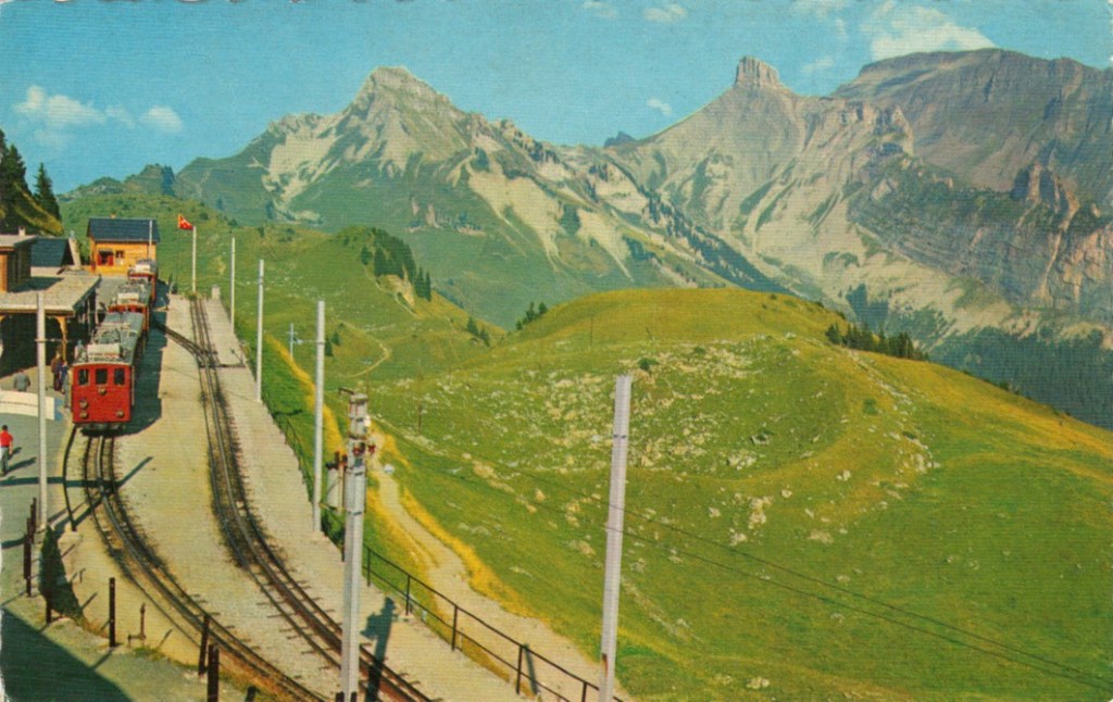
Below is a rendition of the standard colour spectrum as it relates to differing types of colour deficiency.

Simulated colour deficiencies applied to the colour spectrum.

In reality people who are colourblind may be better at discerning some things. A 2005 article [1] suggests people with deuteranomaly may actually have an expanded colour space in certain circumstances, making it possible for them to for example discern subtle shades of khaki.

Note: The colour deficiencies shown above were simulated using ImageJ’s (Fiji) “Simulate Color Blindness” function. An good online simulator is the Coblis, Color Blindness Simulator.

  1. Bosten, J.M., Robinson, J.D., Jordan, G., Mollon, J.D., “Multidimensional scaling reveals a color dimension unique to ‘color-deficient’ observers“, Current Biology, 15(23), pp.R950-R952 (2005)

Demystifying Colour (vi) : Additive vs. subtractive

In the real world there are two ways to produce colours, and they are very relevant because they deal with opposite ends of the photographic spectrum – additive and subtractive. Additive colours are formed by combining coloured light, whereas subtractive colours are formed by combining coloured pigments.

Additive colours are so-called because colours are built by combining wavelengths of light. As more colours are added, the overall colour becomes whiter. Add green and blue together and what you get is a washed out cyan. RGB is an example of an additive colour model. mixing various amounts of red, green, and blue produces the secondary colours: yellow, cyan, and magenta. Additive colour models are the norm for most systems of photograph acquisition or viewing.

Additive colour
Subtractive colour

Subtractive colour works the other way, by removing light. When we look at a clementine, what we see is the orange light not absorbed by the clementine, i.e. all other wavelengths are absorbed, except for orange. Or rather the clementine is subtracting the other wavelengths from the visible light, meaning there is only orange left to reflect off. CMYK and RYB (Red-Yellow-Blue) are good examples of subtractive colour models. Subtractive models are for most systems for printed material.

Different colour inks absorb and reflect specific wavelengths. CMYK (0,0,0,0) looks like white (no ink is laid down, so no light is absorbed), whereas (0,0,0,100) looks like black (maximum black is laid down meaning all colours are absorbed). CMYK values range from 0-100%. Below are some examples.

Ink colourabsorbsreflectsappears
cyanredgreen, bluecyan
magentagreenred, bluemagenta
yellowbluegreen, redyellow
magenta + yellowblue, greenredred
cyan + yellowred, bluegreengreen
cyan + magentared, greenblueblue

Demystifying Colour (v) : colour gamuts

Terms used to describe colours are often confusing. If a colour space is a subset of a colour model, then what is a colour gamut? Is it the same as a colour space? How does it differ from a colour profile? In reality there is often very little difference between the terms. For example, depending on where you read it sRGB can be used to describe a colour space, a colour gamut, or a colour profile. Confused? Probably.

Colour gamuts

A gamut is a range or spectrum of some entity, for example “the complete gamut of human emotions“. A colour gamut describes a subset of colours within the entire spectrum of colours that are identifiable by the human eye, i.e. the visible colour spectrum. More specifically a gamut is the range of colours a colour space can represent.

While the range of colour imaging devices is very broad, e.g. digital cameras, scanners, monitors, printers, the range of colours they produce can vary considerably. Colour gamuts are designed to reconcile colours that can be used in common between devices. The term colour gamut is usually used in association with electronic devices, i.e. the devices range of reproducible colours, or the range of different colours that can be interpreted by a colour model. A colour gamut can therefore be used to express the difference between various colour spaces, and to illustrate the extent of coverage of a colour space.

Fig.1: CIE XYZ 2D Chromaticity Diagram depicting various colour spaces as gamuts

The colour gamut of a device is sometimes visualized as a volume of colours, typically in CIELab or CIELuv colour spaces, or as a project in the CIEXYZ colour space producing a 2D xy chromaticity diagram (CD). particularly the luminance of the primary colours. Typically a colour space specifies three (x,y) coordinates to define the three primary colours it uses. The triangle formed by the three coordinates encloses the gamut of colours that the device can reproduce. The table below shows the RGB coordinates for various colour spaces in the CIE chromaticity diagram, shown on the 2D diagram in Figure 1.

NameR(x)R(y)G(x)G(y)B(x)B(y)%CIE
sRGB0.640.330.30.60.150.0635
Adobe RGb0.640.330.210.710.150.0650
ProPhoto0.73470.26530.15960.84040.03660.000191
Apple RGB0.62500.340.280.59500.15500.0733.5
NTSC RGB0.670.330.210.710.140.0854
CIE RGB0.73460.26650.28110.70770.17060.0059

Note that colour gamuts are 3D which is more informative than the 2D CD – it captures the nuances of the colour space, particularly the luminance of the primary colours. However the problem with 3D is that it is not easy to plot, and hence the reason a 2D representation is often used (the missing dimension is brightness).

Two of the most common gamuts in the visual industry are sRGB, and Adobe RGB (which are also colour spaces). Each of these gamuts references a different range of colours, suited to particular applications and devices. sRGB is perhaps the most common gamut used in modern electronic devices. It is gamut that covers a good range of colours for average viewing needs, so much so that it is the default standard for the web, and most images taken using digital cameras. The largest RGB working space, ProPhoto is an RGB color space developed by Kodak, and encompasses 90% of the possible colours in the CIE XYZ chromaticity diagram.

Gamut mapping is the conversion of one devices colour space to another. For example the case where an image stored as sRGB is to be reproduced on a print medium with a CMYK colour space. The objective of a gamut mapping algorithm is to translate colours in the input space to achievable colours in the output space. The gamut of an output device depends on its technology. For example, colour monitors are not always capable of displaying all colours associated with sRGB.

Colour profiles

On many systems the colour gamut is described as a colour profile, and more specifically is associated with an ICC Color Profile, which is a standardized system put in place by the international colour consortium. Such profiles help convert the colours in the designated colour space associated with an image to the device. For example the standard profile on Apple laptops is “Color LCD”.Some of the most common RGB ICC profiles are sRGB (sRGB IEC61966-2.1).

Demystifying colour (iv) : RGB colour model

The basics of human perception underpin the colour theory used in devices like digital cameras. The RGB colour model is based partly on the Young-Helmholtz theory of trichromatic colour vision, developed by Thomas Young, and Hermann von Helmholtz in the 19th century, the manner in which the human visual system gives rise to the theory of colour. In 1802, Young postulated the existence of three types of photoreceptors in the eye, each sensitive to a particular range of visible light. Helmholtz further developed the theory in 1850, suggesting the three photoreceptors be classified into short, middle and long according to their response to wavelengths of light striking the retina. In 1857 James Maxwell used linear algebra to prove the Young-Helmholtz theory. Some of the first experiments colour photography using the concept of RGB were made by Maxwell in 1861. He created colour images by combining three separate photographs, each taken with a red, green, and blue colour-filter.

In the early 20th century the CIE set out to create a comprehensively quantify the human perception of colour. This was based on experimental work done by William David Wright and John Guild. The results of the experiments were summarized by the standardized CIE RGB colour matching functions for R, G, and B. The name RGB stems from the fact that red, green, and blue primaries can be thought of as the basis for a vector representing a colour. Devices such as digital cameras have been designed to approximate the spectral response of the cones of the human eye. Before light photons are captured by a camera sensors photosites they pass through red, green or blue optical filters which mimic the response of the cones. The image that is formed at the other end of the process is encoded using RGB colour space information.

The RGB colour model is one in which colours are represented as combinations of the three primary colours: red (R), green (G), and blue (B). RGB is an additive colour model, which means that a colour is formed by mixing various intensities of red, green and blue light. The collection of all the colours obtained by such a linear combination of red, green and blue forms a cube shaped colour space (see Fig.1). Each colour, as described by its RGB components, is represented by a point that can be found either on the surface or inside the cube.

RGB colour space cube
Fig.1: The geometric representation of the RGB colour space

The cube, as shown in Fig.1, shows the primary (red, green, blue), and secondary colours (cyan, magenta, yellow), all of which lie on the vertices of the colour cube. The corner of RGB colour cube that is at the origin of the coordinate system corresponds to black (R=G=B=0). Radiating out from Black are the three primary coordinate axes, Red, Green, and Blue. Each of these range from 0 to Cmax, where Cmax is typically 255 for a 24-bit colour space (8-bits each for R, G, and B). The corner of the cube that is diagonally opposite to the origin represents white (R=G=B=255). Each of these 8-bit colours contains 256 values, so the total amount of colours which can be produced is 2563, or 16,777,216 colours. Sometimes the values are normalized between 0 and 1, and the colour cube is called the unit cube. The diagonal (dashed) line connecting black and white corresponds to all the gray colours between black and white, which is also known as gray axis. Grays are formed when all three components are equal, i.e. R=G=B. For example the 50% gray is (127,127,127).

Fig.2: An image and its RGB colour space.

Figure 2 illustrates an RGB cube for a colour image. Notice that while the pink colour of the sky looks somewhat uniform in the image, it is anything, showing up as a swath of various shades of pink in the RGB cube. There are 275,491 unique colours in the Fig.2 image. Every possible colour corresponds to a point within the RGB colour cube, and is of the form: Cxyz = (Rx,Gy,Bz). For example Fig.3 illustrates three colours extracted from the image in Fig.2.

Fig.3: Examples of some RGB colours from Fig.2

The RGB colour model has a number of benefits:

  • It is the simplest colour model.
  • No transformation is required to display data on a screen, e.g. images.
  • It is a computationally practical system.
  • The model is very easy to implement.

But equally it has a number of limitations:

  • It is not a perceptual model. In perceptual terms, colour and intensity are distinct from one another, but the R, G, and B components each contain both colour and intensity information. This makes it challenging to perform some image processing operations in RGB space.
  • It is psychologically non-intuitive, i.e. not able to determine what a particular RGB colour corresponds to in the real world, or what RGB means in a physical sense.
  • It is non-uniform, i.e. it is impossible to evaluate the perceived differences between colours on the basis of distance in RGB space (the cube).
  • For the purposes of image processing, the RGB space is often converted to another colour space by means of some non-linear transformation.

The RGB colour space is commonly used in imaging devices because of its affinity with the human visual system. Two of the most commonly used colour spaces derived from the RGB model are sRGB and Adobe RGB.

Demystifying Colour (iii) : colour models and spaces

Colour is a challenging concept in digital photography and image processing, partially because it is not a physical property, but rather a perceptual entity. Light is made up of many wavelengths, and colour is a sensation that is caused when our brain interprets these wavelengths. In the digital world, colour is represented using global colour models and more specific colour spaces

Colour models

colour model is a means of mapping wavelengths of light to colours, based on some particular scientific process, and a mathematical model, i.e. a way to convert colour into numbers. A colour model on its own is abstract, with no specific association to how the colours are perceived. The components of colour models have a number of distinguishing features. The core feature is the component type (e.g. RGB primaries, hue) and its associated units (e.g. degrees, percent). Other features included scale type (e.g. linear/non-linear), and geometric shape of the model (e.g. cube, cone, etc).

Colour models can be expressed in many different ways, each with their own benefits and limitations. Colour models can be described based on how they are constructed:

  • Colorimetric – These are colour models based on physical measurements of spectral reflectance. One of the CIE chromaticity diagrams is usually the basis for these models.
  • Psychological – These colour models are based on the human perception of colour. They are either designed on subjective observation criteria, and some sort of comparative references, (e.g. Munsell), or are designed through experimentation to comply with the human perception of colour, e.g. HSV, HSL.
  • Physiological – These colour models are based on the three primary colours associated with the three types of cones in the human retina, e.g. RGB.
  • Opponent – Based on perception experiments using pairwise opponent primary colours, e.g. Y-B, R-G.

Sometimes colour models are distinguised based on how colour components are combined. There are two methods of colour mixing – additive or subtractive. Additive colour models use light to display colours, while subtractive models use printing inks. Colours received in additive models such as RGB are the result of transmitted light, whereas those perceived in subtractive models such as CMYK are the result of reflected light. An example of an image showing its colours as represented using the RGB colour model is shown in Fig.1.

Fig.1: A colour image and its associated RGB colour model

Colour models can be described using a geometric representation of colours in a three-dimensional space, such as a cube, sphere or cone. The geometric shape describes what the map for navigating a colour space looks like. For example RGB is shaped like a cube, HSV can be represented by a cylindrical or conical object, and YIQ is a convex-poyhedron (a somewhat skewed rectangular box). The geometric representations of the image in Figure 1 shown using three different colour models is shown in Figure 2.

Fig.2: Three different colour models with differing geometric representations

Colour spaces

colour space, is a specific implementation of a colour model, and usually defines a subset of a colour model. Different colour spaces can exist within a colour model. With a colour model we are able to determine a certain colour relative to other colours in the model. It is not possible to conclude how a certain colour will be perceived. A colour space can then be defined by a mapping of a colour model to a real-world colour reference standard. The most common reference standard is CIE XYZ which was developed in 1931. It defines the number of colours the human eye can distinguish in relation to wavelengths of light.

In the context of photographs colour space is the specific range of colours that can be represented. For example the RGB colour model has several different colour spaces, e.g. sRGB, Adobe RGB. sRGB is the most common colour space and is the standard for many cameras, and TVs. Adobe RGB was designed (by Adobe) to complete with sRGB, and is meant to offer a broader colour gamut (some 35% more). So a photograph taken using sRGB may have more subtle tones, than one taken using Adobe RGB. CIELab, and CIELuv are colour spaces within the CIE colour model.

That being said, the terms colour model and colour space are often used interchangeably, for example RGB is considered both a colour model and a colour space.

Demystifying Colour (ii) : the basics of colour perception

How humans perceive colour is interesting, because the technology of how digital cameras capture light is adapted from the human visual system. When light enters our eye it is focused by the cornea and lens into the “sensor” portion of the eye – the retina. The retina is composed of a number of different layers. One of these layers contains two types of photosensitive cells (photoreceptors), rods and cones, which interpret the light, and convert it into a neural signal. The neural signals are collected and further processed by other layers in the retina before being sent to the brain via the optic nerve. It is in the brain that some form of colour association is made. For example, an lemon is perceived as yellow, and any deviation from this makes us question what we are looking at (like maybe a pink lemon?).

Fig.1: An example of the structure and arrangement of rods and cones

The rods, which are long and thin, interpret light (white) and darkness (black). Rods work only at night, as only a few photons of light are needed to activate a rod. Rods don’t help with colour perception, which is why at night we see everything in shades of gray. The human eye is suppose to have over 100 million rods.

Cones have tapered shape, and are used to process the the three wavelengths which our brains interpret as colour. There are three types of cones – short-wavelength (S), medium-wavelength (M), and long-wavelength (L). Each cone absorbs light over a broad range of wavelengths: L ∼ 570nm, M ∼ 545nm, and S ∼ 440nm. The cones are usually called R, G, and B for L, M, and S respectively. Of course these cones have nothing to do with their colours, just wavelengths that our brain interprets as colours. There are roughly 6-7 million cones in the human eye, divided up into 64% “red” cones, 32% “green” cones, and 2% “blue” cones. Most of these are packed into the fovea. Figure 2 shows how rods and cones are arranged in the retina. Rods are located mainly in the peripheral regions of the retina, and are absent from the middle of the fovea. Cones are located throughout the retina, but concentrated on the very centre.

Fig.2: Rods and cones in the retina.

Since there are three types of cones, how are other colours formed? The ability to see millions of colours is a combination of the overlap of the cones, and how the brain interprets the information. Figure 3 shows roughly how the red, green, and blue sensitive cones interpret different wavelengths as colour. As different wavelengths stimulate the colour sensitive cones in differing proportions, the brain interprets the signals as differing colours. For example, the colour yellow results from the red and green cones being stimulated while the blues cones are not.

Fig.3: Response of the human visual system to light

Below is a list of approximately how the cones make the primary and secondary colours. All other colours are composed of varying strengths of light activating the red, green and blues cones. when the light is turned off, black is perceived.

  • The colour violet activates the blue cone, and partially activates the red cone.
  • The colour blue activates the blue cone.
  • The colour cyan activates the blue cone, and the green cone.
  • The colour green activates the green cone, and partially activates the red and blue cones.
  • The colour yellow activates the green cone and the red cone.
  • The colour orange activates the red cone, and partially activates the green cone.
  • The colour red activates the red cones.
  • The colour magenta activates the red cone and the blue cone.
  • The colour white activates the red, green and blue cones.

So what about post-processing once the cones have done their thing? The sensor array receives the colours, and stores the information by encoding it in the bipolar and ganglion cells in the retina before it is passed to the brain. There are three types of encoding.

  1. The luminance (brightness) is encoded as the sum of the signals coming from the red, green and blue cones and the rods. These help provide the fine detail of the image in black and white. This is similar to a grayscale version of a colour image.
  2. The second encoding separates blue from yellow.
  3. The third encoding separates red and green.
Fig.4: The encoding of colour information after the cones do their thing.

In the fovea there are no rods, only cones, so the luminance ganglion cell only receives a signal from one cone cell of each colour. A rough approximation of the process is shown in Figure 4.

Now, you don’t really need to know that much about the inner workings of the eye, except that colour theory is based a great deal on how the human eye perceives colour, hence the use of RGB in digital cameras.

Demystifying Colour (i) : visible colour

Colour is the basis of human vision. Everything appears coloured. Humans see in colour, or rather the cones in our eyes interpret wavelengths of red, green and blue when they enter the eye in varying proportions, enabling us to see a full gamut of colours. The miracle of the human eyes aside, how does colour exist? Are trees really green? Bananas yellow? Colour is not really inherent in objects, but the surface of an object reflects some colours and absorb others. So the human eye only perceives reflected colours. The clementine in the figure below reflects certain wavelengths, which we perceive as orange. Without light there is no colour.

Reflected wavelengths = perceived colours

Yet even for the simplest of colour theory related things, like the visible spectrum, it is hard to find an exact definition. Light is a form of electromagnetic radiation. Its physical property is described in terms of wavelength (λ) in units of nanometers (nm, which is 10-9 metres). Human eyes can perceive the colours associated with the visible light portion of the electromagnetic radiation spectrum. It was Isaac Newton who in 1666 described the spectrum of white light as being divided into seven distinct colours – red, orange, yellow, green, blue, indigo and violet. Yet in many renditions, indigo has been replaced by blue, and blue by cyan. In some renditions there are only six colours (like in Pink Floyd’s album cover for Dark Side of the Moon), others have eight. It turns out indigo likely doesn’t need to be there (because its hard to tell indigo apart from blue and violet). Another issue is the varied ranges of the visible spectrum in nanometers. Some sources define it as broadly as 380-800nm, while others narrow it to 420-680nm. Confusing right? Well CIE suggests that there are no precise limits for the spectral range of visible radiation – the lower limit is 360-400nm and the upper limit 760-830nm.

The visible spectrum of light (segmented into eight colours)

Thankfully for the purposes of photography we don’t have to delve that deeply into the specific wavelengths of light. In fact we don’t even have to think too much about the exact wavelength of colours like red, because frankly the colour “red” is just a cultural association with a particular wavelength. Basically colours are named for the sake of communications and so we can differentiate thousands of different paints chips. The reality is that while the human visual system can see millions of distinct colours, we only really have names for a small set of them. Most of the worlds languages only have five basic terms for colour. For example, the Berinmo tribe of Papua New Guinea have a term for light, dark, red, yellow, and one that denotes both blue and green [1]. Maybe we have overcomplicated things somewhat when it comes to colour.

But this does highlight some of the issues with colour theory – the overabundance of information. There are various terms which seem to lack a clear definition, or overlap with other terms. Who said colour wasn’t messy? It is. What is the difference between a colour model and a colour space? Why do we use RGB? Why do we care about HSV colour space? This series will look at some colour things as it relates to photography, explained as simply as possible.

  1. Davidoff, J., Davies, I., Roberson, D., “Colour categories in a stone-age tribe”, Nature, 398, pp.203-204 (1999)

How do we perceive photographs?

Pictures are flat objects that contain pigment (either colour, or monochrome), and are very different from the objects and scenes they represent. Of course pictures must be something like the objects they depict, otherwise they could not adequately represent them. Let’s consider depth in a picture. In a picture, it is often easy to find cues relating to the depth of a scene. The depth-of-field often manifests itself as a region of increasing out-of-focus away from the object which is in focus. Other possibilities are parallel lines than converge in the distance, e.g. railway tracks, or objects that are blocked by closer objects. Real scenes do not always offer such depth cues, as we perceive “everything” in focus, and railway tracks do not converge to a point! In this sense, pictures are very dissimilar to the real world.

If you move while taking a picture, the scene will change. Objects that are near move more in the field-of-view than those that are far away. As the photographer moves, so too does the scene, as a whole. Take a picture from a moving vehicle, and the near scene will be blurred, the far not as much, regardless of the speed (motion parallax). This then is an example of a picture for which there is no real world scene.

A photograph is all about how it is interpreted

Photography then, is not about capturing “reality”, but rather capturing our perception, our interpretation of the world around us. It is still a visual representation of a “moment in time”, but not one that necessarily represents the world around us accurately. All perceptions of the world are unique, as humans are individual beings, with their own quirks and interpretations of the world. There are also things that we can’t perceive. Humans experience sight through the visible spectrum, but UV light exists, and some animals, such as reindeer are believed to be able to see in UV.

So what do we perceive in a photograph?

Every photograph, no matter how painstaking the observation of the photographer or how long the actual exposure, is essentially a snapshot; it is an attempt to penetrate and capture the unique esthetic moment that singles itself out of the thousands of chance compositions, uncrystallized and insignificant, that occur in the course of a day.

Lewis Mumford, Technics and Civilization (1934)

Every colour photograph is a manipulation of the truth

Previous discussions have focused on the quasi untruths the camera produces. What is the greatest of them? The freezing or blur of movement? The distortion of perspective? Or maybe the manipulation of colour? When it comes to colour, where does the truth lie? Colour is interpreted differently by each person, and even the camera itself. No one may truly understand the complexities of how colour is actually perceived. Most people see a blue sky, but what shade of blue? Consider the following photograph taken at Point Pleasant Park, in Halifax (Nova Scotia). The sky seems over-saturated, but there was no processing done. Is it natural, or an affect of being in the right place at the right time?

Prince of Wales Tower, Point Pleasant Park, Halifax

Colours in a digital photograph are a result of many differing processes – light passes through the various glass optics of the lens, and is absorbed by the sensor which converts the photons into a digital signal. This does not mean that the colours which exist in a scene will be properly interpreted. The pure “light” of white can be used to manipulate the colours of a photograph, something called white balancing. Scroll through the available choices, and the colour temperature of the photograph will change. Sometimes we manipulate colours through white balancing, other times through manipulation of the colour histogram, all to make the contents of the photograph seem more akin to our perception of realism. Sometimes we add colour to add a sense of non-realism. Sometimes we saturate the colours to make them seem bright, and other times we mute them. 

Take a photograph of something. Look at the colours in the scene, and try to remember what they looked like. Maybe take the same photo with different cameras. It is hard to reproduce the exact colour… so in many ways the photograph the camera produces is something of a generic interpretation to be manipulated in a human way to some visual aesthetic. Which takes us to the question of what is the truth? Is there any real truth to a photograph? 

Nothing has a true colour- it is all varying perceptions of the interaction of light and colour pigments, and the human eye. We apply filters in Instagram to make things seem more vivid and hyper real, or desaturated and contemplative. There is no right or wrong way of understanding colour, although our experiences are influenced by the other senses such as smell. I mean, as far as wavelengths go, the Earth’s sky is really more of a bluish violet colour, but because of the human visual system we perceive it as pale blue. So maybe our own eyes are manipulating the truth?

The perception of enhanced colour images

Image processing becomes more difficult when you involve colour images. That’s primarily because there is more data involved. With monochrome images, there is really only intensity. With colour images comes chromaticity – and the possibility of modifying the intrinsic colours within an image whilst performing some form of image enhancement. Often, image enhancement in colour images is challenging because the impact of the enhancement is very subjective.

Consider this image of Schynige Platte in Switzerland. It is very colourful, and seems quite vibrant.

The sky however seems too aquamarine. The whole picture seems like some sort of “antique photo filter” has been applied to it. How do we enhance it, and what do we want to enhance? Do we want to make the colours more vibrant? Do we want to improve the contrast?

In the first instance, we merely stretch the histogram to reduce the gray tonality of the image. Everything becomes much brighter, and there is a slight improvement in contrast. There are parts of the image that do seem too yellow, but it is hard to know whether this is an artifact of the original scene, or the photograph (likely an artifact of dispersing yellow flower petals).

Alternatively, we can improve the images contrast. In this case, this is achieved by applying a Retinex filter to the image, and then taking the average of the filter result and the original image. The resulting image is not as “bright”, but shows more contrast, especially in the meadows.

Are either of these enhanced images better? The answer of course is in the eye of the beholder. All three images have certain qualities which are appealing. At the end of the day, improving the aesthetic appeal of a colour image is not an easy task, and there is no “best” algorithm.