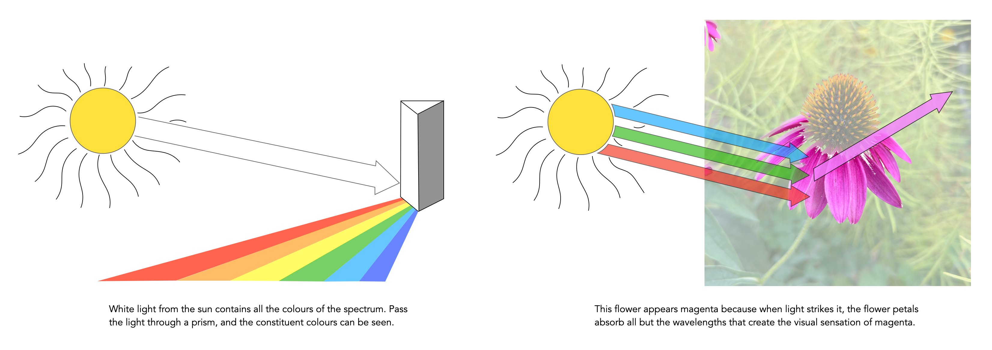
Light from the sun has appears to have no hue or colour of its own; it is “white” light. But it actually does contain all colours, and if it is projected through a prism it will be separated into a band of colours like a rainbow. A coloured object, for example a flower, has colour because when light strikes it, the flower petals reflect their hue components or wavelengths of the light while absorbing other colours. In the example below the flower reflects the ‘magenta’ components, and the human eye being sensitive to these reflected wavelengths, sees them as magenta. Dyes, such as those found in paint, and colour prints acts just like the flower does in selectively absorbing and reflecting certain wavelengths of light and therefore producing colour.
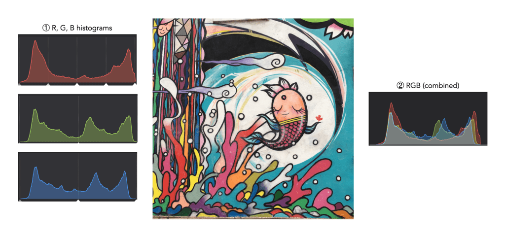
When taking an image on a digital camera, we are often provided with one or two histograms – the luminance histogram, and the RGB histogram. The latter is often depicted in various forms: as a single histogram showing all three channels of the RGB image, or three separate histograms, one for each of R, G, and B. So how useful is the RGB histogram on a camera? In the context of improving image quality RGB histograms provide very little in the way of value. Some people might disagree, but fundamentally adjusting a picture based on the individual colour channels on a camera, is not realistic (and usually it is because they don’t have a real understanding about how colour spaces work).
Consider the image example shown in Figure 1. This 3024×3024 pixel image has 9,144,576 pixels. On the left are the three individual RGB histograms, while on the right is the integral RGB histogram with the R, G, B, histograms overlapped. As I have mentioned before, there is very little information which can be gleaned by looking at the these two-dimensional RGB histograms – they do not really indicate how much red (R), green (G), or blue (B) there is in an image, because these three components can only be used together to produce information that is useful. This is because RGB is a coupled colour space where luminance and chrominance are coupled together. The combined RGB histogram is especially poor from an interpretation perspective, because it just muddles the information.
Fig.1: The types of RGB histograms found in-camera.
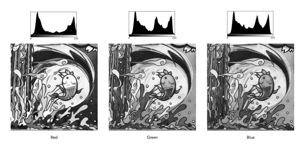
But to understand it better, we need to look at what information is contained in a colour image. An RGB colour image can be conceptualized as being composed of three layers: a red layer, a green layer, and a blue layer. Figure 2 shows the three layers of the image in Figure 1. Each layer represents the values associated with red, green, and blue. Each pixel in a colour image is therefore a set of triplet values: a red, a green, and a blue, or (R,G,B), which together form a colour. Each of the R, G, and B components is essentially an 8-bit (grayscale) image, then can be viewed in the form of a histogram (also shown in Figure 2 and nearly always falsely coloured with the appropriate red, green or blue colour).
Fig.2: The R, G, B components of RGB.
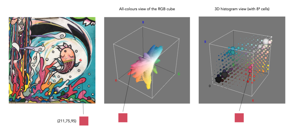
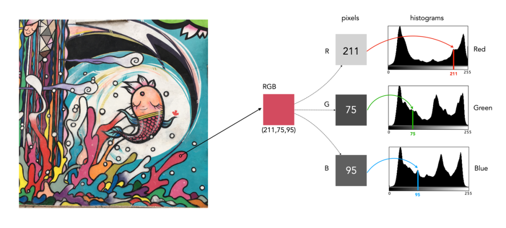
To understand a colour image further, we have to look at the RGB colour model, the method used in most image formats, e.g. JPEG. The RGB model can be visualized in the shape of a cube, formed using the R, G, and B data. Each pixel in an image has an (R, G, B) value which provides a coordinate in the 3D space of the cube (which contains 2563, or 16,777,216 colours). Figure 3 shows two different ways of viewing image colour in 3D. The first is an all-colours view of the colours. This basically just indicates all the colours contained in the image without frequency information. This gives an overall indication on how colours are distributed. In the case of the example image, there are 526,613 distinct colours. The second cube is a frequency-based 3D histogram, grouping like data together in “bins”, in this example the 3D histogram has 83 or 512 bins (which is honestly easier to digest than 16 million-odd bins). Within the image there is shown one pixel with the RGB value (211,75,95), and its location in the 3D histograms.
Fig.3: How to really view the colours in RGB
In either case, visually you can see the distribution of colours. The same can not be said of many of the 2D representations. Let’s look at how the colour information pans out in 2D form. The example image pixel in Figure 3 at location (2540,2228) has the RGB value (211,75,95). If we look at this pixel in the context of the red, green, and blue histograms it exists in different bins (Figure 4). There is no way that these 2D histograms provide anything in the way of context on the distribution of colours. All they do is show the distribution of red, green, and blue values, from 0 to 255. What the red histogram tells us is that at value 211 there are 49972 colour pixels in the image whose first value of the triplet (R) is 211. It may also tell us that the contribution of red in pixels appears to be constrained to the upper and lower bounds of the histogram (as shown by the two peaks). There is only one pure value of red, (255,0,0). Change the value from (211,75,95) to (211,75,195) and we get a purple colour.
Fig.4: A single RGB pixel shown in the context of the separate histograms.
The information in the three histograms is essentially decoupled, and does not provide a cohesive interpretation of colours in the image, for that you need a 3D image of sorts. Modifying one or more of the individual histograms will just lead to a colour shift in the image, which is fine if that is the what is to be achieved. Should you view the colour histograms on a camera viewscreen? I honestly wouldn’t bother. They are more useful in an image manipulation app, but not in the confines of a small screen – stick to the luminance histogram.
One of the more interesting aspects of photographing outdoors is the colour of the sky. You know the situation – you’re out photographing and the sky just isn’t as vivid as you wished it was. This happens a lot in the warmer months of the year.
The sky isn’t blue of course. We interpret it is blue because of light, and its interaction with the atmosphere. The type of blue also changes, but the difference is most noticeable in fall and winter, when the sky appears a more vivid blue than it does throughout the summer months (that’s why you can never expect a really vividly blue sky in summer when travelling).
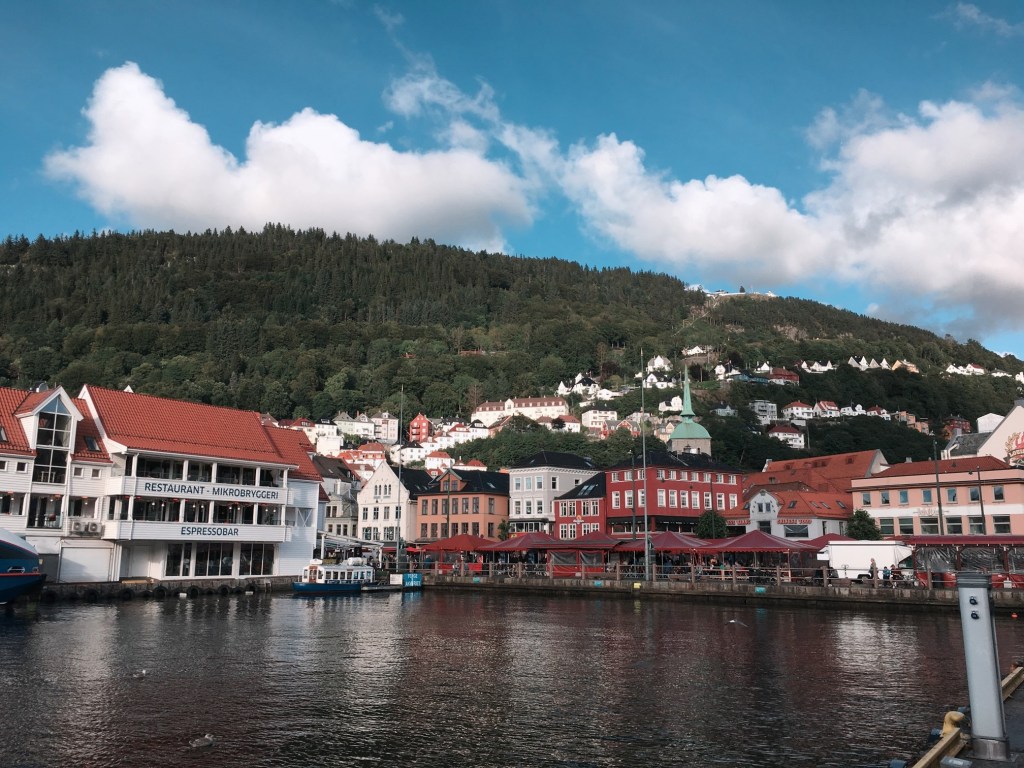
The blue of the sky is more saturated further from the sun. Note that in this image taken in Toronto in May, the right side, furthest from the sun appears more saturated.
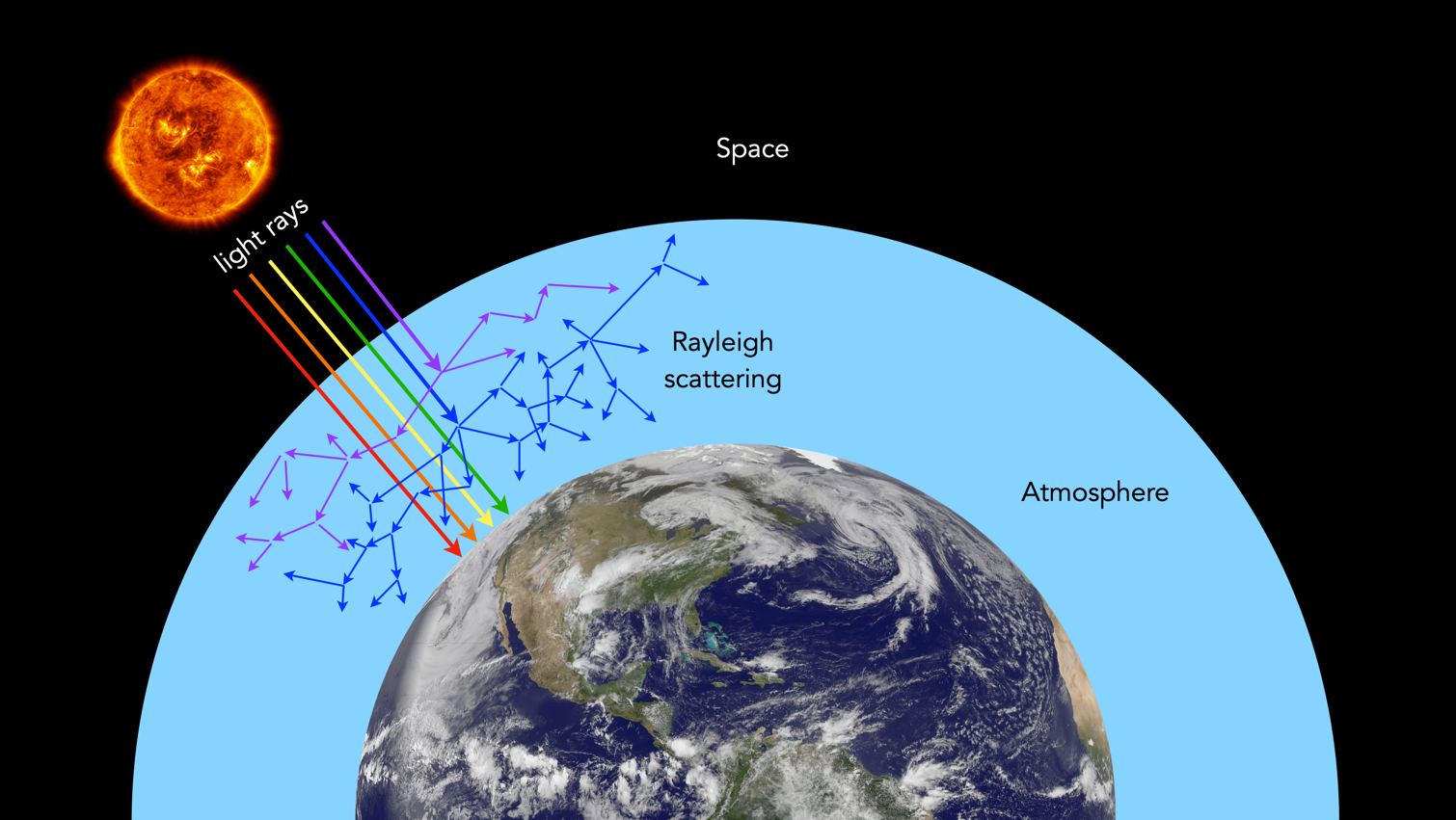
Firstly the blue colour of the sky is due to the scattering of sunlight off molecules in the atmosphere smaller than the wavelength of light (approximately 1/10th the wavelength). There are many gases in the atmosphere, e.g. nitrogen, oxygen, and hydrogen. Mixed in with these elements are particles which include dust, pollen, and pollution. The scattering is known as Rayleigh scattering, and is most effective at the short wavelength (400nm) end of the visible spectrum. Therefore the light scattered down to the earth at a large angle with respect to the direction of the sun’s light is predominantly in the blue end of the spectrum. Because of this wavelength-selective scattering, more blue light diffuses throughout atmosphere than other colours producing the familiarblue sky.
An illustration of how Rayleigh Scattering works in the atmosphere.
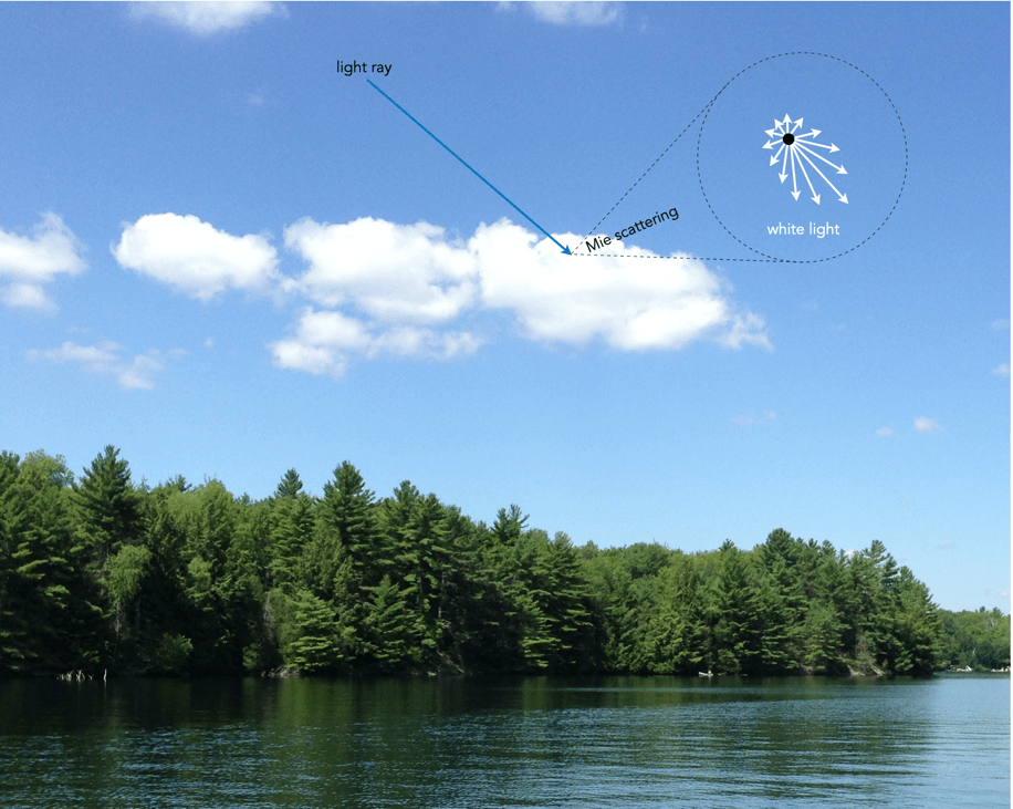
During the summer months, when the sun is higher in the sky, light does not have to travel as far through the atmosphere to reach our eyes. Consequently, there is less Rayleigh scattering. Blue skies often appear somewhat hazy, veiled by a thin white sheen. When light encounters large particles suspended in the air, like dust or water vapour droplets, wavelengths are scattered equally. This process is known as Mie scattering, and produces white-coloured light, e.g. making clouds appear white. In summer in particular, increased humidity increases Mie scattering, and as a result the sky tends to be relatively muted, or pale blue.
The visibility of clouds can be attributed to Mie scattering, which is not very wavelength dependent.
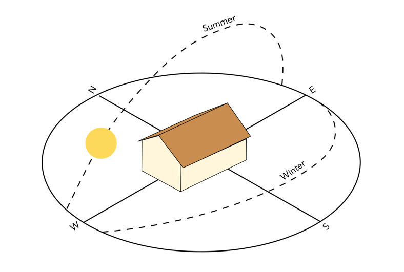
In the fall and winter the Northern Hemisphere is tilted away from the sun, the sun’s angle is lower, which increases the amount of Raleigh scattering (light has to travel further through the atmosphere, and the scattering of shorter wavelengths is more complete). The cooler air during this period also decreases the amount of moisture the air can hold, diminishing Mie scattering. These two factors taken in conjunction can produce skies that are vividly blue.
Angle of the sun, summer versus winter.
Q: If the wavelength of purple is only 380nm, why don’t we see more purple skies? A: Purple skies are rare because the sun emits a higher concentration of blue light waves in comparison to violet. Furthermore, our eyes are more sensitive to blue rather than violet meaning to us the sky appears blue.
Q: What particles cause Rayleigh Scattering? A: Small specks of dust or nitrogen and oxygen molecules.
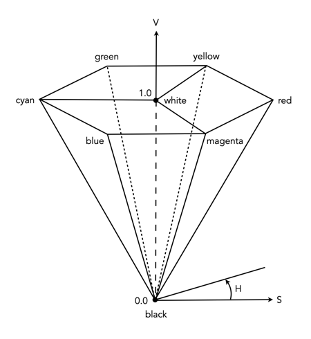
RGB is used to store colour images in image file formats, and view images on a screen, but it’s honestly not very useful in day-to-day image processing. This is because in an RGB image the luminance and chrominance information is coupled together. Therefore when one of the R, G, or B components is modified, the colours within the image will change. For performing many operations we need another form of colour space – one where the characteristics of chrominance and luminance can be separated. One of the most common of these is HSV, or Hue−Saturation−Value.
HSV as an upside-down, six-sided pyramid
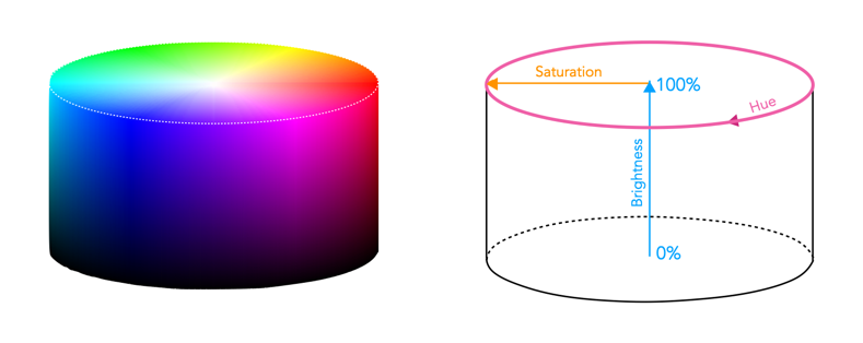
HSV/HSB as a cylindrical space
HSV is derived from the RGB model, and is sometimes known as HSB (Hue, Saturation, Brightness) and characterizes colour in terms of hue and saturation. It was created by Alvy Ray Smith in 1978 [1]. Now the space is traditionally represented using an an upside-down hex-cone or six-sided pyramid – however mathematically the space is actually conceptualized as a cylinder. HSV/HSB is a perceptual colour space, i.e. it decomposes colour based on how it is perceived rather than how it is physically sensed, as is the case with RGB. This means HSV (and its associated colour spaces) is more aligned with a more intuitive understanding of colour.
The top of the HSB colour space cylinder showing hue and saturation (left), and a slice through the cylinder showing brightness versus saturation (right).
A point within the HSB space is defined by hue, saturation, and brightness.
Hue represents the chromaticity or pure colour. It is specified by an angular measure from 0 to 360° – red corresponds to 0°, green to 120°, and blue to 240°.
Saturation is the vibrancy, vividness/colourfulness, or purity of a colour. It is defined as a percentage measure from the central vertical axis (0%) to the exterior shell of the cylinder (100%). A colour with 100% saturation will be the purest color possible, while 0% saturation yields grayscale, i.e. completely desaturated.
Value/Brightness is a measure of the lightness or darkness of a colour. It is specified by the central axis of the cylinder, and ranges from white at the top to black at the bottom. Here 0% indicates no intensity (pure blackness), and 100% indicates full intensity (white).
The values are very much interdependent, i.e. if the value of a colour is set to zero, then the amount of hue and saturation will not matter, as the colour will be black. Similarly, if the saturation is set to zero, then hue will not matter, as there will be no colour.
An example of a colour image, and two views of its respective HSB colour space.
Manipulating images in HSB is much more intuitive. In order to lighten a colour in HSB, it is as simple as increasing the brightness value, while a similar technique applied to an RGB image requires scaling each of the R, G, B components proportionally. The task of increasing saturation, i.e. making an image more vivid is easily achieved in this colour space.
Note that converting an image from RGB to HSB involves a nonlinear transformation.
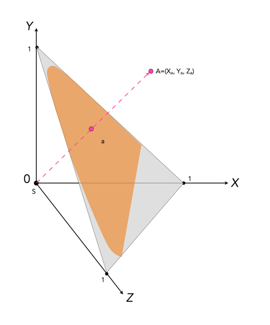
Colour can be divided up into luminosity and chromaticity. The CIE XYZ colour space was designed such that Y is a measure of the luminance of a colour. Consider a 3D plane is described by X=Y=Z=1, as shown in Figure 1. A colour point A=(Xa,Ya,Za) is then found by intersecting the line SA (S=starting point, X=Y=Z=0) with the plane formed within the CIE XYZ colour volume. As it is difficult to perceive 3D spaces, most chromaticity diagrams discard luminance and show the maximum extent of the chromaticity of a particular 2D colour space. This is achieved by dropping the Z component, and projecting back onto the XY plane.
Fig.1: CIE XYZ chromaticity diagram derived from CIE XYZ open cone.
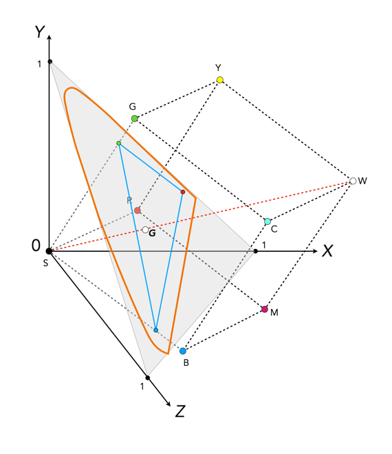
Fig.2: RGB colour space mapped onto the chromaticity diagram
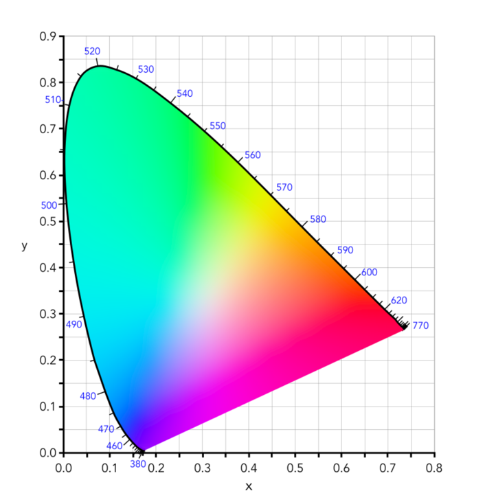
This diagram shows all the hues perceivable by the standard observer for various (x, y) pairs, and indicates the spectral wavelengths of the dominant single frequency colours. When Y is plotted against X for spectrum colours, it forms a horseshoe, or shark-fin, shaped diagram commonly referred to as the CIE chromaticity diagram where any (x,y) point defines the hue and saturation of a particular colour.
Fig.3: The CIE Chromaticity Diagram for CIE XYZ
The xy values along the curved boundary of the horseshoe correspond to the “spectrally pure”, fully saturated colours with wavelengths ranging from 360nm (purple) to 780nm (red). The area within this region contains all the colours that can be generated with respect to the primary colours on the boundary. The closer a colour is to the boundary, the more saturated it is, with saturation reducing towards the “neutral point” in the centre of the diagram. The two extremes, violet (360nm) and red (780nm) are connected with an imaginary line. This represents the purple hues (combinations of red and blue) that do not correspond to primary colours. The “neutral point” at the centre of the horseshoe (x=y=0.33) has zero saturation, and is typically marked as D65, and corresponds to a colour temperature of 6500K.
Fig.4: Some characteristics of the CIE Chromaticity Diagram
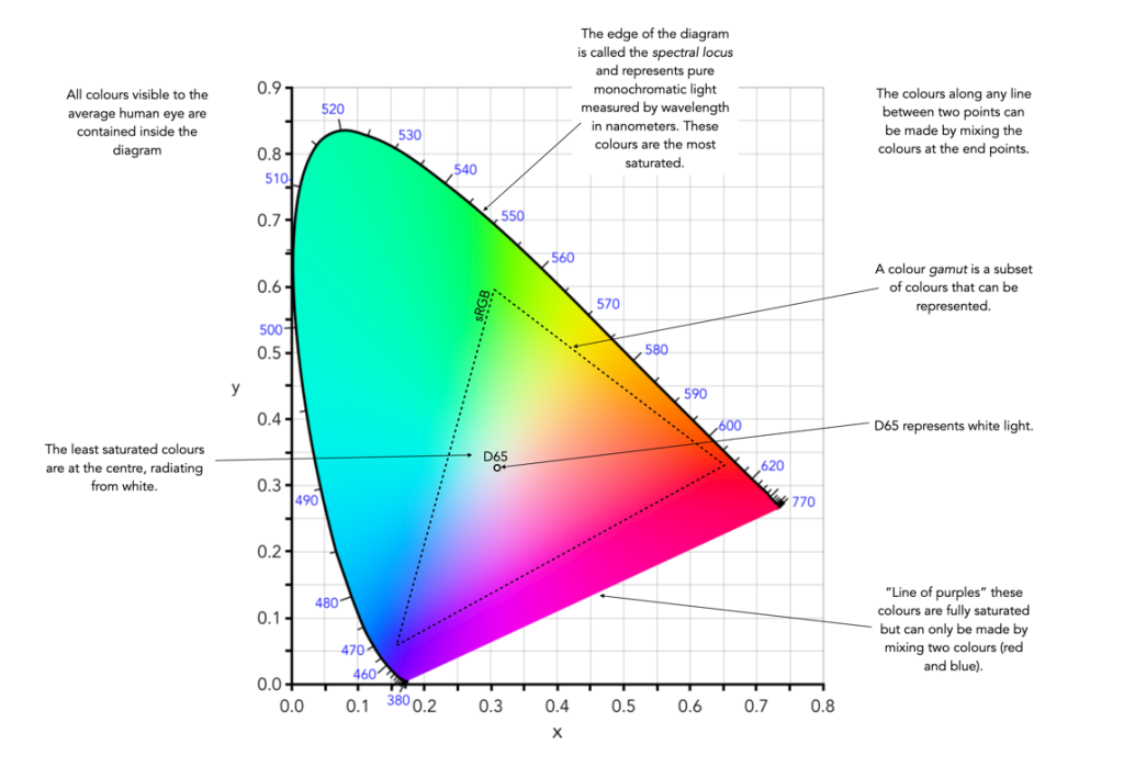
So we have colour models, colour spaces, gamuts, etc. How do these things relate to digital photography and the acquisition of images? While a 24-bit RGB image can technically can provide up to 16.7 million colours, not all these colours are actually used.
Two of the most commonly used RGB colour spaces are sRGB and Adobe RGB. They are important in digital photography because they are usually the two choices provided in digital cameras. For example in the Ricoh GR III, the “Image Capture Settings” allow the “Color Space” to be changed to either sRGB or Adobe RGB. These choices relate to the JPG files created and not the RAW files (although they may be used in the embedded JPEG thumbnails). All these colour spaces do is set the range of colours available to the camera.
It should be noted that choosing sRGB or Adobe RGB for storing a JPEG makes no difference to the number of colours which can be stored. The difference is in the range of colours that can be represented. So, sRGB represents the same number of colours as Adobe RGB, but the range of colours that it represents is narrower (as seen when the two are compared in a chromaticity diagram). Adobe RGB has a wider range of possible colors, but the difference between individual colours is bigger than in sRGB.
sRGB
Short for “standard” RGB, it was literally described as the “Standard Default Color Space for the Internet“, by its authors. sRGB was developed jointly by HP and Microsoft in 1996 with the goal of creating a precisely specified colour space based on standardized mappings with respect to the CIEXYZ model.
sRGB is the now the most common colour space found in modern electronic devices, e.g. digital cameras, web, etc. sRGB exhibits a relatively small gamut, covering just 33.3% of visible colours – however it includes most colours which can be reproduced by visual devices. EXIF (JPEG) and PNG are based on sRGB colour data, making it the de facto standard for digital cameras, and other imaging devices. Shown on the CIE chromaticity diagram, sRGB shares the same location as Rec.709, the standard colour space for HDTV.
Adobe RGB
The colour space was defined by Adobe Systems in 1998. It is optimized for printing and is the de facto standard in professional colour imaging environments. Adobe RGB covers 38.8% of visible colours, 17% more than sRGB. Adobe RGB extends into richer cyans and greens than sRGB. Converting from Adobe RGB to sRGB results in the loss of highly saturated colour data, and the loss of tonal subtleties. Adobe RGB is typically used in professional photography, and for picture archive applications.
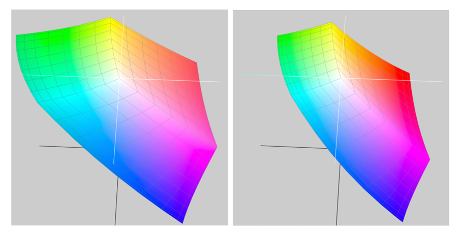
Adobe RGB and sRGB shown in CIELab space
sRGB or Adobe RGB?
For general use, the best option may be sRGB, because it is the standard colour space. It doesn’t have the largest gamut, and may not be ideal for high-quality imaging, but nearly every device is capable of handling an image embedded with the sRGB colour space.
sRGB is suitable for non-professional printing.
Adobe RGB is suited to professional printing, especially good for saturated colours.
A typical computer monitor can display most of the sRGB range but only about 75% of the range found in Adobe RGB.
Adobe RGB can be converted to sRGB, but the reverse is not true.
An Adobe RGB image displayed on a device with a sRGB profile will appear dull and desaturated.
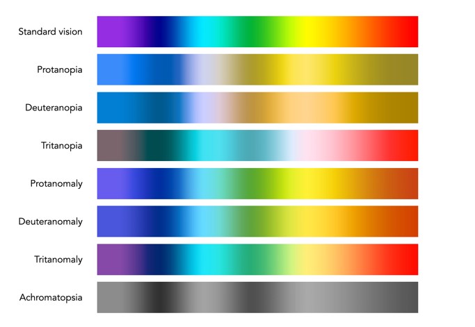
How often do we stop and think about how colour blind people perceive the world around us? For many people there is a reduced ability to perceive colours in the same way that the average person perceives them. Colour blindness, which is also known as colour vision deficiency affects some 8% of males, and 5% of females. Colour blindness means that a person has difficulty seeing red, green, or blue, or certain hues of these colours. In extremely rare cases, a person have an inability to see any colour at all. And one term does not fit all, as there are many differing forms of colour deficiency.
The most common form is red/green colour deficiency, split into two groups:
Deuteranomaly – 3 cones with a reduced sensitivity to green wavelengths. People with deuteranomaly may commonly confuse reds with greens, bright greens with yellows, pale pinks with light grey, and light blues with lilac.
Protanomaly – The opposite of deuteranomaly, a reduced sensitivity to red wavelengths. People with protanomaly may confuse black with shades of red, some blues with reds or purples, dark brown with dark green, and green with orange.
Then there is also blue/yellow colour deficiency. Tritanomaly is a rare color vision deficiency affecting the sensitivity of the blue cones. People with tritanomaly most commonly confuse blues with greens and yellows with purple or violet.
Standardvision
Deuteranomaly
Protanomaly
Tritanomaly
People with deuteranopia, protanopia, or tritanopia are the dichromatic forms where the associated cones (green, red, or blue) are missing completely. Lastly there is monochromacy, achromatopsia, or total colour blindness are conditions of having mostly defective or non-existent cones, causing a complete lack of ability to distinguish colours.
Standard vision
Deuteranopia
Protanopia
Tritanopia
How does this affect photography? Obviously photographs will be the same, but photographers who have a colour deficiency will perceive a scene differently. For those interested, there are some fine articles on how photographers deal with colourblindness.
Check here for an exceptional article on how photographer Cameron Bushong approaches colour deficiency.
Photographer David Wilder offers some insights into working on location and some tips for editing.
Some examples of what the world looks like when your colour-blind.
Below is a rendition of the standard colour spectrum as it relates to differing types of colour deficiency.
Simulated colour deficiencies applied to the colour spectrum.
In reality people who are colourblind may be better at discerning some things. A 2005 article [1] suggests people with deuteranomaly may actually have an expanded colour space in certain circumstances, making it possible for them to for example discern subtle shades of khaki.
Note: The colour deficiencies shown above were simulated using ImageJ’s (Fiji) “Simulate Color Blindness” function. An good online simulator is the Coblis, Color Blindness Simulator.
The basics of human perception underpin the colour theory used in devices like digital cameras. The RGB colour model is based partly on the Young-Helmholtz theory of trichromatic colour vision, developed by Thomas Young, and Hermann von Helmholtz in the 19th century, the manner in which the human visual system gives rise to the theory of colour. In 1802, Young postulated the existence of three types of photoreceptors in the eye, each sensitive to a particular range of visible light. Helmholtz further developed the theory in 1850, suggesting the three photoreceptors be classified into short, middle and long according to their response to wavelengths of light striking the retina. In 1857 James Maxwell used linear algebra to prove the Young-Helmholtz theory. Some of the first experiments colour photography using the concept of RGB were made by Maxwell in 1861. He created colour images by combining three separate photographs, each taken with a red, green, and blue colour-filter.
In the early 20th century the CIE set out to create a comprehensively quantify the human perception of colour. This was based on experimental work done by William David Wright and John Guild. The results of the experiments were summarized by the standardized CIE RGB colour matching functions for R, G, and B. The name RGB stems from the fact that red, green, and blue primaries can be thought of as the basis for a vector representing a colour. Devices such as digital cameras have been designed to approximate the spectral response of the cones of the human eye. Before light photons are captured by a camera sensors photosites they pass through red, green or blue optical filters which mimic the response of the cones. The image that is formed at the other end of the process is encoded using RGB colour space information.
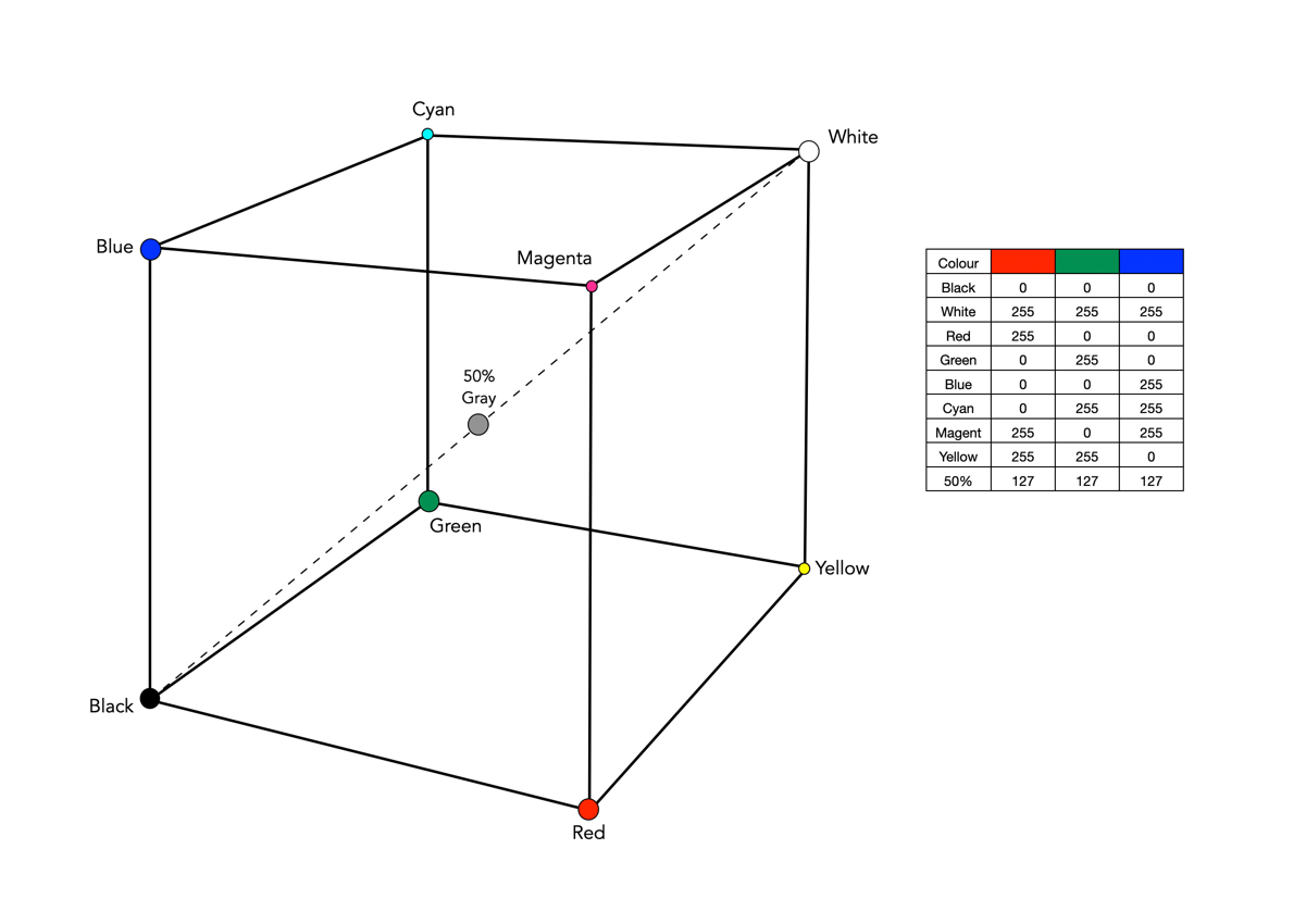
The RGB colour model is one in which colours are represented as combinations of the three primary colours: red (R), green (G), and blue (B). RGB is an additive colour model, which means that a colour is formed by mixing various intensities of red, green and blue light. The collection of all the colours obtained by such a linear combination of red, green and blue forms a cube shaped colour space (see Fig.1). Each colour, as described by its RGB components, is represented by a point that can be found either on the surface or inside the cube.
Fig.1: The geometric representation of the RGB colour space
The cube, as shown in Fig.1, shows the primary (red, green, blue), and secondary colours (cyan, magenta, yellow), all of which lie on the vertices of the colour cube. The corner of RGB colour cube that is at the origin of the coordinate system corresponds to black (R=G=B=0). Radiating out from Black are the three primary coordinate axes, Red, Green, and Blue. Each of these range from 0 to Cmax, where Cmax is typically 255 for a 24-bit colour space (8-bits each for R, G, and B). The corner of the cube that is diagonally opposite to the origin represents white (R=G=B=255). Each of these 8-bit colours contains 256 values, so the total amount of colours which can be produced is 2563, or 16,777,216 colours. Sometimes the values are normalized between 0 and 1, and the colour cube is called the unit cube. The diagonal (dashed) line connecting black and white corresponds to all the gray colours between black and white, which is also known as gray axis. Grays are formed when all three components are equal, i.e. R=G=B. For example the 50% gray is (127,127,127).
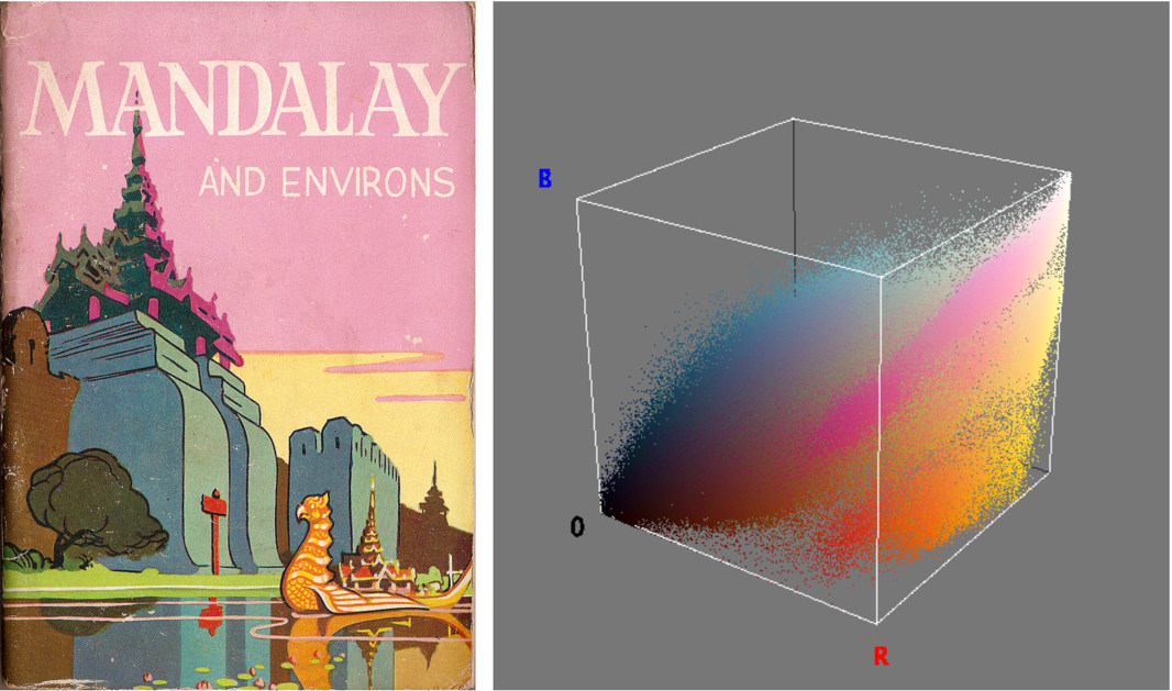
Fig.2: An image and its RGB colour space.
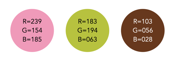
Figure 2 illustrates an RGB cube for a colour image. Notice that while the pink colour of the sky looks somewhat uniform in the image, it is anything, showing up as a swath of various shades of pink in the RGB cube. There are 275,491 unique colours in the Fig.2 image. Every possible colour corresponds to a point within the RGB colour cube, and is of the form: Cxyz = (Rx,Gy,Bz). For example Fig.3 illustrates three colours extracted from the image in Fig.2.
Fig.3: Examples of some RGB colours from Fig.2
The RGB colour model has a number of benefits:
It is the simplest colour model.
No transformation is required to display data on a screen, e.g. images.
It is a computationally practical system.
The model is very easy to implement.
But equally it has a number of limitations:
It is not a perceptual model. In perceptual terms, colour and intensity are distinct from one another, but the R, G, and B components each contain both colour and intensity information. This makes it challenging to perform some image processing operations in RGB space.
It is psychologically non-intuitive, i.e. not able to determine what a particular RGB colour corresponds to in the real world, or what RGB means in a physical sense.
It is non-uniform, i.e. it is impossible to evaluate the perceived differences between colours on the basis of distance in RGB space (the cube).
For the purposes of image processing, the RGB space is often converted to another colour space by means of some non-linear transformation.
The RGB colour space is commonly used in imaging devices because of its affinity with the human visual system. Two of the most commonly used colour spaces derived from the RGB model are sRGB and Adobe RGB.
We live in a world where colour surrounds us, so why would anyone want to take an achromatic, black-and-white photograph? What draws us to a B&W photograph? Many modern colour images are brightened to add a sense of the exotic in the same way that B&W invokes an air of nostalgia. B&W does not exaggerate the truth in the same way that colour does. It does sometimes veil the truth, but in many ways it is an equalizer. Colours and the emotions they represent are stripped away, leaving nothing but raw structure. We are then less likely to draw emotions into the interpretation of achromatic photographs. There is a certain rawness to B&W photographs, which cannot be captured by colour.
Every colour image is of course built upon an achromatic image. The tonal attributes provides the structure, the chrominance the aesthetic elements that help us interpret what we see. Black and white photographs offer simplicity. When colour is removed from a photograph, it forces a different perspective of the world. To create a pure achromatic photograph means the photographer has to look beyond the story posed by the chromatic elements of the scene. It forces one to focus on the image. There is no hue, no saturation to distract. The composition of the scene suddenly becomes more important. Both light and the darkness of shadows become more pronounced. The photographic framework of a world without colour forces one to see things differently. Instead of highlighting colour, it helps highlight shape, texture, form and pattern.
Sometimes even converting a colour image to B&W using a filter can make the image content seem more meaningful. Colour casts or odd-ball lighting can often be vanquished if the image is converted. Noise that would appear distracting in a colour image, adds to an image as “grain” in B&W. B&W images will always capture the truth of a subjects structure, but colours are always open to interpretation due to the way individuals perceive colour.
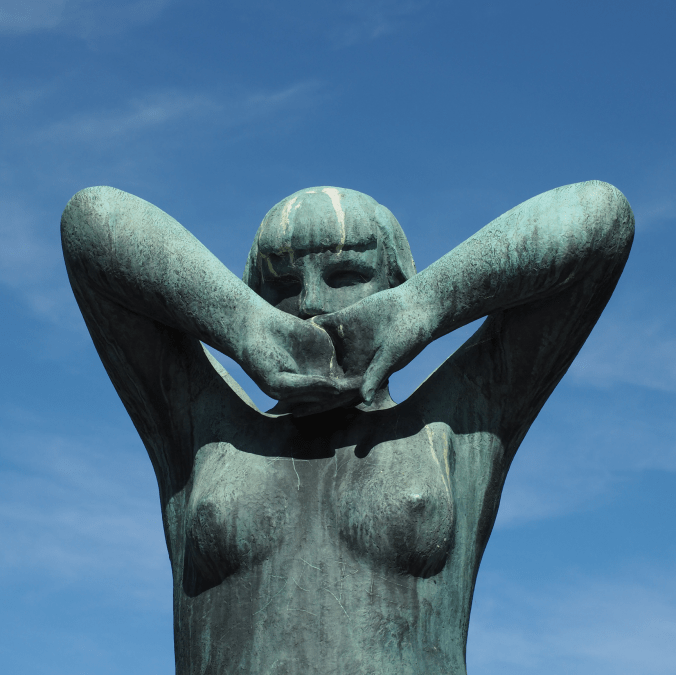
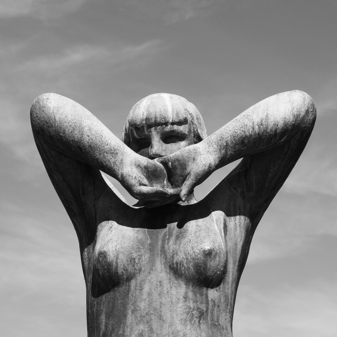
Above is a colour photograph of a bronze sculpture taken at The Vigeland Park in Oslo, a sculpture park displaying the works of Gustav Vigeland. The colour image is interesting, but the viewer is somewhat distracted by the blue sky, and even the patina on the statue. A more interesting take is the achromatic image, obtained via the Instagram Inkwell filter. The loss of colour has helped improve the contrast between the sculpture and its background.
Pictures are flat objects that contain pigment (either colour, or monochrome), and are very different from the objects and scenes they represent. Of course pictures must be something like the objects they depict, otherwise they could not adequately represent them. Let’s consider depth in a picture. In a picture, it is often easy to find cues relating to the depth of a scene. The depth-of-field often manifests itself as a region of increasing out-of-focus away from the object which is in focus. Other possibilities are parallel lines than converge in the distance, e.g. railway tracks, or objects that are blocked by closer objects. Real scenes do not always offer such depth cues, as we perceive “everything” in focus, and railway tracks do not converge to a point! In this sense, pictures are very dissimilar to the real world.
If you move while taking a picture, the scene will change. Objects that are near move more in the field-of-view than those that are far away. As the photographer moves, so too does the scene, as a whole. Take a picture from a moving vehicle, and the near scene will be blurred, the far not as much, regardless of the speed (motion parallax). This then is an example of a picture for which there is no real world scene.
A photograph is all about how it is interpreted
Photography then, is not about capturing “reality”, but rather capturing our perception, our interpretation of the world around us. It is still a visual representation of a “moment in time”, but not one that necessarily represents the world around us accurately. All perceptions of the world are unique, as humans are individual beings, with their own quirks and interpretations of the world. There are also things that we can’t perceive. Humans experience sight through the visible spectrum, but UV light exists, and some animals, such as reindeer are believed to be able to see in UV.
So what do we perceive in a photograph?
Every photograph, no matter how painstaking the observation of the photographer or how long the actual exposure, is essentially a snapshot; it is an attempt to penetrate and capture the unique esthetic moment that singles itself out of the thousands of chance compositions, uncrystallized and insignificant, that occur in the course of a day.