Japanese Are-Bure-Boke style photography

Artistic movements don’t arise out of a void. There are many factors which have contributed to the changes in Japanese society. Following World War 2 Japan was occupied by the United States, leading to the introduction of Western popular culture and consumerism, which was aptly termed Americanization. The blend of modernity and tradition was likely to lead to some waves, which was magnified by the turbulent changes occurring in Western society in the late 1960s, e.g. the demonstrations against the Vietnam War. In the late 1960s, Japan’s rapid economic growth began to falter, exposing a fundamental opposition to Japan’s postwar political, economic and cultural structure, which lead to a storm of protests by the likes of students and farmers.

It had a long-term effect on photography, forcing a rethink on how it was perceived. In November 1968 a small magazine called Provoke was published, conceived by art critic Koji Taki (1928-2011) and photographer Takuma Nakahira, with poet Takahiko Okada (1939-1997) and photographer Yutaka Takanashi as dojin members. Daido Moriyama joined a for the second and third issues, bringing with him his early influences of Cartier-Bresson. The subtitle for the magazine was “Provocative Materials for Thought”, and each issue was composed of photographs, essays and poems. The magazine had a lifespan of three issues, the Provoke members disbanding due to a lack of cohesion in their ideals.

The ambitious mission of Provoke to create a new photographic language that could transcend the limitations of the written word was declared with the launch of the magazine’s first issue. The year was 1968 and Japan, like America, was undergoing sweeping changes in its social structure.

Russet Lederman, 2012

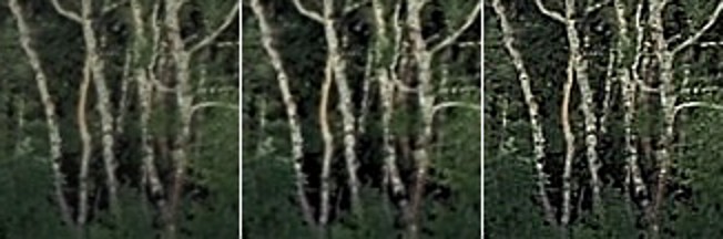
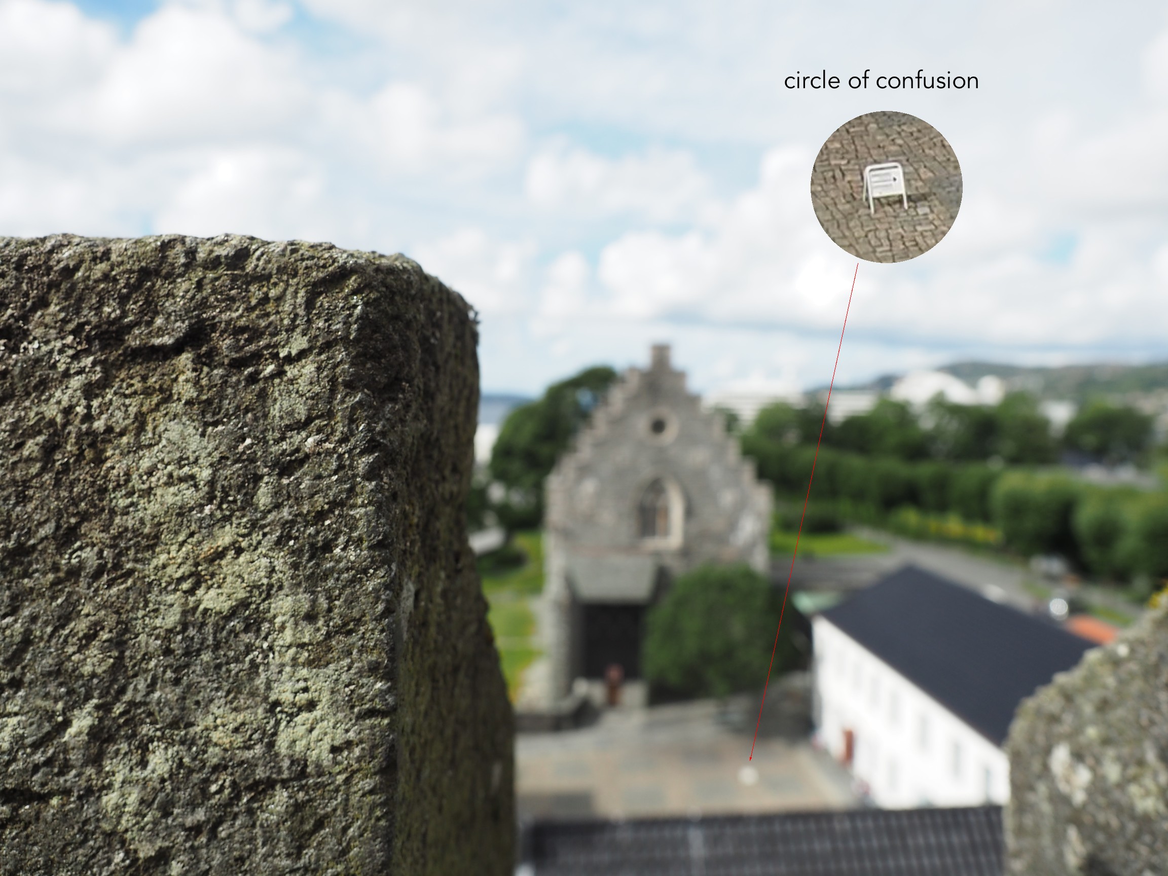
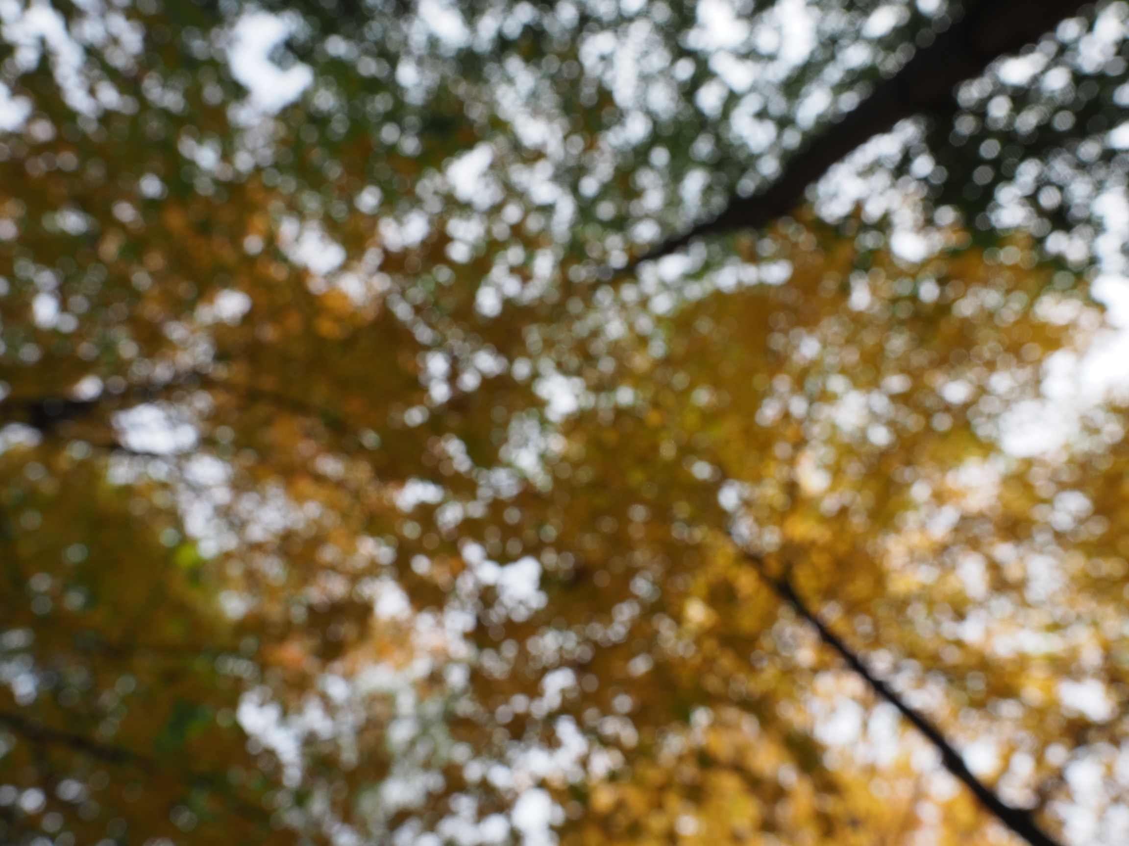
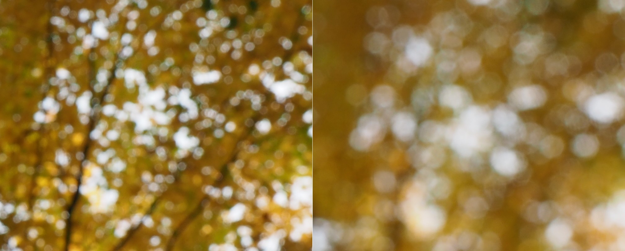
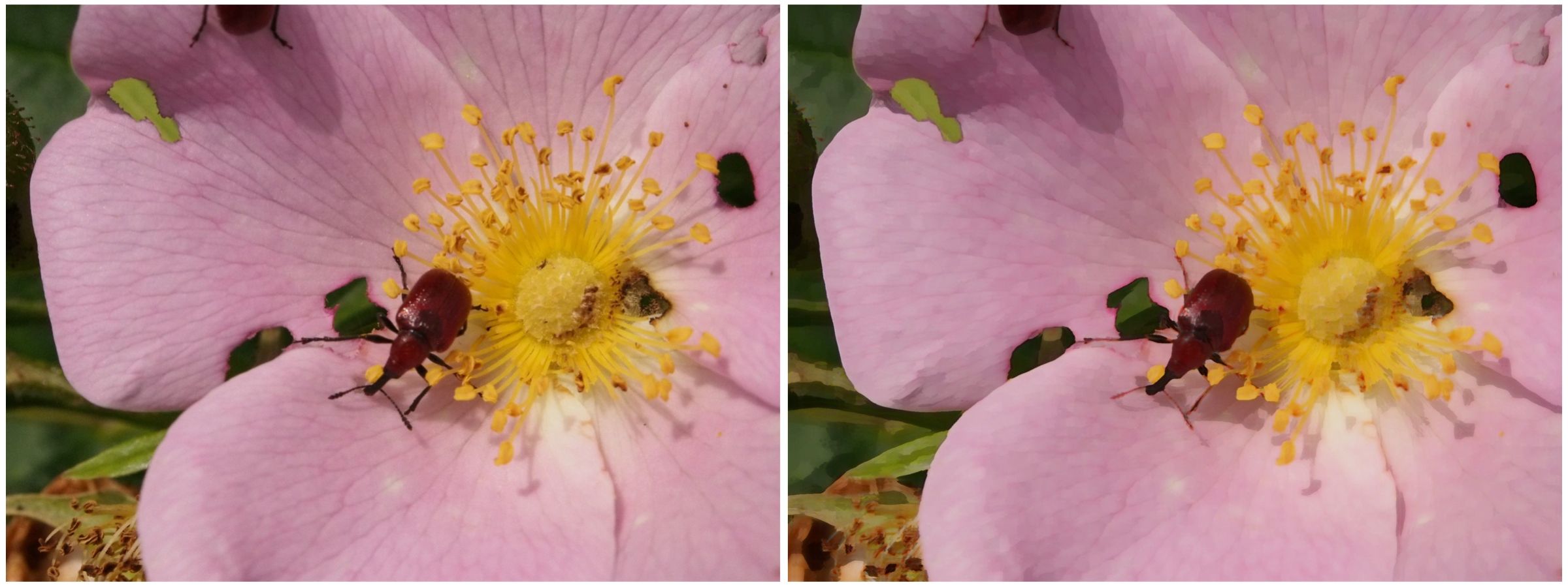
The aim of Provoke was to rethink the relationship between word and image, in essence to create a new language. It was to challenge the traditional view of the beauty of photographs, and their function as narrative, pictorial entities. The photographs were fragmented images that rethought the established aesthetic of photography. The photographs they published were an collection of “coarse, blurred and out-of-focus” images, characterized by the phrase Are‑Bure‑Boke (pronounced ah-reh bu-reh bo-keh). It roughly translates to “rough, blurred and out-of-focus”, i.e. grainy (Are), blurry (Bure) and out-of-focus (Boke).

An example of Daido Moriyama’s work.

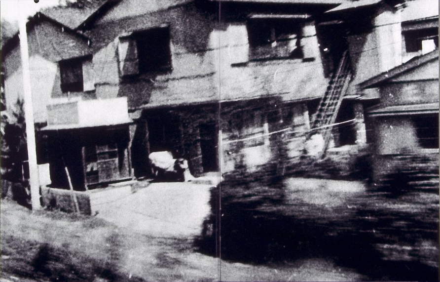
They tried random triggering, they shot into the light, they prized miss-shots and even no-finder shots (in which no reference is made to the viewfinder). This represented not just a new attitude towards the medium, but a fundamental new outlook toward reality itself. Of course that is not to say that every photograph had the same characteristics, because there are many different ways of taking a picture. The unifying characteristic is the ability to push beyond the static boundaries of traditional photographic aesthetics. Provoke provided an alternative understanding of the post-war years, one that had traditionally been quite Western centric.

Further reading:

Photography and colour deficiency

How often do we stop and think about how colour blind people perceive the world around us? For many people there is a reduced ability to perceive colours in the same way that the average person perceives them. Colour blindness, which is also known as colour vision deficiency affects some 8% of males, and 5% of females. Colour blindness means that a person has difficulty seeing red, green, or blue, or certain hues of these colours. In extremely rare cases, a person have an inability to see any colour at all. And one term does not fit all, as there are many differing forms of colour deficiency.

The most common form is red/green colour deficiency, split into two groups:

  • Deuteranomaly – 3 cones with a reduced sensitivity to green wavelengths. People with deuteranomaly may commonly confuse reds with greens, bright greens with yellows, pale pinks with light grey, and light blues with lilac.
  • Protanomaly – The opposite of deuteranomaly, a reduced sensitivity to red wavelengths. People with protanomaly may confuse black with shades of red, some blues with reds or purples, dark brown with dark green, and green with orange.

Then there is also blue/yellow colour deficiency. Tritanomaly is a rare color vision deficiency affecting the sensitivity of the blue cones. People with tritanomaly most commonly confuse blues with greens and yellows with purple or violet.

Standard vision
Deuteranomaly
Protanomaly
Tritanomaly

People with deuteranopia, protanopia, or tritanopia are the dichromatic forms where the associated cones (green, red, or blue) are missing completely. Lastly there is monochromacy, achromatopsia, or total colour blindness are conditions of having mostly defective or non-existent cones, causing a complete lack of ability to distinguish colours.

Standard vision
Deuteranopia
Protanopia
Tritanopia

How does this affect photography? Obviously photographs will be the same, but photographers who have a colour deficiency will perceive a scene differently. For those interested, there are some fine articles on how photographers deal with colourblindness.

  • Check here for an exceptional article on how photographer Cameron Bushong approaches colour deficiency.
  • Photographer David Wilder offers some insights into working on location and some tips for editing.
  • David Wilder describes taking photographs in Iceland using special glasses which facilitate the perception of colour.
  • Some examples of what the world looks like when your colour-blind.

Below is a rendition of the standard colour spectrum as it relates to differing types of colour deficiency.

Simulated colour deficiencies applied to the colour spectrum.

In reality people who are colourblind may be better at discerning some things. A 2005 article [1] suggests people with deuteranomaly may actually have an expanded colour space in certain circumstances, making it possible for them to for example discern subtle shades of khaki.

Note: The colour deficiencies shown above were simulated using ImageJ’s (Fiji) “Simulate Color Blindness” function. An good online simulator is the Coblis, Color Blindness Simulator.

  1. Bosten, J.M., Robinson, J.D., Jordan, G., Mollon, J.D., “Multidimensional scaling reveals a color dimension unique to ‘color-deficient’ observers“, Current Biology, 15(23), pp.R950-R952 (2005)

Does a lack of colour make it harder to extract the true context of pictures?

For many decades, achromatic black-and-white (B&W) photographs were accepted as the standard photographic representation of reality. That is until the realization of colour photography for the masses. Kodak introduced Kodachrome in 1936 and Ektachrome in the 1940s which lead to the gradual, popular adoption of colour photography. It only became practical for everyday photographers during the mid-1950s after film manufacturers had invented processes that made colour pictures sufficiently easy to develop. That didn’t mean that B&W disappeared from society, as in certain fields like journalistic photography they remained the norm. There were a number of reasons for this – news photos were generally printed in B&W, and B&W film was faster, meaning less light was needed to take an image, allowing photojournalists to shoot in a variety of conditions. So from a journalistic viewpoint, people interpreted the news of the world in B&W for nearly a century.

The difference between B&W and colour is that humans don’t see the world in monochromatic terms. Humans have the potential to discern millions of colours, and yet are limited to approximately 32 shades of gray. We have evolved in this manner because the world around us is not monochromatic, and our very survival once depended on our ability to separate good food from the not so good. Many things can be inferred from colour. Many things are lost in B&W. Colour catches the eye, and highlights regions of interest. For instance, setting and time of day/year can be inferred from a photograph’s colours. Mood can also be communicated based on colour. 

Black-and-white photographs offer a translation of our view of the world into a unique achromatic medium. Shooting B&W photographs is clearly more challenging because unlike the 16 million odd colours available to describe a scene, B&W typically offers only 256, from pure black (0), to pure white (255). Take for example a photograph taken during the First World War. These photographs were typically B&W, and grainy, painting a rather grim picture of all aspects of society during this period. We typically associated B&W with nostalgia. There was some colour photography during the early 20th century, provided by the Autochrome Lumière technology, and resulting in some 72,000 photographs of the time period from places all over the world. But seeing things in B&W means having to interpret a scene without the advantage of colour. Consider the following photograph from Paris during the early 1900s. It offers a very vibrant rendition of the street scene, with the eye drawn to the varied colour posters on the wall of the building. 

Two forms of reality: Colour versus black-and-white

Without the colour, we are left with a somewhat drab and gloomy scene, befitting the somber mood associated with the early years of the early 20th century. In the B&W we cannot see the colour of the posters festooning the buildings. What is interesting is that we are likely not use to seeing colour photographs from before the 1950s. It’s almost like we expect images from the before 1950 to be monochromatic, maybe because we perceive these years filled with hardship and suffering. But there is something unique about the monochrome domain. 

The aesthetic of black-and-white photographs is based on many factors, including lighting, any colour filters that were used during acquisition of the photograph, and the colour sensitivity of the B&W film. Sergei Mikhailovich Prokudin-Gorskii (1863-1944) was a man well ahead of his time. He developed an early technique for taking colour photographs involving a series of monochrome photographs and colour (R-G-B) filters. The images below show an example of Alim Khan, Emir of Bukhara. It is shown in comparison with two grayscale renditions of the photograph. The first is the lightness component from the Lab colour space, and the second is a grayscale image extracted from RGB using G=0.299R+0.587G+0.114B. Both offer a different perspective of how the colour in the image could be rendered by the camera. None present the vibrance of the image in the same way as the colour image.

Image sharpening – image content and filter types

Using a sharpening filter is really contingent upon the content of an image. Increasing the size of a filter may have some impact, but it may also have no perceptible impact – what-so-ever. Consider the following photograph of the front of a homewares store taken in Oslo.

A storefront in Oslo with a cool font

The image (which is 1500×2000 pixels – down sampled from a 12MP image) contains a lot of fine details, from the stores signage, to small objects in the window, text throughout the image, and even the lines on the pavement. So sharpening would have an impact on the visual acuity of this image. Here is the image sharpened using the “Unsharp Mask” filter in ImageJ (radius=10, mask-weight=0.3). You can see the image has been sharpened, as much by the increase in contrast than anything else.

Image sharpened with Unsharp masking radius=10, mask-weight=0.3

Here is a close-up of two regions, showing how increasing the sharpness has effectively increased the contrast.

Pre-filtering (left) vs. post-sharpening (right)

Now consider an image of a landscape (also from a trip to Norway). Landscape photographs tend to lack the same type of detail found in urban photographs, so sharpening will have a different effect on these types of image. The impact of sharpening will be reduced in most of the image, and will really only manifest itself in the very thin linear structures, such as the trees.

Sharpening tends to work best on features of interest with existing contrast between the feature and its surrounding area. Features that are too thin can sometimes become distorted. Indeed sometimes large photographs do not need any sharpening, because the human eye has the ability to interpret the details in the photograph, and increasing sharpness may just distort that. Again this is one of the reasons image processing relies heavily on aesthetic appeal. Here is the image sharpened using the same parameters as the previous example:

Image sharpened with Unsharp masking radius=10, mask-weight=0.3

There is a small change in contrast, most noticeable in the linear structures, such as the birch trees.  Again the filter uses contrast to improve acuity (Note that if the filter were small, say with a radius of 3 pixels, the result would be minimal). Here is a close-up of two regions.

Pre-filtering (left) vs. post-sharpening (right)

Note that the type of filter also impacts the quality of the sharpening. Compare the above results with those of the ImageJ “Sharpen” filter, which uses a kernel of the form:

ImageJ “Sharpen” filter

Notice that the “Sharpen” filter produces more detail, but at the expense of possibly overshooting some regions in the image, and making the image appear grainy. There is such as thing as too much sharpening.

Original vs. ImageJ “Unsharp Masking” filter vs. ImageJ “Sharpen” filter

So in conclusion, the aesthetic appeal of an image which has been sharpened is a combination of the type of filter used, the strength/size of the filter, and the content of the image.

Optical blur and the circle of non-sharpness

Most modern cameras automatically focus a scene before a photograph is acquired. This is way easier than the manual focus that occurred in the ancient world of analog cameras. When part of a scene is blurry, then we consider this to be out-of-focus. This can be achieved in a couple of ways. One way is by means of using the Aperture Priority setting on a camera.  Blur occurs when there is a shallow depth of field. Opening up the aperture to f/2.8 allows in more light, and the camera will compensate with the appropriate shutter speed. It also means that objects not in the focus plane will be blurred. Another way is through manually focusing a lens.

Either way, the result is optical blur. But optical blur is by no means shapeless, and has a lot to do with a concept known as the circle of confusion (CoC). The CoC occurs when the light rays passing through the lens are not perfectly focused. It is sometimes known as the disk of confusioncircle of indistinctnessblur circle, or blur spot. CoC is also associated with the concept of Bokeh, which I will discuss in a later post. Although honestly – circle of confusion may not be the best term. In German the term used is “Unschärfekreis”, which translates to “circle of non-sharpness“, which inherently makes more sense.

A photograph is basically an accumulation of many points – which represent the exact points in the real scene. Light striking an object reflects off many points on the object, which are then redirected onto the sensor by  the lens. Each of these points is reproduced by the lens as a circle. When in focus, the circle appears as a sharp point, otherwise the out-of-focus region appears as circle to the eye. Naturally the “circle” normally takes the shape of the aperture, because the light passes through it. The following diagram illustrates the “circle of confusion“. A photograph is exactly sharp only on the focal plane, with more or less blur around it.  The amount of blur depends on an objects  distance from the focal plane. The further away, the more distinct the blur. The blue lines signify an object in focus. Both the red and purple lines show objects not in the focal plane, creating large circles of confusion (i.e. non-sharpness = blur).

The basics of the “circle of confusion”

Here is a small example. The photograph below is taken in Bergen, Norway. The merlon on the battlement is in focus with the remainder of the photograph beyond that blurry. Circles of confusion are easiest to spot as small bright objects on darker backgrounds. Here a small white sign becomes a blurred circle-of-confusion.

An example of the circle of confusion as a bright object.

Here is a second example, of a forest canopy, taken through focusing manually. The CoC are very prevalent.

An example where the whole image is composed of blur.

As we de-focus the image further, the CoC’s become larger, as shown in the example below.

As the defocus increases (from left to right), so too does the blur, and the size of the CoC.

Note that due to the disparity in blurriness in a photograph, it may be challenging to apply a “sharpening” filter to such an image.

How do we perceive depth from flat pictures?

Hang a large, scenic panorama from a wall, and the picture of the scene looks like the scene itself. Photographs are mere imitations of life, albeit flat renditions. Yet although they represent different realities, there are cues on the flat surface of a photograph which help us perceive the scene in depth. We perceive depth is photographs (or even paintings) because the same type of information reaches our visual system from photographs of scenes as from the scenes themselves.

Consider the following Photochrom print (from the Library of Congress) of the Kapellbrücke in the Swiss city of Lucerne, circa 1890-1900. There is no difficulty perceiving the scene as it relates to depth. It is possible to identify buildings and objects in the scene, and obtain an understanding of the relative distances of objects in the scene from one another. These things help define its “3D” ness. The picture can be seen from another perspective as well. The buildings on the far side of the river get progressively smaller as they progress along the river from the left to right, and the roof of the bridge is much larger in the foreground than it is in the distance. There is no motion parallax, which is the relative movement of near and far objects were we physically moving around the scene. These things work together to define our perception of the prints flatness.

Kapellbrücke in Lucerne
Fig. 1: Flatness – The Kapellbrücke in Lucerne

Our perception of the 3D nature of a flat photograph comes from the similarity of information reaching the human visual system from an actual 3D scene, and one described in a photograph of the same scene.

What depth cues exist in an image?

  • Occlusion – i.e. overlapping or superimposition. If object A overlaps object B, then it is presumed object A is closer than object B. The water tower in Fig.1 hides the buildings on the hill behind it, hence it is closer.
  • Converging lines – As parallel lines go into the distant, they become closer together. The bridge’s roofline in Fig.1 gets smaller as it moves higher in the picture.
  • Relative size – Objects that are larger in an image are perceived to be closer than those which are further away. For example, the houses along the far riverbank in Fig. 1 are roughly the same height, but become smaller as they progress from the left of the picture towards the centre.
  • Lighting and shading – Lighting is what brings out the form of a subject/object. The picture in Fig. 1 is light on the right, and darker on the right, this is effectively shown in the water tower which has a light side, and a side with shadows. This provides information about the shape of the tower.
  • Contrast – For scenes where there is a large distance between objects, those further away will have a lower contrast, and may appear blurrier.
  • Texture gradient – The amount of detail on an object helps understand depth. Objects that are closer appear to have more detail, and as it begins to loose detail those areas are perceived to be further away.
  • Height in the plane – An object closer to the horizon is perceived as being more distant than objects above or below it.

Examples of some of these depth cues are explained visually below.

Examples of depth cues in pictures

Creating art-like effects in photographs

Art-like effects are easy to create in photographs. The idea is to remove textures, and sharpen edges in a photograph to make it appear more like abstract art. Consider the image below. An art-like effect has been created on this image using a filter known as Kuwahara. It has the effect of homogenizing regions of colour, hence you will notice a loss of detail within the image, and colours within a region. It was originally designed to process angiocardiographic images. The usefulness of filters such as Kuwahara is that they remove detail and  increase abstraction. Another example of such a filter is the bilateral filter.

Image (before) and (after)

The Kuwahara is based on local area “flattening”, removing detail in high-contrast regions while protecting shape boundaries in low-contrast areas. The only issue with Kuwahara is that is can produce somewhat “blocky” results. Choosing a different shaped “neighbourhood” will have a different affect on the image. A close-up view of the beetle in the image above shows the distinct edges of the processed image. Note also how some of the features have changed colour slightly (the beetles legs have transformed from dark brown to a pale brown colour), due to the influence of the surrounding pink petal colour.

Close-up detail (before) and (after)

Filters like Kuwahara are also used to remove noise from images.

The perception of enhanced colour images

Image processing becomes more difficult when you involve colour images. That’s primarily because there is more data involved. With monochrome images, there is really only intensity. With colour images comes chromaticity – and the possibility of modifying the intrinsic colours within an image whilst performing some form of image enhancement. Often, image enhancement in colour images is challenging because the impact of the enhancement is very subjective.

Consider this image of Schynige Platte in Switzerland. It is very colourful, and seems quite vibrant.

The sky however seems too aquamarine. The whole picture seems like some sort of “antique photo filter” has been applied to it. How do we enhance it, and what do we want to enhance? Do we want to make the colours more vibrant? Do we want to improve the contrast?

In the first instance, we merely stretch the histogram to reduce the gray tonality of the image. Everything becomes much brighter, and there is a slight improvement in contrast. There are parts of the image that do seem too yellow, but it is hard to know whether this is an artifact of the original scene, or the photograph (likely an artifact of dispersing yellow flower petals).

Alternatively, we can improve the images contrast. In this case, this is achieved by applying a Retinex filter to the image, and then taking the average of the filter result and the original image. The resulting image is not as “bright”, but shows more contrast, especially in the meadows.

Are either of these enhanced images better? The answer of course is in the eye of the beholder. All three images have certain qualities which are appealing. At the end of the day, improving the aesthetic appeal of a colour image is not an easy task, and there is no “best” algorithm.

In image processing, have we have forgotten about aesthetic appeal?

In the golden days of photography, the quality and aesthetic appeal of the photograph was unknown until after the photograph was processed, and the craft of physically processing it played a role in how it turned out. These images were rarely enhanced because it wasn’t as simple as just manipulating it in Photoshop. Enter the digital era. It is now easier to take photographs, from just about any device, anywhere. The internet would not be what it is today without digital media, and yet we have moved from a time when photography was a true art, to one in which photography is a craft. Why a craft? Just like a woodworker crafts a piece of wood into a piece of furniture, so to do photographers  crafting their photographs in the like of Lightroom,or Photoshop.There is nothing wrong with that, although I feel like too much processing takes away from the artistic side of photography.

Ironically the image processing community has spent years developing filters to process images, to make them look more visually appealing – sharpening filters to improve acuity, contrast enhancement filters to enhance features. The problem is that many of these filters were designed to work in an “automated” manner (and many really don’t work well), and the reality is that people prefer to use interactive filters. A sharpening filter may work best when the user can modify its strength, and judge its aesthetic appeal through qualitative means. The only place “automatic” image enhancement algorithms exist are those in-app filters, and in-camera filters. The problem is that it is far too difficult to judge how a generic filter will affect a photograph, and each photograph is different. Consider the following photograph.

Cherries in a wooden bowl, medieval.

A vacation pic.

The photograph was taken using the macro feature on my 12-40mm Olympus m4/3 lens. The focal area is the top-part of the bottom of the wooden bucket. So some of the cherries are in focus, others are not, and there is a distinct soft blur in the remainder of the picture. This is largely because of the low depth of field associated with close-ip photographs… but in this case I don’t consider this a limitation, and would not necessarily want to suppress it through sharpening, although I might selectively enhance the cherries, either through targeted sharpening or colour enhancement. The blur is intrinsic to the aesthetic appeal of the image.

Most filters that have been incredibly successful are usually proprietary, and so the magic exists in a black box. The filters created by academics have never faired that well. Many times they are targeted to a particular application, poorly tested (on Lena perhaps?), or not at all designed from the perspective of aesthetics. It is much easier to manipulate a photograph in Photoshop because the aesthetics can be tailored to the users needs. We in the image processing community have spent far too many years worrying about quantitative methods of determining the viability of algorithms to improve images, but the reality is that aesthetic appeal is all that really matters. Aesthetic appeal matters, and it is not something that is quantifiable. Generic algorithms to improve the quality of images don’t exist, it’s just not possible in the overall scope of the images available. Filters like Instagram’s Larkwork because they are not changing the content of the image really, they are modifying the colour palette, and they do that applying the same look-up table for all images (derived from some curve transformation).

People doing image processing or computer vision research need to move beyond the processing and get out and take photographs. Partially to learn first hand the problems associated with taking photographs, but also to gain an understanding of the intricacies of aesthetic appeal.

Why aesthetic appeal in image processing matters

What makes us experience beauty?

I have spent over two decades writing algorithms for image processing, however I have never really created anything uber fulfilling . Why? Because it is hard to create generic filters, especially for tasks such as image beautification. In many ways improving the aesthetic appeal of photographs involves modifying the content on an image in more non natural ways. It doesn’t matter how AI-ish an algorithm is, it cannot fathom what the concept of aesthetic appeal is.  A photograph one person may find pleasing may be boring to others. Just like a blank canvas is considered art to some, but not to others. No amount of mathematical manipulation will lead to a algorithmic panacea of aesthetics. We can modify the white balance and play with curves, indeed we can make 1001 changes to a photograph, but the final outcome will be perceived differently by different people.

After spending years researching image processing algorithms, and designing some of my own, it wasn’t until I decided to take the art of acquiring images to a greater depth that I realized algorithms are all good and well, but there is likely little need for the plethora of algorithms created every year. Once you pick up a camera, and start playing with different lenses, and different camera settings, you begin to realize that part of the nuance any photograph is its natural aesthetic appeal. Sure, there are things that can be modified to improve aesthetic appeal, such as contrast enhancement or improving the sharpness, but images also contain unfocused regions that contribute to their beauty.

If you approach image processing purely from a mathematical (or algorithmic) viewpoint, what you are trying to achieve is some sort of utopia of aesthetics. But this is almost impossible, largely because every photography is unique.  It is possible to improve the acuity of objects in an image using techniques such as unsharp masking, but it is impossible to resurrect a blurred image – but maybe that’s the point. One could create an fantastic filter that sharpens an image beautifully, but with the sharpness of modern lenses, that may not be practical. Consider this example of a photograph taken in Montreal. The image has good definition of colour, and has a histogram which is fairly uniform. There isn’t a lot that can be done to this image, because it truly does represent the scene as it exists in real life. If I had taken this photo on my iPhone, I would be tempted to post it on Instagram, and add a filter… which might make it more interesting, but maybe only from the perspective of boosting colour.

aestheticAppeal1

A corner hamburger joint in Montreal – original image.

Here is the same image with only the colour saturation boosted (by ×1.6). Have its visual aesthetics been improved? Probably. Our visual system would say it is improved, but that is largely because our eyes are tailored to interpret colour.

aestheticAppeal2

A corner hamburger joint in Montreal – enhanced image.

If you take a step back from the abyss of algorithmically driven aesthetics, you begin to realize that too few individuals in the image processing community have taken the time to really understand the qualities of an image. Each photograph is unique, and so the idea of generic image processing techniques is highly flawed. Generic techniques work sufficiently well in machine vision applications where the lighting is uniform, and the task is also uniform, e.g. inspection of rice grains, or identification of burnt potato chips. No aesthetics are needed, just the ability to isolate an object and analyze it for whatever quality is needed. It’s one of the reasons unsharp masking has always been popular. Alternative algorithms for image sharpening really don’t work much better. And modern lenses are sharp, in fact many people would be more likely to add blur than take it away.