The aesthetic appeal of mid-century vintage lenses

When you look at modern lenses, there isn’t much that sets them apart. They are usually pretty plain black cylinders, partially due to the consistency of modern lens design. The same could not be said of vintage lenses. Maybe this has something to do with the fact that many vintage lenses were made by companies that focused purely on lenses, and as such tried hard to differentiate their lenses from their competitors. For example a company like Meyer Optik Gorlitz manufactured lenses for cameras using the Exakta mount had to compete for the consumer spending with lenses from a myriad of other companies (at least 25-30).

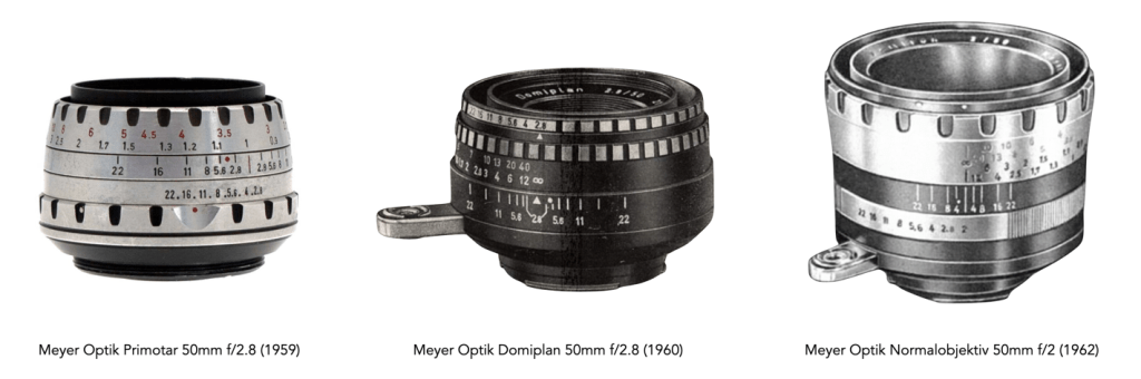
Over time the appearance of lenses naturally changed, as new materials were introduced, often for the purpose of reducing the overall cost of lenses. For example, many early 35mm lenses had a shiny, chrome-like appearance. The earliest, pre-war lenses were often made of chrome-plated brass. As the Second World War progressed, shortages or re-direction of materials like brass led some manufacturers had begun to transition towards aluminum, which was both less expensive, easier to manufacture, and produced a lighter lens. While these early aluminum lenses were aesthetically pleasing there was little that differentiated them in a world where there was an increasing number of 3rd party lens manufacturers.

Fig.1: Evolution of the aluminum design of the Zeiss Jena Biotar 58mm f/2

When it first appeared as a lens material, aluminum was chic. The 1950s was the age of aluminum, which was a symbol of modernism. Many of the largest aluminum producers pursued new markets to absorb their increased wartime production capacity, used in everything from drink cans to kitchenware and Airstream trailers (there was also extra aluminum from scrapping of war surplus aircraft etc.). These aluminum lenses were initially clear-coated to reduce the likelihood of tarnishing, but eventually anodized to provide a robust black coating. Also in the 1950s, lens manufacturers to realize changing trends in lens design – buyers had moved away from the idea of pure practicality, and focused also on design. This wasn’t really surprising considering the broad scope of modernist design during this period – design tended to favour sleek and streamlined silhouettes. It is interesting to note that most of the aesthetically pleasing lenses of the post-1950 period originated from Germany.

Fig.2: Every lens manufacturer had a different interpretation of both “berg-and-tal”, and the black-and-white “zebra” aesthetic

The first notable change was the gradual move towards what in German manufacturers called the “berg und tal” design, or rather “mountain and valley” design of the grips on a lens – usually knurled depressions milled into the surface of the ring (but also the opposite like the lenses of Steinheil where the depressions are smooth and the mountains are knurled). English-speaking regions often referred to this as a “knurled grip”. Appearing in the early 1950s, it was particularly common for focusing rings, making them more prominent, and likely more ergonomic, i.e. easier to grip. Some lenses started with the focusing ring, and eventually used the same design on the aperture ring. Prior to this most lenses used a simple straight knurl on the adjustment rings.

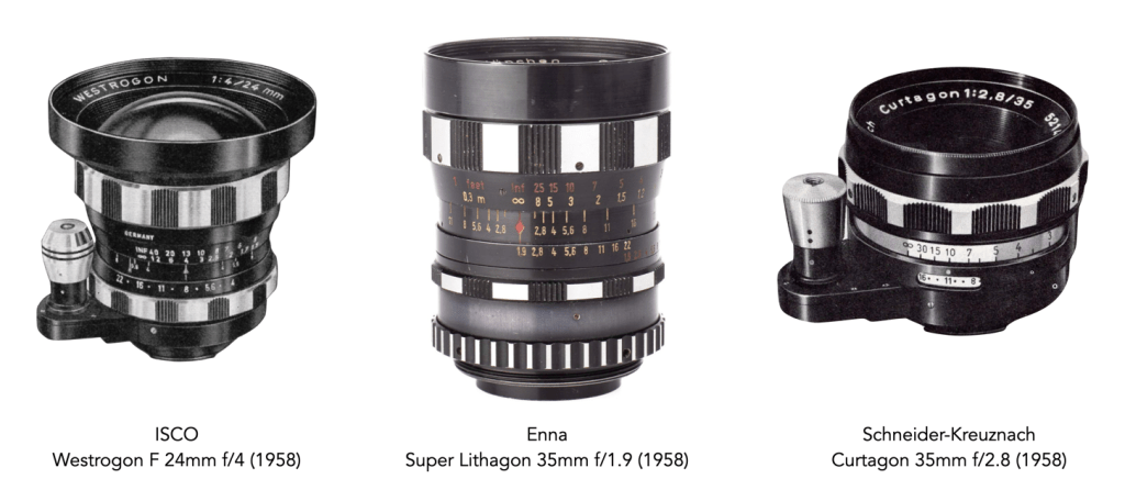
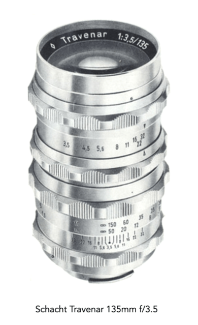
Towards the end of the 1950s, the pure-aluminum design transitioned to a combination of silver and black anodized aluminum. The lens bodies themselves were mostly black, with the “berg und tal” designs alternating between black and silver. This alternating pattern is what is colloquially known as “zebra” design. Many lens manufacturers utilized the zebra aesthetic in one form or another including Schacht, Enna, Steinheil, Schneider-Kreuznach, Meyer Optik, Rodenstock, ISCO etc..

Fig.3: Meyer Optik had an interesting twist on the zebra design. There were very few of these lenses and they are very minimalistic in design.

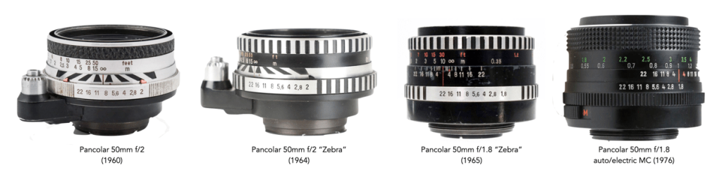
Zeiss probably produced the best known examples of the zebra aesthetic design with the Pancolar and Flektogon series of lenses. Although these lenses did not appear until the early 1960s, they bypassed the more prominent berg-und-tal in favour of a much subdued black-and-white knurled grip (which is also something Meyer Optik did with lenses like the Lydith 30mm). This design for both focusing and aperture rings replaced the rough textured rings of the earlier lenses. Some call these lenses the “Star Wars lens”. The Pancolar 50mm f/2 appeared ca. 1960 in the form of an f/2 lens with dual black-silver body encompassing a “converging-distance” depth of field range indicator, and either a textured or nubbed rubber focusing ring. This evolved a few years later to the classic “zebra” design, shortly before the release of the classic Pancolar 50mm f/1.8, which also sported the zebra design. By the 1970s, the Pancolar 50mm f/1.8 had morphed into a complete black configuration with a large rubber cross knurling focus grip and a finely knurled aperture ring.

Fig.4: Evolution of design aesthetics of the Zeiss Pancolar 50mm lens.

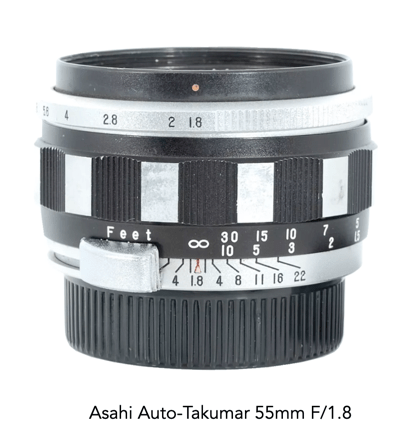
Japanese manufacturers transitioned from aluminum/chrome to black bypassing the zebra design. The one exception seems to be the Asahi Auto-Takumar 55mm F/1.8, which appeared in 1958, but is the sole example of zebra design (at least by Asahi). Japanese manufacturers did however embrace the berg-and-tal design.

Fig.5: Some lens companies couldn’t settle on a design. Here we have differing focus ring designs from the same Meyer Optik catalog in the 1960s

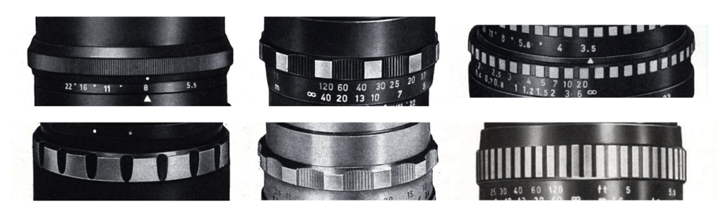
By the mid-1960s many camera manufacturers were producing their own lenses, particularly in Japan. As such lenses became more consistent, with little need to compete with other lens manufacturers. There were still 3rd party lens manufacturers but their perspective was to concentrate more on the manufacture of inexpensive lenses. Most lenses transitioned to using standardized, nonchalant black aluminum lenses, with the onus being more on the quality of the optics. Grips transitioned from berg-und-tal to a flatter, square-grooved style, still using a in black/chrome contrast (which likely resulted in a cost saving). By the mid-1970s focus rings were provided with a ribbed rubber coating, still common today on some lenses.

Fig.6: Berg-und-tal overkill?
Fig.7: One of the few Japanese zebra lenses.

Today, the sleek aluminum lenses are sought after because of their “retro” appeal, as too are the zebra lenses.

Twig art via water flow

A lot of photographic inspiration often comes from nature. Last week I was walking in a park a few hours after the torrential “100 year storm”, and noticed that all the twigs lying on the ground had been washed down the grassy hill, forming these clumps of miniature log-jams. They were just a lot of fun from a artistic viewpoint, showing again that nature truly knows how to do randomized, chaotic art.

How do we define beauty?

It’s funny when someone says a photograph is beautiful, because not everyone will have the same perception. This is because the idea of beauty is a very subjective one. Beauty is a term which cannot truly be quantified in any real manner. What society has done is imprint certain standards of beauty based on a few peoples opinions. If you look at the picture of the pink flower below, you might say it’s beautiful – but why is it beautiful? Is it because most people would say that, or is it because it is colourful. A brown flower would likely be considered not-so-beautiful. Is it because the flower smells nice? (which obviously you cannot tell from a photograph). The second flower below, a Frangipani is simpler, but may be beautiful because of its decadently sweet, floral, fragrance. Could beauty be an amalgam of visual and olfactory senses?

Are pink roses considered more beautiful?
This Frangipani flower is plain, but still beautiful.

For most of human existence, beauty has not really mattered that much (well, except maybe for those who had wealth, I mean gold is shiny, which likely contributes to its allure). Most humans were concerned with survival. That is not to say that aesthetics did not play a role in the things they made, but let’s face it, catching food took precedence over making things look pretty. Beauty may have existed more in the natural world. In fact it may be these natural patterns that exist in nature that has lead to humans being somewhat hardwired to experience beauty.

“Beauty is no quality in things themselves: It exists merely in the mind which contemplates them; and each mind perceives a different beauty. One person may even perceive deformity, where another is sensible of beauty; and every individual ought to acquiesce in his own sentiment, without pretending to regulate those of others.”

Hume, David, “Of the Standard of Taste”, Essays Moral and Political, p.136 (1757)

Beauty has to do with the idea of aesthetics, which is essentially the appreciation of beauty. The term “aesthetics” was introduced in 1750 by German philosopher Alexander Gottlieb Baumgarten who defined taste, in its wider meaning, as the ability to judge according to the senses, instead of according to the intellect. When we say something is beautiful, we are expressing an aesthetic judgment. When you pick a raspberry from a bush, you tend to choose the bright red, firm raspberries, with no apparent visual defects, those that are most beautiful (of course these is nothing to say they will taste good from pure visual assessment alone).

Is there not beauty in the piped twist of a French crullers?
The beauty in a matcha latte lies in the contrast between the green of the matcha and the foamy heart.

Beauty can be objective and universal, as certain things are beautiful to everyone. Perhaps flowers are a good example, or things in the natural world. However beauty in the human-made world is more subjective and individual. It is no different with our other senses. A delicious food to some, may taste repugnant to others. Another good example is art. Some people can find a piece of art beautiful, while others find it loathsome. Beauty truly is in the eye of the beholder. Each person’s perception of beauty is also influenced by their environment. In 1951 artist Robert Rauschenberg produced White Painting, basically white latex house paint applied with a roller and brush on two canvas panels. Some will find beauty in this nothingness, many won’t (well because there is nothing there).

The same is true of photographs, where beauty truly is subjective, mainly because photographs inherently represent the visual perspectives of the photographer, not necessarily those of the viewer. In some cases what is viewed in a photograph may not have the same beauty as the scene in real life, perhaps due to the lack of depth (i.e. flatness), or the misinterpretation of colour. In other cases, the photograph tells a different story of beauty to the real world. For instance colour may not be quintessential to beauty. The absence of colour in B&W images is not to everyone’s taste, yet it helps to tell a story in a way that means the colour does not distract the viewer from the image’s inner beauty, perhaps highlighting the expressions and textures of the scene.

There are many elements to producing a beautiful photograph, but at the end of the day, beauty is very much tied to the perceptions of the viewer. And unlike the physical world where we can harness all out senses to decipher our understanding of beauty, in visual media we have only our eyes.

Do the aesthetics of a camera impact its usability?

The useful and the beautiful are never far apart.

Periander

There is a condition known as the aesthetic-usability effect, whereby users perceive objects with more aesthetically pleasing designs to be easier to use than less aesthetically pleasing designs. Humans tend to be drawn towards nicer looking things. Take for example the aesthetic appealing atomic coffee maker. The design is attributed to Italian Giordano Robbiati, and was born in the 1940s. It ozzed aesthetic appeal, and was very popular (and still is). People likely presumed that something that looks nice probably works well. Its curved form likely melded well with the fluidity of coffee.

The atomic espresso maker.

People of course use aesthetics to judge appeal and perceived usability. Something that looks will likely work well. It is no different with cameras. There are cameras that are very aesthetically pleasing, and work extremely well, from the perspective of the layout of controls, or even how easy it is to add/remove a lens.

One of the ugliest cameras around appears to be the Konica Aiborg, more often referred to as Darth Vader camera. A 35mm camera which appeared in 1991, its name a blend of AI and cyBORG. It was bulky, had poor ergonomics, and just seemed an odd design from an aesthetic point-of-view. It’s quite possible that curved surfaces just don’t translate well to cameras, the same as they do to espresso makers. In fact all the curved surfaces do is detract from the aesthetic appeal of the camera, and may ultimately affect its usability.

Luke, I am you father (Konica Aiborg)

What is the most aesthetically pleasing 35mm camera? Well that likely is in the eye of the beholder… and whereas many people might agree about an ugly camera, beautiful cameras are harder to pin down. With film cameras, I am certainly partial to cameras that have clean lines, but that may result from the fact that the pictures themselves are rectangular in form. I do like the Canon 7s, the Olympus Pen F and just about any Ihagee Exakta Varex camera. With digital cameras I inherently lean towards those that mimic the lines of previous film cameras.

The Olympus Pen-F

In my opinion, one of the nicest 35mm cameras is the Olympus Pen-F half-frame camera. It has beautifully clean lines, lacking the “triangular hat” of a regular 35mm SLR (because it uses a Porro prism), and placing the shutter speed dial on the front of the camera. The camera is small, and compact, ergonomic to use, and almost minimalist.

How natural light and meaningful darkness tell a story

Have you ever been somewhere, and want to take a photograph, and there just isn’t much natural light, or perhaps the light is only coming from a single source, such as a window? Are you tempted to use a flash? Well don’t even think about it, because doing so takes away from the story of what you are photographing. Usually this sort of scenario manifests itself inside historical buildings where there just isn’t much natural light, and in context, no artificial light. Think anything before electric lighting – houses, castles, outbuildings, etc. Photography in historical buildings can be burdened by a lack of light – but that’s how they were when inhabited.

I photograph mostly using natural light. I don’t like using a flash, because ultimately there are certain qualities of natural light that enhance the colours and aesthetics of an object or scene. I find flash light too harsh, even when used with diffusers. But that’s just me. Below is an image from the attic space of a building at the Voss Folkemuseum in Norway. The room contained some beds, and storage chests, so obviously it was used as a bedroom. The light streaming through the window is enough to bathe the room with enough light to show its use (typically windows would only have been installed where the light would be most concentrated, in this case south-facing). Notice the spinning wheel next to the window where the light is most concentrated?

An attic space in a building at the Voss Folkemuseum in Voss, Norway.

A lack of light often tells a story. It shows you what the space really was like for those who inhabited it long ago. Before the advent of electricity, most buildings relied on natural light during the day, and perhaps candle-light at night. Windows were small because glass was inherently expensive, and the more glass one had, the more heat that was lost in winter. If you were documenting a scene in a more archival manner, you might naturally flood the scene with artificial light of a sort, but historical photography should not be harshly lit.

Many historic buildings were built at a time of very little beyond natural light and candles. The light today is that very same light, and to bath it with artificial light would be unnatural. These nooks and crannies were never meant to be bathed in complete light. Consider the images below, taken at different folke-museums in Norway. The images are of cooking fires inside historic buildings, which had no openings except in the roof. The one from the Norsk Folkemuseum is Saga-Stau, a replica of an open-hearth house from about 3000 years ago.

The inside of an open-hearth house at the Norsk Folkemuseum
Eldhus (house with fireplace and bakehouse) at Voss Folkemuseum

On a bright sunny day, dark spaces are bathed in whatever available light is able to seep through every opening. In a dark space this light can often appear harsh, blinding window openings to the point where there is little cognition of the scene beyond the window. Yet it also tends to produce shards of light puncturing into a space. On clouded days, the light can be more muted. In the image below of the living space, the light coming through the window is harsh enough to produce highlight clipping of both the window frame and part of the table. However the light adds a sense of Norwegian Hygge to the entire scene. To light this scene with a flash would simply reduce the scene to a series of artifacts, rather than a slice of history.

An indoor scene at the Voss Folkemuseum.

Is luminance the true reality?

Like our sense of taste and smell, colour helps us perceive and understand the world around us. It enriches our lives, and helps us comprehend the aesthetic quality of art, or differentiate between many things in the world around us. Yet colour is not everything. Pablo Picasso, said that “Colors are only symbols. Reality is to be found in luminance alone.” But is this a valid reality?

There is a biological basis for the fact that colour and luminance (what most people think of as B&W) play distinct roles in our perception of art, or of real life – colour and luminance are analyzed by different portions of our visual system, and as such they are responsible for different aspects of visual perception. The parts of our brain that process information about colour are located several cm away from the parts that analyze luminance – as anatomically distinct as vision is from hearing. The part that processes colour information is found in the temporal lobe, whereas luminance information is processed in the parietal lobe.

Below is a comparison of Vincent van Gogh’s Green Wheat Field with Cypress (1889), with a version containing only luminance. Our ability to recognize the various regions of vegetation and to perceive their three-dimensional shape and the spatial organization of this scene depends almost entirely on the luminance of the paints used, and not their colours.

Green Wheat Field with Cypress (1889)

Yet a world without colour is one that forfeit’s crucial elements. While luminance provides the structure for a scene, colours allow us to see the scene more precisely. In the colour image above, it allows us to better differentiate the different greens of the grasses, and the blues of the sky. In the B&W image, the grasses are less distinct, the vibrancy in the green trees and bushes is absent, and there is very little differentiation between the colours of the sides and roof of the cottage. Of course we must always remember that colour is almost never seen exactly as it physically is. All colour perception is relative. The images below compare the luminance and chrominance information for the image above – the chrominance information is extracted from the HSB colour space, which incorporate the hue and saturation components. Note how it lacks the “structural” information which is bestowed by light and dark.

Luminance
Chrominance (i.e. colour information)

Is luminance more important than colour? In some ways yes, because of the way our eyes have evolved. Our eyes perceive light and dark as well as colour through rods and cones. Rods are very sensitive to light and dark (and help give us good vision in low light), whereas cones are responsible for colour information. But rods are more plentiful than cones. In the central fovea there may be about 20 times more rods (≈100-120 million) than cones (≈5-6 million). In reality, the details in what we perceive in a scene are carried mostly by the information we perceive about light and dark. So reality can be found in luminance alone, because even without colour we can still perceive what is in a scene (people with achromatopsia, which is a complete lack of colour, do exactly that).

But for most humans colour is an integral part of our vision, we cannot switch it off at will, in the same way that we engage a B&W mode in a camera. It allowed our early ancestors to see colourful ripe fruit more easily against a background of mostly green forest, and it allows us to appreciate the world around us.

Further reading:

Margaret Livingston, Light Vision, Harvard Medical Alumni Bulletin, pp.15-23 (Autumn, 2003)

Colour (photography) is all about the light

Photography in the 21st century is interesting because of all the fuss made about megapixels and sharp glass. But none of the tools of photography matter unless you have an innate understanding of light. For it is light that makes a picture. Without light, the camera is blind, capable of producing only dark unrecognizable images. Sure, artificial light could be used, but photography is mostly about natural light. It is light that provides colour, helps interpret contrast, determines brightness and darkness, and also tone, mood, and atmosphere. However in our everyday lives, light is often taken somewhat fore granted.

One of the most important facets of light is colour. Colour begins and ends with light; without light, i.e. in darkness, there is no colour. Light is an attribute of a big family of “waves” that starts with wavelengths of several thousand kilometres, including the likes of radio waves, heat radiation, infrared and ultraviolet waves, and X rays, and ends with gamma radiation of radium and cosmic rays with wavelengths so short that they have to be measured in fractions of a millionth part of a millimeter. Visible light is of course that part of the spectrum which the human eyes are sensitive to, ca. 400-700nm. For example the wavelength representing the colour green has values in the range 500-570nm.

The visible light spectrum

It is this visible light that builds the colour picture in our minds, or indeed that which we take with a camera. An object will be perceived as a certain colour because it absorbs some colours (or wavelengths) and reflects others. The colours that are reflected are the ones we see. For example the dandelion in the image below looks yellow because the yellow petals in the flower have absorbed all wavelengths of colour except yellow, which is the only colour reflected. If only pure red light were shone onto the dandelion, it would appear black, because the red would be absorbed and there would be no yellow light to be reflected. Remember, light is simply a wave with a specific wavelength or a mixture of wavelengths; it has no colour in and of itself. So technically, there is really no such thing as yellow light, rather, there is light with a wavelength of about 590nm that appears yellow. Similarly, the grass in the image reflects green light.

The colours we see are reflected wavelengths that are interpreted by our visual system.

The colour we interpret will also be different based on the time of day, lighting, and many other factors. Another thing to consider with light is its colour temperature. Colour temperature uses numerical values in degrees Kelvin to measure the colour characteristics of a light source on a spectrum ranging from warm (orange) colours to cool (blue) colours. For example natural daylight has a temperature of about 5000 Kelvin, whereas sunrise/sunset can be around 3200K. Light bulbs on the other hand can range anywhere from 2700K to 6500K. A light source that is 2700K is considered “warm” and generally emits more wavelengths of red, whereas a 6500K light is said to be “cool white” since it emits more blue wavelengths of light.

We see many colours as one, building up a picture.

Q: How many colours exist in the visible spectrum?
A: Technically, none. This is because the visible spectrum is light, with a wavelength (or frequency), not colour per se. Colour is a subjective, conscious experience which exists in our minds. Of course there might be an infinite number of wavelengths of light, but humans are limited in the number they can interpret.

Q: Why is the visible spectrum described in terms of 7 colours?
A: We tend to break the visible spectrum down into seven colours: red, orange, yellow, green, blue, indigo, and violet. Passing a ray of white light through a glass prism, splits it into seven constituent colours, but these are somewhat arbitrary as light comes as a continuum, with smooth transitions between colours (it was Isaac Newton that first divided the spectrum into 6, then 7 named colours). There are now several different interpretations of how spectral colours have been categorized. Some modern ones have dropped indigo, or have replaced it with cyan.

Q: How is reflected light interpreted as colour?
A: Reflected light is interpreted by both camera sensors, film, and the human eye by filtering the light, to interpret the light in terms of the three primary colours: red, green, and blue (see: The basics of colour perception).

My thoughts on algorithms for image aesthetics

I have worked on image processing algorithms on and off for nearly 30 years. I really don’t have much to show for it because in reality I found it was hard to build on algorithms that already existed. What am I talking about, don’t all techniques evolve? Well, yes and no. What I have learned over the years is that although it is possible to create unique, automated algorithms to process images, in most cases it is very hard to make those algorithms generic, i.e. apply the algorithm to all images, and get aesthetically pleasing results. And I am talking about image processing here, i.e. improving or changing the aesthetic appeal of images, not image analysis, whereby the information in an image is extracted in some manner – there are some good algorithms out there, especially in machine vision, but predominantly for tasks that involve repetition in controlled environments, such as food production/processing lines.

The number one thing to understand about the aesthetics of an image is that it is completely subjective. In fact image processing would be better termed image aesthetics, or aesthetic processing. Developing algorithms for sharpening an image is all good and well, but it has to actually make a difference to an image from the perspective of human perception. Take unsharp masking for example – it is the classic means of applying sharpening to an image. I have worked on enhanced algorithms for sharpening, involving morphological shapes that can be tailored to the detail in an image, and while they work better, for the average user, there may not be any perceivable difference. This is especially true of images obtained using modern sharp optics.

How does an algorithm perceive this image? How does an algorithm know exactly what needs sharpening? Does an algorithm understand the aesthetics underlying the use of Bokeh in this image?

Part of the process of developing these algorithms is understanding the art of photography, and how simple things like lenses, and how various methods of taking a photo effect the outcome. If you ignore all those and just deal with the mathematical side of things, you will never develop a worthy algorithm. Or possibly you will, but it will be too complicated for a user to understand, let alone use. As for algorithms that supposedly quantify aesthetics in some manner – they will never be able to aesthetically interpret an image in the same way as a human.

Finally, improving the aesthetic appeal of an image can never be completely given over to an automated process, although the algorithms provided in many apps these days are good. Aesthetic manipulation is still a very fluid, dynamic, subjective process accomplished best through the use of tools in an app, making subtle changes until you are satisfied with the outcome. The problem with many academically-motivated algorithms is that they are driven more from a mathematical stance, rather than one based on aesthetics.

Are-Bure-Boke aesthetic using the Provoke app

It is possible to experience the Are-Bure-Boke aesthetic in a very simple manner using the Provoke app. Developed by Toshihiko Tambo in collaboration with iPhoneography founder Glyn Evans, it was inspired by Japanese photographers of the late 1960’s like Daidō Moriyama, Takuma Nakahira and Yutaka Takanashi. This means it produces black and white images with the same gritty, grainy, blurry look reminiscent of the “Provoke” era of photography.

There isn’t much in the way of explanation on the app website, but it is fairly easy to use. There aren’t a lot of controls (the discussion below assumes the iPhone is held in landscape mode). The most obvious one is the huge red shutter release button. The button is obviously well proportioned in order to easily touch it, even though it does somewhat impede the use of the other option buttons. Two formats are provided: a square format 126 [1:1] and 35mm format 135 [3:2]. There is an exposure compensation setting which allows changes to be made up and down. The slider can be adjusted up to three stops in either direction: −3 to +3 in 1/3 steps. On the top-right is a button for the flash settings (Auto/On/Off). On the top-left there is a standard camera flip switch, and a preferences button which allows settings of Grid, TIFF, or GeoTag (all On/Off).

One of the things I dislike most about the app is related to its usability. Both the preferences and camera-flip buttons are very pale, making them hard to see in all but dark scenes when using 35mm format. The other thing I don’t particularly like is the inability to pull in a photograph from the camera roll. It is possible to access the camera roll to apply the B&W filters to photos on the camera roll, but the other functionality is restricted to live use. I do however like the fact that the app supports TIFF.

The original used to illustrate how the Provoke filters work (the “no filter” option).

The app provides nine B&W filters, or rather “films” as the app puts it. They are in reality just filters, as they don’t seem to coincide with any panchromatic films that I could find. The first three options offer differing levels of contrast.

  • HPAN High Contrast – a high contrast film with fine grain.
  • NPAN Normal – normal contrast
  • LPAN Low Contrast – low contrast

The next three are contrast + noise:

  • X800 – more High Contrast with more noise
  • I800 – IR like filter
  • Z800 – +2EV with more noise

The film types with “100” designators introduce blur and grain.

  • D100 – Darken with Blur (4Pixel)
  • H100 – High Contrast with Blur(4Pixel)
  • E100 : +1.5EV with Blur(4Pixel)

Examples of each of the filters are shown below. I have not adjusted any of the images for exposure compensation.

HPAN
X800
D100
NPAN
I800
H100
LPAN
Z800
E100

The Are-Bure-Boke aesthetic produces images which have characteristics of being grainy (Are), blurry (Bure) and out-of-focus (Boke). With the use of film cameras, these characteristics were intrinsic to the camera or film. The use of half-frame cameras allowed image grain to be magnified, low shutter speeds provide blur, and a fixed-focal length (providing a shallow DOF) provides out-of-focus. It is truly hard to replicate all these things in software. Contrast was likely added during the photo-printing stage.

What the app really lacks is the ability to specify a shutter-speed, meaning that Bure can not really be replicated. Blur is added by means of an algorithm, however is added across the whole image, simulating the entire camera panning across the scene using a low shutter speed, rather than capturing movement using a low-shutter speed (where some objects will not be blurred because they are stationary). It doesn’t seem like there is anything in the way of Boke, out-of-focus. Grain is again added by means of filter which adds noise. Whatever algorithm is used to replicate film grain also doesn’t work well, with uniform, high intensity regions showing little in the way of grain.

In addition Provoke also provides three colour modes, and a fourth no-filter option.

  • Nofilter
  • 100 Old Color
  • 100U Vivid and Sharp
  • 160N Soft
100
100U
160N

Honestly, I don’t know why these are here. Colour filters are a dime a dozen in just about every photo app… no need to crowd this app with them, although they are aesthetically pleasing. I rarely use anything except HPAN, and X800. Most of the other filters really don’t provide anything in the way of the contrast I am looking for, of course it depends on the particular scene. I like the app, I just don’t think it truly captures the point-and-shoot feel of the Provoke era.

The inherent difference between traditional Are-Bure-Boke vs the Provoke app is one is based on physical characteristics versus algorithms. The aesthetics of the photographs found in Provoke-era photographs is one of in-the-moment photography, capturing slices of time without much in the way of setting changes. That’s what sets cameras apart from apps. Rather than providing filters, it might have been better to provide a control for basic “grain”, the ability to set a shutter speed, and a third control for “out-of-focus”. Adding contrast could be achieved in post-processing with a single control.

The photography of Daidō Moriyama

Daidō Moriyama was born in Ikeda, Osaka, Japan in 1938, and came to photography in the late 1950s. Moriyama studied photography under Takeji Iwamiya before moving to Tokyo in 1961 to work as an assistant to Eikoh Hosoe. In his early 20’s he bought a Canon 4SB and started photographing on the streets on Osaka. Moriyama was the quintessential street photographer focused on the snapshot. Moriyama likened snapshot photography to a cast net – “Your desire compels you to throw it out. You throw the net out, and snag whatever happens to come back – it’s like an ‘accidental moment’” [1]. Moriyama’s advice on street photography was literally “Get outside. It’s all about getting out and walking.” [1]

In the late 1960s Japan was characterized by street demonstrations protesting the Vietnam War and the continuing presence of the US in Japan. Moriyama joined a group of photographers, associated with the short-lived (3-issue) magazine Provoke (1968-69), which really dealt with elements of experimental photography. His most provocative work during the Provoke-era was the are-bure-boke style that illustrates a blazing immediacy. His photographic style is characterized by snapshots which are gritty, grainy black and white, out-of-focus, extreme contrast, Chiaroscuro (dark, harsh spotlighting, mysterious backgrounds). Moriyama is “drawn to black and white because monochrome has stronger elements of abstraction or symbolism, colour is something more vulgar…”.

“My approach is very simple — there is no artistry, I just shoot freely. For example, most of my snapshots I take from a moving car, or while running, without a finder, and in those instances I am taking the pictures more with my body than my eye… My photos are often out of focus, rough, streaky, warped etc. But if you think about I, a normal human being will in one day receive an infinite number of images, and some are focused upon, other are barely seen out of the corners of one’s eye.”

Moriyama is an interesting photographer, because he does not focus on the camera (or its make), instead shoots with anything, a camera is just a tool. He photographs mostly with compact cameras, because with street photography large cameras tend to make people feel uncomfortable. There were a number of cameras which followed the Canon 4SB, including a Nikon S2 with a 25/4, Rolleiflex, Minolta Autocord, Pentax Spotmatic, Minolta SR-2, Minolta SR-T 101 and Olympus Pen W. One of Moriyama’s favourite film camera’s was the Ricoh GR series, using a Ricoh GR1 with a fixed 28mm lens (which appeared in 1996) and sometimes a Ricoh GR21 for a wider field of view (21mm). Recently he was photographing with a Ricoh GR III.

“I’ve always said it doesn’t matter what kind of camera you’re using – a toy camera, a polaroid camera, or whatever – just as long as it does what a camera has to do. So what makes digital cameras any different?”

Yet Moriyama’s photos are made in the post-processing stage. He captures the snapshot on the street and then makes the photo in the darkroom (or in Silver Efex with digital). Post-processing usually involves pushing the blacks and whites, increasing contrast and adding grain. In his modern work it seems as though Moriyama photographs in colour, and converts to B&W in post-processing (see video below). It is no wonder that Moriyama is considered by some to be the godfather of street photography, saying himself that he is “addicted to cities“.

“[My] photos are often out of focus, rough, streaky, warped, etc. But if you think about it, a normal human being will in one day perceive an infinite number of images, and some of them are focused upon, others are barely seen out of the corner of one’s eye.”

For those interested, there are a number of short videos. The one below shows Moriyama in his studio and takes a walk around the atmospheric Shinjuku neighbourhood, his home from home in Tokyo. There is also a longer documentary called Daidō Moriyama: Near Equal, and one which showcases some of his photographs, Daido Moriyama – Godfather of Japanese Street Photography.

Artist Daido Moriyama – In Pictures | Tate (2012)

Further Reading: