So when people create images for the web they are often told that the optimal resolution is 72dpi. First of all, dpi (dots-per-inch) has nothing to do with screens – it is used only in printing. When we talk about screen resolution, we are talking about ppi (points-per-inch), so the concept of dpi is already a misinterpretation.
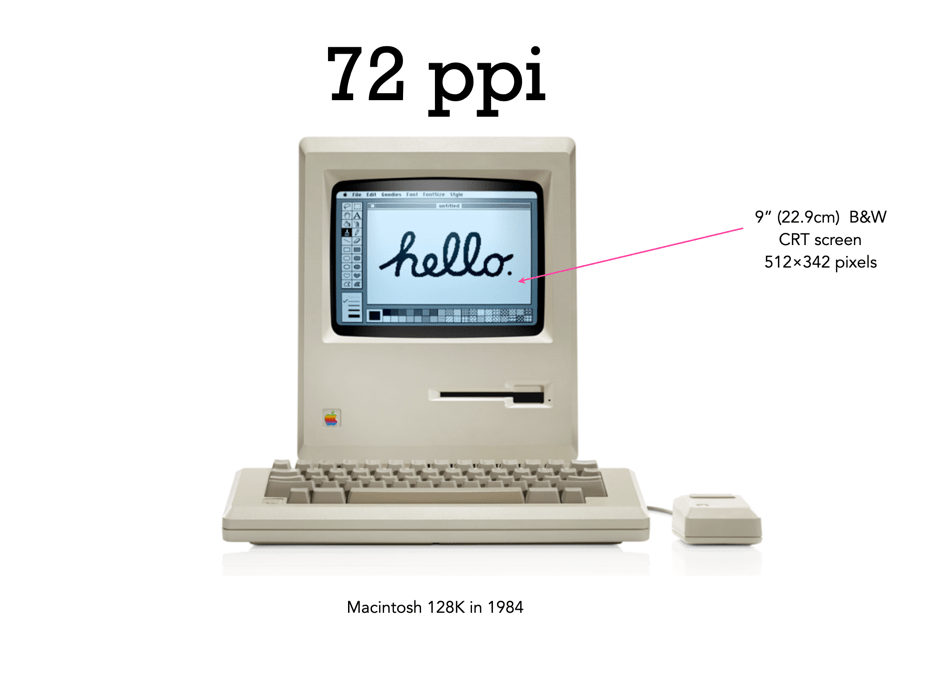
There is still a lot of talk about the magical 72dpi. This harkens back to the time decades ago when computer screens commonly had 72ppi (the Macintosh 128K had a 512×342 pixel display), as opposed to the denser screens we have now (to put this into perspective, it had 0.175 megapixels versus the 4MP on the 13.3” Retina display). This had to do with Apple’s attempt to match the size of the graphics on the screen to the size when it is printed. The most common resolution of the bits of a bitmapped image on the screen of a Macintosh was 72dpi. In a 1989 InfoWorld article (June 19), a review of colour display systems mentioned that “… the closer the display is to 72 dpi, the more ‘real world’ the image will appear, compared with printed output.” This was no coincidence, as Apple’s first printer, the “ImageWriter” could produce print up to a resolution of 144dpi, doubled the resolution of the Mac, so this made scaling images easy.
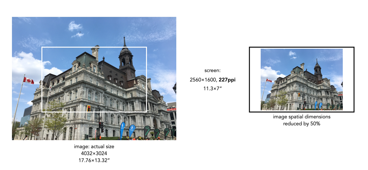
Saving an image using 72ppi makes no sense, because it makes no difference to what is seen on the screen. An image by itself is just a quadrilateral of pixels, it has no context until it is viewed on a screen or printed out. Viewing devices have pixels that don’t change unless the resolution of the monitor changes. This means how an image is displayed is dependent on the resolution of the screen. For example, a 13” MacBook Pro with Retina screen has a size of 2560×1600 with a resolution of 227ppi. This means an image that is 4000×3000 pixels will take up 17.6×13.2” – it would be much larger than the screen if displayed at full resolution. When these images are opened on the laptop they are generally displayed at around 30% of their size, so that the entire image can be viewed.
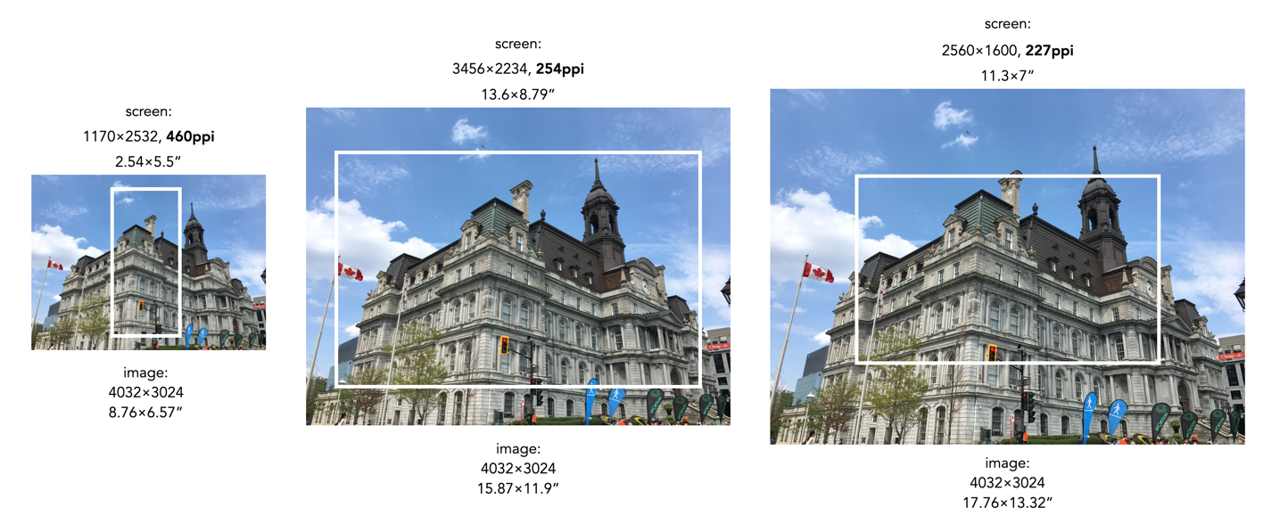
Most webpages are designed in a similar manner, and auto-adjust image sizes to fit the constraints of the webpage design template. It also shows why 12MP or even 6MP images really aren’t needed for webpages. If we instead reduce the spatial dimensions of a 12MP image by 50% we get a 2016×1512, 3MP image – which would only take up 8.8×6.6” of space on the screen (illustrated below). Less screen space is needed, and the smaller file size will benefit things like site loading. If a 6 or 12MP image were used it will just be a larger image to load, and will resized within the webpage by the browser.
What about viewing an image on a 4K television? 4K televisions all have a resolution of 3840×2160. The only caveat here is that if the size of the television changes, the ppi also changes. A 50” TV will have a resolution of 88ppi, whereas an 80” TV will only be 55ppi. This means the 2016×1512 image will appear to be 23×17” on the 50” TV, and 37×27” on the 80” TV. It’s all relative.
So changing an image to 72dpi has what effect? Basically, none. You cannot change the ppi or dpi of an image, because they are dependent on the screen, and printer respectively. So modifying this field in a file to 72ppi/dpi makes no difference to how it is viewed on the screen, or printed on a printer. No screens today have a resolution of 72ppi, unless you are still using a 1980s era Macintosh.
 Crafting Pixels